

1. “Tiny” Text
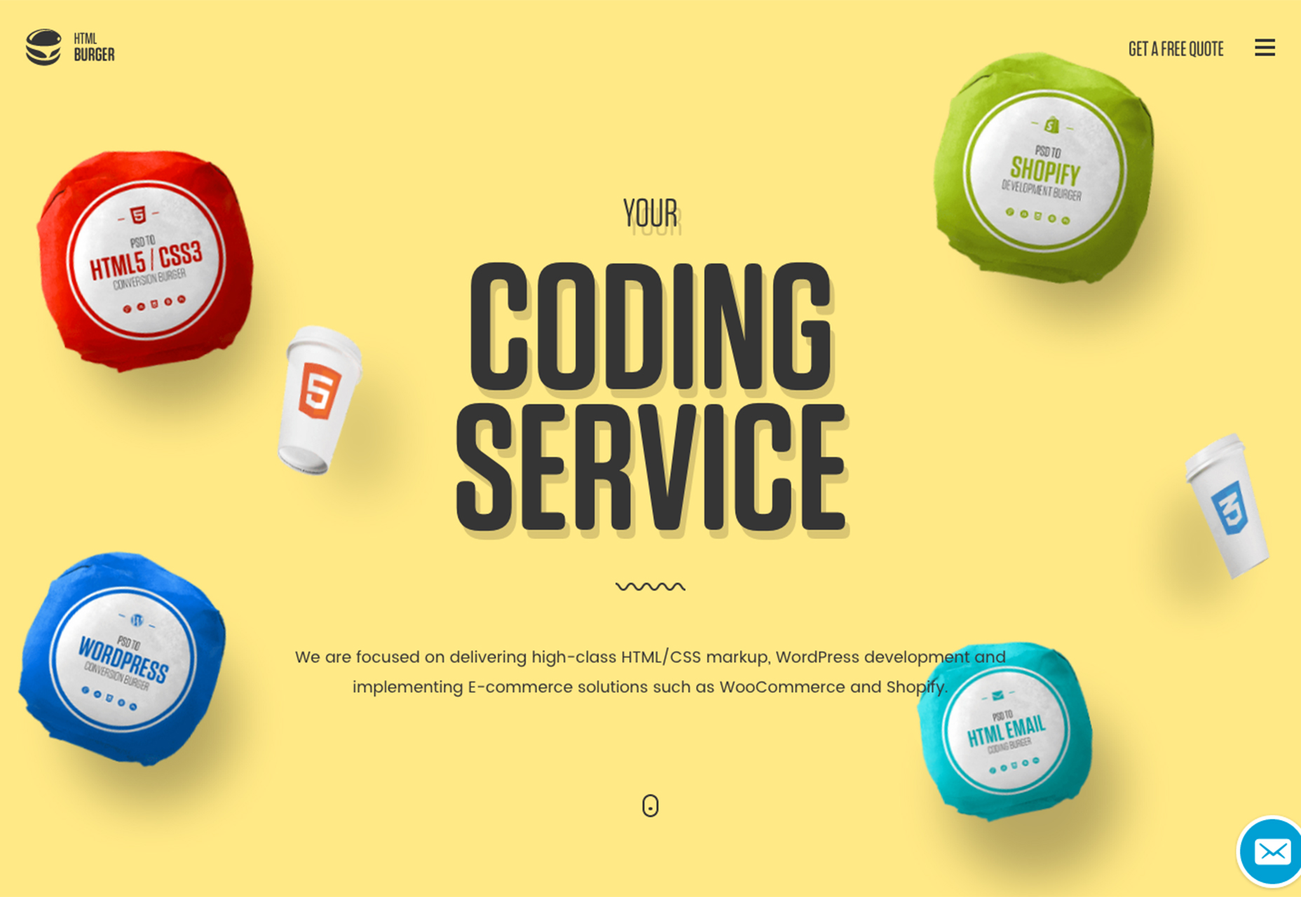
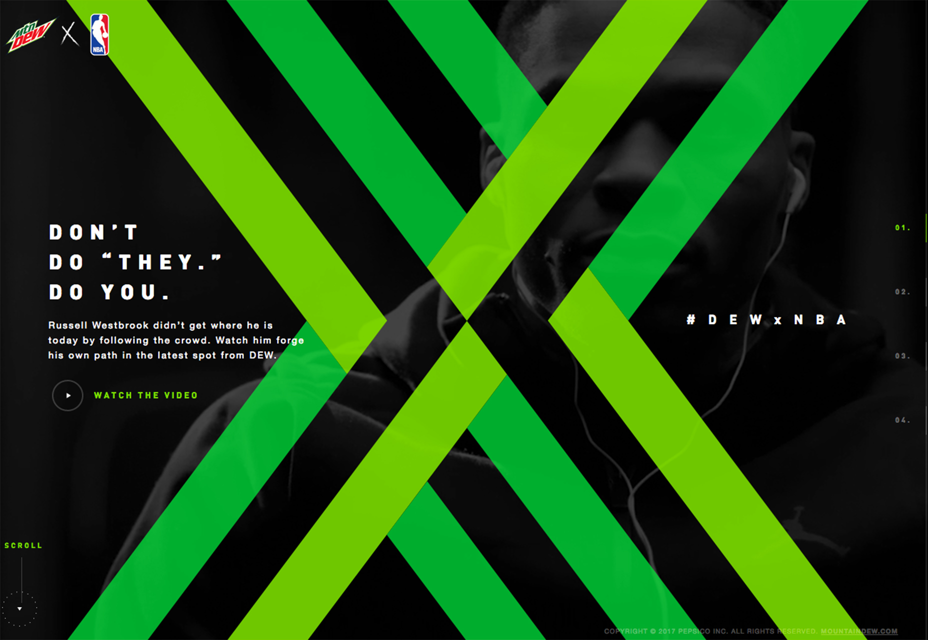
Does it seem like oversized typography is a thing of the past? Smaller, almost “tiny” text has begun to replace the big bold headers that have been a website design staple for a while now. From smaller headlines to body text that seems sparse, there’s been a definite trend in typography downsizing. While there might be some concerns about readability when it comes to small text sizes, particularly for body text, smaller fonts are not a bad thing. Oversized typography had almost started trending toward garish with sizes and lettering that was almost too big to read with ease. Smaller typefaces feel somewhat softer and give the design more space for other elements for the eye to move around to. The trick to effectiveness with small type is to keep lettering to a minimum. Without a lot to read, this trend can be effective and interesting. On the other hand, with large blocks of type tiny type gets lost and can hinder the user’s ability to read with ease and scan copy efficiently. Balance is a concern as well. All of the typefaces have to scale down somewhat to create a nice sense of harmony. Moonfarmer uses a light typeface for the logotype treatment and a small line of secondary copy. The type elements contrast nicely and the light type treatment seems to fit the mood of the imagery. HTML Burger takes almost the opposite approach with a bold headline and small secondary lines of text. The lighter descriptive words work small because they are common words—HTML, CSS, e-commerce—and contrast significantly with the still-oversized headline. Mountain Dew’s NBA design pushes everything to a small scale. This is one of the smallest headline treatments you’ll likely find, but combined with the overly bold X overlay and video background, users are still pulled to the tiny text.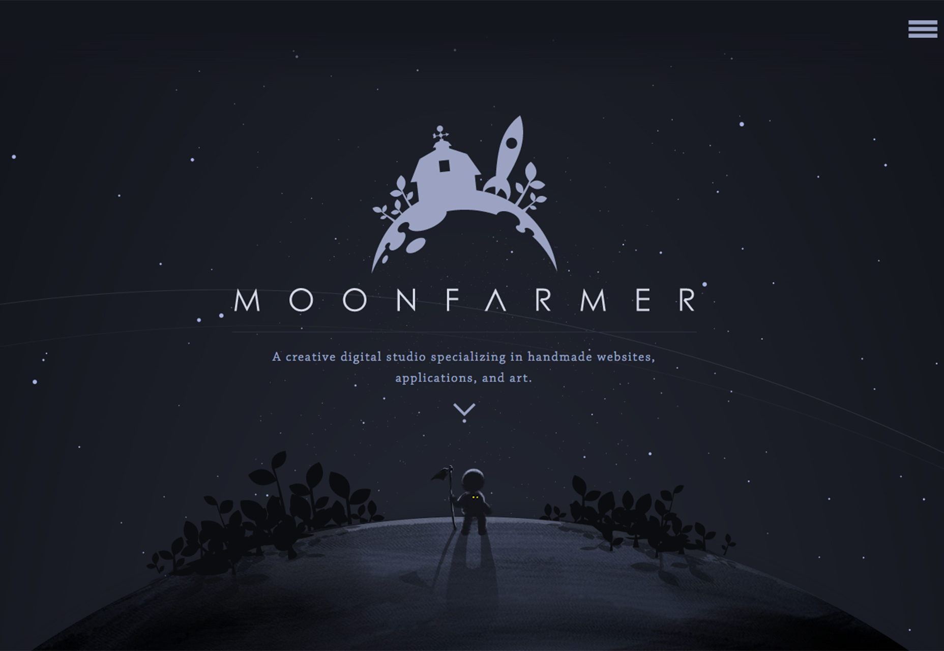
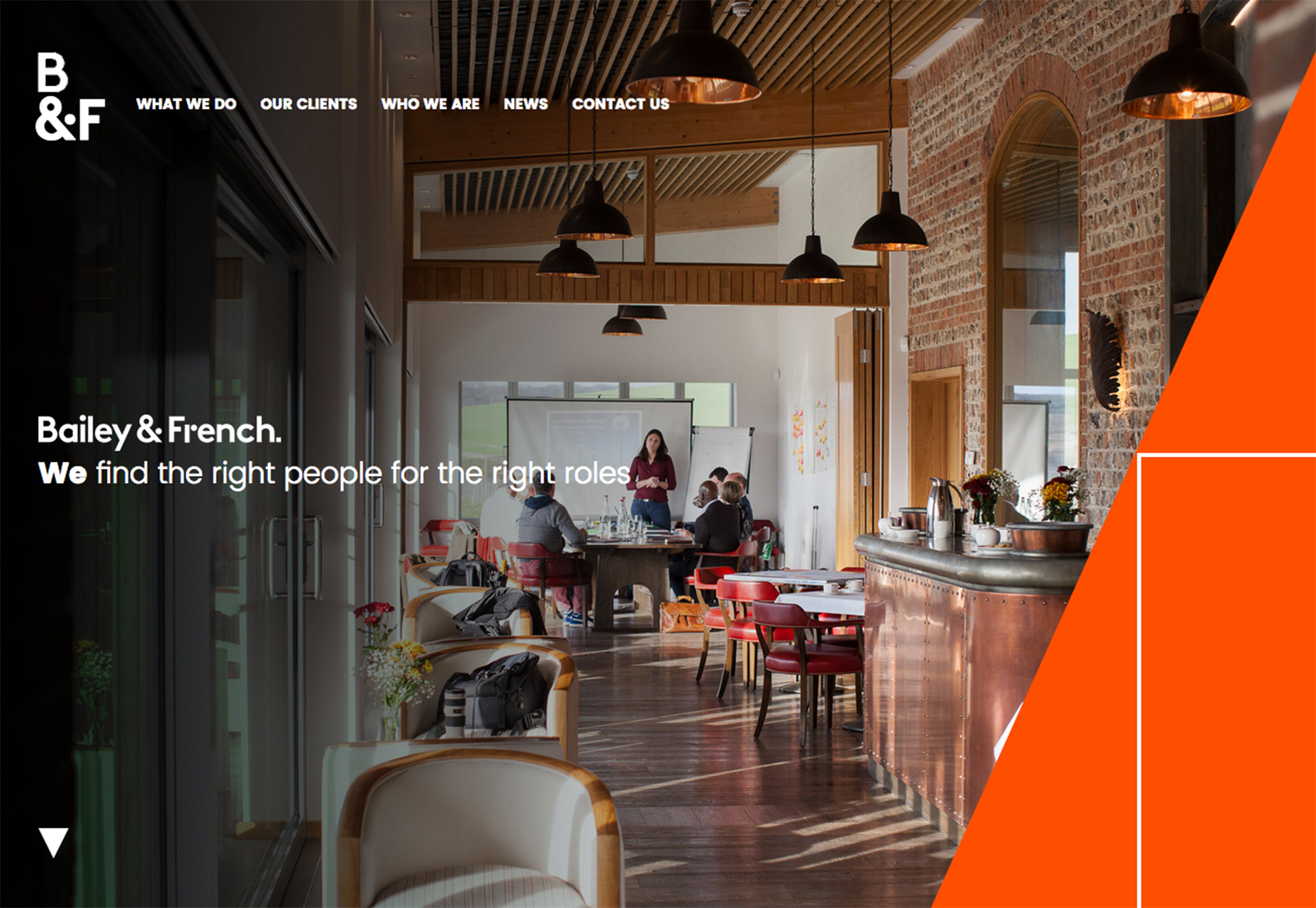
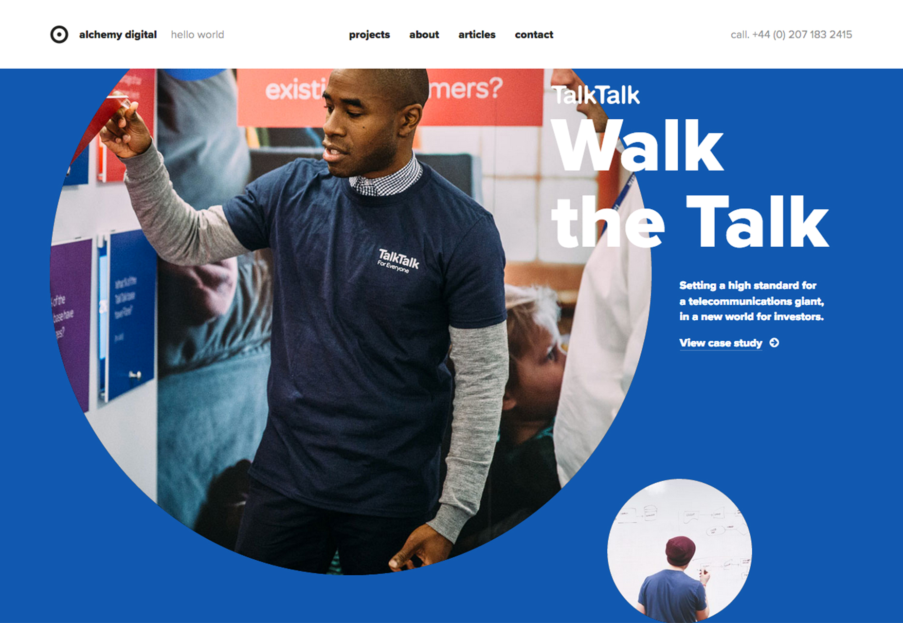
2. Geometric Layering
New ways to layer elements has been steadily growing in popularity. First brought back as a mainstream and modern design technique by Google’s Material Design idea, geometric layering is a different way to add visual interest to visuals that might leave something to be desired. Each of the examples below uses a framework with bold shapes to bring new life to images that are somewhat plain – buildings, a meeting photo, images of people working. The addition of fun shapes, cut outs and color give the user a starting point to get into the design. Note how each of the designs uses geometric to effectively move the user from a shape to the most relevant content, such as a headline or branding. Geometry can be used in a number of ways that integrates with the rest of the design:- cut into images to bring focus to important test elements like Salt Projects;
- use an unexpected bright border element to create an off-balance focal point that leads users across the screen such as Bailey and French;
- put photos in unusual shapes to add new focus on the images, like Alchemy Digital.
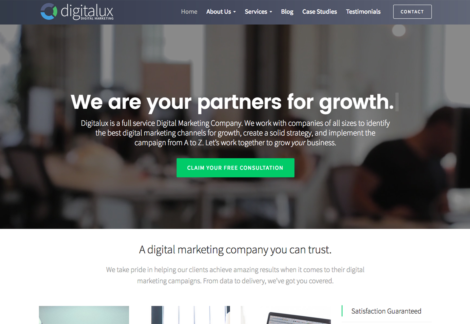
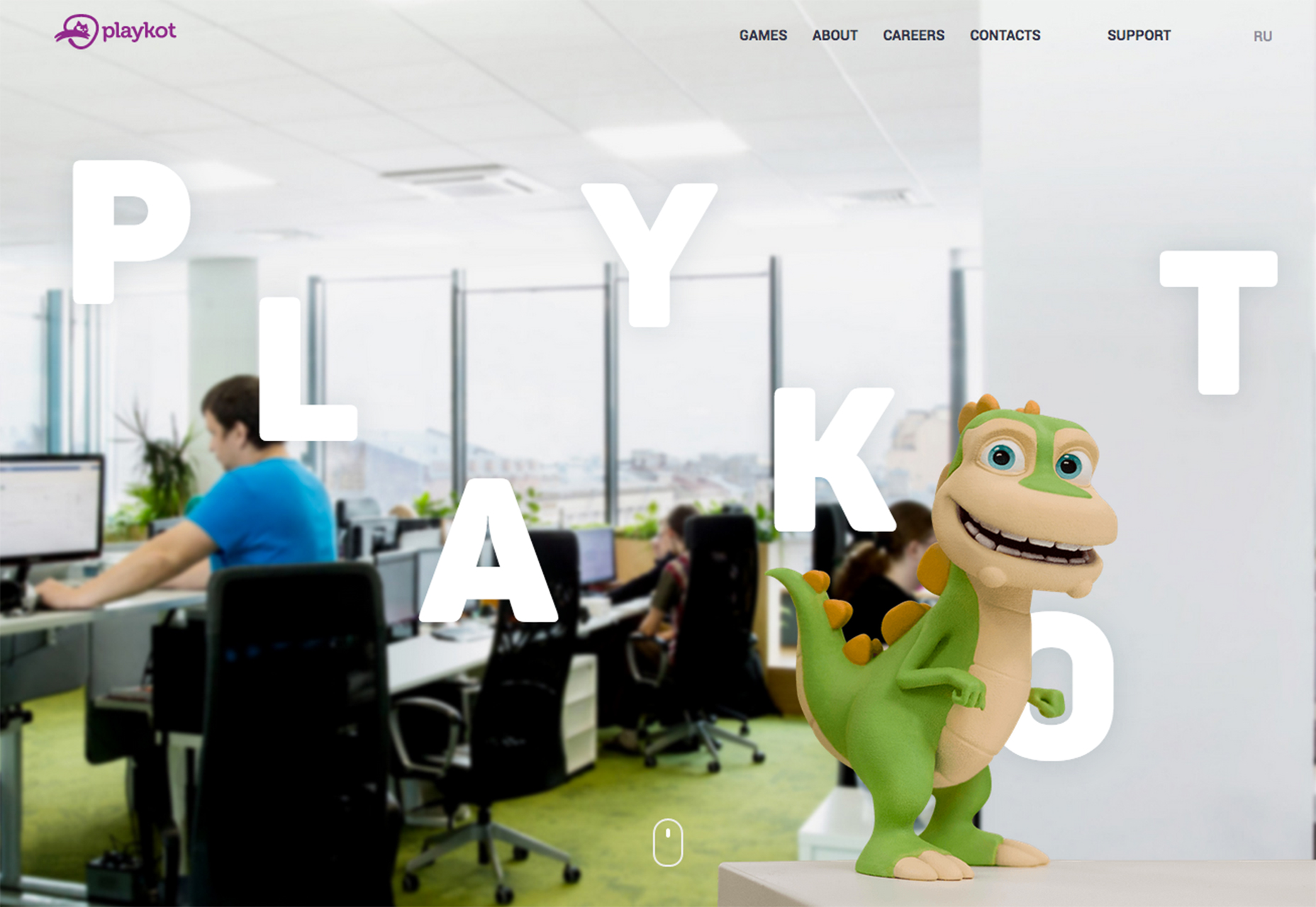
3. Blurred Imagery
Blurred imagery is a technique that’s not new. But it seems to be getting new life with more designs featuring fully, or partially, blurred images or video. Blurred imagery can create a distinct feel for a website with an element of mystery or help push the emphasis away from the image to other part of the design. Each of the examples below uses blur for different reasons:- Digitalux takes what would be a boring bit of video—people working in an office—and uses blue to add a bit of movement behind the main message and call to action;
- Playkot uses a blurred background to add emphasis to the fun character and interesting typography treatment in the foreground, adding an element of reality to this virtual city-style gaming adventure;
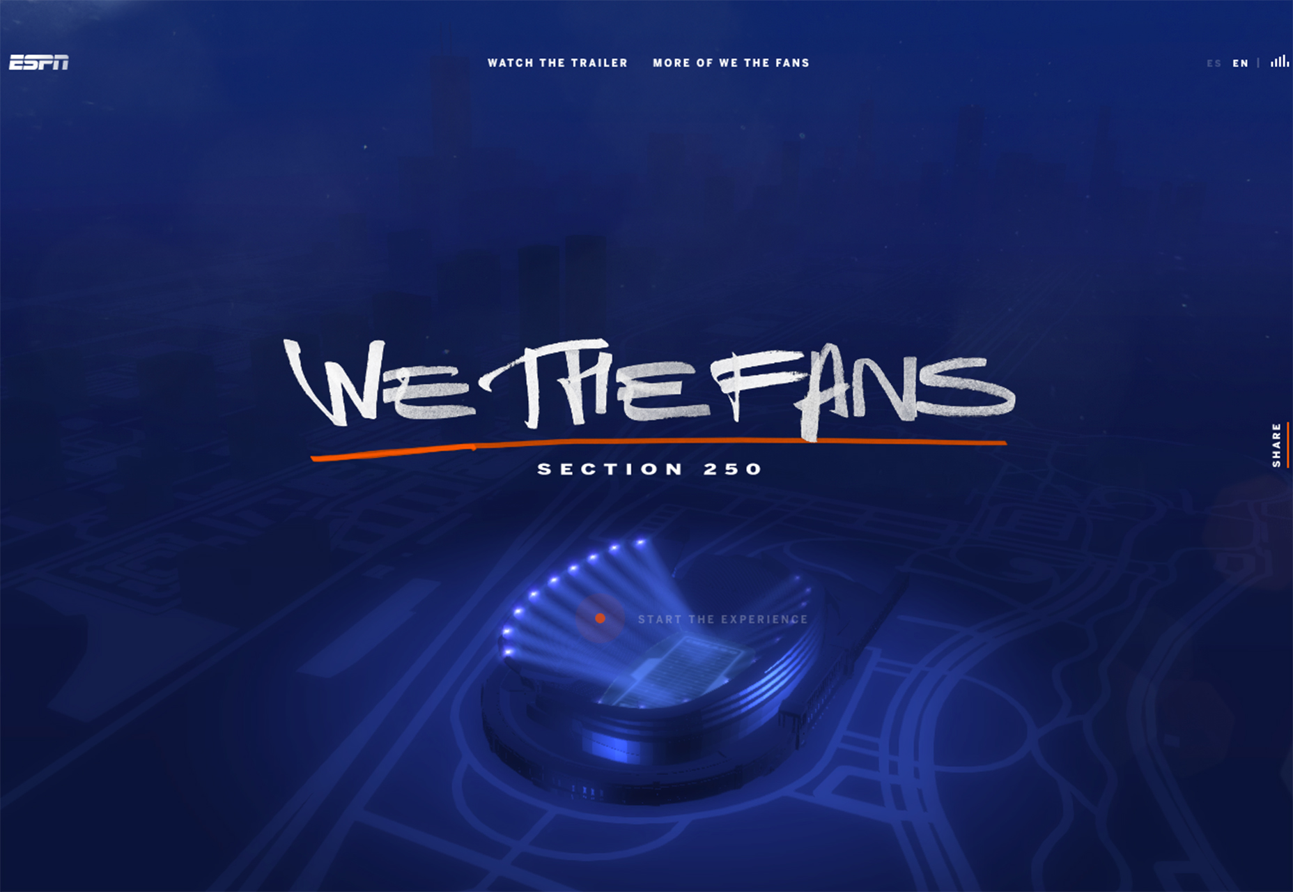
- ESPN’s “We the Fans” features a blurred stadium style backdrop that would almost be a football arena anywhere to showcase the preview for a television documentary; the blurred backdrop helps put more focus on the fun type treatment that’s the main branding for the series.
Conclusion
Sometimes the biggest trends are stepping stones in the evolutions of other trends. It can be interesting to see the small-step progress almost as it happens. That’s what you tend to get when looking at trending elements that can be applied to almost any project, such as the three trends showcased here. The nice thing about these ideas is that they are applicable on almost any scale. You can add tiny text to just your homepage, for example, and see how the change impacts users before rolling it out on a wider scale. Trial and testing on this level will help predict whether a trend like this will have staying power or will fade quickly. What trends are you loving (or hating) right now? I’d love to see some of the websites that you are fascinated with. Drop me a link on Twitter; I’d love to hear from you.Carrie Cousins
Carrie Cousins is a freelance writer with more than 10 years of experience in the communications industry, including writing for print and online publications, and design and editing. You can connect with Carrie on Twitter @carriecousins.


Read Next

15 Best New Fonts, July 2024
Welcome to our monthly roundup of the best fonts we’ve found online in the last four weeks. This month, there are fewer…
By Ben Moss

20 Best New Websites, July 2024
Welcome to July’s round up of websites to inspire you. This month’s collection ranges from the most stripped-back…

Top 7 WordPress Plugins for 2024: Enhance Your Site's Performance
WordPress is a hands-down favorite of website designers and developers. Renowned for its flexibility and ease of use,…
By WDD Staff

Exciting New Tools for Designers, July 2024
Welcome to this July’s collection of tools, gathered from around the web over the past month. We hope you’ll find…

3 Essential Design Trends, July 2024
Add some summer sizzle to your design projects with trendy website elements. Learn what's trending and how to use these…

15 Best New Fonts, June 2024
Welcome to our roundup of the best new fonts we’ve found online in the last month. This month, there are notably fewer…
By Ben Moss

20 Best New Websites, June 2024
Arranging content in an easily accessible way is the backbone of any user-friendly website. A good website will present…

Exciting New Tools for Designers, June 2024
In this month’s roundup of the best tools for web designers and developers, we’ll explore a range of new and noteworthy…

3 Essential Design Trends, June 2024
Summer is off to a fun start with some highly dramatic website design trends showing up in projects. Let's dive in!

15 Best New Fonts, May 2024
In this month’s edition, there are lots of historically-inspired typefaces, more of the growing trend for French…
By Ben Moss

How to Reduce The Carbon Footprint of Your Website
On average, a web page produces 4.61 grams of CO2 for every page view; for whole sites, that amounts to hundreds of KG…
By Simon Sterne

20 Best New Websites, May 2024
Welcome to May’s compilation of the best sites on the web. This month we’re focused on color for younger humans,…