

The Essence of Digital Illustration
Historically, the verb “illustrate” used to mean “to clarify.” In modern graphic design, illustration becomes a working functional element. Illustrations became a tool for communication. The aim of illustration is to enlighten, to clarify, to deliver the message by means of visual elements. Where words can tell you something; illustration can show you something. To make the illustration functional, the image should be easily recognizable and the information it transfers should be decoded similarly by different viewers. Here are some instances where illustrations are able to bring value to design and users…1. Homepage Illustrations
Good web design has a significant impact on potential customers. People judge a company based on the quality of a website, whether that’s fair or not. User perception is what really matters. As a result designers constantly try to find new ways how we can improve the experience for visitors. And just like in the real world, first impressions rely heavily on visuals. This is where illustrations enter the scene. Homepage illustrations are able to create more artistic feel to the whole website. They appeal to users’ imagination to establish a stronger personal connection with the user. Using unique custom-made illustrations can distinguish you from the crowd and create a better brand recall.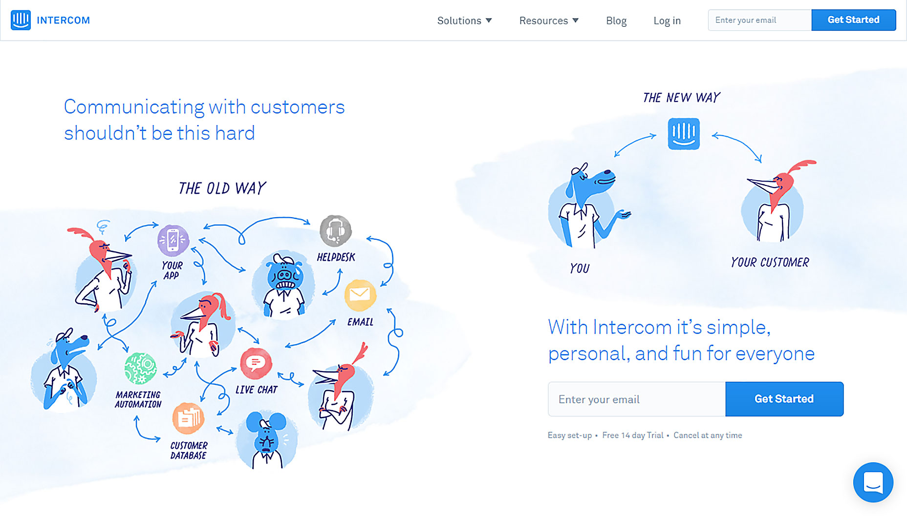 Illustrations help Intercom create a very personal connect with users.
2. Mascots
Mascots are those little characters that are able to make your product more authentic, trustworthy and engaging. Mascots create a connection between the user and the app/website: they bring life to the interaction process, keep users’ attention and become the memorable element of user experience. This is a great way to get people engaged. Probably the most popular example of how a mascot can help to improve the user experience is the email newsletter service Mailchimp. Freddie, the friendly chimp of Mailchimp, appears on every page, taking in a different role, to either draw attention to a certain element or to crack a joke in order to make the user feel better.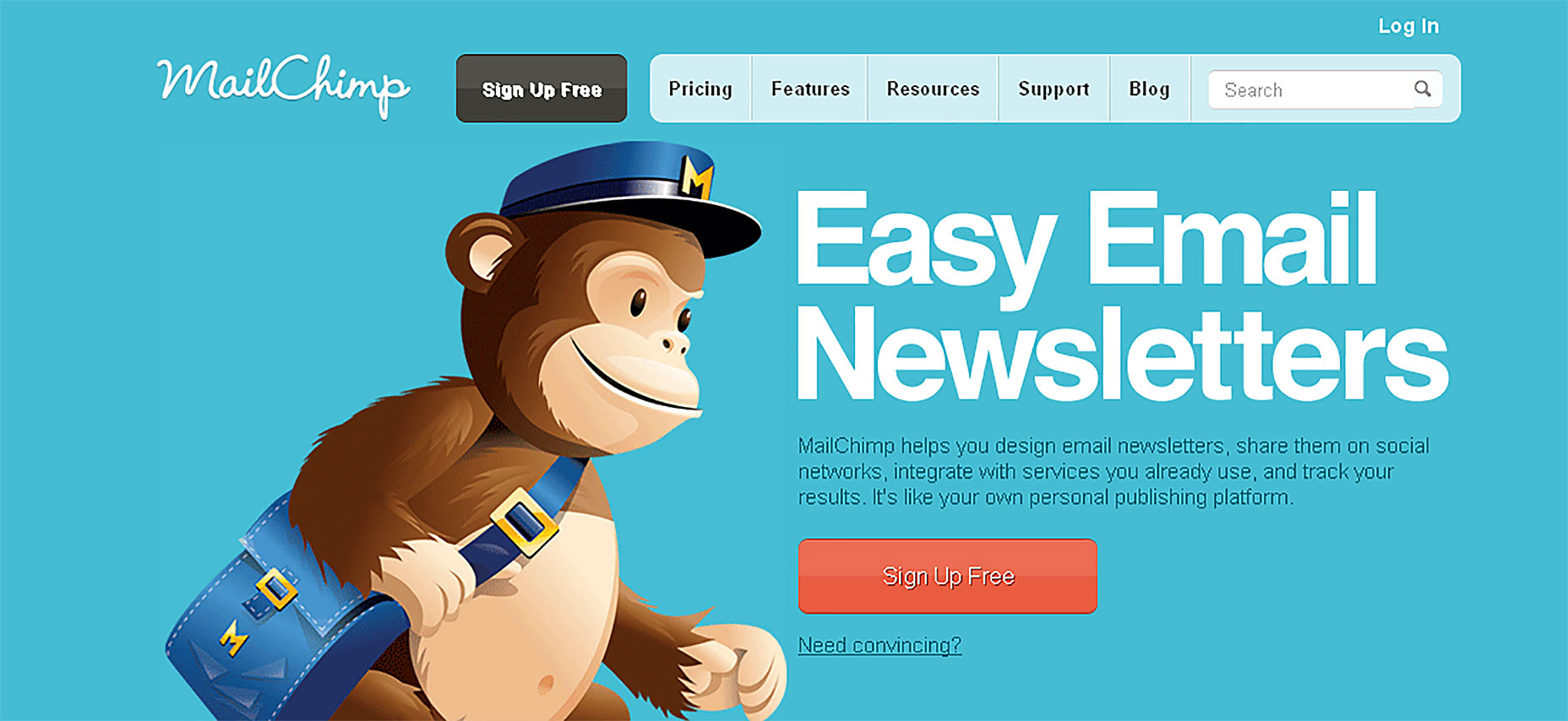 Good mascots provide the solid basis for positive user experience.
3. Illustrations for Onboarding and Tutorials
Illustrations provide visual aid. They are able to clarify messaging by boiling down concepts into easily-understood visuals. Pictures speak louder than words—and make the experience go faster. That’s why illustrations are so popular for onboarding and tutorials. Onboarding screens introduce the key features or benefits of app to the user. Illustration used during onboarding provides context, adds clarity, or leads the user to their next step. When combined with a minimal interface, illustrations can really help deliver the key message without too much copy.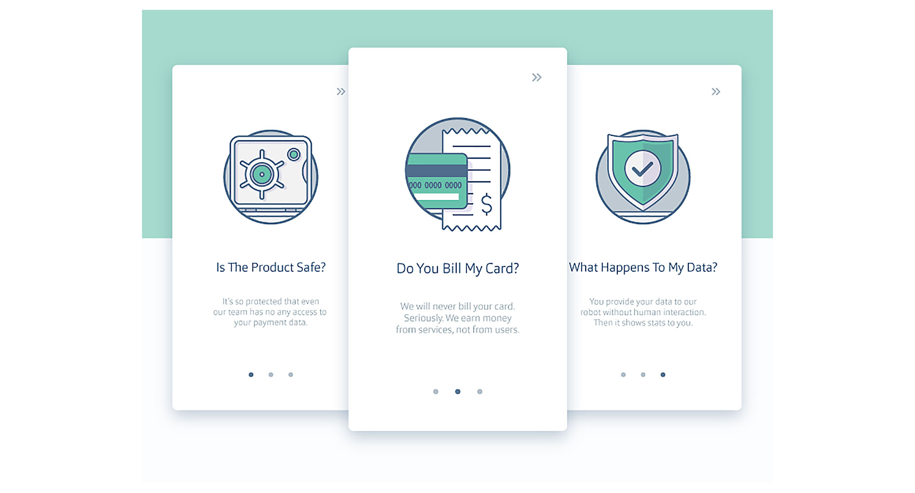 Image credit: Ramotion
An engaging and interactive onboarding automatically invokes the users interest in the app at the initial step. It makes the user happy and feel eager to start using the app. Animations and illustrations have always gone hand-and-hand.
Using illustrations you can transform a long and boring tutorial into an interesting and joyful experience. An instruction manual with images is easier and faster to understand than a lengthy explanation. Even apps/sites that don’t incorporate the drawn style throughout still can use cartoons for instructions and tutorials.
Image credit: Ramotion
An engaging and interactive onboarding automatically invokes the users interest in the app at the initial step. It makes the user happy and feel eager to start using the app. Animations and illustrations have always gone hand-and-hand.
Using illustrations you can transform a long and boring tutorial into an interesting and joyful experience. An instruction manual with images is easier and faster to understand than a lengthy explanation. Even apps/sites that don’t incorporate the drawn style throughout still can use cartoons for instructions and tutorials.
4. Illustrations for Reward Screens
We all familiar with rewarding experience from video games: almost every video-game has a set of achievements or trophies that are gained by completing a set of criteria. The phrase “Achievement Unlocked” has almost become synonymous with progression or successful completion. But why is rewarding so valuable for us? The answer is simple: it makes the interface experience feel like there’s a human on the other end, not a computer. Rewarding is a truly emotional interaction: positive emotional stimulus builds a sense of engagement with the user. People forgive the app’s shortcomings when you reward them with positive emotion.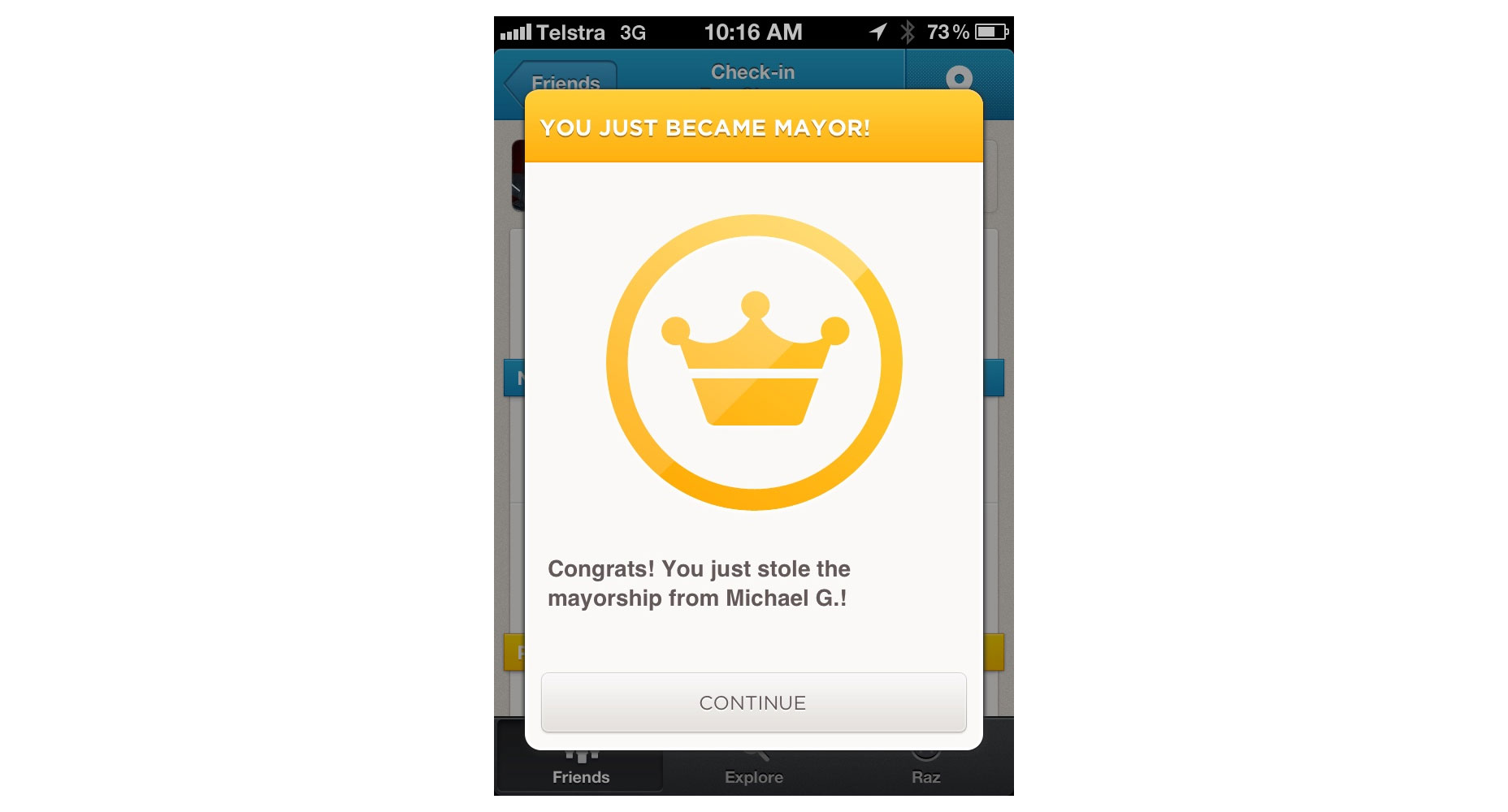 A Mayor's badge on Foursquare. This type of Illustrations creates delight and a joyful experience.
Success state is a great place to show that you care about your users. Reward the user with an animation when they accomplish personal goals. For example, when a user reaches inbox zero, create deeper engagement with app features using animation.
A Mayor's badge on Foursquare. This type of Illustrations creates delight and a joyful experience.
Success state is a great place to show that you care about your users. Reward the user with an animation when they accomplish personal goals. For example, when a user reaches inbox zero, create deeper engagement with app features using animation.
Conclusion
Illustration is a powerful and important tool for enhancing user experience and making interface both attractive and efficient. While there’s no hard or fast rule on using illustration in your design, it’s important to keep in mind one thing: keep illustrations useful. Ultimately, any illustration should provide a deeper understanding of your product or brand.Nick Babich
Fireart Studio is a design studio passionate about creating beautiful design for startups & leading brands. We pay special attention to nuances all the time to create professional while cool products that will not only meet all expectations, but exceed them.


Read Next

15 Best New Fonts, July 2024
Welcome to our monthly roundup of the best fonts we’ve found online in the last four weeks. This month, there are fewer…
By Ben Moss

20 Best New Websites, July 2024
Welcome to July’s round up of websites to inspire you. This month’s collection ranges from the most stripped-back…

Top 7 WordPress Plugins for 2024: Enhance Your Site's Performance
WordPress is a hands-down favorite of website designers and developers. Renowned for its flexibility and ease of use,…
By WDD Staff

Exciting New Tools for Designers, July 2024
Welcome to this July’s collection of tools, gathered from around the web over the past month. We hope you’ll find…

3 Essential Design Trends, July 2024
Add some summer sizzle to your design projects with trendy website elements. Learn what's trending and how to use these…

15 Best New Fonts, June 2024
Welcome to our roundup of the best new fonts we’ve found online in the last month. This month, there are notably fewer…
By Ben Moss

20 Best New Websites, June 2024
Arranging content in an easily accessible way is the backbone of any user-friendly website. A good website will present…

Exciting New Tools for Designers, June 2024
In this month’s roundup of the best tools for web designers and developers, we’ll explore a range of new and noteworthy…

3 Essential Design Trends, June 2024
Summer is off to a fun start with some highly dramatic website design trends showing up in projects. Let's dive in!

15 Best New Fonts, May 2024
In this month’s edition, there are lots of historically-inspired typefaces, more of the growing trend for French…
By Ben Moss

How to Reduce The Carbon Footprint of Your Website
On average, a web page produces 4.61 grams of CO2 for every page view; for whole sites, that amounts to hundreds of KG…
By Simon Sterne

20 Best New Websites, May 2024
Welcome to May’s compilation of the best sites on the web. This month we’re focused on color for younger humans,…