

1. Monotone
One of the most popular ways to use vibrant colors in your design is a technique called monotone. Monotone palettes include a single color with a mixture of shades and tints. Monotone is fairly easy to create: Think about the color that best works with your message and consider the amount of variance you want between tones.Improve Readability
Monotone helps establish a solid foundation for foreground content, taking care of readability. Paired with dramatic typography, monotone color schemes are able to create truly memorable experience.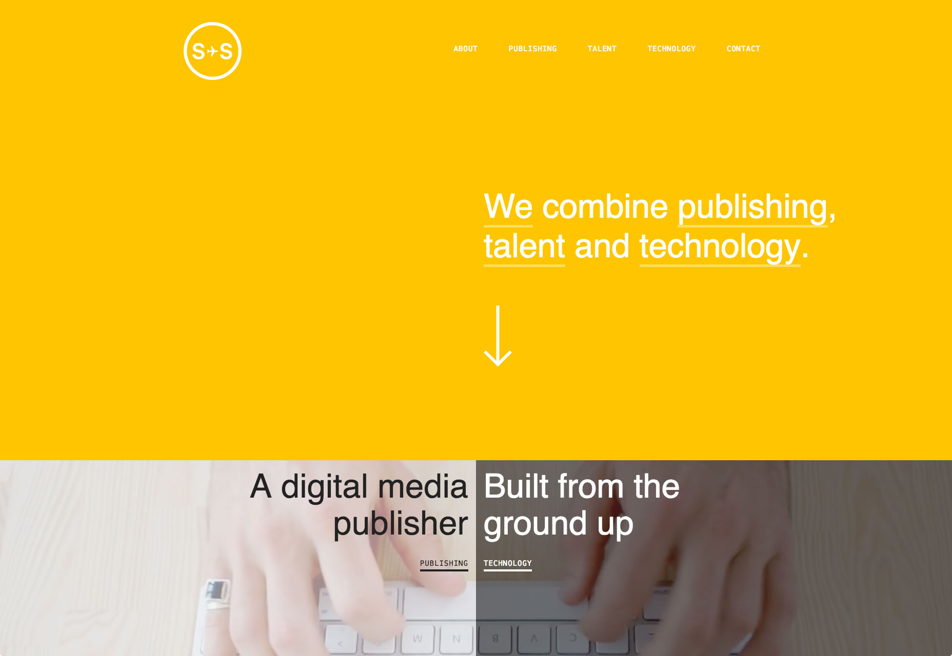 Sydneystockhom uses bold color to create a memorable look in a very simple way
2. Duotone
As the name suggests, duotone is an image made up of two colors. This can be two shades of the same color, or two contrasting colors. The technique that was once a print staple has found new life online. Thanks to Spotify, duotone is growing in popularity almost every day.Create an Atmosphere
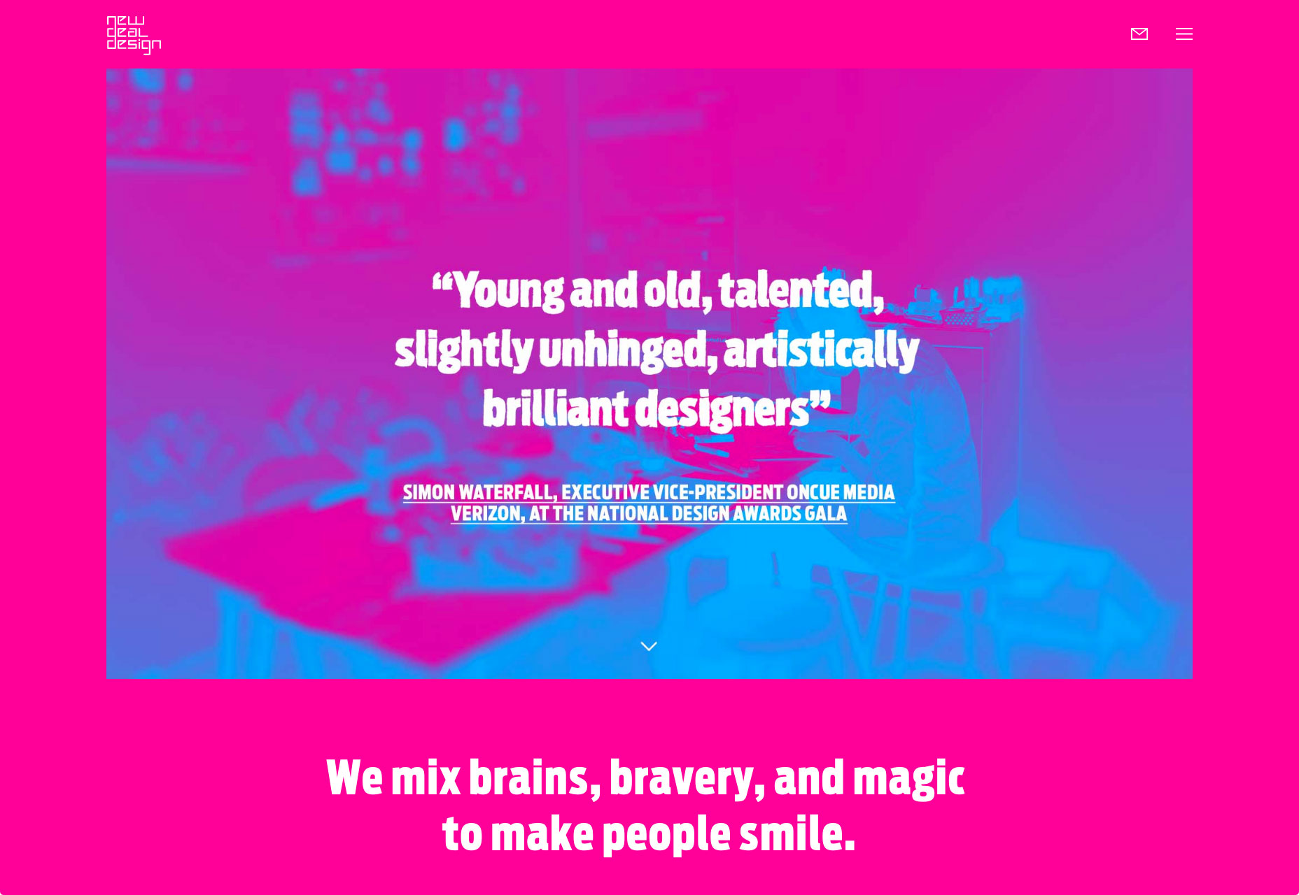
Duotones allows you to inject any image with the emotional attributes of any color. Remember, that different colors evoke different emotions. Soft and modest combination of colors is able to create a serious atmosphere. For example, in Holm Marcher & Co example every detail tries to contribute to the businesslike atmosphere, and background images are no exception.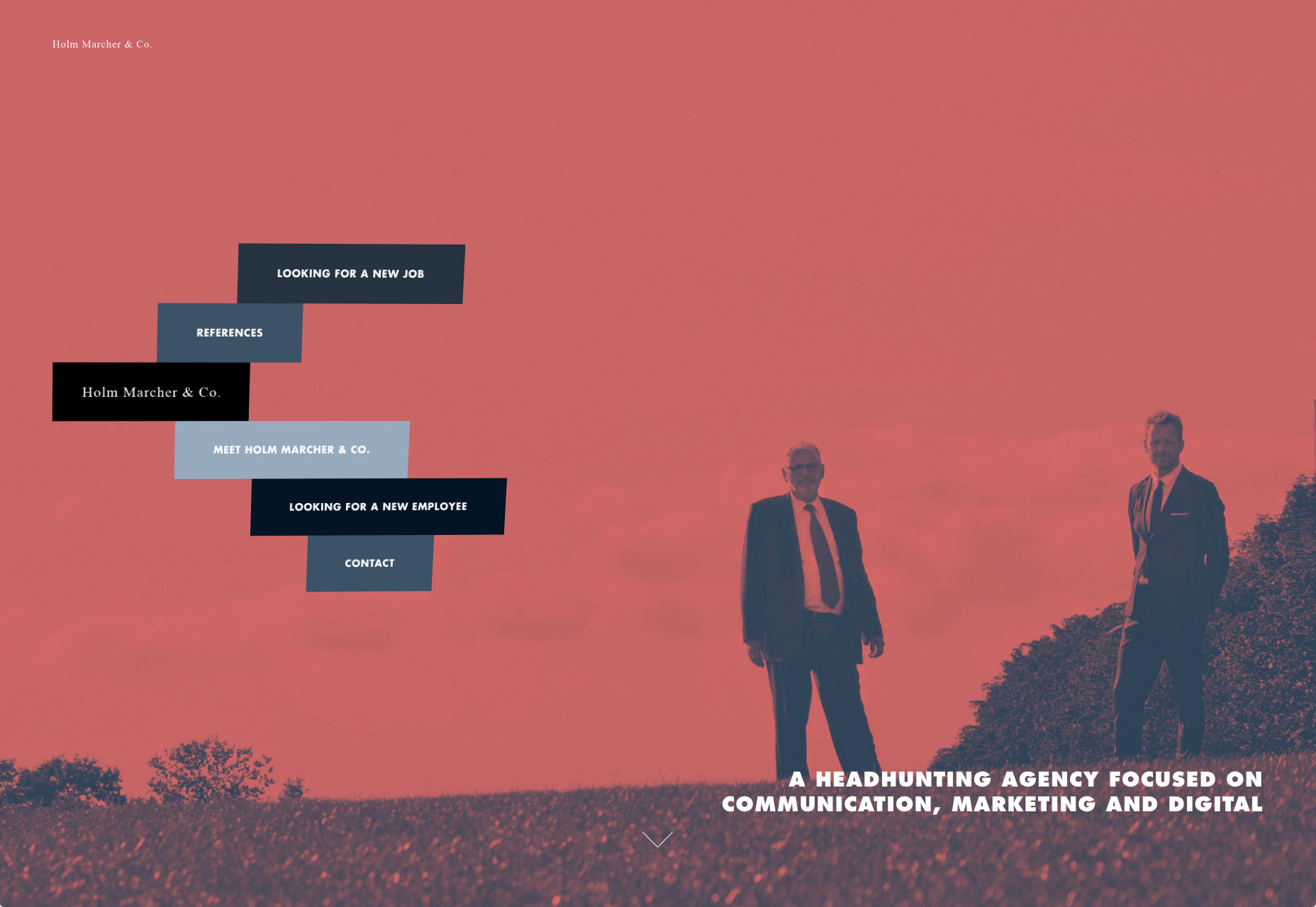 While a combination of bright colors is able to create a sense of happiness.The main visual for New Deal Design is striking thanks to a bold color choice. They create friendly atmosphere and set a positive mood.
Increase Readability
Duotone is able to give the text plenty of contrast. It adjusts color variations in an image so that text can be placed using a single color almost anywhere on the image.
3. Gradients
Gradients have made their way back into GUIs, this time using high-contrast complementary colors. Modern gradients might include multiple colors, radiate from the center, come from a corner or fall horizontally.Create a Modern Look
Gradients made a comeback and breathe new life into the bright color trend. Paired with flat color palette they can evoke feelings of modernism. With only one color, Zample uses a gradient effect on its background without falling into dull tones.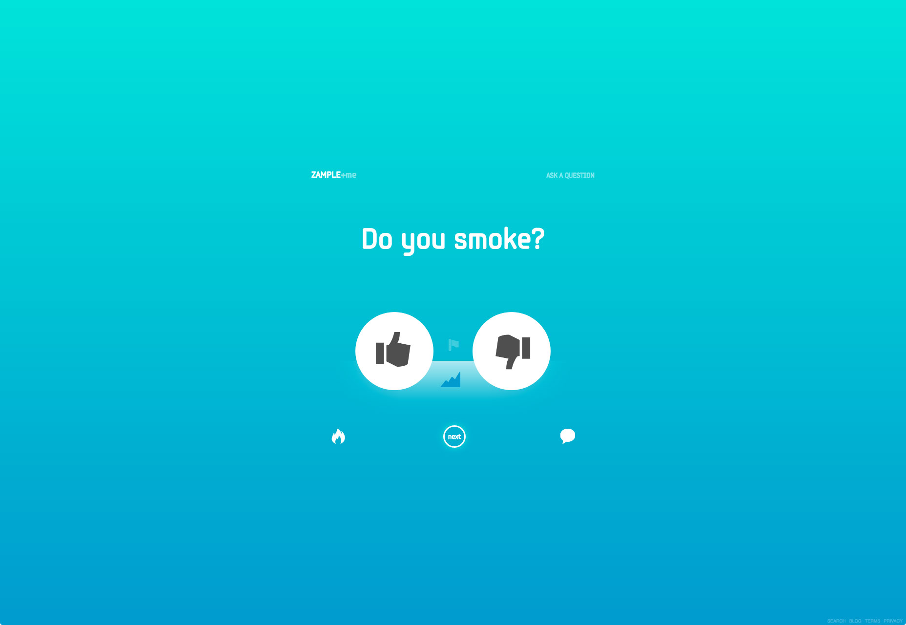 By using one of the bright, saturated colors associated with Material Design, you can evoke feelings of modernism.
Make Layout Easy on the Eyes
Gradients can improve visual communication. The transition from orange to pink in Symodd’s example below gives depth and contrast to the interface, and creates some eye-catching visual effects. The shift from light to dark follows natural human eye scanning patterns that move from the top left of the page to the bottom right.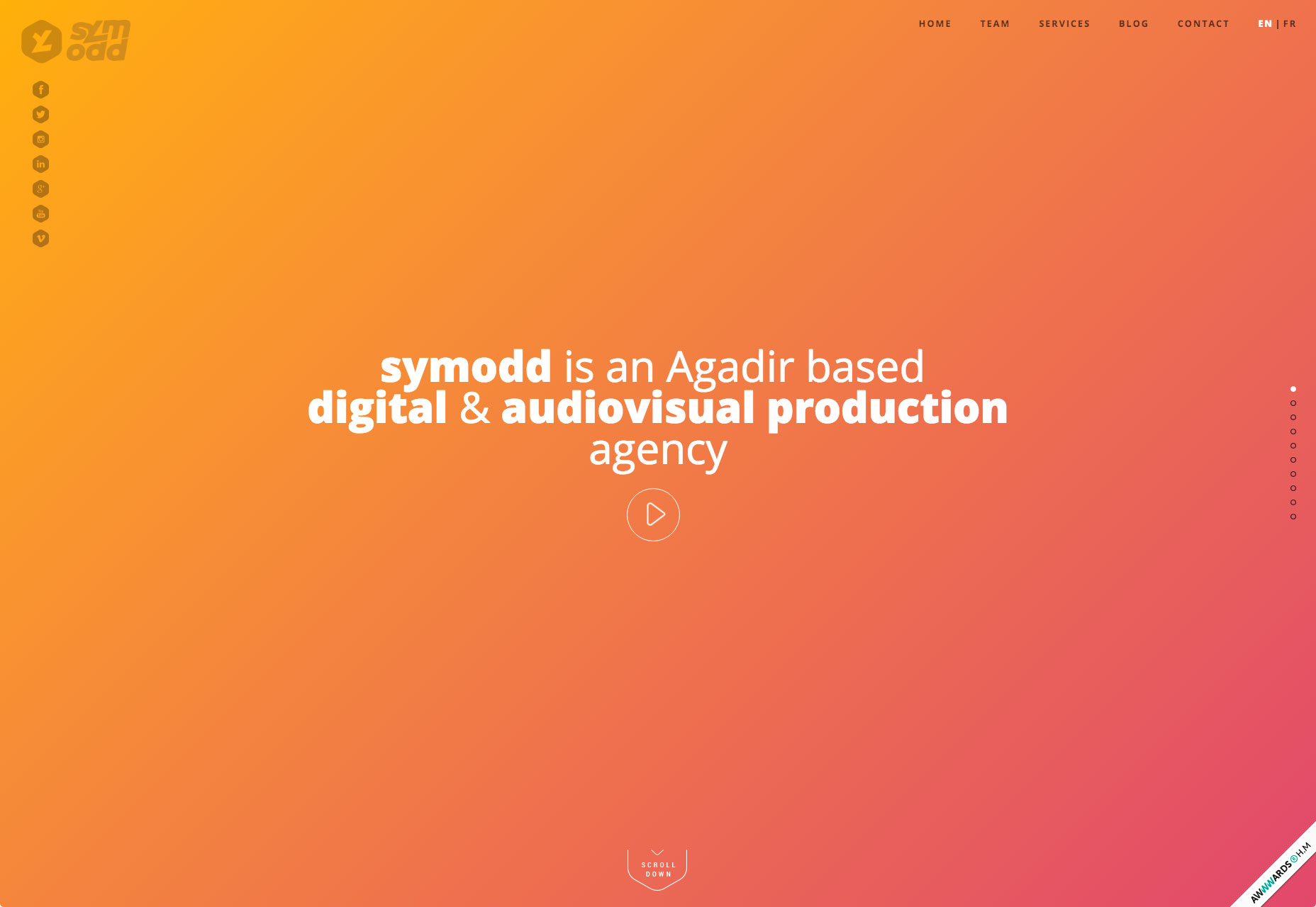 Symodd’s homepage features a full gradient background from orange to pink. It’s a subtle gradient as the two hues aren’t too different from each other making this easy on the eyes.
Use it as an Accent
While gradient is often used as backgrounds for pages, they can work in smaller places as well. Consider using gradients as an accent in the navigation, for secondary images or for specific types of content. What’s nice about smaller areas of gradient is that you have more freedom to play with this technique. And when used in smaller spaces, it can be visually interesting to play with multiple color pairs, just like Bloomberg did in example below.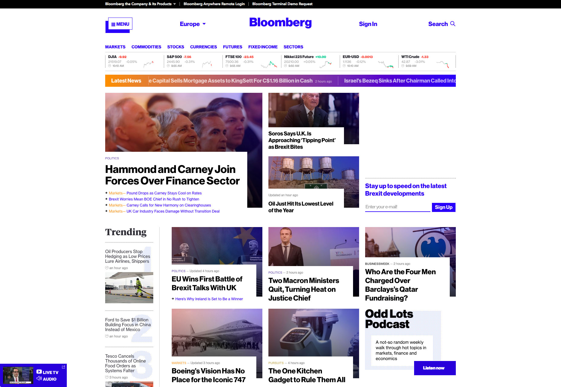 Bloomberg uses gradient for the ticker Latest News.
4. Overlays
Overlaying is filtering an image through a colored “lens”. Images with color overlays have been a popular design choice for a long time because it’s fairly easy to create this effect: you simply cover an image or video with a semi-transparent colored box.Focus User Attention
Overlaying effects can help focus users on certain design elements. However, when using a single color as an overlay, think about the degree of saturation and transparency of the color. Heavy color combinations (less transparency and more saturation) put more focus on the color itself: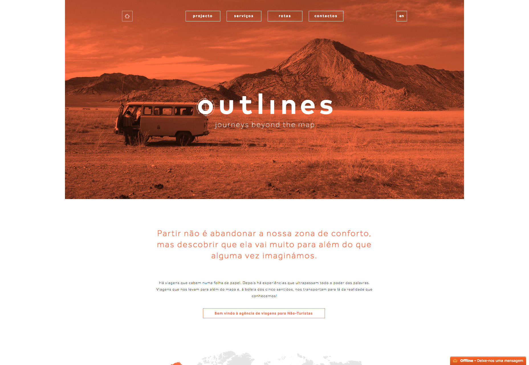 Color overlay used by Outlines puts more focus on the image
Conclusion
It’s hard to find a design technique that’s more fun to play with than color. Color effects can be dramatic, impressive and even serene. Don’t be afraid to go outside your comfort zone when it comes to working with colors. Whether you are a fan of bright, bold hues or prefer a more minimalist black and white, the one thing you need to remember: there are no wrong colors, what matters most is how you use them.Nick Babich
Fireart Studio is a design studio passionate about creating beautiful design for startups & leading brands. We pay special attention to nuances all the time to create professional while cool products that will not only meet all expectations, but exceed them.


Read Next

15 Best New Fonts, July 2024
Welcome to our monthly roundup of the best fonts we’ve found online in the last four weeks. This month, there are fewer…
By Ben Moss

20 Best New Websites, July 2024
Welcome to July’s round up of websites to inspire you. This month’s collection ranges from the most stripped-back…

Top 7 WordPress Plugins for 2024: Enhance Your Site's Performance
WordPress is a hands-down favorite of website designers and developers. Renowned for its flexibility and ease of use,…
By WDD Staff

Exciting New Tools for Designers, July 2024
Welcome to this July’s collection of tools, gathered from around the web over the past month. We hope you’ll find…

3 Essential Design Trends, July 2024
Add some summer sizzle to your design projects with trendy website elements. Learn what's trending and how to use these…

15 Best New Fonts, June 2024
Welcome to our roundup of the best new fonts we’ve found online in the last month. This month, there are notably fewer…
By Ben Moss

20 Best New Websites, June 2024
Arranging content in an easily accessible way is the backbone of any user-friendly website. A good website will present…

Exciting New Tools for Designers, June 2024
In this month’s roundup of the best tools for web designers and developers, we’ll explore a range of new and noteworthy…

3 Essential Design Trends, June 2024
Summer is off to a fun start with some highly dramatic website design trends showing up in projects. Let's dive in!

15 Best New Fonts, May 2024
In this month’s edition, there are lots of historically-inspired typefaces, more of the growing trend for French…
By Ben Moss

How to Reduce The Carbon Footprint of Your Website
On average, a web page produces 4.61 grams of CO2 for every page view; for whole sites, that amounts to hundreds of KG…
By Simon Sterne

20 Best New Websites, May 2024
Welcome to May’s compilation of the best sites on the web. This month we’re focused on color for younger humans,…