

See the Pen Final (title). Customized 100% stacked bar chart by Ruslan (@ruslankorsar) on CodePen.
Today there are many JavaScript charting libraries; some of them are absolutely free such as D3 and Google Charts while others require payments for commercial use. In my opinion, the most comprehensive and robust of them are amCharts, AnyChart, and Highcharts. For this tutorial, I’ve decided to use AnyChart. However, the process is very similar for every library, especially if you are making something simple. AnyChart has extensive documentation and API reference as well as a great variety of supported chart types and demos on the code playground, so it is a good choice for beginners. For your convenience, all the examples pictured in the tutorial are available in this collection on CodePen and can be explored right there or exported to ZIPs with CSS/HTML/JavaScript demo files.JS Charting in 3 Easy Steps
The process of making a basic JavaScript graph for your website or app consists of the following three steps:- Prepare your data;
- Connect the library;
- Write a simple code.
1. Preparing Data
Just as a great ship wants deep waters, a simple graph wants simple data. Of course, if you have large amounts of data or its structure is not obvious, you need to prepare it first. When building the majority of popular chart types we just need X and Y fields. However, bar charts can be even simpler because it often happens that only the Y field is used, and an index, or an item number, is taken as X. That is the case when we use a JavaScript array of data, for example:// 5 data points = 5 categories for a single series var data = [19, 24, 30, 34, 42]; // Y is these values; X is item numbers [0,1,2,3,4,5]If you use JSON/XML to transfer data, then your data could look as follows.
 [{
 'x': 'Product A',
 'value': 19
 },{
 'x': 'Product B',
 'value': 24
 }...]
Generally speaking, there are many ways of working with data, and visualization software developers usually describe all or many of them in docs. With that in mind, I recommend checking the relevant section of your charting library’s documentation.
2. Getting a Charting Library
The library you use is obviously a vital ingredient here. If you are going to use charts locally, it should be reasonable to download the binary package and keep it nearby. However, if you need graphs for a web app or a page on a website, then a CDN may be a better option. It will load the files from the closest server to your client, giving you a faster page load and better performance.<script src="//cdn.anychart.com/js/latest/anychart.min.js" type="text/javascript"></script>
3. Writing a Simple HTML/JavaScript Code
When our data and the library are ready, we can start writing the code to actually draw our chart. a) First, we need to create a chart container on the page. The best way is to use a <div> element and set its ID:<div id="container"></div>b) After that, let’s include our data:
var data = [
 {x: 'DVD player', y: 19},
 {x: 'Home theater system', y: 24},
 {x: 'Karaoke player', y: 30},
 {x: 'Projector', y: 34},
 {x: 'TV receiver', y: 42}
 ];
c) Then, we specify what type of chart we want by calling the relevant constructor function:
var chart = anychart.bar();d) To make things clearer for viewers, I want to give the chart a title:
chart.title('Product Sales');
e) Now, let’s create a series:
 chart.addSeries(data);
 // or we can specify a simple dataset within the method:
 chart.addSeries([19, 24, 30, 34, 42]);
f) Our chart must be put in a container, so we are specifying the one we’ve just created:
chart.container('container');
g) Everything seems fine, so we can draw our chart now:
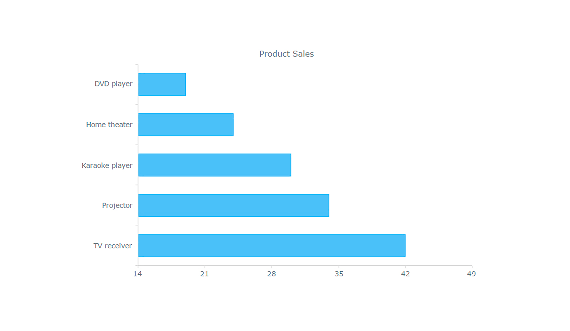
chart.draw();Here’s what the result looks like:
 The following is the whole code for your convenience:
<html>
<head>
 <script src="//cdn.anychart.com/js/latest/anychart.min.js" type="text/javascript"></script>
 <script>
anychart.onDocumentLoad(function() {
 var data = [
 {x: 'DVD player', y: 19},
 {x: 'Home theater system', y: 24},
 {x: 'Karaoke player', y: 30},
 {x: 'Projector', y: 34},
 {x: 'TV receiver', y: 42}
 ];
 var chart = anychart.bar();
 chart.title('Product Sales');
 chart.addSeries(data);
 chart.container('container');
 chart.draw();
});
 </script>
</head>
 <body>
 <div id="container"></div>
 </body>
</html>
Looks pretty straightforward, doesn’t it? And now we can conveniently compare the total sales by category.
Creating Multi-Series and Stacked Bar Charts
Now that we’ve learned the basics of charting with JavaScript, we can proceed to building a slightly more complex graph which displays more information. As I stated earlier, I will show you an easy way to make a multi-series bar chart and then a stacked one. Basically, the procedures are quite similar. As always, it all starts with data.Data From a Table
In the context of the bar chart above, we had one variable (the product sales data series) and several categories (types of product). To additionally display the composition of each value, which is the essence of stacked bar charts, we need more detailed data. For this, we can use data that is already displayed on the page. For example, if you already have an HTML table, you can easily build a graph based on it. If you use AnyChart’s Data Adapter module all you need is to specify that table as the data source. 1) Get the data adapter:<script src="https://cdn.anychart.com/js/latest/data-adapter.min.js"></script>2) Prepare data from the table:
var tableData = anychart.data.parseHtmlTable('#tableWithData');
3) Create a chart and specify the data source:
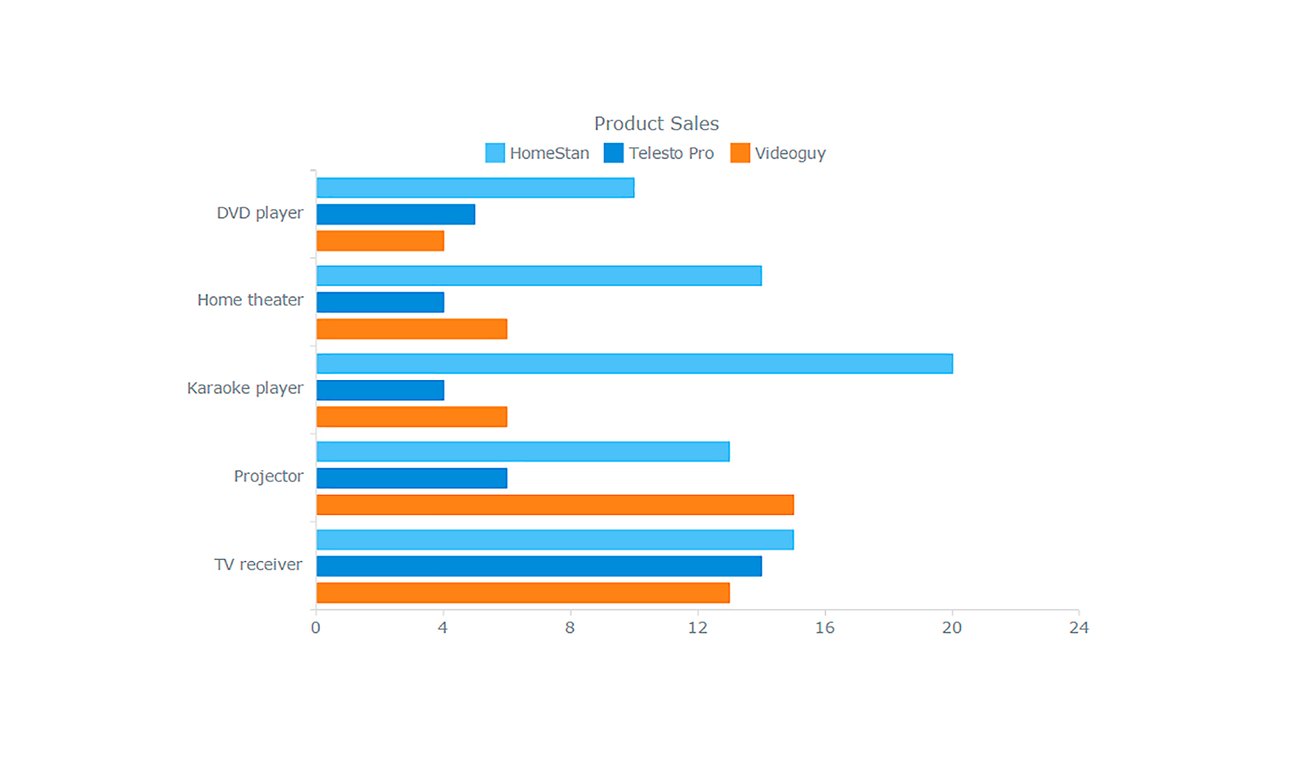
 var chart = anychart.bar();
 chart.data(tableData);
The immediate result is a multi-series bar chart that allows us, for example, to quickly compare each product’s performance within every single category.
Changing the Type of Series
All necessary details, including data, are already specified. Now we can change the series type and get a stacked bar chart out of that conventional multi-series one. It is not difficult at all as you need just one line of code to have the values stacked: chart.yScale().stackMode('values');
Voila!
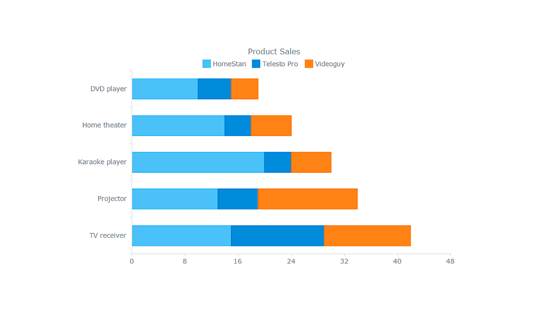 We’ve just created a stacked bar chart on the fly without actually changing the configuration of that multi-series one. As a result, not only are we ready now to compare total sales by category like with the single-series bar chart from the very beginning of the article, but we can also identify which product responsible for making one category total smaller or bigger than others.
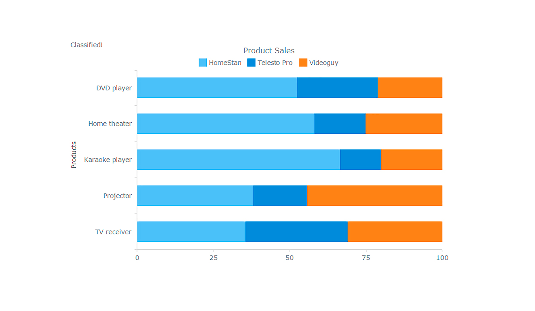
Since we agreed in advance that our final goal is a 100% stacked bar chart, let’s just change the mode to get it:
We’ve just created a stacked bar chart on the fly without actually changing the configuration of that multi-series one. As a result, not only are we ready now to compare total sales by category like with the single-series bar chart from the very beginning of the article, but we can also identify which product responsible for making one category total smaller or bigger than others.
Since we agreed in advance that our final goal is a 100% stacked bar chart, let’s just change the mode to get it:
chart.yScale().stackMode('percent');
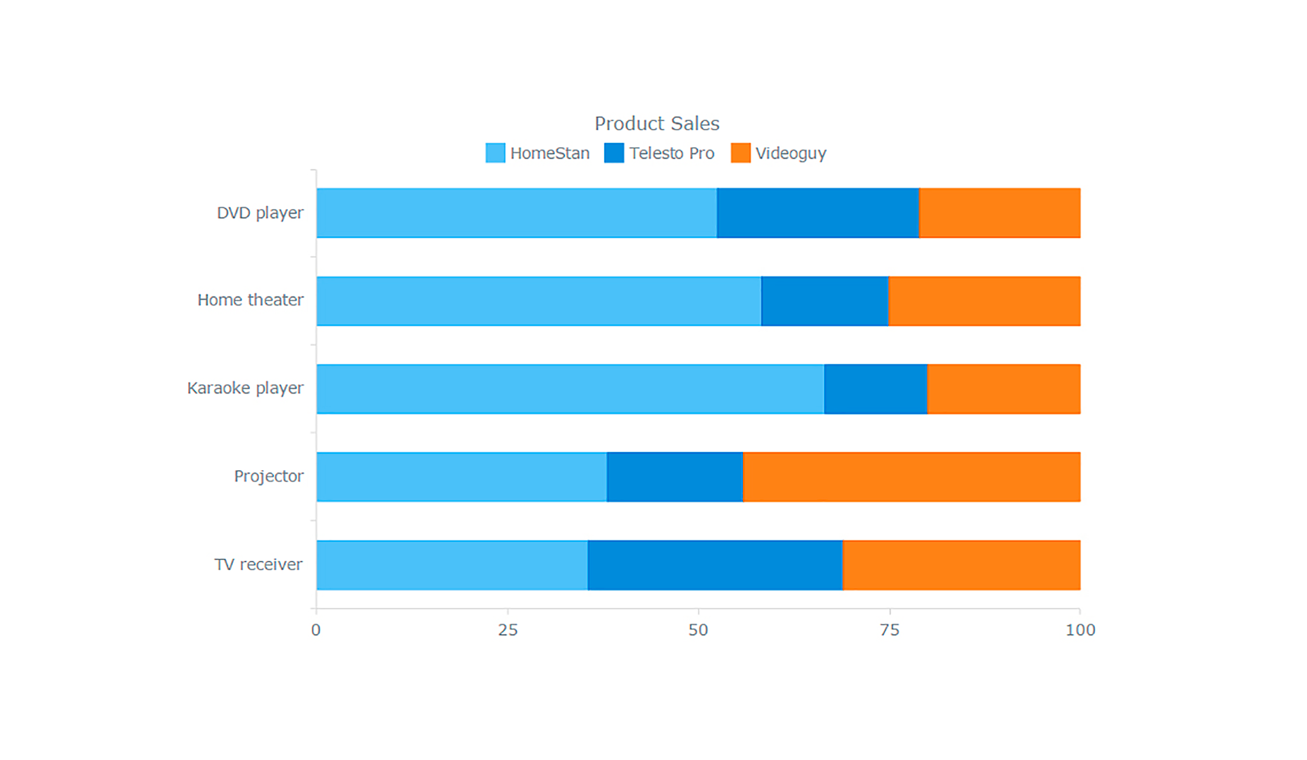 It is a 100% stacked bar chart, which allows you to highlight part-to-whole relationships and assess the contribution of each product to the category total.
Design Customization
Design is very important in data visualization, for attracting attention, enhancing clarity, and maintaining visual integrity within your web project. Helpfully with this charting library, customization is quite simple.Adding Text
For more clarity, you can provide your visualization with additional texts. For example I’ll give the vertical axis a title and add a chart label temporarily: chart.xAxis().title('Products');
chart.label({text: 'Classified!'});
Color Settings
You can add color through a palette (chart.palette()) and change the background settings (chart.background()) among other things. Or you can use a theme:<script src="//cdn.anychart.com/themes/latest/wines.min.js" type="text/javascript"></script>Then we need to specify it in the chart settings:
anychart.theme(anychart.themes.wines);
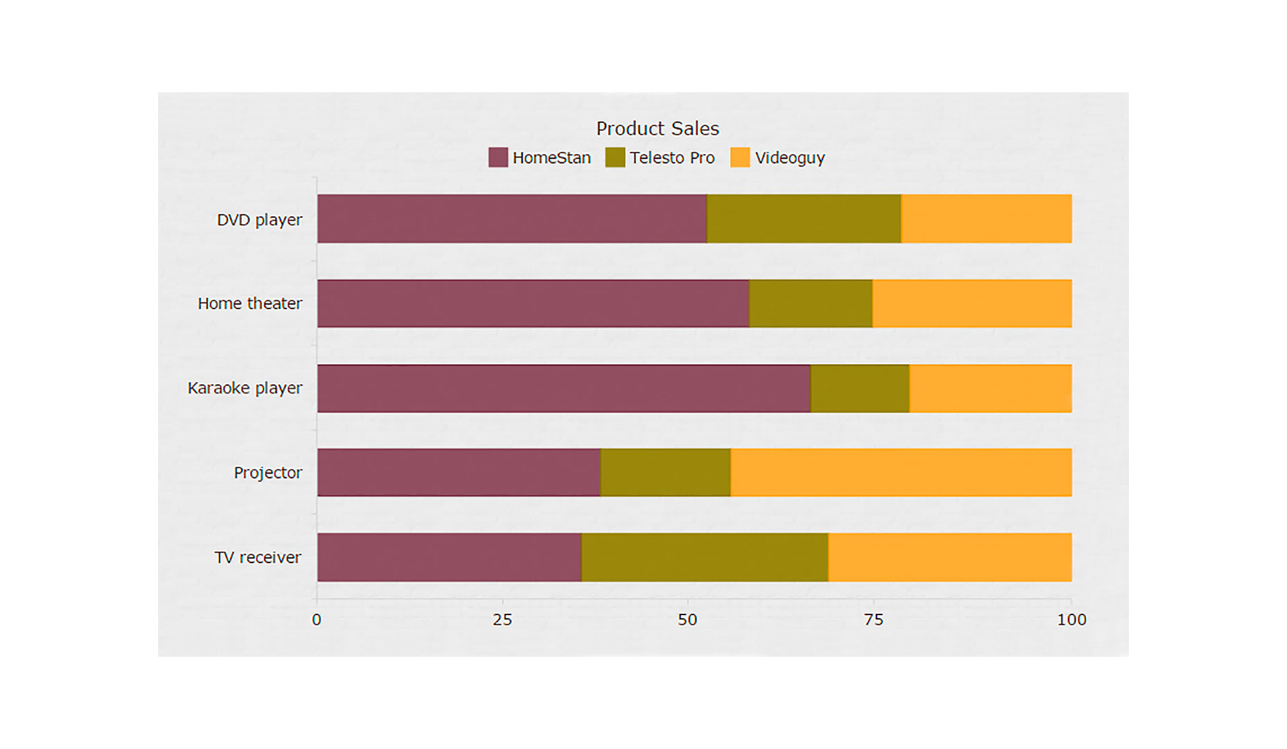
Chart Interactivity
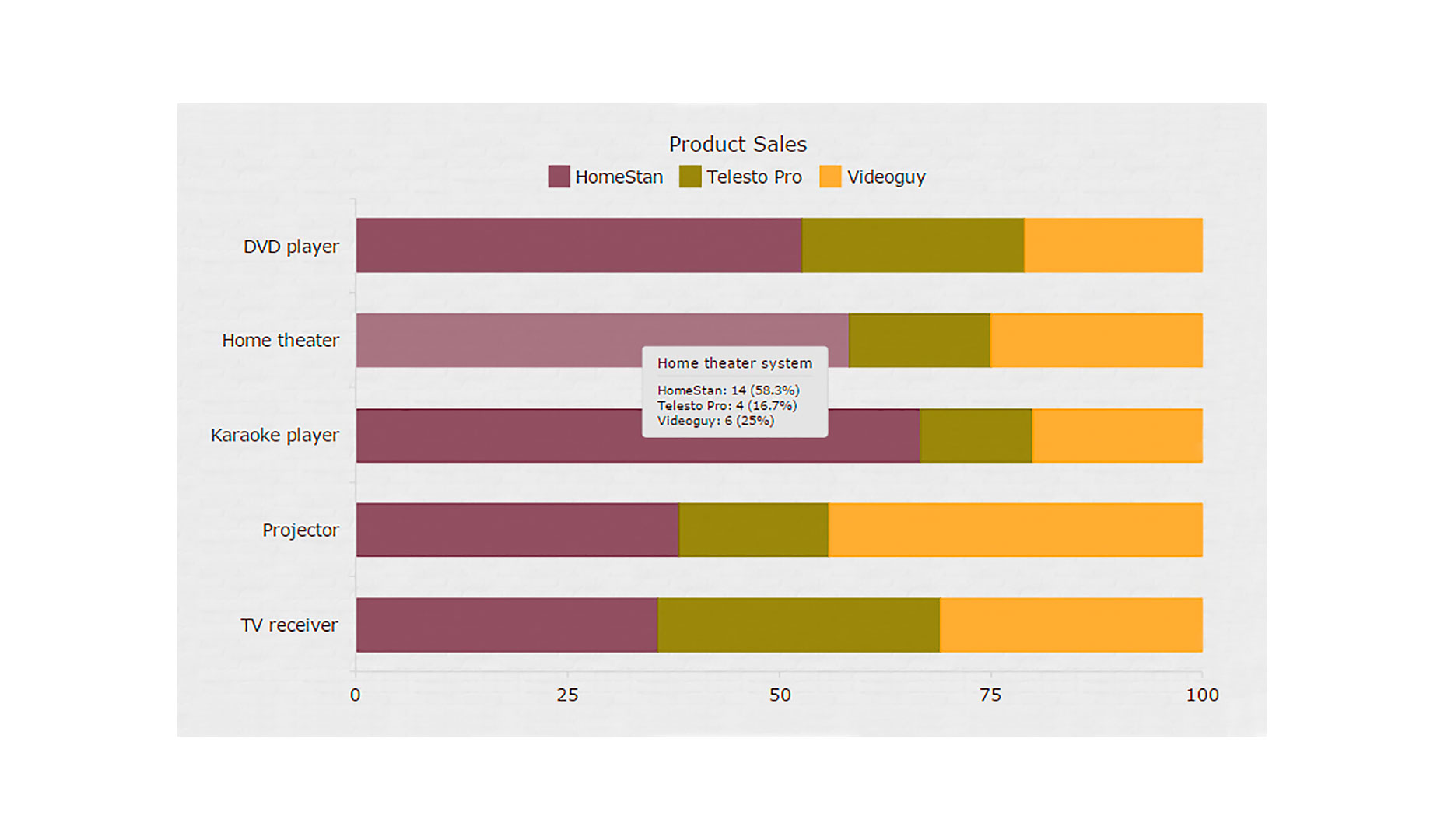
Making a JavaScript chart at least a little interactive is not a big deal. Probably the most basic approach consists in enabling the hover state on data points, to make them change color and or add or modify markers. The select state determines how each point looks after being clicked. Some simple hover and select based interactivity is included by default so right now we’re not going to add anything to the example above. Please return to it to explore the basic interactivity, if you want. It is worth talking about the tooltip element, which can float when a point is hovered over. I always try to make good use of tooltips by having them display some helpful information about what series a point belongs to, what value it represents, and so forth. You can easily tune your tooltips to show anything. We are introducing the tooltip and specifying what to show in it: var tooltip = chart.tooltip();
tooltip.displayMode('union');
tooltip.textFormatter('{%SeriesName}: {%Value} ({%YPercentOfCategory}%)');
Here is the result:
 This is just a brief glance at the customization options, to go into detail would be a whole article by itself. For now, I suggest you read the interactivity section of the documentation for more information.
Conclusion
As you see, it is not difficult to build interactive charts with JavaScript. Moreover, you can find all the examples from the tutorial in my collection on CodePen and easily use them in your work. Just copy the code, change my data to yours, and get your project up and running very quickly. Please always remember to check the documentation and/or API reference as well as pay attention to the demos of the library you are using, such as this AnyChart’s gallery. Usually, it is not complicated to see if there is anything close to what you need, find an example that fits best, make some simple amendments, and then use it the way you need.Ruslan Borovikov
Ruslan is an experienced web developer, especially fond of creating efficient front-ends and UIs as well as researching new relevant techniques and components. Although his main occupation is business software development, he also happens to find some time to code his own startups including websites, apps, and Telegram bots.


Read Next

15 Best New Fonts, July 2024
Welcome to our monthly roundup of the best fonts we’ve found online in the last four weeks. This month, there are fewer…
By Ben Moss

20 Best New Websites, July 2024
Welcome to July’s round up of websites to inspire you. This month’s collection ranges from the most stripped-back…

Top 7 WordPress Plugins for 2024: Enhance Your Site's Performance
WordPress is a hands-down favorite of website designers and developers. Renowned for its flexibility and ease of use,…
By WDD Staff

Exciting New Tools for Designers, July 2024
Welcome to this July’s collection of tools, gathered from around the web over the past month. We hope you’ll find…

3 Essential Design Trends, July 2024
Add some summer sizzle to your design projects with trendy website elements. Learn what's trending and how to use these…

15 Best New Fonts, June 2024
Welcome to our roundup of the best new fonts we’ve found online in the last month. This month, there are notably fewer…
By Ben Moss

20 Best New Websites, June 2024
Arranging content in an easily accessible way is the backbone of any user-friendly website. A good website will present…

Exciting New Tools for Designers, June 2024
In this month’s roundup of the best tools for web designers and developers, we’ll explore a range of new and noteworthy…

3 Essential Design Trends, June 2024
Summer is off to a fun start with some highly dramatic website design trends showing up in projects. Let's dive in!

15 Best New Fonts, May 2024
In this month’s edition, there are lots of historically-inspired typefaces, more of the growing trend for French…
By Ben Moss

How to Reduce The Carbon Footprint of Your Website
On average, a web page produces 4.61 grams of CO2 for every page view; for whole sites, that amounts to hundreds of KG…
By Simon Sterne

20 Best New Websites, May 2024
Welcome to May’s compilation of the best sites on the web. This month we’re focused on color for younger humans,…