
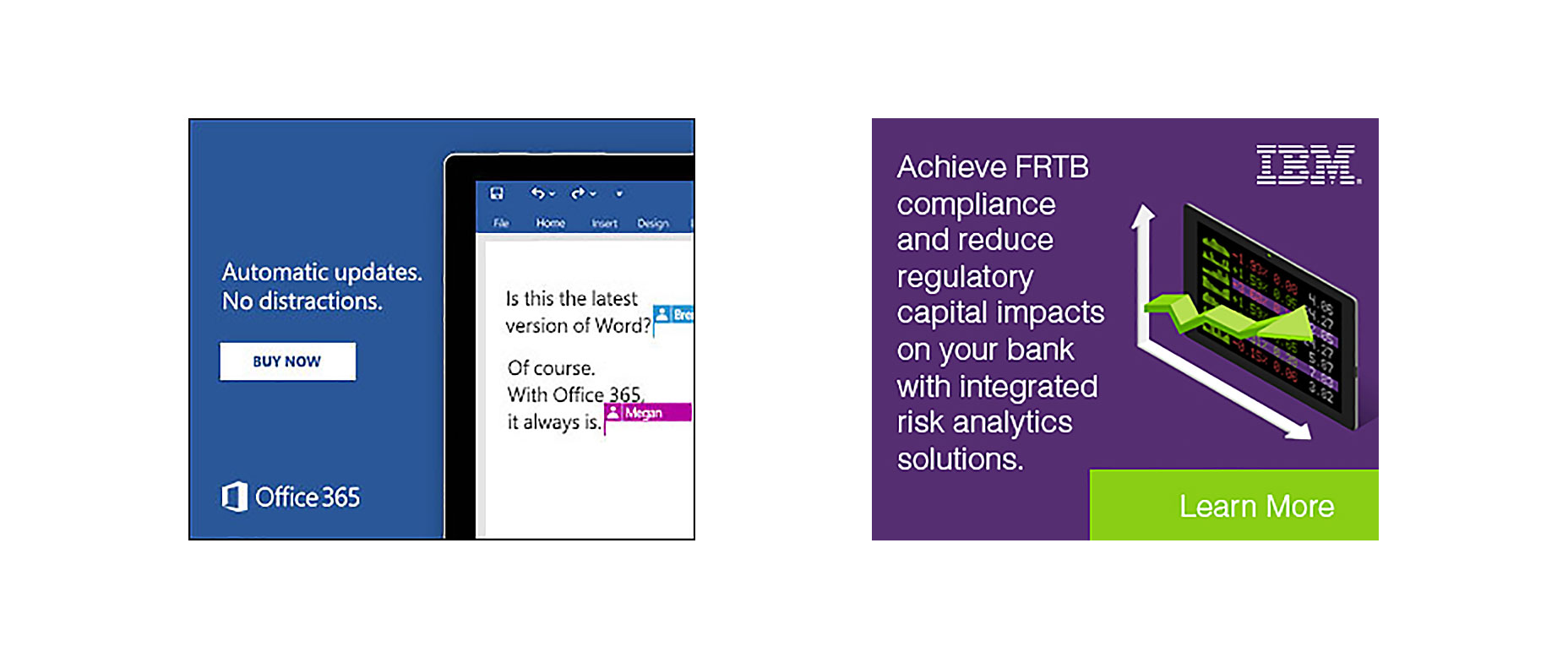
 Microsoft’s advert focuses on consumers, and their message is written in a simple, jargon-free way that anybody can understand.
IBM cater primarily to B2Bs and have used professional and business-like words such as regulatory and compliance that will resonate more with c-level executives than everyday consumers.
Personalization and Localization
75% of consumers say they are frustrated when a business serves them content, such as ads, that are not relevant to their interests, whereas marketers who do use personalization notice, on average, a 19% uplift in sales. Personalization and localization is key to creating successful banners. With the average consumer consuming thousands of ads per day, anything that is not relevant to their interests will be ignored.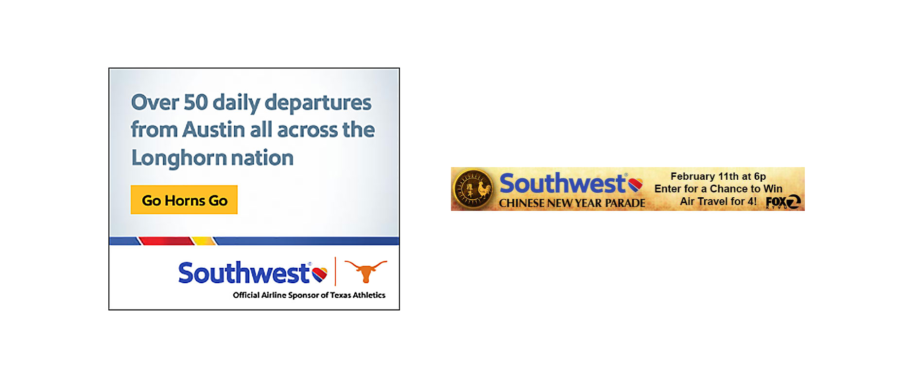 Here’s an advert from Southwest targeting consumers living in Austin, Texas. This banner hits on three points of personalization and localization. Their advert shows the state’s national stadium, and it also has the state, city, and nickname of Texas to catch the customer’s eye. During the Chinese New Year, they leveraged the national Asian holiday to set up a sweepstake (lead generation campaign) to win free flights for four people. You can personalize an advert based on what you know about the audience, the geo-location of that audience, or by tagging in relevant seasonal holidays or current pop culture trends.
Color
There are two things you need to consider when choosing the right colors for your client’s banners: brand colors and color psychology. Brand colors: these are the colors used by your client on their website, logo, and other marketing materials. Color psychology: this is the effect certain colors have on our minds; different colors have been proven to evoke various emotions in the human brain.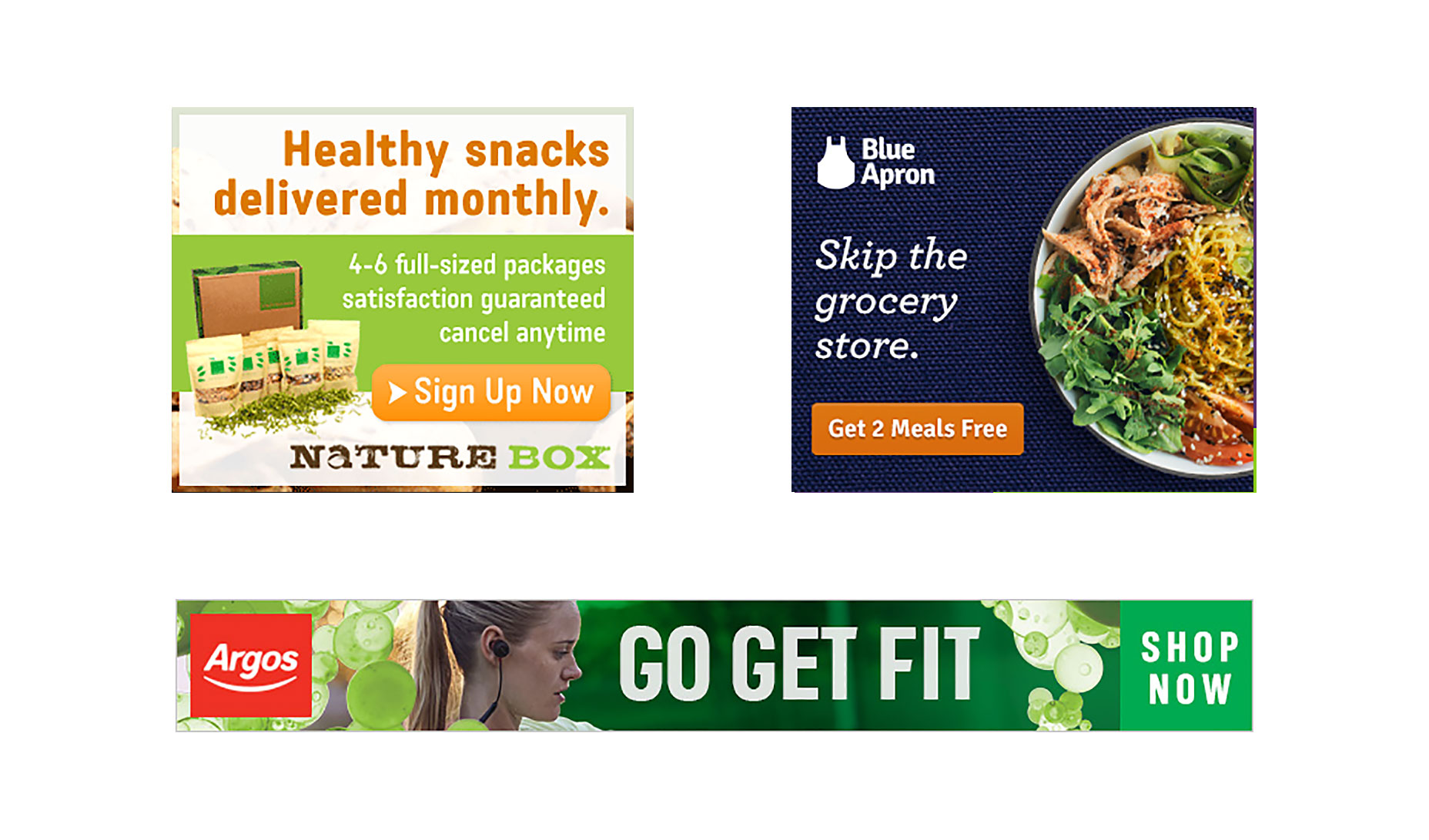 For example, the color green is known to relax us and is often the color used to indicate an environmentally friendly approach. This color psychology has been leveraged to full effect by Nature Box who use green as the primary color of their advert.
Blue Apron is another food brand that promotes healthy eating with one of their USPs being that there is no food left over. However, unlike Nature Box, they tend to focus more on their brand colors (blue) than color psychology.
Sticking to their brand colors, Blue Apron are still able convey the message of healthy eating by using relevant images.
Argos, whose brand colors are red and white, also plaster their fitness related advert with the color green to further empathize their message of health.
Brand Colors or Color Psychology?
There is no right or wrong answer. Look at your client’s past adverts and view the colors and images they used so you can keep their brand consistent across all platforms. This should also be discussed before work begins so you know the parameters that you can work within.Words and Imagery
Words and images go hand in hand. The image should further emphasize the text and the text should further emphasize the image.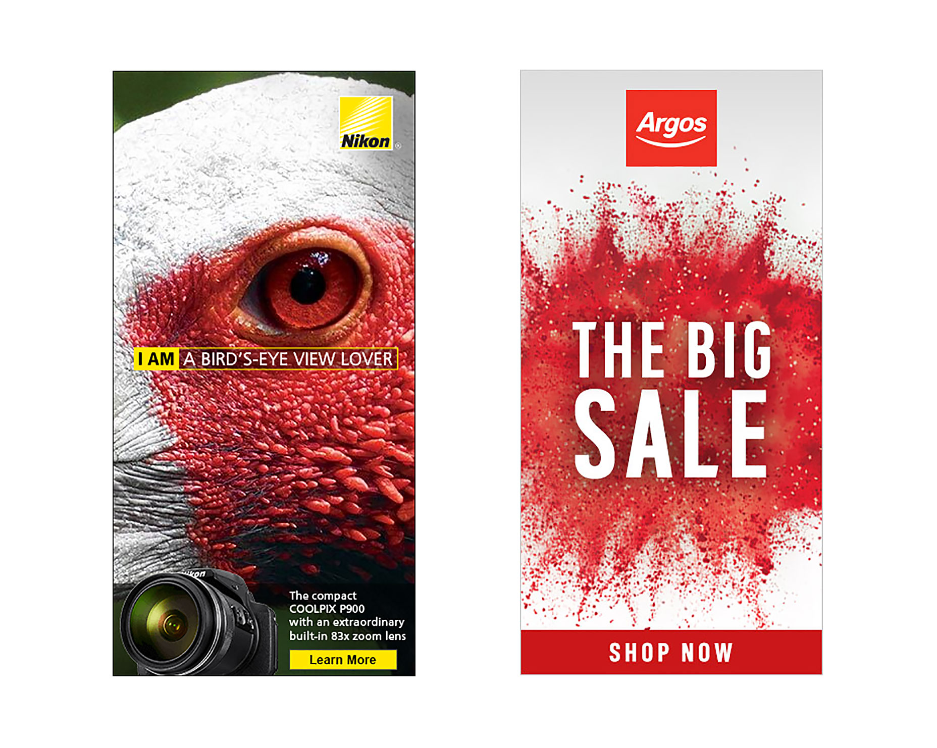 Take this Nikon banner advert as the perfect example. It uses images and word psychology to portray how powerful their camera is. Birds are known for their great vision, with many having the ability to see for miles. The text "I am a bird’s-eye view lover" is reinforced with the image of the bird as the focal point of the advert. At the bottom of the advert is a small call to action, which showcases the camera’s power with a built-in 83x zoom lens. You can get creative when mixing words with images, and you needn’t limit your image choices to your client’s product range.
Argos, who were running a huge sale, used the words "THE BIG SALE" with a colorful red explosion in the background. Notice that when they don’t focus on health, they have gone back to red (brand color) – a color which has also been proven to increase urgency.
During the communication stage of your project, ask your client what words they would and would not like mentioned in their adverts. Certain brands want to retain their hard-to-obtain and luxury status and avoid using words like discount, free, sale, or save. Some may not want you to use cartoon graphics or certain animation effects because it may damage their band.
Calls to Action
Not every advert you create will need a call to action, but most will. A call to action must be easy to see and match the page the user is sent to. When using call to actions, you must analyze the page you’re sending traffic to in order to create the base of your advert. To reach your client’s objective of securing a sale, signing up to their website, or reading a blog post, you need the user to stay on their website once they click the advert. Customers may leave directly after clicking if there is no ad scent, that is the experience they see on the website is totally different from the advert banner they viewed.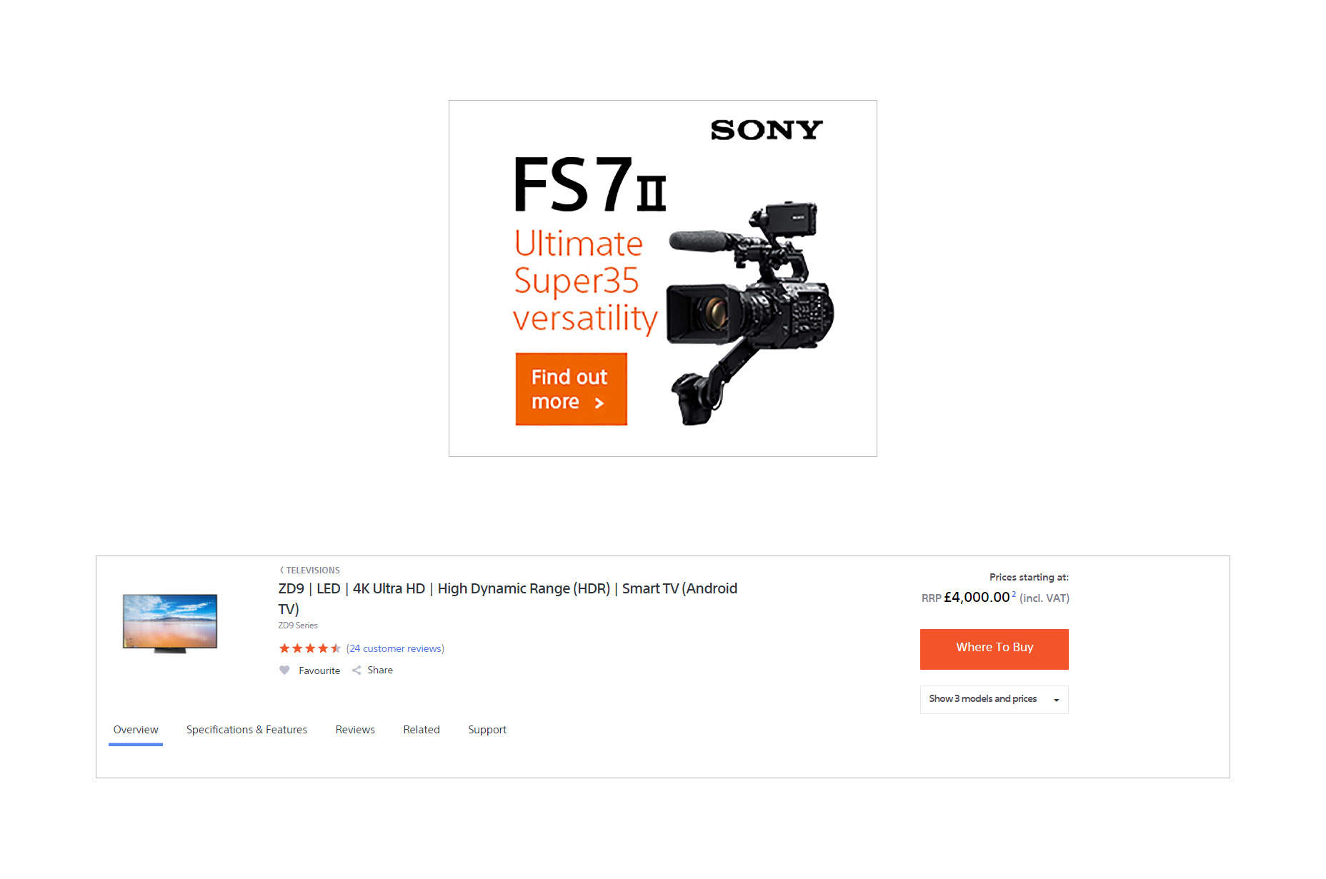 Sony’s banner ads and website have a strong ad scent as they use the same color, font, and white space in both their advert and website.
Call to actions should also pass the squint test.
The squint test is a simple way to detect whether your call to action stands out or not. To perform the squint test, take three steps away from your monitor, squint your eyes, and if you cannot clearly spot the call to action button, your call to action needs to be adjusted.
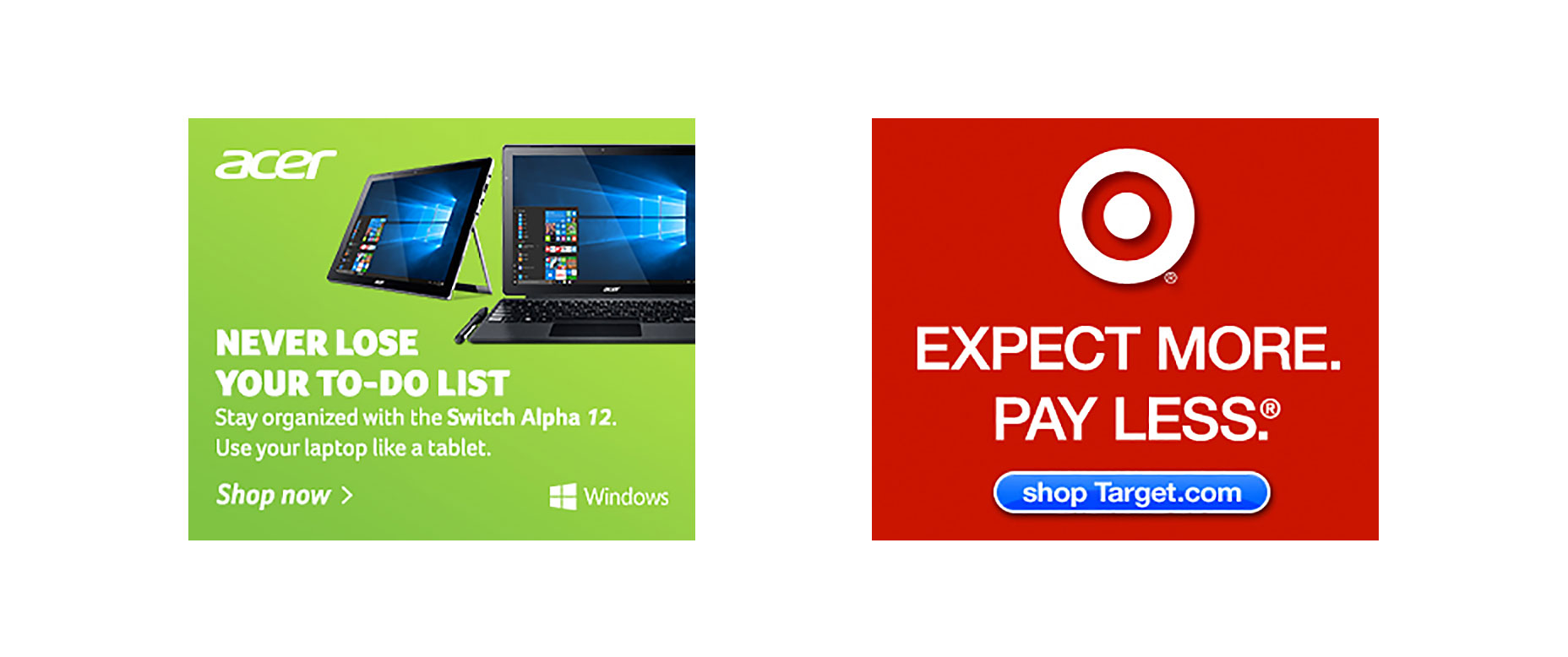 Here’s an Acer advert. Does it pass your squint test? Nope, ours neither. The entire background is green and it’s hard to identify where the call to action is as nothing in that advert is popping out urging us to click.
What about Target’s advert leading users to their online shop? Does this pass your squint test? Yes, we can see it too.
To create a clear call to action button, ensure it stands out from the background and, if possible, use a unique color that hasn’t been used in the image.
Position the button away from the feature image and let it breathe so it can stand out more. Most call to action buttons are directly underneath the image and text, as the customer first consumes the content and is then presented with a decision to click or not.
You will rarely see the call to action button at the top of the advert with the text and image at the bottom or at the left of an image.
Promotions and Offer-Based Banners
The primary objective for your clients will be to win more business, and most will do this by offering some type of offer or discount on their products. As a designer, you may not have data on your client’s bestselling products or most viewed item, and you may end up choosing a product image that you think looks good but actually doesn’t sell that well. As a creator of images, one of your tasks should be to learn more about your client’s customers and products. The difference between showing their bestselling item and an item that hardly anyone buys can be huge for click-through rates and conversions. The more data you have, the better you can choose product images to reach the client’s desired goal.Animation
As websites become more flexible, there are dozens of widgets and pieces of content that attracts the human eye. In most studies, animation banners always outperform static banners, but they can also end up annoying the user and devaluing your client’s brand if done incorrectly. While you want customers to click your banners, you don’t want to turn your banners into what we call ‘eye-bait’ (similar to click-bait). Eye-bait is when you use contrasting background colors or fast flashing images for the sole purpose of getting users to view your advert when on a website. As a general rule of thumb, the background of the image should not change color, only the text or images on that page should. The best animation adverts lead the customer through a quick story as can be seen by this Samsung advert.
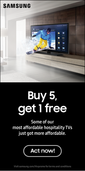 It first reveals the product and our eyes focus on it; then comes the text that redirects us to the second part of the story. Finally, we’re shown the call to action button which jumps out at us telling the user’s subconscious mind that the next appropriate action is to click and learn more.
Jorrit Baerends
Jorrit Baerends is founder of Adpiler. Adpiler is a project management tool for banner production agencies. You can preview HTML5 banner ads to your clients and easily manage all of their feedback.
Read Next
15 Best New Fonts, July 2024
Welcome to our monthly roundup of the best fonts we’ve found online in the last four weeks. This month, there are fewer…
By Ben Moss
20 Best New Websites, July 2024
Welcome to July’s round up of websites to inspire you. This month’s collection ranges from the most stripped-back…
Top 7 WordPress Plugins for 2024: Enhance Your Site's Performance
WordPress is a hands-down favorite of website designers and developers. Renowned for its flexibility and ease of use,…
By WDD Staff
Exciting New Tools for Designers, July 2024
Welcome to this July’s collection of tools, gathered from around the web over the past month. We hope you’ll find…
3 Essential Design Trends, July 2024
Add some summer sizzle to your design projects with trendy website elements. Learn what's trending and how to use these…
15 Best New Fonts, June 2024
Welcome to our roundup of the best new fonts we’ve found online in the last month. This month, there are notably fewer…
By Ben Moss
20 Best New Websites, June 2024
Arranging content in an easily accessible way is the backbone of any user-friendly website. A good website will present…
Exciting New Tools for Designers, June 2024
In this month’s roundup of the best tools for web designers and developers, we’ll explore a range of new and noteworthy…
3 Essential Design Trends, June 2024
Summer is off to a fun start with some highly dramatic website design trends showing up in projects. Let's dive in!
15 Best New Fonts, May 2024
In this month’s edition, there are lots of historically-inspired typefaces, more of the growing trend for French…
By Ben Moss
How to Reduce The Carbon Footprint of Your Website
On average, a web page produces 4.61 grams of CO2 for every page view; for whole sites, that amounts to hundreds of KG…
By Simon Sterne
20 Best New Websites, May 2024
Welcome to May’s compilation of the best sites on the web. This month we’re focused on color for younger humans,…


