

1. Scrolling: parallax, long and infinite
While scrolling, in all its hypostases, underlies a bunch of today’s websites—especially those that bring to life a storytelling experience—UX gurus find this technique “mauvais ton”. They consider it bad for many reasons:- users may not know what to do when first they stumble upon such a site;
- users can feel confused and frustrated;
- users often become bored after several minutes of constant moving;
- there is no way out, whatsoever;
- the navigation is not transparent and habitual;
- relatively bad site performance;
- in some cases, it does not work in mobile devices;
- etc.
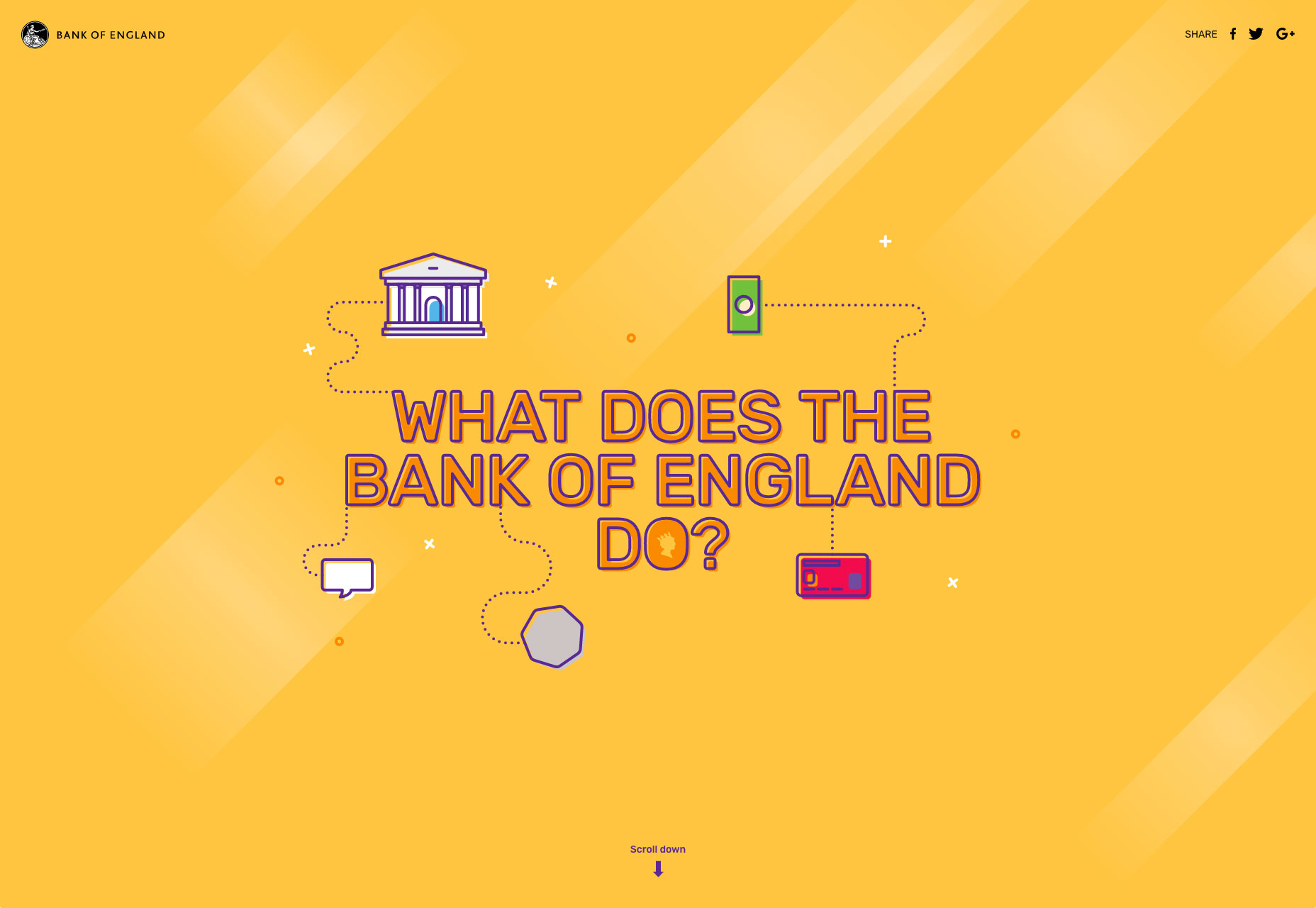 What does the Bank of England do?
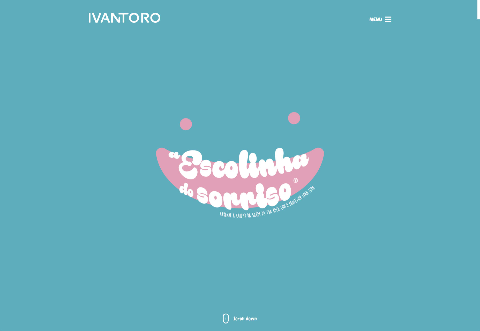 Ivan Toro
2. Experiments with Typography and Taglines
As all we know, your message to the targeted audience should be as clean and clear as a little angel’s tear. Good contrast, optimal readability, and some other factors ensure the successful transmission of the company’s message. For example, Six Potatoes or Biron: their titles are pretty straightforward and plain. Without a doubt, this technique works: it is really hard to miss the tagline.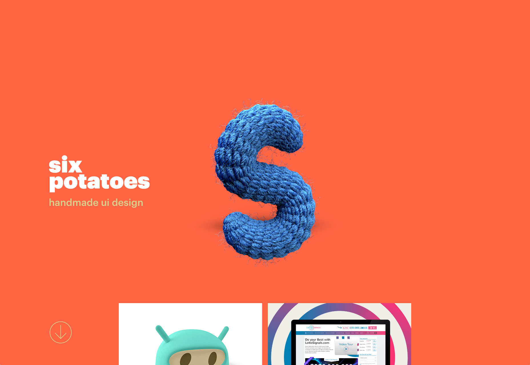 Six Potatoes
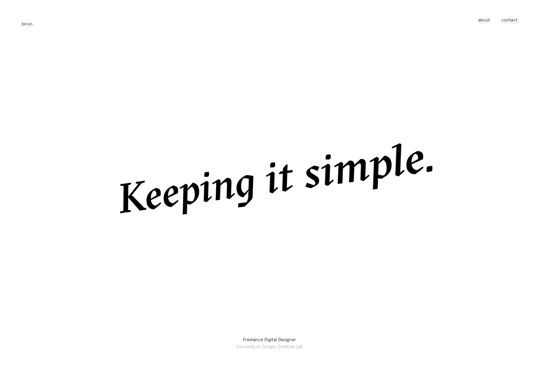 Biron
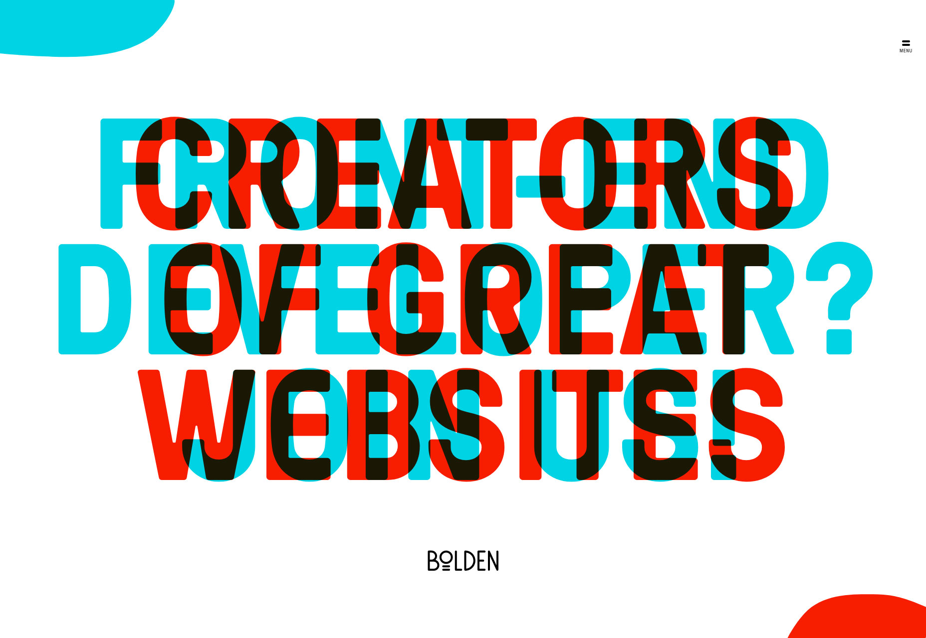
However, what about the homepage of Bolden? Their “welcome” message is a true mess. Letters overlap each other looking much like the Venn diagram. The first thing that comes to mind “What a…?” Undoubtedly, such a peculiar solution evokes mixed feelings. Nevertheless, these feelings ignite our interest. Curiosity is our natural instinct that is truly powerful.
What’s really hidden inside this tiny chaos? The team is managed to seize and hold our attention, and not only convey the message and reflect a creative thinking but also use our short memory span to their advantage.
Biron
However, what about the homepage of Bolden? Their “welcome” message is a true mess. Letters overlap each other looking much like the Venn diagram. The first thing that comes to mind “What a…?” Undoubtedly, such a peculiar solution evokes mixed feelings. Nevertheless, these feelings ignite our interest. Curiosity is our natural instinct that is truly powerful.
What’s really hidden inside this tiny chaos? The team is managed to seize and hold our attention, and not only convey the message and reflect a creative thinking but also use our short memory span to their advantage.
 Bolden
3. WebGL Experiments
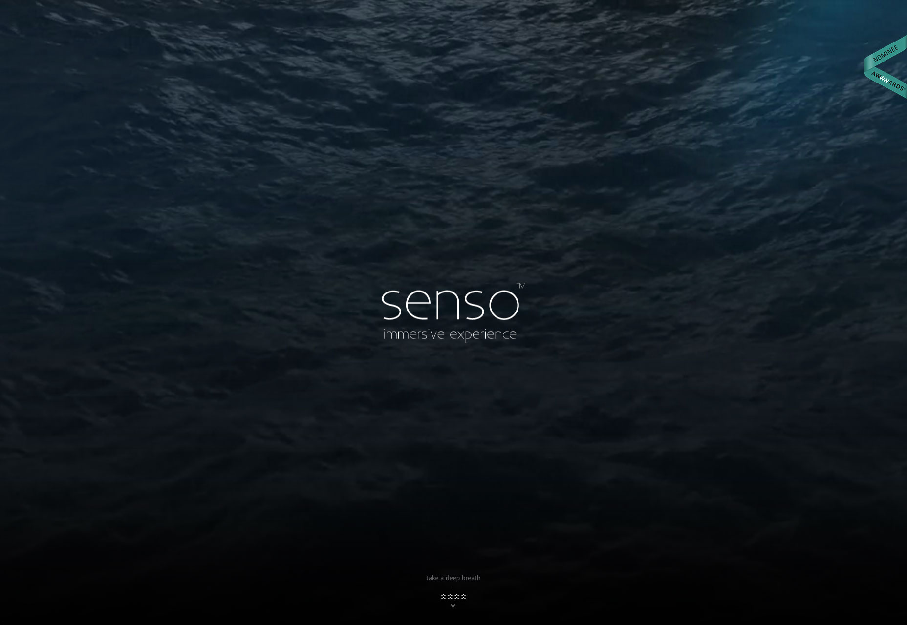
Can anyone call WebGL along with Chrome experiments an example of good UX? Absolutely, not. Some of them even do not work on the majority of browsers, so a lion share of online audience are simply unable to open them on their desktops, to say nothing about the tablets and mobile devices. But still, the upsurge of using high-end features and experimental libraries in building web applications is evident. Interland by Google, DEVX Experiments, 86 and half years—all these and many more concepts slowly but surely are earning their place in the sun. They are impressive, ingenious and intriguing; and if they open in your browser you will definitely forget about the comfort at least for 10-15 minutes.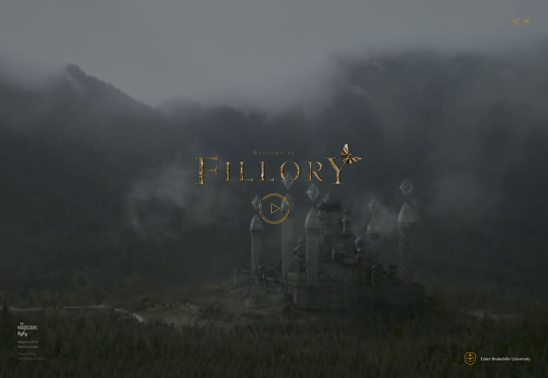 Welcome to Fillory
 Senso
Senso
4. Original Navigation
“Should I stay or should I go?” Navigation plays a decisive role in whether your users stay or leave. No one wants to fish in the dark. Navigation’s power to destroy user experience (or vice versa) take it to the next level. Good practice encourages us to make the main menu simple, handy, intuitive, but at the same time all-embracing. Everything should be on the surface, or at within easy clicks. The user should get answers to their questions quickly and without much pain. Plain top bars with nav links, hamburger menu buttons and of course, sticky nav bars that accompany us on our journey through the website are really popular these days. Staying conservative and pragmatic in choosing the navigation lets you provide your visitors with a Navigation GPS Unit rather than a map with descriptions written in Moon-letters. Nonetheless, to a certain degree these trivial solutions will take away all the fun and playfulness of your interface. Unexpected menus are creative, thought-provoking and captivating. Yes, they can be misleading, but when done right they are almost flawless masterpieces that pique our curiosity.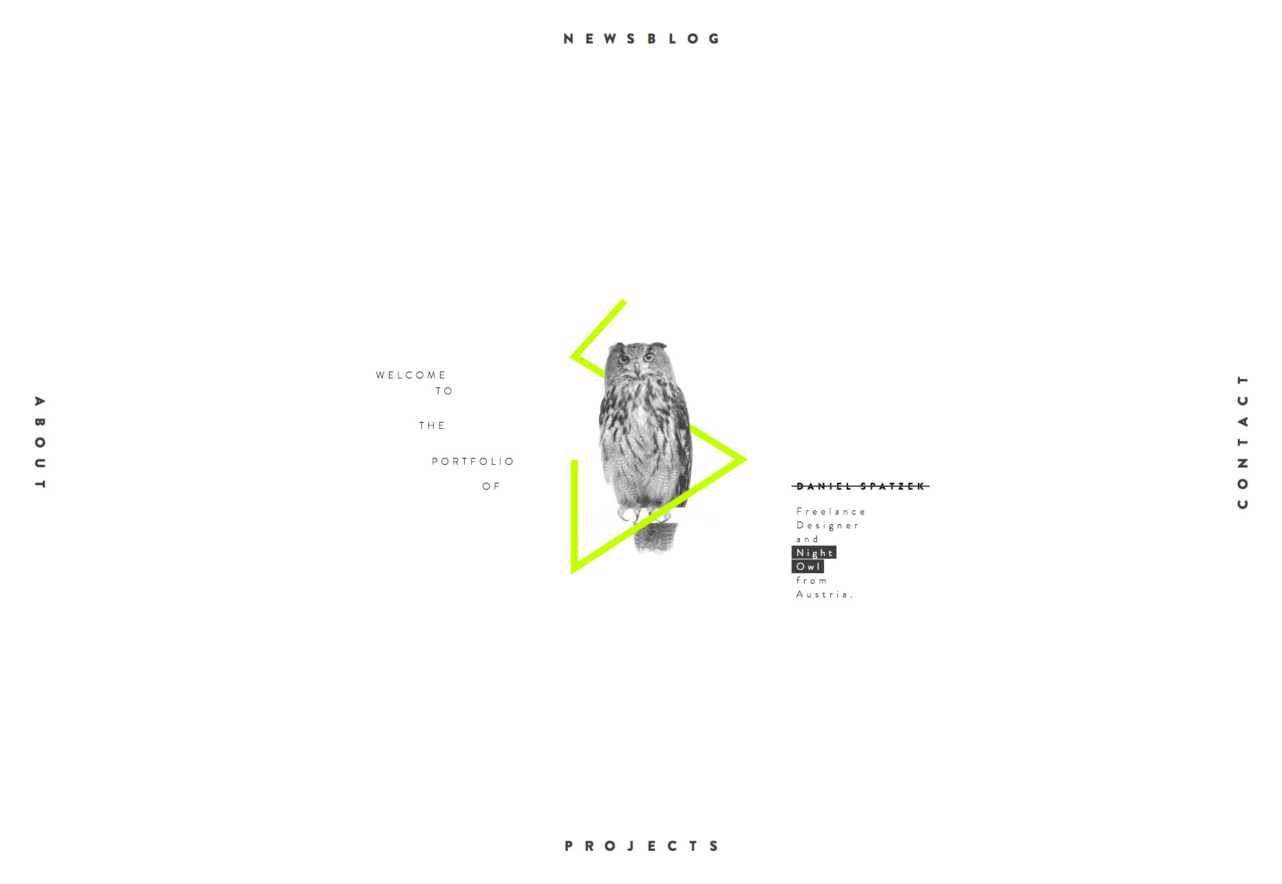 Daniel Spatzek
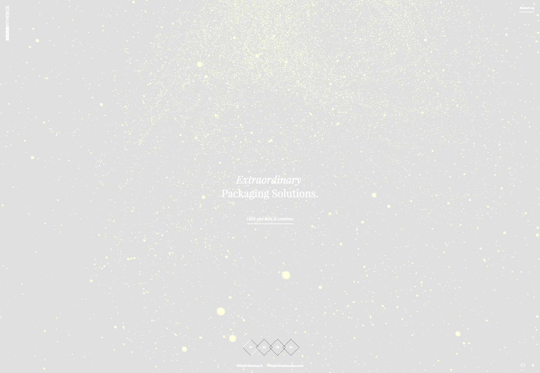 In The Box
Conclusion
Without a doubt, user experience is a vital aspect of a good web application whether it is just a plain blog, complex corporate portal, or huge e-commerce website. Along with such important things like mobile-friendliness or cross-browser compatibility it forms a safe and sound foundation that ensures success. However, sometimes, like in the real world, there are things that we find truly uncomfortable, like taking long trips in a sports car or wearing high heels, but still we admire them, want to possess them, they make us turn our heads. So, should everything be about UX? Should we all abandon the desire of going off the beaten track and follow the same old roads over and over? Is it possible to strike the balance between creativeness and pragmatism?Nataly Birch


Read Next

3 Essential Design Trends, May 2024
Integrated navigation elements, interactive typography, and digital overprints are three website design trends making…

How to Write World-Beating Web Content
Writing for the web is different from all other formats. We typically do not read to any real depth on the web; we…
By Louise North

20 Best New Websites, April 2024
Welcome to our sites of the month for April. With some websites, the details make all the difference, while in others,…

Exciting New Tools for Designers, April 2024
Welcome to our April tools collection. There are no practical jokes here, just practical gadgets, services, and apps to…

How Web Designers Can Stay Relevant in the Age of AI
The digital landscape is evolving rapidly. With the advent of AI, every sector is witnessing a revolution, including…
By Louise North

14 Top UX Tools for Designers in 2024
User Experience (UX) is one of the most important fields of design, so it should come as no surprise that there are a…
By Simon Sterne

What Negative Effects Does a Bad Website Design Have On My Business?
Consumer expectations for a responsive, immersive, and visually appealing website experience have never been higher. In…

10+ Best Resources & Tools for Web Designers (2024 update)
Is searching for the best web design tools to suit your needs akin to having a recurring bad dream? Does each…
By WDD Staff

3 Essential Design Trends, April 2024
Ready to jump into some amazing new design ideas for Spring? Our roundup has everything from UX to color trends…

How to Plan Your First Successful Website
Planning a new website can be exciting and — if you’re anything like me — a little daunting. Whether you’re an…
By Simon Sterne

15 Best New Fonts, March 2024
Welcome to March’s edition of our roundup of the best new fonts for designers. This month’s compilation includes…
By Ben Moss

LimeWire Developer APIs Herald a New Era of AI Integration
Generative AI is a fascinating technology. Far from the design killer some people feared, it is an empowering and…
By WDD Staff