

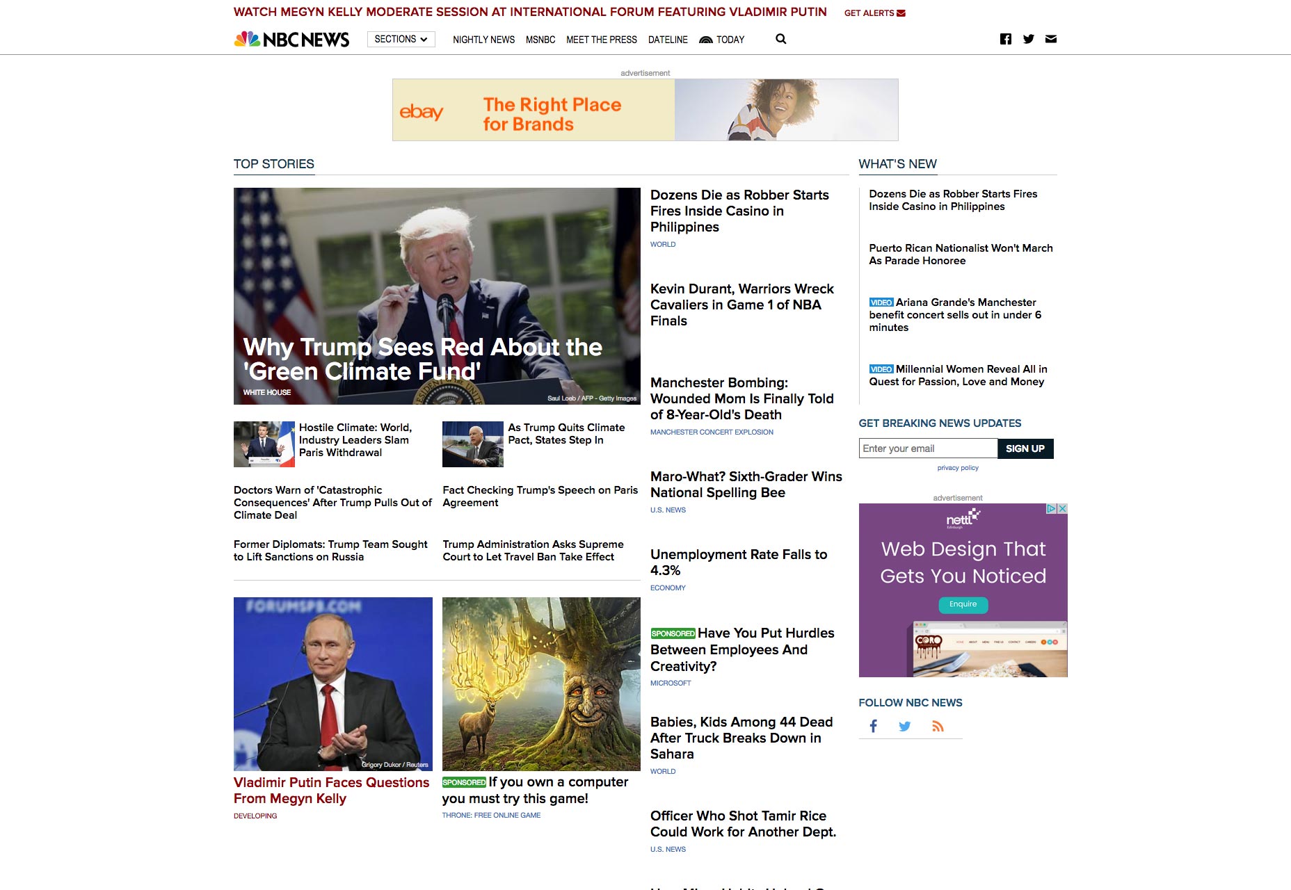
 The Current NBC News Site
Their new style places a stronger emphasis on imagery and video than the old one, presumably out of a desire to give context to every headline (and get more clicks). But no, they really doubled down on the video as well: they straight up developed their own HTML5 video player for use on their sites.
The Current NBC News Site
Their new style places a stronger emphasis on imagery and video than the old one, presumably out of a desire to give context to every headline (and get more clicks). But no, they really doubled down on the video as well: they straight up developed their own HTML5 video player for use on their sites.
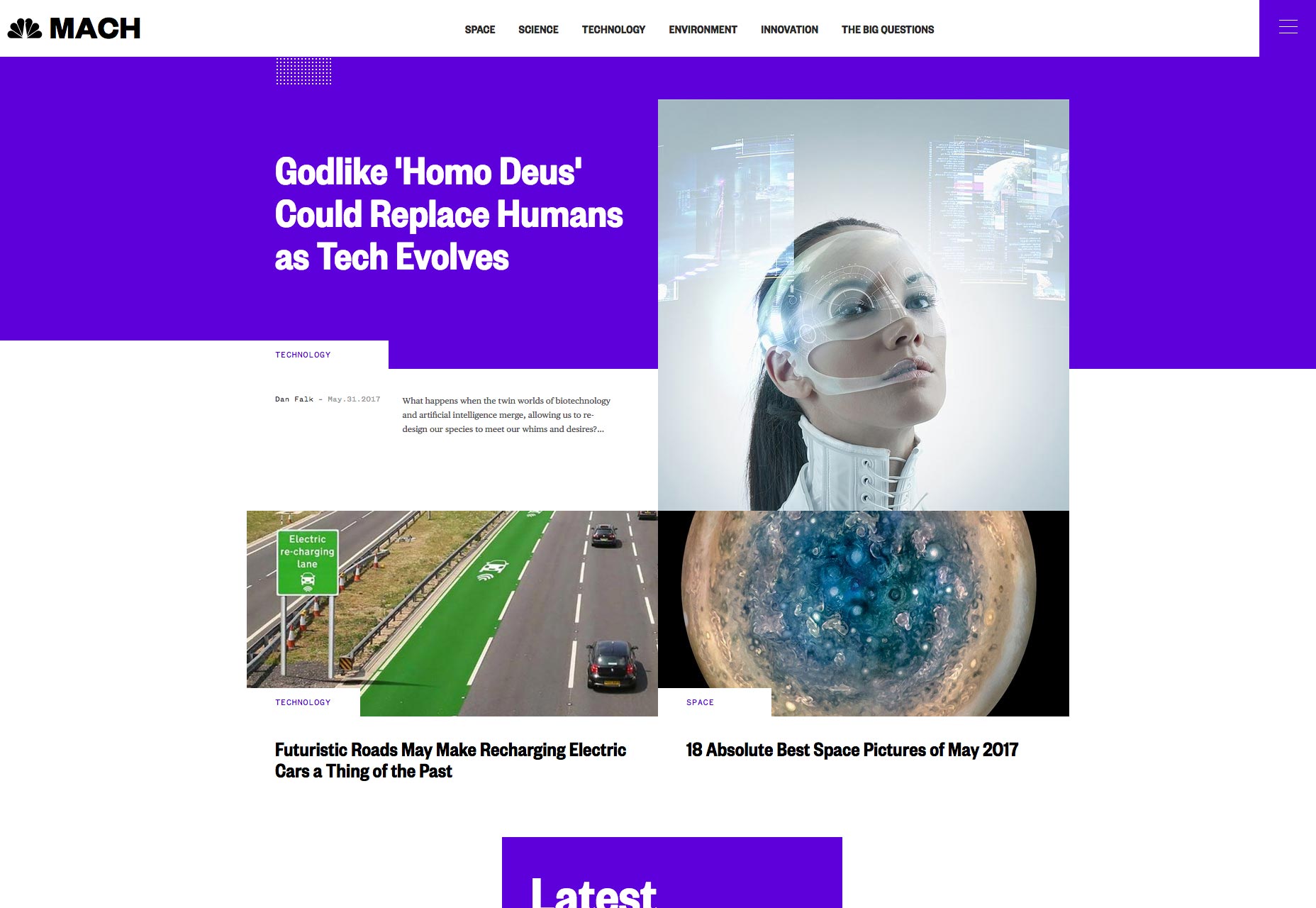 The Mach Vertical
Additionally, they have embraced a touch of asymmetry on both the desktop and mobile versions of their sites. They’ve gone for a streamlined and pixel-perfect variation on the increasingly popular "collage" look. In the meantime, they’ve actually toned down their traditional branding a little in favor of making each sub-site look like its own thing. This is largely accomplished through the heavy use of accent colors that are different for each vertical. That in itself is a nod to the peacock logo, but it also serves to separate their properties. The tech-minded vertical "Mach" goes for the classic deep blue, while the self-improvement and health-focused "Better" is accented in green. I find myself compelled to suggest a nice depressing brown for their political section, when they get around to it.
The Mach Vertical
Additionally, they have embraced a touch of asymmetry on both the desktop and mobile versions of their sites. They’ve gone for a streamlined and pixel-perfect variation on the increasingly popular "collage" look. In the meantime, they’ve actually toned down their traditional branding a little in favor of making each sub-site look like its own thing. This is largely accomplished through the heavy use of accent colors that are different for each vertical. That in itself is a nod to the peacock logo, but it also serves to separate their properties. The tech-minded vertical "Mach" goes for the classic deep blue, while the self-improvement and health-focused "Better" is accented in green. I find myself compelled to suggest a nice depressing brown for their political section, when they get around to it.
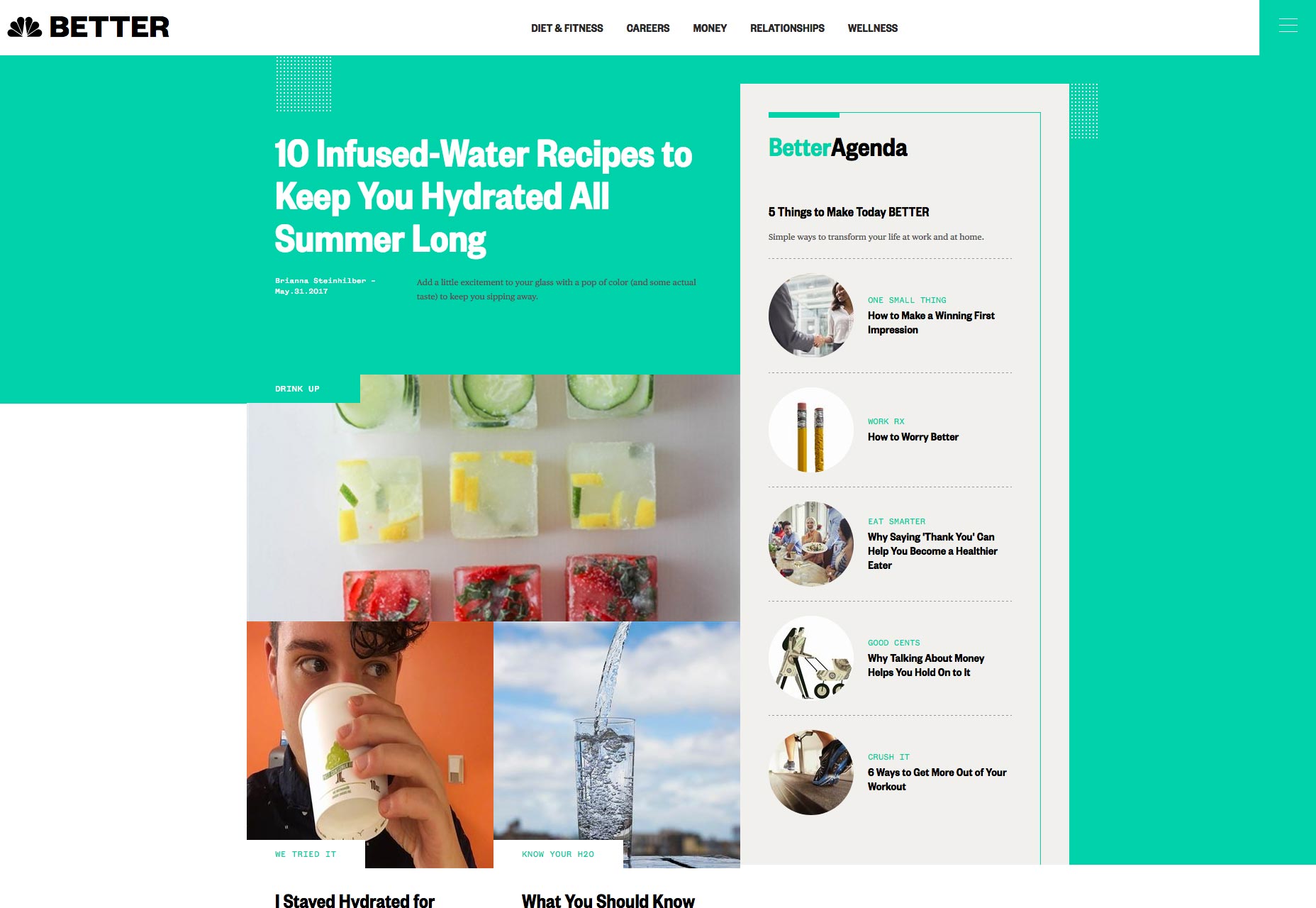 The Better Vertical
The typography is solid, and designed to scale to all screen sizes. The headlines are set in the beautiful Founders Grotesk Condensed, and the body text in Publico. These typefaces were chosen for legibility, and as I have yet to encounter any issues, I’d say they got it right.
The really big thing about the design, however, is that it’s meant to be modular, instead of relying on strict page templates. They want to be able to put any kind of content pretty much wherever they want to while maintaining consistent branding and style, so flexibility was a priority. Given the sheer variety of content a large news agency might have to include on their site, this is important.
[pullquote]They didn’t just update the look, they updated their whole process for putting news where people can see it[/pullquote]
Now, does this design system live up to its aspirations? Well, like all design systems, it’s probably going to need some iteration, which is why NBC News made the very smart tactical move of testing it out on sub-sites. Still, looking at Mach and Better, and reading the stated goals for the design system in their Medium post, I’d say they got awful close. (Incidentally, they talk about their tech stack in that post; they use Drupal.)
The longer I look at it, the more I realize that the visual refresh is, perhaps, not the most important part of the redesign. They didn’t just update the look, they updated their whole process for putting news where people can see it. That said, I do love the new look. I might be biased, given how similar it is to some design and tech blogs, but I do.
I think this revamp is going to work out for them.
The Better Vertical
The typography is solid, and designed to scale to all screen sizes. The headlines are set in the beautiful Founders Grotesk Condensed, and the body text in Publico. These typefaces were chosen for legibility, and as I have yet to encounter any issues, I’d say they got it right.
The really big thing about the design, however, is that it’s meant to be modular, instead of relying on strict page templates. They want to be able to put any kind of content pretty much wherever they want to while maintaining consistent branding and style, so flexibility was a priority. Given the sheer variety of content a large news agency might have to include on their site, this is important.
[pullquote]They didn’t just update the look, they updated their whole process for putting news where people can see it[/pullquote]
Now, does this design system live up to its aspirations? Well, like all design systems, it’s probably going to need some iteration, which is why NBC News made the very smart tactical move of testing it out on sub-sites. Still, looking at Mach and Better, and reading the stated goals for the design system in their Medium post, I’d say they got awful close. (Incidentally, they talk about their tech stack in that post; they use Drupal.)
The longer I look at it, the more I realize that the visual refresh is, perhaps, not the most important part of the redesign. They didn’t just update the look, they updated their whole process for putting news where people can see it. That said, I do love the new look. I might be biased, given how similar it is to some design and tech blogs, but I do.
I think this revamp is going to work out for them.
Ezequiel Bruni
Ezequiel Bruni is a web/UX designer, blogger, and aspiring photographer living in Mexico. When he’s not up to his finely-chiselled ears in wire-frames and front-end code, or ranting about the same, he indulges in beer, pizza, fantasy novels, and stand-up comedy.


Read Next

15 Best New Fonts, July 2024
Welcome to our monthly roundup of the best fonts we’ve found online in the last four weeks. This month, there are fewer…
By Ben Moss

20 Best New Websites, July 2024
Welcome to July’s round up of websites to inspire you. This month’s collection ranges from the most stripped-back…

Top 7 WordPress Plugins for 2024: Enhance Your Site's Performance
WordPress is a hands-down favorite of website designers and developers. Renowned for its flexibility and ease of use,…
By WDD Staff

Exciting New Tools for Designers, July 2024
Welcome to this July’s collection of tools, gathered from around the web over the past month. We hope you’ll find…

3 Essential Design Trends, July 2024
Add some summer sizzle to your design projects with trendy website elements. Learn what's trending and how to use these…

15 Best New Fonts, June 2024
Welcome to our roundup of the best new fonts we’ve found online in the last month. This month, there are notably fewer…
By Ben Moss

20 Best New Websites, June 2024
Arranging content in an easily accessible way is the backbone of any user-friendly website. A good website will present…

Exciting New Tools for Designers, June 2024
In this month’s roundup of the best tools for web designers and developers, we’ll explore a range of new and noteworthy…

3 Essential Design Trends, June 2024
Summer is off to a fun start with some highly dramatic website design trends showing up in projects. Let's dive in!

15 Best New Fonts, May 2024
In this month’s edition, there are lots of historically-inspired typefaces, more of the growing trend for French…
By Ben Moss

How to Reduce The Carbon Footprint of Your Website
On average, a web page produces 4.61 grams of CO2 for every page view; for whole sites, that amounts to hundreds of KG…
By Simon Sterne

20 Best New Websites, May 2024
Welcome to May’s compilation of the best sites on the web. This month we’re focused on color for younger humans,…