1
Every SaaS product and subscription website needs a great pricing table. It’s the easiest way to share information with potential buyers and explain the differences in your plans.
But with so many websites running pricing tables they can get a little stale.
These designs are some of the best I’ve found with fresh trends, color schemes, and a clean experience that encourages user interaction. If you’re designing a custom pricing table page then these designs are sure to give you some cool ideas.
1. Algolia
The hosted search SaaS product Algolia has a clean pricing page with a material design style and colorful icon designs.
Each column uses different a color in the header to stand out and create contrast. The tables are pretty simple so the information is easy to consume at a glance.
Typically you find signup buttons at the bottom of each column but Algolia uses one large CTA underneath the table. This keeps it cleaner and reduces the need to duplicate buttons over multiple columns.

2. Slack
The Slack pricing page is also pretty unique with a left-hand feature column for labels. You can find this in many other pricing tables but not always with such a smooth design.
Each row uses check marks to show which features are covered in each plan. These rows are super spacious and the headers even use a light grey background to build contrast for easy skimming.
Not to mention the fonts they’re using look fantastic and really make the content easy to consume.

3. Symu
I’ve never seen greyed-out features in a pricing table but Symu makes this work. Each column has a small progress bar placed just above the features list showing how much you get with each plan.
This grabs your attention fast and the greyed-out features also catch your eye.
My problem with the light gray font is that it’s tough to read. Potential buyers may not know what they’re missing out on with the free plan, so they’d have to read the “Team” column to clearly see all the features in one list.
But the visual removal of these features with a lighter font implies scarcity, a great tool for sales and marketing.

4. Digital Ocean
The VPS service Digital Ocean has their own rotating pricing table because they offer so many different plans.
Most new visitors will start with cheaper plans so it makes sense to keep these right in view. But you can click, or swipe, through the list to browse higher-priced plans with more power and storage space.
Another feature I like is the “create account” button which only appears for the selected plan. This draws your attention to that one plan so you can compare it against its neighbors and see whatever works best for you.

5. UsabilityHub
The pricing table on UsabilityHub has a nifty design with hover details for each feature. Different accounts let you run different tests but newer users may not understand the value of these tests.
If you hover the information icon beside each feature you’ll get more info about what it means and why it’s useful. Some are just features like A/B testing while others are account settings like team support or custom branding.
For the larger team column you’ll also notice the monthly quote increases automatically when you add more people onto the plan. This is great for teams who want to estimate costs and get quick estimates for software.

6. Optimal Workshop
Optimal Workshop uses a lot of branding and custom graphics on their pricing page. This may not add directly to the table itself, but it does add to the ambiance of the page.
The main feature I like in this design is the built-in monthly/yearly price switch. You’ll often see these on pricing pages but they’re usually way too small. This gives visitors a false sense of pricing because initial prices can be pitched cheaper assuming the user wants an annual plan.
With this pricing table you can clearly see what you’re getting per month and how to compare between the monthly and yearly costs.

7. Airtable
Here’s another design that uses bright colors to grab attention. The Airtable pricing page keeps things simple and tries to draw your attention to the prices immediately.
If you look right above the table you’ll see the same monthly/yearly switch. See how it’s miniscule enough to completely miss at a glance? That’s a nice trick for sales but it’s not great from a UX perspective.
The best part of this table is the hover effect added onto each row. You can learn about each feature just by hovering to figure out which plan offers exactly what you need.

8. Lookback
Another table design with the hover information is Lookback. You won’t find the hover tooltip on every row but it’s visible on the most complex feature items.
Another minor design choice that I like is how each column of features adds onto the prior one. The column for the “Pro” plan notes that it offers everything in the standard plan along with a few extra features.
Sometimes this can throw off visitors who aren’t reading closely because they may gloss over this text. But it’s a great way to save space and keep your tables clean.

9. BuzzSumo
Although the design is somewhat basic, I have to say the BuzzSumo pricing table does a lot of things right. The monthly/yearly billing switch is in clear view and you can even see exactly how much you’ll save by switching to annual billing.
Their features list feels a tad crowded but it’s pretty simple to read through. And each row uses the hover info feature with tooltips explaining what each feature means.
My only complaint here is the aesthetic of the page. It’d look nicer if the features connected more into a larger table with more borders or perhaps zebra striping. But the UX is superb and that’s what matters most on a pricing page.

10. Litmus
The email testing suite Litmus has been around for years and it’s the de-facto choice for email newsletters. Their pricing page isn’t too detailed but it offers just enough for potential buyers.
They use the labeling trend of “most popular” by highlighting one specific plan to stand out from the rest. It’s a design choice that works well and encourages more signups for mid-tier plans over cheaper ones.
But I really like the amount of space you get with each row. The features are explained right on the page and some features even have internal pages with more detail.
With clean text, solid borders, and plenty of whitespace, this pricing table is one of the most pragmatic designs in my list.

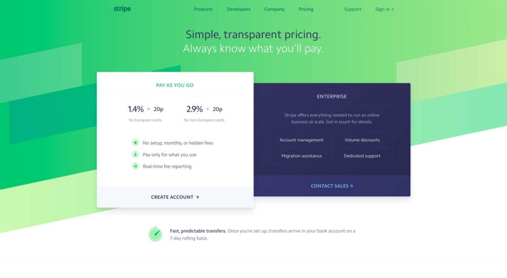
11. Stripe
Stripe’s pricing page is incredibly simple and it’s hard to even call this a full pricing table. But it’s so well designed that I just had to include it here.
The goal of any pricing table is to share information with potential customers, and to convert those people into paying customers. Stripe’s design offers two very clear payment plans: Direct payments or larger enterprise setups.
People looking into Stripe won’t fall into analysis paralysis trying to choose between five different plans. The table is quick to read and offers an easy way to calculate costs.
But if you like this table design you could build out a similar pricing table and throw one or two more plans into the mix.

Not Useless: Why Experimental Websites Matter More Than You Think
Every once in a while, a site comes along that makes you pause, grin, and think: Wait—websites can do that? Maybe it’s a portfolio where the cursor morphs into a liquid blob,…
How Aspect Ratios Define Perception, Rhythm, and Flow
Designers talk about color, typography, and hierarchy constantly. But proportion—the silent structure beneath everything—rarely gets the same respect. Every card, photo, video, and module in an interface lives within a…

Token Fatigue: When Abstraction Eats Itself
In theory, design tokens were supposed to save us. They were the missing link between design and code, a neat way to abstract decisions—colors, spacing, typography, motion—into a unified language…

AI as Art Director: Can Machines Develop Taste?
Let’s get this out of the way: AI doesn’t have taste. It has statistics. It knows what’s popular, what’s trending, what’s most likely to earn a double-tap — but it…
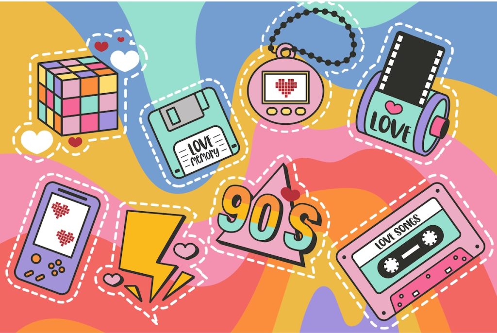
Pixel Nostalgia: Why We Miss the 90s Web (Even If It Was Ugly)
It’s easy to laugh at the 90s web now — the blinking GIFs, Comic Sans banners, table layouts held together with duct tape and hope. But beneath all that chaos…
Exciting New Tools for Designers, February 2026
There are so many new – and good – tools for designers out there right now. From tiny bits of artificial intelligence to icons that delight, there’s something to help…