

Zurb
Well let’s get the big one out of they way. Zurb — the creators of Foundation — went and redesigned their site again. Yeah, they still do client work. Their website loosely keeps to the sort of alien astronaut theme that they’ve developed over the years. You’ll still see their mascot hidden here and there. The header of the home page says "Greetings, Earthling." in a typeface ripped straight from old sci-fi. Their penchant for illustration, however, has taken a backseat to photography, and subtle animation. The rest of the site is the pure, clean simplicity we’ve come to expect from the creators of Foundation. As a bonus, there are forty-two illustrated cows hidden throughout their site. If you click on the cow icon on the bottom of any page, you can keep track of the ones you’ve found so far.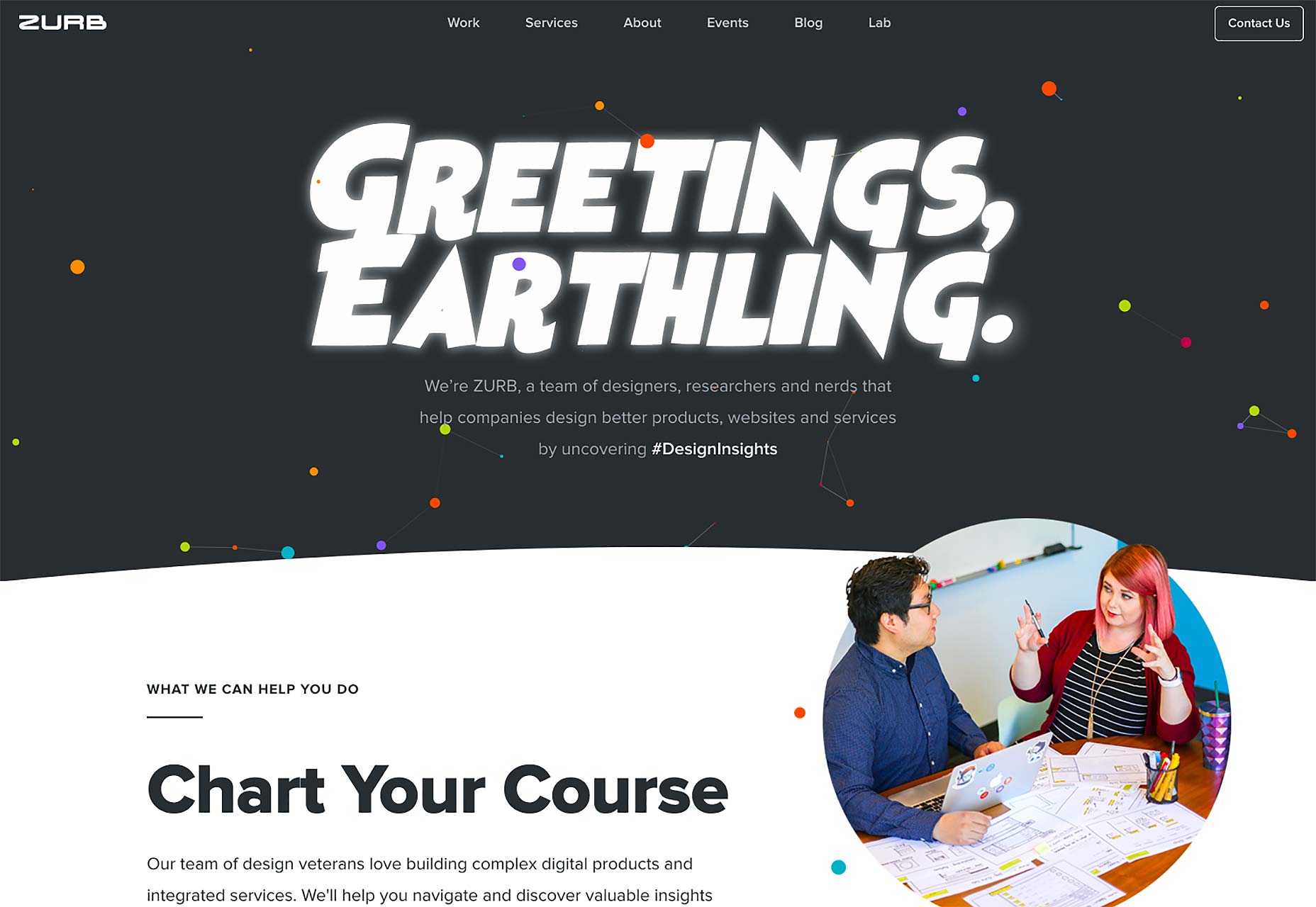
Jacob Sutton
Jacob Sutton is a photographer, as as such, he is contractually obligated to use the now-classic post-minimalism for his portfolio. I kid. It’s just regular minimalism with a bit of asymmetry thrown in. It looks elegant and understated at the same time, which is quite a feat of design.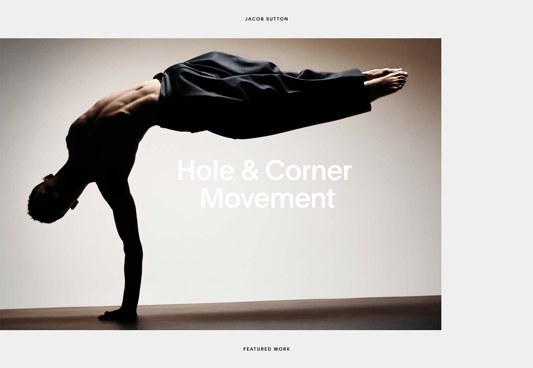
Use All Five
Use All Five’s website has a distinctly modern aesthetic and uses a lot of pastels. Darnit, I think I used a Morticia joke some months ago already. In any case, it’s a pretty good-looking site that definitely stands out with its own distinct personality.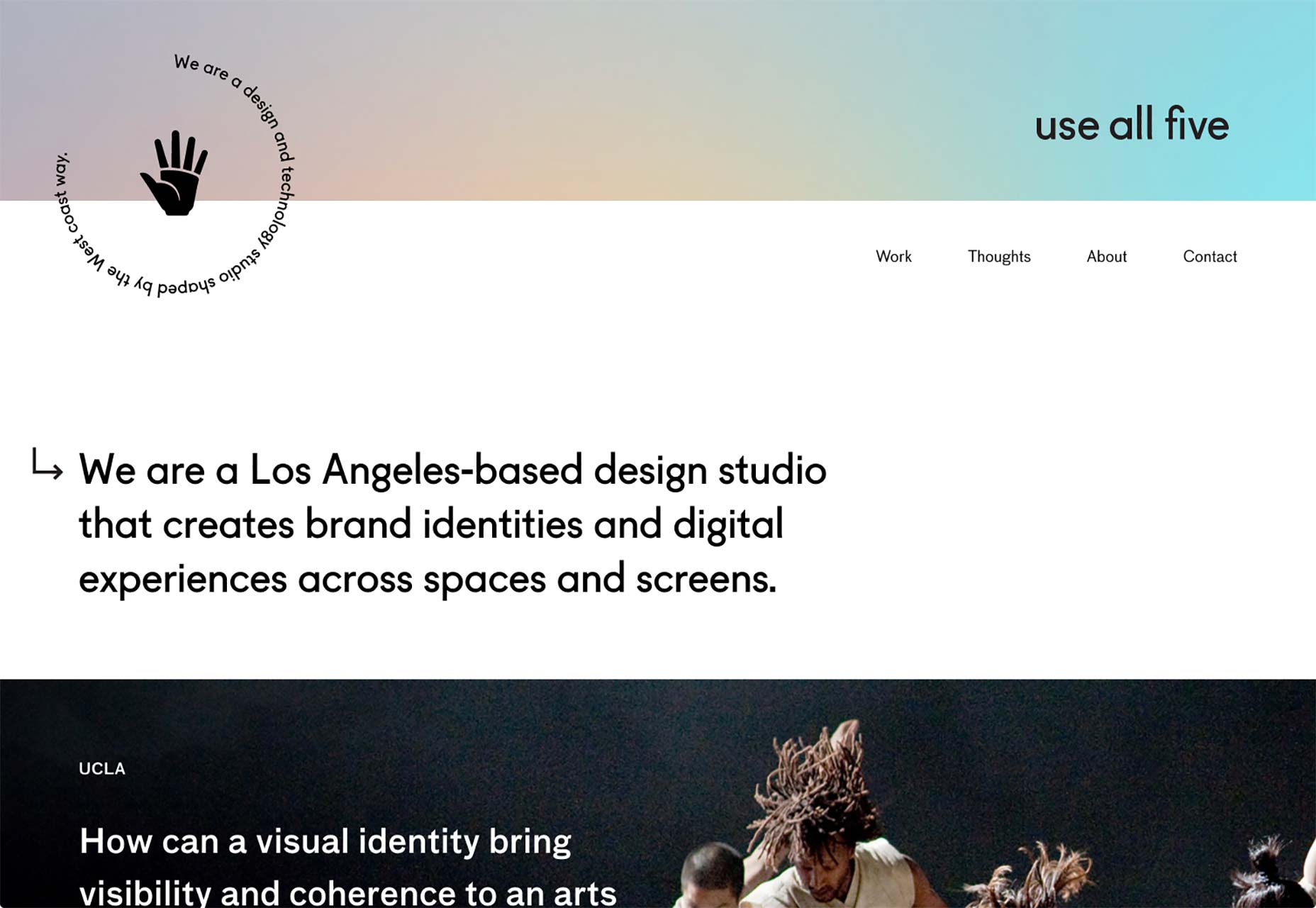
L’Éloi
L’Éloi’s agency site combines the an asymmetrical layout with a kind of minimalism I’m going to start calling "design portfolio chic". I need to start collecting these terms somewhere. Anyway, you know the drill: thick heading text, classic serif body text, a metric ton of white space. But instead of a giant hero image and three columns outlining the services, we get the collage-style layout and asymmetrical tendencies of the post-minimalist. I actually think it’s a pretty great combo. And it’s one seen a couple of times in this list.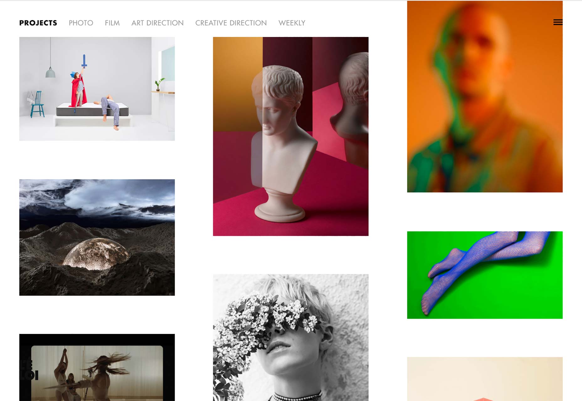
Oui Will
Oui WIll Has a lot going for it. First, there’s that glorious pun. Second, there’s a beautiful layout with an emphasis on great typography. They didn’t quite commit to a dark or light layout, opting to mix the two and let the contrast do a lot of the talking. They also do that thing with the overlapping elements. Overall, it’s a solid piece of web design that combines a clearly professional feel with a few artistic flourishes.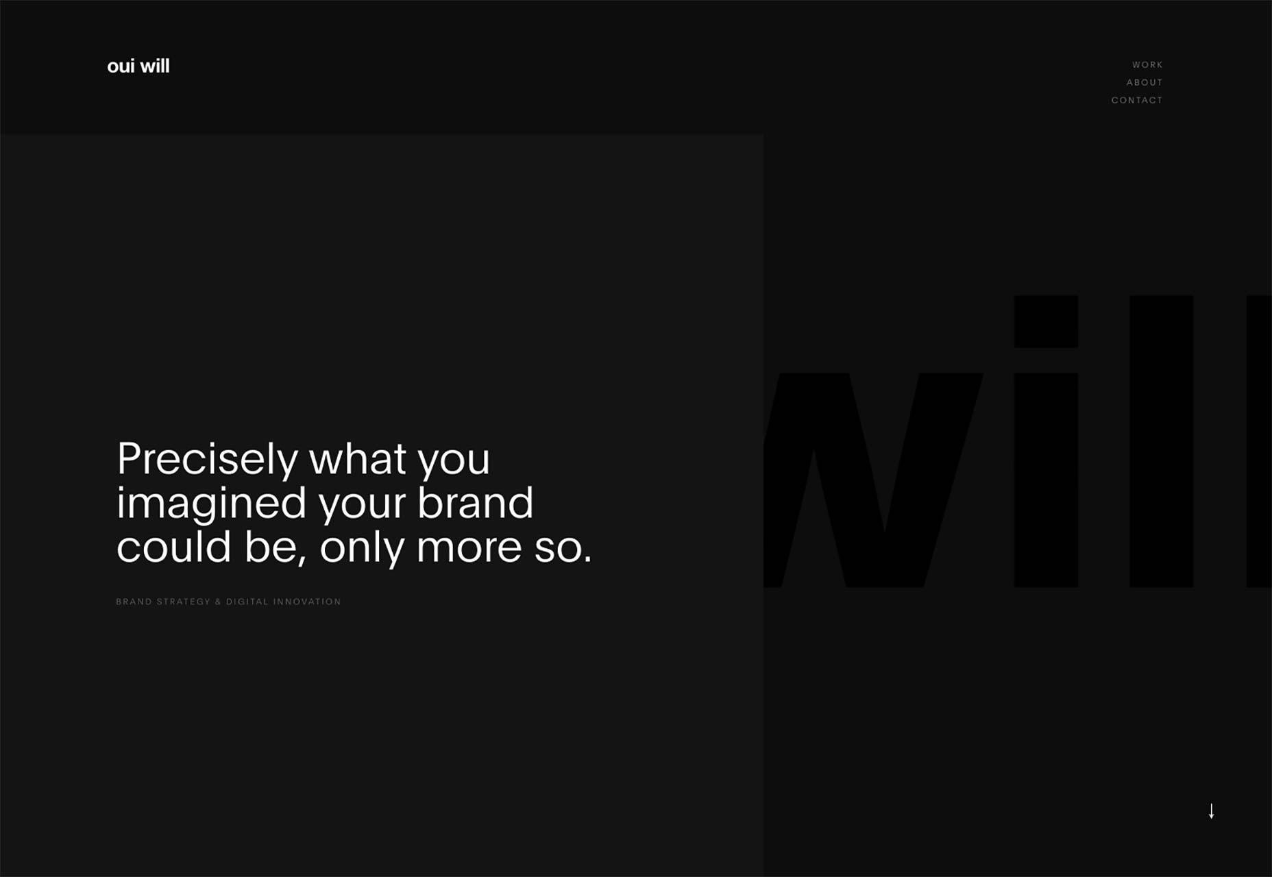
Pavel Kedzich
Pavel Kedzich has one of those websites that you’d swear is a classic case of post-minimalism... and it is... almost? I mean, yes, the images are laid out collage-style, but that’s it. There’s a floating logotype and nav-bar on the right and the rest of the site is literally single column. If anything, this is just minimalism with style.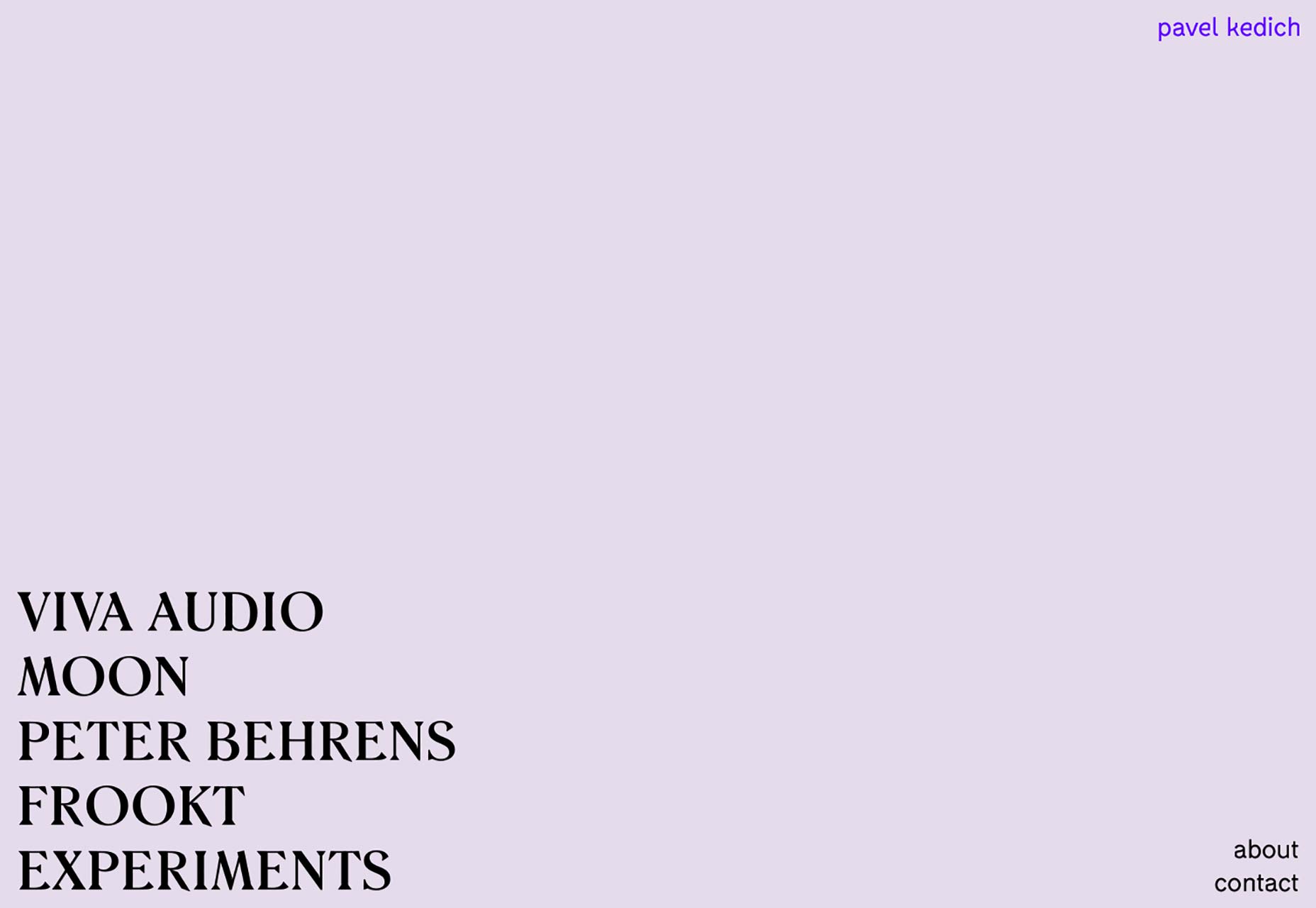
Negative Labs
Okay, remember when a ton of minimalist websites used all sans-serif typefaces (usually just one), and used a lot of thick black borders? I don’t have a good term for it yet, but it was a sort of precursor to brutalism. This is that, but with very minimalist WordArt. You think I’m joking? Go look at their home page. I won’t say I dislike it, but I’m not that sure I love it, either. Nonetheless, it stands out, and it might inspire you to try something new.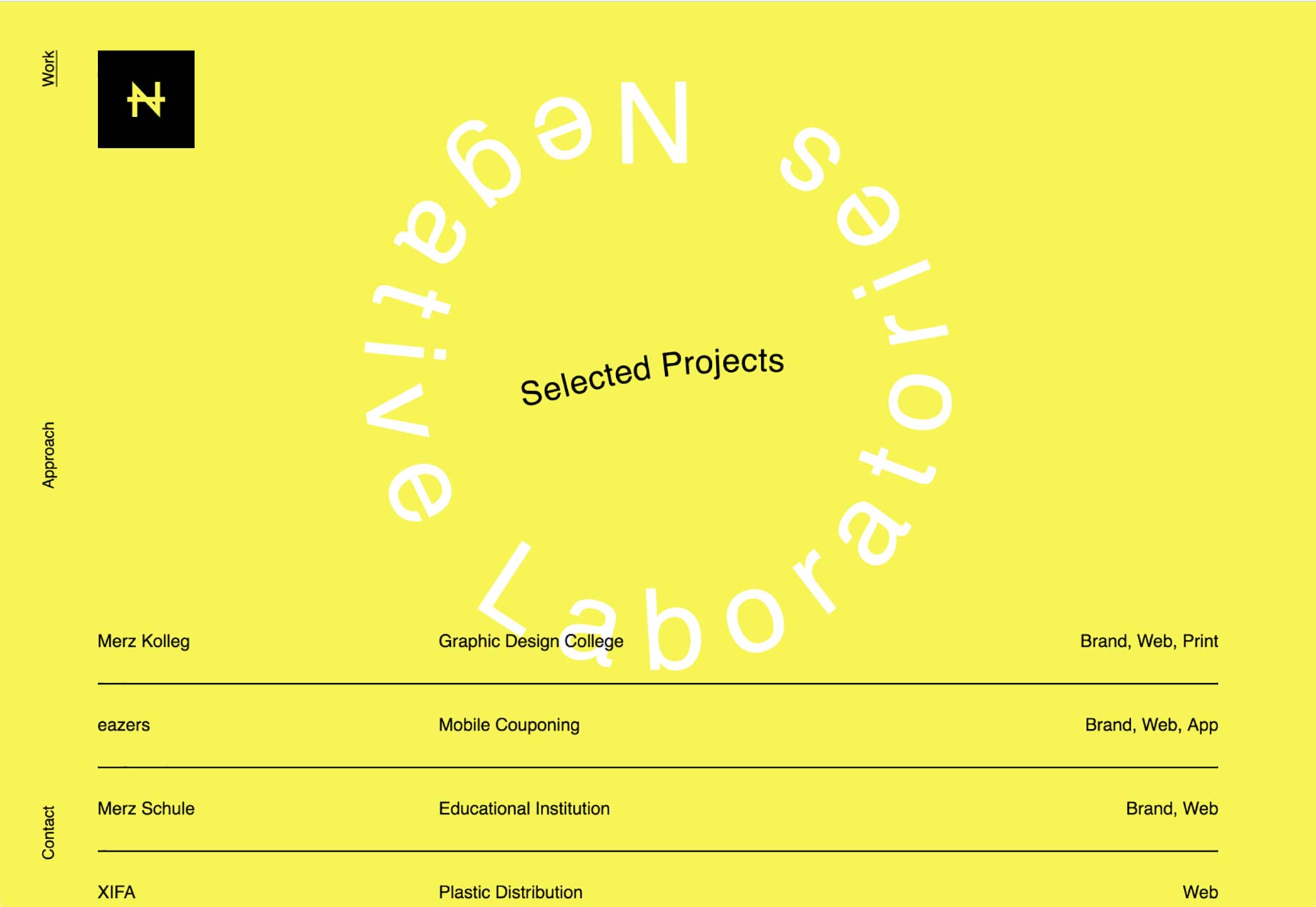
All Boats Rise
All Boats Rise has a fairly standard layout with decent typography, and a whole lot of personality. It’s one of the first sites I’ve seen in a while that uses this much blue, but doesn’t feel super corporate. That’s some good work.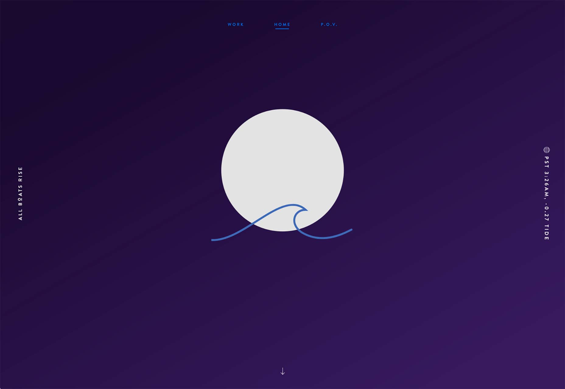
Flavien Guilbaud
Flavien Guilbaud’s portfolio is one more that’s mixing collage-style presentation and asymmetry with a distinctly professional aesthetic. This one has an even bigger focus on animation than others on the list, and it looks fantastic.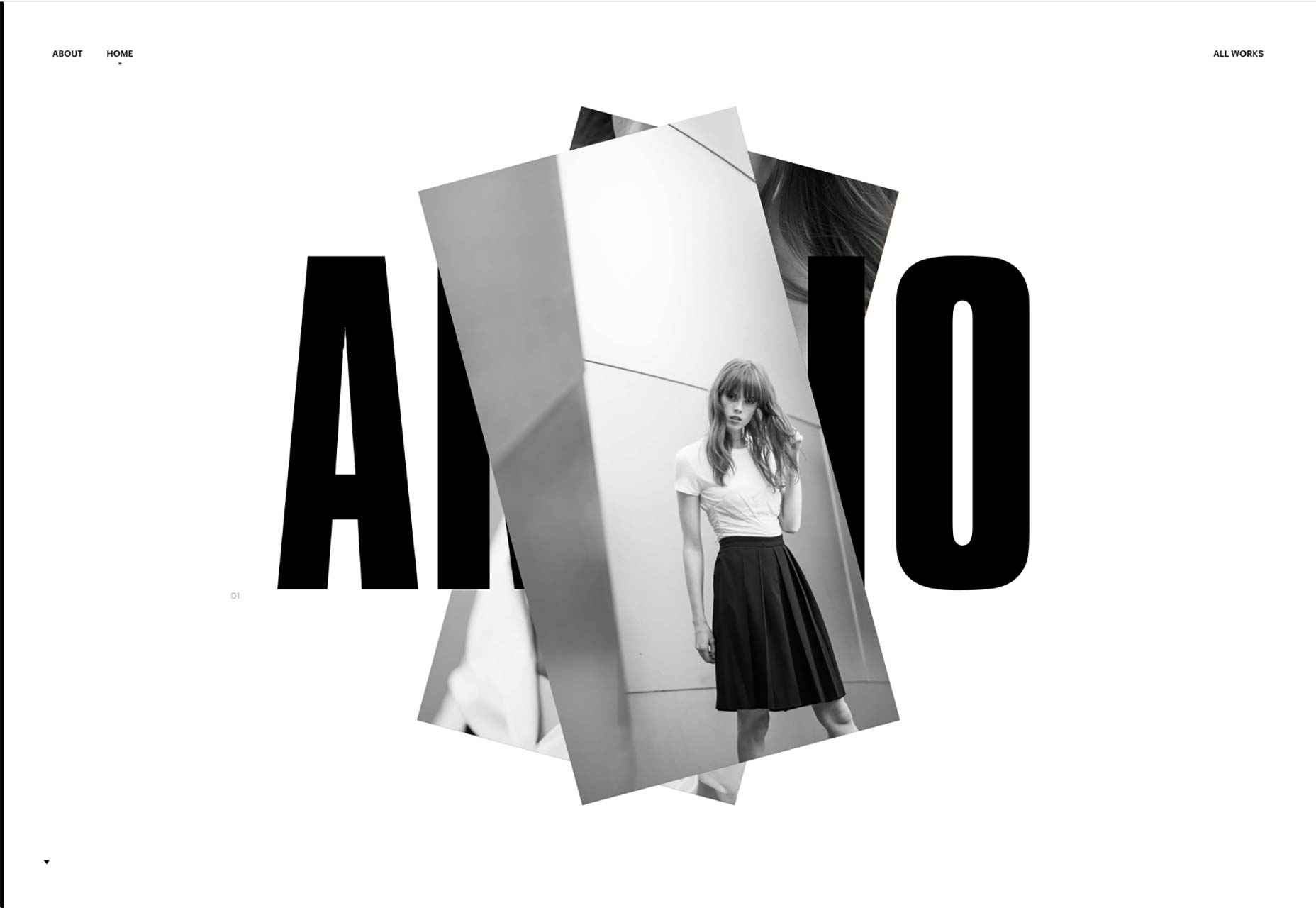
Standing By
Standing By mostly focuses on typography and imagery, with a somewhat... eclectic grid layout. This is classic minimalism at its finest. Sticking their portfolio navigation into a dropdown in the header is an interesting choice. Not sure every new user will get it at first, but it’s cool.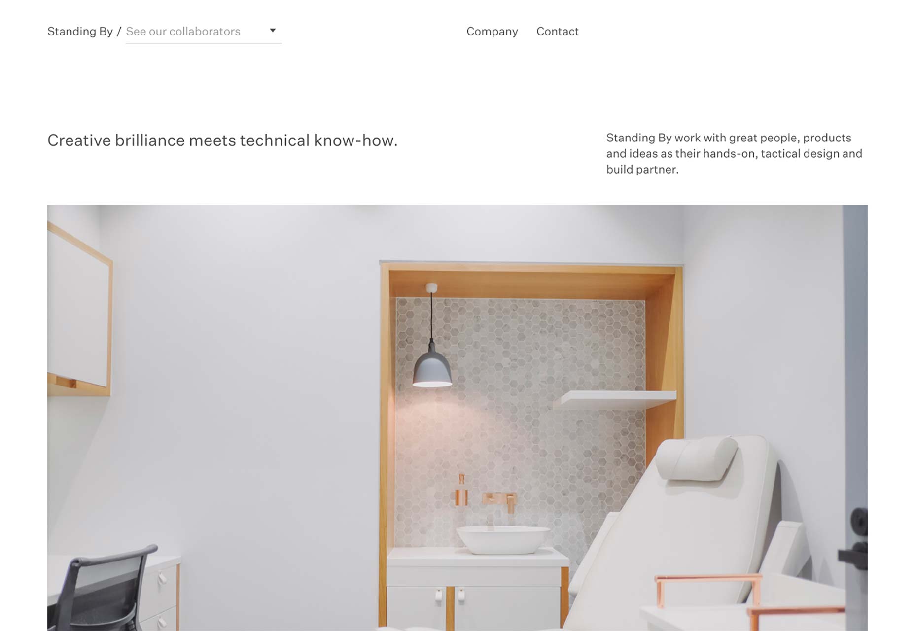
Amber Eve Anderson
In another example of that minimalism with lots of borders, Amber Eve Anderson spices up a classic aesthetic with larger fonts than we used back in the early ’00s, and some subtle background imagery. I quite like the way her work is organized by year.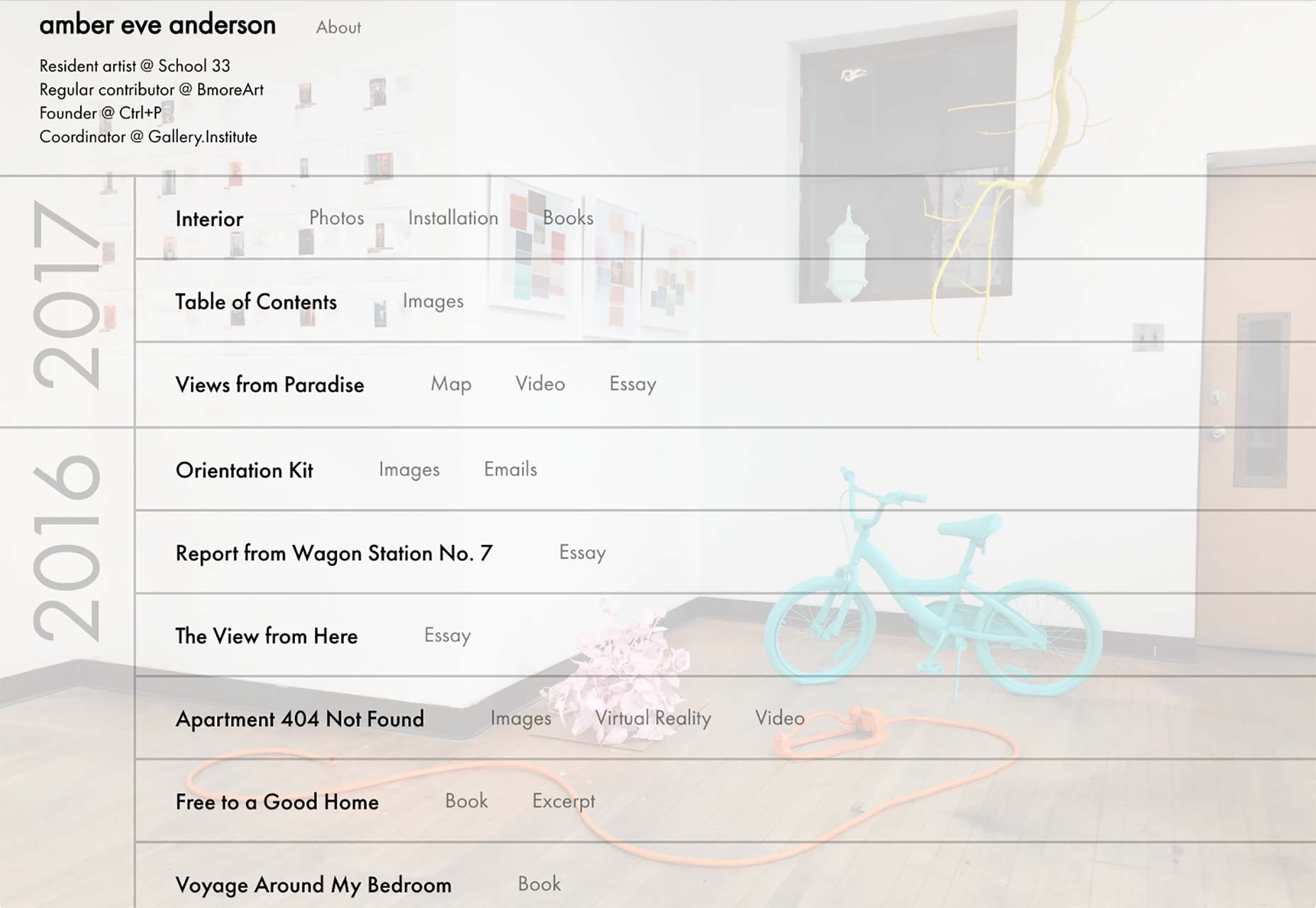
The Feebles
The Feebles’s portfolio site is modern, colorful, and stylish as can be. The make excellent use of animation, minimal asymmetry, and element overlap to make as site that feels as playful as their work, while remaining quite classy.
Hype Type Studio
Hype Type Studio embraces the grid, and that classic minimalism in the sense that it’s all black and white except for the images. Nothing exotic here, just good, clean design.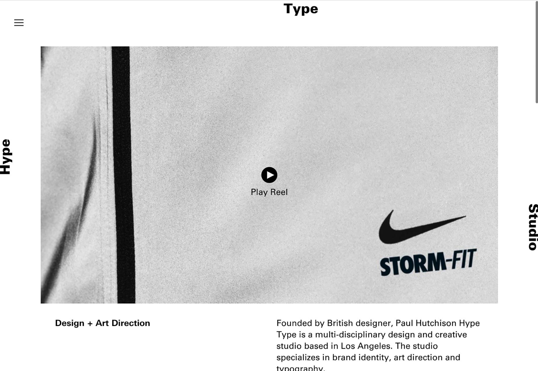
Laura Makabresku
Laura Makabresku’s photography portfolio is yet one more presentation style website. It puts the work front and center, and let’s you, the user, just get to work. Yet for all that, it’s a pleasure to browse through. It’s a textbook example of how to match a website’s aesthetic to the tone of its content.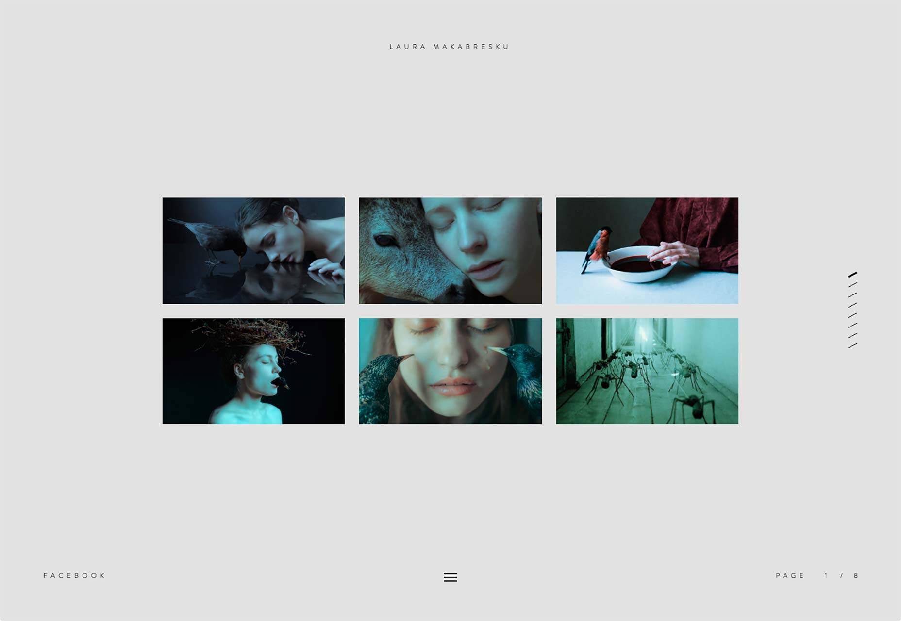
Any Studio
The single most interesting thing about Any Studio is their Tinder profile. Well, sort of. They show off ten of their projects on their home page in a little game that allows you to swipe left if you don’t like their work, or swipe right if you do. If you like most of their stuff, they suggest contacting them. If you don’t they suggest trying again. It’s an interesting approach, to be sure, and it might actually help them find the right clients for them. My only issue is that, other than the cursor, there is little indication that anything like this is going on until you start clicking and dragging, or swiping. There is a message while the whole thing loads, but people on fast Internet (or people who open a lot of tabs at once) may never see it.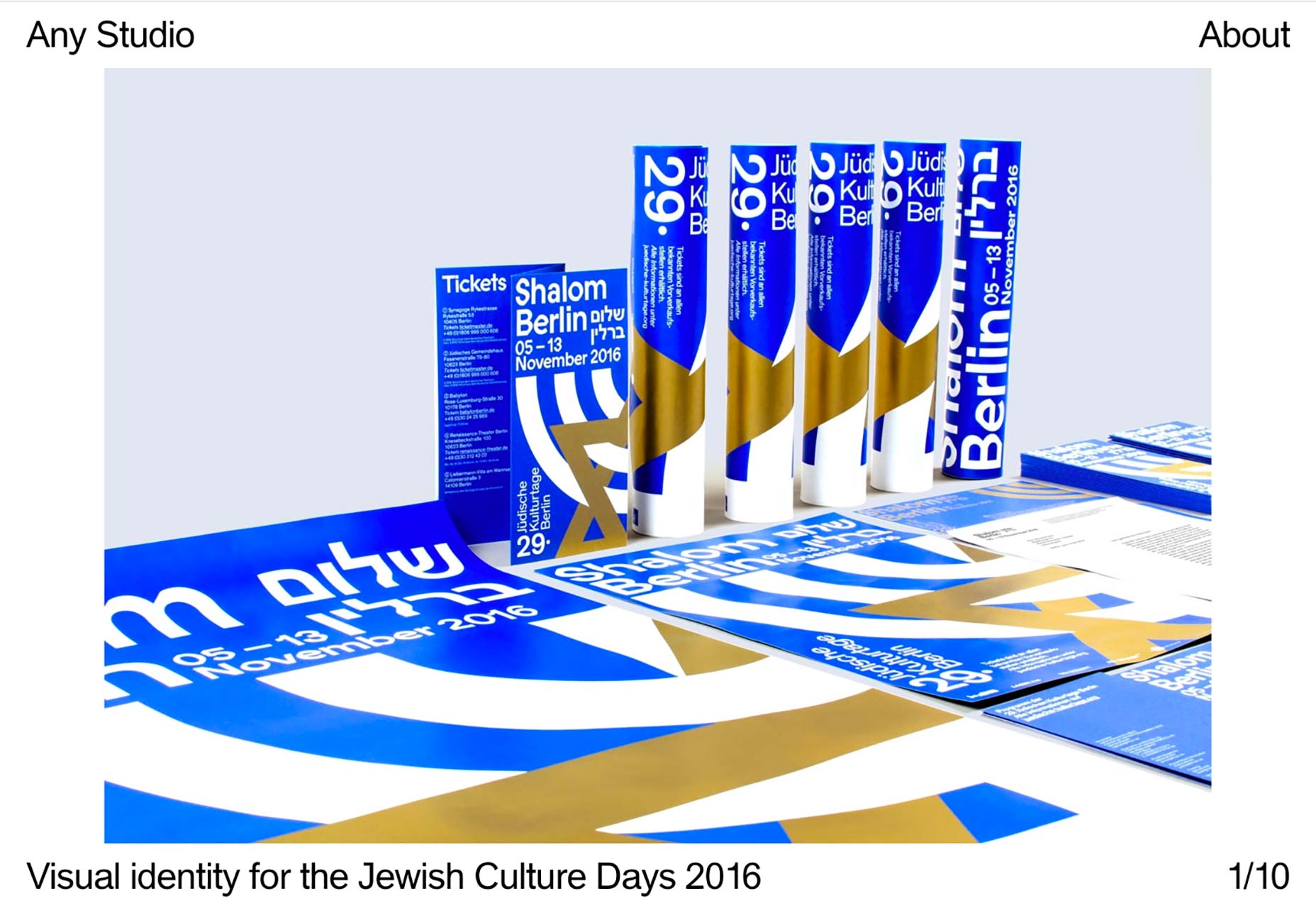
Type and Pixel
Type and Pixel present us with almost the perfect example of mixing post-minimalism and with a professional aesthetic. The layout is mostly simple, with hints of the collage style, while the graphics and colors lean to the wilder, artistic side of the spectrum. It’s all held together by simple but well-executed typography to create a site that spans the spectrum from chaos to classical minimalism.Neutron Creative
Neutron Creative brings us a design slightly reminiscent of brutalism. It’s got the monospaced typeface and the shades of grey. But it also with good typography, and the creative use of accent colors. Oh, and white space. If anything, the entire design is meant to present them as a company of nerds, from the logo to the type, and it does that while looking professional.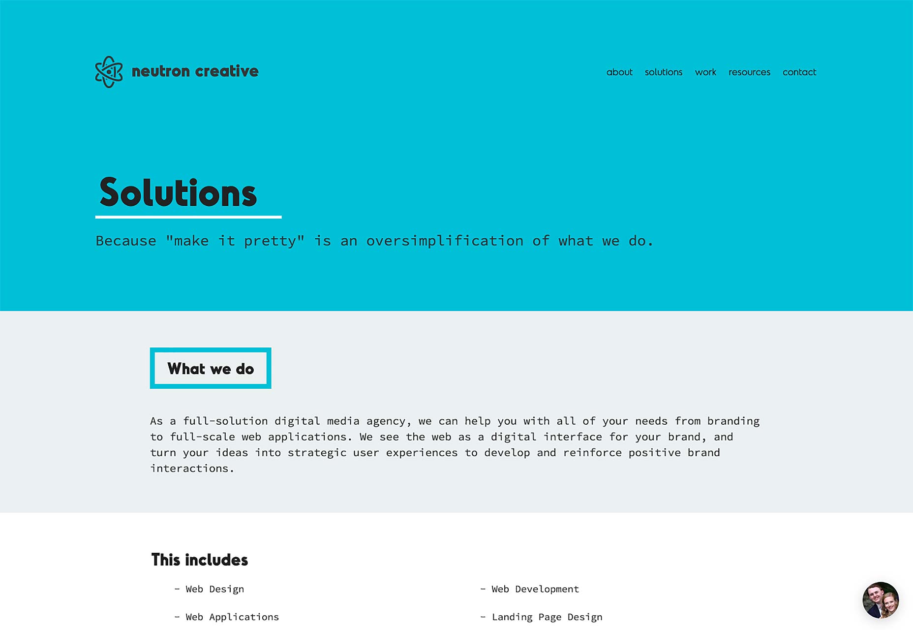
Tyron Hayman
Tyron Hayman’s portfolio is as simple as they come, but that works for him. It’s spiced up with some very subtle background video, some bright gradients, and decent typography. It;s nothing revolutionary, but it looks darned pretty. I only have one little issue. On the home page, the first words you see are these: "I am a minimalist. I believe in saying the most with the least." As I am often one to split hairs, I am compelled to point out that he should have just used the first sentence. The second detracts from the minimalism. He probably needed to put that in for people who are fuzzy on the concept of minimalism. But, you know, hairs. Splitting. Etc.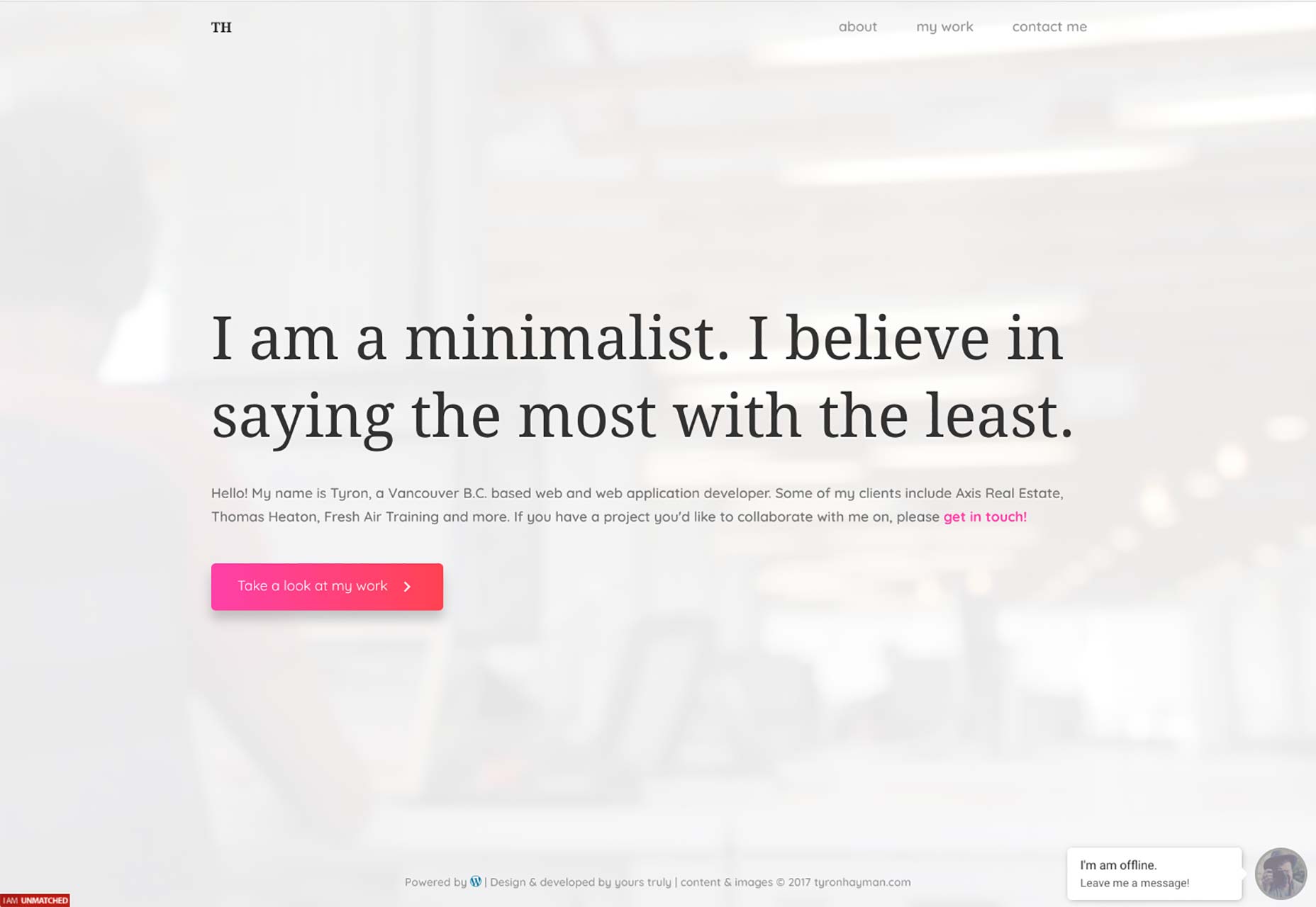
Activeoo Banners
Web agency Activeoo is trying something interesting by creating a separate portfolio for just one of their services. The service in question? HTML5 banner ads. The design is crisp, clean, and professional. It’s good. But... I’m actually not interested in the design so much as the strategy. Activeoo has obviously put a lot of work into developing this sub-site, and written a lot of content about one single service that they offer. This positions them as not just "an agency that does banner ads among other things", but as experts in banner ads. Conceivably, you could design a separate portfolio site for each service to paint that same picture to every potential customer, no matter which of your services they need. It’s a lot more effort, but it could work.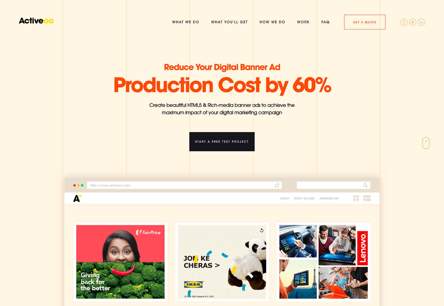
Ezequiel Bruni
Ezequiel Bruni is a web/UX designer, blogger, and aspiring photographer living in Mexico. When he’s not up to his finely-chiselled ears in wire-frames and front-end code, or ranting about the same, he indulges in beer, pizza, fantasy novels, and stand-up comedy.


Read Next

15 Best New Fonts, July 2024
Welcome to our monthly roundup of the best fonts we’ve found online in the last four weeks. This month, there are fewer…
By Ben Moss

20 Best New Websites, July 2024
Welcome to July’s round up of websites to inspire you. This month’s collection ranges from the most stripped-back…

Top 7 WordPress Plugins for 2024: Enhance Your Site's Performance
WordPress is a hands-down favorite of website designers and developers. Renowned for its flexibility and ease of use,…
By WDD Staff

Exciting New Tools for Designers, July 2024
Welcome to this July’s collection of tools, gathered from around the web over the past month. We hope you’ll find…

3 Essential Design Trends, July 2024
Add some summer sizzle to your design projects with trendy website elements. Learn what's trending and how to use these…

15 Best New Fonts, June 2024
Welcome to our roundup of the best new fonts we’ve found online in the last month. This month, there are notably fewer…
By Ben Moss

20 Best New Websites, June 2024
Arranging content in an easily accessible way is the backbone of any user-friendly website. A good website will present…

Exciting New Tools for Designers, June 2024
In this month’s roundup of the best tools for web designers and developers, we’ll explore a range of new and noteworthy…

3 Essential Design Trends, June 2024
Summer is off to a fun start with some highly dramatic website design trends showing up in projects. Let's dive in!

15 Best New Fonts, May 2024
In this month’s edition, there are lots of historically-inspired typefaces, more of the growing trend for French…
By Ben Moss

How to Reduce The Carbon Footprint of Your Website
On average, a web page produces 4.61 grams of CO2 for every page view; for whole sites, that amounts to hundreds of KG…
By Simon Sterne

20 Best New Websites, May 2024
Welcome to May’s compilation of the best sites on the web. This month we’re focused on color for younger humans,…