

1. Downpage Navigation
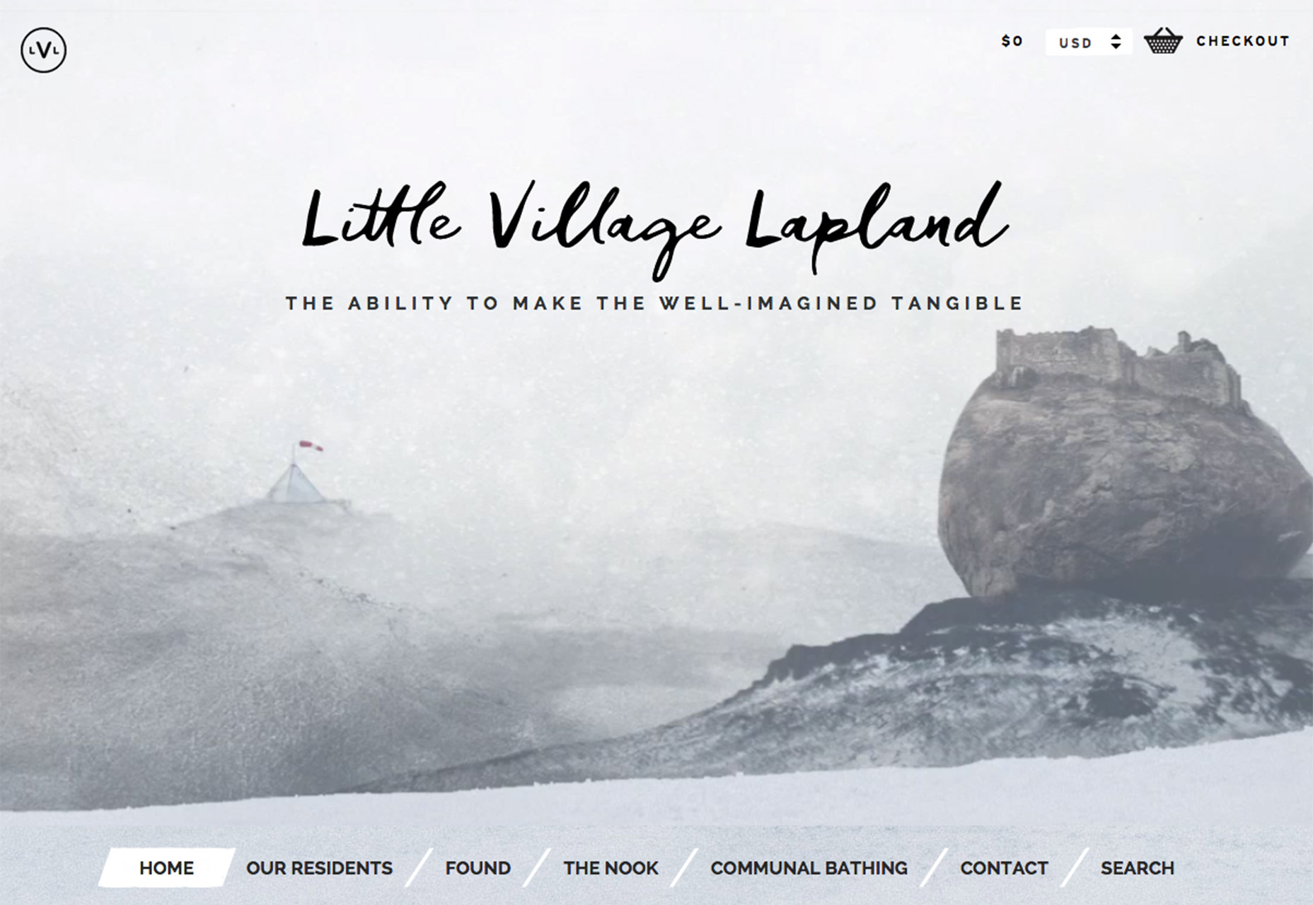
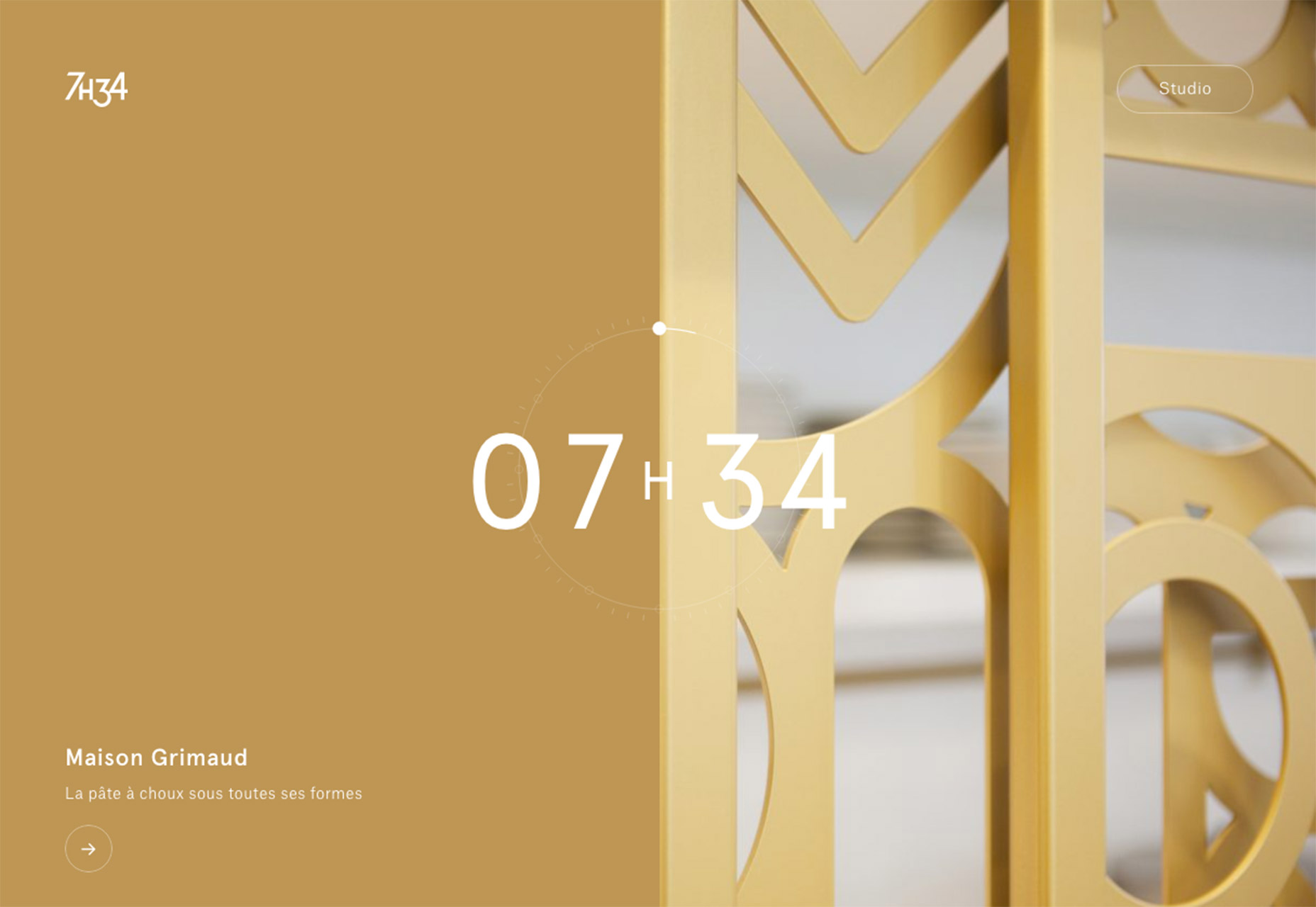
Designers seem to be in quite the experimental phase when it comes to navigation these days. From vertical, side navigation options to pop-out styles to downpage styles, menu items are kind of all over the place. While downpage navigation used to be a distinct no-no, it can grow on you. And as more designers opt for this user pattern, it will become more generally accepted. Here’s a word of caution: If you opt for downpage navigation, keep a close eye on website analytics to ensure that your visitors understand the pattern and are continuing to click. This technique might not work for all audiences. So how do you make it work?- The best downpage navigation styles are applied to simple, designs. A homepage without a scroll and only a handful of pages is best.
- Downpage navigation elements need to be on the large side, so that users don’t overlook them.
- Sticky elements are necessary if the page has a longer scroll.
- Consider downpage navigation on the homepage for a fresh alternative, but return to a more traditional pattern on interior pages.
- Use it with a minimal framework. Downpage navigation can get lost easily in a design that’s complex or has a lot of elements competing for a user’s attention.
- Include an “extra” design element to push users toward navigation. This could include anything from a bold color choice to a directional visual that helps guide the eye toward navigation in a nontraditional location.
2. Boxes as Design Elements
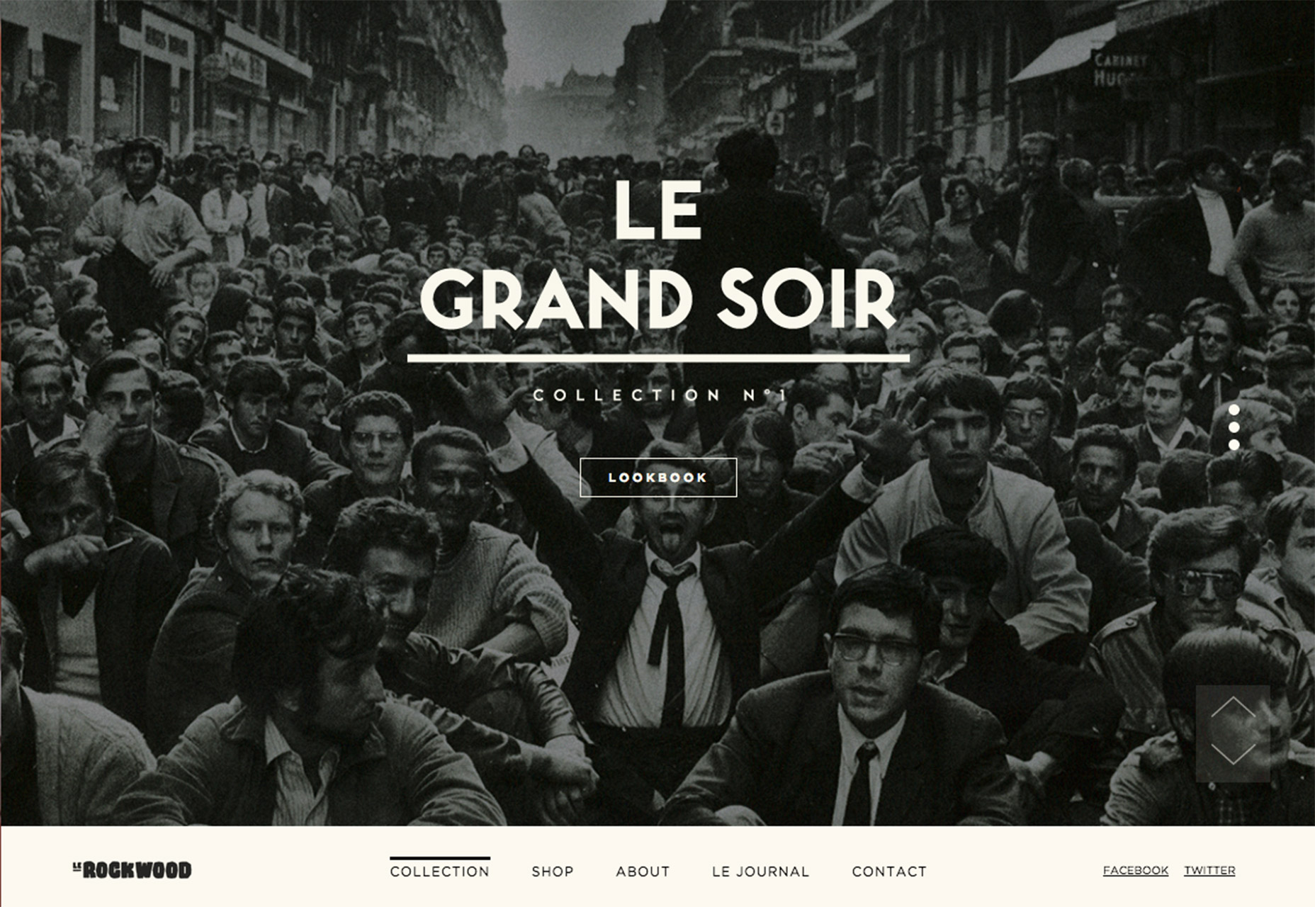
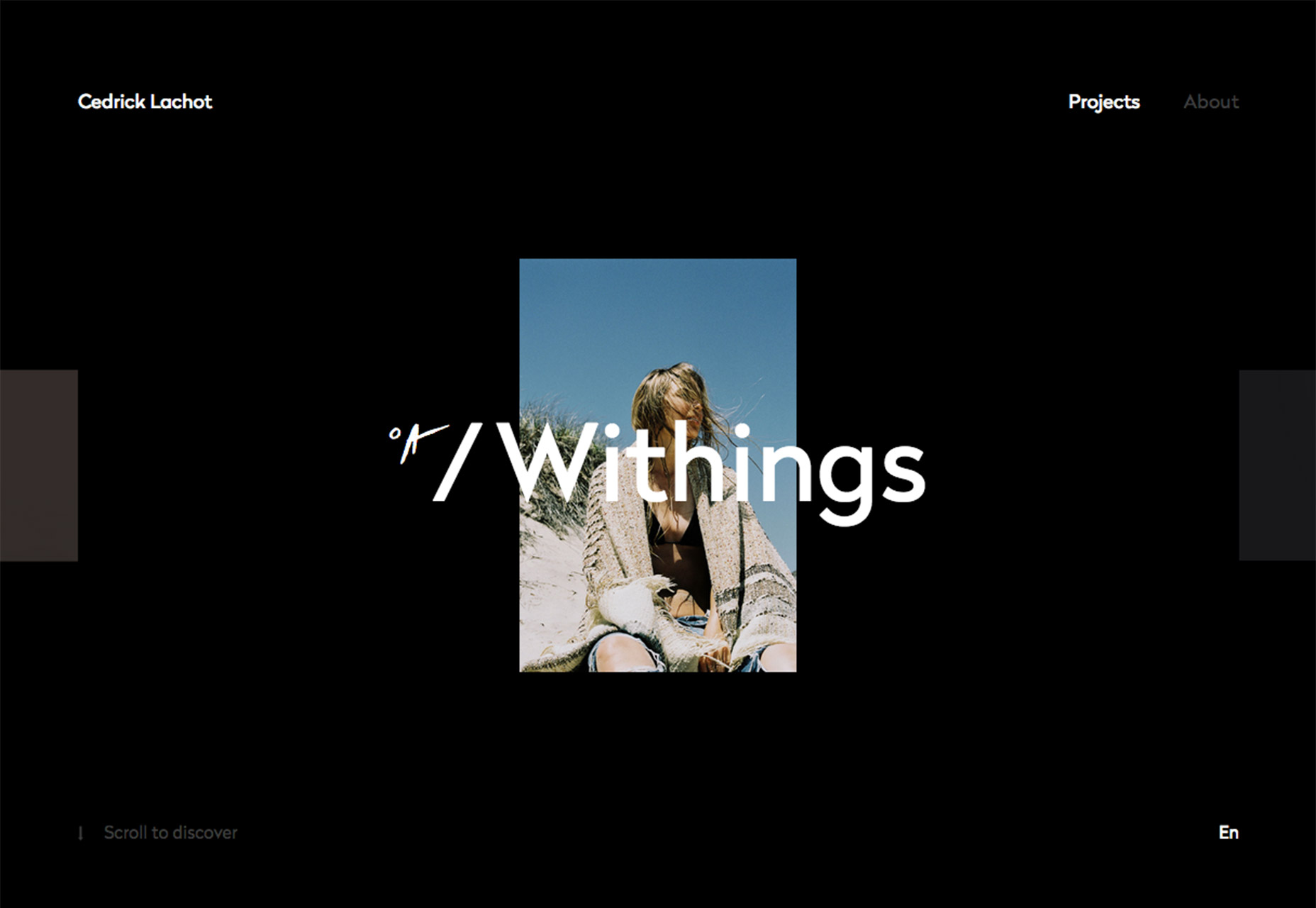
This might be one of the most striking and versatile trends of 2017—boxed elements for pure aesthetic purposes. Boxes are a great container—as we’ve seen from the card trend—but designers are working with boxes to highlight content, show off images and draw the eye to a certain part of the canvas. And it works beautifully. The nice thing about this trend is that it is so versatile. You don’t have to rethink an entire design to use boxed elements. They can serve as pure visuals or link to other content. A box can contain almost anything, from a great image to a call to action. Some tips for making the most out of a boxed design element include:- Use a box to create depth or focus, such as Cedrick Lachot, below. The photo on the black background is simple, and the white text on top adds emphasis to the rectangular shape and other clickable boxes on the homepage and throughout the design.
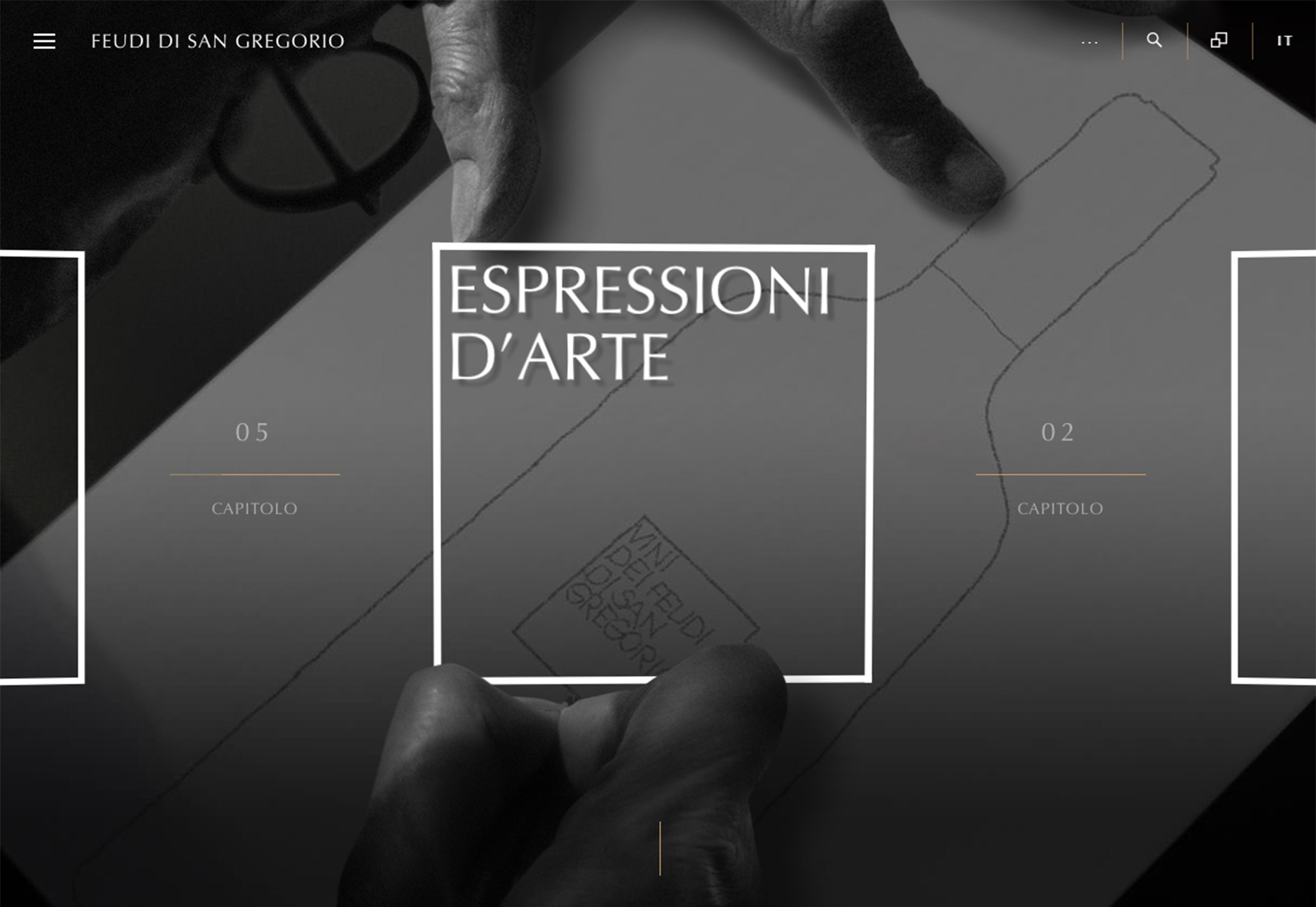
- Use a box to layer elements. Feudi Di San Gregorio, below, uses a box to draw the eye to a very specific part of the content with a layering technique that make it feel like part of the image. Look closely at the hands in relationship to the box. This same concept is used for multiple images in the horizontal scroller and adds an extra layer of beautiful complexity to the simple design.
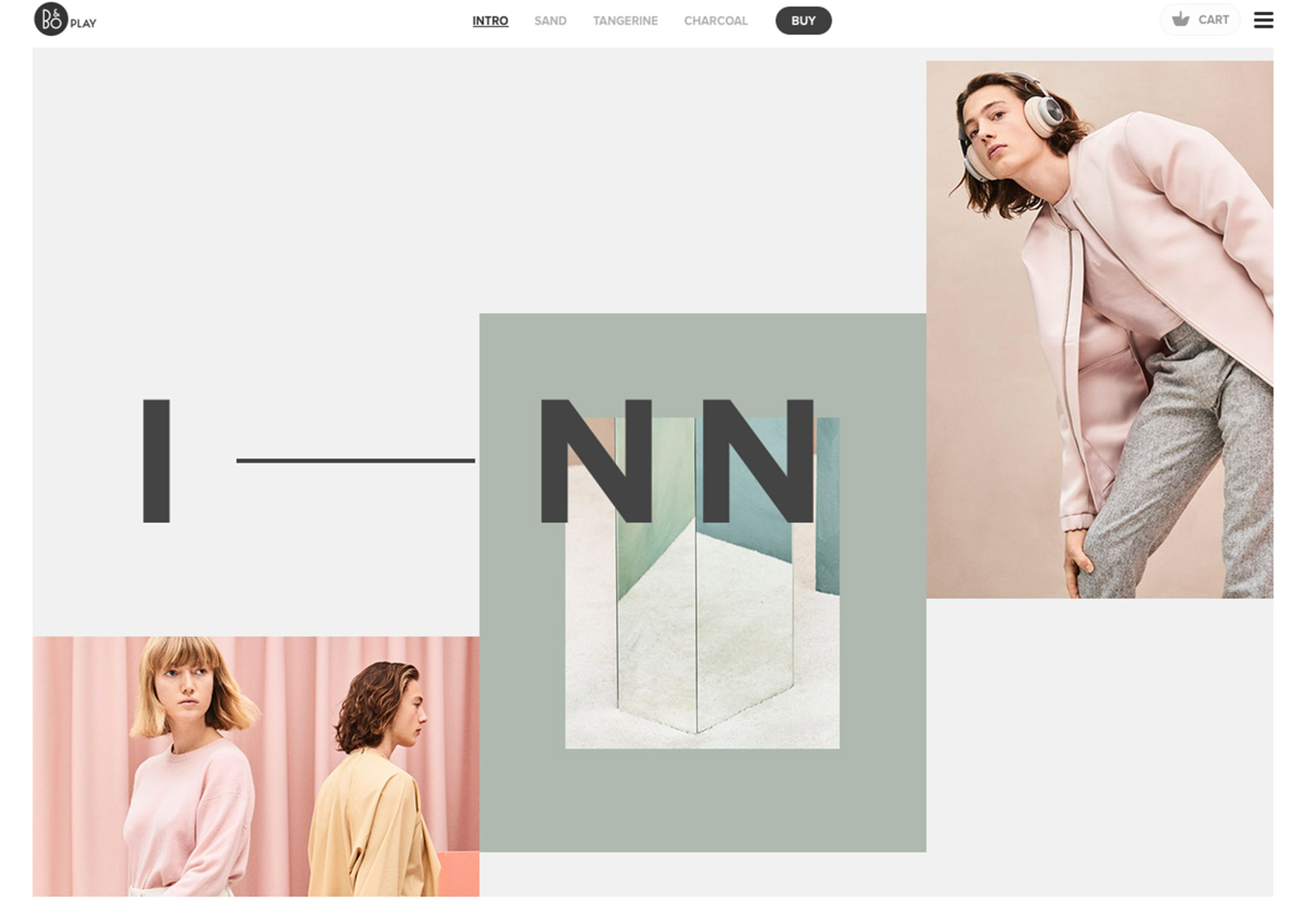
- Use a box to create flow. Beoplay, below, uses stacked boxes with images to create a path through the design. Each box animates from a number of smaller boxes to engage the user and encourage scrolling.
- Use a box to create an actionable element, such as a pop-up call to action, on top of the design.
- Use boxes to create a design with cards in the Material Design style. While this trend has been around for a little while, it is still a popular option, particularly for mobile-based designs.
3. Vertical Lines
You don’t always think about the web as a vertical space, but more designers are incorporating very vertical elements into designs. From skinny lines to establish flow to photos with distinct up and down elements, vertical elements can help direct users through a design, encourage scrolling and even focus attention on certain elements. As an added bonus, vertical elements are visually interesting simple because they aren’t as common as horizontal, square or circular elements. Some of the desire to think more vertically might start in your hands. While most desktop websites live in the standard 16:9 space, access to websites on phones and tablets is often turned on the side with a more vertical orientation. (In the case of many mobile phones, this orientation is distinctly vertical.) That makes vertical accents and user patterns more common and more accepted for website visitors. They won’t balk at the design or wonder how to interact with it. Vertical orientation is quite mainstream. There are plenty of ways to incorporate a vertical feeling to a design.- Try a background with subtle vertical lines to create texture.
- Create a collage of images with vertical shapes.
- Use vertical lines over the main image to establish depth between layers of elements, such as photos or videos and text.
- Use vertically animated sweep to separate elements in an image slider.
- Plan imagery with a vertical focus.
- Consider a split-screen design so that each side has a more vertically-oriented aspect ratio.
- Use a background pattern of small objects in a vertical alignment.
- Stack icons or elements rather than space them across the screen.
Conclusion
Any time you consider using a trend in a design project, there’s an element of risk involved. How long will the trend be popular? Will it make the design look dated? Rather than opting for full-scale trendy website options, consider a trendy element such as those above. These elements can be easier to incorporate into the design (and just as easy to remove if you don’t like them later). The trick to maintaining a modern style is in the details; it doesn’t require a brand new design every six months. What trends are you loving (or hating) right now? I’d love to see some of the websites that you are fascinated with. Drop me a link on Twitter; I’d love to hear from you.Carrie Cousins
Carrie Cousins is a freelance writer with more than 10 years of experience in the communications industry, including writing for print and online publications, and design and editing. You can connect with Carrie on Twitter @carriecousins.


Read Next

15 Best New Fonts, July 2024
Welcome to our monthly roundup of the best fonts we’ve found online in the last four weeks. This month, there are fewer…
By Ben Moss

20 Best New Websites, July 2024
Welcome to July’s round up of websites to inspire you. This month’s collection ranges from the most stripped-back…

Top 7 WordPress Plugins for 2024: Enhance Your Site's Performance
WordPress is a hands-down favorite of website designers and developers. Renowned for its flexibility and ease of use,…
By WDD Staff

Exciting New Tools for Designers, July 2024
Welcome to this July’s collection of tools, gathered from around the web over the past month. We hope you’ll find…

3 Essential Design Trends, July 2024
Add some summer sizzle to your design projects with trendy website elements. Learn what's trending and how to use these…

15 Best New Fonts, June 2024
Welcome to our roundup of the best new fonts we’ve found online in the last month. This month, there are notably fewer…
By Ben Moss

20 Best New Websites, June 2024
Arranging content in an easily accessible way is the backbone of any user-friendly website. A good website will present…

Exciting New Tools for Designers, June 2024
In this month’s roundup of the best tools for web designers and developers, we’ll explore a range of new and noteworthy…

3 Essential Design Trends, June 2024
Summer is off to a fun start with some highly dramatic website design trends showing up in projects. Let's dive in!

15 Best New Fonts, May 2024
In this month’s edition, there are lots of historically-inspired typefaces, more of the growing trend for French…
By Ben Moss

How to Reduce The Carbon Footprint of Your Website
On average, a web page produces 4.61 grams of CO2 for every page view; for whole sites, that amounts to hundreds of KG…
By Simon Sterne

20 Best New Websites, May 2024
Welcome to May’s compilation of the best sites on the web. This month we’re focused on color for younger humans,…