

1. Popups
I know you’re with me on this one. You click a link to open up a web page and half way through reading the content you’re abruptly interrupted by a huge overlay begging for your email address. I understand they think they have a pretty good newsletter going that I would probably enjoy, that’s why I clicked on their link, but they will never make new friends by shouting down their throats. Instead allow users to read content and get acquainted before asking for anything. Give them the chance to decide on their own instead of forcing it on them. This could either be a subtle pop-out after reading the page, or a popup modal before the user clicks off the page.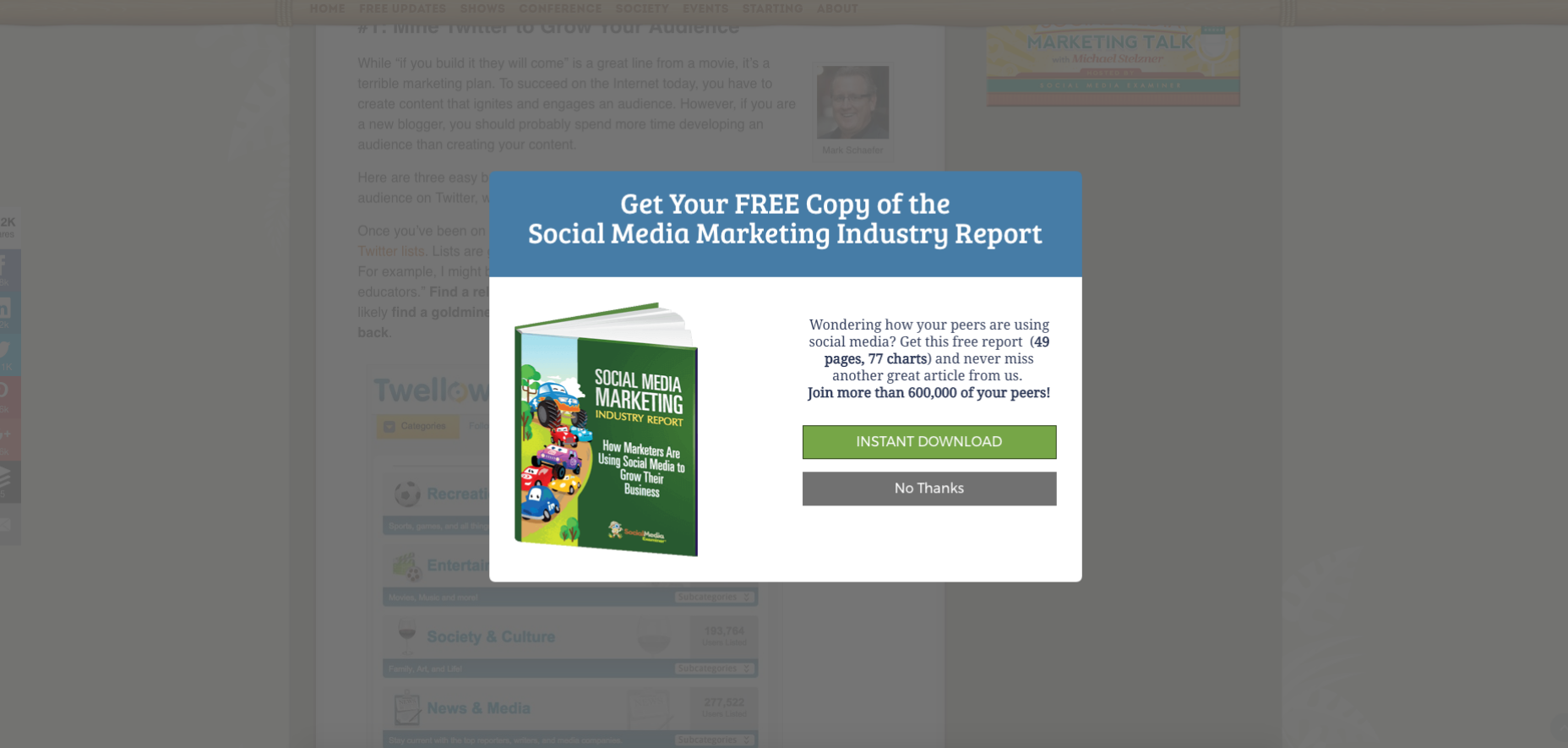
2. Social Integration
Sharing is awesome. Especially for your business as it’s the most cost effective way to get customers to your website. Social widgets on the other hand should be used sparingly. Why spend hours of your time producing a great piece of content only to distort it with eager social buttons. Sharing on social media should be an organic experience, not a forced one. A user will want to share your content more if they are not patronised into it, so limit your widgets and consider using a pleasant message at the end of the content asking them to give it a quick tweet if they enjoy your work.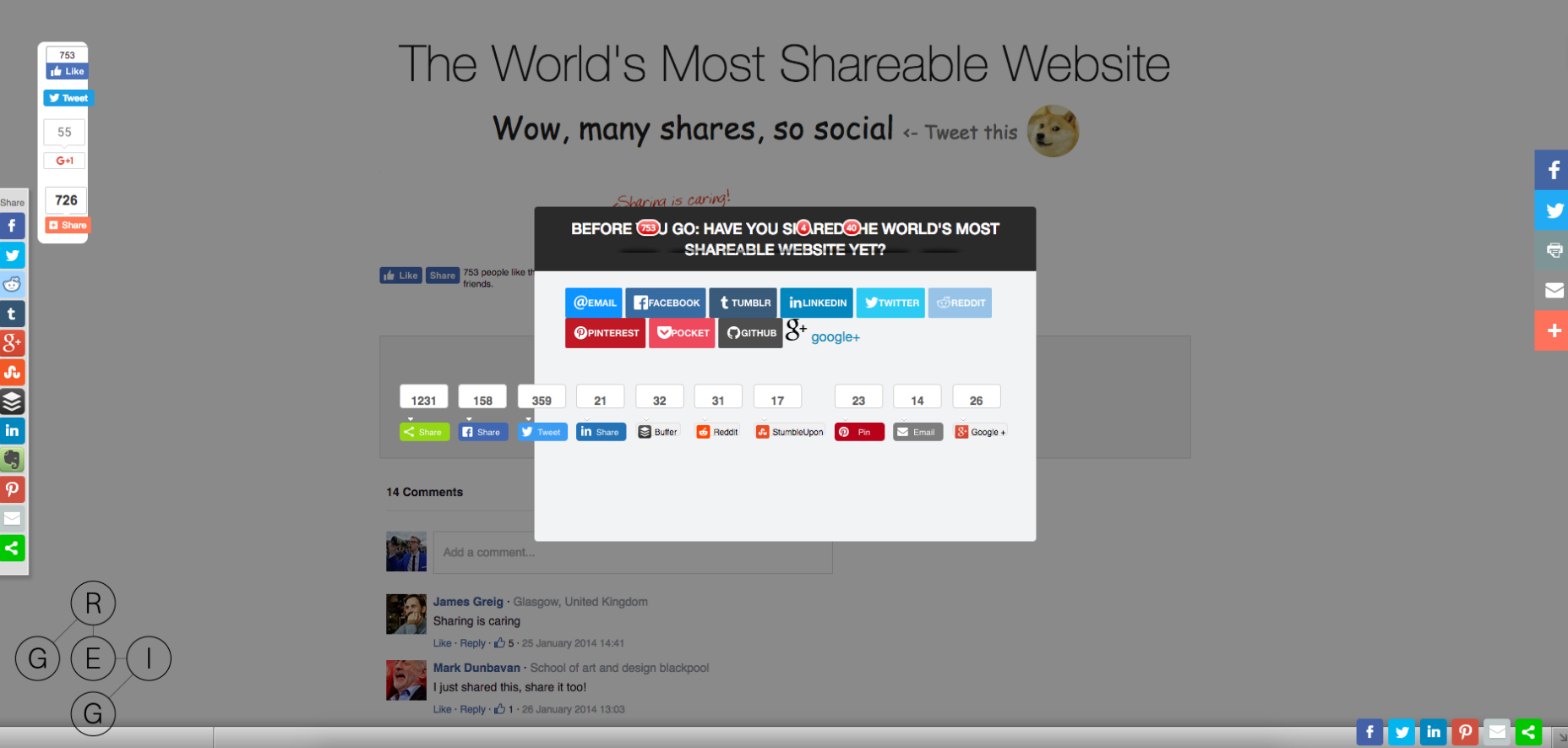
3. Page Preloaders
As technology progresses our generation gets more impatient and in 2017 we shouldn’t have to watch a spinner load a 2MB website. I know this might just be a fancy trend, and I’m sure 80% of them weren’t actually loading anything but used aesthetically, but speed should be a priority when building a web application. If you are having speed issues, load in the lighter elements of the page first—like the navigation—and use a loader for the heavier content, instead of leaving the user on a blank screen staring at a cute animation. This way the user doesn’t feel like you’ve stood them up on a date, and that you are still there.
4. Mega Menus
Mega menus may seem like a good solution for a website that has many pages and sections, but it’s not. The problem being is that they create a maze-like experience for the user as they try to find their desired page. It forces the burden of navigation to the user and they will quickly get frustrated or bored. If you don’t want your site’s navigation to resemble a game of Where’s Waldo, you can split up the different links into sections. You could also swap out some of the text links for imagery to make it less mundane. Lastly, for the sake of all humanity, please stay well away from hover activated dropdowns.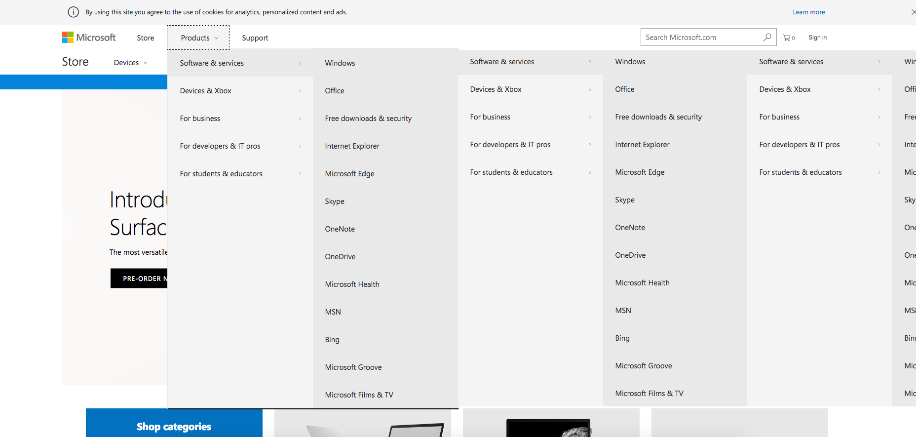
5. Infinite Scrolling
While infinite scrolling solved retention issues for us, it created more problems than it fixed. If you need to reach an important page that’s located in the site’s footer and the site has auto infinite scrolling activated, it is a lost cause. Another problem being when you have been scrolling for a while and visit another page. Time to go back and carry on from where you left off? Not a chance. Just like mega menus, infinite scrolling has great potential if implemented correctly. Blend the pattern with traditional pagination and allow the user to choose to continue scrolling with an action. This will help keep your footer accessible. In order to fix the issue of users losing where they were up to, have the URL change whenever the page loads up another section.
Wrapping Up
A quick disclaimer to bear in mind is that although I’ve mentioned that the above UX patterns are insanely annoying, that doesn’t mean that you should avoid them like the plague. While they are not the best option, some of them might work for your website depending on your requirements. However, try empathising with your users and think before you employ any of these patterns.Nick Hiley
Nick Hiley is a digital designer and frontend developer from the UK. You can view his work at nickhiley.com or reach out on Twitter @nickhiley


Read Next

15 Best New Fonts, July 2024
Welcome to our monthly roundup of the best fonts we’ve found online in the last four weeks. This month, there are fewer…
By Ben Moss

20 Best New Websites, July 2024
Welcome to July’s round up of websites to inspire you. This month’s collection ranges from the most stripped-back…

Top 7 WordPress Plugins for 2024: Enhance Your Site's Performance
WordPress is a hands-down favorite of website designers and developers. Renowned for its flexibility and ease of use,…
By WDD Staff

Exciting New Tools for Designers, July 2024
Welcome to this July’s collection of tools, gathered from around the web over the past month. We hope you’ll find…

3 Essential Design Trends, July 2024
Add some summer sizzle to your design projects with trendy website elements. Learn what's trending and how to use these…

15 Best New Fonts, June 2024
Welcome to our roundup of the best new fonts we’ve found online in the last month. This month, there are notably fewer…
By Ben Moss

20 Best New Websites, June 2024
Arranging content in an easily accessible way is the backbone of any user-friendly website. A good website will present…

Exciting New Tools for Designers, June 2024
In this month’s roundup of the best tools for web designers and developers, we’ll explore a range of new and noteworthy…

3 Essential Design Trends, June 2024
Summer is off to a fun start with some highly dramatic website design trends showing up in projects. Let's dive in!

15 Best New Fonts, May 2024
In this month’s edition, there are lots of historically-inspired typefaces, more of the growing trend for French…
By Ben Moss

How to Reduce The Carbon Footprint of Your Website
On average, a web page produces 4.61 grams of CO2 for every page view; for whole sites, that amounts to hundreds of KG…
By Simon Sterne

20 Best New Websites, May 2024
Welcome to May’s compilation of the best sites on the web. This month we’re focused on color for younger humans,…