

1. Wayfair
Wayfair’s website does a lot right and their entire UX is phenomenal page to page. One thing I really like is their breadcrumb style because it’s not too large, yet also not too small and not obtrusive either. You’ll find these crumbs on product pages and category pages so they follow you around the whole site. This lets you jump a category or two from any detailed page. And the breadcrumb bar gets its own little section under the navigation with a different BG color. Not obtrusive but not hard to find either. A great design style and one of my personal favorites.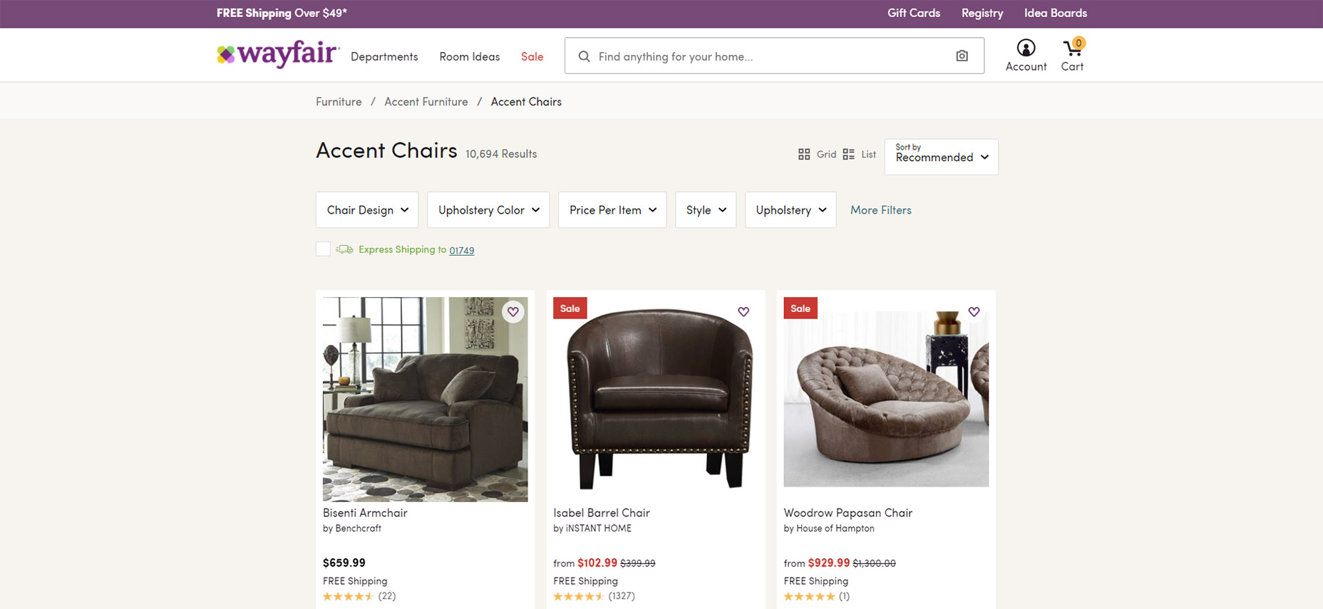
2. Google Support
Another obvious mention is Google since they’re known for incredible UX work. You’ll find breadcrumbs on most Google products with tiered pages and one of the best is the Google Support site. Their support pages offer advice on everything from schema to analytics and the Search Console tool. Each page has breadcrumbs and these crumbs occupy a similar space as the page heading so they’re clearly visible. Again notice how these links blend in nicely without jumping off the page. They feel very natural in the design and this should always be the goal with your breadcrumbs.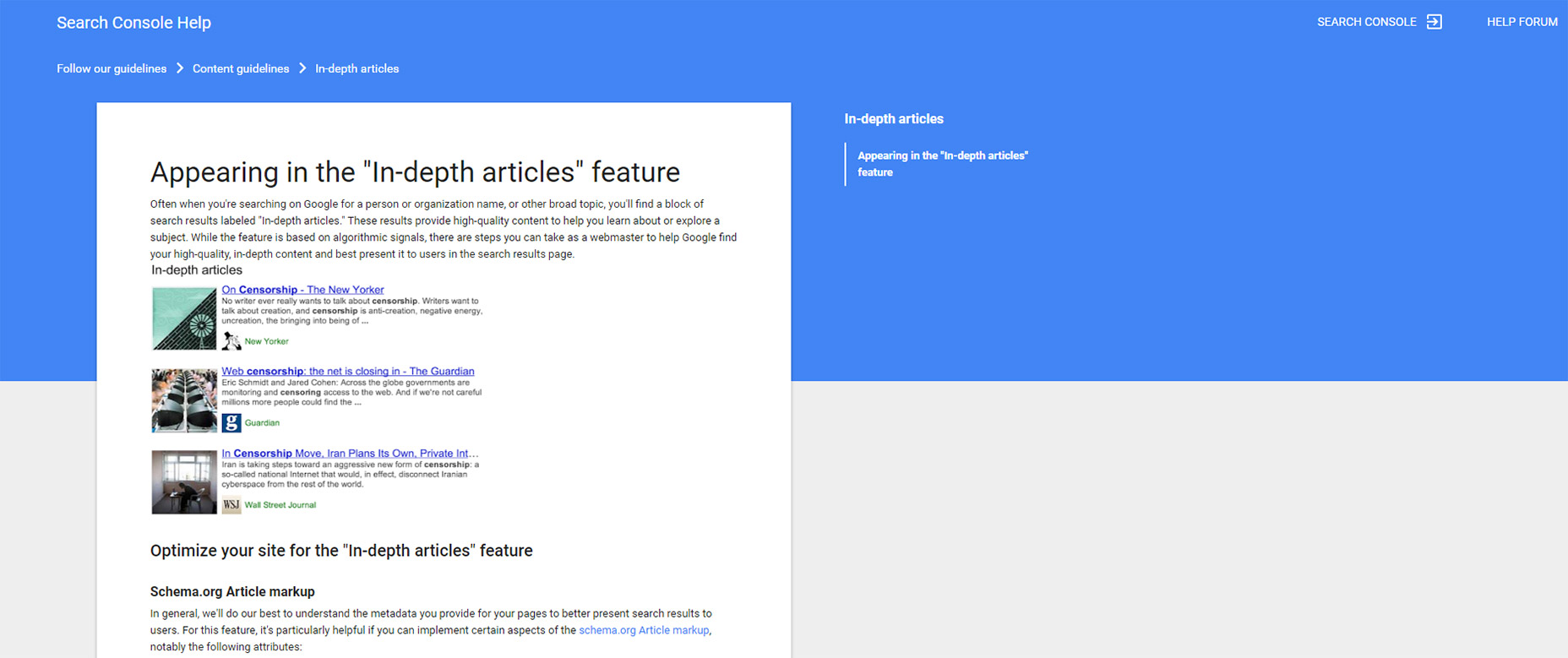
3. MSDN Docs
There’s a real unique breadcrumb feature in the MSDN Docs that I really like. It has all the typical design features like arrow icons and categorical links, but the final link in the chain has a custom dropdown with extra pages. I’ve never seen this before on any breadcrumb design but it’s incredibly valuable to the user. Typically it’d require another navigation menu to access these links but with a site like Microsoft there are so many pages to go through. Not to mention documentation can be rather complex so it’s not the easiest stuff to create breadcrumbs for. This technique is brilliant and well worth using if you have a complex hierarchy on your site.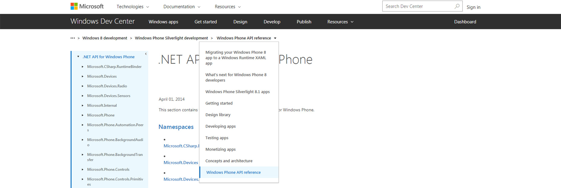
4. Apple
On the Apple website I’ve seen tons of breadcrumbs across many pages like the online shop pages and product pages. But one minor detail that caught my eye is the footer link area with a small breadcrumb above their bottom links. Apple is a huge company with a lot of pages and resources. This breadcrumb would be worth adding towards the top of the page too but it certainly doesn’t hurt to being near the bottom. I’d encourage designers to try this out and see how it works. Footer breadcrumbs certainly aren’t the norm but they do help with visual navigation.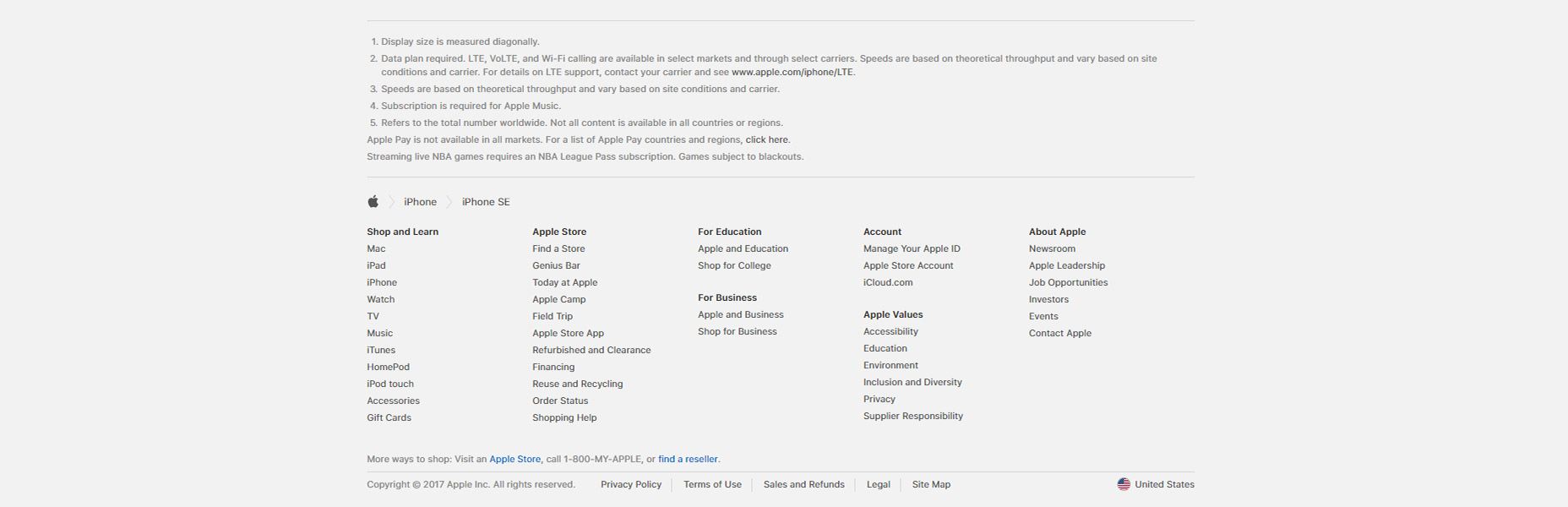
5. TechRadar
The majority of breadcrumbs that I find are usually on company sites or ecommerce shops. But blogs often have their own breadcrumbs too and one good example is the TechRadar article page. Each breadcrumb is pretty small featuring a link directly to the head category & a copy of the article’s title. For this type of blog it’s tough to justify breadcrumbs because there isn’t much of a hierarchy. But this works well if you don’t have another place to add the article’s category onto the page.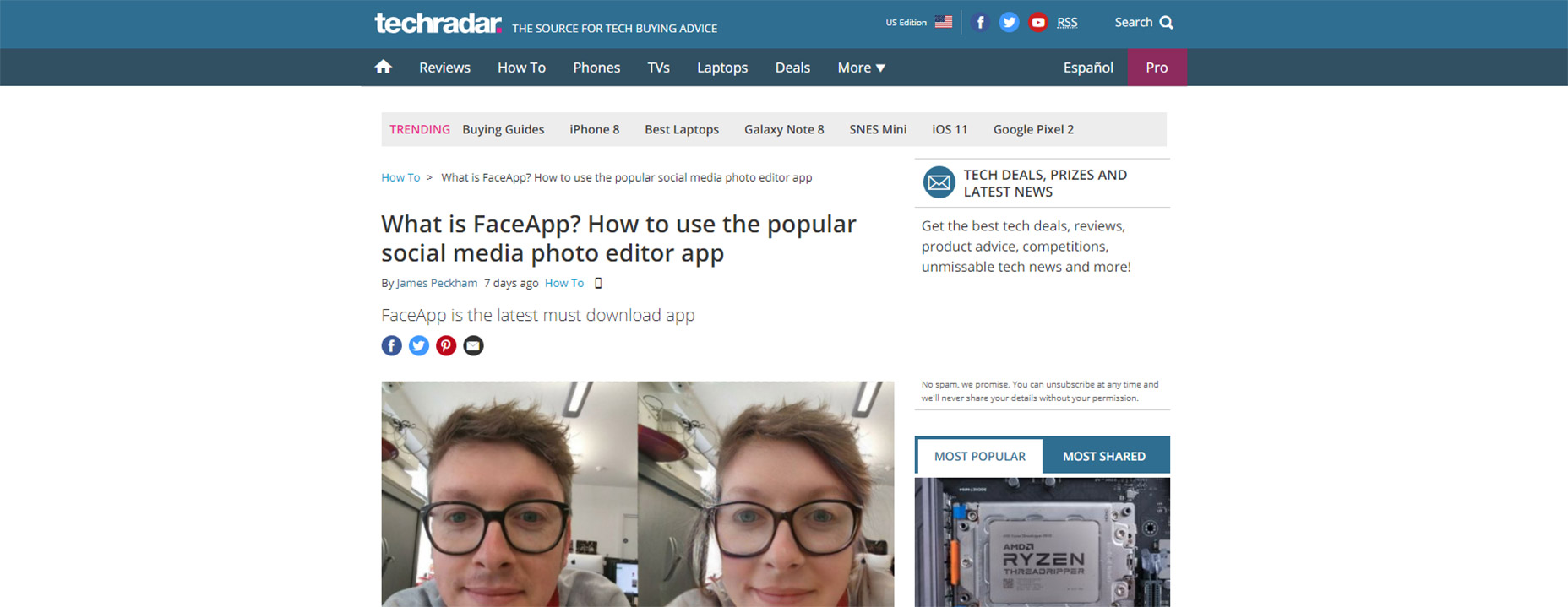
6. TutsPlus
For a much more detailed breadcrumb design check out the TutsPlus blog. Each article features a small breadcrumb at the very top of the page including the primary and secondary categories. I like this design a lot because it blends naturally into the headline of the page. So instead of duplicating the headline in a breadcrumb and in a heading tag, this combines it all into one element so the <h1> heading is part of the breadcrumb. Note this doesn’t use proper Google schema so it doesn’t appear with breadcrumbs in search. But considering that barely affects CTR I value the design and on-page usability far more than SEO benefits (or lack thereof).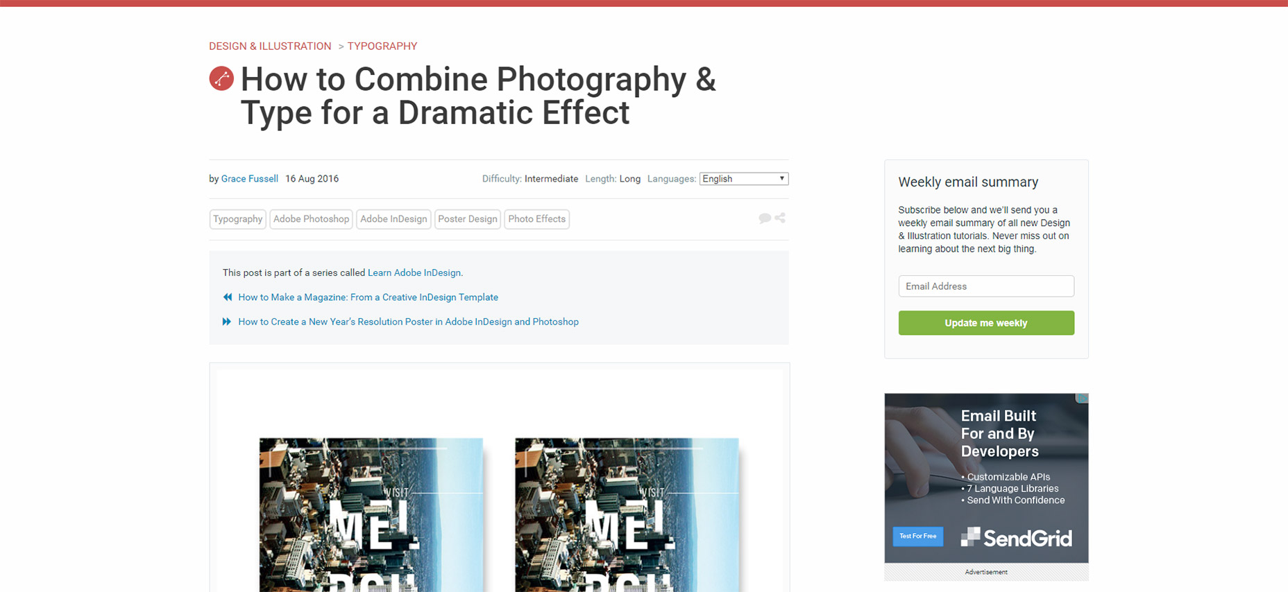
7. Coolspotters
Traditional breadcrumbs usually stick with a few text symbols like the forward slash or the right arrow bracket (>). These work because they’ve been used for decades and users are familiar with them. But I always like to see other breadcrumb design trends like on Coolspotters. They use custom breadcrumb links that have arrows built into the link elements. You can find plenty of open source breadcrumb styles just like these for your own site. It’s a great way to jazz up this very traditional page element.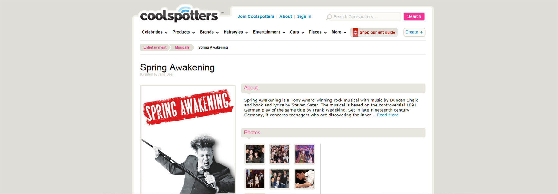
8. MarketWatch
Getting back to basics is the online news site MarketWatch. All of their internal posts feature breadcrumb navs with right pointing arrow icons fairly small text. In this case I think the small text works well. It’s not exactly difficult to use the breadcrumbs but they do feel smaller and less significant than the rest of the page. Blogs and news sites work better with smaller breadcrumbs because the real focus is the content. Still it’s nice to fit them in somewhere and this design is a great example.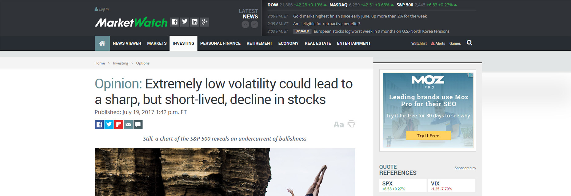
9. Amazon
Everyone loves Amazon for their huge inventory and free shipping. But they also have a fantastic site and there’s no way I could pass over their breadcrumb design. Many product pages have a set of breadcrumbs near the very top navigation. This is always super long because Amazon’s categories get deep. This is valuable for consumers to see which categories might be worth browsing, and valuable for designers/webmasters to study Amazon’s massive product structure. But if you scroll down on each product page you’ll find a “product information” or “product details” section with best sellers listings. This feature uses breadcrumb links to show where the product has sold the best and encourages visitors to click through to those related categories. Amazon’s breadcrumbs are admirably lengthy so they’re worth studying if you have a site with a very deep hierarchy.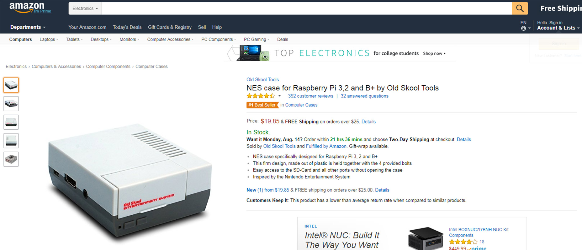
10. Etsy
The massive online DIY/crafts ecommerce site Etsy is constantly advancing their design. It was founded in 2005 and looking at the site now you can see they’ve made some big changes over the past 10+ years. If you check out any category page you’ll find small breadcrumbs in the top-left corner. These aren’t as prominent compared to the sidebar navigation which really feels like the primary way to search. But a nice added effect is the total item listing inside the category. Etsy lists how many total items are for sale in each subcat as you dig deeper into the site. One thing I will complain about is the lack of breadcrumbs on product pages. This seems like a real oversight to the UI and I hope they add that going forward.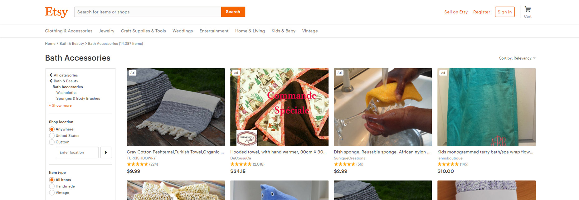
11. LinuxInsider
This breadcrumb design isn’t particularly beautiful but it does have a feature that grabs my attention. You’ll notice a “Next article” link near the top of each LinuxInsider post. This appears directly next to the breadcrumb so it feels like part of the navigation. Users who interact with breadcrumbs typically want to dig around in those crumb categories so this extra link makes sense. Anyone interested in Linux software may want to jump right to the next article in that category.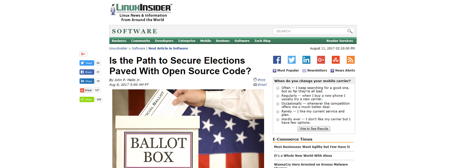
Jake Rocheleau
Jake is a writer and user experience designer on the web. He publishes articles discussing HTML5/CSS3 and jQuery coding techniques. Find out more on his website or you can follow his updates on Twitter @jakerocheleau


Read Next

15 Best New Fonts, July 2024
Welcome to our monthly roundup of the best fonts we’ve found online in the last four weeks. This month, there are fewer…
By Ben Moss

20 Best New Websites, July 2024
Welcome to July’s round up of websites to inspire you. This month’s collection ranges from the most stripped-back…

Top 7 WordPress Plugins for 2024: Enhance Your Site's Performance
WordPress is a hands-down favorite of website designers and developers. Renowned for its flexibility and ease of use,…
By WDD Staff

Exciting New Tools for Designers, July 2024
Welcome to this July’s collection of tools, gathered from around the web over the past month. We hope you’ll find…

3 Essential Design Trends, July 2024
Add some summer sizzle to your design projects with trendy website elements. Learn what's trending and how to use these…

15 Best New Fonts, June 2024
Welcome to our roundup of the best new fonts we’ve found online in the last month. This month, there are notably fewer…
By Ben Moss

20 Best New Websites, June 2024
Arranging content in an easily accessible way is the backbone of any user-friendly website. A good website will present…

Exciting New Tools for Designers, June 2024
In this month’s roundup of the best tools for web designers and developers, we’ll explore a range of new and noteworthy…

3 Essential Design Trends, June 2024
Summer is off to a fun start with some highly dramatic website design trends showing up in projects. Let's dive in!

15 Best New Fonts, May 2024
In this month’s edition, there are lots of historically-inspired typefaces, more of the growing trend for French…
By Ben Moss

How to Reduce The Carbon Footprint of Your Website
On average, a web page produces 4.61 grams of CO2 for every page view; for whole sites, that amounts to hundreds of KG…
By Simon Sterne

20 Best New Websites, May 2024
Welcome to May’s compilation of the best sites on the web. This month we’re focused on color for younger humans,…