

 A split-screen layout is in use when full-screen elements are divided into two or more vertical parts. A scene from the film “Scott Pilgrim vs the World”
However, this is a relatively new technique for the web design industry. Split screens only became popular around mid-2016 and now we have more and more websites which use this design pattern. There are a few reasons why this design pattern became so popular:
A split-screen layout is in use when full-screen elements are divided into two or more vertical parts. A scene from the film “Scott Pilgrim vs the World”
However, this is a relatively new technique for the web design industry. Split screens only became popular around mid-2016 and now we have more and more websites which use this design pattern. There are a few reasons why this design pattern became so popular:
- It has a nice aesthetic quality. When executed correctly it can offer users a wonderful viewing experience.
- It’s a good choice for responsive frameworks. Split-screen design can be adapted for a variety of screens, even small ones. When it comes to smaller screens, such as mobile displays, the panels can be stacked.
- It helps guide navigation. Using simple design techniques, you can draw the user’s attention to a specific part of the screen or encourage them to click.
When Split Screen Works The Best
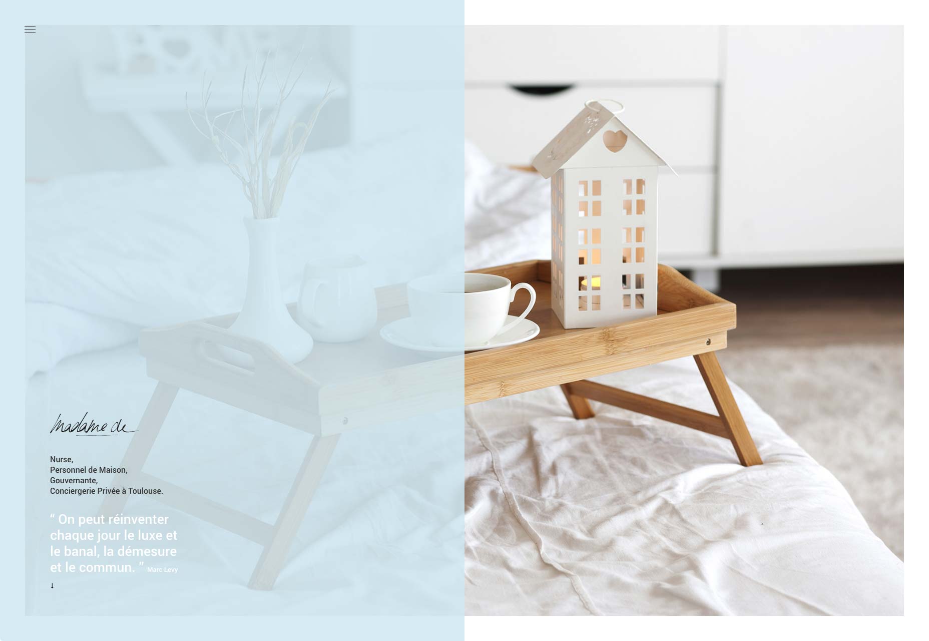
Split-screen is especially good when you have two things to promote. For example, when a site offers two entirely opposite variations. This approach allows designers to give prominence to both things and allow the user to quickly select between them.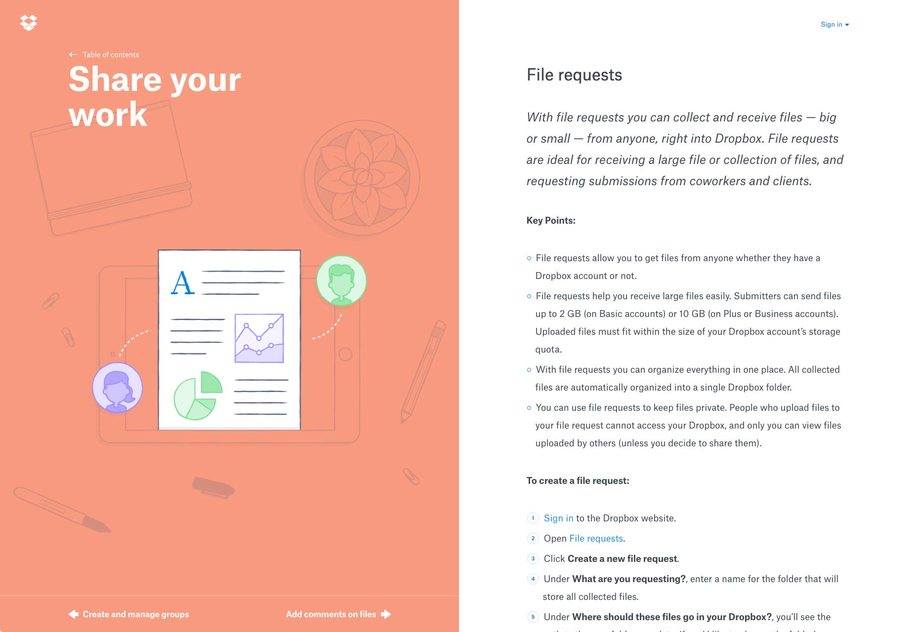 One screen, two messages in Dropbox Guides
When You Should Avoid Split Screen
Split-screen designs don’t expand well as the content grows, therefore it is not recommended to apply them to content-heavy layouts. It’s important to keep the screens simple because complex split screens make the UI look overloaded with information. That’s why split-screen layout would be a perfect fit for minimalist website designs.How to Decide if Split Screen is Good For You
If you’re considering a split-screen technique for your website, I advise you to ask yourself a few questions:- Is it suitable for your content?
- Will there be enough negative space to make the layout work?
- Will your users appreciate the layout or it will confuse them?
- Will it be OK to split your users’ attention in half?
Design Techniques For Split Screens
1. Pair Vibrant Color and Dramatic Typography
Thanks to Flat and Material Design, vibrant colors and dramatic typography are big trends now. Vibrant colors are visually stimulating and dramatic typography enhances the text content. Simply combine the two and you will create a visually interesting design. Baesman has done this masterfully. They gave equal importance to both elements while, at the same time, allowing the user to choose between them quickly.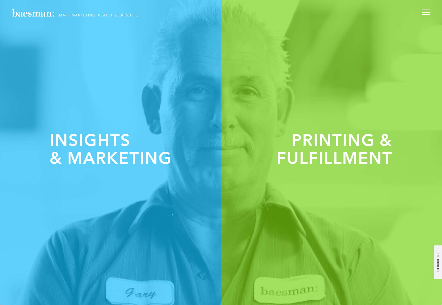 Bright colors and interesting typography pairs can add interest
2. Draw User Attention to the CTA Button
Much more than a simple graphic trend, splitting the screen into two distinct parts provides an original way to guide the user through your site. It’s a great option when you want to create a bigger focal point for calls to action. In the example below, you can see how negative space creates a vertical divide to give equal weighting to two different options. Vertical divide allows emphasis on two different CTAs without favoring either
3. Create Visual Flow Between “Screens”
When split screen represents a single object, it’s important to establish a connection between content containers. One possible way to do that is by using a color. Simply duplicate a distinct color to establish visual flow between two screens. This works particularly well with a brand color or hue with a lot of contrast. Using color it’s possible to communicate a stronger connection between two pieces of content. Another possible way to create a strong connection is layering a single element such as text copy across screens: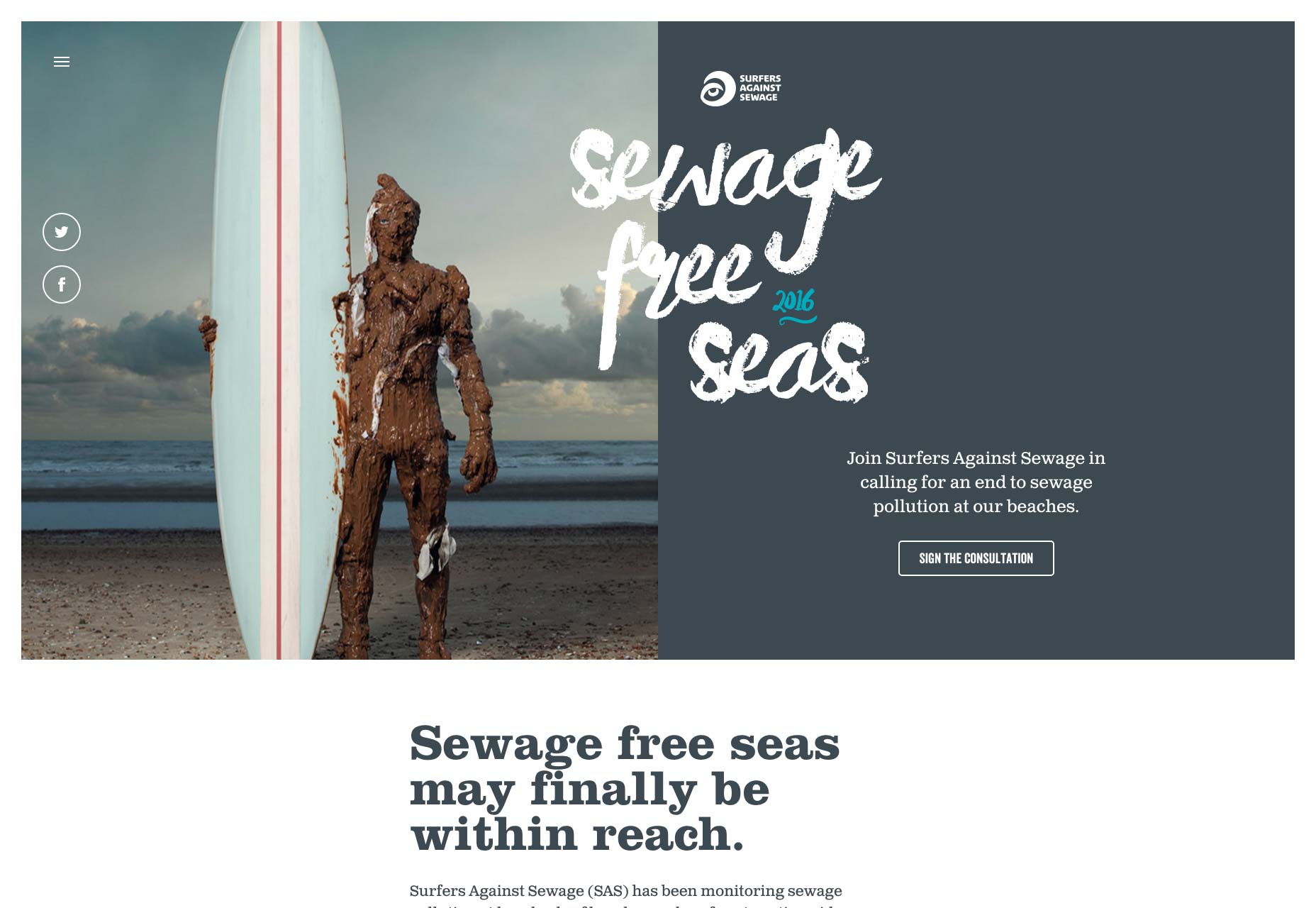 Overlapping text connects two screens
Last but not least you can use a colored overlay for this purpose:
Overlapping text connects two screens
Last but not least you can use a colored overlay for this purpose:
 Consider the left part of the screen
4. Use Animation To Encourage Users To Act
Fine animation and interactive effects encourage users to click. Look at the design used for the “Chekhov is Alive” site below. The design begs you to click to find your character.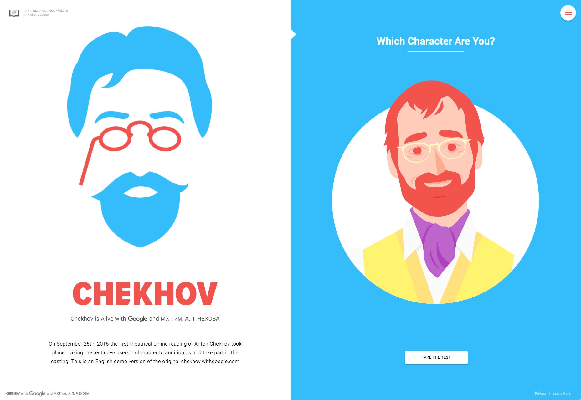
Conclusion
It takes approximately three seconds for a visitor to make a decision regarding your website. Consequently, your layouts should always be visitor-friendly if you want to reduce bounce rates. Split-screen technique can help you with that. Split-screen designs are a fun, functional, and responsive way to create an engaging design.Nick Babich
Fireart Studio is a design studio passionate about creating beautiful design for startups & leading brands. We pay special attention to nuances all the time to create professional while cool products that will not only meet all expectations, but exceed them.


Read Next

15 Best New Fonts, July 2024
Welcome to our monthly roundup of the best fonts we’ve found online in the last four weeks. This month, there are fewer…
By Ben Moss

20 Best New Websites, July 2024
Welcome to July’s round up of websites to inspire you. This month’s collection ranges from the most stripped-back…

Top 7 WordPress Plugins for 2024: Enhance Your Site's Performance
WordPress is a hands-down favorite of website designers and developers. Renowned for its flexibility and ease of use,…
By WDD Staff

Exciting New Tools for Designers, July 2024
Welcome to this July’s collection of tools, gathered from around the web over the past month. We hope you’ll find…

3 Essential Design Trends, July 2024
Add some summer sizzle to your design projects with trendy website elements. Learn what's trending and how to use these…

15 Best New Fonts, June 2024
Welcome to our roundup of the best new fonts we’ve found online in the last month. This month, there are notably fewer…
By Ben Moss

20 Best New Websites, June 2024
Arranging content in an easily accessible way is the backbone of any user-friendly website. A good website will present…

Exciting New Tools for Designers, June 2024
In this month’s roundup of the best tools for web designers and developers, we’ll explore a range of new and noteworthy…

3 Essential Design Trends, June 2024
Summer is off to a fun start with some highly dramatic website design trends showing up in projects. Let's dive in!

15 Best New Fonts, May 2024
In this month’s edition, there are lots of historically-inspired typefaces, more of the growing trend for French…
By Ben Moss

How to Reduce The Carbon Footprint of Your Website
On average, a web page produces 4.61 grams of CO2 for every page view; for whole sites, that amounts to hundreds of KG…
By Simon Sterne

20 Best New Websites, May 2024
Welcome to May’s compilation of the best sites on the web. This month we’re focused on color for younger humans,…