

 Floating Action Button in Android app
1. Represent a Hallmark Action
Ideally, FAB should highlight the most relevant or frequently used actions, it should be used for the actions that are the primary characteristics of your app. If you’re going to use FAB in your app, the design of the app must be carefully considered and the user’s possible actions must be boiled down to a single prominent feature. For example, a music app may have FAB that represents ‘Play/Stop’. An Instagram-like app might have a FAB that represents ‘Take a Photo’.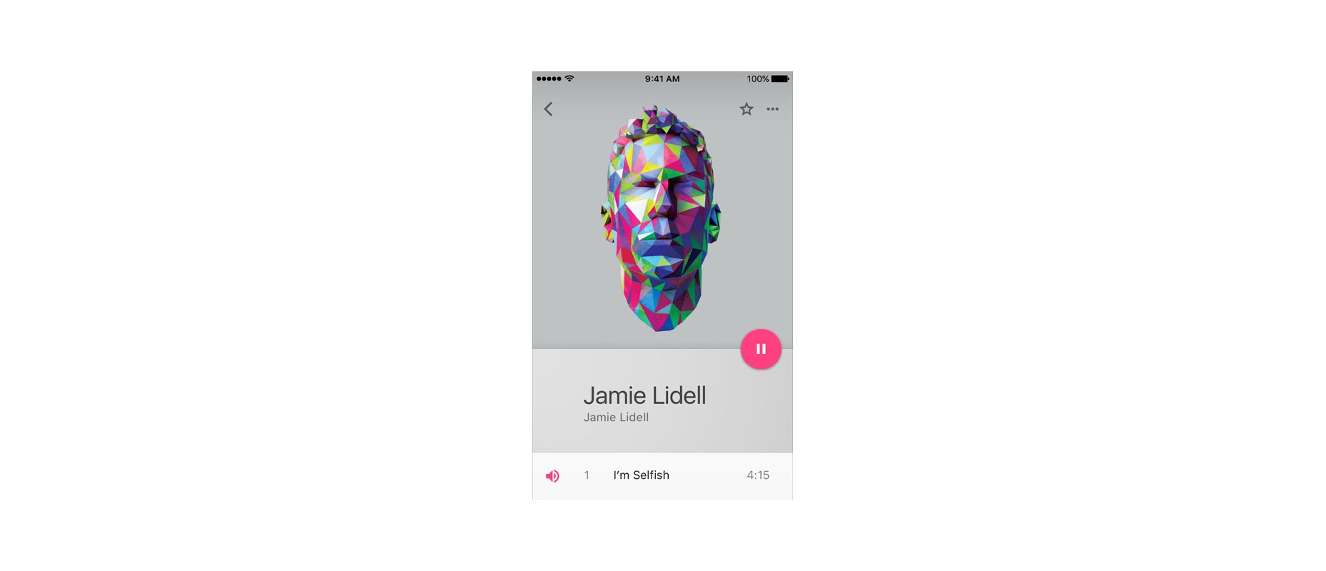 A floating action button represents the primary action in an application. Pausing or resuming playback on this screen tells users that it’s a music app.
According to research by Steve Jones, FAB demonstrates a slight negative usability impact when users first use the button. However, once users successfully complete a task using the FAB, they are able to use it more efficiently than a traditional action button.
A floating action button represents the primary action in an application. Pausing or resuming playback on this screen tells users that it’s a music app.
According to research by Steve Jones, FAB demonstrates a slight negative usability impact when users first use the button. However, once users successfully complete a task using the FAB, they are able to use it more efficiently than a traditional action button.
2. Be a Way-Finding Tool
FAB is a natural cue for telling users what to do next. Research by Google shows that, when faced with unfamiliar screens many users rely on FAB to navigate. Thus, FAB is very useful as a signpost of what to do next.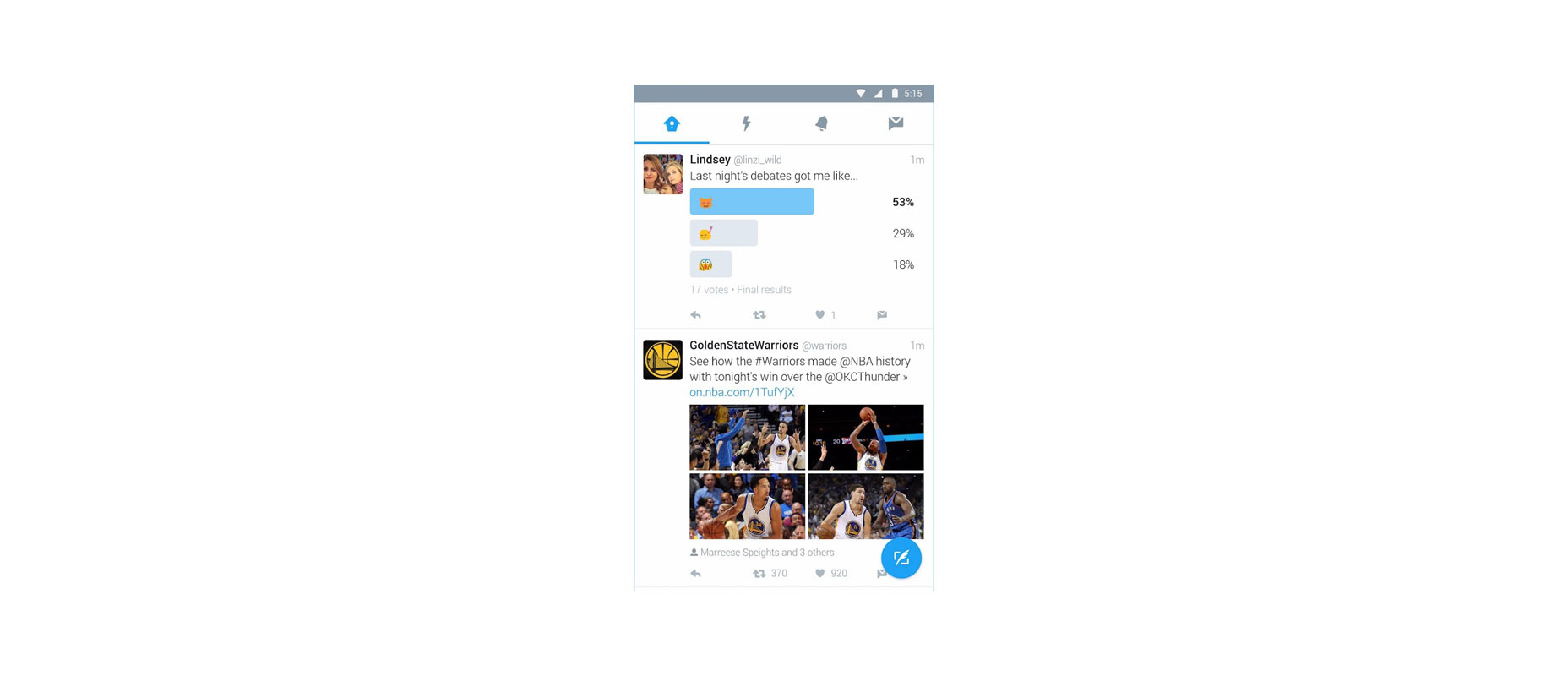 The use of a Floating Action Button in Twitter encourages you to post content
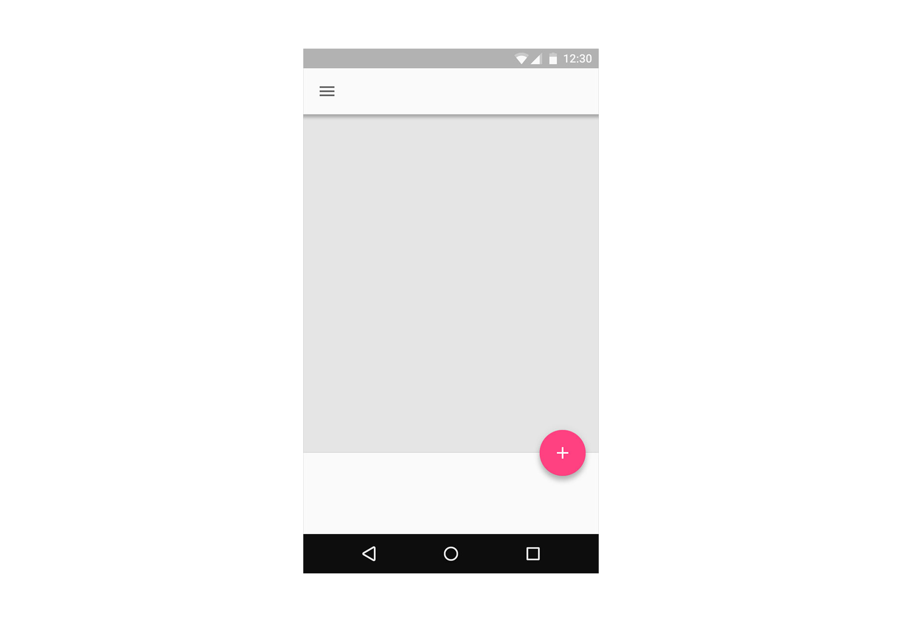
3. Provide a Set of Actions
In some cases, it is appropriate for the button to spin out and expose a few other options as can be seen in the Evernote example below. The FAB can replace itself with a sequence of more specific actions and you can design them to be contextual to your users. As a rule of thumb, provide at least three options upon press but not more than six (including the original floating action button target).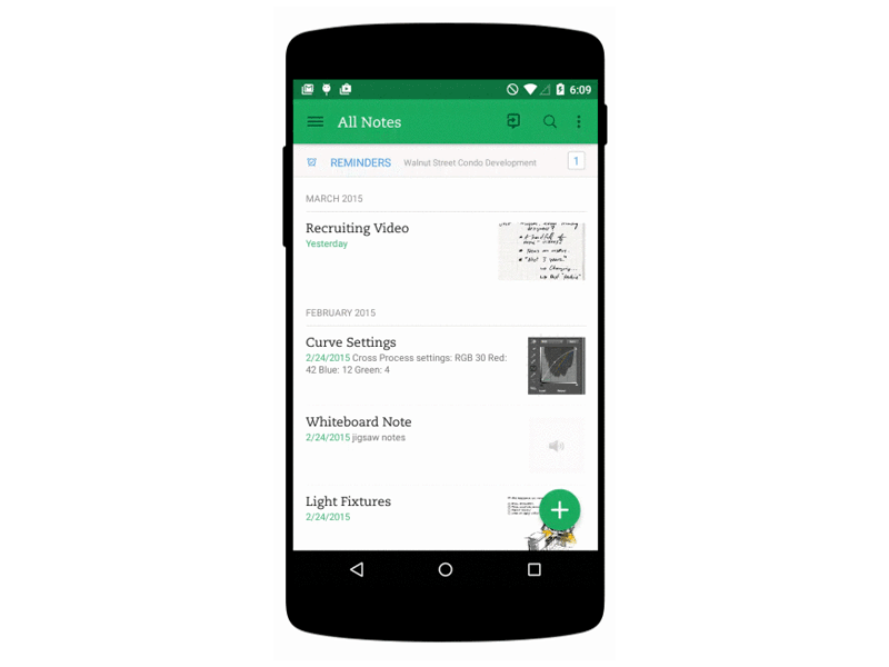 Also keep in mind that these actions must be related to the primary action the FAB itself expresses, and be related to each other: do not treat these revealed actions as independent as they could be if positioned on a toolbar.
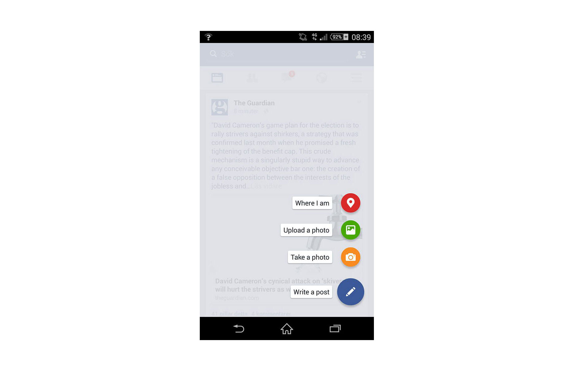 Don’t: ‘Where I am’ action isn’t relevant to create content actions.
4. Be Context Aware
Context plays an important role in user interaction. Sometimes users want to consume content, sometimes they want to perform actions. It all depends on context. Using some contextual behavior could bring the best of FAB to the UX of any app. Let’s consider Google+ as an example. Google+ shows the button when the user is engaging with the stream, and hiding it when that engagement is reversed. These two states rely on context : when users are engaging with a social stream, a primary action is to scroll, hence there’s no need for FAB, and when users stop scrolling, they might want to post something.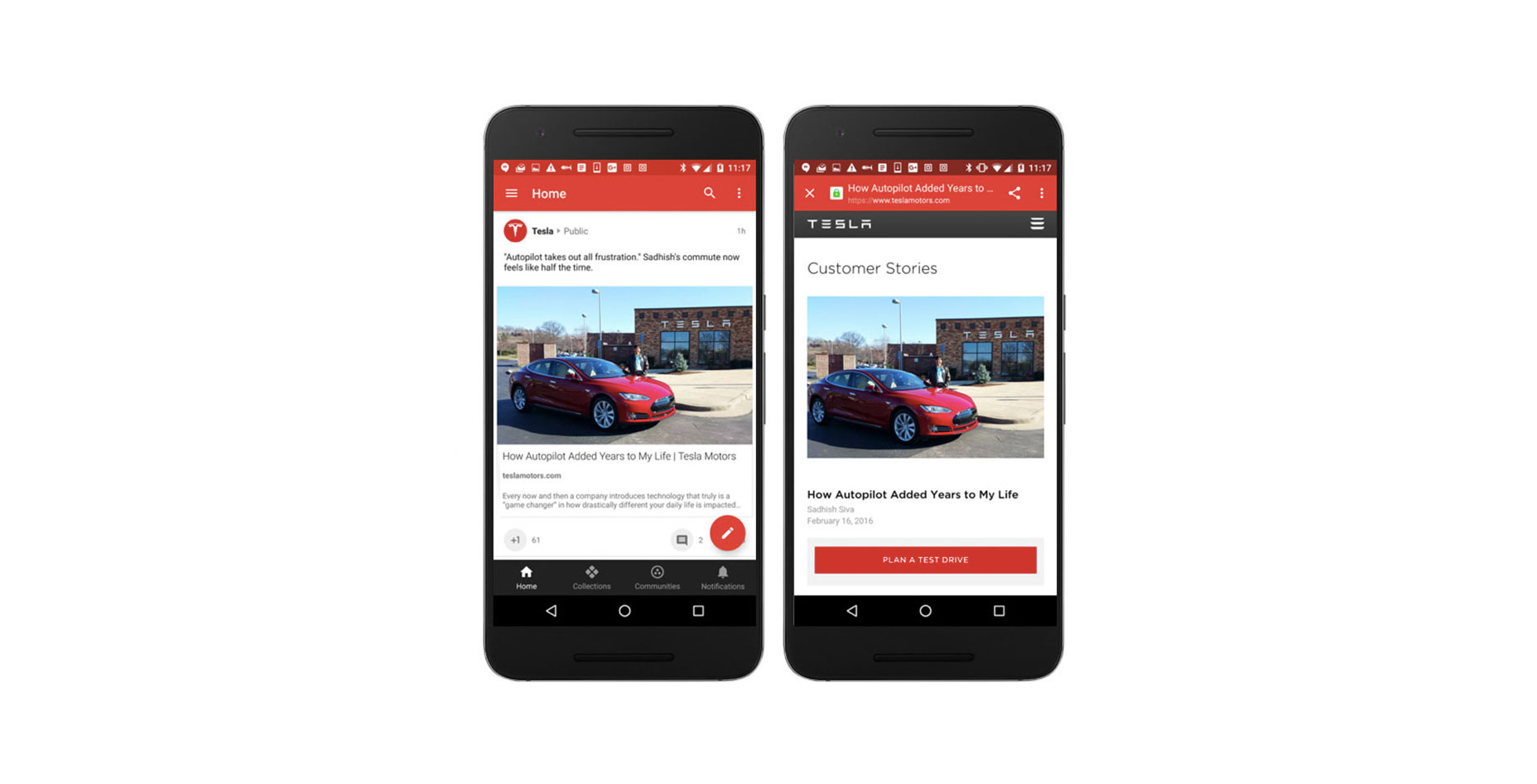
5. Connect Two States Together
FAB is not just a round button, it has some transformative properties that you can use to help ease your users from screen to screen. When morphing the floating action button, make transition between two states in a logical way. The animation in the examples below maintain the user’s sense of orientation and help the user comprehend the change that has just happened in the view’s layout, what has triggered the change, and how to initiate the change again later on if needed. Image credit: Ehsan Rahimi
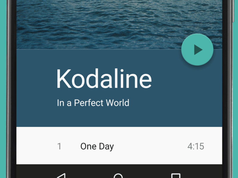 Image credit: Dribbble
Conclusion
Some might say that FAB is bad UX. It's tempting to say that because users and designers aren’t used to it. We are used to familiar toolbars and the concept of FAB is still fairly new to us. We all know how that new things are hard, but at the same time they encourage a more carefully designed user experience. Used correctly, FAB can be an astoundingly helpful pattern for the end-user.Nick Babich
Fireart Studio is a design studio passionate about creating beautiful design for startups & leading brands. We pay special attention to nuances all the time to create professional while cool products that will not only meet all expectations, but exceed them.


Read Next

15 Best New Fonts, July 2024
Welcome to our monthly roundup of the best fonts we’ve found online in the last four weeks. This month, there are fewer…
By Ben Moss

20 Best New Websites, July 2024
Welcome to July’s round up of websites to inspire you. This month’s collection ranges from the most stripped-back…

Top 7 WordPress Plugins for 2024: Enhance Your Site's Performance
WordPress is a hands-down favorite of website designers and developers. Renowned for its flexibility and ease of use,…
By WDD Staff

Exciting New Tools for Designers, July 2024
Welcome to this July’s collection of tools, gathered from around the web over the past month. We hope you’ll find…

3 Essential Design Trends, July 2024
Add some summer sizzle to your design projects with trendy website elements. Learn what's trending and how to use these…

15 Best New Fonts, June 2024
Welcome to our roundup of the best new fonts we’ve found online in the last month. This month, there are notably fewer…
By Ben Moss

20 Best New Websites, June 2024
Arranging content in an easily accessible way is the backbone of any user-friendly website. A good website will present…

Exciting New Tools for Designers, June 2024
In this month’s roundup of the best tools for web designers and developers, we’ll explore a range of new and noteworthy…

3 Essential Design Trends, June 2024
Summer is off to a fun start with some highly dramatic website design trends showing up in projects. Let's dive in!

15 Best New Fonts, May 2024
In this month’s edition, there are lots of historically-inspired typefaces, more of the growing trend for French…
By Ben Moss

How to Reduce The Carbon Footprint of Your Website
On average, a web page produces 4.61 grams of CO2 for every page view; for whole sites, that amounts to hundreds of KG…
By Simon Sterne

20 Best New Websites, May 2024
Welcome to May’s compilation of the best sites on the web. This month we’re focused on color for younger humans,…