

The Concept of a Frictionless Experience
Frictionless user experience has now become the new standard. The goal of frictionless experiences is to simplify our lives. The most successful digital experiences have emerged out of focusing on reducing friction in the user journey.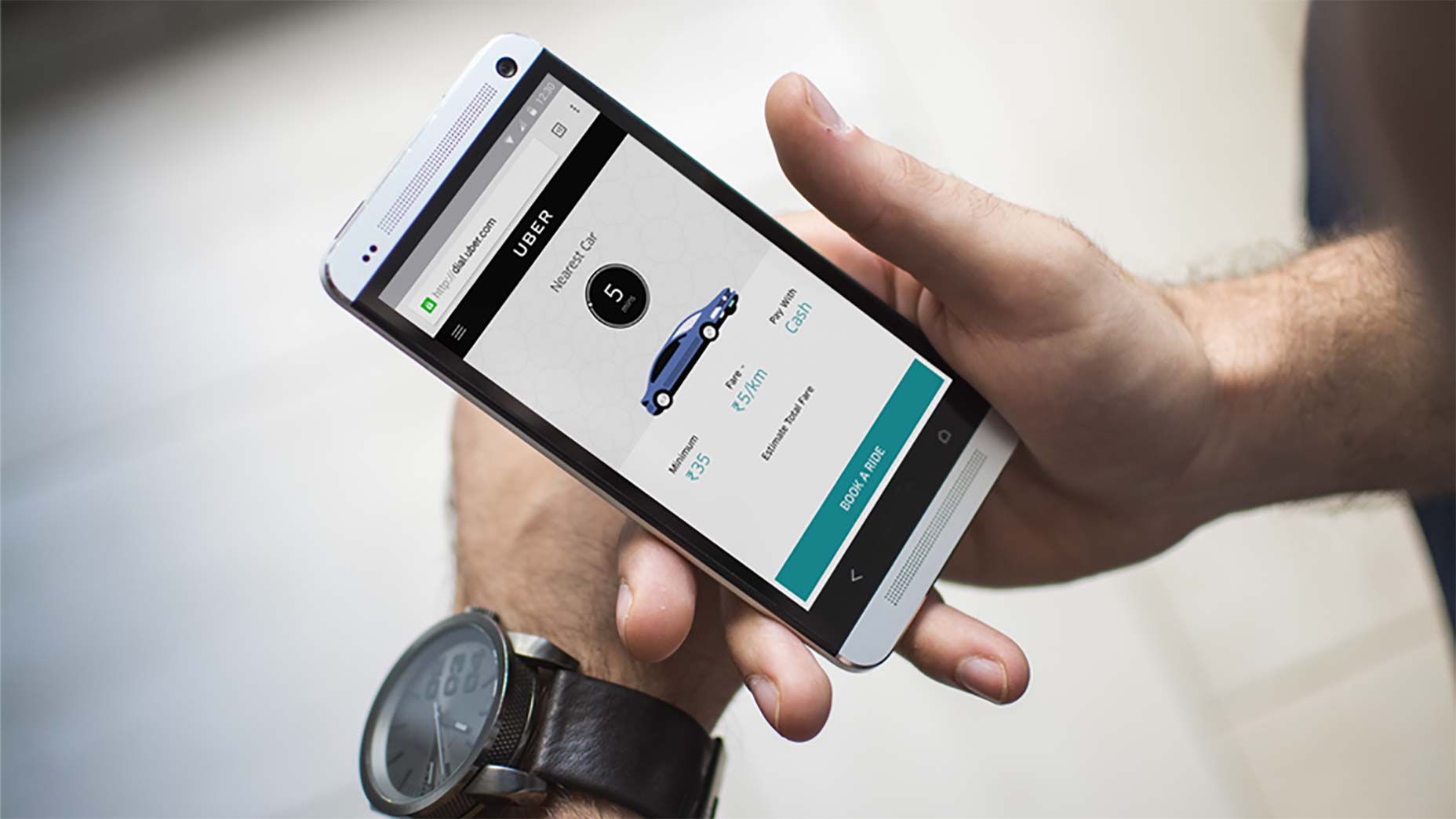 Uber knows that the fewer steps involved in a task, the less friction.
Outside of GUIs, a good example is the Amazon dash button, that allows you to order a refill of a specific product with a single push.
Uber knows that the fewer steps involved in a task, the less friction.
Outside of GUIs, a good example is the Amazon dash button, that allows you to order a refill of a specific product with a single push.
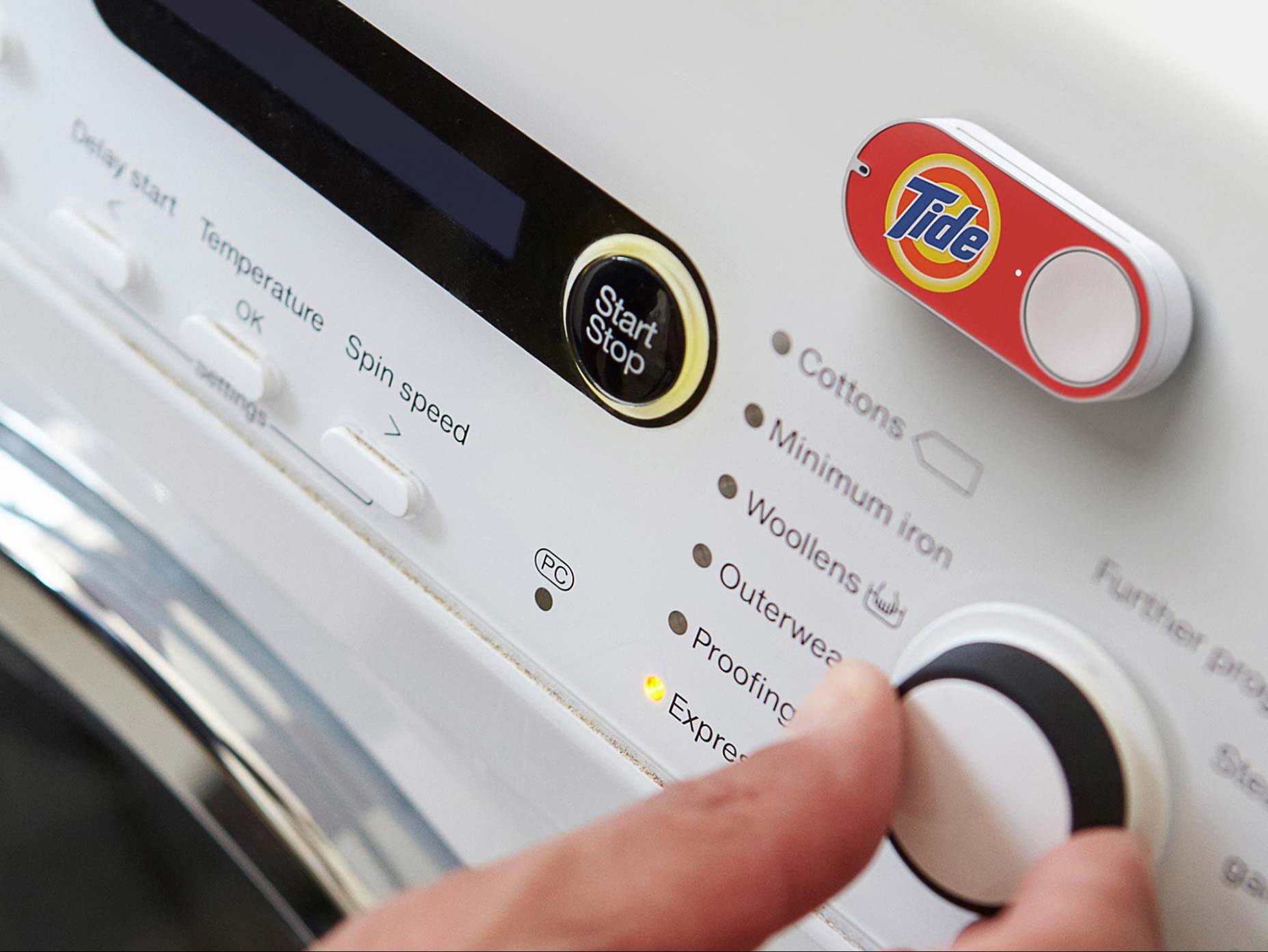
Amazon dash button
Good and Bad Friction
It’s important to say that there are two types of friction — “good” and “bad” friction:“Good” Friction
There are times when a little UI/UX friction is actually desirable. As Sangeet Choudary said: “Friction in design is helpful if it facilitates the interaction instead of [getting] in the way of it.” Sometimes you might want to slow the user down to ensure data captured is correct or to prevent users from taking an incorrect path. For example, for actions with severe consequences, some friction is not a bad idea.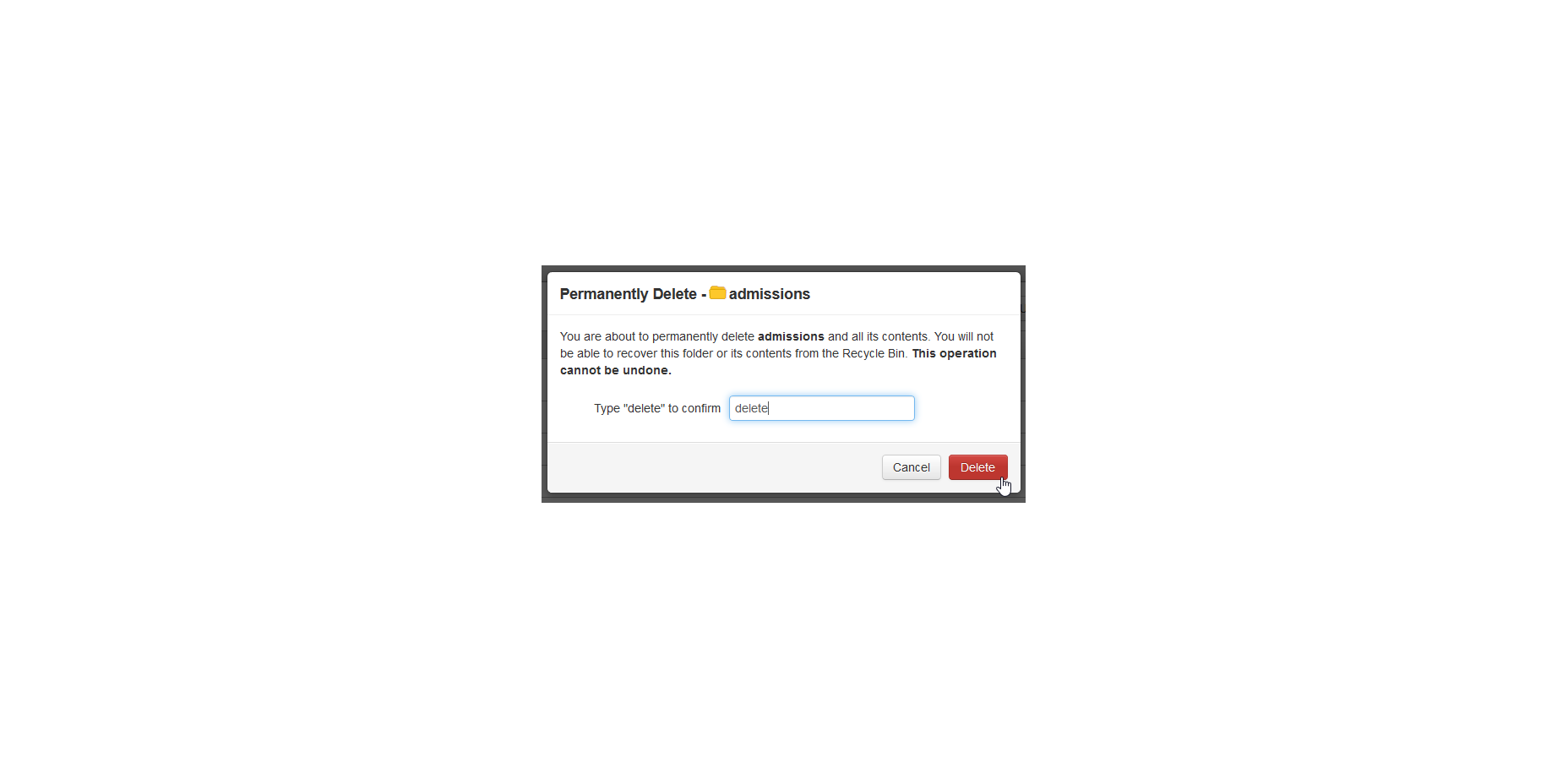
Friction can prevent mistakes by asking for confirmation. A user must confirm a delete action by actually typing delete.
“Bad” Friction
This is an unwanted friction created by a visual clutter (a busy layout that confuses or distracts user), inconsistency (“Why does the ‘Submit’ button look different on this page?”), unfamiliar features or functions. Bad friction is the enemy of interaction design because it creates extra cognitive load in the user interface. Reducing bad friction is good for your UI.How To Prevent Bad Friction
UX designers master the art of reducing bad friction through a combination of design techniques. Applying the following 6 key principles will help drive any product or service to a more frictionless experience for your users.1. Consider a Complete User Journey
It’s important to design a product with a full user journey in mind in order to find where friction is helpful and where it is harmful to both user and business goals. Every step in the journey can either create or remove friction and impact the success of the overall product. When the designer understands the steps involved in a user journey they can remove (or at least adjust) any steps that negatively impact response rate.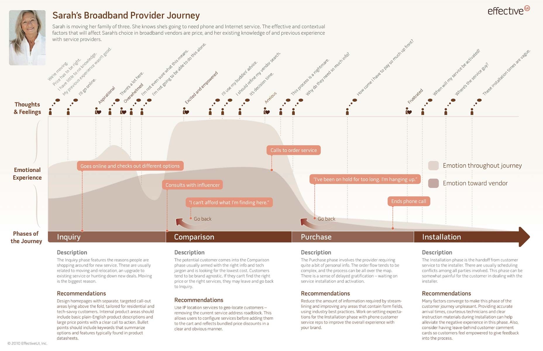
Having a user journey map would make it easier to spot frictions in an experience. Image credit: Effective UI
2. Limit the Total Number of Steps Required to Complete the Task
The fewer steps involved in a task, the less friction. Here is a famous example of John Gruber’s comparing calendar entry overhead: “My typical usage [in iCal]:- Double-click on the date of the event in month view.
- Type the event name.
- Tab past Location.
- Tab past ‘all-day’ checkbox.
- Tab past Month.
- Tab past Day.
- Tab past Year.
- Enter the hour.
- Enter the minutes.
- Swap the AM/PM.
- Double-click on the date of the event in month view.
- Type the time and name of the event.”
3. Design Clear Navigation
A lot can go wrong with navigation, making it a source of potential friction. While it’s definitely impossible to provide a one-size-fits-all solution, it’s still possible to improve navigation experiences by learning from users. The right user testing technique (such as card sorting) can help you understand how users categorize and access content in your app or in your website. This information will help you to design or adjust the navigation for the needs of your users.4. Follow the “Less is More” approach
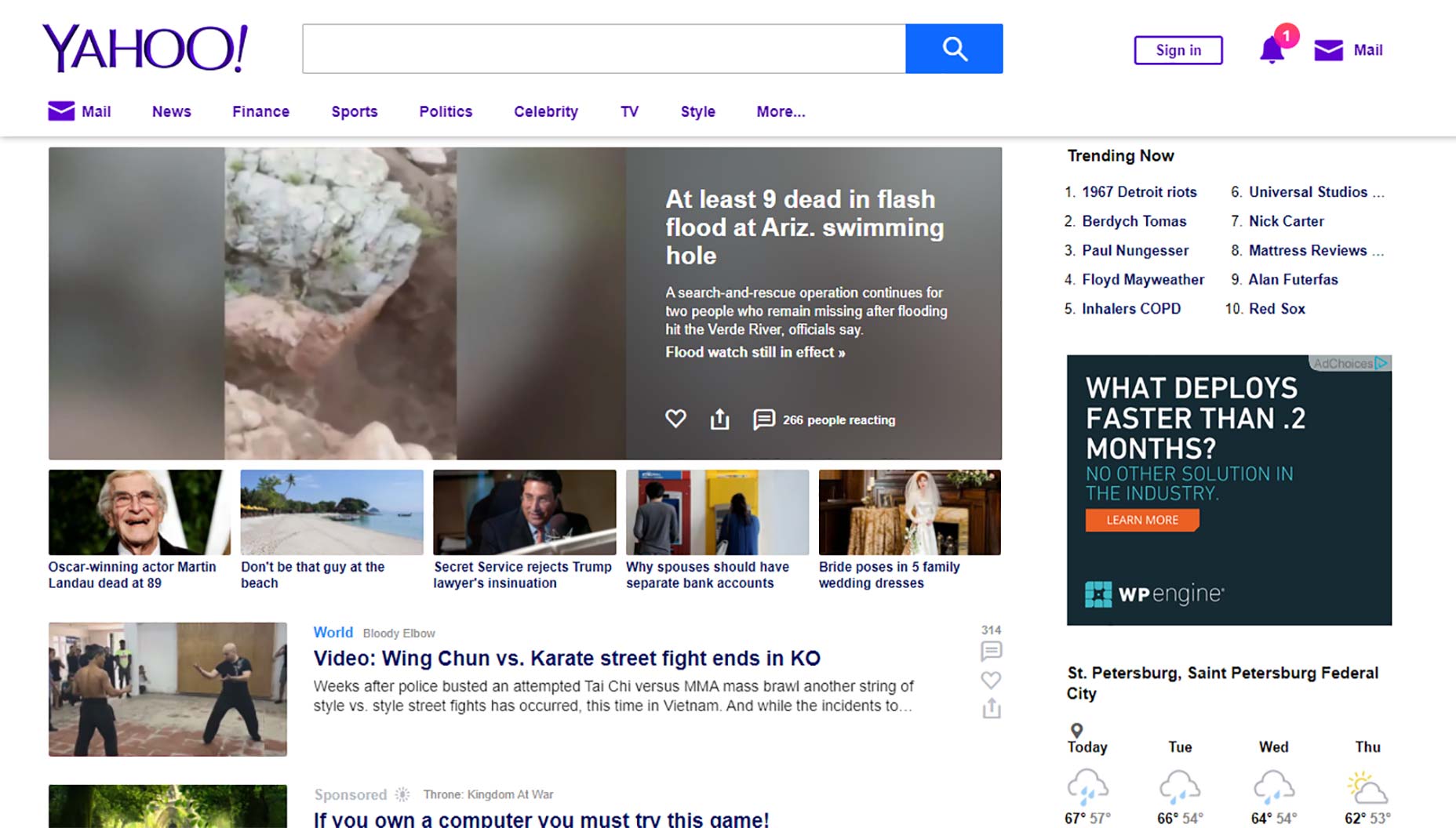
The ultimate purpose of an interface is to make things simpler. That’s why simplicity is an important part of what the adepts of frictionless design aim to achieve. Designers try to convey the essential by removing the unnecessary. As Antoine de Saint-Exupery once said: “Perfection is achieved, not when there is nothing more to add, but when there is nothing left to take away.” This is absolutely true for user interfaces. As a designer, you should prioritize only the elements that match user expectations and trim anything that doesn’t help the user. A good example of a product that follows this principle is the Google home page: as simple as it can be; only one thing to do and a lot of white space around it.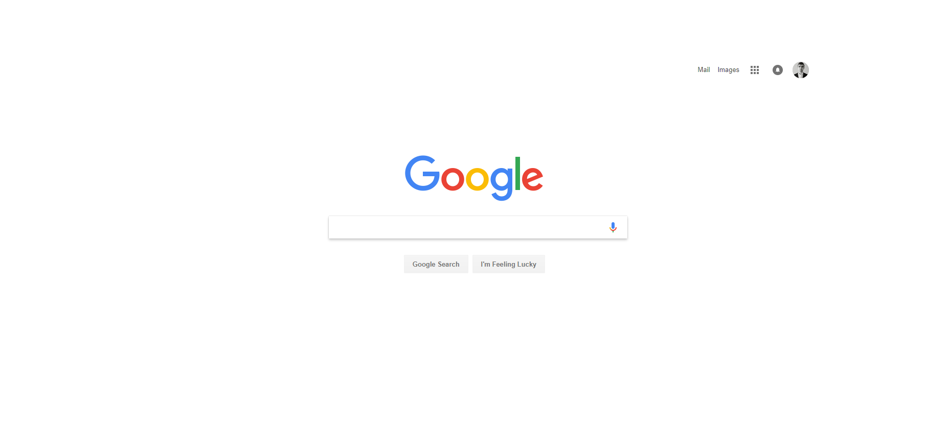 Compare it to the Yahoo home page that looks like a swiss army knife. Too many features and options can be intimidating and occasionally harmful.
5. Use Recognisable UI Patterns
When we interact with familiar UI elements, we can use knowledge from our previous experience. However, every time we must learn how something new works, it creates friction (too little knowledge can deteriorate the ease of use). UI patterns help users understand very complex systems and successfully deal with difficult tasks. UX/UI designers should use as many appropriate UI patterns as possible. Recognizable conventions, such as a magnifying glass icon for search, require no extra thought for the users.6. Use Chunking
The cognitive psychologist George A. Miller argued that the number of objects an average human can hold in working memory is 7 ± 2. In order to prevent overwhelming a user with too much information at once, designers often use the technique of chunking. Chunking works around the natural limitations of the human brain and memory retention. Dividing complex content into smaller sections improves the pace of the experience. It allows users to process the information by suggesting how each piece should be interpreted. As a result, users actually retain content better. Sometimes it’s best to break up a complex task into smaller sub-tasks. The same principles apply to input forms in breaking one long form into multiple smaller steps.
Chunking prevents overwhelming the brain with too much information at once. Facebook uses a process of chunking to display a progress through a sequence of logical and numbered steps.
Nick Babich
Fireart Studio is a design studio passionate about creating beautiful design for startups & leading brands. We pay special attention to nuances all the time to create professional while cool products that will not only meet all expectations, but exceed them.


Read Next

15 Best New Fonts, July 2024
Welcome to our monthly roundup of the best fonts we’ve found online in the last four weeks. This month, there are fewer…
By Ben Moss

20 Best New Websites, July 2024
Welcome to July’s round up of websites to inspire you. This month’s collection ranges from the most stripped-back…

Top 7 WordPress Plugins for 2024: Enhance Your Site's Performance
WordPress is a hands-down favorite of website designers and developers. Renowned for its flexibility and ease of use,…
By WDD Staff

Exciting New Tools for Designers, July 2024
Welcome to this July’s collection of tools, gathered from around the web over the past month. We hope you’ll find…

3 Essential Design Trends, July 2024
Add some summer sizzle to your design projects with trendy website elements. Learn what's trending and how to use these…

15 Best New Fonts, June 2024
Welcome to our roundup of the best new fonts we’ve found online in the last month. This month, there are notably fewer…
By Ben Moss

20 Best New Websites, June 2024
Arranging content in an easily accessible way is the backbone of any user-friendly website. A good website will present…

Exciting New Tools for Designers, June 2024
In this month’s roundup of the best tools for web designers and developers, we’ll explore a range of new and noteworthy…

3 Essential Design Trends, June 2024
Summer is off to a fun start with some highly dramatic website design trends showing up in projects. Let's dive in!

15 Best New Fonts, May 2024
In this month’s edition, there are lots of historically-inspired typefaces, more of the growing trend for French…
By Ben Moss

How to Reduce The Carbon Footprint of Your Website
On average, a web page produces 4.61 grams of CO2 for every page view; for whole sites, that amounts to hundreds of KG…
By Simon Sterne

20 Best New Websites, May 2024
Welcome to May’s compilation of the best sites on the web. This month we’re focused on color for younger humans,…