

1. Never make users wait without giving them feedback
If the user’s connection is slow, it can take a while for a site to populate content on the screen. A user’s wait time begins the moment they initiate an action, and the worst case is when they don’t have any indicator that the site has received it. When your site fails to notify users that it needs some time to complete an action, users often think it didn’t receive the request, and they try again. Plenty of extra taps have resulted due to a lack of feedback. To make people happy, we need to give an indication that something is happening, offer visual feedback.2. Avoid static progress indicators
Static progres indicators are the ones that have an unmoving image or text, such as “Loading…” or “Please wait...” to indicate that the request has been received. While any feedback is better than none, static indicators are bad UX. Users don’t have any indicator that content is being loaded, so they aren’t sure if the process is actually stuck.3. Use animated loading indicators
Psychological studies of waiting time show that user focus starts to shift after one second of waiting without any feedback. In order to reduce a user’s uncertainty, use a progress indicator for any action that takes longer than that. (Note: the use of animation isn’t recommended for anything that takes less than one second to load, because users might feel anxious about what just flashed on and off the screen).Infinite loading spinners for reasonably fast operations
The simplest form of animated indicators is a loading spinner. This type of visual feedback just states the fact that user has to wait, but doesn’t say how long they should wait. As a general rule, you should use this type of progress indicator for fast actions (2–10 seconds). A spinner of gray lines radiating from a central point is a standard approach.
Loading spinners are often used together with pull-to-refresh gesture. It acts as an intermediary between two states of the UI, and helps users to understand what is going on when the screen changes.
A spinner of gray lines radiating from a central point is a standard approach.
Loading spinners are often used together with pull-to-refresh gesture. It acts as an intermediary between two states of the UI, and helps users to understand what is going on when the screen changes.
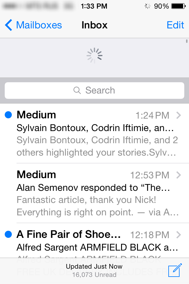 Apple Mail app for iOS
Percent-done animation for long lasting operations
Loading spinners aren’t the right way to indicate long lasting loading. It’s much more bearable to wait for something if we know when it will happen. That’s why for long lasting operations you should give your users a clear indication of how long they need to wait. As a general rule of thumb, you should use a percent-done animation for longer processes that take 10 or more seconds.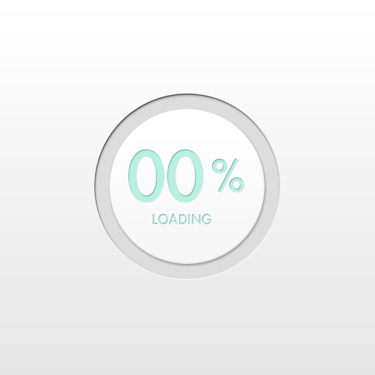 Image credit: Behance
Alternatively you can provide a general time estimate for the operation. Don’t try to be exact, a simple, “This might take a minute” can be enough to inform the user and encourage them to wait it out.
Image credit: Behance
Alternatively you can provide a general time estimate for the operation. Don’t try to be exact, a simple, “This might take a minute” can be enough to inform the user and encourage them to wait it out.
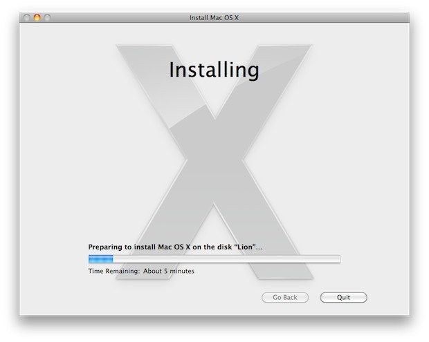 Installing software update in Mac OS X
4. Tweaking the user’s perception of time
How fast your content loads is in the mind of the user. When trying to create a faster user experience you can shorten the perceived time rather than the actual time. In order to do so, you can fill waiting times using content, animations, or actions the user can perform.Progress bars
A progress bar makes users develop an expectation for how fast the action is being processed. The way your progress bar moves affects how they perceive the load time. In order to make a progress bar feel faster to users you can use follow simple techniques:- The progress bar should never stop, otherwise users will think the site froze. The worst possible case is when progress bar approaches 99% and suddenly stops. Most users will be frustrated by this behavior.
- You can disguise small delays in your progress bar by moving it instant and steady.
- Move the progress bar slow in the beginning and accelerate it towards the end to give users a rapid sense of completion time.
 Image credit: Dribbble
Skeleton screens
Wait-time is a right time for skeleton screens (a.k.a temporary information containers). A skeleton screen is essentially a blank version of a page into which information is gradually loaded. It provides an alternative to the traditional animated indicators. Rather than show an abstract widget, skeleton screens create anticipation of what is to come and makes user focus on progress instead of wait times. Skeleton images load quickly since it’s a small image that is often made up of simple shapes. These techniques can be taken even further in mobile apps because the skeleton template can be stored locally together with app’s data. Facebook’s app for iOS shows users gray blocks and lines to represent images and text as the app loads. Once it finishes loading, the images and text appear in place of the temporary containers. This is no faster than having a loading screen with a spinner, but in the user’s mind, it feels like it is.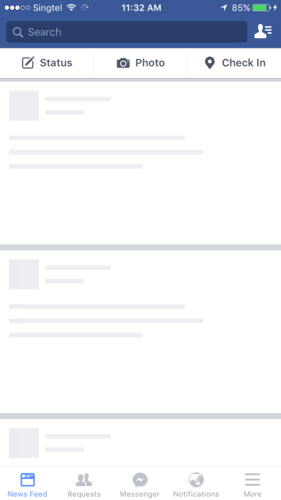
Background operations
Another speed trick you can use is background operations. Actions which are packed into background operations have two benefits — they are invisible to the user and happen before the user actually asks for them. Give users other things to focus on as a process is going on in the background. A good example of this is uploading pictures on Instagram. As soon as the user chooses a picture to share, it starts uploading. The app invites users to add title and tags while the picture is being uploaded in the background. By the time when users will be ready to press a ‘Share’ button, upload will be completed and it’ll be possible to share their picture instantly.Progressive image loading
As modern apps and sites load more and more images, it’s good to think of their loading process, since it affects performance and user experience. Using a blur effect you can create a progressive image loading effect. One good example is Medium, which blurs the post image cover as well as images within the post content until the image is fully loaded. First, it loads a small blurry image (thumbnail) and then makes a transition to the large image. The thumbnails are very small (just a few kilobytes) which combined with the blurry effect allows for a better placeholder than a solid color, without sacrificing payload.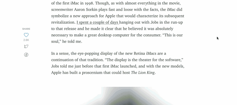 Medium uses blur to create a progressive image loading effect
Visual distraction
You should always try to make the wait more pleasant if you can’t shorten the line. To ensure people don’t get bored while waiting for something to happen, offer them some distraction. Fine animations can distract your visitors and make them ignore long loading times. Animated splash screen. Image credit: Ramotion (Dribbble)
 Image credit: Vimeo
Nick Babich
Fireart Studio is a design studio passionate about creating beautiful design for startups & leading brands. We pay special attention to nuances all the time to create professional while cool products that will not only meet all expectations, but exceed them.


Read Next

3 Essential Design Trends, May 2024
Integrated navigation elements, interactive typography, and digital overprints are three website design trends making…

How to Write World-Beating Web Content
Writing for the web is different from all other formats. We typically do not read to any real depth on the web; we…
By Louise North

20 Best New Websites, April 2024
Welcome to our sites of the month for April. With some websites, the details make all the difference, while in others,…

Exciting New Tools for Designers, April 2024
Welcome to our April tools collection. There are no practical jokes here, just practical gadgets, services, and apps to…

How Web Designers Can Stay Relevant in the Age of AI
The digital landscape is evolving rapidly. With the advent of AI, every sector is witnessing a revolution, including…
By Louise North

14 Top UX Tools for Designers in 2024
User Experience (UX) is one of the most important fields of design, so it should come as no surprise that there are a…
By Simon Sterne

What Negative Effects Does a Bad Website Design Have On My Business?
Consumer expectations for a responsive, immersive, and visually appealing website experience have never been higher. In…

10+ Best Resources & Tools for Web Designers (2024 update)
Is searching for the best web design tools to suit your needs akin to having a recurring bad dream? Does each…
By WDD Staff

3 Essential Design Trends, April 2024
Ready to jump into some amazing new design ideas for Spring? Our roundup has everything from UX to color trends…

How to Plan Your First Successful Website
Planning a new website can be exciting and — if you’re anything like me — a little daunting. Whether you’re an…
By Simon Sterne

15 Best New Fonts, March 2024
Welcome to March’s edition of our roundup of the best new fonts for designers. This month’s compilation includes…
By Ben Moss

LimeWire Developer APIs Herald a New Era of AI Integration
Generative AI is a fascinating technology. Far from the design killer some people feared, it is an empowering and…
By WDD Staff