

1. Simple, But Dramatic Typeface
Simple typography and dramatic typography aren’t mutually exclusive. In fact, simple typography is one of the best forms of dramatic typography. This technique is relatively easy to incorporate on your page—just select a simple typeface and follow these tips:- Increase typeface size (large typefaces send a powerful message especially when coupled with hero images)
- Make text colour contrasting to the background (the color of the text copy is usually white or black which contrasts well against an image or brightly colored background.)
- Add a bold style
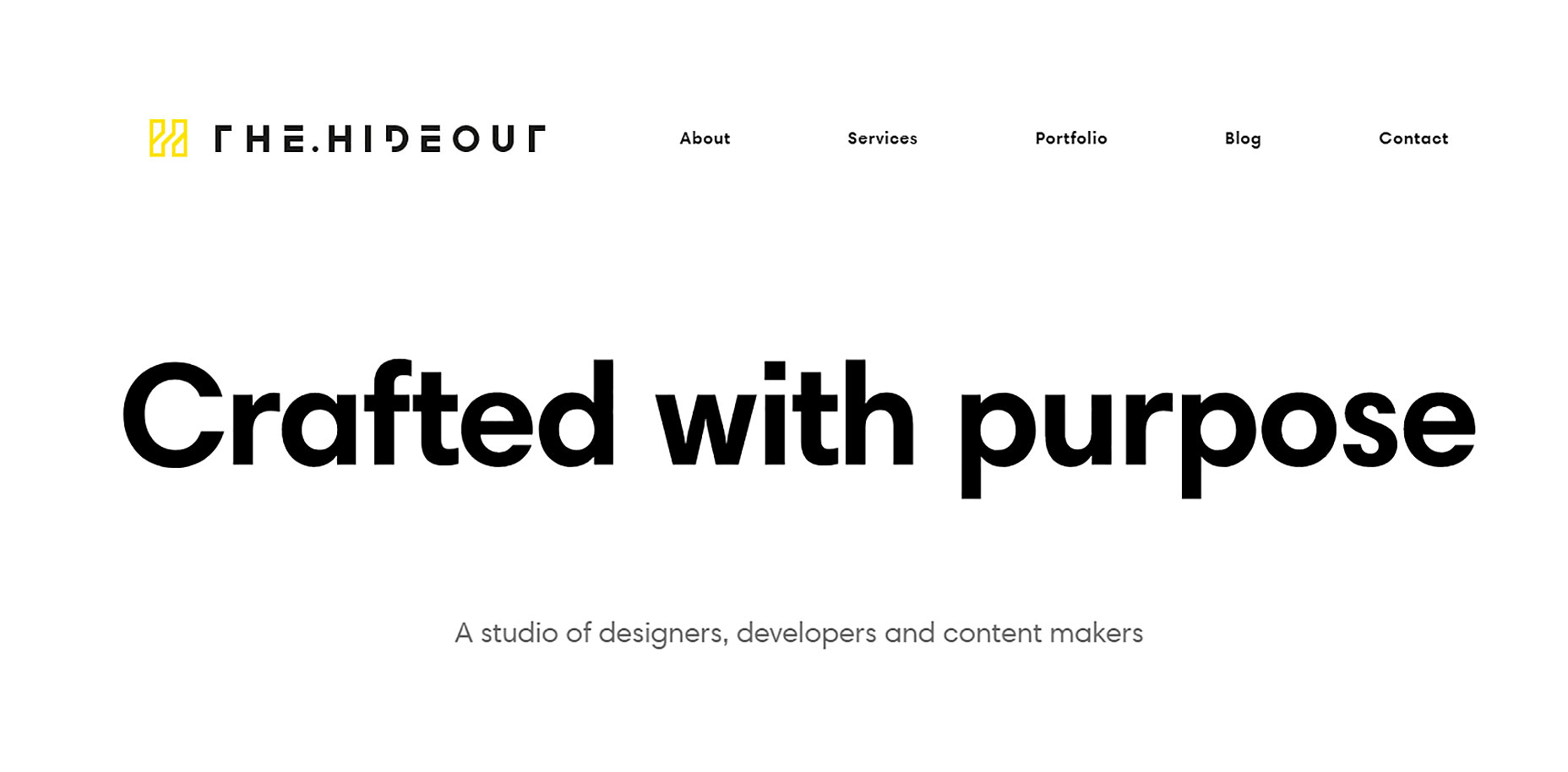 Simple typefaces communicate confidence and clarity.
2. Creative Use of Simple Typefaces
It’s absolutely possible to take the most basic fonts and create a memorable experience. All you need is to experiment with typography: Need to send your message loud and clear? Use ALL CAPS for copy. Want to create something really special? Use simple typeface together with animated effects or video.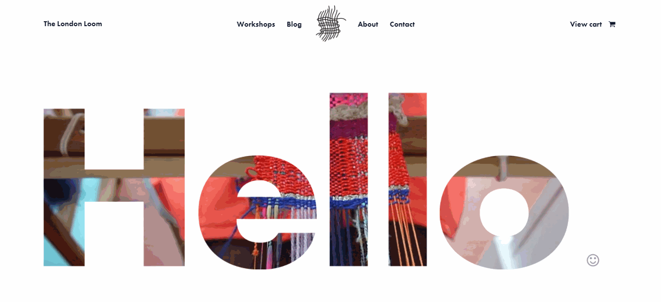
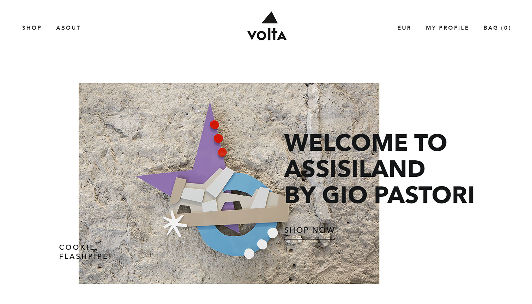
3. Decorative Typeface
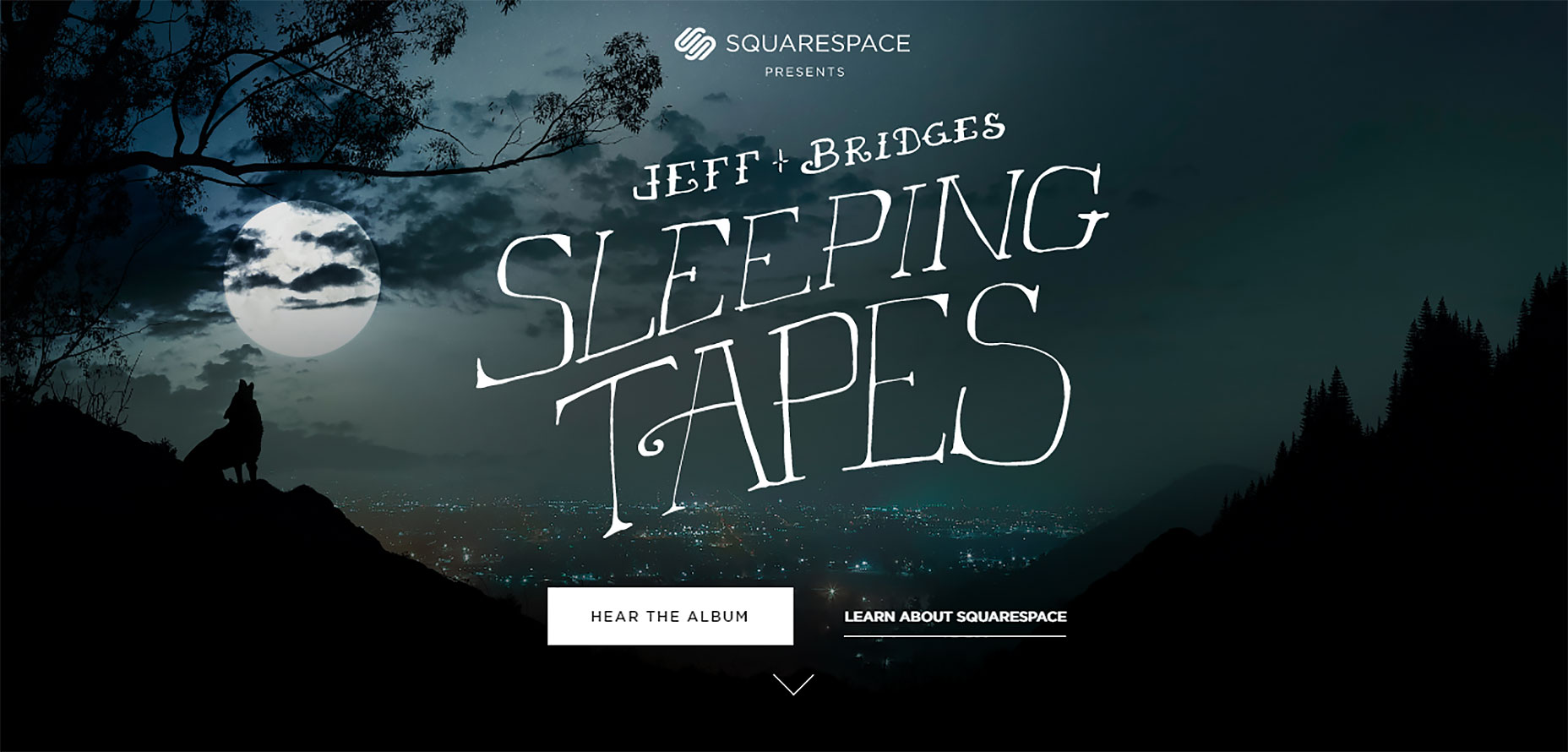
Designers have mixed feelings about decorative typefaces. Many designers despise decorative faces as cheap and sloppy, while others adore them and leverage in creative and interesting ways. As for me, I believe that used properly, decorative typography can set the tone for the site and highlights the brand in a lovely way; but only when it matches the personality of the brand and the atmosphere of the site. When a designer achieves a balance by incorporating copy with a proper decorative type, the whole experience is better. Here are a few examples: In the Hawk&Hen example below, the decorative font helps to establish a quirky and unique style for this kitchen/bar.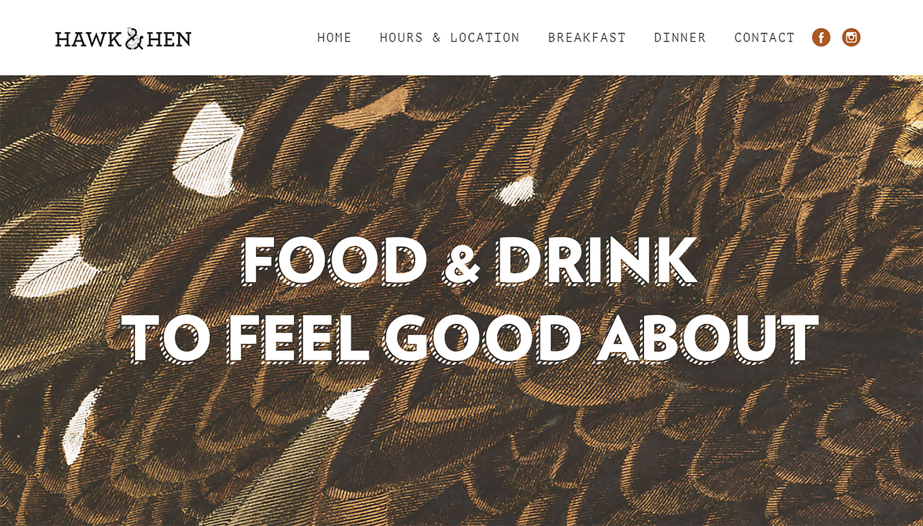 A custom typeface on Squarespace’s Sleeping Tapes sets a right mood for experience.
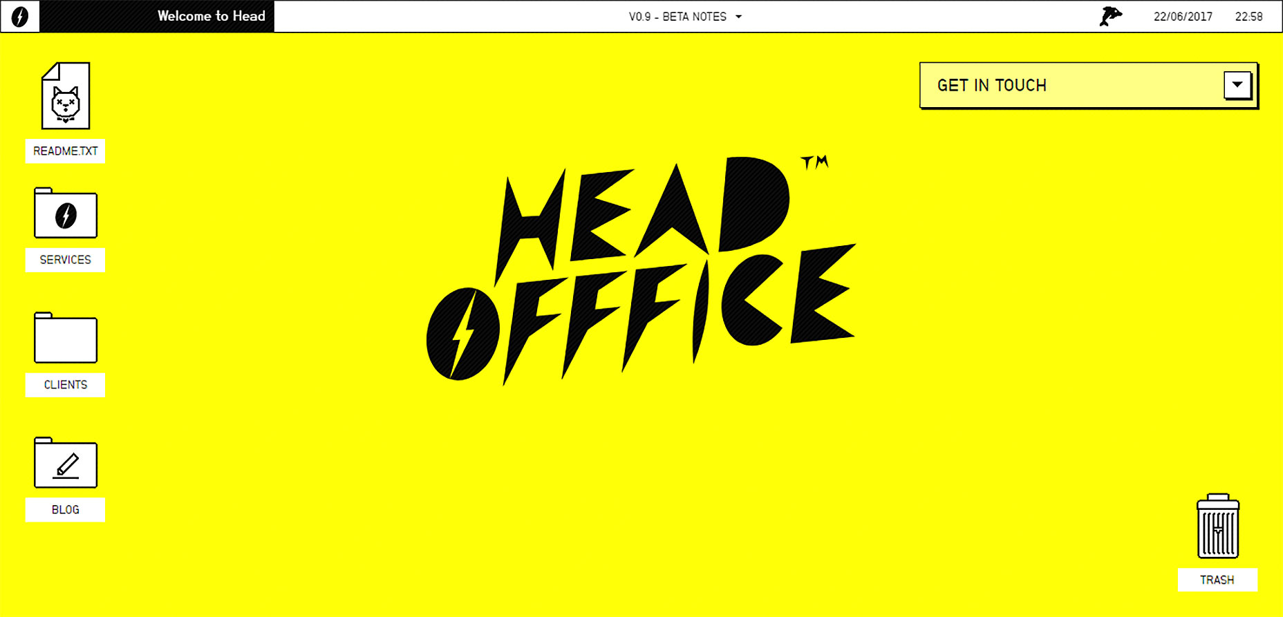
 The playful typeface on HeadOfffice sets energetic atmosphere.
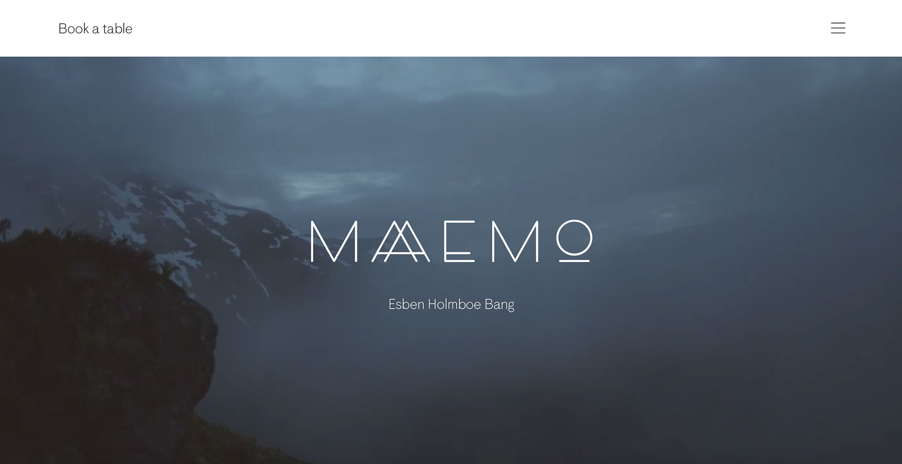
 The modern and original typeface used on the Maaemo homepage creates mysterious atmosphere.
 You’ve probably noticed that all the examples above have one thing in common: the decorative typeface is used together with a simple, minimal layout. This isn’t a coincidence. The fact is that decorative typography is interesting on it’s own. Thus, if you’re going to use decorative type on your homepage, to concentrate user attention on a single element it’s better to use a simple layout.
4. Lettering
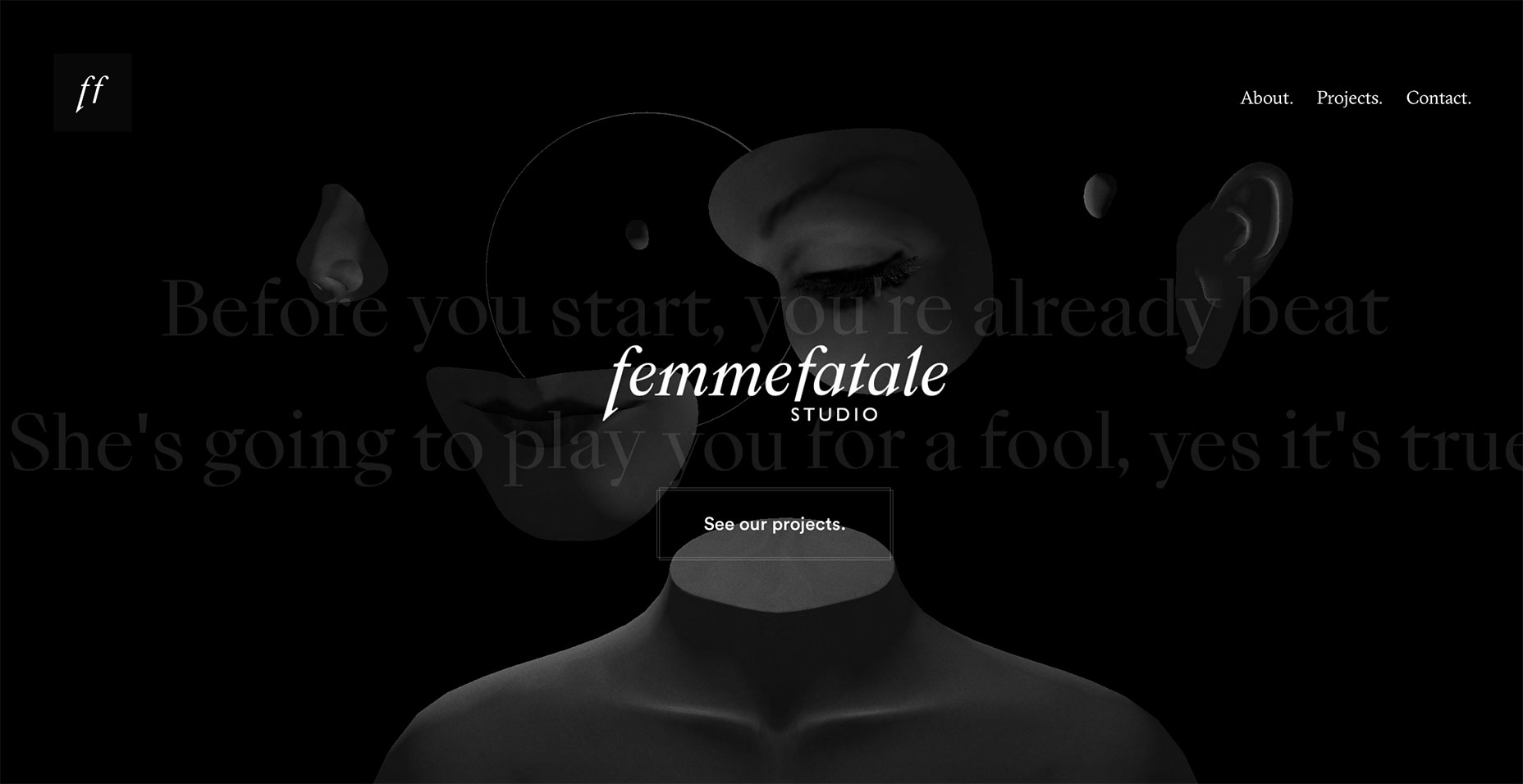
Hand-drawn type has long been a part of web design. At times it is a real lettering that is scanned in, but in many cases, it’s a typeface made to look hand-drawn. Script fonts and lettering add an elegant flair to any design when done right. The hand-drawn text is unique as it is capable of conveying messaging about the organisation behind it. Take a look at Grain&Mortar and Femmefatale examples below. The artistic roots of these design agencies shine through in their home page design.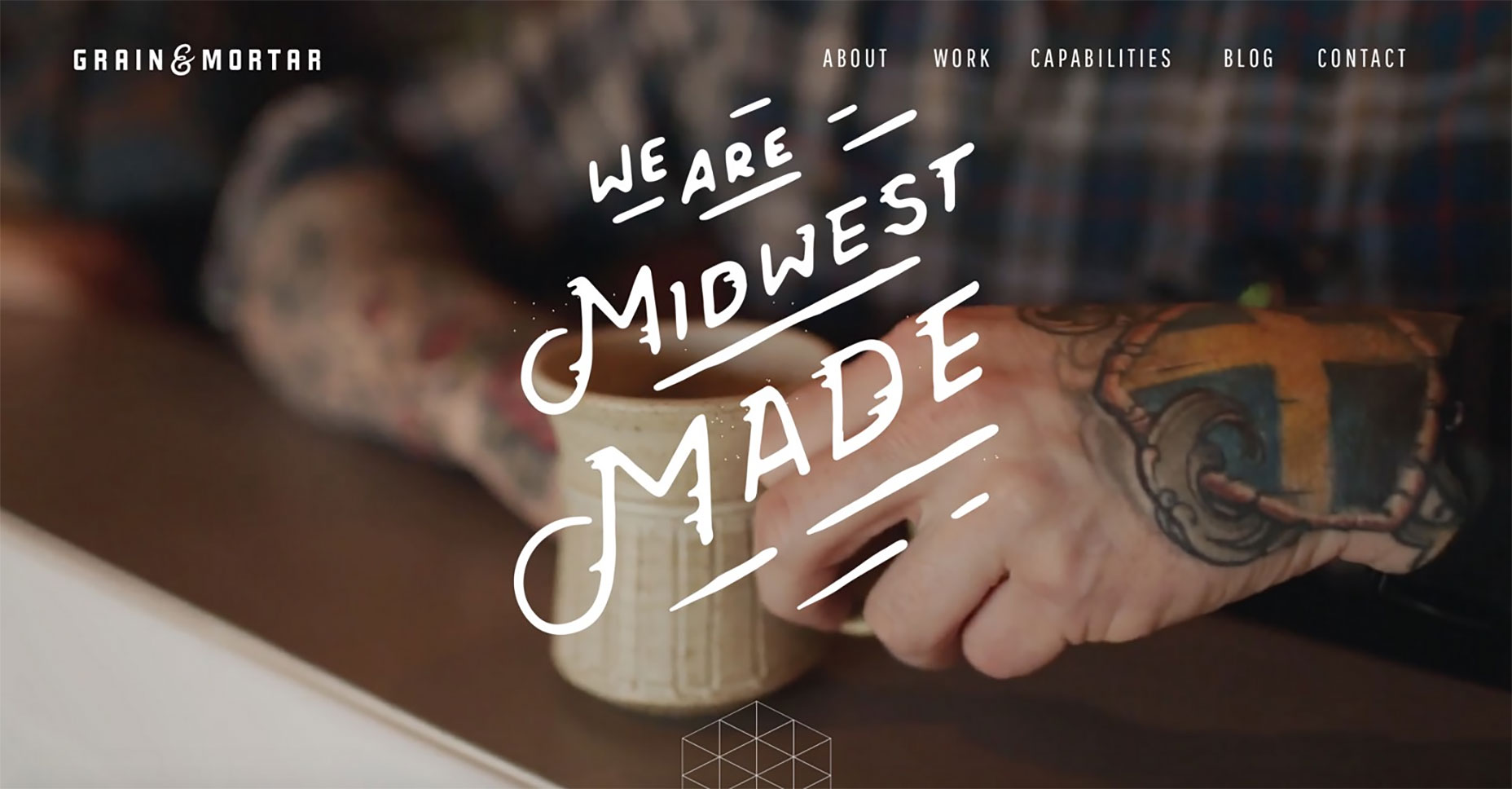 Hand drawn elements are a great way to humanise a brand.
 Just make sure that, if readability is the ultimate goal, the message isn’t lost in the beauty. To prevent potential issues, try to limit the use of hand drawn fonts to big titles overlaid across images and use another font for the regular copy.
5. Superimposed Over Elements
One of the best ways to get text noticed is by superimposing it over other elements (such as images or other graphical objects). Usually, the fonts chosen to be superimposed take account of other textures, patterns and artwork that are going to be present in the design: You can extend text beyond its section into others.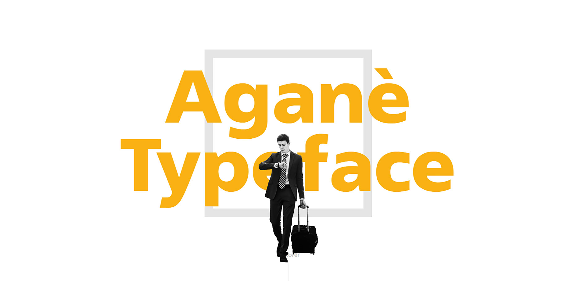 Having half of the words “bleed” over an image.
 Or even break the rules and give prominence for primary image and hide the words behind it.
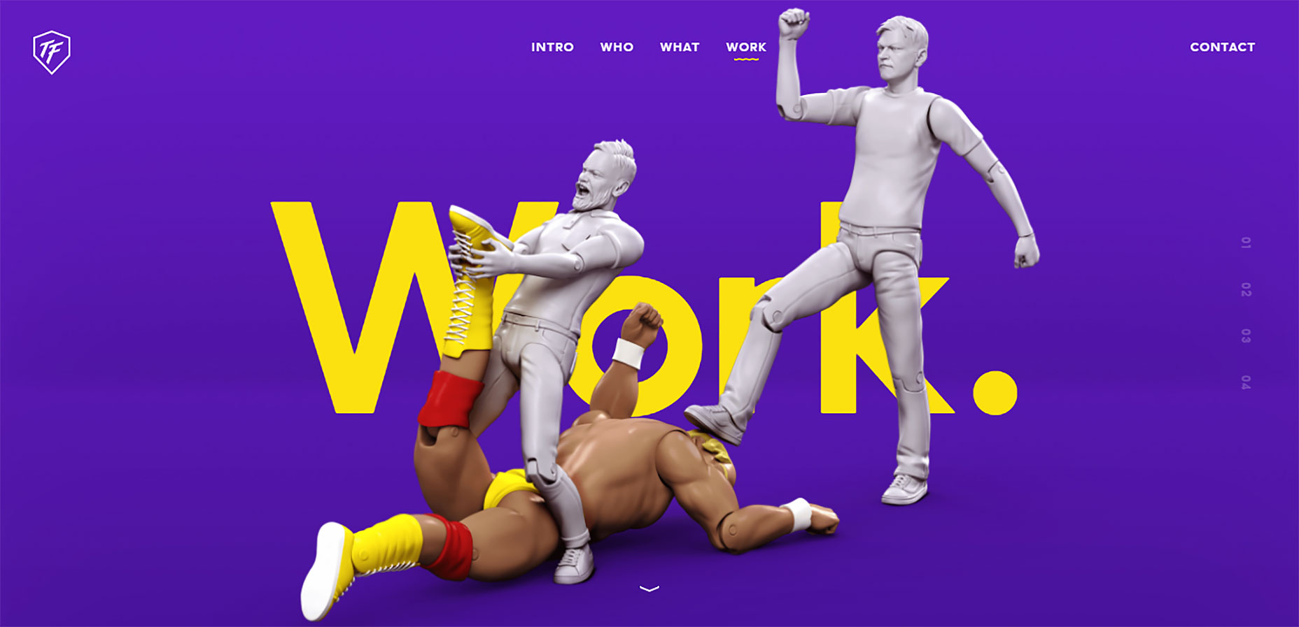 The two important considerations with this technique are contrast and legibility. You need to test out your design to ensure that both requirements are satisfied and the site has good user experience.
Nick Babich
Fireart Studio is a design studio passionate about creating beautiful design for startups & leading brands. We pay special attention to nuances all the time to create professional while cool products that will not only meet all expectations, but exceed them.


Read Next

15 Best New Fonts, July 2024
Welcome to our monthly roundup of the best fonts we’ve found online in the last four weeks. This month, there are fewer…
By Ben Moss

20 Best New Websites, July 2024
Welcome to July’s round up of websites to inspire you. This month’s collection ranges from the most stripped-back…

Top 7 WordPress Plugins for 2024: Enhance Your Site's Performance
WordPress is a hands-down favorite of website designers and developers. Renowned for its flexibility and ease of use,…
By WDD Staff

Exciting New Tools for Designers, July 2024
Welcome to this July’s collection of tools, gathered from around the web over the past month. We hope you’ll find…

3 Essential Design Trends, July 2024
Add some summer sizzle to your design projects with trendy website elements. Learn what's trending and how to use these…

15 Best New Fonts, June 2024
Welcome to our roundup of the best new fonts we’ve found online in the last month. This month, there are notably fewer…
By Ben Moss

20 Best New Websites, June 2024
Arranging content in an easily accessible way is the backbone of any user-friendly website. A good website will present…

Exciting New Tools for Designers, June 2024
In this month’s roundup of the best tools for web designers and developers, we’ll explore a range of new and noteworthy…

3 Essential Design Trends, June 2024
Summer is off to a fun start with some highly dramatic website design trends showing up in projects. Let's dive in!

15 Best New Fonts, May 2024
In this month’s edition, there are lots of historically-inspired typefaces, more of the growing trend for French…
By Ben Moss

How to Reduce The Carbon Footprint of Your Website
On average, a web page produces 4.61 grams of CO2 for every page view; for whole sites, that amounts to hundreds of KG…
By Simon Sterne

20 Best New Websites, May 2024
Welcome to May’s compilation of the best sites on the web. This month we’re focused on color for younger humans,…