

Why is Color Contrast So Useful?
Color contrast, in a nutshell, provides visual intrigue and keeps viewers interested. Consider for a moment how boring it would be if an entire poster was made out of one color or only included shades from the same color family. Although there are some instances when this does work from an artistic perspective, it’s not an approach that is likely to grab someone’s attention when they’re perusing store shelves, looking at movie posters or surfing the web. Therefore, it’s wise to use contrasting colors whenever appropriate. Think about the classic Coca-Cola can. If the entire thing was red, it wouldn’t stand out nearly as much as it does. The white writing truly pops off of the red background, which grabs attention and is instantly recognizable. This contrast is visually stunning, and it stands out from its competitors.
How to Best Use Color Contrast
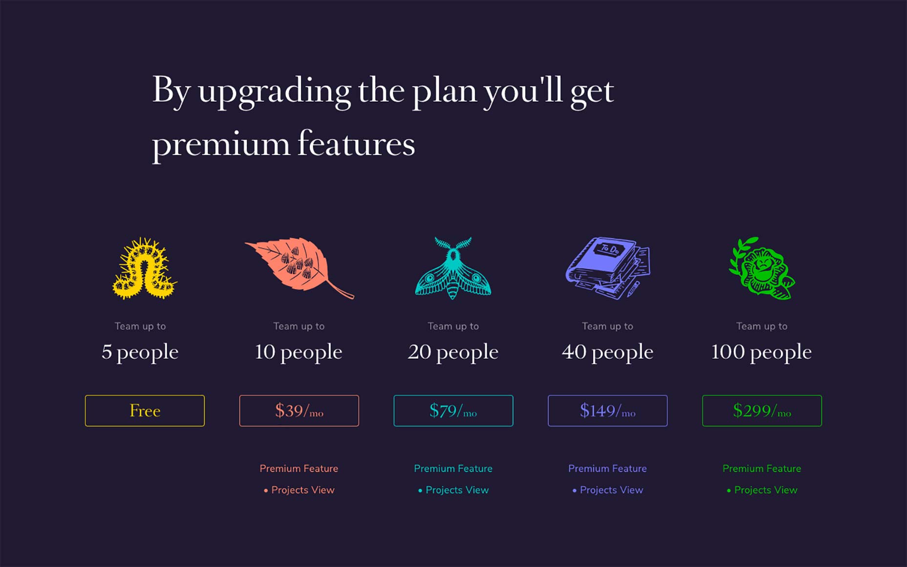
The color choices you make must depend largely on the format that you’re using. The Coca-Cola can provides a great way to explain this process. In a physical product such as a can of soda, the red background works. It also stands out well in print advertising, on TV commercials and much more. But what if you were to attempt to design a website with these same colors? To put it as bluntly as possible, a solid red website page background with white text on top would be atrocious. A full red background will work, though, if you put a text box on top of it that has a lighter color such as white or tan. From there, you’d most likely want to use black text in the text box to create another layer of contrast. Not only will this approach be more eye-catching but it will also enable people to actually read the text. Remember: black text on red is very difficult to read. Other examples of contrasting color combinations that won’t work well on the web and may also be almost indecipherable in other formats include light green on medium green, green on red and red on blue. Instead, consider using white on green and yellow or white on blue. If you must put text on a solid red background, it’s best to use white just like Coca-Cola. Of course, color contrast isn’t always used to call attention to text. If you’re looking to put two different contrasting colors together to draw the eye to something specific on the page, you can choose between dramatically different colors and the more subtle contrast that is caused by changes in shade, tint and saturation. Color contrast plays a huge role in getting your CTA or button standing out. This should go without saying but when the user is skimming the landing page or your article, a CTA with a different color than the page will grab their attention. This all sounds good but in order to see it in action we should take a look at some companies that are using color contrast to their advantage.Teamweek is by far one of the best examples I can give you. As you can see in the image above, although the plans are all a different color, the contrast between the turquoise button and the rest of the page still does an amazing job drawing your attention to the CTA.
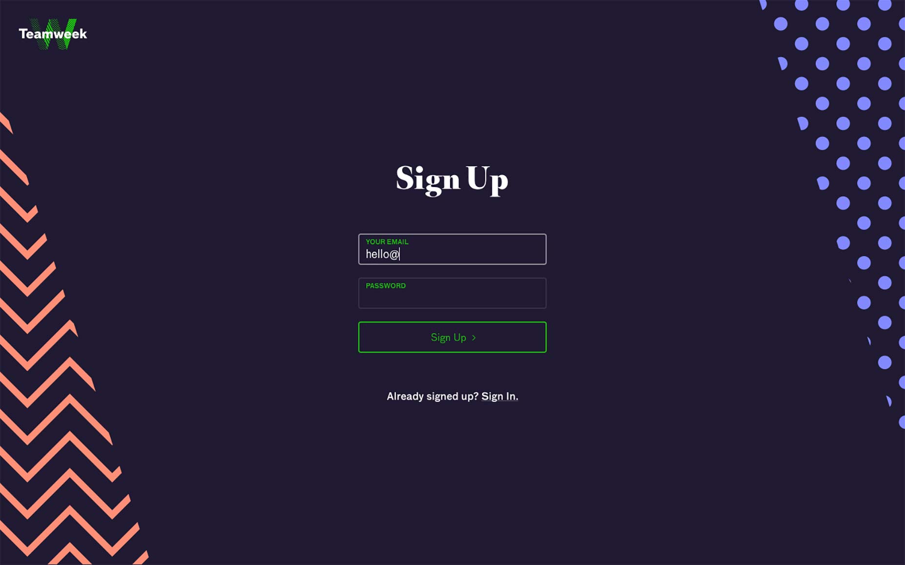
 The same thing happens on their sign-up page. Although the page is rich in colors and patterns, the user’s attention is redirected to the center of the page.
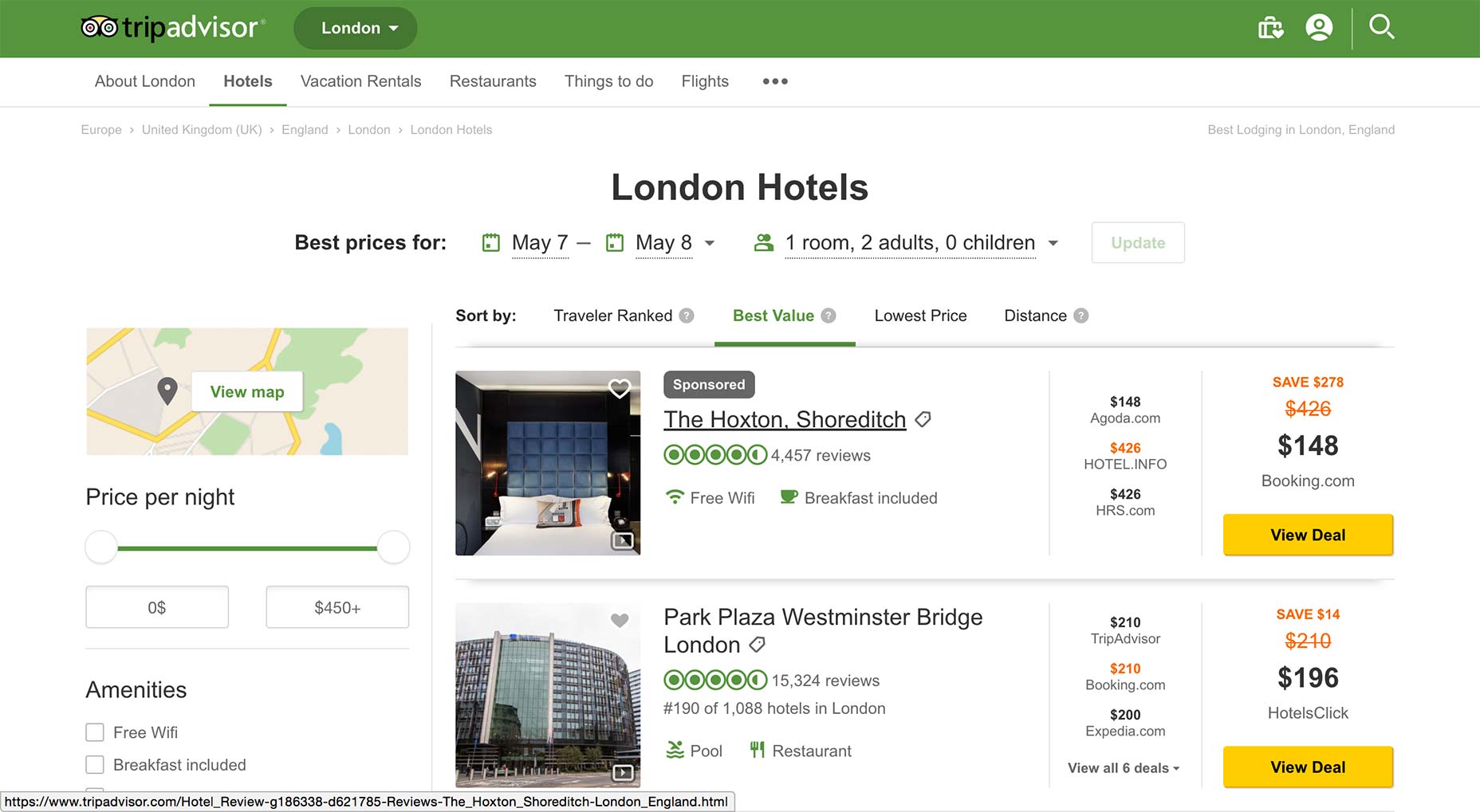
 Trip Advisor does a nice job of using contrasting colors and white space to direct each user’s eyes to the most important aspects of their search results. The mixture of green and yellow is pleasing to the eye, and they kept the classic blue hyperlink color to make it easy for people to know where to click to learn more. Even better, they chose a bold yellow with black text for their “show prices” button, which stands out so much that people are virtually certain to engage with this call-to-action.
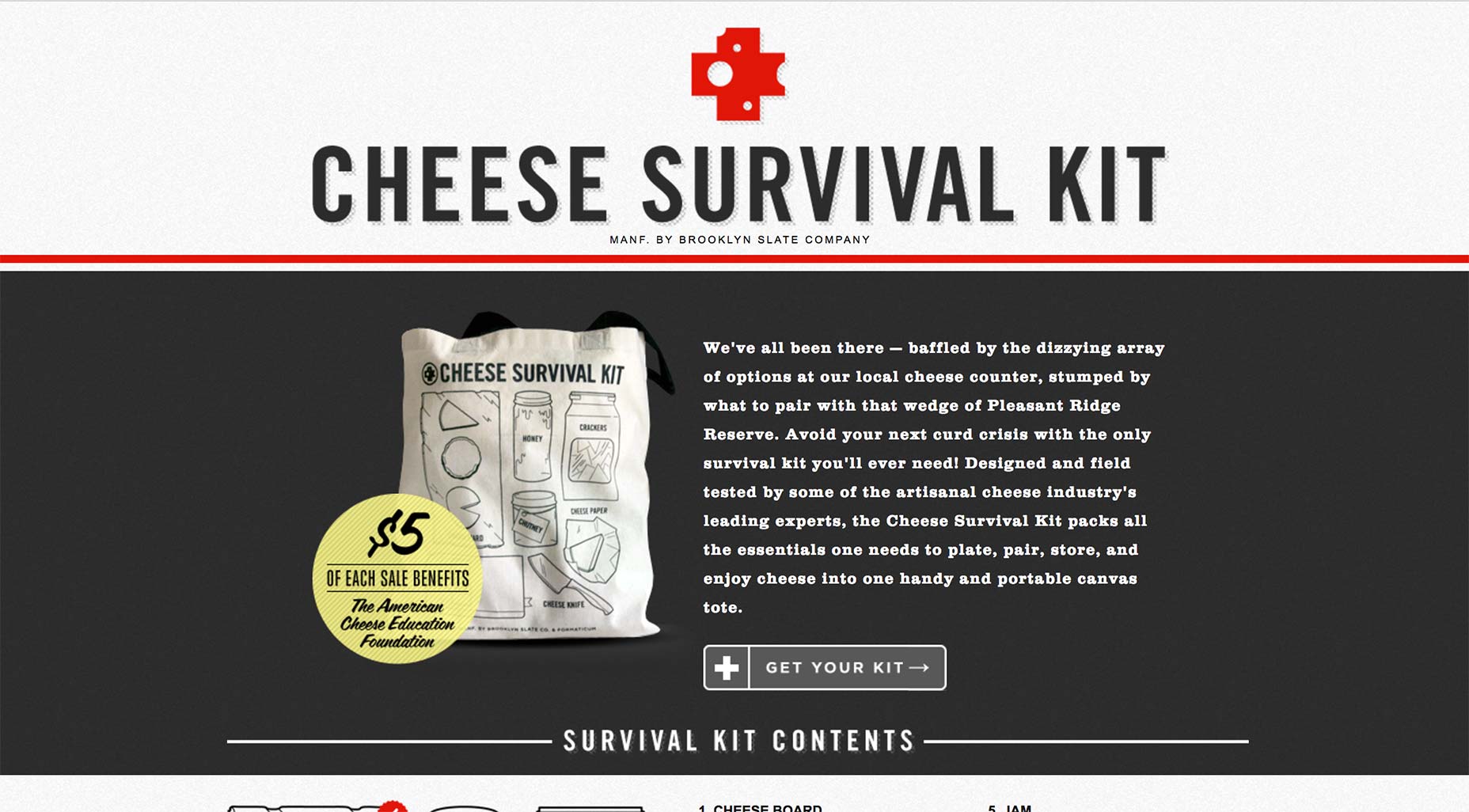
 Another prime example of how to use contrasting colors to your advantage can be found at CheeseSurvivalKit.com. Alternating between open and negative space with their choice of white and gray pulls the eye in. Topping off this combination with a splash of red helps ensure that website visitors will be visually intrigued enough to stick around.
What Every Designer Needs to Know
Approximately 8 percent of men worldwide suffer from some form of color-blindness. This condition is much rarer in women, but 1 out of every 17 people with color-blindness is female. In total, 4.5 percent of the world’s population does not see all colors as the rest of the world does. This may seem like a small enough percentage that you wouldn’t cater to their needs. However, the reality is that in the UK alone, 2.7 million people are colorblind. This is something designers really need to consider, especially if they’re creating something that is targeted at men. Red/green blindness is the most common version of color-blindness. What this means is that the red and green elements of any color will not have their true appearance to these individuals. For instance, a person with red/green blindness will perceive purple as blue. This happens because they’re unable to see the red tone that helps differentiate purple from blue.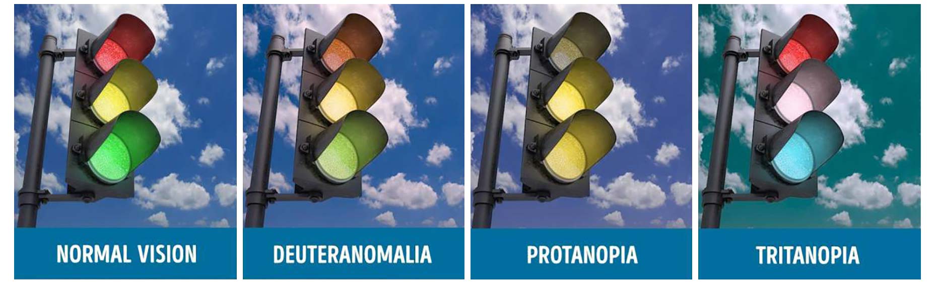 As you can imagine, this makes the process of choosing the perfect color contrast even more difficult. If you were to choose green as your primary background color or even as a font color, 4.5 percent of your intended viewing audience may not be able to accurately see everything. They may not even be able to read the words very well depending on the hue you chose and how severe their color-blindness is.
The Bottom Line
Ultimately, a color contrast should make both elements stand out, but especially the element that is most important. In other words, if you’re putting text on a colorful background or image, make sure that the words are easy to see and read. Keep your audience in mind and try to steer clear of color combinations that would make the final result difficult for people with color-blindness.Andrei Tiburca


Read Next

15 Best New Fonts, July 2024
Welcome to our monthly roundup of the best fonts we’ve found online in the last four weeks. This month, there are fewer…
By Ben Moss

20 Best New Websites, July 2024
Welcome to July’s round up of websites to inspire you. This month’s collection ranges from the most stripped-back…

Top 7 WordPress Plugins for 2024: Enhance Your Site's Performance
WordPress is a hands-down favorite of website designers and developers. Renowned for its flexibility and ease of use,…
By WDD Staff

Exciting New Tools for Designers, July 2024
Welcome to this July’s collection of tools, gathered from around the web over the past month. We hope you’ll find…

3 Essential Design Trends, July 2024
Add some summer sizzle to your design projects with trendy website elements. Learn what's trending and how to use these…

15 Best New Fonts, June 2024
Welcome to our roundup of the best new fonts we’ve found online in the last month. This month, there are notably fewer…
By Ben Moss

20 Best New Websites, June 2024
Arranging content in an easily accessible way is the backbone of any user-friendly website. A good website will present…

Exciting New Tools for Designers, June 2024
In this month’s roundup of the best tools for web designers and developers, we’ll explore a range of new and noteworthy…

3 Essential Design Trends, June 2024
Summer is off to a fun start with some highly dramatic website design trends showing up in projects. Let's dive in!

15 Best New Fonts, May 2024
In this month’s edition, there are lots of historically-inspired typefaces, more of the growing trend for French…
By Ben Moss

How to Reduce The Carbon Footprint of Your Website
On average, a web page produces 4.61 grams of CO2 for every page view; for whole sites, that amounts to hundreds of KG…
By Simon Sterne

20 Best New Websites, May 2024
Welcome to May’s compilation of the best sites on the web. This month we’re focused on color for younger humans,…