Ultimate UX Design Guide to SaaS On-Boarding, Part 1: Sign-up Forms


- Sign up Form
- Welcome Email
- Drip Campaign
- First Login & Product Tutorial
- Data Import & Notifications
- Check up calls & Swag
Keep the Questions Limited
If you ask the customers to fill a large amount of fields on the sign up form, there is bound to be some discontent at their end. You have to limit the questions you ask, to increase the rate of conversion from the sign up form to the other parts of the process. By decreasing the amount of questions you initially ask, you can ensure a higher conversion rate. Having understood the importance of keeping the questions limited, it is imperative that you know which questions to cut out and which you should include. Anything that can directly initiate your relationship with the customer should be asked. An email address is good enough for a subscription, so it should be your priority. Shopify’s sign up page is an example of keeping it precise and to-the-point.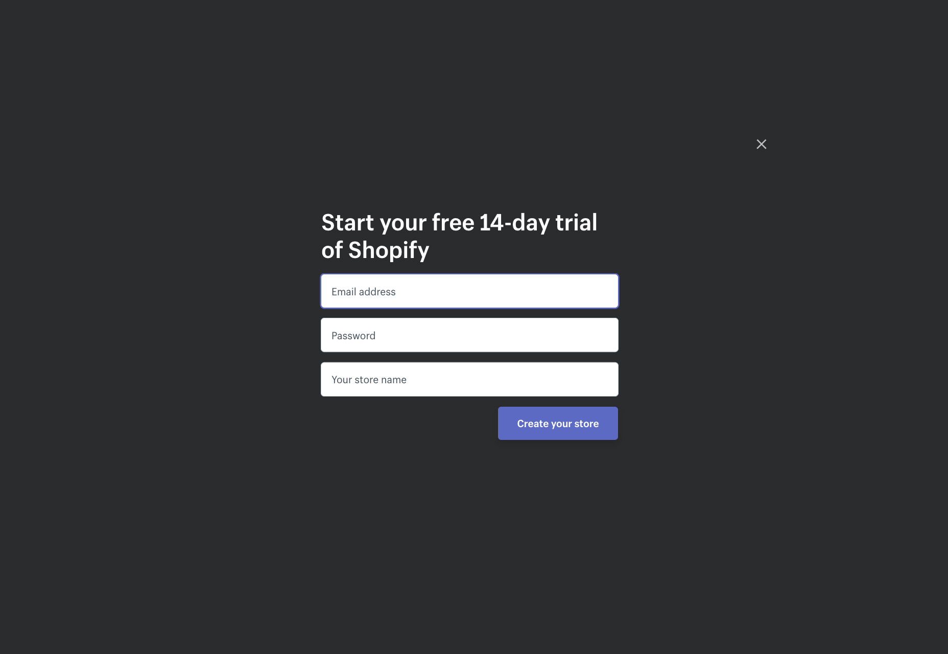 Ask whatever is necessary to initiate your relationship and make the customer proceed to the next step. Necessary questions include the email address of a user, so that there is a mode of communication. Besides the email and user name, other questions regarding the personal information of the user should be left for later, in the ‘Complete Your Profile’ step. Let’s continue using Shopify’s example. Once a customer signs up with Shopify, they are directed towards completing their profile:
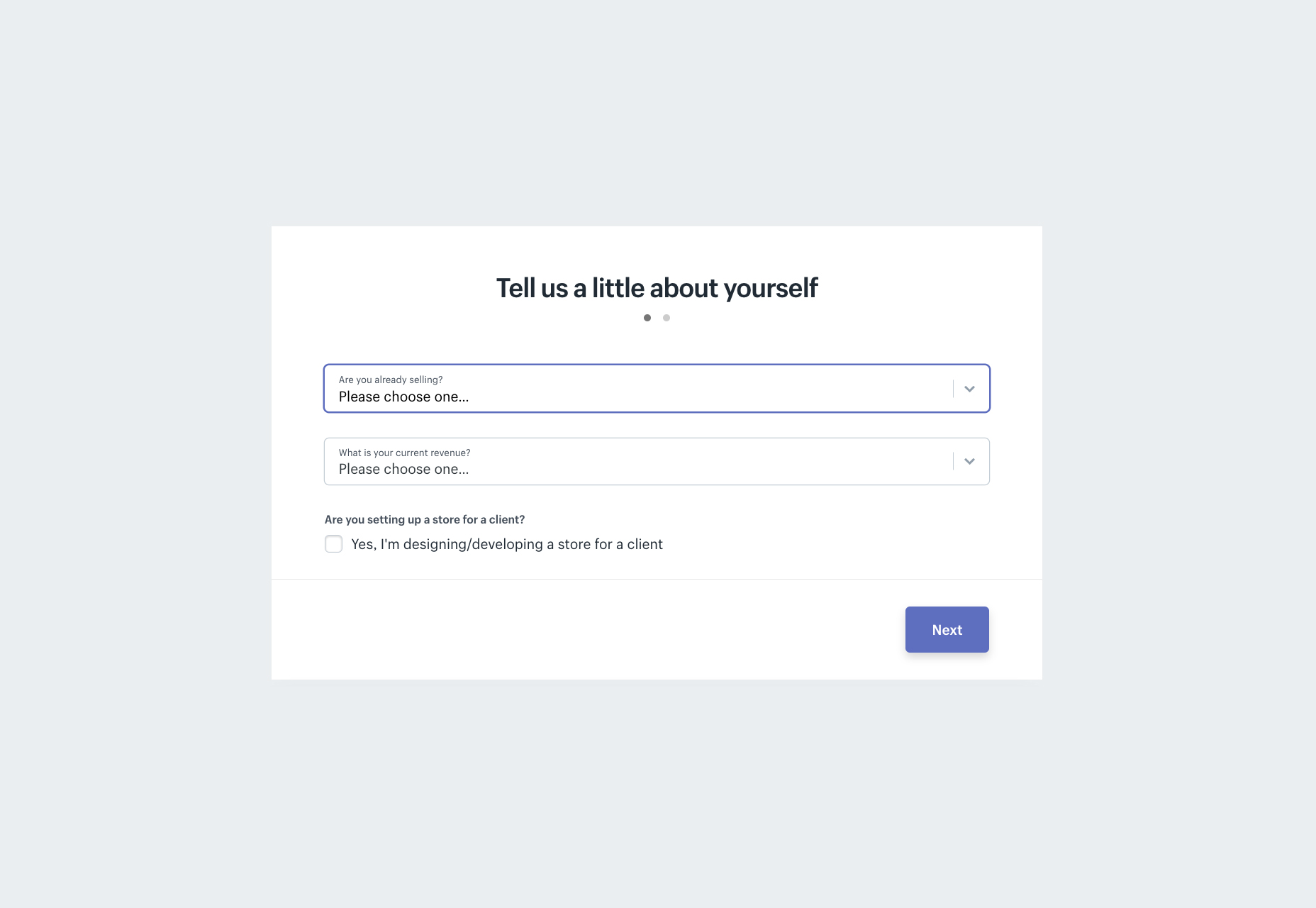
Back Your Sign Up Form with Strong Social Evidence
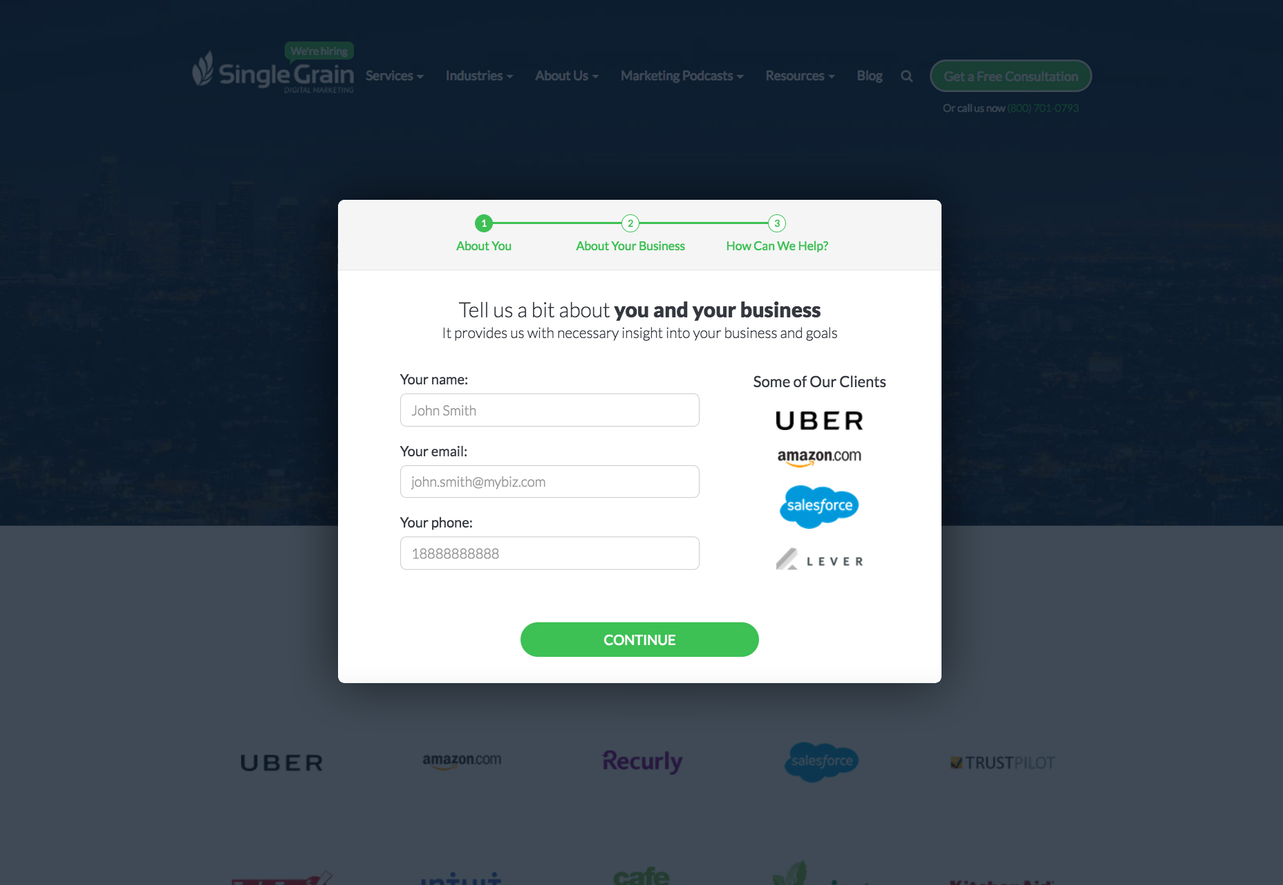
One noticeable thing about the current generation is their infatuation towards joining the bandwagon and keeping up with the fads. So, if you are able to put up interesting figures regarding the people who have signed up on your website with success, you can be guaranteed of a positive response from the customer. Salesforce is an excellent example of a company that does this. Right below the signup form, a customer can find the benefits that customers of Salesforce have received.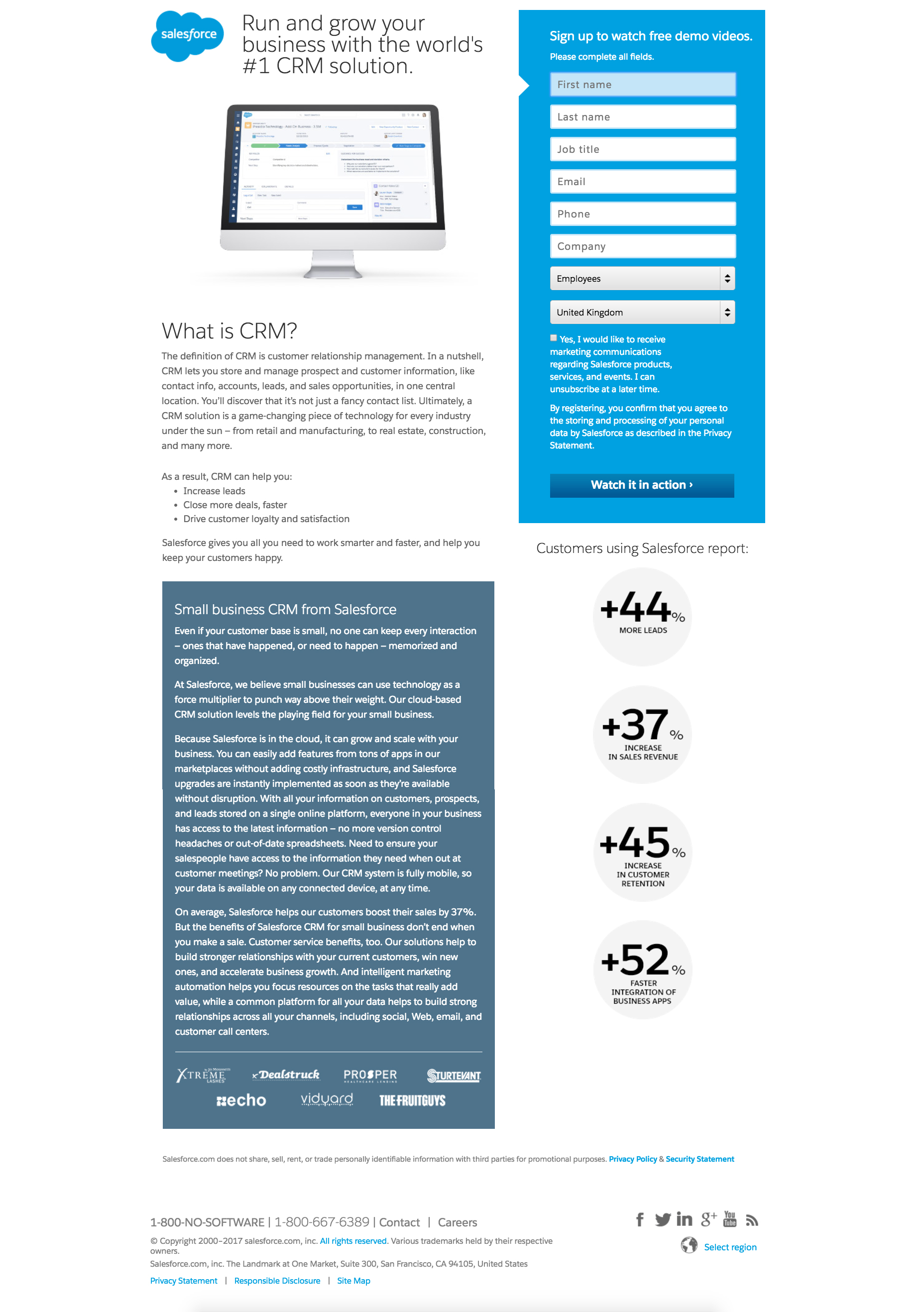 SingleGrain decided to create their social proof by displaying on the sign-up page logos of their clients.
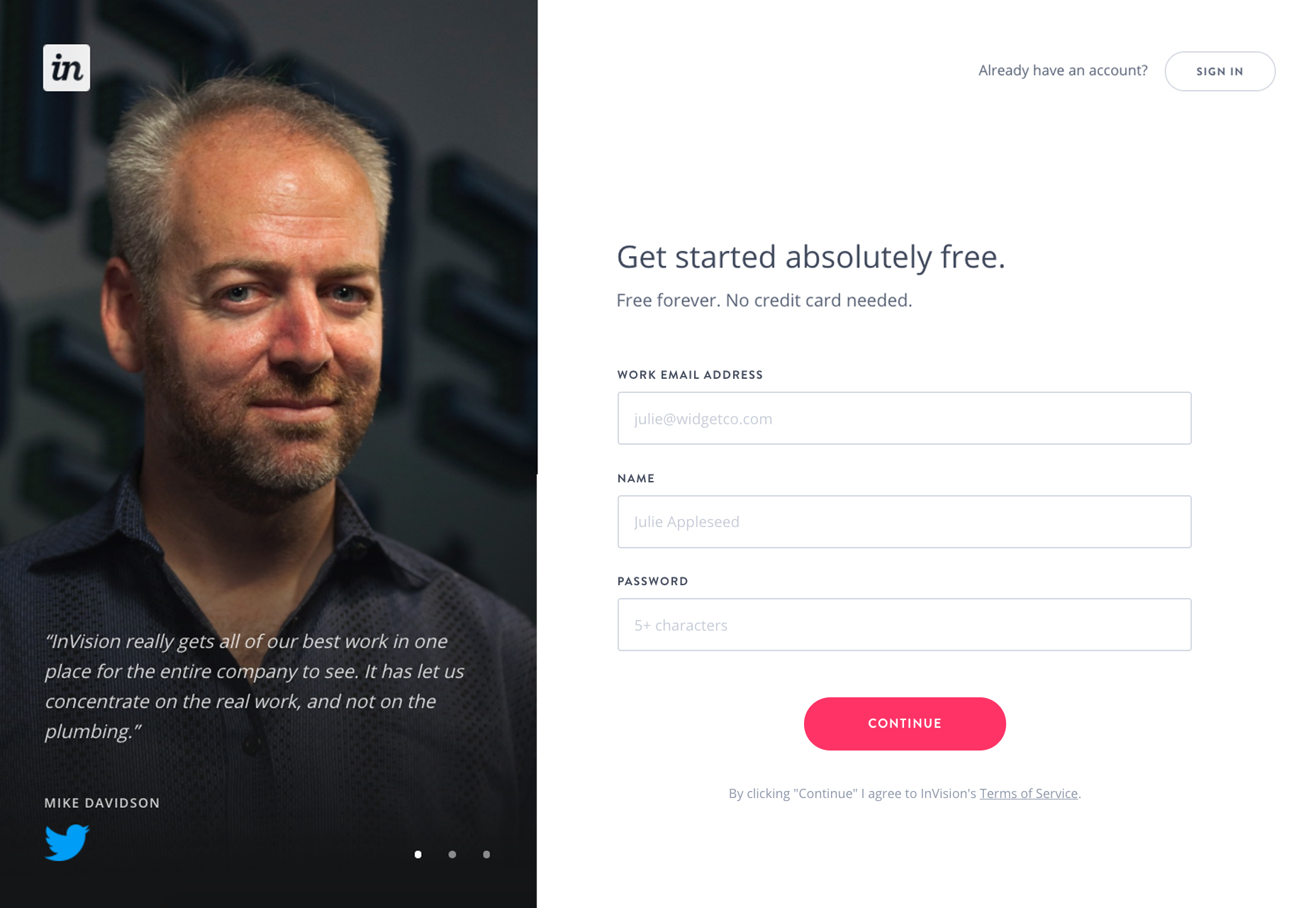
 InVisionApp took and advantage of the authority principle displaying on the sign-up page testimonials from people like Mike Davidson (Vice President of Design at Twitter) or Andy Law (Manager of Mobile Product Design at Netflix)
Make the Email Sign-up a Beneficial Deal For the Customer
If you are able to sell the sign up to the customer, you have aced the first step of the SaaS customer on-boarding process. You need them to sign up on your website, and the customers need something for doing that. To be fair, the customers want as much as they can get, for giving as little information as they can. This is where a conundrum arises. The confusion can be solved by creating a deal for the customer. Get the customer to perceive they’re benefiting from the deal. This can be done by offering the customer something in return, something which motivates the customer to move into the sign-up process. The value proposition should be clearly visible for the customer to comprehend. Many SaaS companies like Convertize.io come up with a brilliant motivation argument—the free trial period that often motivates individuals to sign up. Convertize gives your 14-days trial as an opportunity to test their product.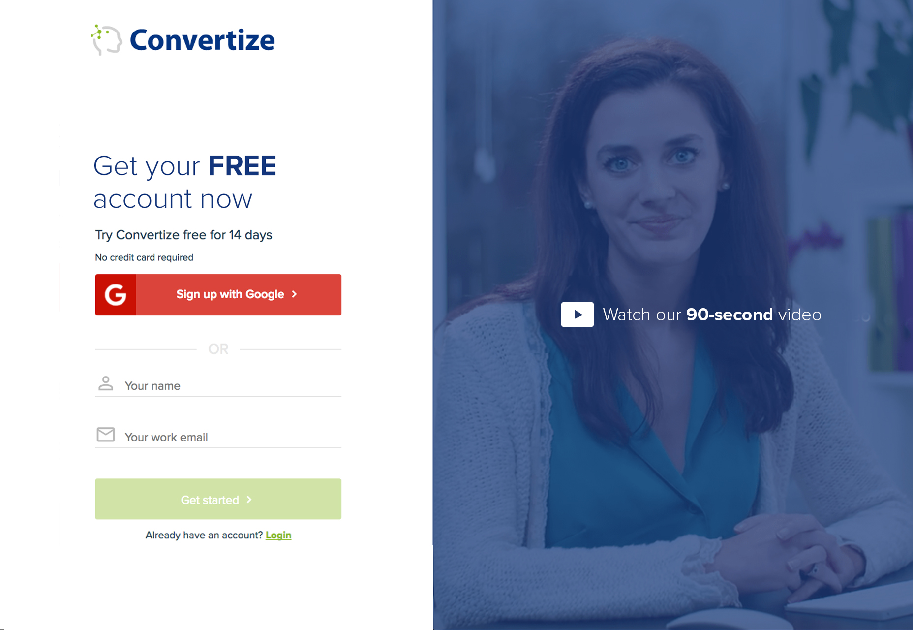 The offer you make to the customers plays the role of the main attraction and serves as bait. If the offer is viable and good enough for the customers, it will help in attracting them to the brand. If it is not, then customers won’t be attracted to your brand. Thus, the offer you make to the customers is your lead magnet or core attraction. All other details just complement the lead magnet into initiating the perfect deal with you.
Design is Important!
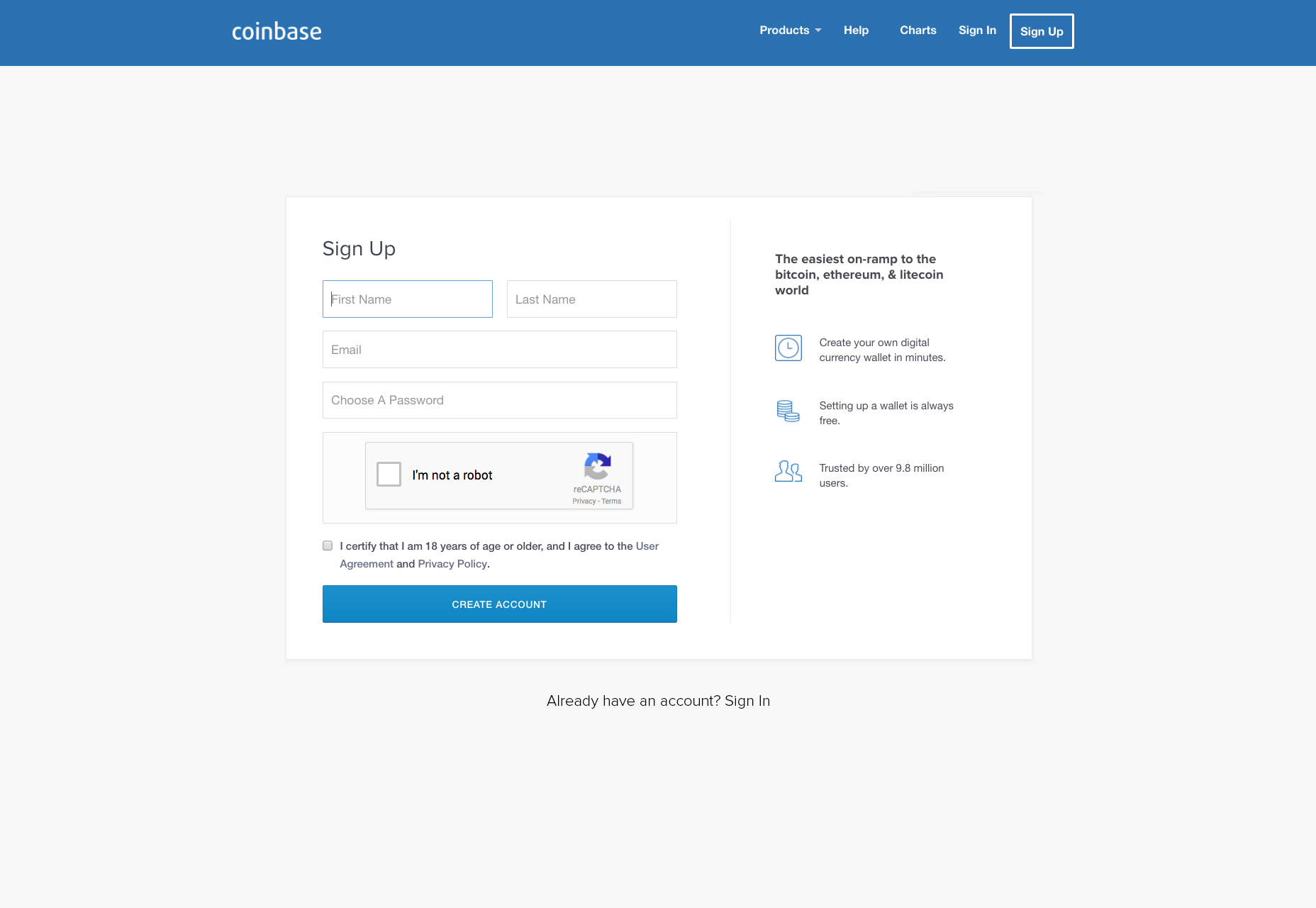
The design of the form is as important as anything else, which is why great detail should be given to this aspect of the deal. A design which is aesthetic is bound to get more customers sign up for your website than before. The importance of design should not be neglected at all costs. Furthermore, a website with a better design than the other websites will garner more trust from the users. Accordingly to Dr Coker, from the University of Melbourne’s Faculty of Business and Economics, users are found to trust website with prettier designs more than others:Internet consumers are 20 per cent more trusting of websites than they were five years agoCoinbase’s signup form is an excellent example. The design is simple and user friendly without compromising on looking sleek and elegant.
Manage User’s Expectations
Let customers know what’s going to happen next. Don’t leave them quizzical as suspense is not the feeling you want to create here. Make the customer trust you from the word go, by letting them know what they’re signing up for. If consumers have to submit the form feeling uncertain about what is going to happen next, there is bound to be friction. The best way to go about this is to have your submit button say something other than just ‘submit’. You can write whatever is going to happen next on the button. This way there will be less uncertainty and the users will be more in control. Leanplum’s signup page is a good example of this, with the promise of instant access after signup.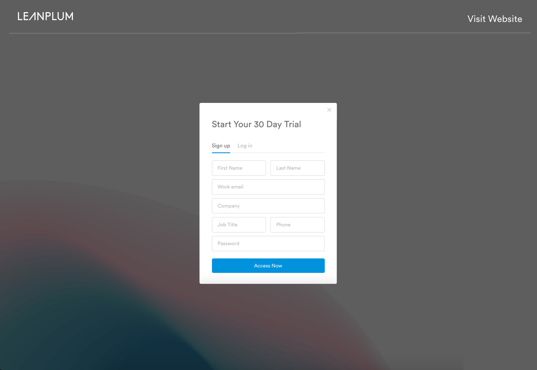
Social Media Signup
Giving users the option to sign up using social media accounts can drastically speed up the process for the user and increase the probability of conversion. Common social media sign-in options include Facebook, Twitter, Google Plus. Clicking on a social media button for access looks far more appealing to the user, as compared to filling in a number of information fields. There are a number of advantages and disadvantages of using social media signups. The advantages include:- No need to worry about an additional password. People with an active online presence are usually members of a lot of websites. Remembering an additional password can be worrisome and can deter a user enough to not sign up for your website. A social media sign-in option eliminates this deterrent.
- Faster registration. Signing up via a social media account is far faster than the tedious process of filling out an online form
- Market Research. A social account sign-in can grant you a wealth of information about your user, ranging from personal preferences to birthday, where they live, their friends etc. This can allow you to better assess your target market.
- Engaged Users. According to online research, users that log in to other websites via Social media accounts stay longer. This research was conducted by Facebook. Users can Like / Share and since their friends are right there, this can increase the market reach for your website.
- Anxiety from too many options. If you offer multiple social media sign-in options your user could become flustered and then decide to “come back to it later”.
- Would it affect your brand? Giving a social media sign-in option is creating the presence of another brand alongside your own. Will the option really result in a greater conversion rate? Also, if a user’s social media account is hacked, their account on your website may suffer too.
- Relying on a third party. If a social media server crashes, it could restrict your user’s access to his/her account with you. You would need a backup for that eventuality.
- Accessibility. Some workplaces have blocked social media websites. Therefore, if your users log in through social media, they would not be able to.
- Privacy. Some users are extremely privacy conscious and would rather create an account with you rather than use their social media.
Signup Flow
We’ve talked about how it’s important to have a signup page that is concise and enticing by way of its content and design. However, the signup page is part of something called the “sign-up flow”. The signup flow refers to the steps in the process that the user has to take to go from signing up to using the product / service. We encounter another term in this regard, which is “friction”. Simply put, friction represents the amount of effort that the user has to invest in completing the signup process. Let’s talk a little bit about friction and then we’ll go on to discuss common signup flows that companies use.Friction
The amount of friction encountered by users can’t really be objectively measured. However there are three things (according to Totango) that can, to an extent, allow for gauging how much friction an average user might encounter:- Information Cost. Total number of fields to be filled in by the user.
- Steps to Completion. The number of steps / pages the user has to pass through to get to access the application.
- Effort investment. Number of decisions that the user has to make and extra activities to be completed.
3 Common Signup Flows
Signup flows can be designed in innumerable ways. The flow is dependent on the product, the target market and many other variables. However there are three broad based signup flows that we’ve observed, and usually other signup flows are more or less derivative of these.Flow 1: Access to App After a Number of Steps
This is the most commonly used sign up flow that companies use. Users are familiar with this process and consequently don’t have to think much about it. However there are a lot of steps that the user needs to take before getting to the app.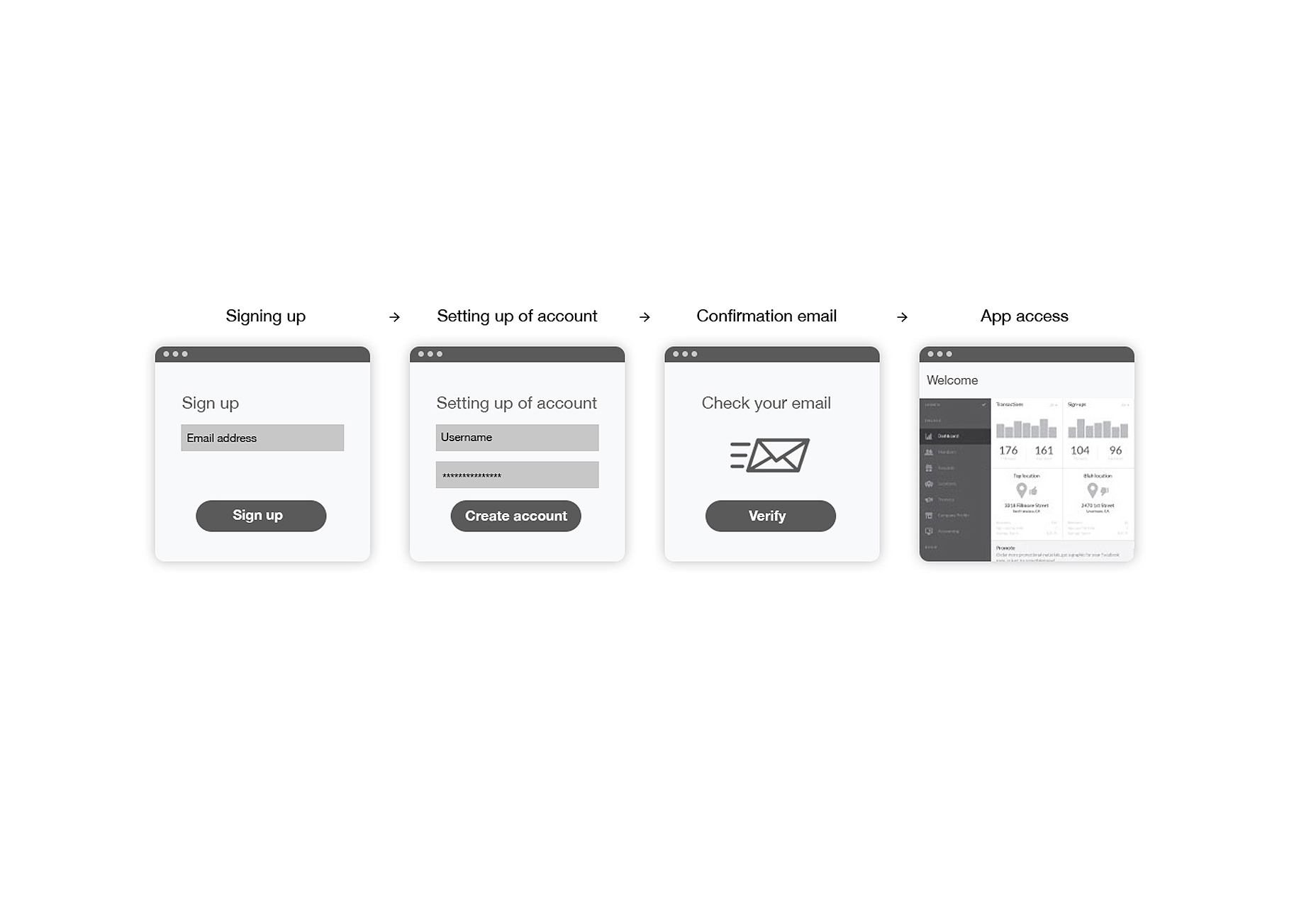
Flow 2: Setting Up of Account After Accessing the App
Being able to instantly access the app after signup is the reason why a lot of friction is eliminated in this approach. However this way you could get a lot of users who just want to try the app out, without any intention of completing the signup process.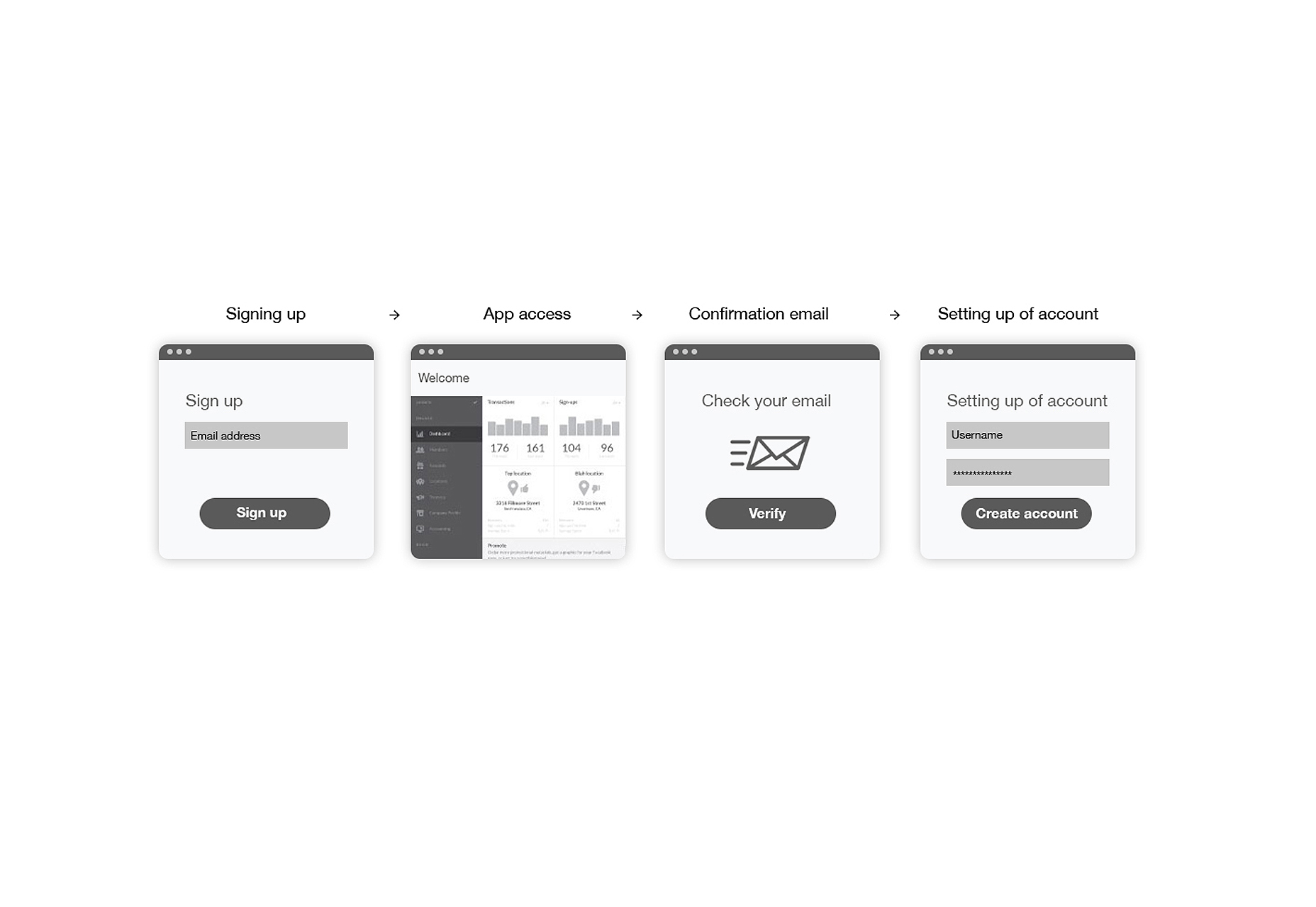
Flow 3: Immediate Access to the App
A signup flow that goes one step further than the second approach, this is absolutely frictionless.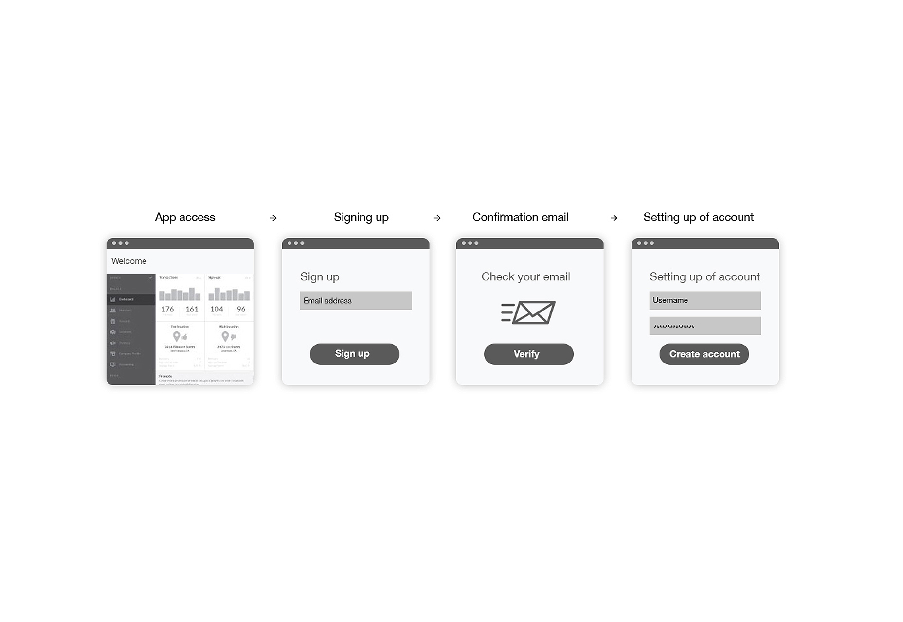
Conclusion
Sign-up forms don’t come across as the most exciting items to design on a website. In fact, most companies neglect the importance of sign-up forms by implementing below par designs. You can either inculcate a striking palette, a witty heading or an aesthetic design. But whatever you do, make sure that your first impression weaves its magic over the customers. Keeping in mind the importance of the sign up page in setting the right impression, there should be no errors whatsoever.Aleksander Góra
Aleksander Góra is enhancing user experience by crafting beautiful and intuitive interfaces since 2006. He is the co-founder & CEO of www.5next.io the first application for strategic networking based on UK accredited business networking program. Aleksander is the author of upcoming book The Open Heart Website Surgery—Ultimate guide for leads generation for medium and small businesses. Recently featured in Rafael Dos Santos book “100 Inspirational Migrant Entrepreneurs in the United Kingdom.” Currently working in London as a Product Manager and Lead UX Designer in one of the lead­­­ing conversion optimization platforms Convertize.io


Read Next

15 Best New Fonts, July 2024
Welcome to our monthly roundup of the best fonts we’ve found online in the last four weeks. This month, there are fewer…
By Ben Moss

20 Best New Websites, July 2024
Welcome to July’s round up of websites to inspire you. This month’s collection ranges from the most stripped-back…

Top 7 WordPress Plugins for 2024: Enhance Your Site's Performance
WordPress is a hands-down favorite of website designers and developers. Renowned for its flexibility and ease of use,…
By WDD Staff

Exciting New Tools for Designers, July 2024
Welcome to this July’s collection of tools, gathered from around the web over the past month. We hope you’ll find…

3 Essential Design Trends, July 2024
Add some summer sizzle to your design projects with trendy website elements. Learn what's trending and how to use these…

15 Best New Fonts, June 2024
Welcome to our roundup of the best new fonts we’ve found online in the last month. This month, there are notably fewer…
By Ben Moss

20 Best New Websites, June 2024
Arranging content in an easily accessible way is the backbone of any user-friendly website. A good website will present…

Exciting New Tools for Designers, June 2024
In this month’s roundup of the best tools for web designers and developers, we’ll explore a range of new and noteworthy…

3 Essential Design Trends, June 2024
Summer is off to a fun start with some highly dramatic website design trends showing up in projects. Let's dive in!

15 Best New Fonts, May 2024
In this month’s edition, there are lots of historically-inspired typefaces, more of the growing trend for French…
By Ben Moss

How to Reduce The Carbon Footprint of Your Website
On average, a web page produces 4.61 grams of CO2 for every page view; for whole sites, that amounts to hundreds of KG…
By Simon Sterne

20 Best New Websites, May 2024
Welcome to May’s compilation of the best sites on the web. This month we’re focused on color for younger humans,…