

Heartbeat
Today, we start off with Heartbeat, a web and app agency. Their site, while hearkening back to the days of pure minimalism, is loaded with personality, and some pretty ingenious animation. This is the first time in a while that animated inter-page transitions haven’t just annoyed me. I’d also note how their contact form is dead simple and short. And if even that’s too much for a given client, they put their phone number, Skype ID, and email right where potential customers can find them. I’m sold, and I don’t even need them to make me anything.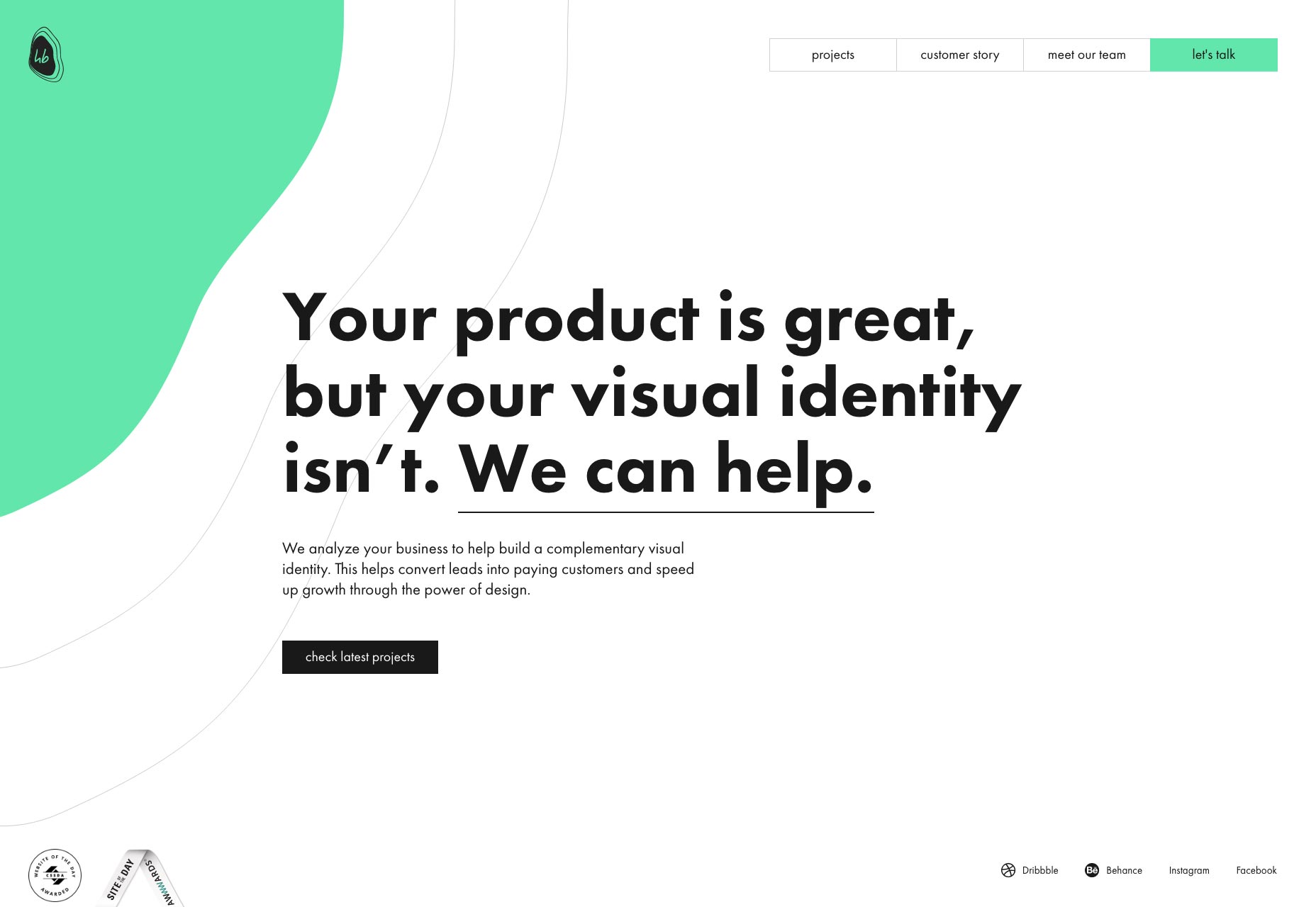
Anakin
Believe is or not, Anakin has nothing to do with a certain notable whiny villain who only stops whining when they cut his limbs off, which is presumably one of the better times to whine. It’s a design studio. It’s got that post-minimalist style, lots of white space, and elegant (if somewhat small at times) typography. Some aspects of their site (especially the labels on their contact form) could use a lot more contrast, but otherwise, this site is darned pretty.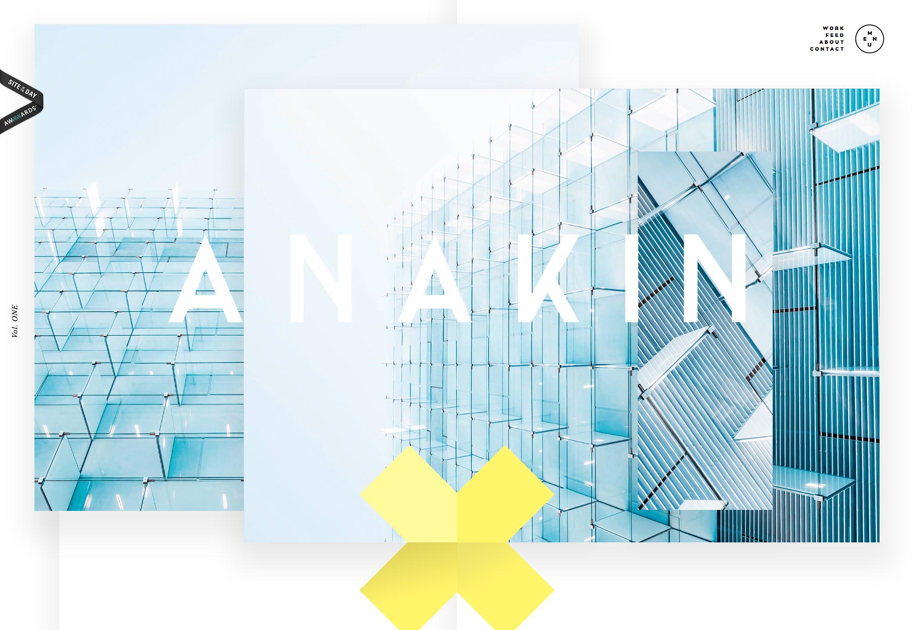
Jony Guedj
Jony Guedj is a filmmaker, and his site makes that very, very clear. I mean, the portfolio itself is basically a minimalist “film reel”, with a timeline at the bottom that is reminiscent of video editing apps. The site might be minimalist, but it’s creative, and gets the point across fairly quickly. Plus, I’d say it’s a fantastic example of how to use a horizontally scrolling layout.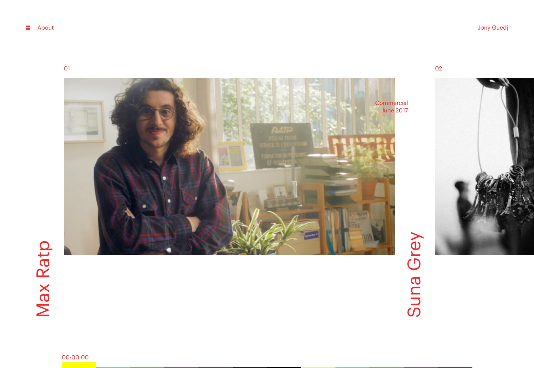
George Hastings
George Hastings’ portfolio is a simple, but finely crafted affair. The colors are striking, the type is solid, and the little animations are downright superb. It feels like minimalism had a brief fling with brutalism, and the result is a site that manages to feel utilitarian in a way, but still quite pretty. Also, you should absolutely have a look at this guy’s code and design experiments.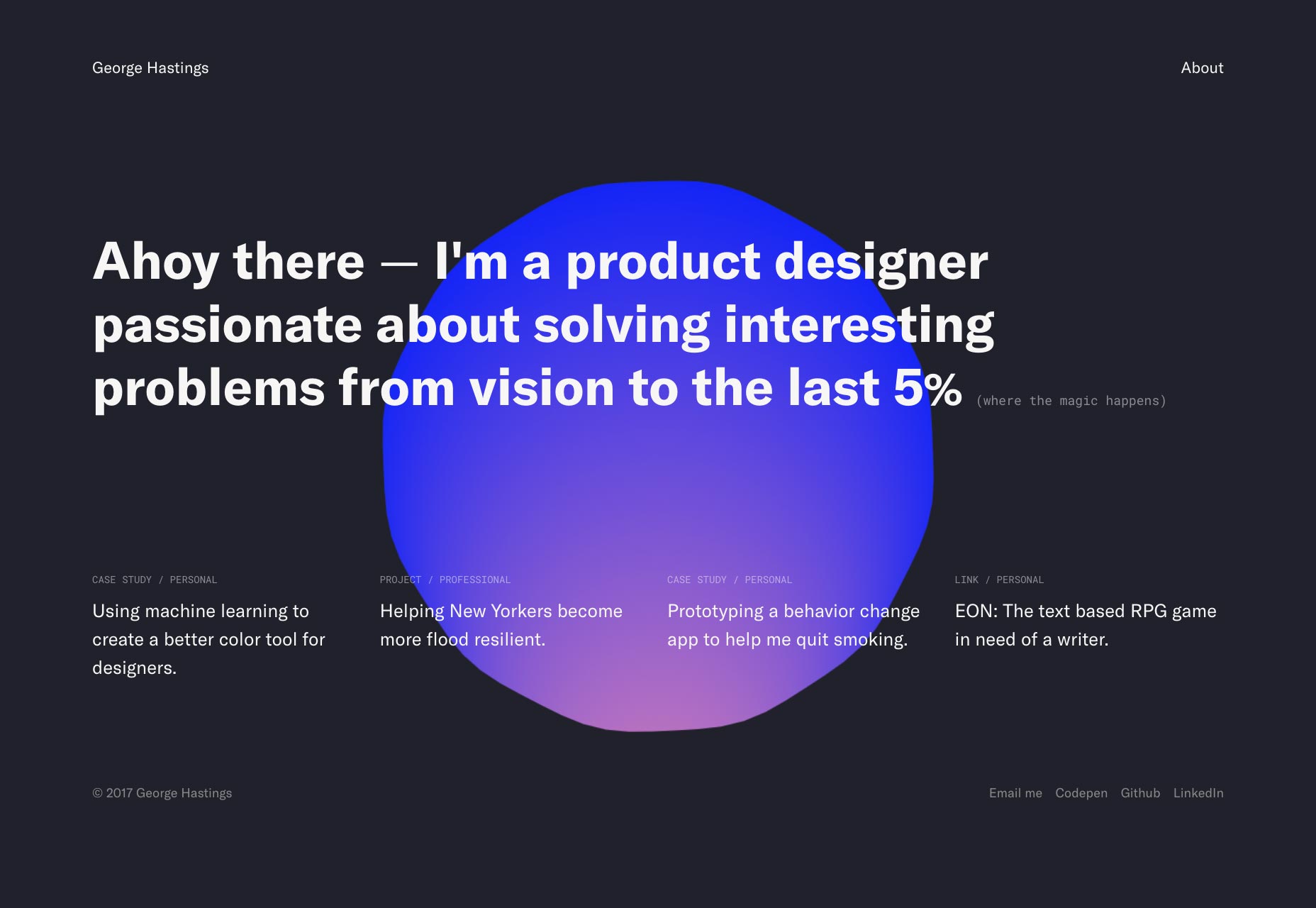
Elsa Muse
Elsa Muse’s work is about as artsy as you can get, and so is her site. It’s got some textbook post-minimalism [I should be writing that textbook] blended rather harshly with the boldest colors out there. The header of the home page is one of those designs that’s a bit of an eyesore on purpose. It’s supposed to stand out, rather than sooth. In a way, it’s genius. With this kind of site, you’ll only ever attract the sort of clients who love your style.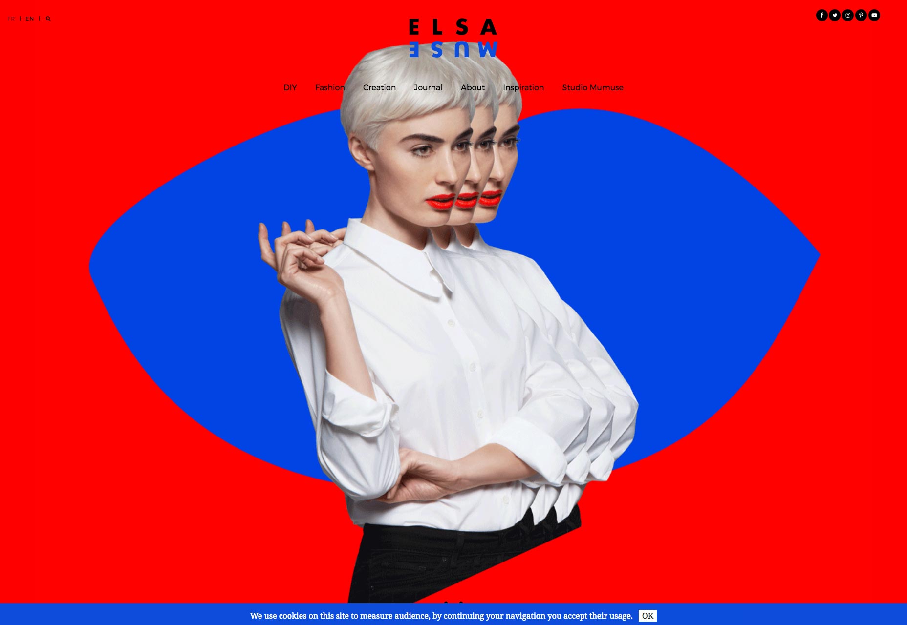
Dries Van Broeck
Dries Van Broeck is a motion designer. While the rest of his site is definitely well-crafted, you’ll be coming here for the animation most of all. So obviously, all of his work and many random site elements are animated, bouncing around, and generally pretty lively. Is it a bit distracting? Yes, but that is literally his job. I’d say this site sells his skills pretty well.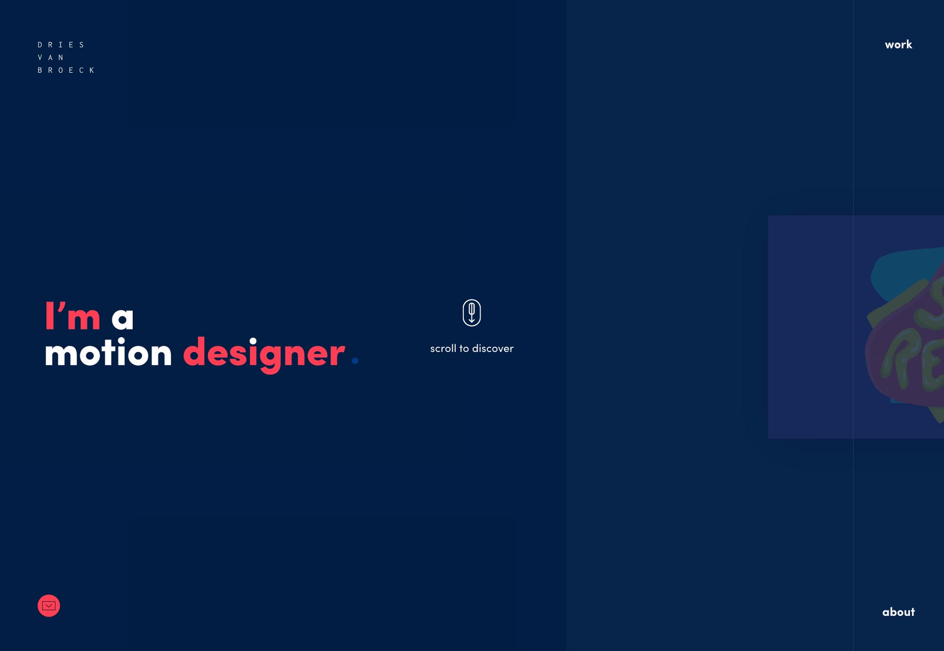
Alex Hunting Studio
Alex Hunting Studio has gone for the white-with-black-lines style of minimalism that used to be everywhere. It’s clean, it fits the textbook modern aesthetic, and presents their projects in slideshow format. They went for that “like a magazine, but online” look, and I’d say they nailed it.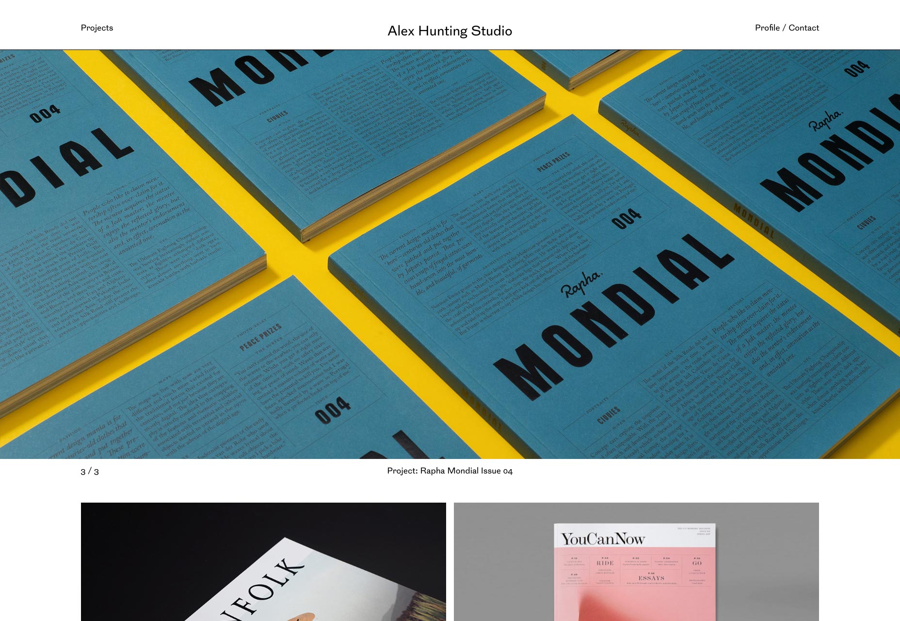
Simon Ammann
Simon Ammann doesn’t take minimalism to a whole new level, but he comes pretty close. Until you actually click through to a project, it’s all about that very small amount of text. Basically, he gets to the point. And he uses white space pretty much perfectly.
Timothy Achumba
Timothy Achumba is a product designer at Facebook, and the experience shows in his work. It’s dark, it’s sleek, it’s pretty. While the UI is simple and unassuming (as portfolios go, anyway), I couldn’t find a single flaw to criticize. Okay, maybe I would have made the contact info more prominent; but this guy’s working for Facebook. He doesn’t need regular clients to hire him often. He just needs to show off his near-flawless work until he moves on to the next billion-dollar corporation.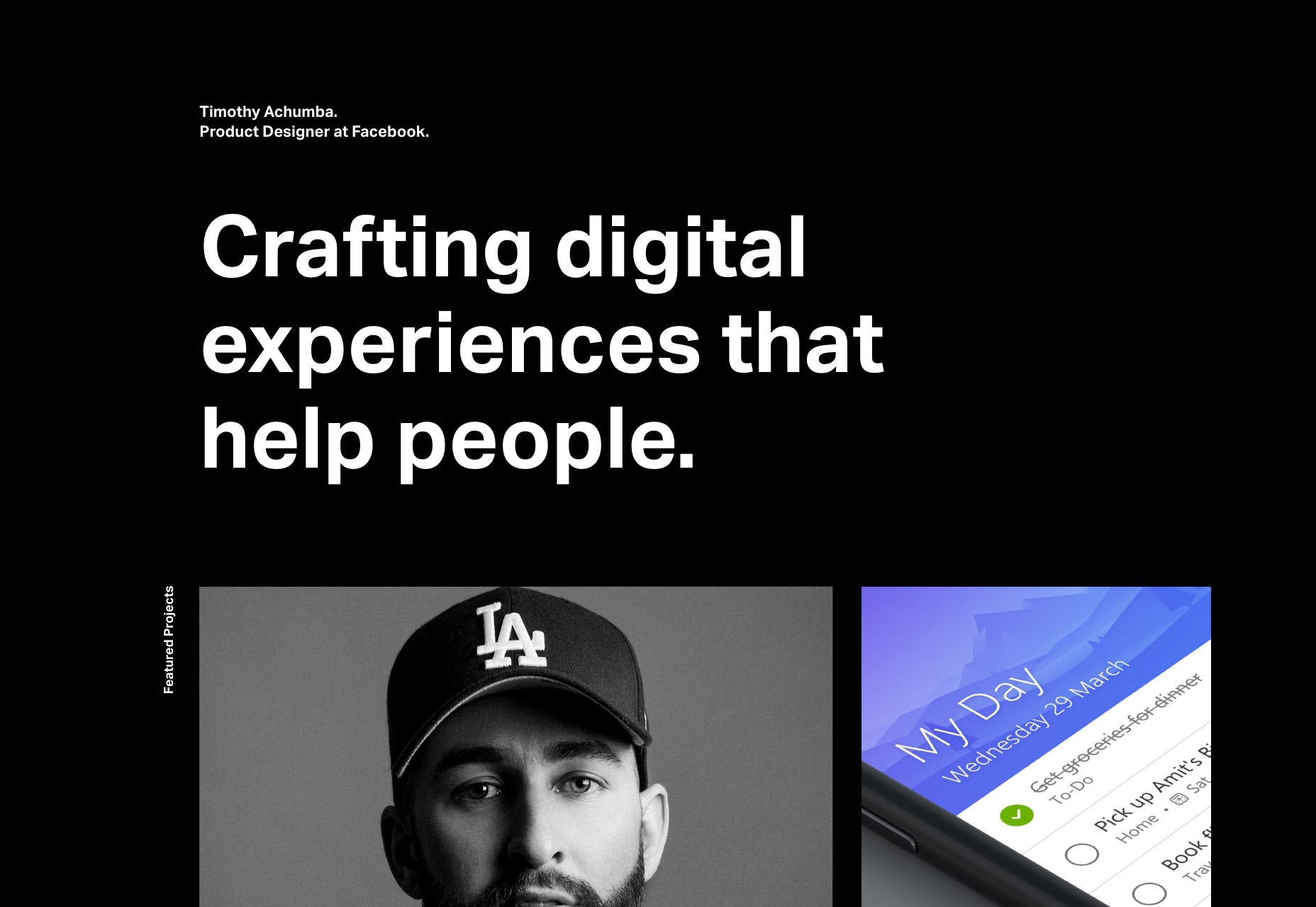
Matthew Vernon
Matthew Vernon’s portfolio took a fairly normal business site layout and gave it a semi-retro feel with magazine-like typography, and that classic “Internet Blue”. It’s a simple change to a simple site; but it gives the whole thing a bit of a nostalgic feel, while still looking professional.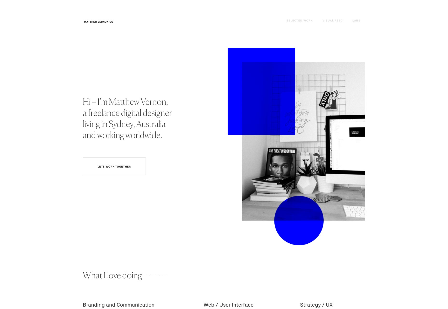
Malte Gruhl
Malte Gruhl’s website is as psychedelic as his name. That’s really the only way I can properly describe it. Oh sure, “artsy”, “post-minimalist”, “etc.”... these are all fairly accurate descriptors. But really, it’s a bit more like a chaotic art project than a website. I don’t know if it will sell his services, but it’s definitely hard to forget. I’d almost hire the guy just to see what would happen.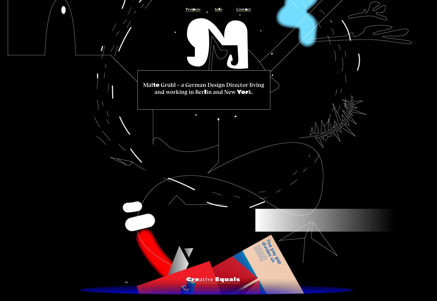
Tyler Hancock
After that last visual feast, Tyler Hancock’s light, minimalist, and type-driven portfolio is soothing to the eyes, even while bordering on brutalism. With big text and bigger images, this site is a delight for anyone who prefers simplicity and order in a site design.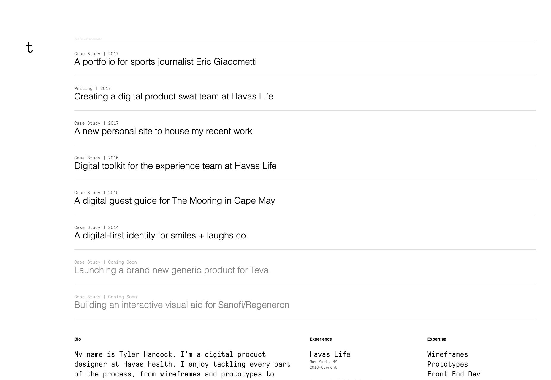
Matt Lee
Matt Lee bills himself as a “creative developer”, and judging by his site, I’d say he earned the title. What looks to be—at first glance—a typical dark layout turns out to be quite stylish. From the typography, to the “pixel” theme (you’ll see what I mean if you look hard at the backgrounds), to the way he uses photographs to reinforce the site’s visual themes, everything is put together beautifully.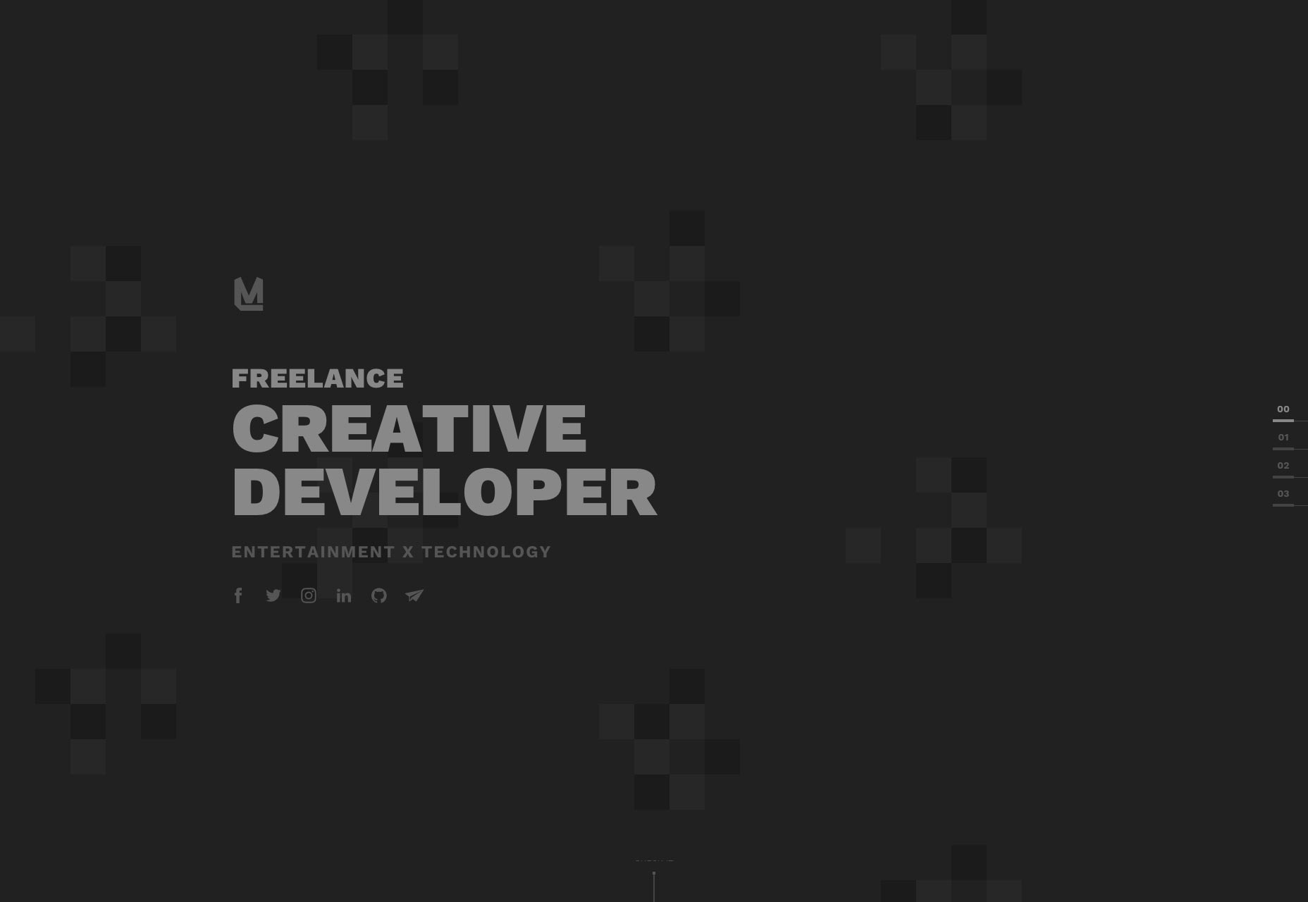
Laboratorium EE
Laboratorium EE isn’t anything groundbreaking, but it’s a pretty, and well-made site. I do particularly like the way they handle large resolutions, though.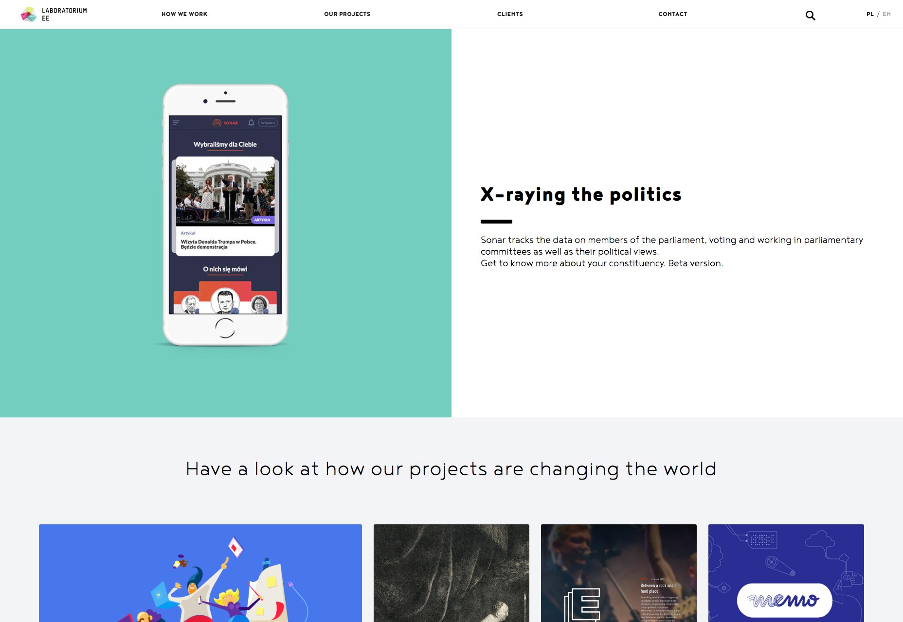
Ben Bate
Ben Bate’s portfolio only looks like it was made with Bootstrap. it’s actually custom made to look like Bootstrap! Okay, all jokes aside, this is an interesting one due to the sales strategy, rather than the aesthetics. Instead of depending on images or the usual copy to sell services, there’s a whole lot of social proof. You get to see the brands Ben has worked for before you even get to see examples of his work. There’s even a few classic testimonials at the bottom of the page. Even more interesting is his sales pitch: you tell him what you want, and he’ll prepare a PDF of relevant work samples. And hey, at that point, you’re already in email contact with him, right? It’s clever, and requires no more work on the part of the client than usual.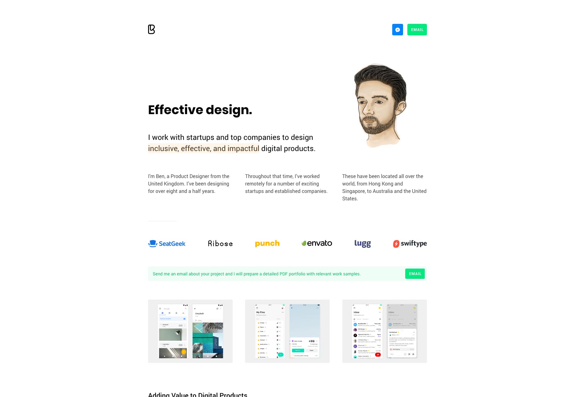
Booreiland
Booreiland is a Dutch digital agency that combines a fairly familiar layout with basically all of my favorite little twists: The effective use of yellow. Drop shadows that don’t suck. Animation that, while obvious, feels understated, and wouldn’t totally break the site were it to go missing. Fantastic type. It’s all good.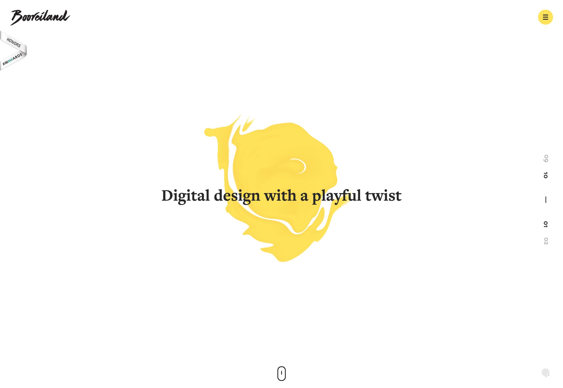
LatinMedios
I live in Mexico, and I can tell you that design sensibilities south of the border trend toward the extremely colorful. LatinMedios doesn’t go full double rainbow, but they have kept some of that color in their branding. To be fair, it’s in some of their work, too. It depends on the client. The rest of the site is a classic nearly-monochromatic business portfolio, with background animations and all the trimmings. It’s a blend of design thinking that could only come from the collision between two or more cultures. LatinMedios is in the U.S., Mexico, and several places in South America, so that just fits.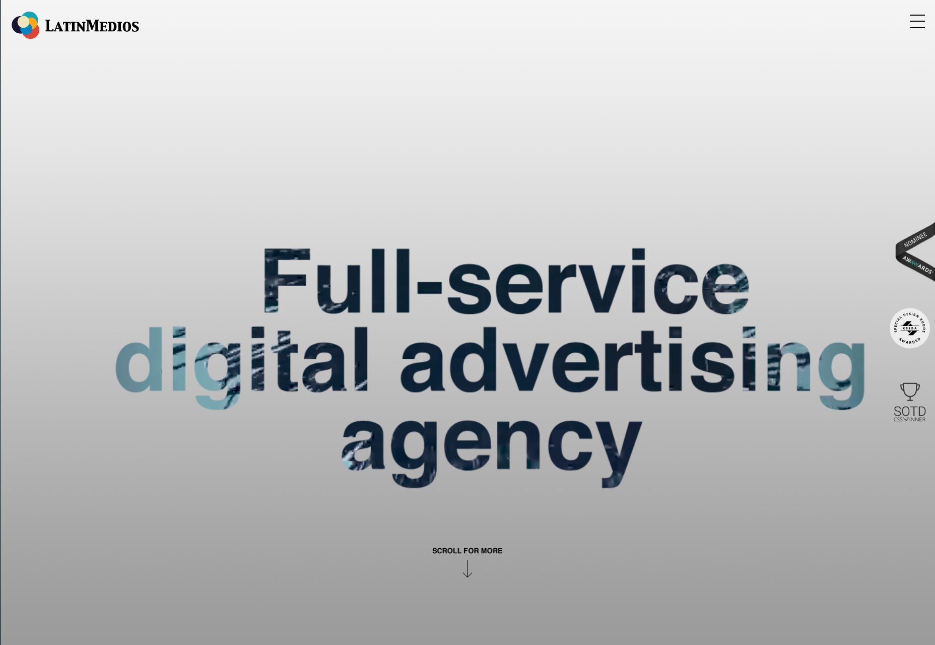
Upperquad
Upperquad brings us a site that’s just plain pretty. It embraces that post-minimalist style, with soft colors, big type, and some subtle (and sometimes not-subtle) animation to spice things up. The use of seemingly randomized geometric shapes adds to the feeling of asymmetry and artful chaos; but the site itself is still simple and usable.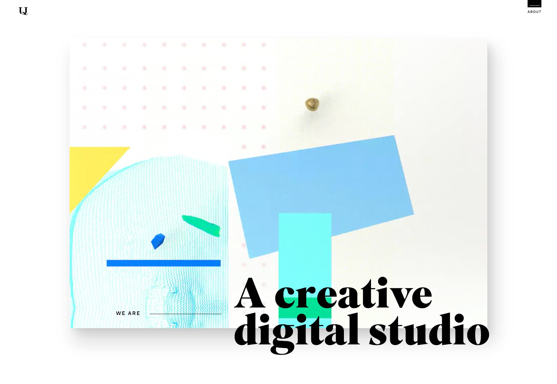
Xigen
Xigen is another one that is just plain pretty and well-done, while not going too experimental. Give it a look!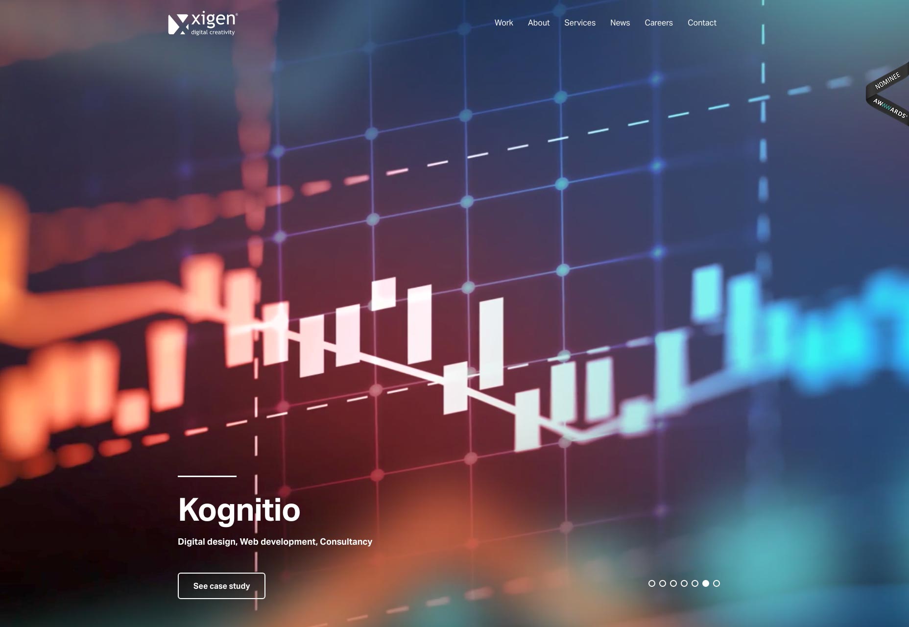
Untold
Untold is last, but not least, with a lovely dark, elegant website that gets right to the point. Mind you, it comes with the usual drawbacks of a site that’s meant to be elegant: namely the small body text size. I don’t know when small text got classified as "modern and elegant", but I’m going to blame the print industry, as usual. (Just kidding, I love you guys.)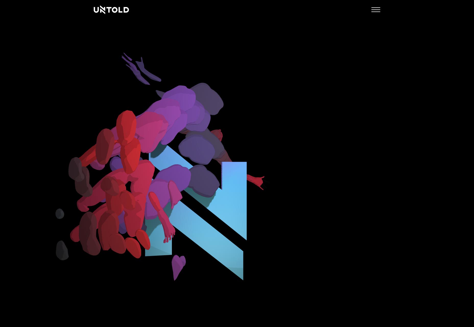
Ezequiel Bruni
Ezequiel Bruni is a web/UX designer, blogger, and aspiring photographer living in Mexico. When he’s not up to his finely-chiselled ears in wire-frames and front-end code, or ranting about the same, he indulges in beer, pizza, fantasy novels, and stand-up comedy.


Read Next

15 Best New Fonts, July 2024
Welcome to our monthly roundup of the best fonts we’ve found online in the last four weeks. This month, there are fewer…
By Ben Moss

20 Best New Websites, July 2024
Welcome to July’s round up of websites to inspire you. This month’s collection ranges from the most stripped-back…

Top 7 WordPress Plugins for 2024: Enhance Your Site's Performance
WordPress is a hands-down favorite of website designers and developers. Renowned for its flexibility and ease of use,…
By WDD Staff

Exciting New Tools for Designers, July 2024
Welcome to this July’s collection of tools, gathered from around the web over the past month. We hope you’ll find…

3 Essential Design Trends, July 2024
Add some summer sizzle to your design projects with trendy website elements. Learn what's trending and how to use these…

15 Best New Fonts, June 2024
Welcome to our roundup of the best new fonts we’ve found online in the last month. This month, there are notably fewer…
By Ben Moss

20 Best New Websites, June 2024
Arranging content in an easily accessible way is the backbone of any user-friendly website. A good website will present…

Exciting New Tools for Designers, June 2024
In this month’s roundup of the best tools for web designers and developers, we’ll explore a range of new and noteworthy…

3 Essential Design Trends, June 2024
Summer is off to a fun start with some highly dramatic website design trends showing up in projects. Let's dive in!

15 Best New Fonts, May 2024
In this month’s edition, there are lots of historically-inspired typefaces, more of the growing trend for French…
By Ben Moss

How to Reduce The Carbon Footprint of Your Website
On average, a web page produces 4.61 grams of CO2 for every page view; for whole sites, that amounts to hundreds of KG…
By Simon Sterne

20 Best New Websites, May 2024
Welcome to May’s compilation of the best sites on the web. This month we’re focused on color for younger humans,…