

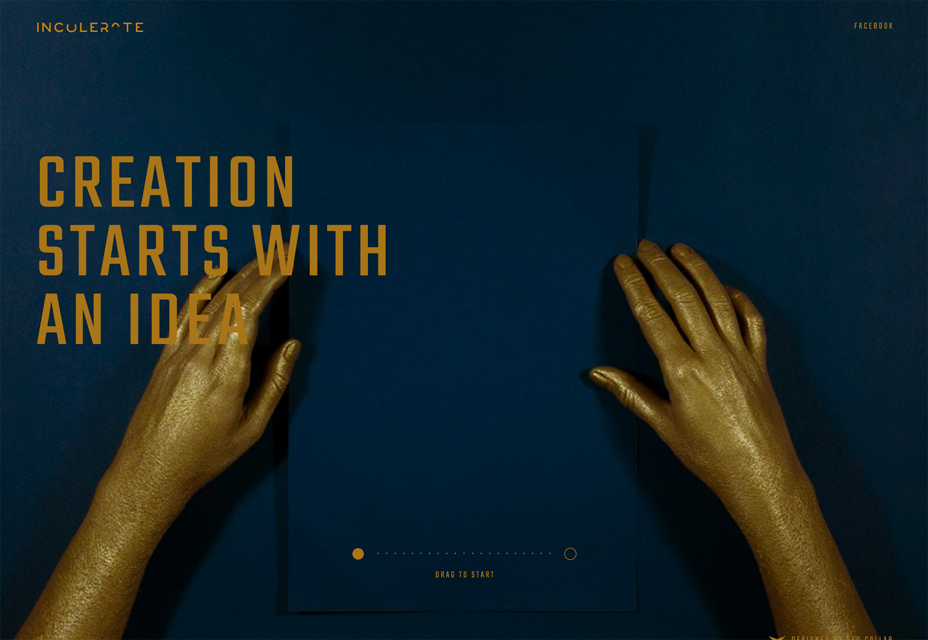
1. Underlined Text and Elements
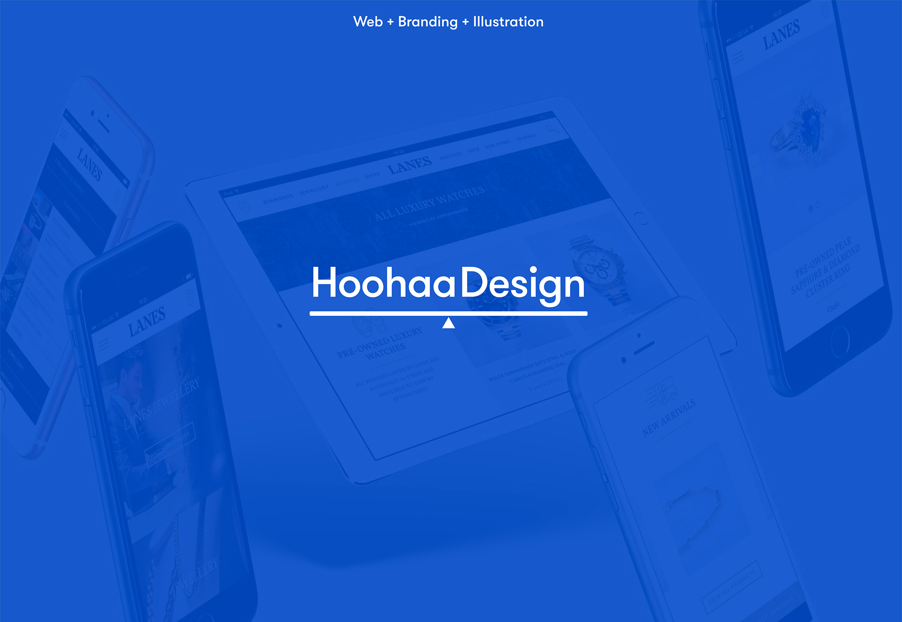
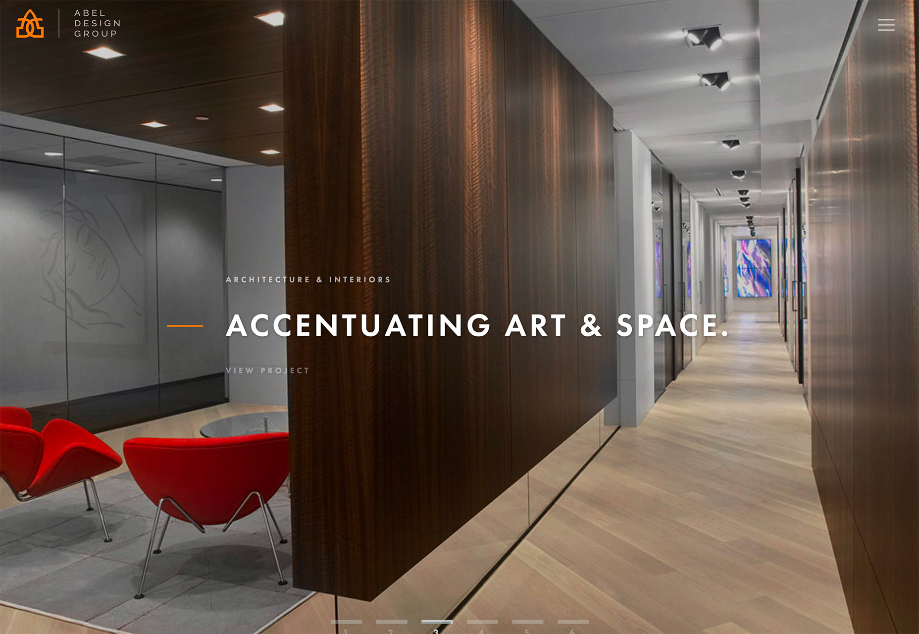
Underlined text is a trend that’s rather unexpected. Thankfully the underlines aren’t the standard underlining you might see from a hyperlink or default setting in a word processor. The underlined text and elements trend uses color and lines to highlight specific information and bring focus to a certain content area. The cleverest uses of underlining combine the stroke with something else so make it feel like a seamless part of the design. For underlining to be successful, it needs to look intentional without getting in the way. Underlining can be a distractive technique in many cases and even make text feel too tight or crowded. But using an underline in a part of the design with plenty of white space can alleviate that problem while drawing attention to underlined text. Both Simon Lee Gallery and Hoohaa Design use a simple underline with plenty of space to pull the eye to certain text. For Simon Lee Gallery, the underline helps users focus on some of the smallest lettering in the design and provides a pause point while the next image in the slider loads. For Hoohaa Design, the underline is part of a balancing scale graphic element that puts emphasis on the site name. Abel Design Group takes another approach with an orange line that is actually more of a center line than underline, but serves a similar purpose–to draw the text to the text connected to the stroke.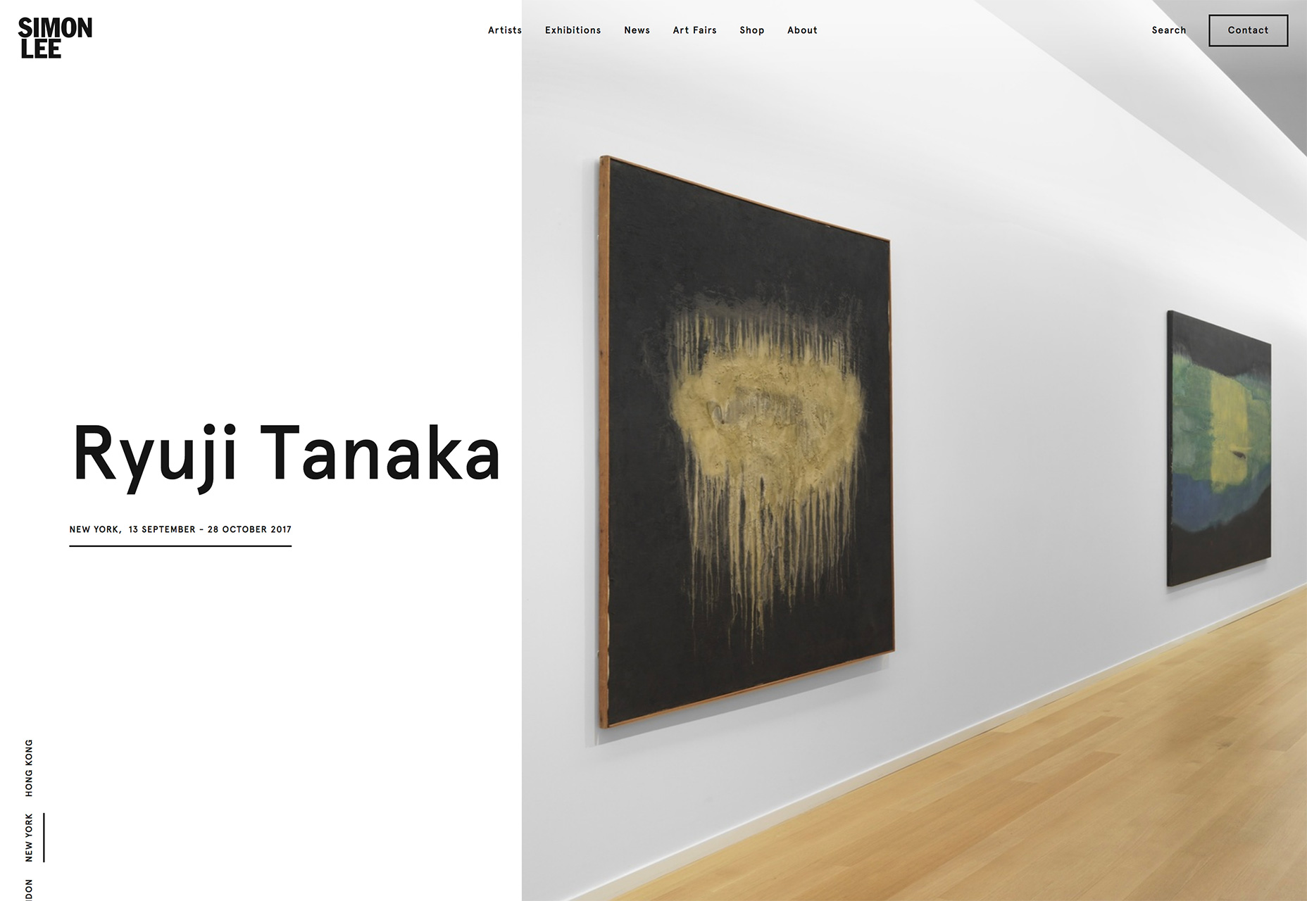
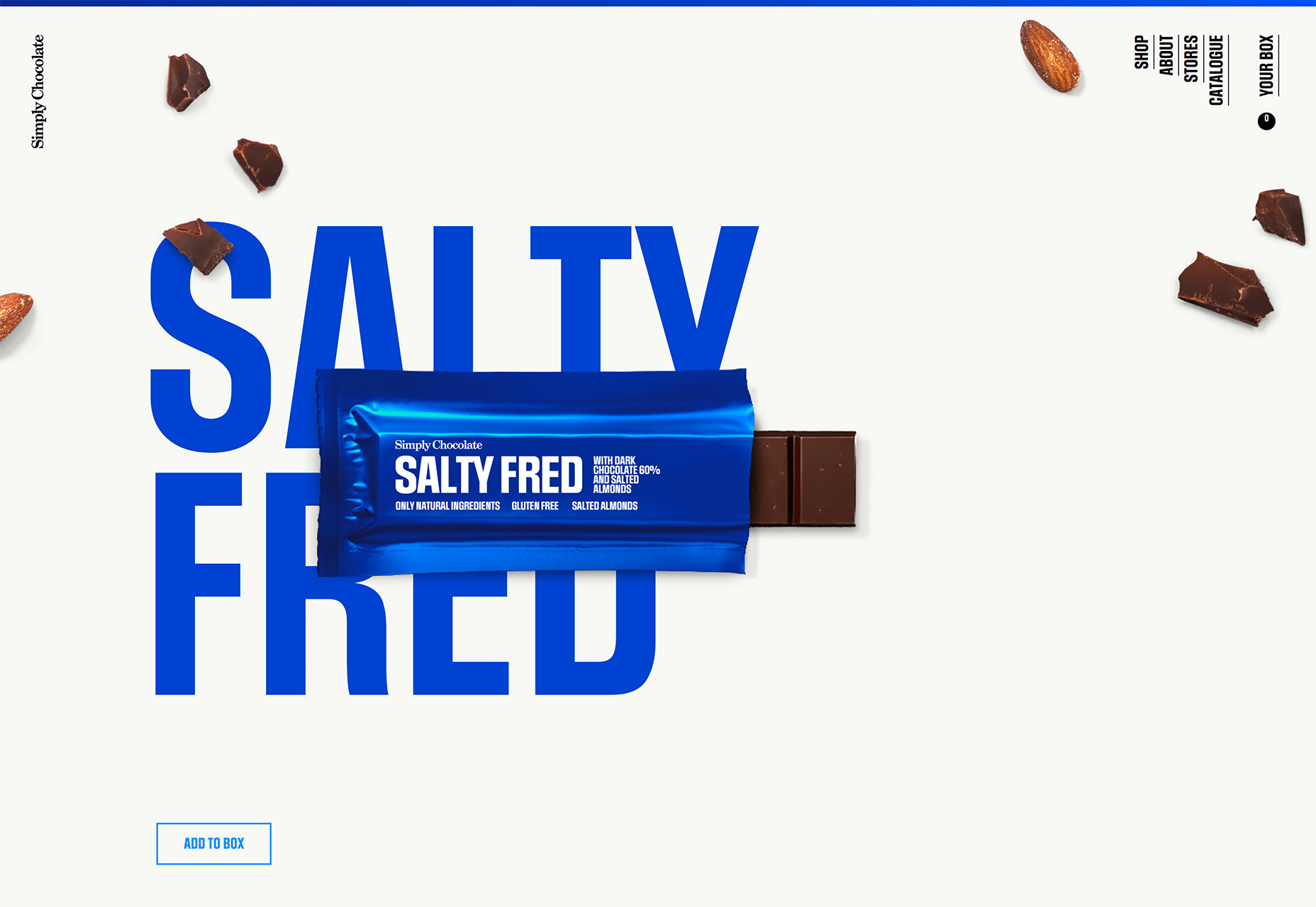
2. Obstructed Text
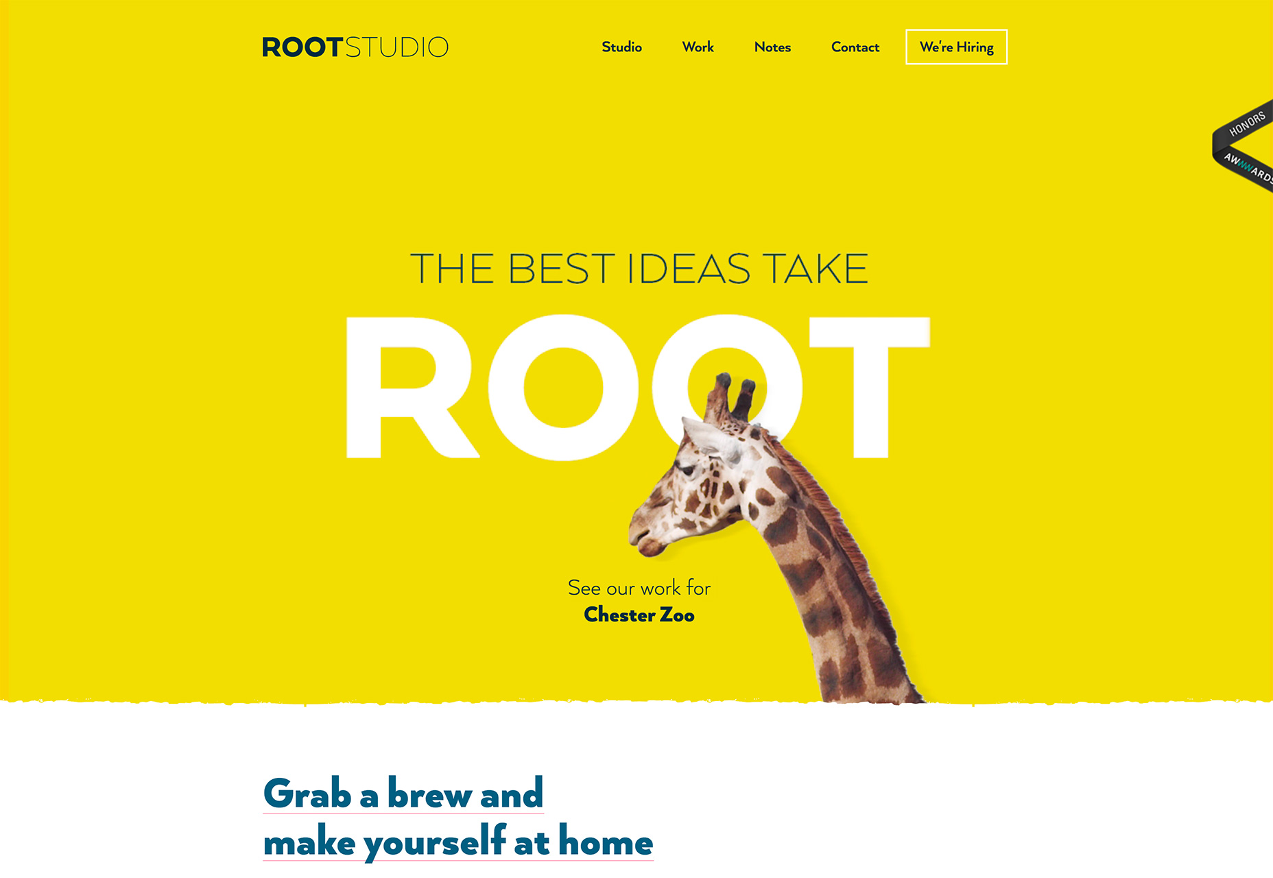
Seeing designs with obstructed or hard to read text isn’t something that you’d probably expect to see on this list, but a lot of designers are playing with the concept right now. This can be a difficult technique to pull off and many designers have failed (and ended up as memes) because of lettering that said something unintended. Designing text with an obstruction lends itself to these kinds of issues. This is a real concern with responsive frameworks because of different breakpoints and movement of the text obstruction. An obstruction can be an element that covers text or a lack of contrast between text and the background where the elements almost fade into each other. But, when done well, it can lead to a pretty eye-catching design. (It’s hard to stop looking at the Root Studio design. The bright color and subtle giraffe movement over the letters is fascinating.) To make it work you have to do a few things:- Ensure that the word is common enough to be understood, which is why “ROOT” isn’t a problem
- Not cover too much of the word
- Be aware of obstructions that can result in unwanted words
- Use a super simple typeface so the lettering style doesn’t compete with the obstruction
- Keep the rest of the design super simple so the user can focus on the word and reading it with as much ease as possible
3. Black and White Aesthetic
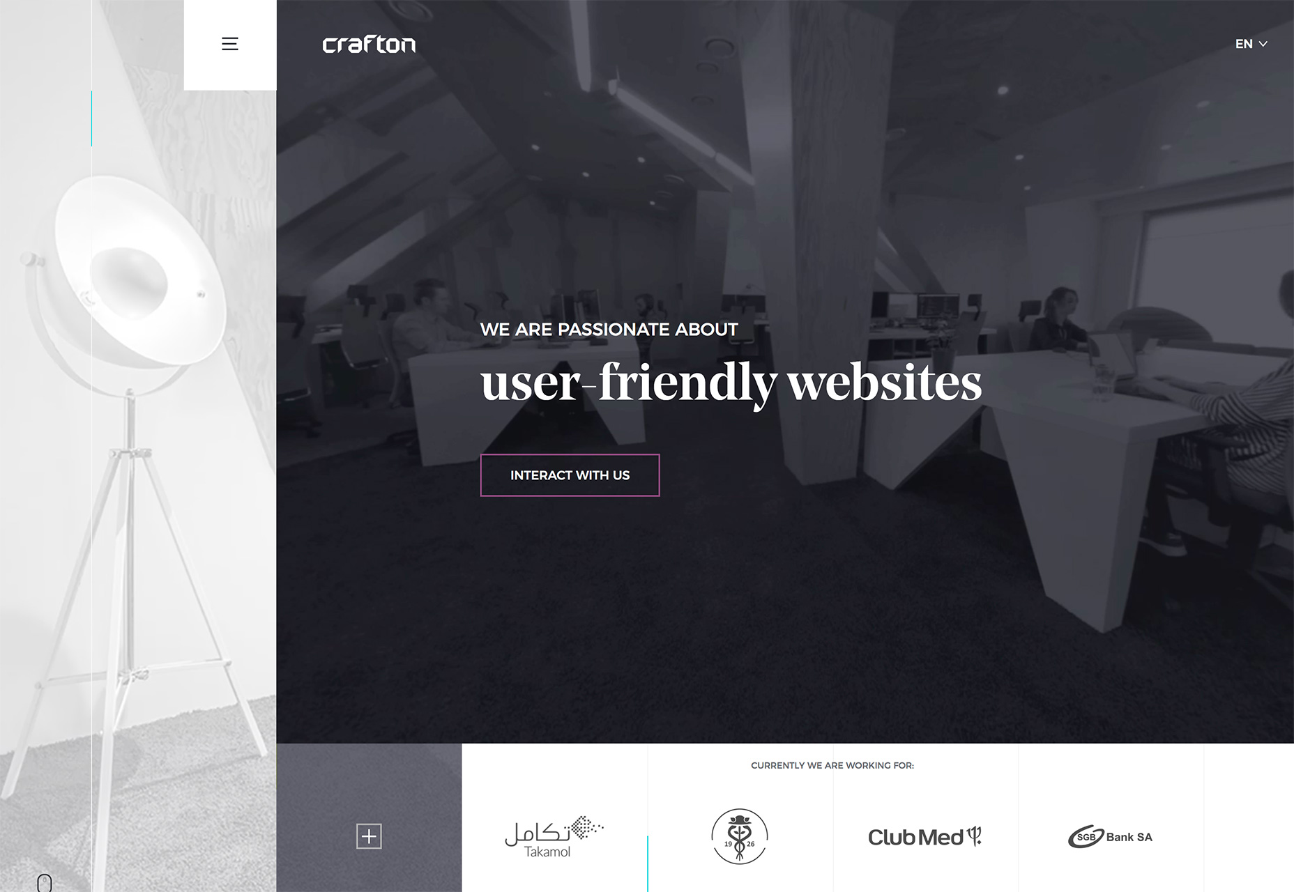
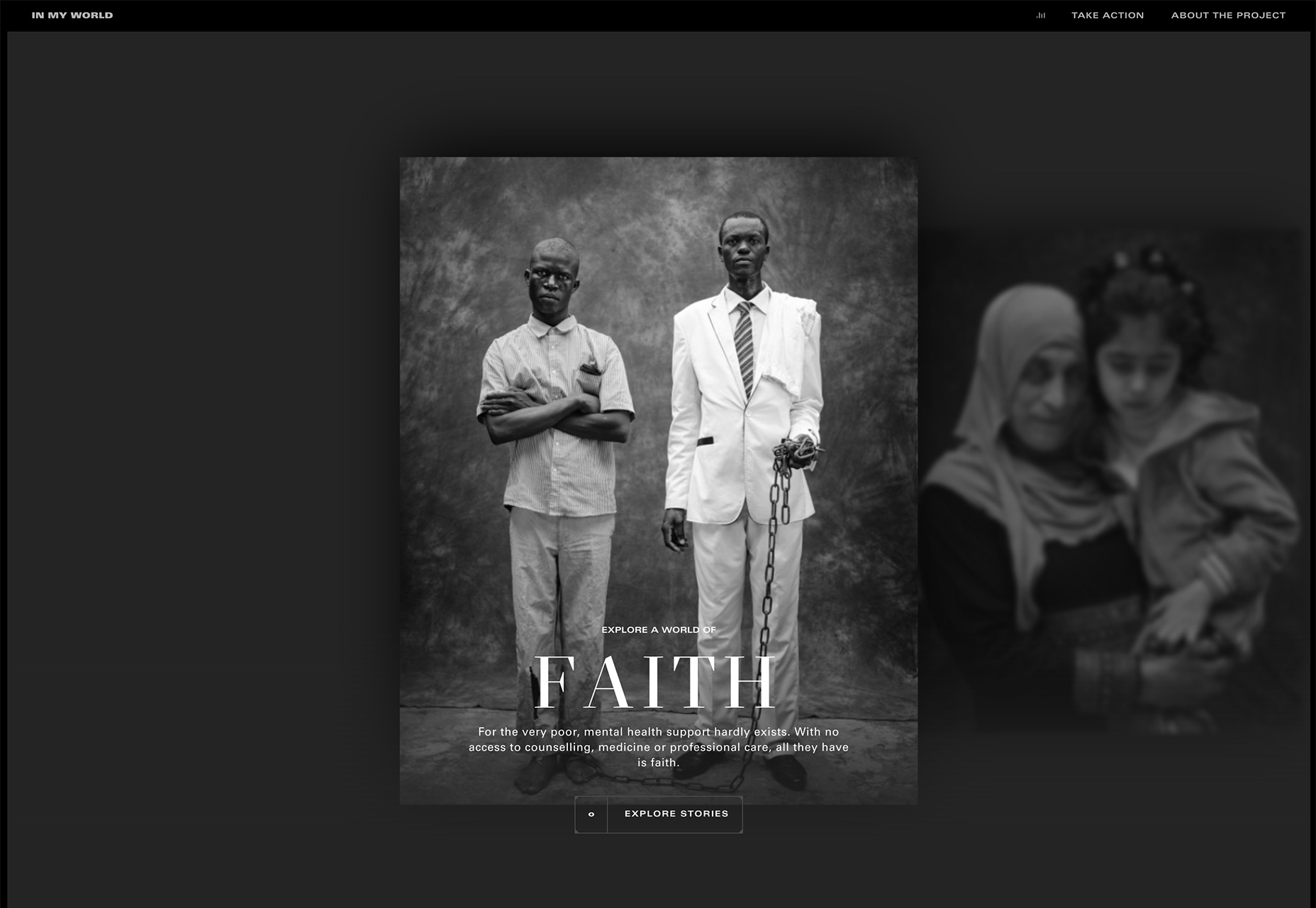
Sometimes design trends–especially when it comes to color–reflect the mood of the creators. Black and white color schemes are trending darker, more minimal and with less bright color accent than has been common in recent years. (Are designers feeling a little more gloomy these days?) The current version of the black and white design trend is different from what has happened in the past as well in that the lack of color isn’t just being used for photography portfolios. The examples below include a furniture design company, a website design agency and stories and information about mental health. They all have the same mood in common though, due to a lack of color. When working with black and white, there can be concerns about text placement and readability, as well as how to include color in certain parts of the design. Designers can struggle with creating something that’s engaging despite the starkness from a lack of color. One technique that can warm up a black and white design is to use a richer color mix for the dark tones. A rich black can have a red, blue, green or other color undertone that helps create a slightly different mood. Rich black is made up of multiple colors when looking at HEX codes. Hex #000000 is made from no color at all. True rich black is #004040. Anything else is a “richer” black. A richer black can serve as a transition between black and white and more colorful design elements. For example, Crafton, below, uses a rich black for the design with subtle color around the ghost style button and other accents. The richer black feels more warm and inviting than some other designs because of this color choice. While the website does not contain a lot of color below the scroll, there are some more colorful divots and design elements that connect fairly seamlessly because of the richness of the black and color accents on the home screen. The other benefit to a rich black, or richer black, is that it can enhance contrast between text and background elements, making everything a little easier to read.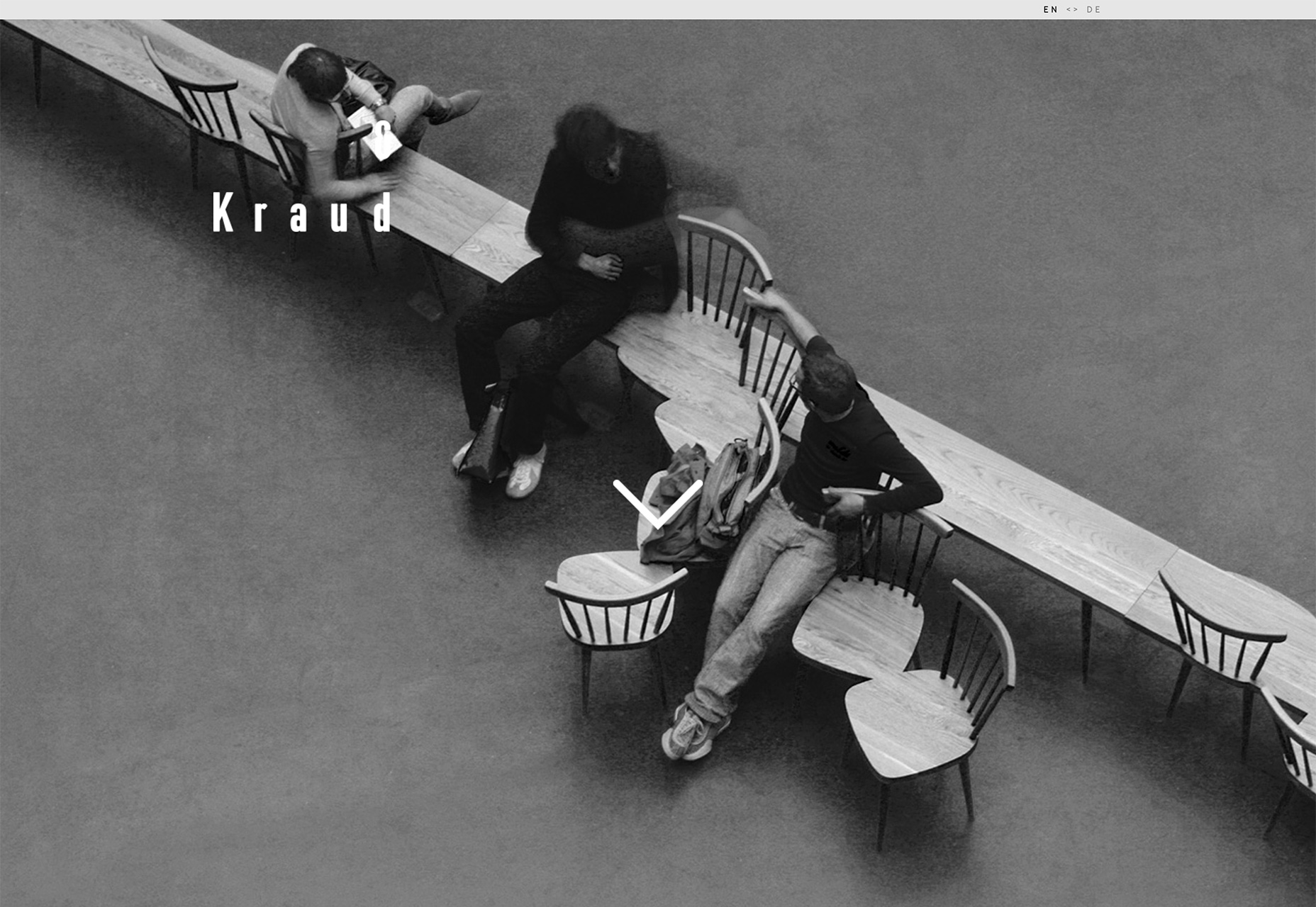
Conclusion
All of the trending designs this month make text a little more difficult to read than what most of us are used to. It’s one of those design concepts that can be effective when used exceptionally well and only for certain projects. But that can be tough to accomplish. What trends are you loving (or hating) right now? I’d love to see some of the websites that you are fascinated with. Drop me a link on Twitter; I’d love to hear from you.Carrie Cousins
Carrie Cousins is a freelance writer with more than 10 years of experience in the communications industry, including writing for print and online publications, and design and editing. You can connect with Carrie on Twitter @carriecousins.


Read Next

15 Best New Fonts, July 2024
Welcome to our monthly roundup of the best fonts we’ve found online in the last four weeks. This month, there are fewer…
By Ben Moss

20 Best New Websites, July 2024
Welcome to July’s round up of websites to inspire you. This month’s collection ranges from the most stripped-back…

Top 7 WordPress Plugins for 2024: Enhance Your Site's Performance
WordPress is a hands-down favorite of website designers and developers. Renowned for its flexibility and ease of use,…
By WDD Staff

Exciting New Tools for Designers, July 2024
Welcome to this July’s collection of tools, gathered from around the web over the past month. We hope you’ll find…

3 Essential Design Trends, July 2024
Add some summer sizzle to your design projects with trendy website elements. Learn what's trending and how to use these…

15 Best New Fonts, June 2024
Welcome to our roundup of the best new fonts we’ve found online in the last month. This month, there are notably fewer…
By Ben Moss

20 Best New Websites, June 2024
Arranging content in an easily accessible way is the backbone of any user-friendly website. A good website will present…

Exciting New Tools for Designers, June 2024
In this month’s roundup of the best tools for web designers and developers, we’ll explore a range of new and noteworthy…

3 Essential Design Trends, June 2024
Summer is off to a fun start with some highly dramatic website design trends showing up in projects. Let's dive in!

15 Best New Fonts, May 2024
In this month’s edition, there are lots of historically-inspired typefaces, more of the growing trend for French…
By Ben Moss

How to Reduce The Carbon Footprint of Your Website
On average, a web page produces 4.61 grams of CO2 for every page view; for whole sites, that amounts to hundreds of KG…
By Simon Sterne

20 Best New Websites, May 2024
Welcome to May’s compilation of the best sites on the web. This month we’re focused on color for younger humans,…