

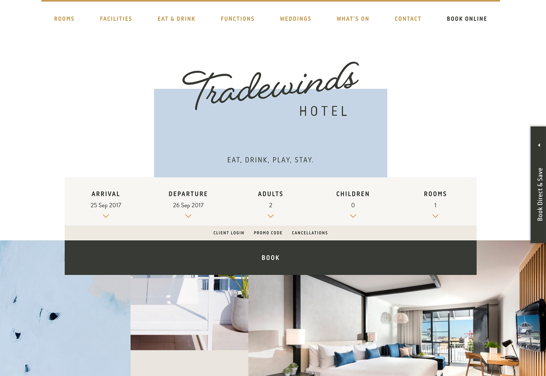
1. Text Without Boundaries
There was a time that every element in a website design had its own place. That’s not always the case anymore. More designs are allowing elements to cross planes and move into the space of other elements. It sounds like one of those ideas that could go horribly wrong (and it could), but these websites show that there’s something beautiful about text that lives in two spaces at the same time. [pullquote]there’s something beautiful about text that lives in two spaces at the same time[/pullquote] The trend is exemplified by text elements that cross into multiple containers, such as text that layers over the background and an image. It can also apply to lettering that layers partially over two different boxes, such as Tradewinds. It can work with typography of any size and shape and images or video. The one consistent theme is that text elements must have a lot of contrast with background elements so that every letter remains readable. You can see from the examples below that lettering doesn’t have to stop between words; it can be broken up vertically or horizontally. The big idea behind this treatment is to draw the user into the page with something totally unexpected. This style of lettering does that. To make it work, treat the text element as a separate layer over background and image layers. Text should always be the uppermost item to help ensure readability. Stick to typefaces that are sharp and easy to read. Simplicity in the rest of the design is key to making this technique work.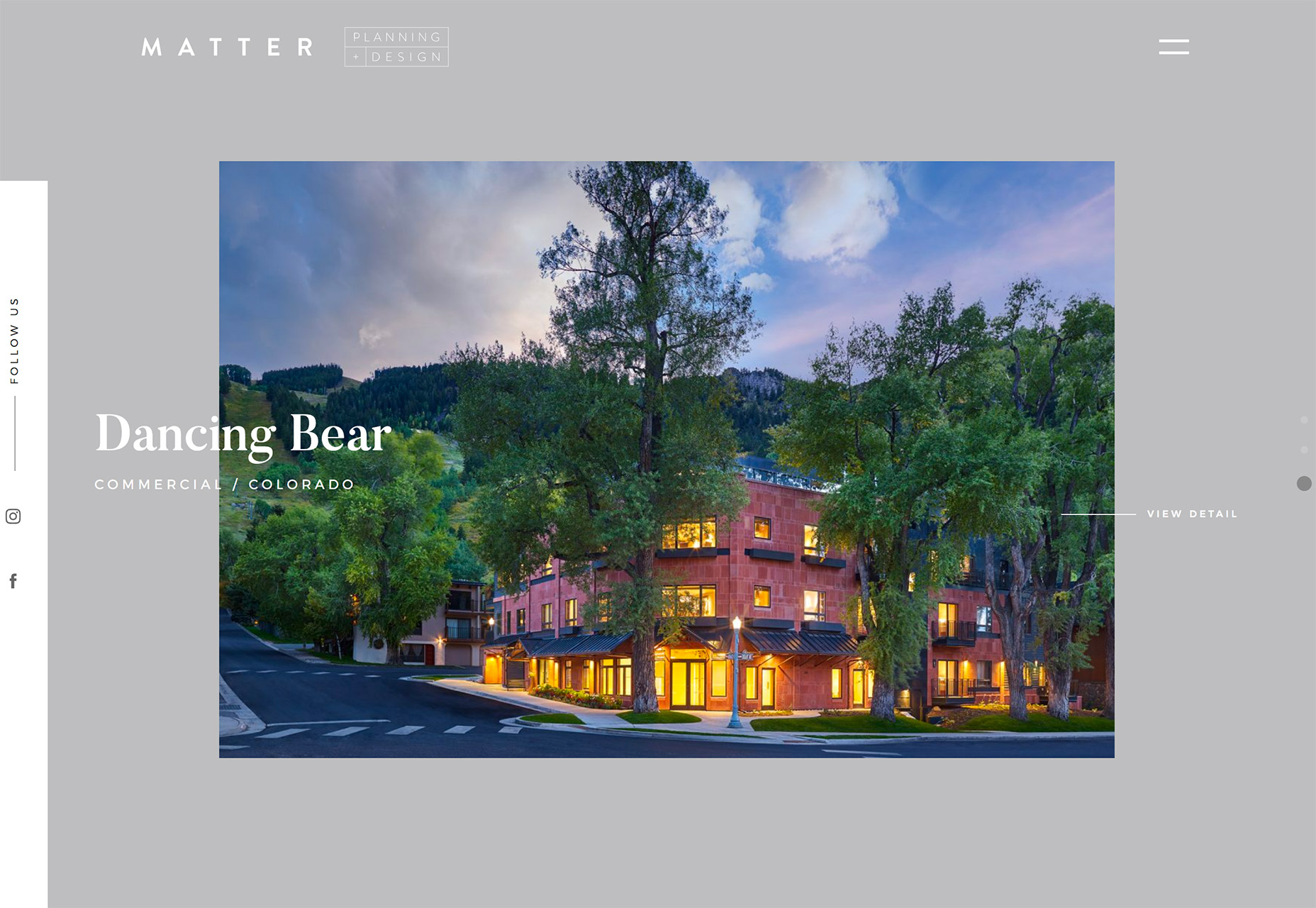
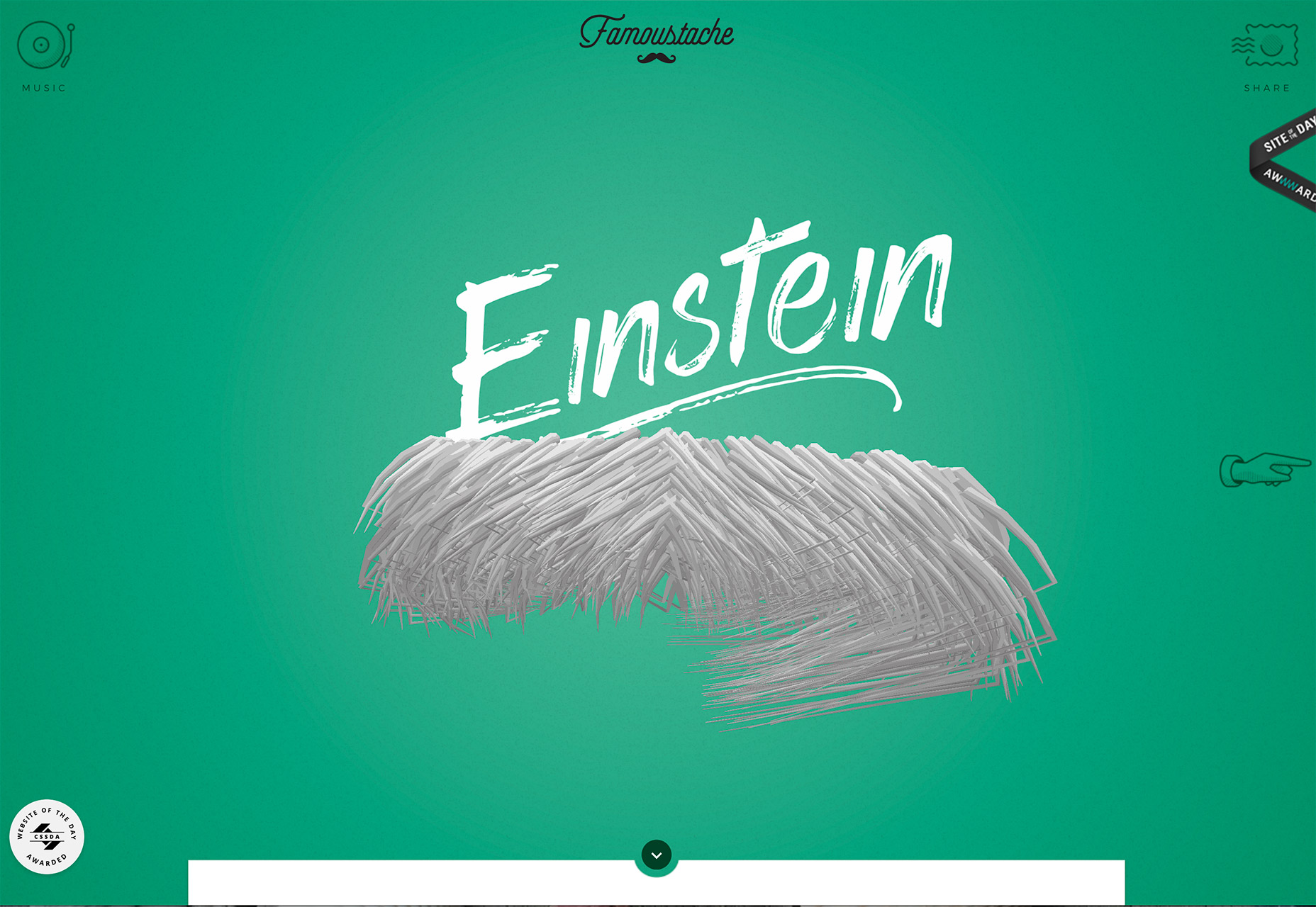
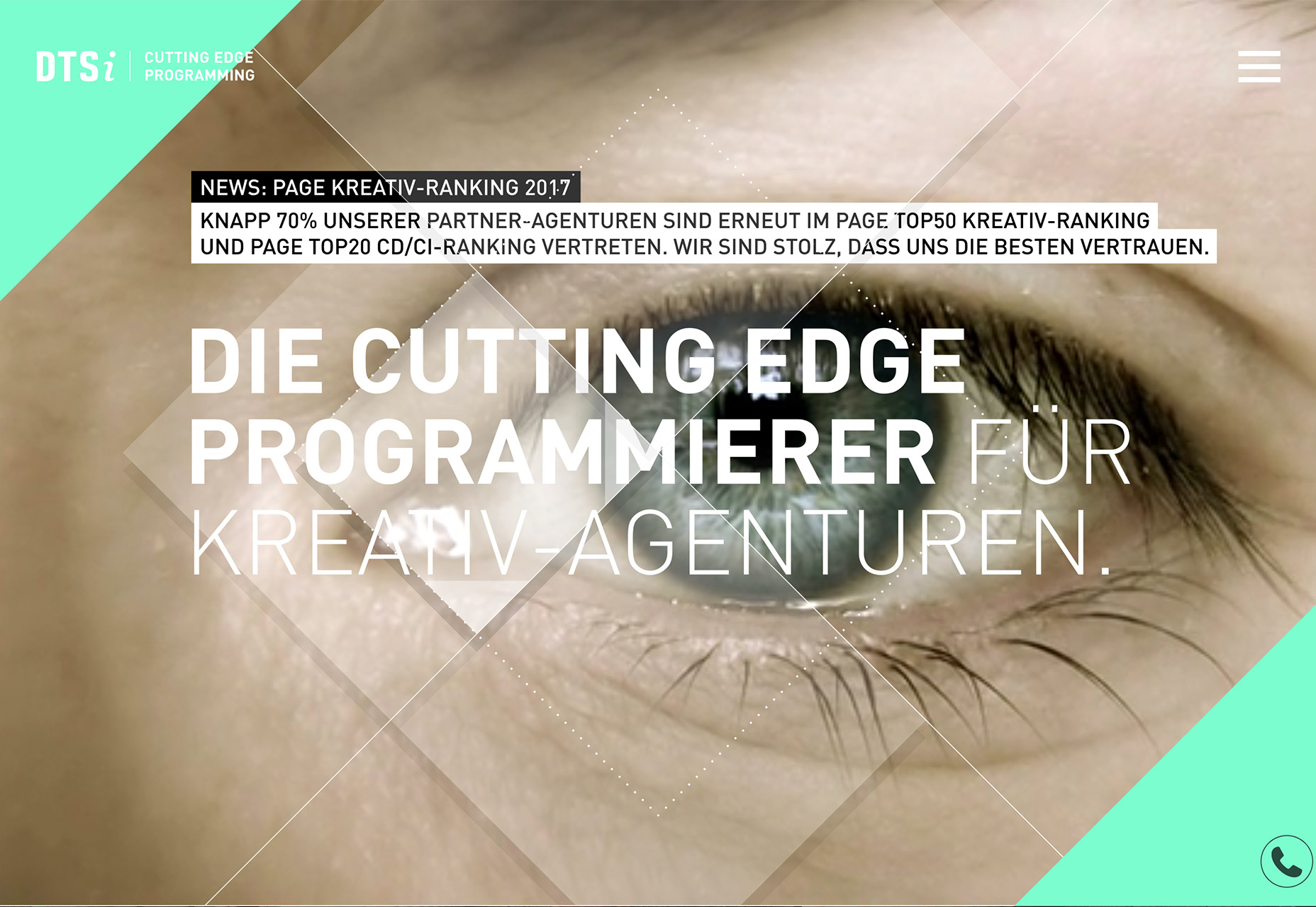
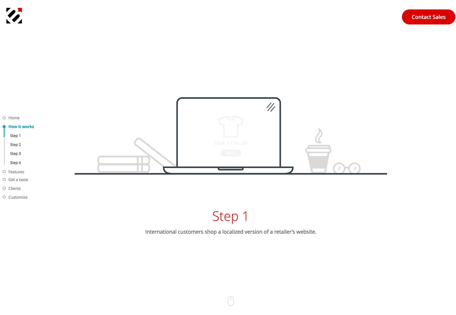
2. Larger Than Life Objects
Oversized design elements are nothing new. But more designs are taking everyday elements and showcasing them in larger than life styles to grab the attention of users. It’s a fun technique that requires a lot of detail for the imagery involved. It’s also takes the right kind of image—and an excellent eye for cropping—to make this work. Look at the examples below. If someone had told you the screen would be filled with half a pair of glasses, a faceless moustache or a single video of an eye would you have imagined the striking success of these concepts? Each is a great example of rule-breaking in a way that’s totally unexpected, original and contributes to the messaging of the brand and overall design. The thing that is challenging about oversized and larger than life design elements is creating balance. Large objects need plenty of space and balancing elements so that the design doesn’t feel odd or jarring. Westward Leaning does this with plenty of whitespace around the eyeglasses image; Famoustache uses bright color and fun typography to offset a “floating,” animated moustache; DTSi uses large text and geometric shape layers to soften the eye video. The key to making a larger than life element work is quality. Images and video have to be top resolution. Oversized elements are not forgiving if they aren’t sharp and perfectly in focus. You’ll need high-resolution video, or photos and vector elements for this technique. Even the lighting and composition of something as simple as a pair of glasses has to be perfectly thought out so that it doesn’t feel off to the user on the screen. Highly-detailed images such as this are nice for providing information to users—especially for ecommerce where users can almost “touch” the object—but it can be tricky to do well.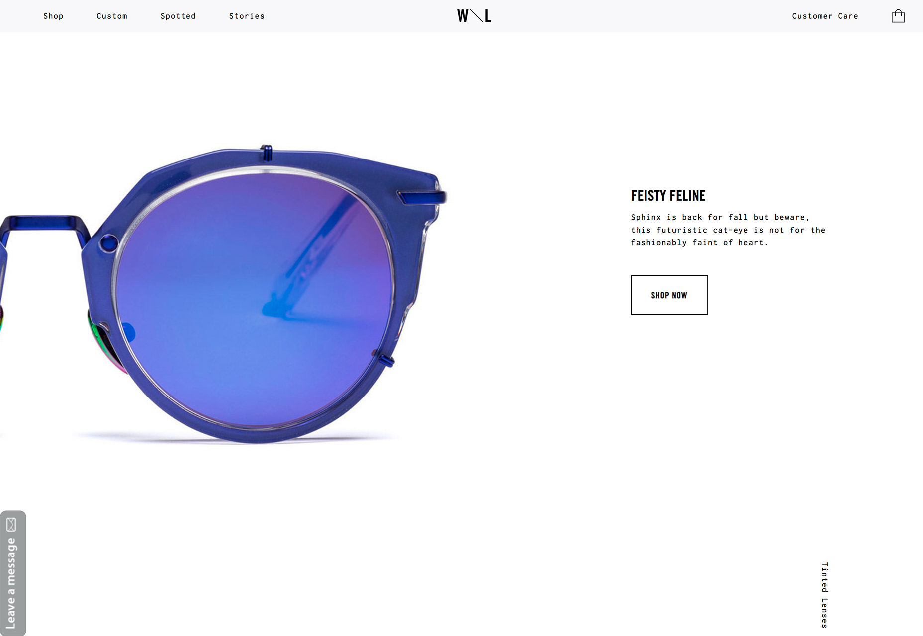
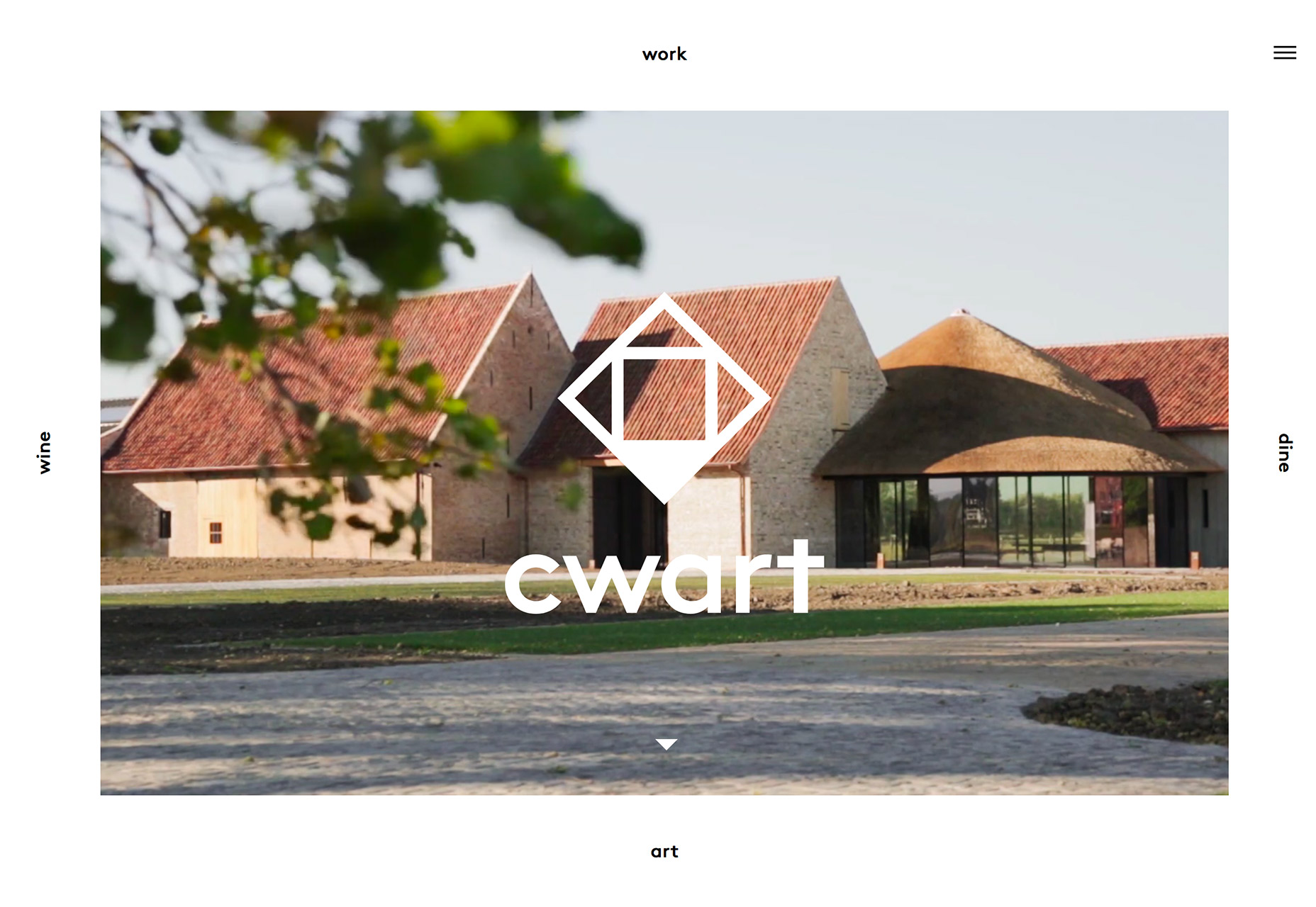
3. Hollow Shapes
Designers have fallen in love with geometric shapes this year. From shape overlays to polygon patterns, this monthly feature has centered on shapes a few times. And now designers are trying something else new with them, hollowed out shapes. For logos, icons and geometric displays, hollow shapes are an interesting design element. Generally, they are quite simple in nature, such as the hollow geometry used by Bruderl, but can also take on more complex roles such as the icons for Borderfree, which contain more detail. [pullquote]hollow shapes are fun because they can be used in space to create a focal point[/pullquote] Either way hollow shapes are fun because they can be used in space to create a focal point, as an overlay on an image or as part of a company logo or branding, or two create a set of visuals that have a consistent feel throughout a design project. To make the most of hollow shapes, create something that has a thick enough stroke that it can stand up on top of different backgrounds and different types of coloring. While you can create your own funky shape, such as some of those below, you can also use common elements to outline. What makes hollow shapes work is visual interest or identification, meaning the shape has to be really unusual or completely clear to grab the attention of a user. Consider a combination of hollow areas balanced with some fill, such as Cwart, to create contrast and more interest. The most difficult part of using a hollow shape design is that they can often feel too light and get lost in proximity to other design elements. The shape has to be clear enough, larger enough and have thick enough lines to convey meaning at every size users encounter it.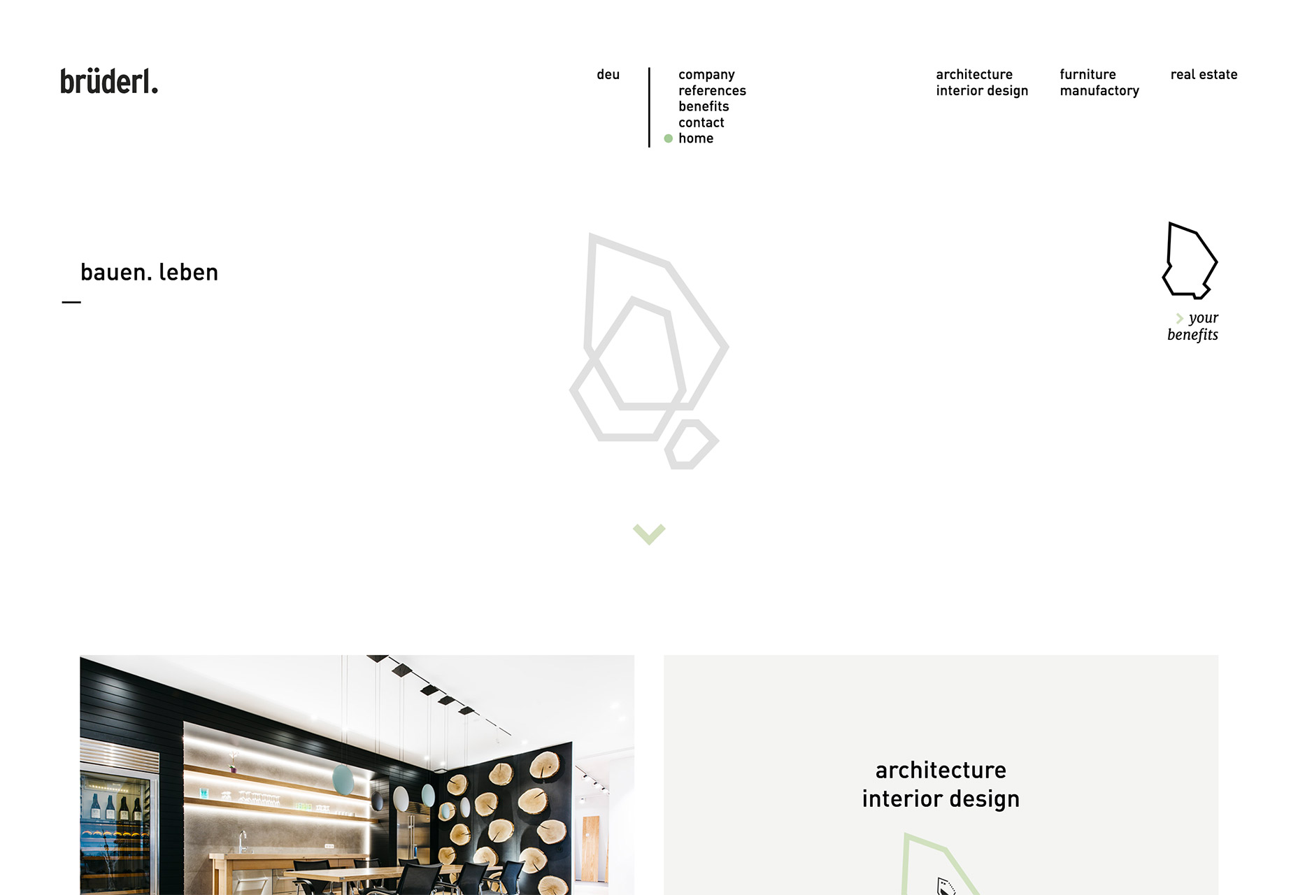
Conclusion
Design rules exist as a starting point for creation. While you don’t want to get in the habit of ignoring these guidelines—you can end up with a design disaster—breaking a rule here and there can help you create something special. Just remember to use this idea sparingly and understand that it won’t work for every project. What do you think of these rule-breaking trends? Would you try them? Hit me up on Twitter and let me know.Carrie Cousins
Carrie Cousins is a freelance writer with more than 10 years of experience in the communications industry, including writing for print and online publications, and design and editing. You can connect with Carrie on Twitter @carriecousins.


Read Next

15 Best New Fonts, July 2024
Welcome to our monthly roundup of the best fonts we’ve found online in the last four weeks. This month, there are fewer…
By Ben Moss

20 Best New Websites, July 2024
Welcome to July’s round up of websites to inspire you. This month’s collection ranges from the most stripped-back…

Top 7 WordPress Plugins for 2024: Enhance Your Site's Performance
WordPress is a hands-down favorite of website designers and developers. Renowned for its flexibility and ease of use,…
By WDD Staff

Exciting New Tools for Designers, July 2024
Welcome to this July’s collection of tools, gathered from around the web over the past month. We hope you’ll find…

3 Essential Design Trends, July 2024
Add some summer sizzle to your design projects with trendy website elements. Learn what's trending and how to use these…

15 Best New Fonts, June 2024
Welcome to our roundup of the best new fonts we’ve found online in the last month. This month, there are notably fewer…
By Ben Moss

20 Best New Websites, June 2024
Arranging content in an easily accessible way is the backbone of any user-friendly website. A good website will present…

Exciting New Tools for Designers, June 2024
In this month’s roundup of the best tools for web designers and developers, we’ll explore a range of new and noteworthy…

3 Essential Design Trends, June 2024
Summer is off to a fun start with some highly dramatic website design trends showing up in projects. Let's dive in!

15 Best New Fonts, May 2024
In this month’s edition, there are lots of historically-inspired typefaces, more of the growing trend for French…
By Ben Moss

How to Reduce The Carbon Footprint of Your Website
On average, a web page produces 4.61 grams of CO2 for every page view; for whole sites, that amounts to hundreds of KG…
By Simon Sterne

20 Best New Websites, May 2024
Welcome to May’s compilation of the best sites on the web. This month we’re focused on color for younger humans,…