

- “Start a trial”
- “Download the app/book/guide”
- “Sign up for updates”
- “Get a consultation”
1. Visually Striking Button
Your button color matters. In fact, if you’re going to take only one single piece of advice from this article, it should be this one: “Consider your CTA button color”. Using color you can make certain buttons stand out more than others by giving them more visual prominence.Use Contrasting Colors
Contrasting colors work best for CTA buttons, using contrasting color it’s possible to create striking buttons that stand out. You should select a contrasting color from the color scheme of the webpage, while still fitting in with the overall design. Consider the Firefox example below. The green color of the CTA button on the Firefox page is jumping off the page and immediately gets user attention.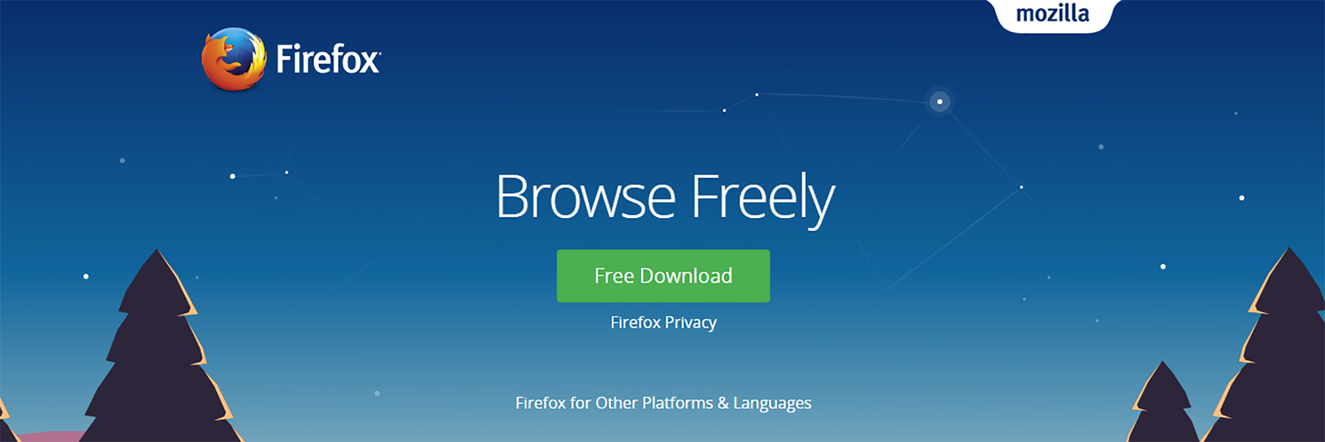 Firefox CTA button is bright green and stands out well on a dark blue background
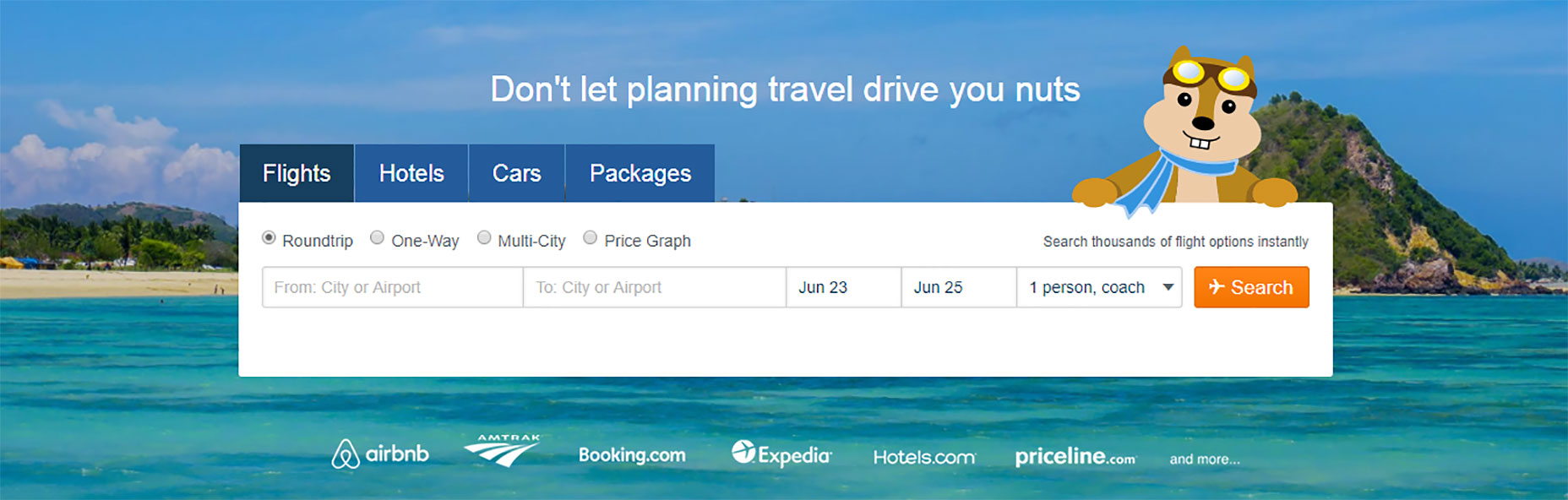
Another eye-catching CTA button can be found on the Hipmunk homepage. A bright orange button captures user attention and defines the next possible action.
Firefox CTA button is bright green and stands out well on a dark blue background
Another eye-catching CTA button can be found on the Hipmunk homepage. A bright orange button captures user attention and defines the next possible action.
Negative Space
Not only is the color important for a CTA, but also the amount of space around it. Whitespace (or negative space) creates essential breathing room and separates your CTA buttons from other elements in your user interface. The old Dropbox homepage was a good example of using negative space to make their primary CTA pop. The blue “Sign up for free” CTA stands out against the light blues of the background.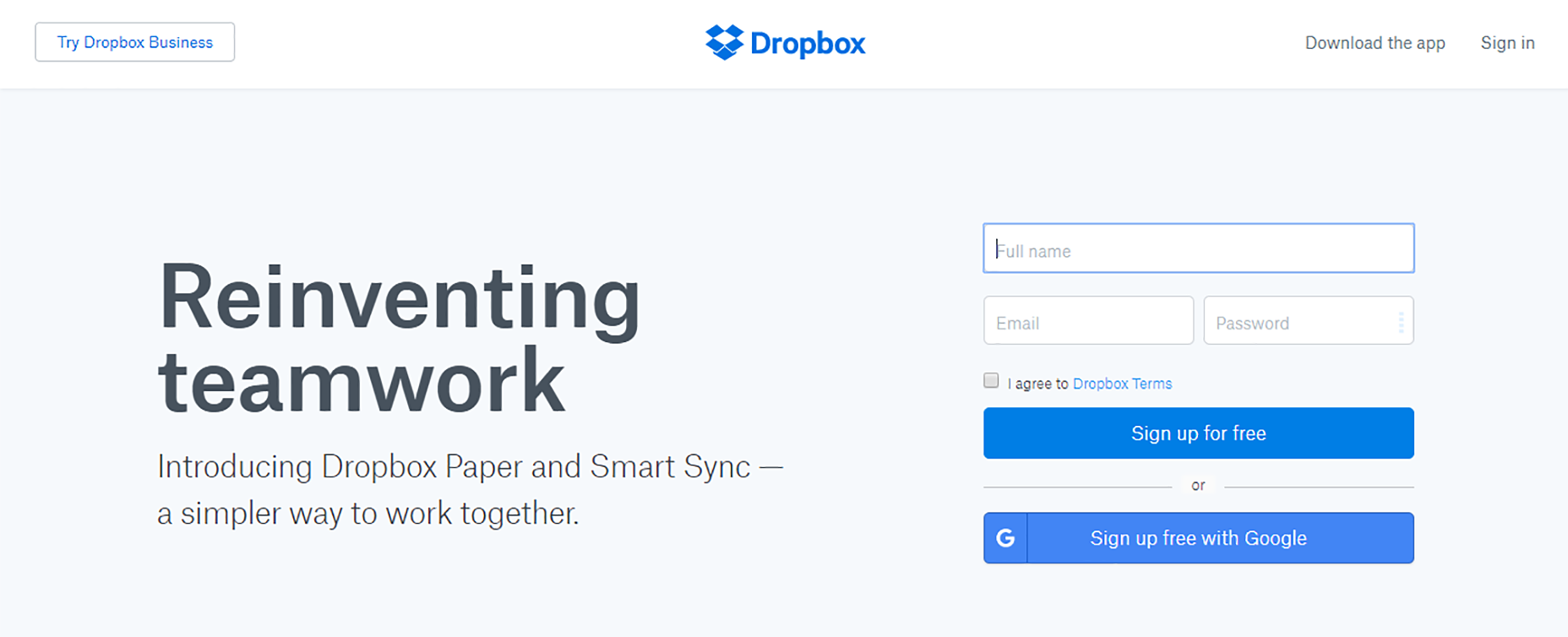
2. Action-Oriented Text
Writing text for your call-to-action button that will compel your visitors to take the right action isn’t an easy task. Fortunately, there are a few things that can help you to do it:Begin With a Verb
You should avoid vague and boring words like “Enter for more information” for your CTA buttons, and replace them with more action-oriented words like “Start your free trial” or “Get discount now.” Evernote has one of the most common, but still working action-oriented texts for their CTA button.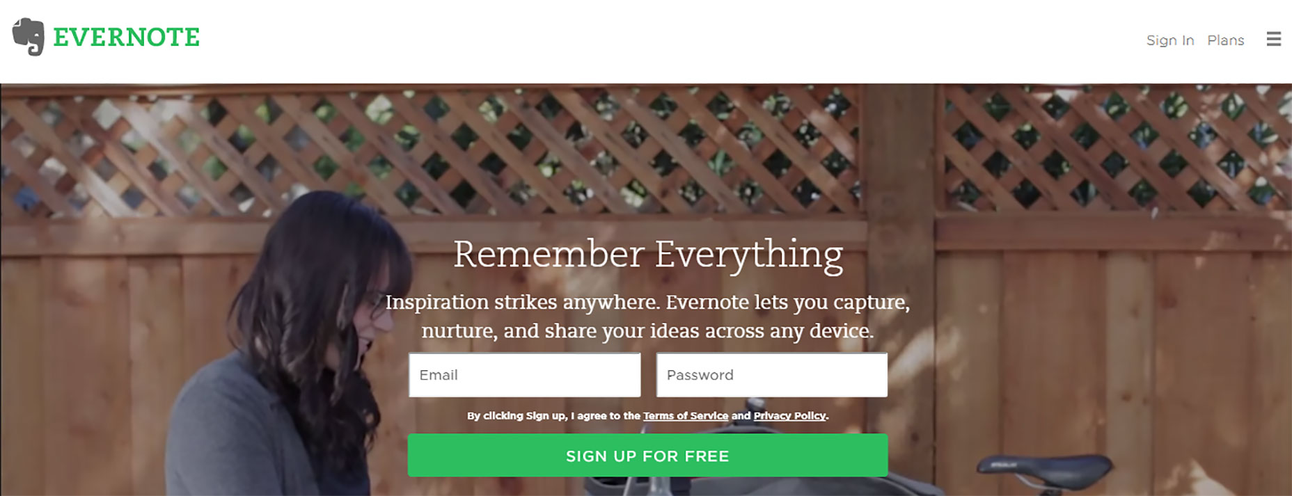 Begin with a verb like “Start,” “Get” or “Join”
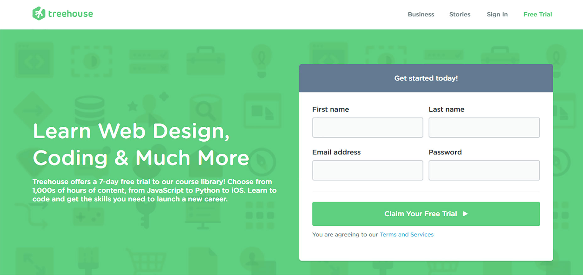
A more interesting example can be found on Treehouse homepage. The CTA on Treehouse's website doesn't just say “Start a Free Trial”; it says “Claim Your Free Trial.” The difference in wording may seem subtle, but “Claim Your Free Trial” sounds much more personal.
Begin with a verb like “Start,” “Get” or “Join”
A more interesting example can be found on Treehouse homepage. The CTA on Treehouse's website doesn't just say “Start a Free Trial”; it says “Claim Your Free Trial.” The difference in wording may seem subtle, but “Claim Your Free Trial” sounds much more personal.
Use Brief and Easy to Understand Text for Buttons
Be sure to state exactly what the visitor will get if they click on the CTA. Ideally, you want to keep button text to between two and five words.Add Value Proposition
Most probably you’ve noticed that many buttons have the words like “free” in their copy and that’s not a coincidence, using such words in button copy emphasizes your offer’s value proposition. Thus, when writing your CTA, try to find a way to integrate one (or all) 3 persuasive words:- Free
- Bonus
- Instantly
Create a Sense Of Urgency
Constructing a sense of urgency in your CTA buttons can yield some impressive click-through rates. For example, you could use button text like “Sign Up and Get 25% Off Today Only!” Limiting the time someone has to make the decision makes people want to claim their offer while they can.Helpful Text
Sometimes you may want to consider adding an extra line of information within your button text. This practice is common with free trial buttons. For example, a free trial button might say “30 day trial, no credit card” in smaller text below the CTA button with “Start Your Free Trial” text. This extra text should ease the decision-making process.3. Make It Visible Without Scrolling
The placement of your call-to-action buttons is as important as the color and message. A CTA button should be located in an easy-to-find spot that follows organically from the flow of the webpage. You should try to keep your CTA button above the fold so that users never miss it. Ideally, your CTA button should be among the first things a user sees on the page when they reach it. The additional information should stay below the fold, where it remains accessible but not distracting.4. Large Button With Rounded Corners
Think about how the design communicates affordance. How do users understand the element as a button? Use shape and size to make the element look like a button.Make it Big Enough
The CTA should be large enough to see from a distance, but not so large as to detract attention from the main content on the pageUser Buttons With Rounded Corners
Button shape can play a big role. It’s a proven fact that rounded corners are easier on the eyes. In ContentVerve’s test, a rounded green button did better than a blue rectangle.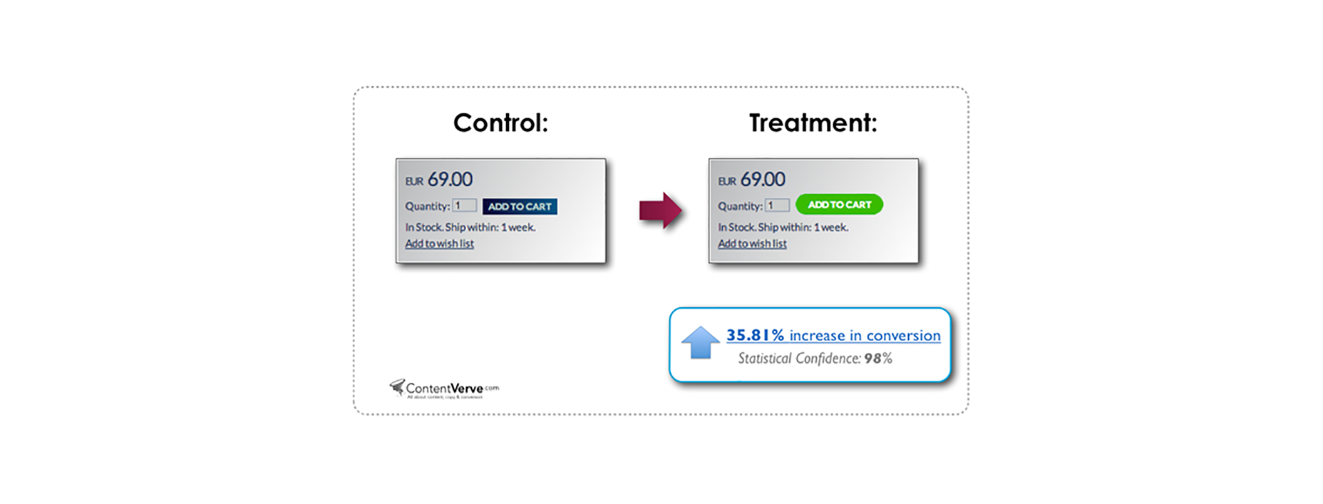
5. Less is More When it Comes to Choices
Keep in mind that if you want your customers to take action, you’ve got to assist them, by removing all possible obstacles from their way. When users are given too many choices, they tend to get confused. So, it's better to offer the potential customers only one option. If you still want to include multiple button choices, give weight to one choice over others to help funnel users towards a specific path. One good example is Evernote: as soon as you reach a bottom part of Evernote’s homepage, it's pretty clear that a preferable choice is “Sign up for free”, while the CTA for users to compare plans is very much secondary.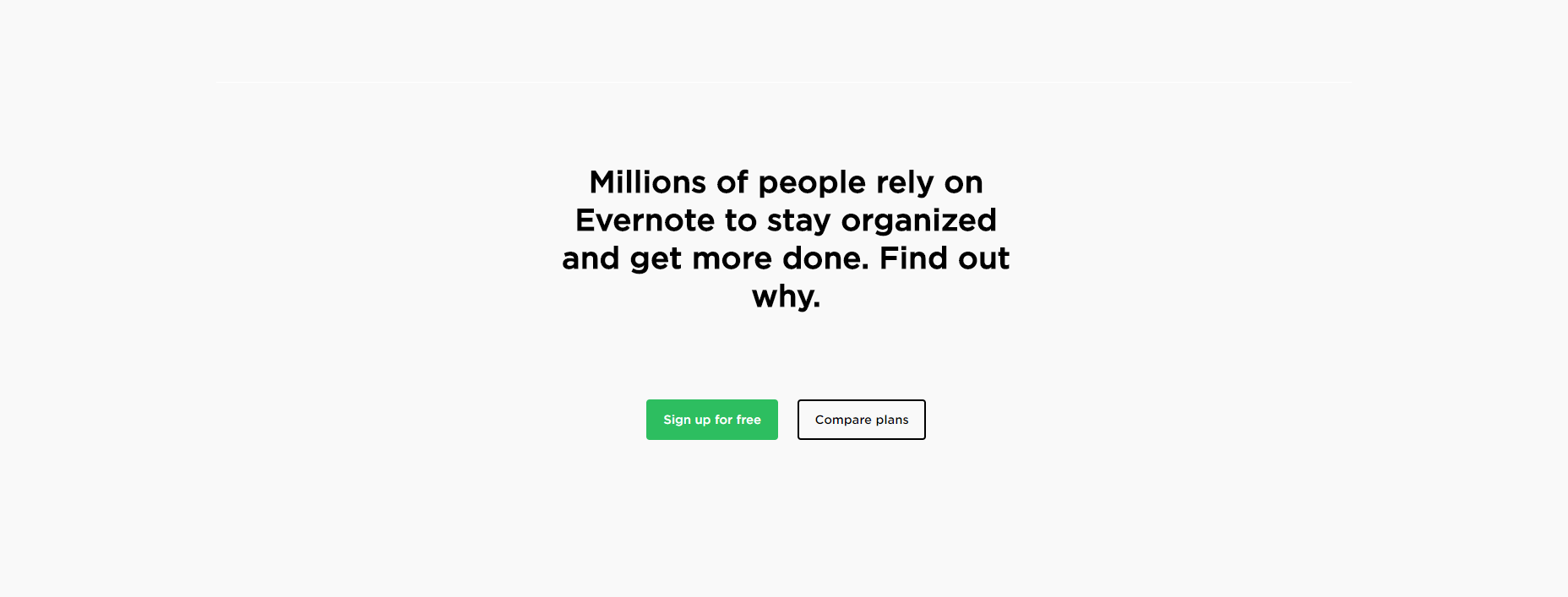
Conclusion
To achieve effective CTA design, you need to consider more than just the button itself. It's also important to think about background color, surrounding images, surrounding text and many other elements. Basecamp team understand the importance of these elements and designed a perfect layout for their landing page. Even the microcopy they use under the CTA button (“4,714 businesses signed up this week!”) boosts the confidence of potential clients.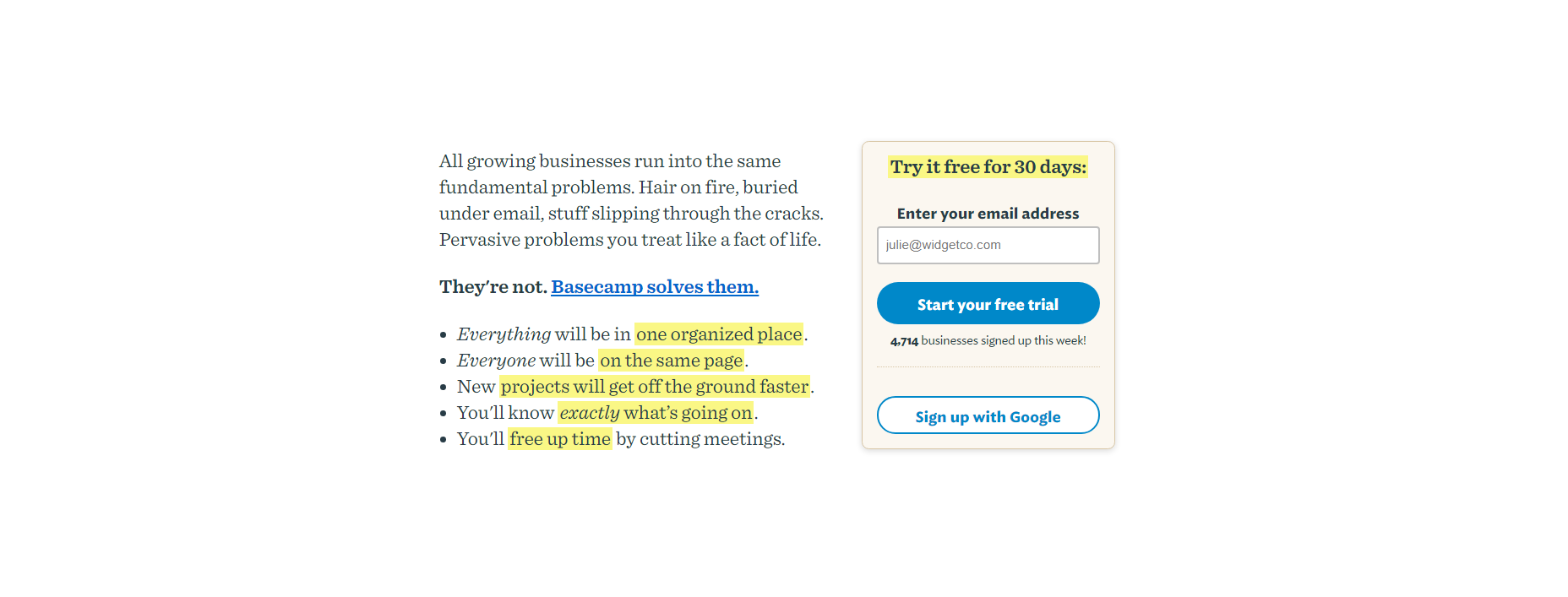 I hope that tips mentioned in this article will help you to create a better call to action button for your website. The last moment is the importance of testing—if you decide to recreate a CTA on your site, remember to test to see if it works for your audience.
Nick Babich
Fireart Studio is a design studio passionate about creating beautiful design for startups & leading brands. We pay special attention to nuances all the time to create professional while cool products that will not only meet all expectations, but exceed them.


Read Next

15 Best New Fonts, July 2024
Welcome to our monthly roundup of the best fonts we’ve found online in the last four weeks. This month, there are fewer…
By Ben Moss

20 Best New Websites, July 2024
Welcome to July’s round up of websites to inspire you. This month’s collection ranges from the most stripped-back…

Top 7 WordPress Plugins for 2024: Enhance Your Site's Performance
WordPress is a hands-down favorite of website designers and developers. Renowned for its flexibility and ease of use,…
By WDD Staff

Exciting New Tools for Designers, July 2024
Welcome to this July’s collection of tools, gathered from around the web over the past month. We hope you’ll find…

3 Essential Design Trends, July 2024
Add some summer sizzle to your design projects with trendy website elements. Learn what's trending and how to use these…

15 Best New Fonts, June 2024
Welcome to our roundup of the best new fonts we’ve found online in the last month. This month, there are notably fewer…
By Ben Moss

20 Best New Websites, June 2024
Arranging content in an easily accessible way is the backbone of any user-friendly website. A good website will present…

Exciting New Tools for Designers, June 2024
In this month’s roundup of the best tools for web designers and developers, we’ll explore a range of new and noteworthy…

3 Essential Design Trends, June 2024
Summer is off to a fun start with some highly dramatic website design trends showing up in projects. Let's dive in!

15 Best New Fonts, May 2024
In this month’s edition, there are lots of historically-inspired typefaces, more of the growing trend for French…
By Ben Moss

How to Reduce The Carbon Footprint of Your Website
On average, a web page produces 4.61 grams of CO2 for every page view; for whole sites, that amounts to hundreds of KG…
By Simon Sterne

20 Best New Websites, May 2024
Welcome to May’s compilation of the best sites on the web. This month we’re focused on color for younger humans,…