

As our mission has evolved from keeping files in sync to helping teams in sync, we realized our brand needs to change, too. Our new brand system shows that Dropbox isn’t just a place to store your files—it’s a living workspace that brings teams and ideas together.This isn’t a brand design, so much as a brand repurposing.
Redefining the Logomark
The “open box” logo mark was the most recognizable of Dropbox’s brand assets, and fortunately they’ve had the good sense to retain it. In fact, you’d be forgiven for thinking that they haven’t changed the logomark at all—other than the fact that someone’s run it through a Warhol-inspired Snapchat filter. However, what has changed is the rationale: Dropbox no longer see this as a box—which would imply storage—but rather as a series of surfaces—which implies open collaboration and creativity, apparently. For those who still see the box, there’s a helpful animated logomark that tries to undermine the original’s 3D qualities. For most people, the original icon, with the original meaning, will still shine through.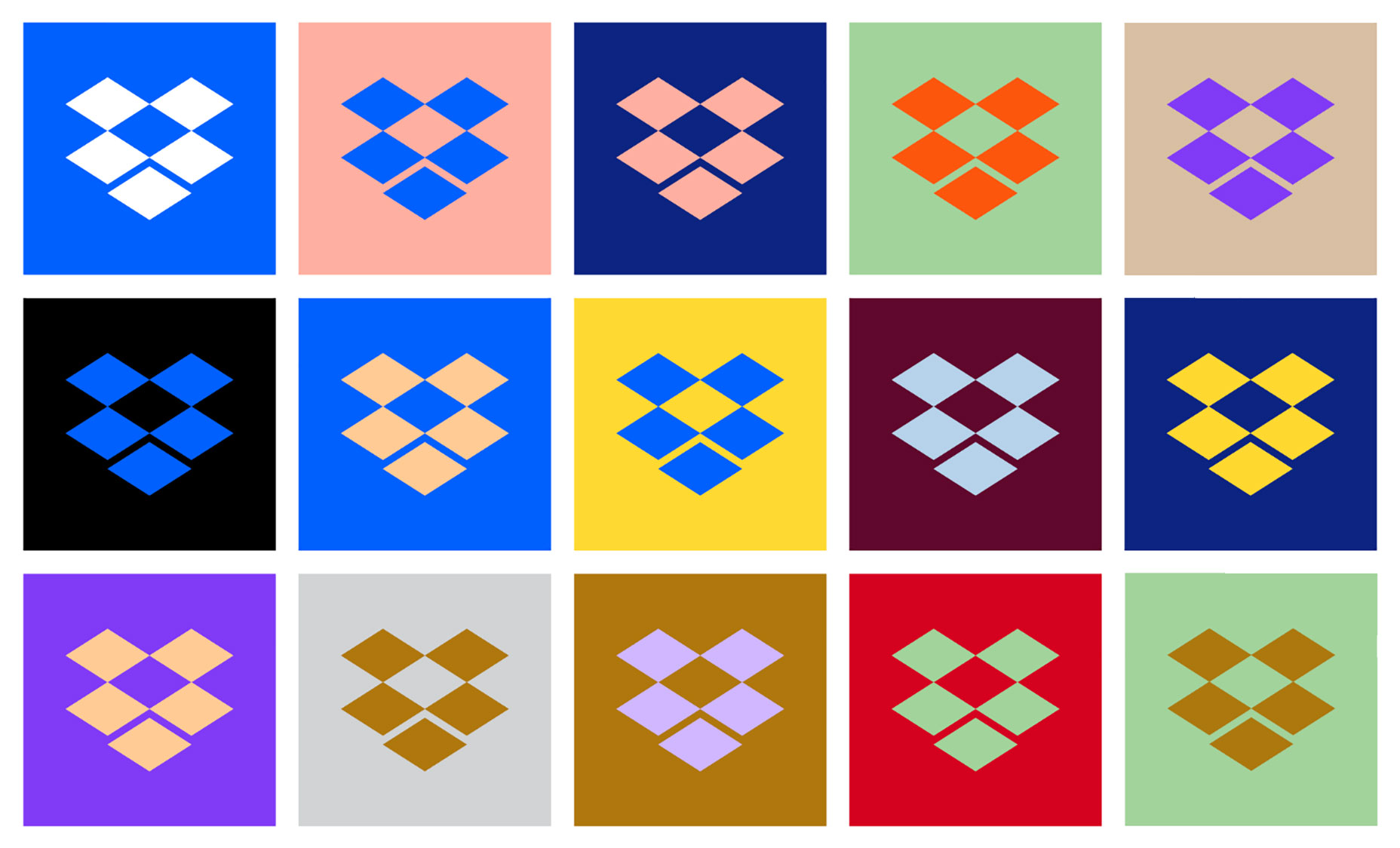
Sharp Grotesk
The revised branding includes a custom typeface, loosely derived from the old logotype, named “Sharp Grotesk”. As a display type, Sharp Grotesk is full of contradictions. A large x-height and counters on some characters enhance readability, whilst very tight counters on others limit it. In weightier fonts the typeface feels distorted to the point that it could almost be monospaced, but in regular weights, especially when sized around 16pt, it’s perfectly readable and still retains enough quirks to keep its character. You have to take your hat off to Dropbox for rejecting the obvious geometric sans direction that seemingly every corporation has adopted in the last couple of years. They’ve gone for broke, and even if Sharp Grotesk isn’t a triumph, it’s undeniably theirs.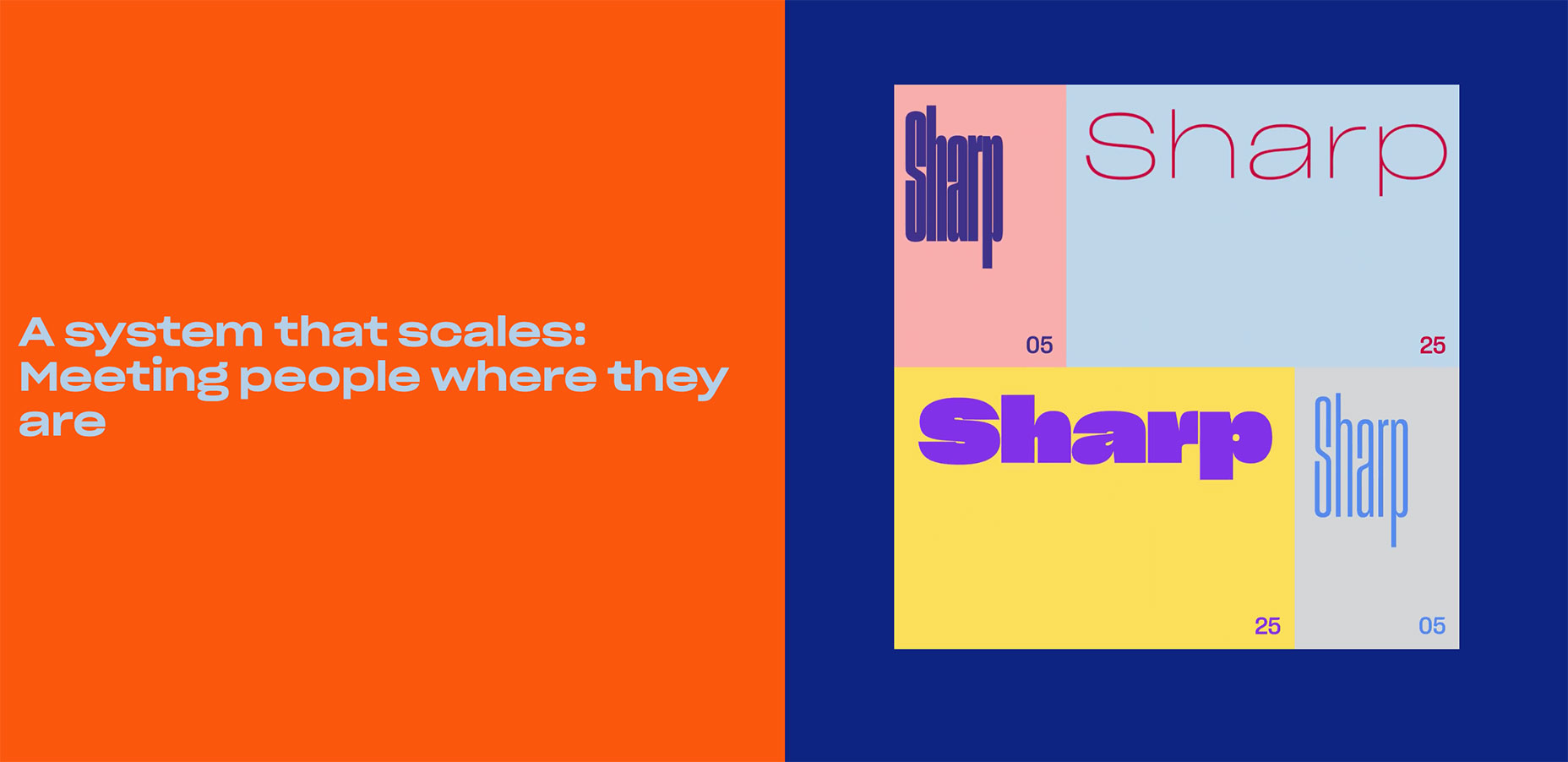
Disposable Color Pairs
Dropbox made the new brand direction public on their dropbox.design site. There are dozens of color pairings on show, with the implication that hundreds more are possible. In this context they are plain ugly but in isolation, with just two colors at a time, the pairings illustrate Dropbox’s central theme, of two different, but equal forces collaborating. You get the impression the color options were put together with real joy, and that no one at Dropbox is married to any individual pairing; they’re just having fun with highly disposable options. It’s also important to note that Dropbox Blue isn’t going anywhere. In the app the same blue you’re used to won’t be replaced by neon purple anytime soon. The new combinations are strictly for marketing.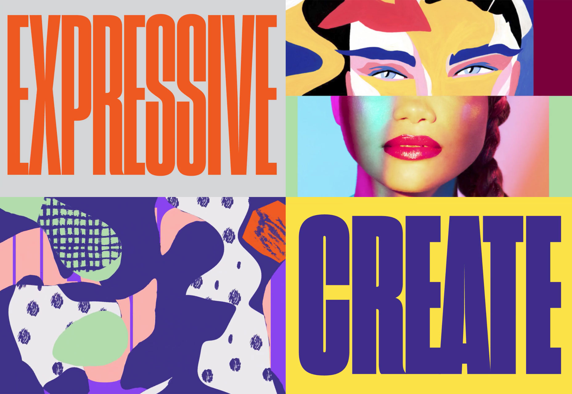
Ugly But Brave
The inspiration behind Dropbox’s new brand identity is that we work better together. Dropbox is no longer for storing photos, or even sharing files, it’s a place to be collaborative and creative. To embody that, they’ve given their design team the freedom to be brave.We want to [build] a brand that help[s] people focus on meaningful work, instead of busywork. And we want to inspire creative energy, instead of taking it away.We have to give the Dropbox design team credit. They had every opportunity to play it safe, churn out something derived from Flat Design, and cash their paychecks. Instead they chose to strike out in a direction most designers would not have opted for. We can’t complain about the homogenization of design, and then act horrified when someone takes a creative risk.
Ben Moss
Ben Moss has designed and coded work for award-winning startups, and global names including IBM, UBS, and the FBI. When he’s not in front of a screen he’s probably out trail-running.


Read Next

15 Best New Fonts, July 2024
Welcome to our monthly roundup of the best fonts we’ve found online in the last four weeks. This month, there are fewer…
By Ben Moss

20 Best New Websites, July 2024
Welcome to July’s round up of websites to inspire you. This month’s collection ranges from the most stripped-back…

Top 7 WordPress Plugins for 2024: Enhance Your Site's Performance
WordPress is a hands-down favorite of website designers and developers. Renowned for its flexibility and ease of use,…
By WDD Staff

Exciting New Tools for Designers, July 2024
Welcome to this July’s collection of tools, gathered from around the web over the past month. We hope you’ll find…

3 Essential Design Trends, July 2024
Add some summer sizzle to your design projects with trendy website elements. Learn what's trending and how to use these…

15 Best New Fonts, June 2024
Welcome to our roundup of the best new fonts we’ve found online in the last month. This month, there are notably fewer…
By Ben Moss

20 Best New Websites, June 2024
Arranging content in an easily accessible way is the backbone of any user-friendly website. A good website will present…

Exciting New Tools for Designers, June 2024
In this month’s roundup of the best tools for web designers and developers, we’ll explore a range of new and noteworthy…

3 Essential Design Trends, June 2024
Summer is off to a fun start with some highly dramatic website design trends showing up in projects. Let's dive in!

15 Best New Fonts, May 2024
In this month’s edition, there are lots of historically-inspired typefaces, more of the growing trend for French…
By Ben Moss

How to Reduce The Carbon Footprint of Your Website
On average, a web page produces 4.61 grams of CO2 for every page view; for whole sites, that amounts to hundreds of KG…
By Simon Sterne

20 Best New Websites, May 2024
Welcome to May’s compilation of the best sites on the web. This month we’re focused on color for younger humans,…