

1. Sistrix
Sistrix is the German company behind popular SEO software package Sistrix Toolbox. As such, their website (including their popular SEO news blog) gets regular traffic from digital experts. When that’s your target market, there isn’t much room for sloppiness when it comes to web design. Keeping things sleek and stylish, the Sistrix navigation menu is comprised of four simple drop down menus: Toolbox, Blog, Resources and Support. Hovering over each header reveals a list of relevant links, each represented by a simple icon. This is a particularly smart idea when your website has as many pages as Sistrix’s has. Just showing a block of text can be overwhelming when trying to navigate through a big website, but these well-designed icons quickly direct the visitor to where they need to go. Looking for help with mobile SEO? A simple smartphone icon draws the eye and gets you there much quicker. Streamlining the user experience for site visitors is one of the main functions of a good navigation header, and this is something the Sistrix site nails.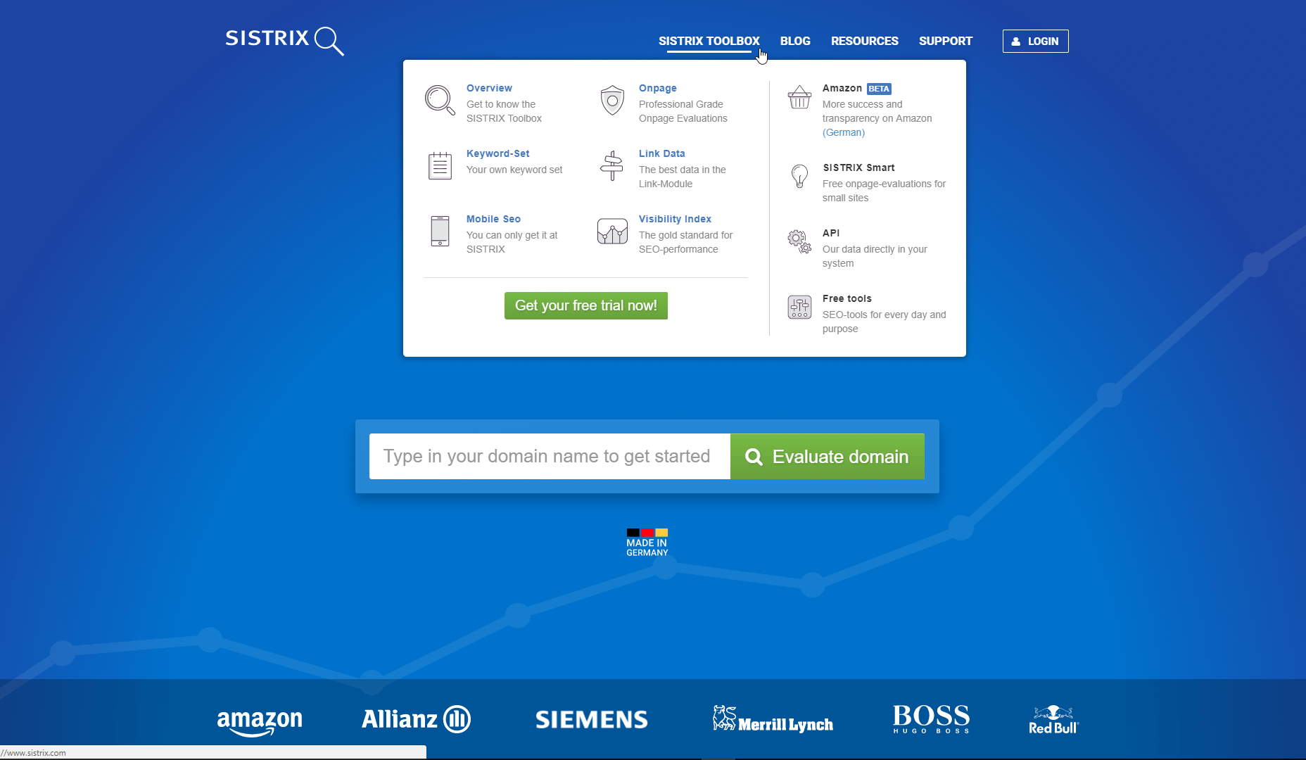
2. Reiss
When you’re a fashion brand, it’s smart to show off your latest designs as much as possible. While many drop-down navigation menus are purely text-based, UK fashion brand Reiss highlights their New Arrivals catalogue using images in the drop-downs for womenswear and menswear, two of their core product categories. It helps that they’ve invested in high-quality photography—with pictures that look this great, why not incorporate them as a key part of the navigation experience?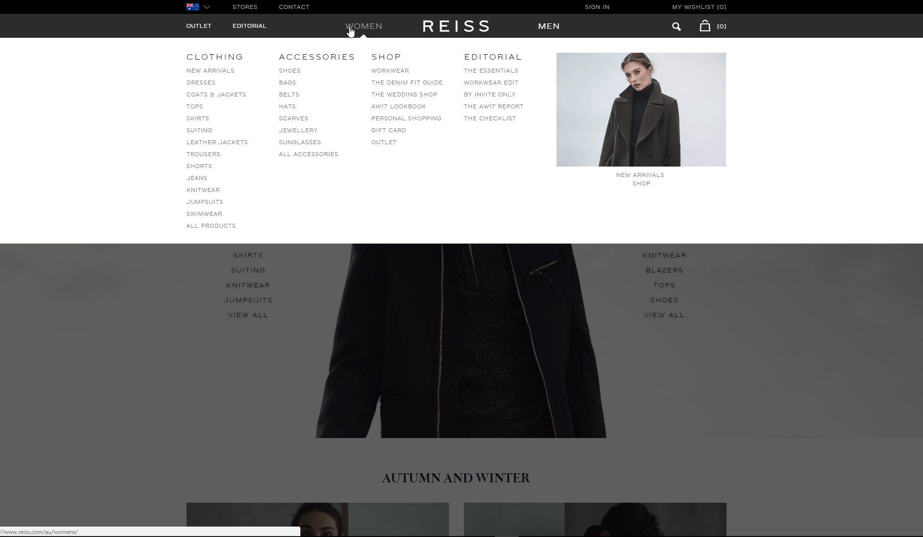
3. Vibrains
Vibrains is a portfolio for Emiliano Borzelli, a front end developer. When it comes to the site, it’s truly out of this world. Picking a clear design motif like ‘space’ gives a cohesive look to the whole site. Everything from the logo design to the key info icons utilise space imagery. A simply animated banner makes browsing the site feel like floating in outer space, but the absolute standout design feature is a fully animated animation of the solar system when you jump into the process section. With to-scale representations of our neighboring planets, it evokes the childlike fascination people have with space to keep visitors engaged with navigating through the site. If you’re as obsessed with this animation as we are, you’ll be glad to hear we tracked down the open source code for it on CodePen here!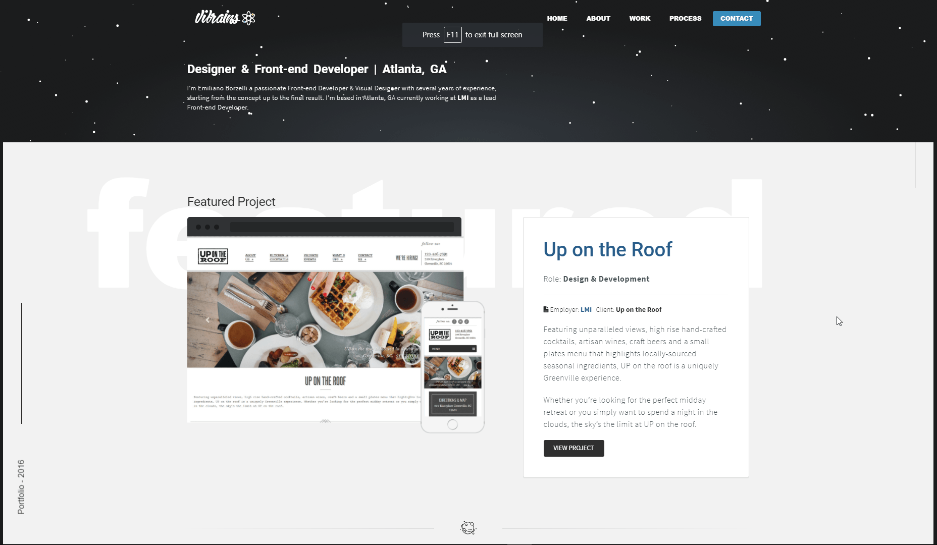
4. Weecom
Brazil-based digital agency Weecom utilise a hamburger-menu button to keep their homepage looking sleek and minimalist, with navigation options only popping up as you hover over the icon. It’s a pretty standard approach to navigation headers, but what we love about Weecom’s site is how scrolling down the page causes the hamburger icon to switch from top-left to bottom-right. It’s a simple, dynamic touch that proves how important it is to use navigation menus that work around the main content of the page.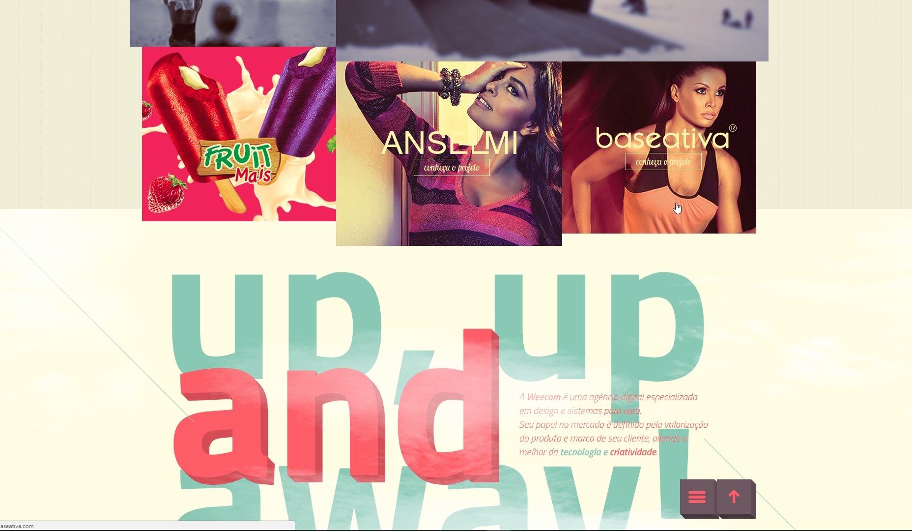
5. Mashable
When you’re a content nexus like Mashable, it can be a tall order displaying all your content in a conventional navigation menu. Headings, subheadings, sub-subheadings—making sure you have clarity is key to providing a good user experience for your site visitors. That’s where their mega-menu comes in. Once you hover over the ‘More’ tab a drop-down menu spanning the entire length of your screen becomes visible. This provides the space to include a series of columns—like ‘Channels’ or ‘Company’—under which your list of subheadings can be displayed. If you’re designing a site that’s hosting a lot of content, considering a mega-menu like this one is a strategic way to handle navigation.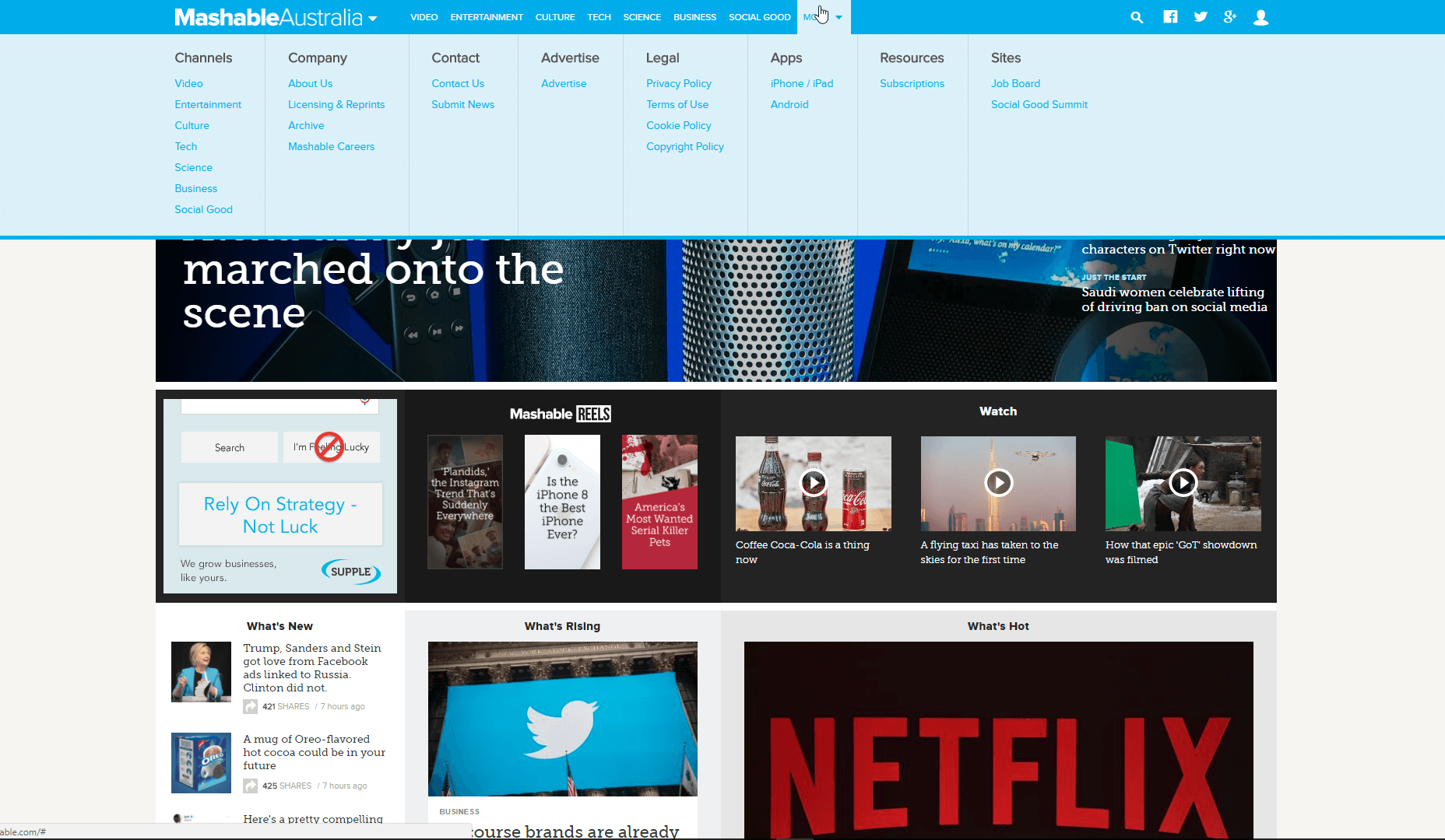
6. Oars
Another example of a mega-menu, travel service Oars uses a clear navigation layout to help you find what you want. For example, hovering over Destinations showcases a mega-menu divided up into Oars’ local United States destinations, International destinations, National Parks and Rivers. Another great addition to the mega-menu design is the use of images under Your Experience, Stories+Video and Plan+Reserve headers. Making the most of the space they have, these eye-catching image panels engage site visitors and encourage click-through.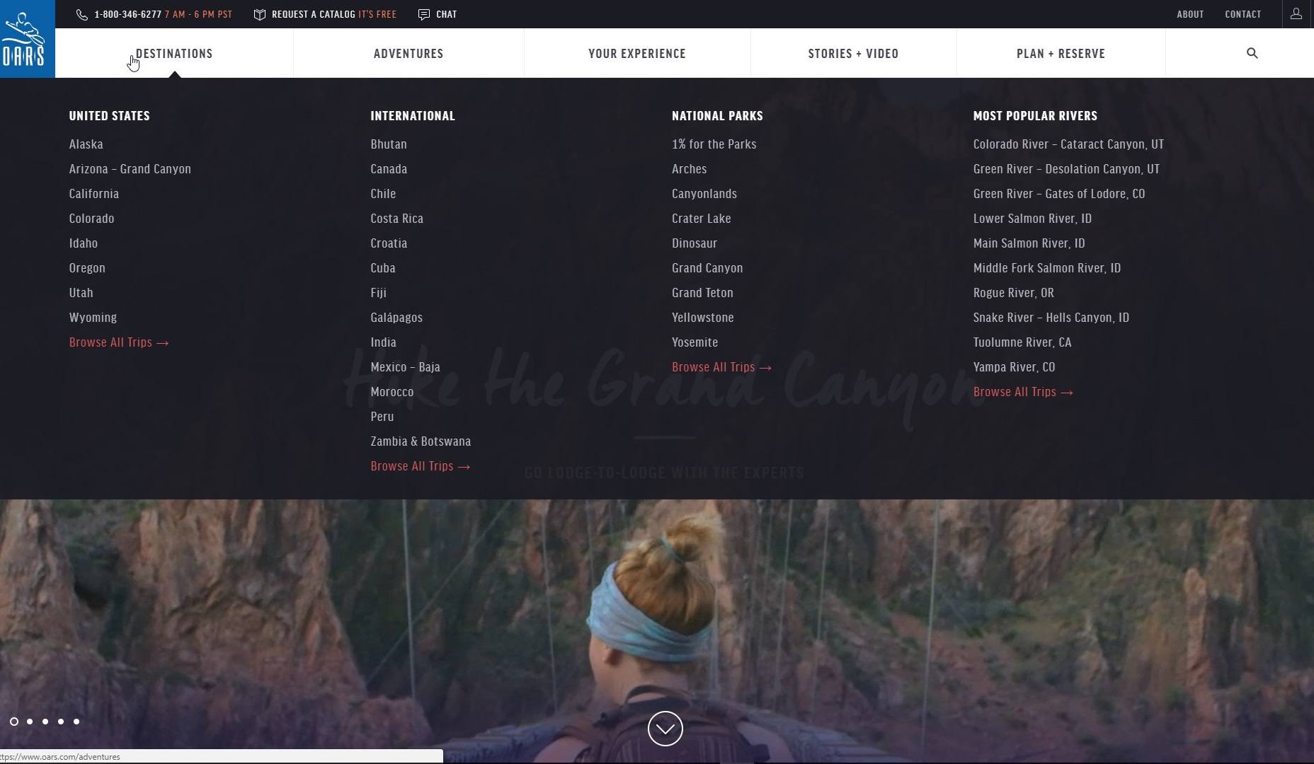
7. Paper Collective
Specializing in stunning art prints for the home or office, it’s clear Paper Collective has an eye for good design. Accordingly, they’ve made clever use of a slide-out sidebar menu—meaning that navigating their site never obscures their homepage product images, but shifts them slightly to the right instead.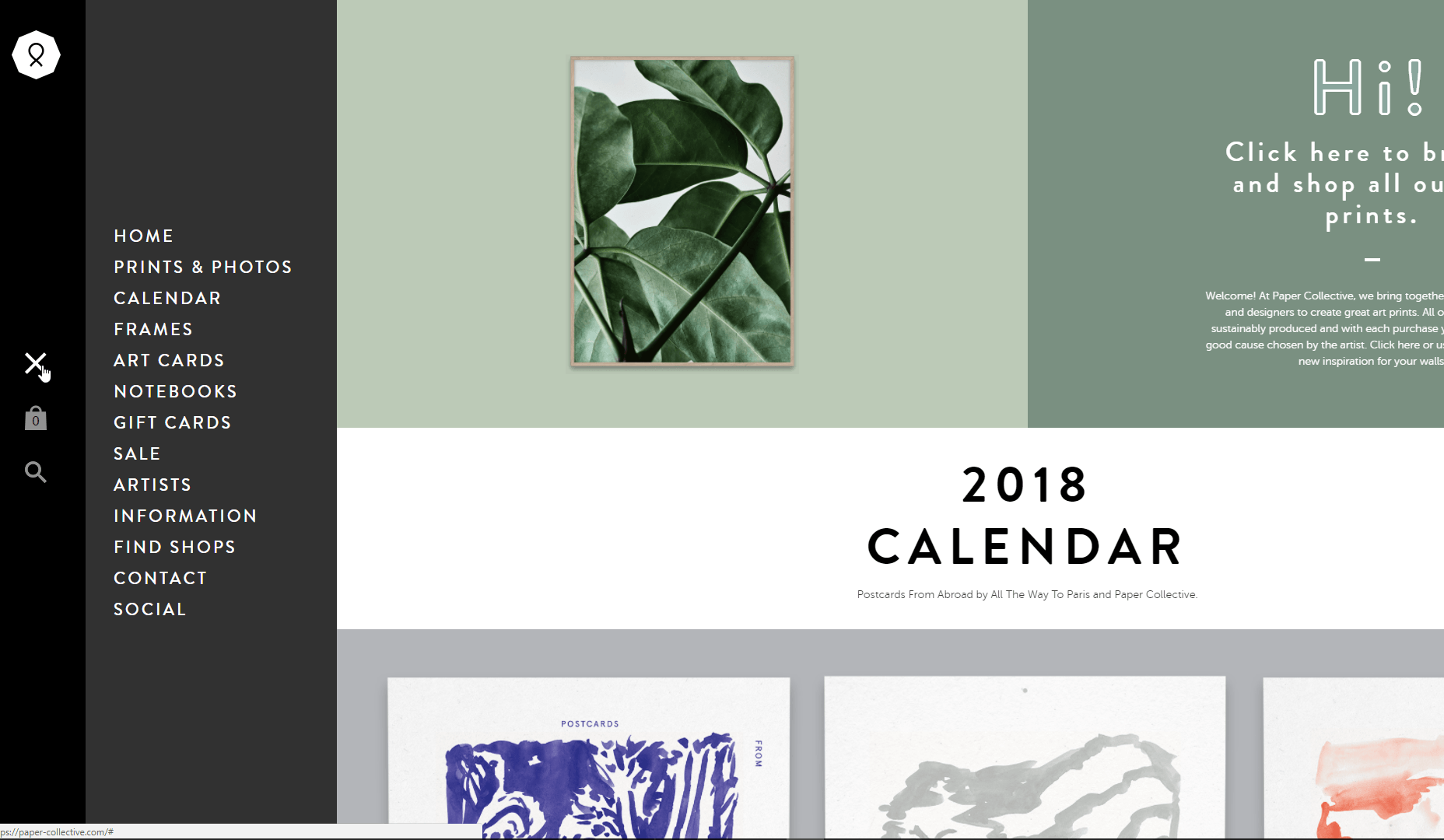
8. Olympics
Maybe we’re design nerds, but one of our favourite parts about the Olympic Games is seeing the logo designs each host city comes up with. Completely individual to the culture and design sensibilities of the time, they’re a great way to look back on past Games. This is something the navigation menu design for the IOC homepage seems mindful of—as you hover over the main ‘Olympic Games’ header each Olympic Games is represented alongside its specific logo. Laid out in a simple, streamlined way that makes navigation by chronology easy, this site sets a gold-standard for good menu design.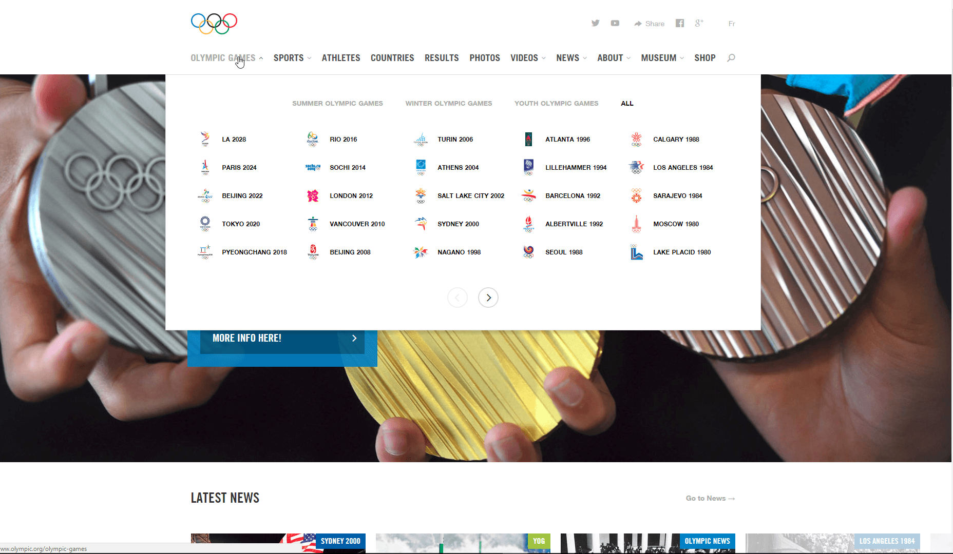
9. Next Stop
Next is a UK brand that sells everything from clothes to shoes, to flower arrangements, to furniture. As such, their navigation menu has to do a lot of heavy-lifting to display their comprehensive catalogue of products. One of the techniques they use is accordion tabs—when you hover over their Home & Furniture header you’ll see a sub-menu of tabs you can click through to see links for bedroom furniture, kitchen fittings and more! If your company has a wide range of products online, this method of dividing up headings, subheadings and sub-subheadings is a fantastic way to go.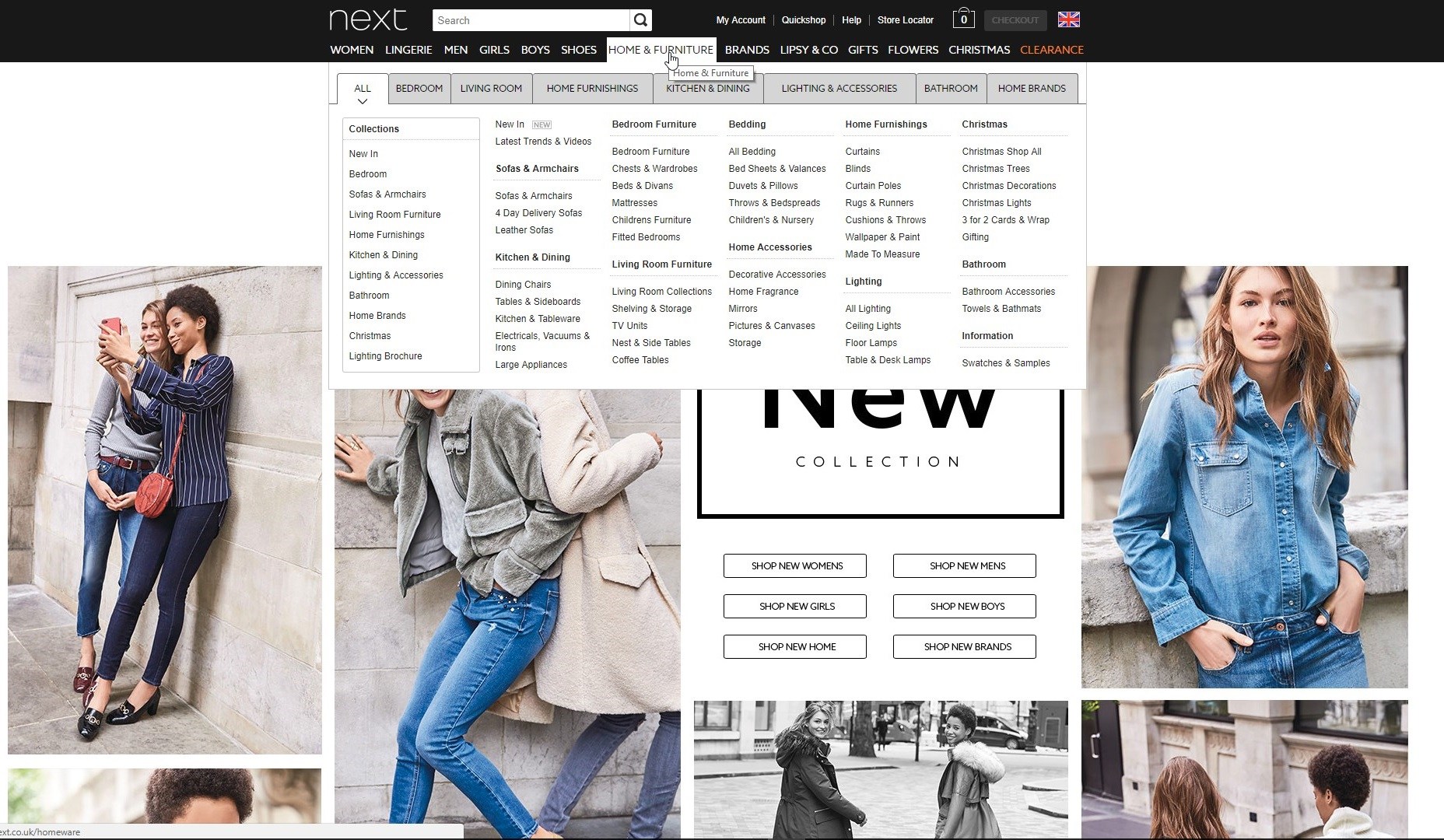
10. ESPN
Smart navigation design means knowing what people are looking for and displaying that as easily as possible. For sporting media empire ESPN, most of their customer base are looking for one thing: the score. With a keen awareness of this, ESPN has made the smart decision to display a Top Events navigation menu above their standard menu, giving quickview results for the latest scores in the most popular games. In combination with the standard menu (which utilises team logos under NBA, NFL, AFL, NRL & Cricket headers for easy browsing) it’s design that’s directly informed by how and why people use the ESPN site.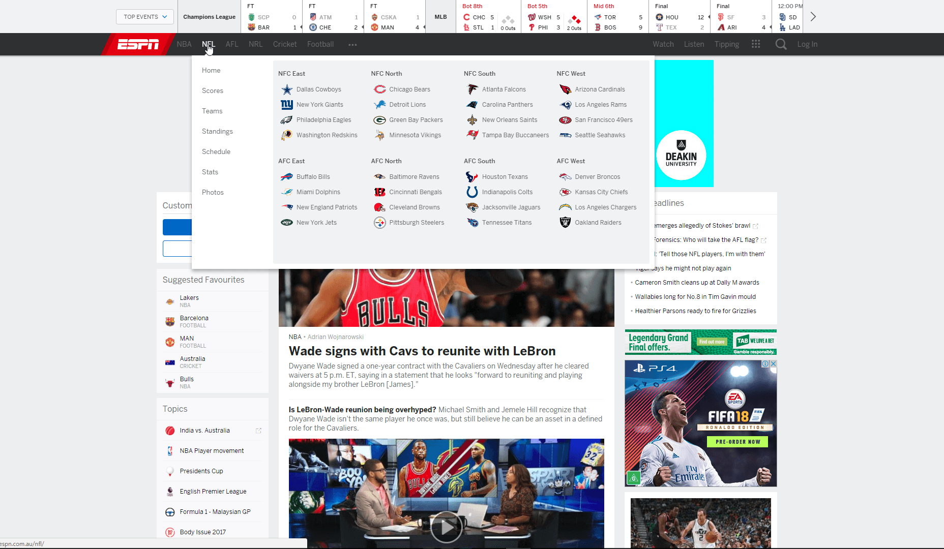
11. Bentley
Bentley is a brand which is held in high regard for their sleek car designs and, so it would seem, sleek web design too. A clever layout has made navigating the Bentley site a joy. Clicking the Models header in the top menu causes a sidebar to appear. As you hover over each car model range, you’re given a stylish sideview of the individual models on offer. With a reputation for beautiful cars, it’s no surprise high-quality images feature so heavily in the Bentley navigation menu. It’s a lesson we can all learn when it comes to web design: if you’ve got it, flaunt it!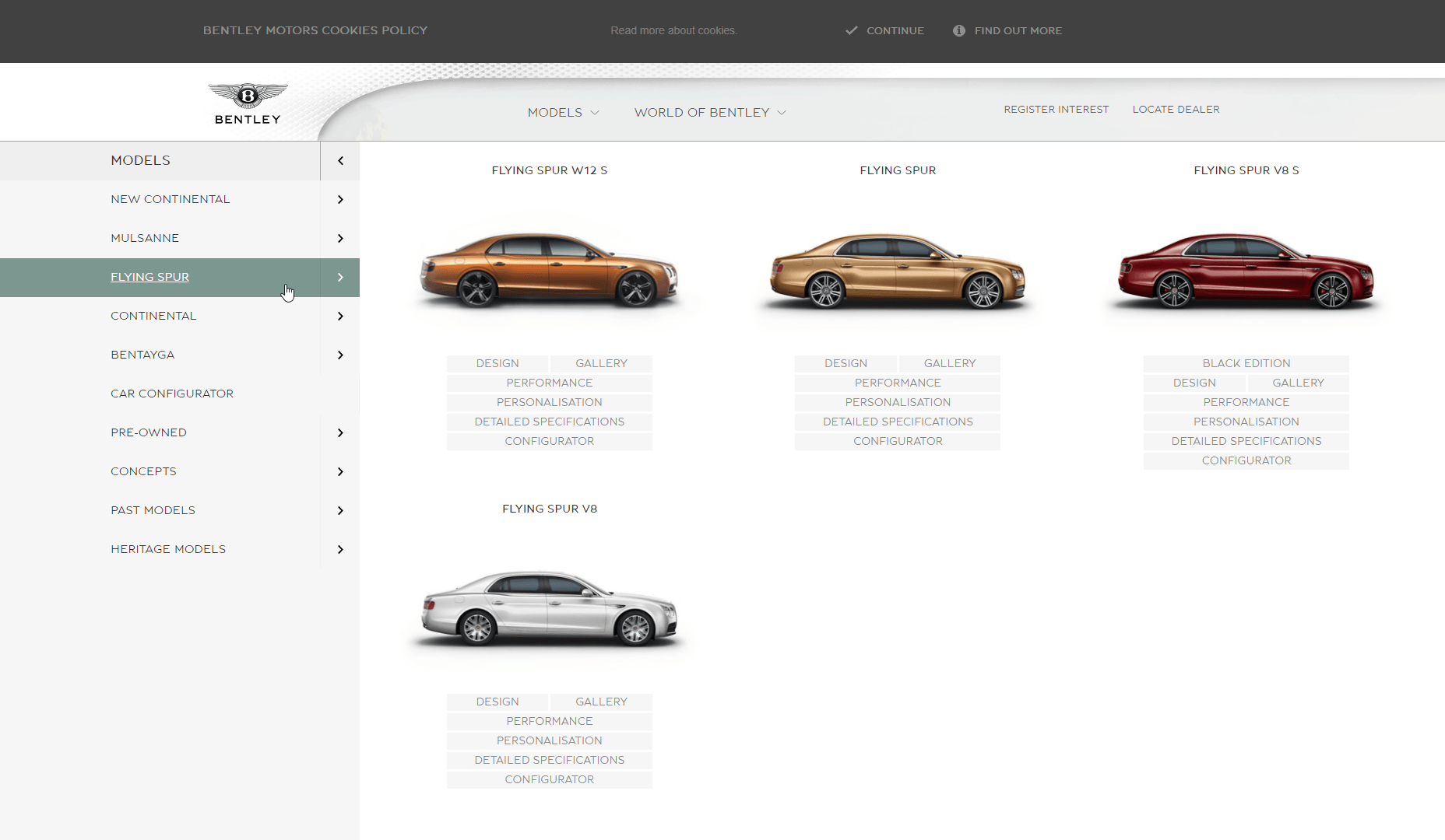
Saijo George
Saijo George works an SEO Strategy Director for Melbourne based award winning marketing agency Supple. When he is not reading up on web design and digital marketing, he is either working on side projects OR playing Helldivers / Hearthstone / Call Of Duty. You can find him on twitter : @Saijo_George and LinkedIn


Read Next

15 Best New Fonts, July 2024
Welcome to our monthly roundup of the best fonts we’ve found online in the last four weeks. This month, there are fewer…
By Ben Moss

20 Best New Websites, July 2024
Welcome to July’s round up of websites to inspire you. This month’s collection ranges from the most stripped-back…

Top 7 WordPress Plugins for 2024: Enhance Your Site's Performance
WordPress is a hands-down favorite of website designers and developers. Renowned for its flexibility and ease of use,…
By WDD Staff

Exciting New Tools for Designers, July 2024
Welcome to this July’s collection of tools, gathered from around the web over the past month. We hope you’ll find…

3 Essential Design Trends, July 2024
Add some summer sizzle to your design projects with trendy website elements. Learn what's trending and how to use these…

15 Best New Fonts, June 2024
Welcome to our roundup of the best new fonts we’ve found online in the last month. This month, there are notably fewer…
By Ben Moss

20 Best New Websites, June 2024
Arranging content in an easily accessible way is the backbone of any user-friendly website. A good website will present…

Exciting New Tools for Designers, June 2024
In this month’s roundup of the best tools for web designers and developers, we’ll explore a range of new and noteworthy…

3 Essential Design Trends, June 2024
Summer is off to a fun start with some highly dramatic website design trends showing up in projects. Let's dive in!

15 Best New Fonts, May 2024
In this month’s edition, there are lots of historically-inspired typefaces, more of the growing trend for French…
By Ben Moss

How to Reduce The Carbon Footprint of Your Website
On average, a web page produces 4.61 grams of CO2 for every page view; for whole sites, that amounts to hundreds of KG…
By Simon Sterne

20 Best New Websites, May 2024
Welcome to May’s compilation of the best sites on the web. This month we’re focused on color for younger humans,…