

The Great Agency
The Great Agency (which sometimes also calls itself "Alexander the Great") could teach us all a thing or two about animation. While not every brand will want to use this much animation, it all feels smooth and fluid; it compliments the rest of the site’s visuals nicely.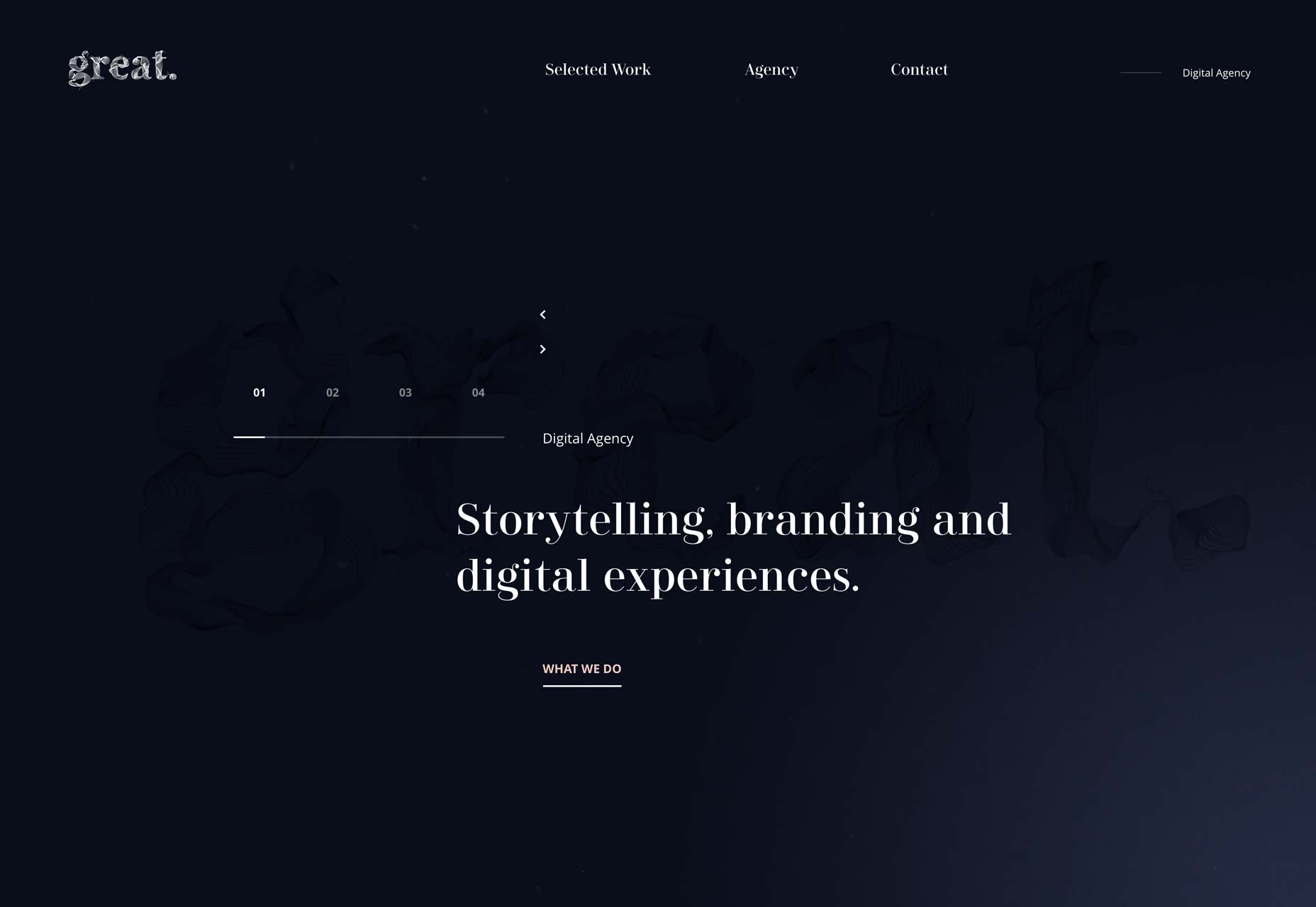
Daniel Arsham
On the down-side, Daniel Arsham’s site could be a little confusing at first, with unconventional navigation, and a screen-saver (Remember those?) that pops up a little two fast. One the other hand, it’s a whole new concept. It’s actually kind of cool to watch the whole page split in two to reveal a bit of the project underneath. Take a look at this one for ideas. And maybe implement them with better usability.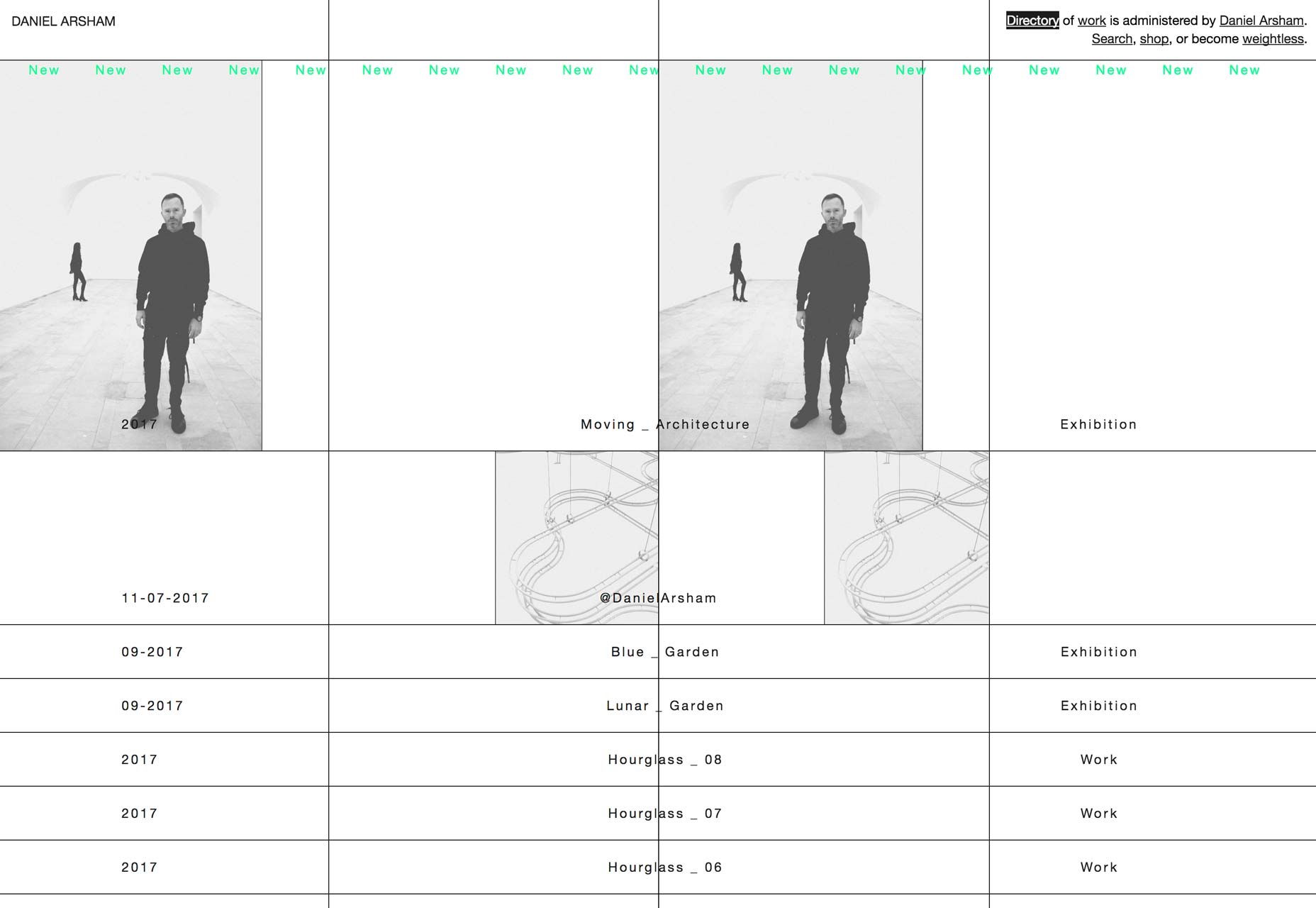
stillcouldbeworse
The oh-so-confidently named stillcouldbeworse brings us a nice little dark website with what might be one of my new favorite navigation patterns. Click on "Projects" to see what I mean. Okay, it wouldn’t work for site where vertical space is at a premium, but I still think it’s cool. The overall style of the site feels a bit ’90s, but has a clearly modern implementation.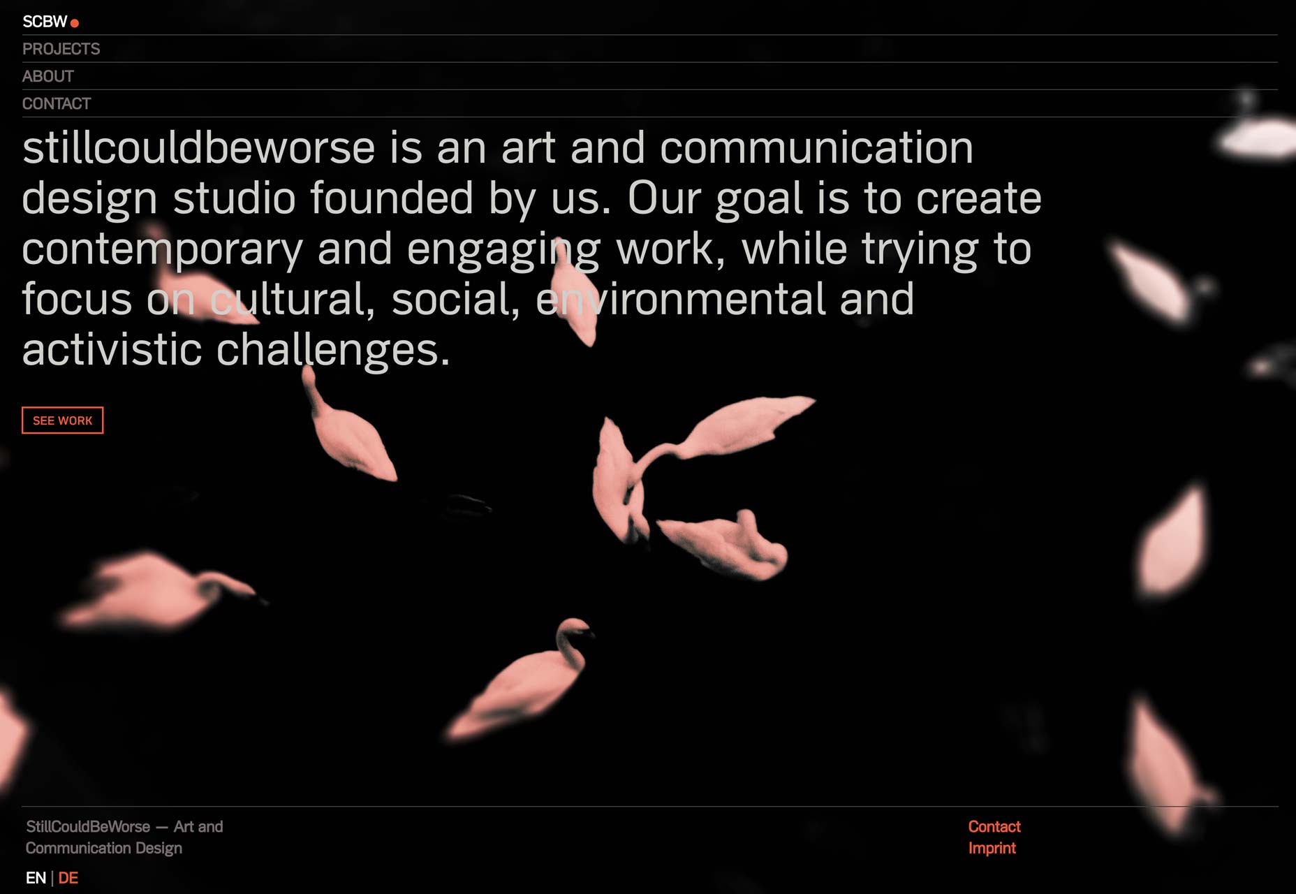
7D8
7D8 has adopted minimalism to the point of near-brutalism. A bit more grey and mono-spaced type, and they’d go right over the edge. As it is, it’s just highly stylized minimalism, and it’s looking good. I’m still not sure about that "four corners" navigation that some sites do; but I’m willing to say that 7D8 makes it work.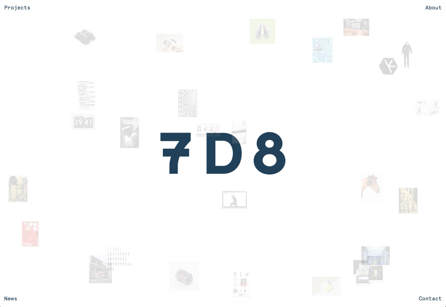
Brave New World
Brave New World has a familiar layout, with the addition of some nice parallax effects. And scrolling text on diagonal vectors. It’s actually way better than it sounds, even if it does remind me a little too much of the marquee element of old.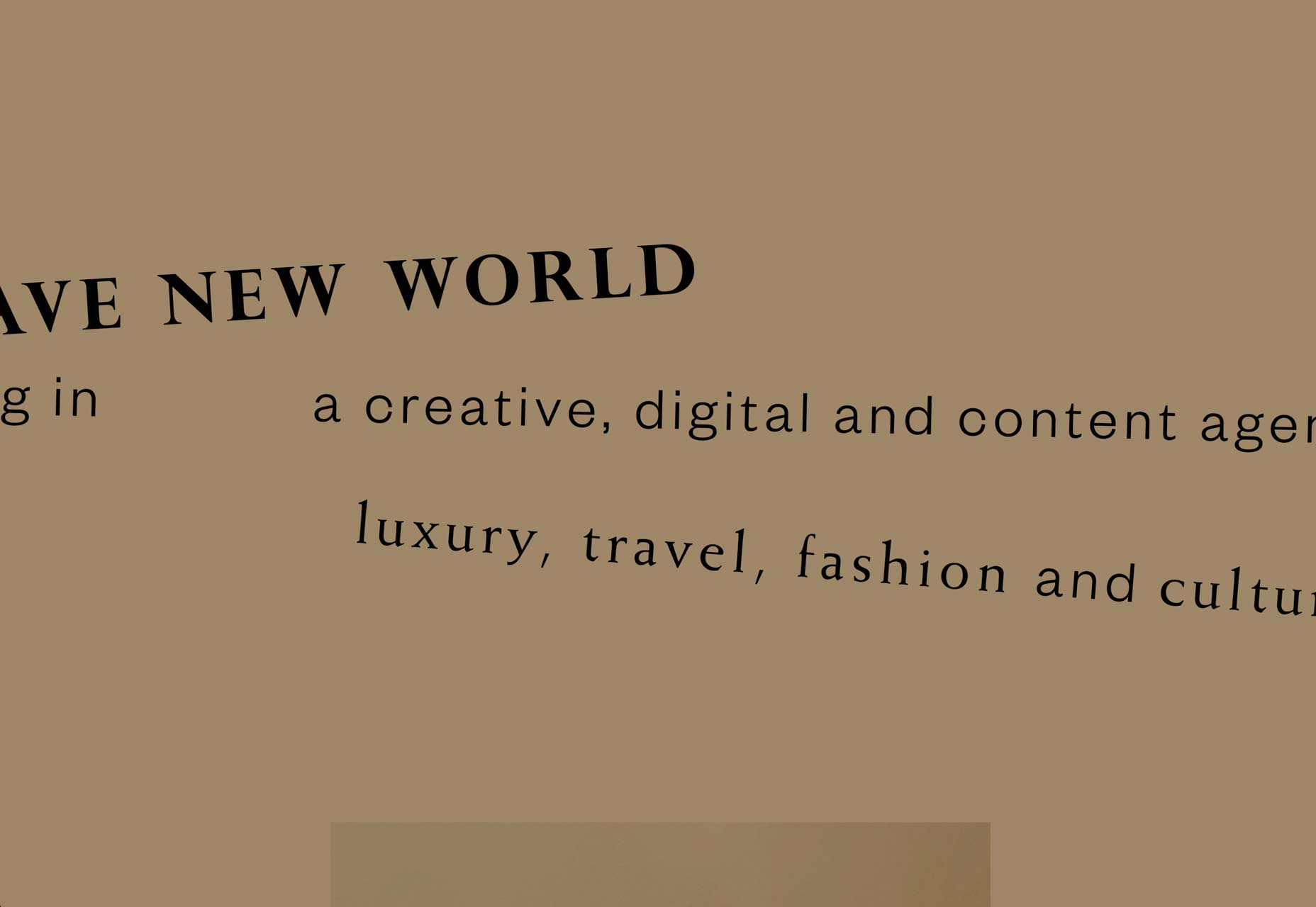
Parametro
Sometimes, I include a site just because they did one cool thing I haven’t seen before. In Parametro’s case, there’s a mind-map-style presentation on the home page. The rest of the site is good—if typical—minimalism. That thing on the home page is just plain cool, though.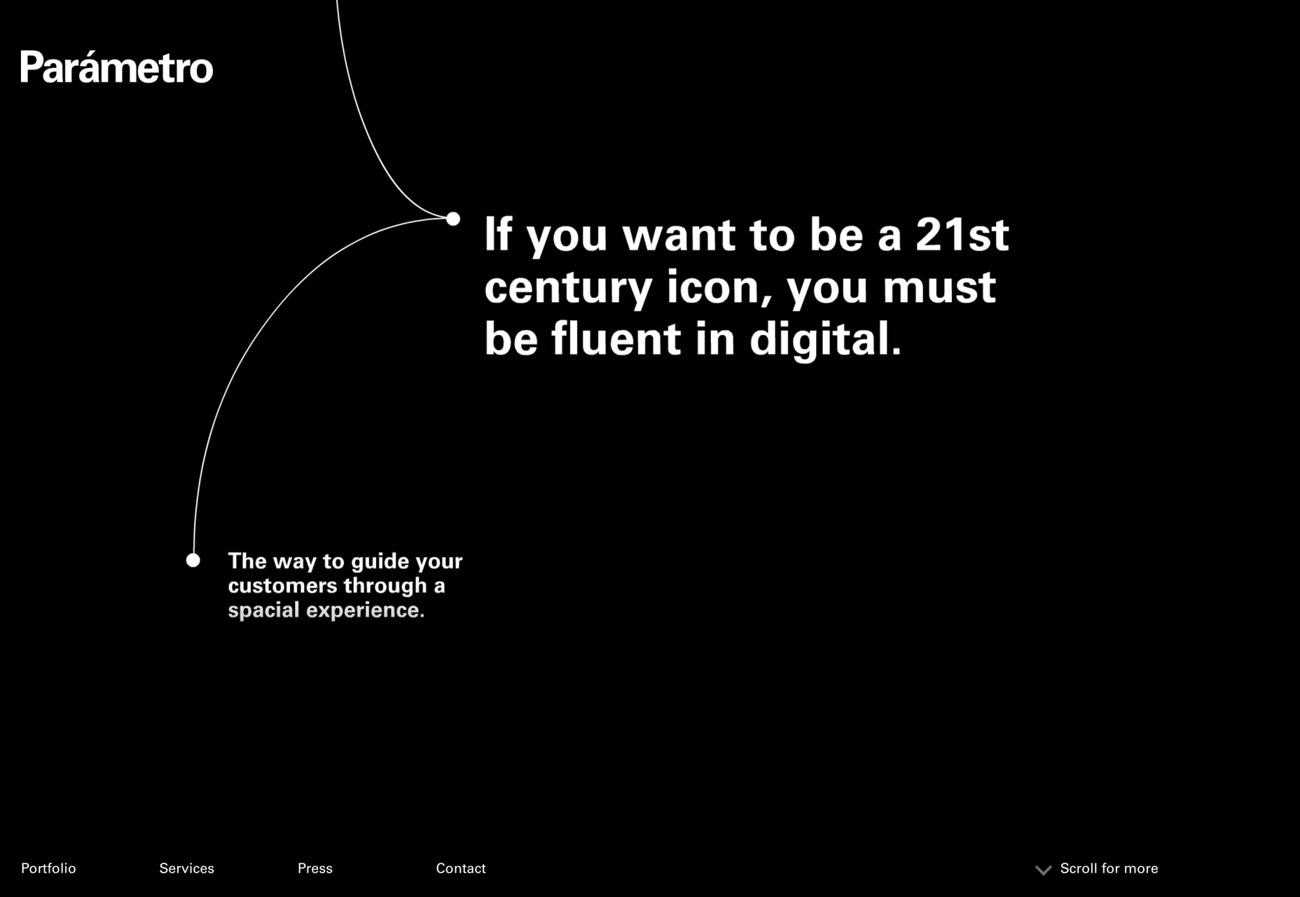
Liah Moss
Post-minimalism ain’t so bad when it’s loaded with color! Liah Moss demonstrates this fact by combining artsy minimalism with a touch of the ’80s. The predictable layout is offset quite nicely by good type, and enough bright pastels to... man I’ve already made too many Morticia jokes. Someone’s going to have to come up with something in the comments.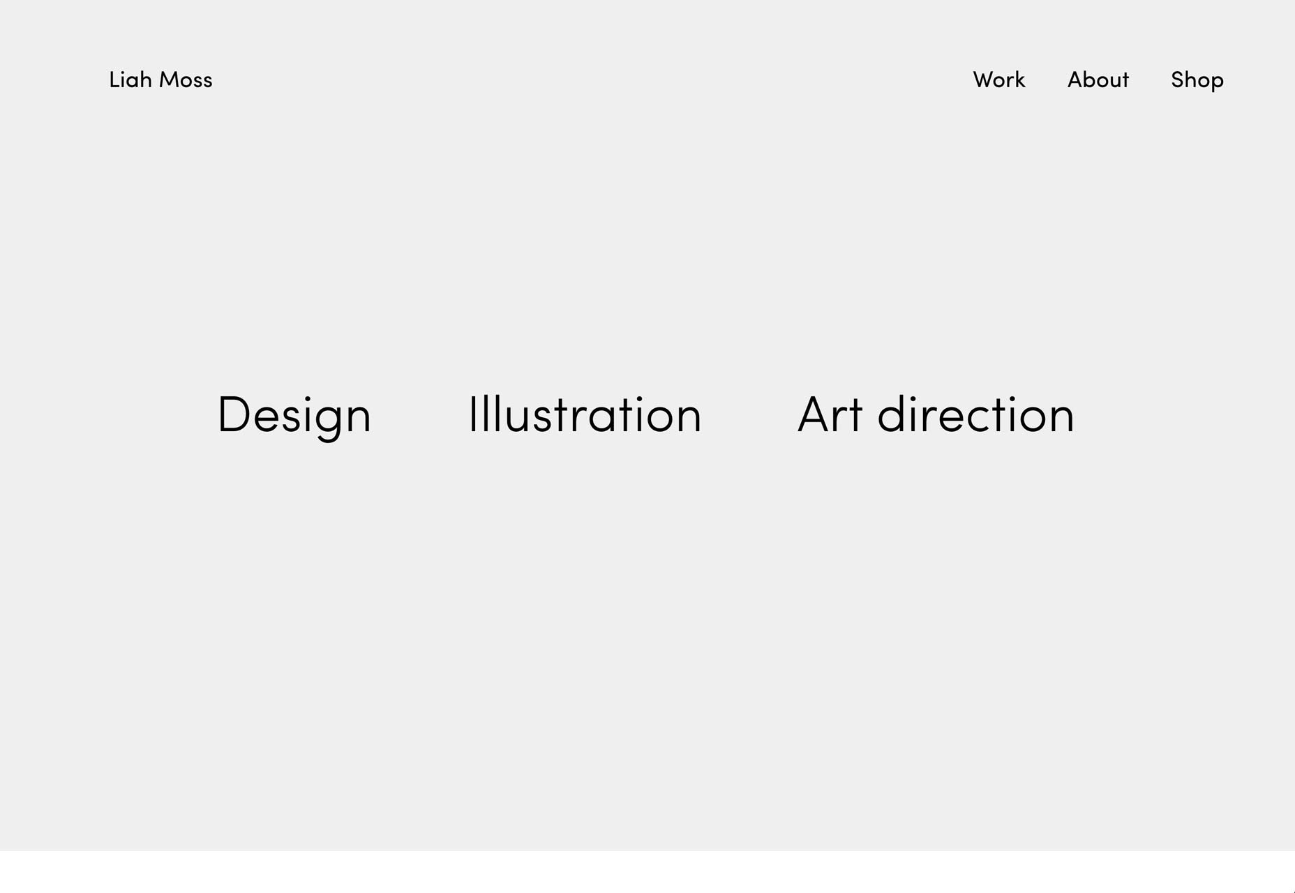
Sophie Hustin
Sophie Hustin is a painter and sculptor with a simple, dark site to show off her wares. It’s a bit presentation-like, but pretty enough to make it onto this list regardless.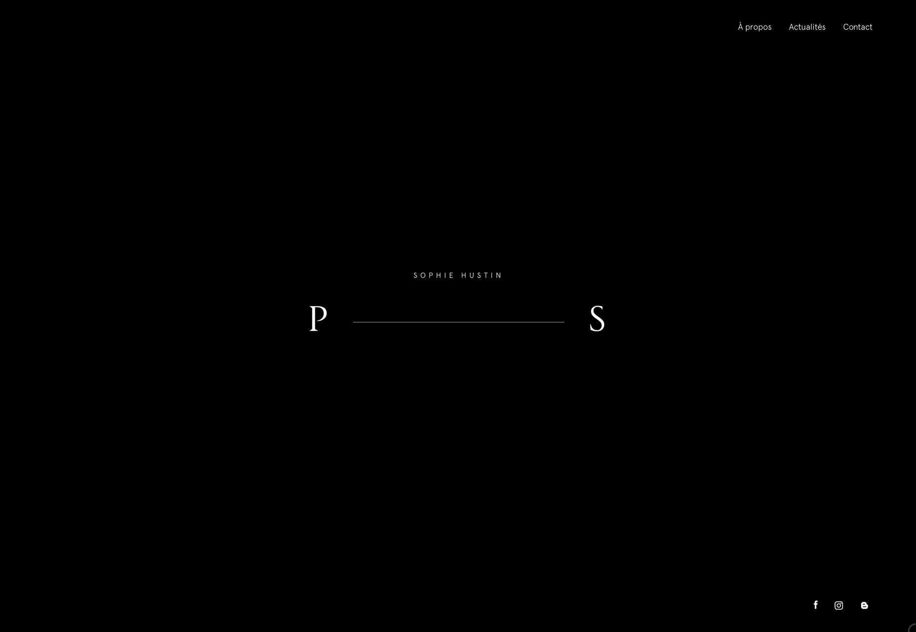
Wild
Wild is a digital branding studio that really, really loves their white space. And who can blame them? Empty space on your screen can feel weirdly refreshing, or panic-inducing, depending on what’s actually supposed to be there. Anyway, there’s also some pleasant type, and an interesting approach to the portfolio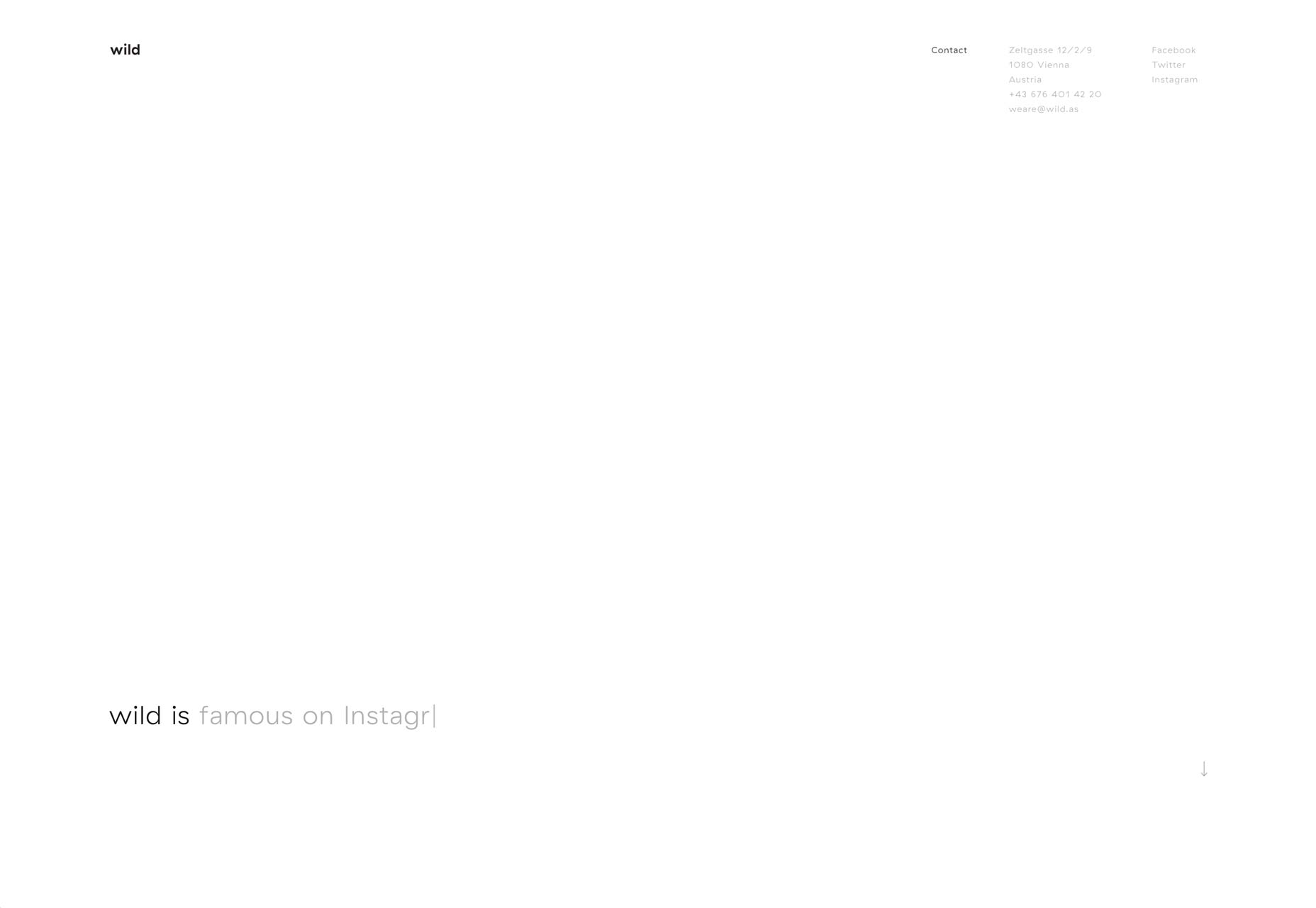
Biscuit Filmworks
Biscuit Filmworks has embraced a portfolio style I’ve seen a lot lately: the list-of-projects-with-changing-background-on-hover. I need to make up a name for that. What this site does differently is the color scheme. I’m not entirely sure how they managed to make the entire site look a bit like a sepia filter in abstract, but they did.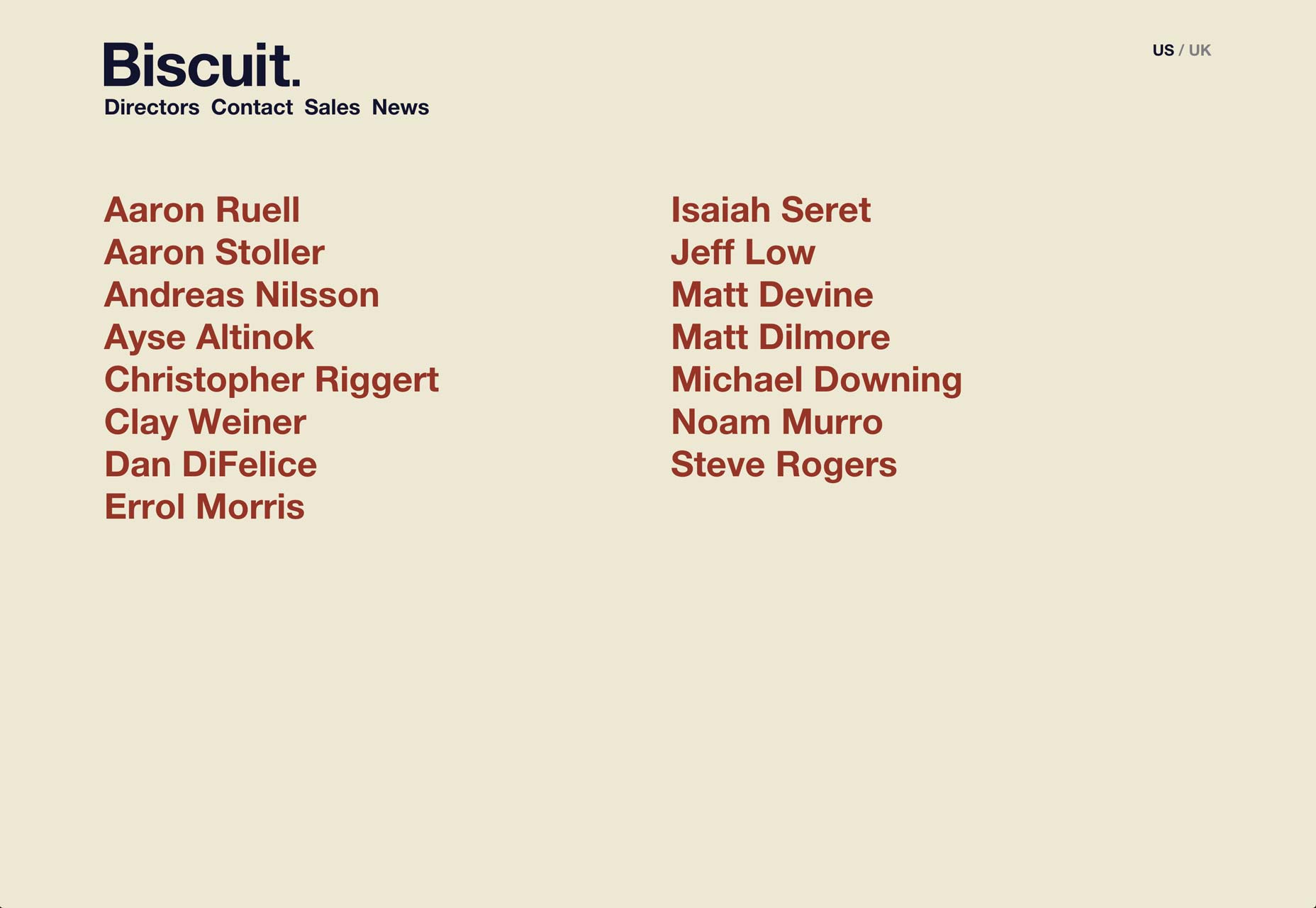
Lotta Nieminen
Lotta Nieminen’s portfolio has that almost magazine-like aesthetic (and text size), but combines it with an app-like approach to browsing the site. All of her work is featured on the home page. Some of it just happens to be off to the side. It’s an efficient and elegant way of combining three pages into one.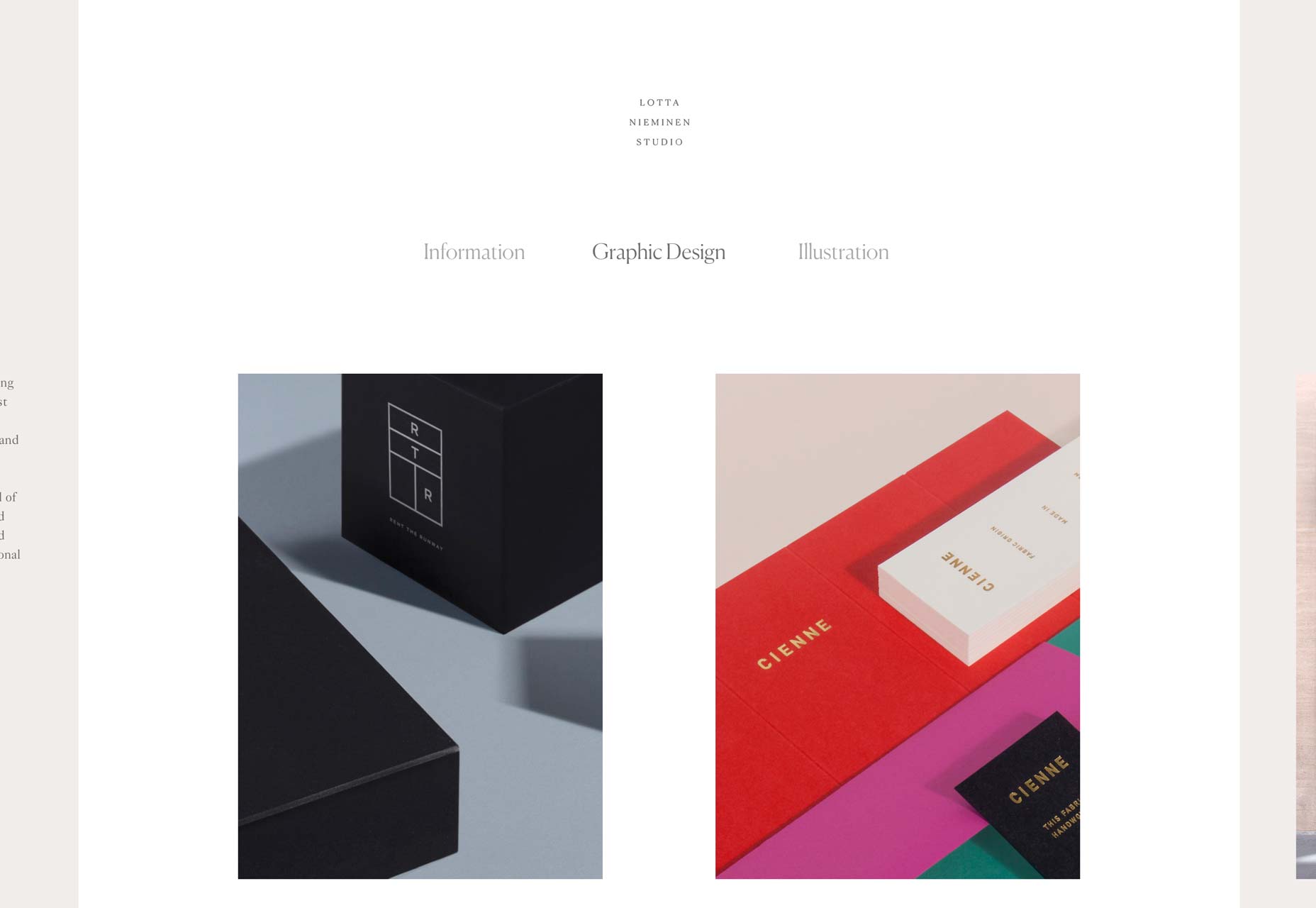
Elegant Seagulls
Elegant Seagulls has one of the more creative post-modern layouts I’ve seen to date. It might feel a bit cluttered at times, but it also feels fresh. And very seagull-obsessed. It’s one of those sites that might not be optimized within an inch of its life, but goshdarnit, it has personality.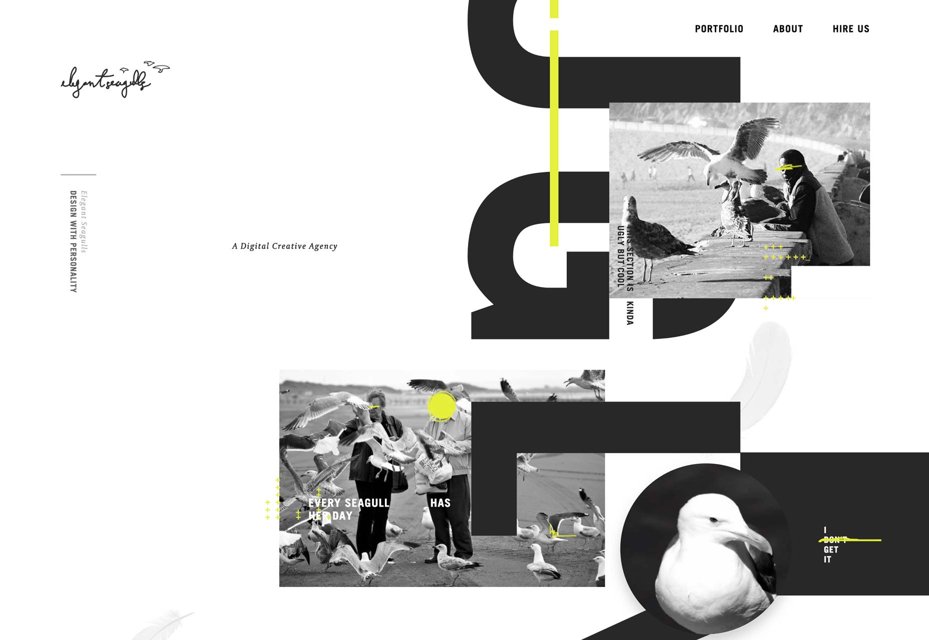
Reed
Reed is bold. And when I say bold, I mean they’ve used pretty much every trend you’ll see on the rest of this list: asymmetry, presentation-style navigation and animation, post-minimalism... everything. They went all out. And yet, it still kind of works. That’s impressive on its own.
Niketo
Niketo is on this list for reasons of style, and style alone. I wish the designer would make his body text a bit bigger, but otherwise, it’s a pleasure to browse through.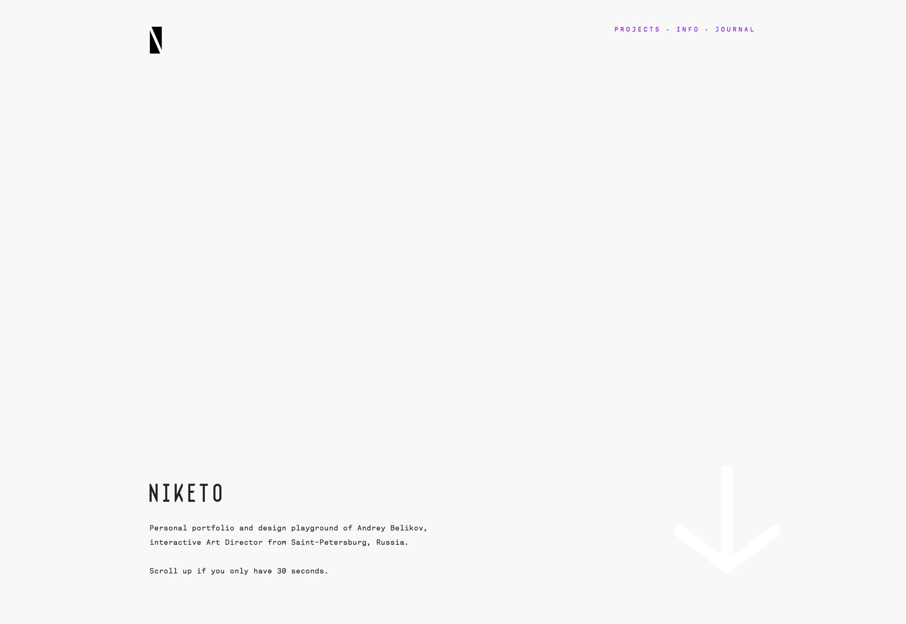
a friend of mine
a friend of mine is an advertising agency that tries to set itself apart immediately by showcasing their humanity. They largely accomplish this with simple, punchy copy in a minimalist layout. Oh, and there’s mild profanity on the home page. Well, it certainly sets them apart, and quickly sorts out the customers they want from the customers they don’t want, I guess.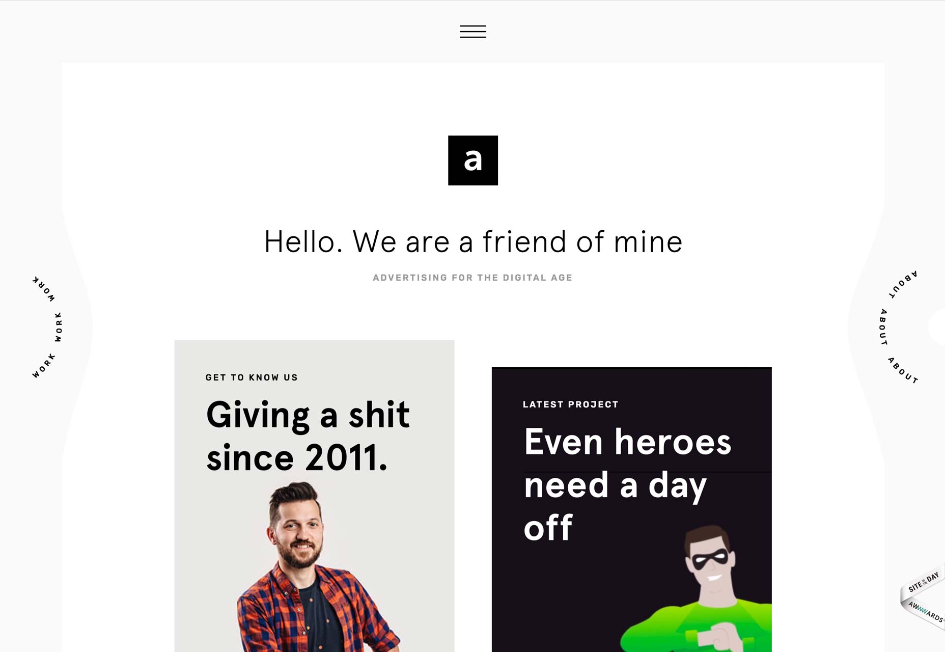
North-East Venture
North-East Venture stands out by having one of the more interesting uses of parallax effects that I’ve seen yet. It combines the sensibilities of a classic typography-and-background images, with just enough animation to make it stand out. Add to that the way they make every portfolio page match the project, and you’ve got a site that’s just plain pretty.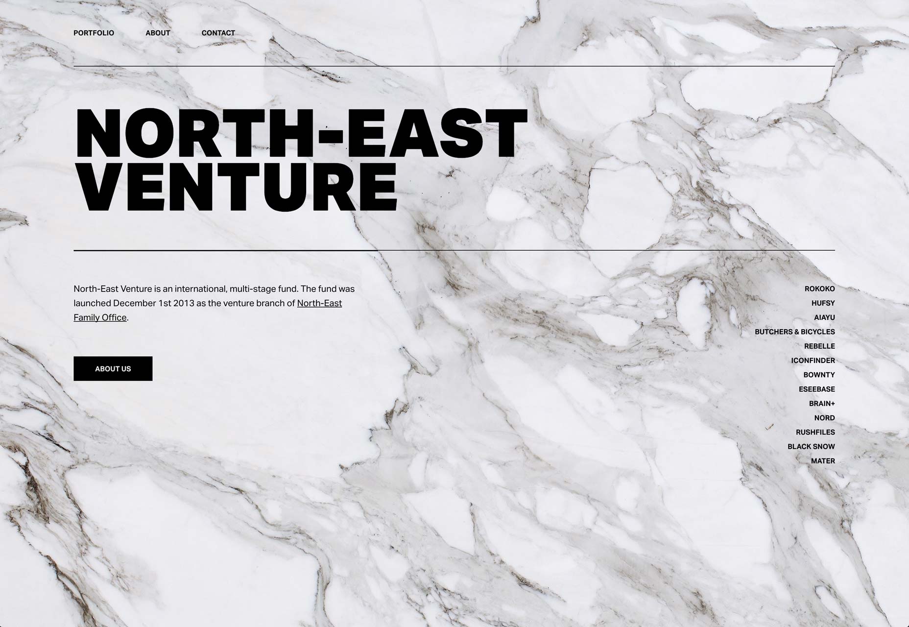
Elodie Fabbri
Elodie Fabbri has a portfolio that is clean, pretty, and rather dependent on slideshows. It’s simple, yet dynamic and eye-catching. Frankly, the only way it could really be better would be to find a JavaScript-free way to implement all of those slideshows.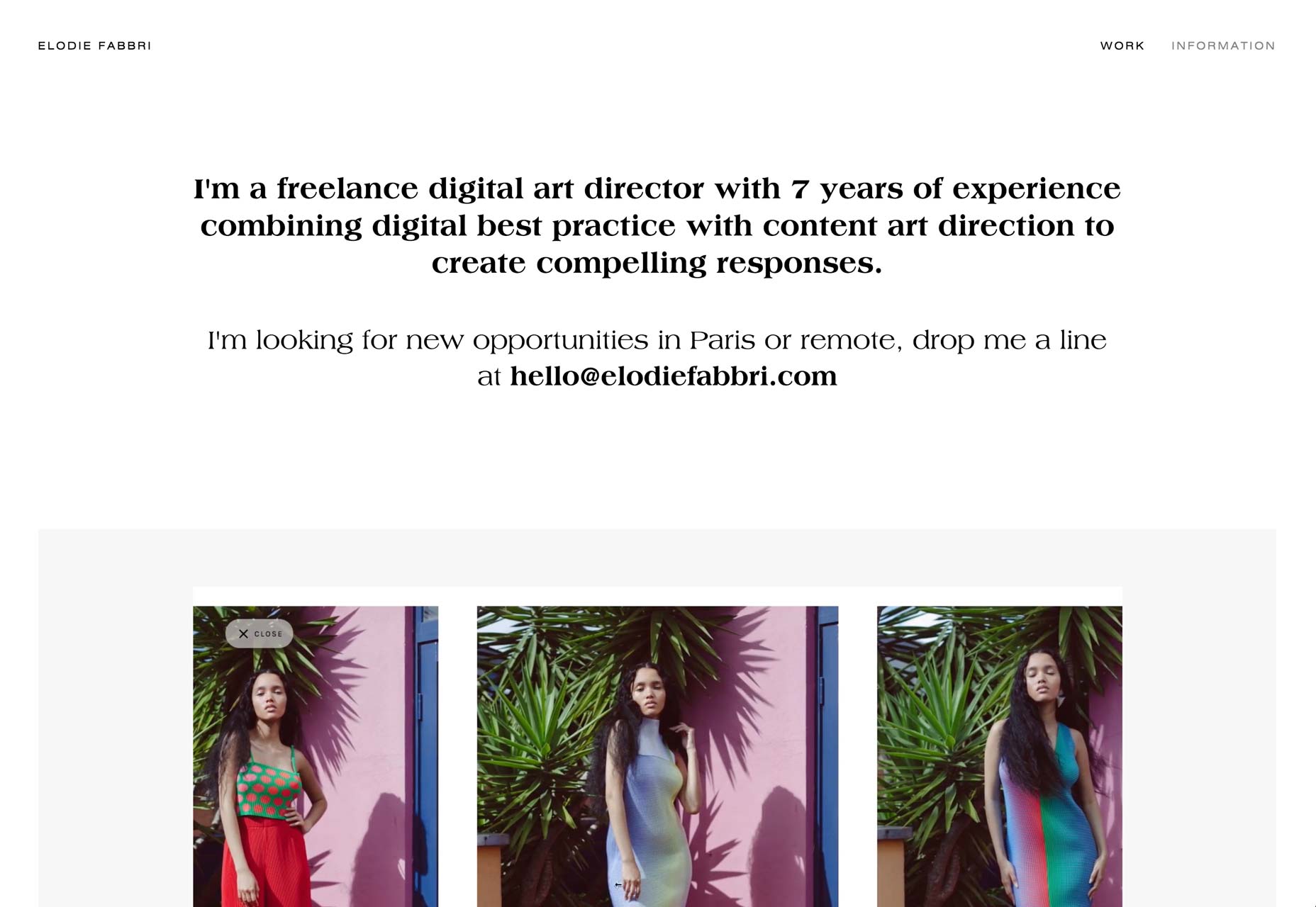
Sally Bliumis-Dunn
This is probably the first poetry portfolio I’ve ever reviewed. And I love it. Most writing sites try to market their products with imagery. They might use the book covers, or push the budget and use some concept art. This site completely ditches that strategy, using fantastic typography to show off excerpts of the poetry itself. After all, that’s what everyone is here for.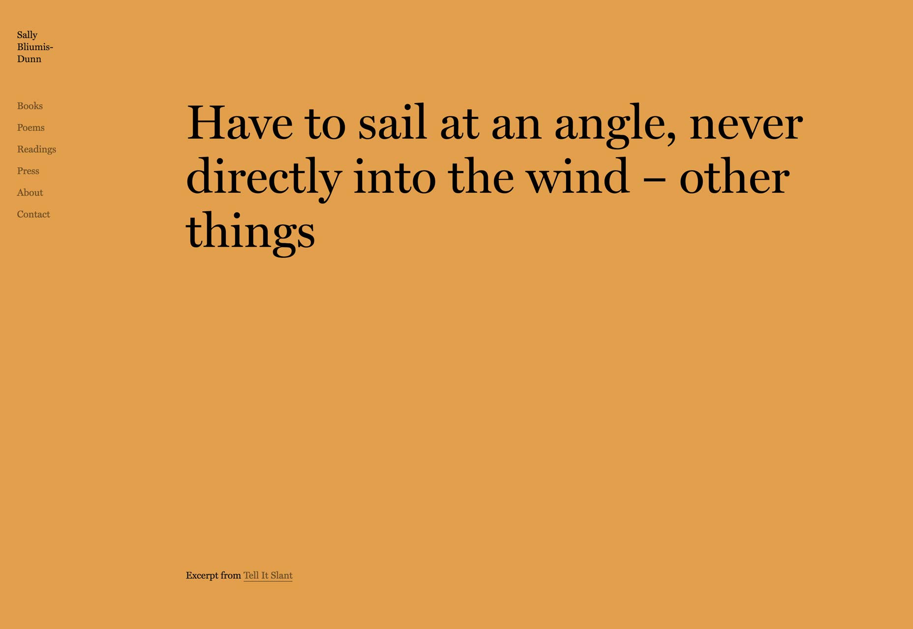
Tristan Bagot
Tristan Bagot’s one-page portfolio combines modern layout with a retro, pixelated style that seems to match the overall theme of his work. Simple, and digital-focused. Linking right to the live sites is always a risk, but it keeps things simple, too.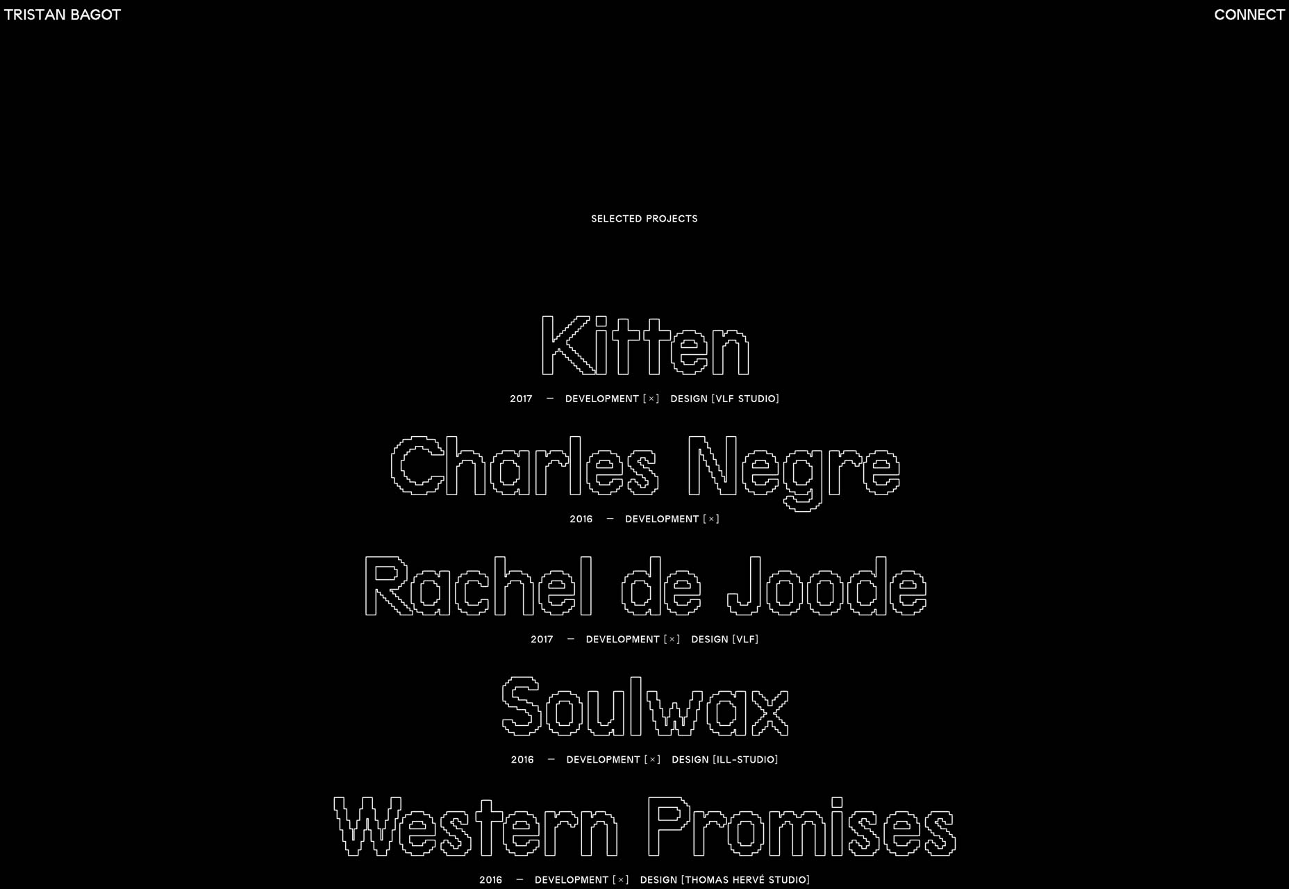
Luke Fenech
We’ll finish this list off with Luke Fenech, a designer and art director. Nothing too out of the ordinary, here. It’s clean, it’s pretty. The type is a joy to the eyes. Sometimes, that’s all you need.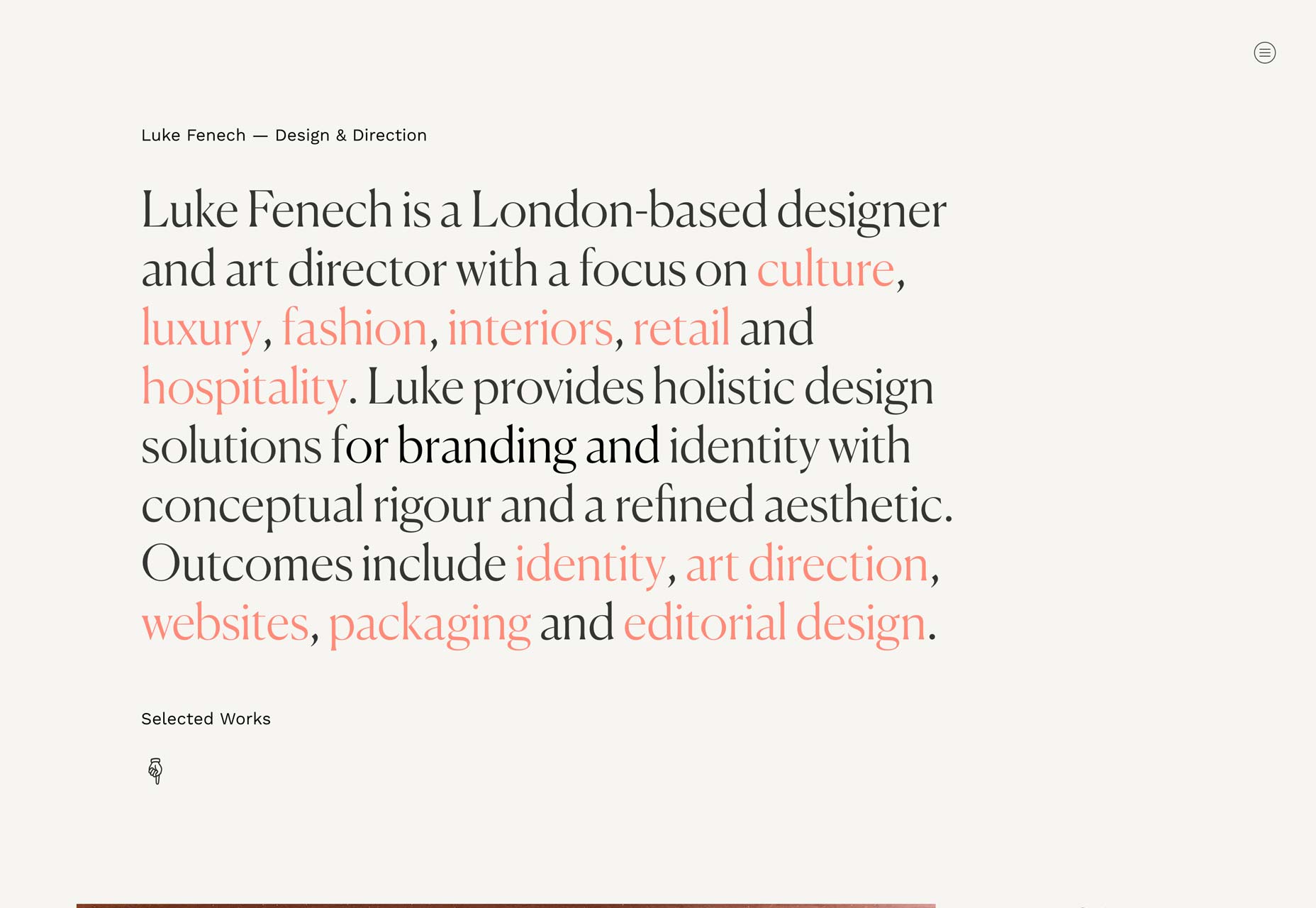
Ezequiel Bruni
Ezequiel Bruni is a web/UX designer, blogger, and aspiring photographer living in Mexico. When he’s not up to his finely-chiselled ears in wire-frames and front-end code, or ranting about the same, he indulges in beer, pizza, fantasy novels, and stand-up comedy.


Read Next

3 Essential Design Trends, May 2024
Integrated navigation elements, interactive typography, and digital overprints are three website design trends making…

How to Write World-Beating Web Content
Writing for the web is different from all other formats. We typically do not read to any real depth on the web; we…
By Louise North

20 Best New Websites, April 2024
Welcome to our sites of the month for April. With some websites, the details make all the difference, while in others,…

Exciting New Tools for Designers, April 2024
Welcome to our April tools collection. There are no practical jokes here, just practical gadgets, services, and apps to…

How Web Designers Can Stay Relevant in the Age of AI
The digital landscape is evolving rapidly. With the advent of AI, every sector is witnessing a revolution, including…
By Louise North

14 Top UX Tools for Designers in 2024
User Experience (UX) is one of the most important fields of design, so it should come as no surprise that there are a…
By Simon Sterne

What Negative Effects Does a Bad Website Design Have On My Business?
Consumer expectations for a responsive, immersive, and visually appealing website experience have never been higher. In…

10+ Best Resources & Tools for Web Designers (2024 update)
Is searching for the best web design tools to suit your needs akin to having a recurring bad dream? Does each…
By WDD Staff

3 Essential Design Trends, April 2024
Ready to jump into some amazing new design ideas for Spring? Our roundup has everything from UX to color trends…

How to Plan Your First Successful Website
Planning a new website can be exciting and — if you’re anything like me — a little daunting. Whether you’re an…
By Simon Sterne

15 Best New Fonts, March 2024
Welcome to March’s edition of our roundup of the best new fonts for designers. This month’s compilation includes…
By Ben Moss

LimeWire Developer APIs Herald a New Era of AI Integration
Generative AI is a fascinating technology. Far from the design killer some people feared, it is an empowering and…
By WDD Staff