

1. Put the search box where users expect to find it
It’s not good when users have to search for search box because it doesn’t stand out and is not easy to spot. The chart you see below was taken from a study by A. Dawn Shaikh and Keisi Lenz: it shows the expected position of the site search form in a survey with 142 participants. The study found that the most convenient spot for the majority of users is the top left or top right area of a page on your site.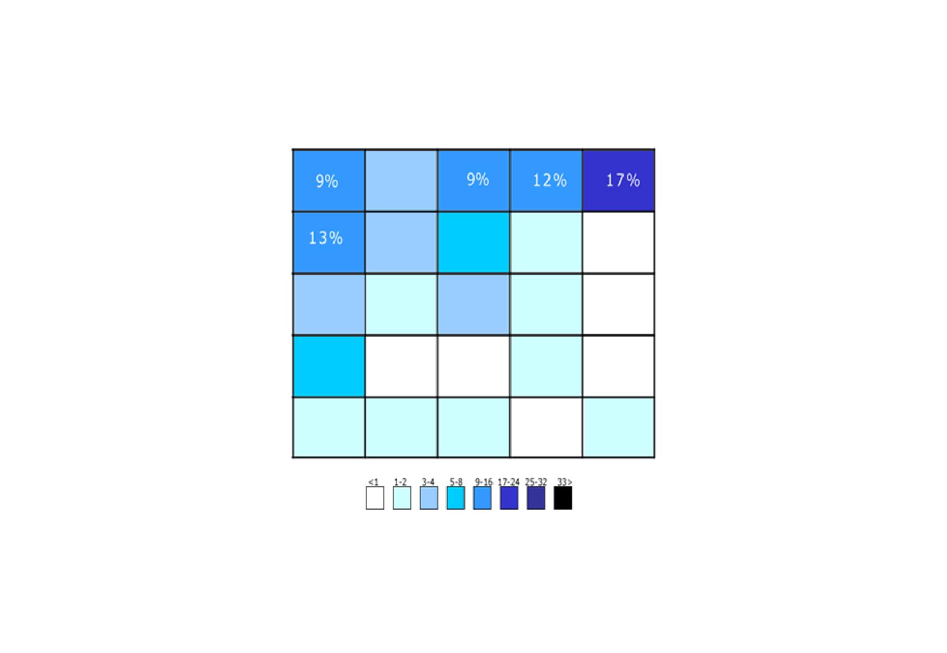 The areas where participants expected the search to be found. The upper-right corner is still the first place users expect to find search.
Thus, place a search box in the upper-right or upper-center area of your layout and you’ll be sure that your users will find it where they expect it to be.
Ideally, the search box should fit the website’s overall design yet manage to stand out slightly when users need it.
The more content you have, the more prominently you want to display your search feature. If search is essential for your site (e.g. your website is a e-commerce store), use plenty of contrast so that the field and icon stand out from the background and from the surrounding elements.
The areas where participants expected the search to be found. The upper-right corner is still the first place users expect to find search.
Thus, place a search box in the upper-right or upper-center area of your layout and you’ll be sure that your users will find it where they expect it to be.
Ideally, the search box should fit the website’s overall design yet manage to stand out slightly when users need it.
The more content you have, the more prominently you want to display your search feature. If search is essential for your site (e.g. your website is a e-commerce store), use plenty of contrast so that the field and icon stand out from the background and from the surrounding elements.
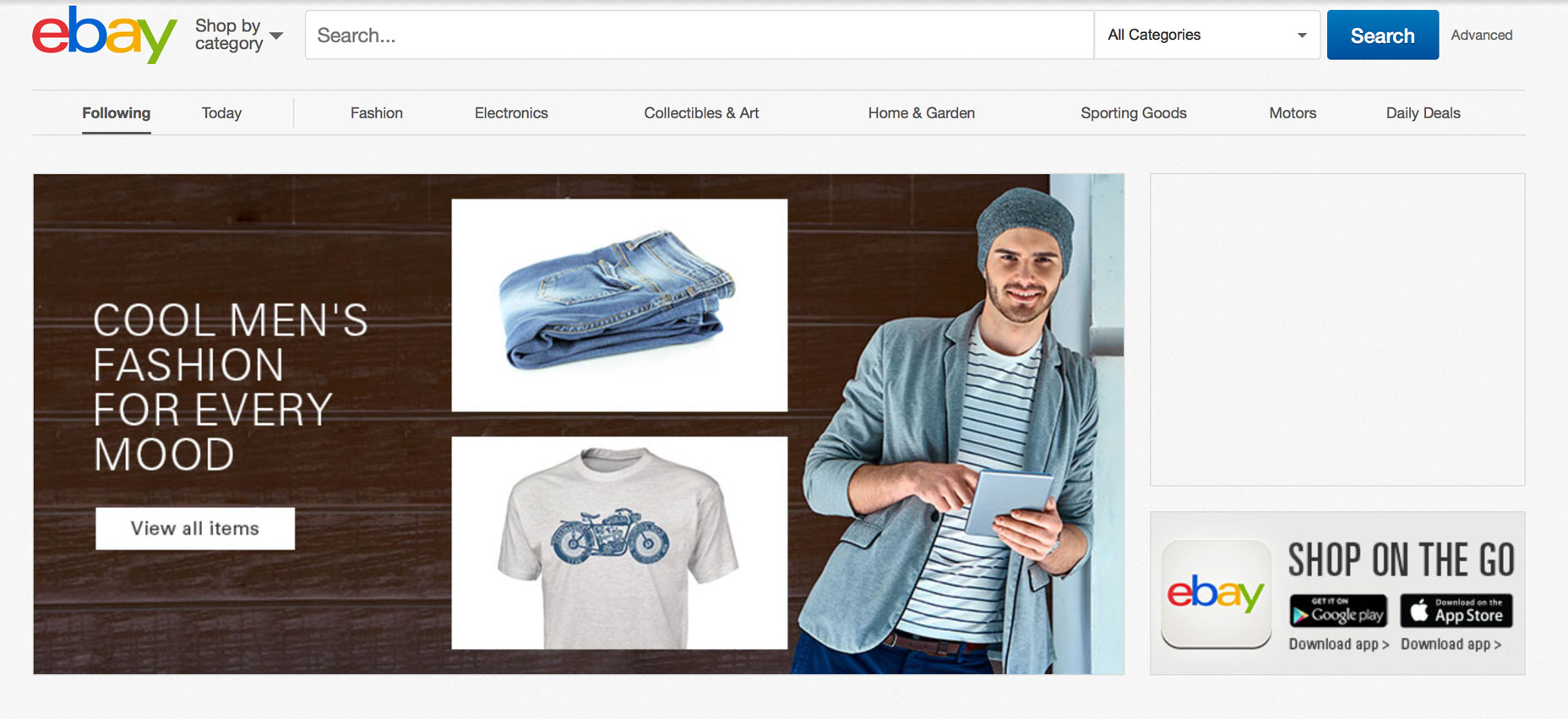 Search is one of the most important features for eBay. Notice the contrasting color for the button “Search” on ebay’s homepage
2. Use a Proper Field Size for the Search Input Field
Making the input field too short is a common mistake among web designers. When users type long queries, only a portion of the text is visible at a time and this means bad usability since users cannot review and edit easily their query. In fact, when search box has a limited number of visible characters users are forced to use short, incomplete queries, because longer queries would be hard to read. If input fields are sized according to their expected input they are both easier to read and to interpret for users. A rule of thumb is to have a 27-characters text input (this size accommodates 90% of queries).3. Make It Clear What Users Can Search For
It is a good idea to include a sample search query in the input field to suggest to users what’s possible to search for. HTML5 makes it easy to include text as a placeholder inside the input field. If the user can search for multiple criteria, use the input hint pattern to explain (see the IMDb example below). But be sure to limit your hint to just a few words, otherwise, you’ll increase the cognitive load.
4. Don’t Erase Users’ Query After They Hit ‘Search’ Button
Keep the original search query. Query reformulation is a critical step in many information journeys. If users don’t find what they’re looking for from the first attempt they might want to search again using a slightly different query. To make it easier for them, leave the initial search term in the search box so they don’t have to re-type the entire query again.5. Use an Auto-Suggestion Mechanism
Research by the Nielsen Norman Group has found that typical users are very poor at query formulation: if they don’t get good results on the first try, later search attempts rarely succeed. In fact, users often give up right after the first negative attempt. However, it’s possible to improve this situation by using an auto-suggestion mechanism. Auto-suggestion mechanisms helps users to find a proper query by trying to predict it based on the entered characters. When this mechanism works well it helps users articulate better search queries. Here are a few things to remember when incorporate auto-suggestion mechanism on your site:- Ensure that auto-suggestions are useful. Poorly designed auto-suggestions can confuse and distract users. So use a spelling auto-corrections, recognition of root words, and predictive text in order to improve the tool.
- Provide auto-suggestions as quickly as possible, such as after the third character is entered. This will provide immediate value and reduce user’s data entry effort.
- Show less than 10 suggested items (and without a scroll bar) so the information doesn’t become overwhelming. Allow users to navigate between items susing a keyboard.
- Highlight differences between the inputted information and suggested information (e.g., input text has a standard weight, while suggested terms have bold weight).
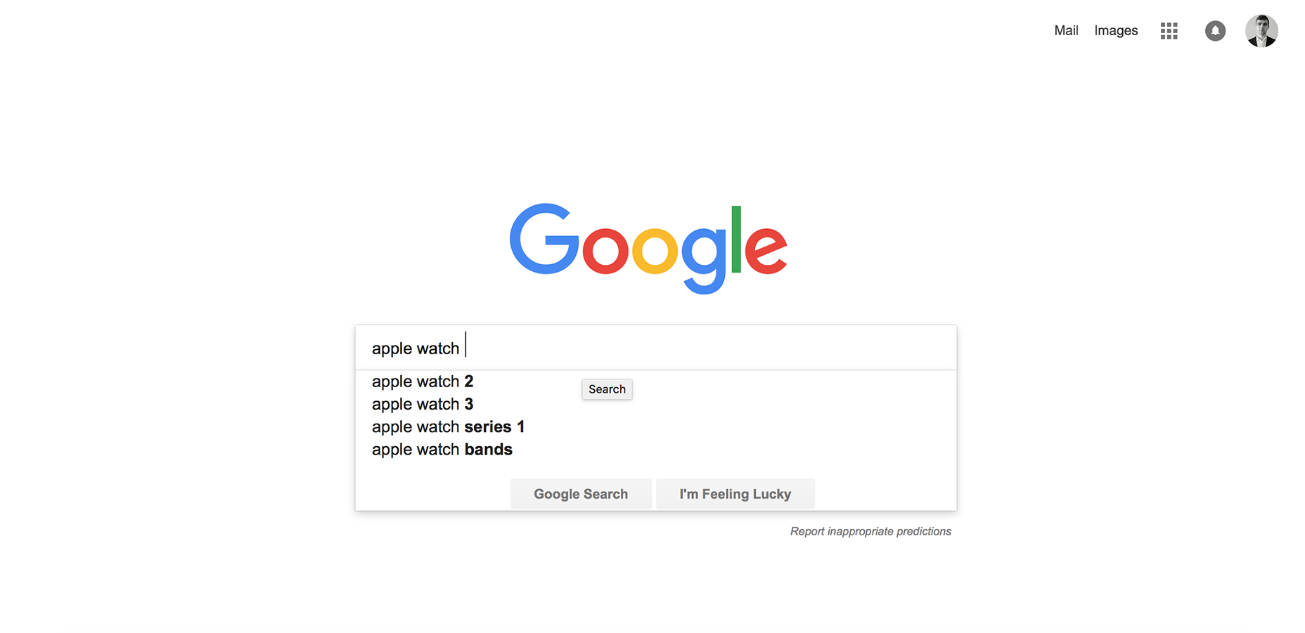 Google searches mastered this pattern, having implemented it since 2008.
Conclusion
Search is a critical element of building a profitable site. Users expect smooth experiences when finding and learning about things and they typically make very quick judgments about site’s value based on the quality of one or two sets of search results. An excellent search facility should help users find what they want quickly and easily.Nick Babich
Fireart Studio is a design studio passionate about creating beautiful design for startups & leading brands. We pay special attention to nuances all the time to create professional while cool products that will not only meet all expectations, but exceed them.


Read Next

15 Best New Fonts, July 2024
Welcome to our monthly roundup of the best fonts we’ve found online in the last four weeks. This month, there are fewer…
By Ben Moss

20 Best New Websites, July 2024
Welcome to July’s round up of websites to inspire you. This month’s collection ranges from the most stripped-back…

Top 7 WordPress Plugins for 2024: Enhance Your Site's Performance
WordPress is a hands-down favorite of website designers and developers. Renowned for its flexibility and ease of use,…
By WDD Staff

Exciting New Tools for Designers, July 2024
Welcome to this July’s collection of tools, gathered from around the web over the past month. We hope you’ll find…

3 Essential Design Trends, July 2024
Add some summer sizzle to your design projects with trendy website elements. Learn what's trending and how to use these…

15 Best New Fonts, June 2024
Welcome to our roundup of the best new fonts we’ve found online in the last month. This month, there are notably fewer…
By Ben Moss

20 Best New Websites, June 2024
Arranging content in an easily accessible way is the backbone of any user-friendly website. A good website will present…

Exciting New Tools for Designers, June 2024
In this month’s roundup of the best tools for web designers and developers, we’ll explore a range of new and noteworthy…

3 Essential Design Trends, June 2024
Summer is off to a fun start with some highly dramatic website design trends showing up in projects. Let's dive in!

15 Best New Fonts, May 2024
In this month’s edition, there are lots of historically-inspired typefaces, more of the growing trend for French…
By Ben Moss

How to Reduce The Carbon Footprint of Your Website
On average, a web page produces 4.61 grams of CO2 for every page view; for whole sites, that amounts to hundreds of KG…
By Simon Sterne

20 Best New Websites, May 2024
Welcome to May’s compilation of the best sites on the web. This month we’re focused on color for younger humans,…