

1. Strong Branding
This may seem obvious but a strong brand really helps sell the “magazine” feeling over a personal blog. If you’re going for an authoritative publication you need to focus on branding. How will you stand out from every other blog? Ideally through content, but your brand is a huge part of that. For example, the Wired logo below is well known amongst tech blogs. It’s been around for years and when you see that brand you instantly recognize the site. But you can add branding in your site’s sidebar and footer too. The goal is to create a consistent style that just feels stronger than rinky-dink blogspot sites.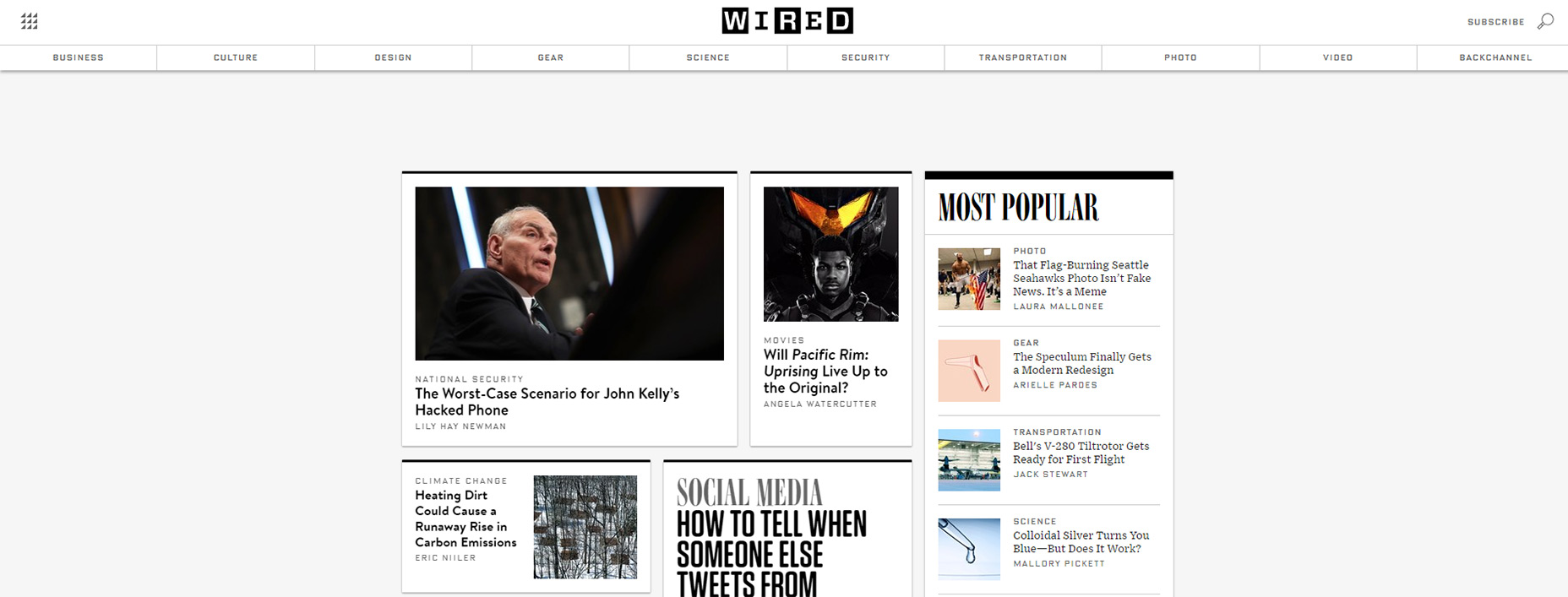
2. Crisp Headlines
You can style your headline any number of ways so there isn’t one correct design. But you always want headline typography that’s crisp, easy to skim, and usually thick. Take a look at the headlines on US Magazine to see what I mean. These headlines span the entire page width and the letters are pretty thick. You can’t ignore that headline because it’s practically shoved into your face. That’s the goal with your headline—make it stand out enough to really grab attention and encourage people to keep reading.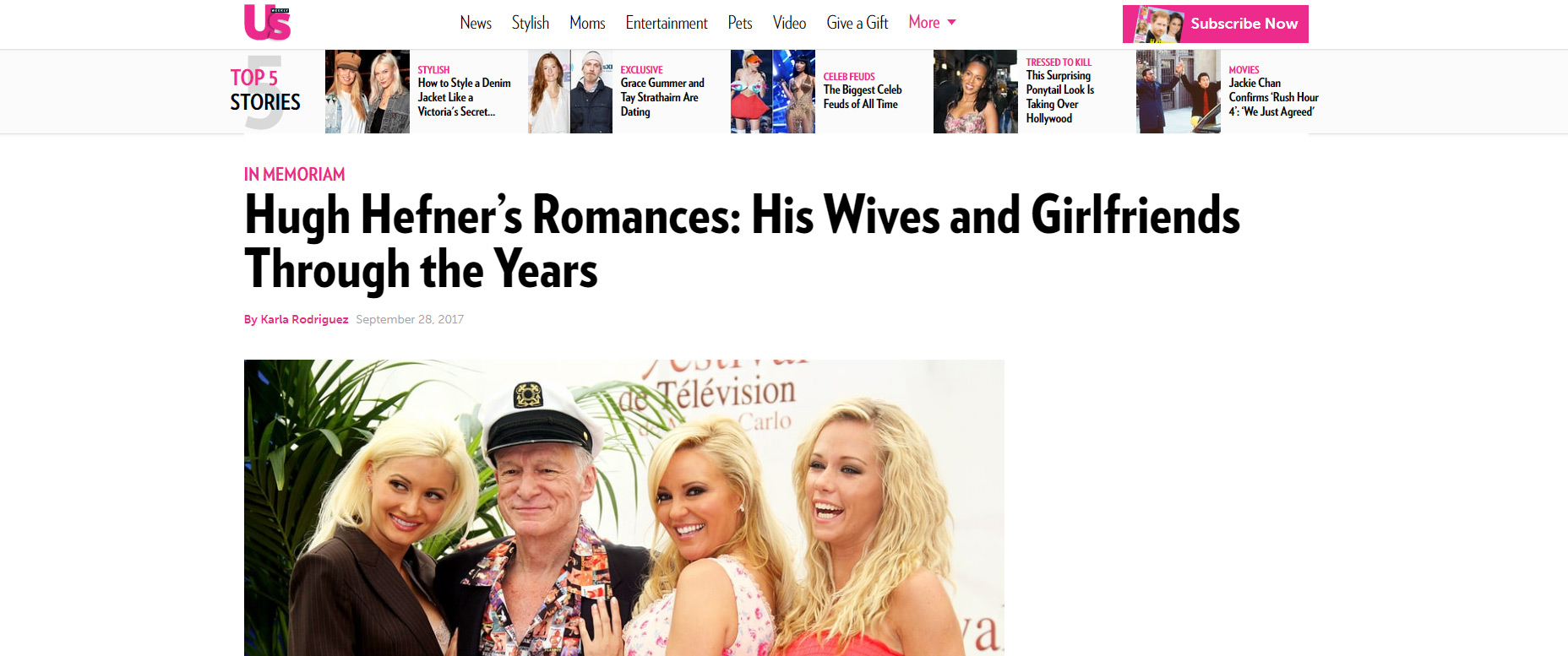
3. Tiered Navigation Menus
Some designers may argue against this feature saying that magazine sites don’t need massive menus. This is generally true, however magazine-style websites often have a large archive of posts. You want to offer the best possible way for people to browse all of those posts. Whether you’re using WordPress categories, tags, or even custom taxonomies, you can add these into a massive mega navigation. This might include dropdown menus with lists of recent posts or popular tags/categories, or even a mix of both. The menu for Atlanta Magazine is pretty smooth with lots of links embedded in the dropdown. Plus the responsive sliding nav is clearly accessible on mobile so smartphone users don’t miss out. This tiered navigation could include multi-level dropdowns or even be fixed to scroll with the user. So many options and really the biggest factor is usability mixed with tons of links to browse.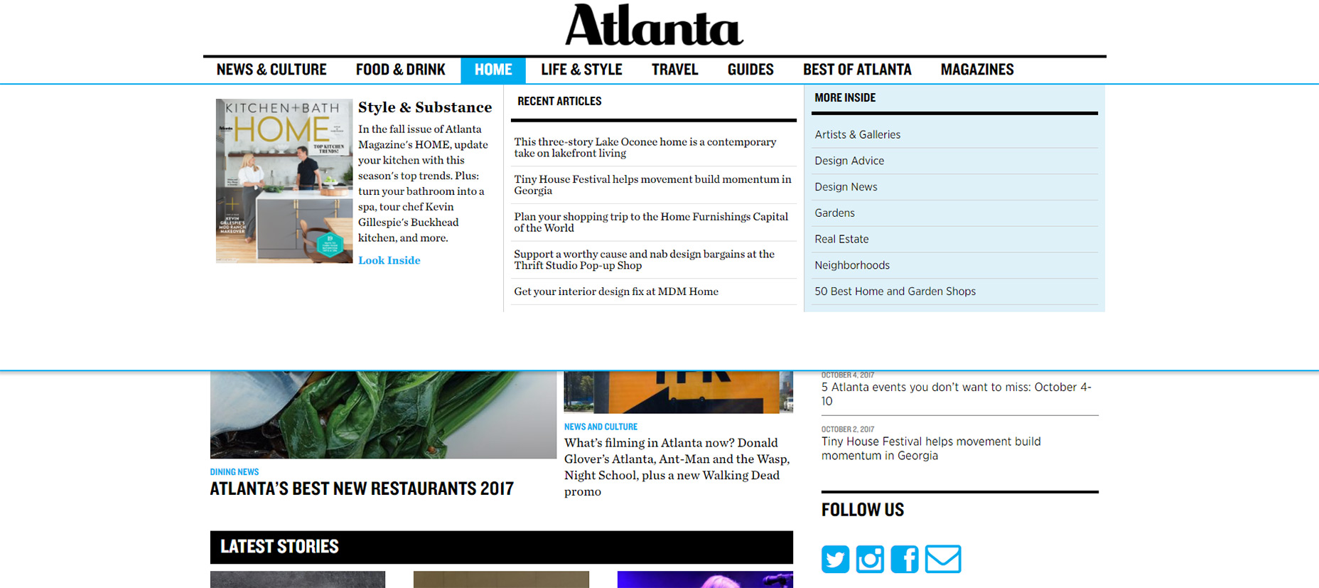
4. Featured Posts Widgets
Every magazine-style homepage looks a bit different with different post thumbnail sizes, custom formats, and of course different featured widgets. I consider these a staple of any magazine site because the featured widget is what grabs attention. It’s what you can use to promote the latest posts or hot stories that should get the most attention. Search Engine Journal has a carousel-type slider where it rotates between 3 of their featured stories at once. Each story loads a snippet in the left-hand side which offers a preview thumbnail too. But no two homepages are identical so try browsing your favorite magazine sites and see what other featured story styles you can find.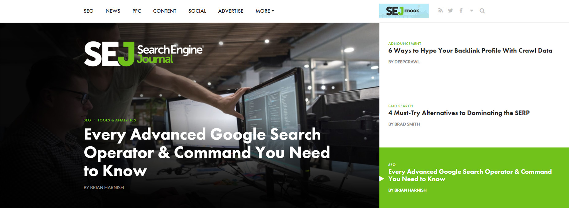
5. Prominent Sharing Buttons
When it comes to building a strong presence you can’t ignore social media. And if you want more visitors to your magazine-style blog you’ll want social sharing buttons on every post. These come in many styles and can be fixed to the side of the page, or added to the bottom of the post, or even added onto images like Pinterest share buttons. On ZDNet they use a long rectangle of sharing buttons right underneath the post headline. This uses plain icons with colored blocks to reference all the top social networks. But again you can find a ton of examples just by looking over some popular blogs. And no matter what style you choose it’s a good idea to split test formats to see which one(s) generate the most shares.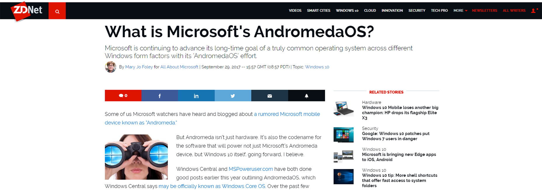
6. Related Posts
I’m sure we’ve all see those widgets titled “you may also like…” at the bottom of news articles. Some of these are native ads but magazine-style sites do genuinely use these widgets to promote relevant content. This feature should be a staple for any blog because it’s a great way to increase pageviews without much effort. Visitors won’t always browse by category but they might browse by related posts. The example below from Real Simple has a super clean design; exactly what you should go for. Post thumbnails grab attention first so make sure those are featured prominently near the headlines.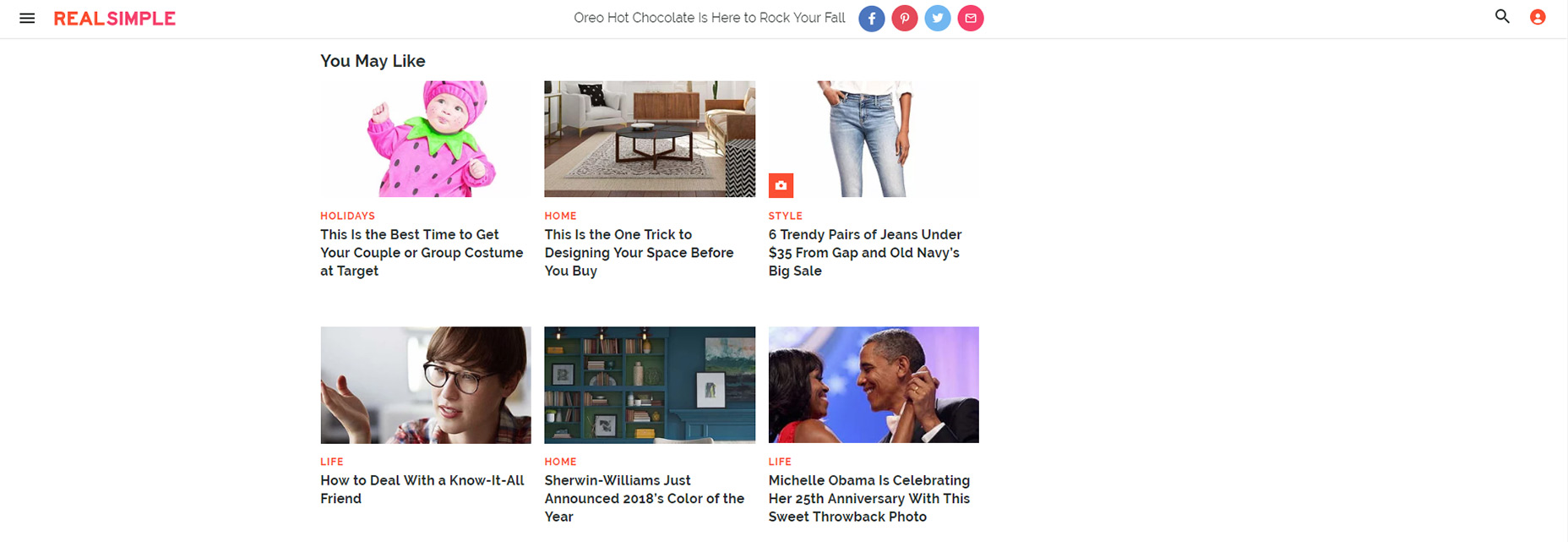
7. Accessible Search (Even On Mobile)
Every website needs a search form. It’s one of the best ways to increase usability by helping people find relevant content. The difference with a magazine site is that it can often feel way too busy to search. Users may feel overwhelmed with so much content and so many links that they might not even bother trying to search. A prominent search form like on Push Square is ideal to encourage more searches. You can toss a magnifying glass icon into your navigation and use the dropdown toggle effect on every page. Naturally this works for mobile too so it’s a reliable choice for every magazine layout.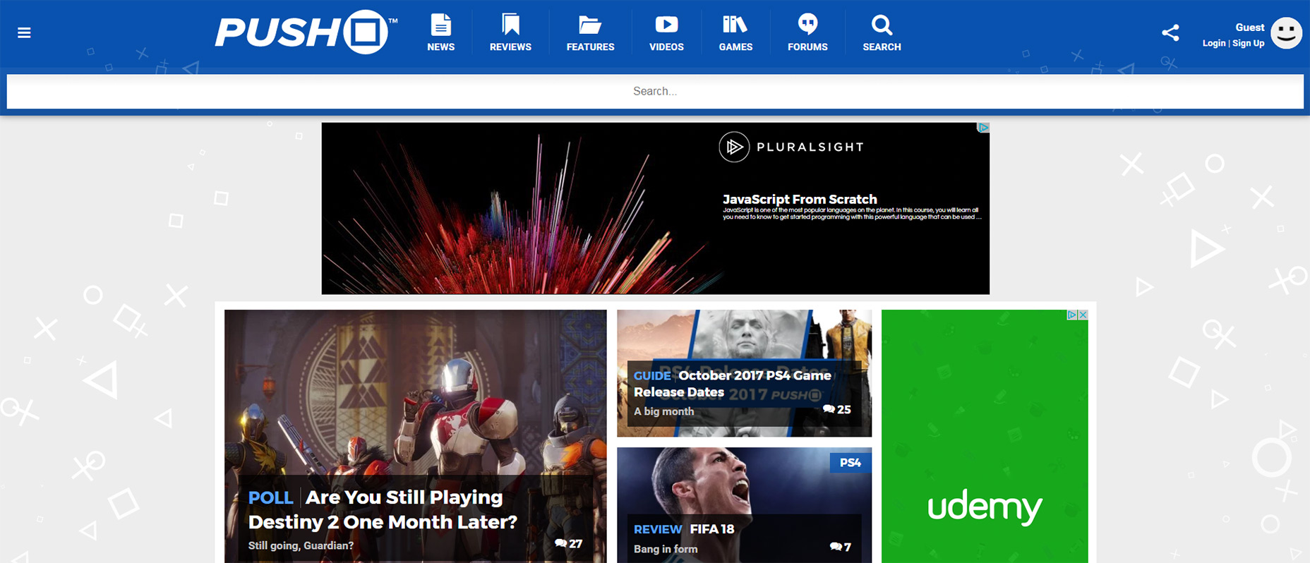
8. Custom Page Elements
This feature is a tad vague but I’m covering it vaguely on purpose. Every generic blog usually feels the same: paragraphs upon paragraphs with little-to-no custom formatting. Great magazine themes take advantage of customization by adding in-post features. These could be any number of page elements that improve your content and make your posts easier to consume. A few ideas I’ve seen used on various websites:- Pull-quotes
- Table of contents
- In-post image slideshows
- “See also” related posts
9. Featured Image Headers
If you want to grab attention right at first pageload you want two things: a large header (covered earlier) and a clear featured image. WordPress comes with featured images by default and you can program specific sizes for your images. For magazine-style blogs it’s best to make these pretty big and follow the hero image trend. You can use a fullscreen image like in the Dwell screenshot below. Or you can design images that fit within your layout’s content area. Either way each post should have a sizable image that helps sell the content. You’ll see this on pretty much every magazine-style blog, even on this post if you scroll to the top! Keep all these ideas in mind when designing your layout and leave plenty of room for eye-catching featured images.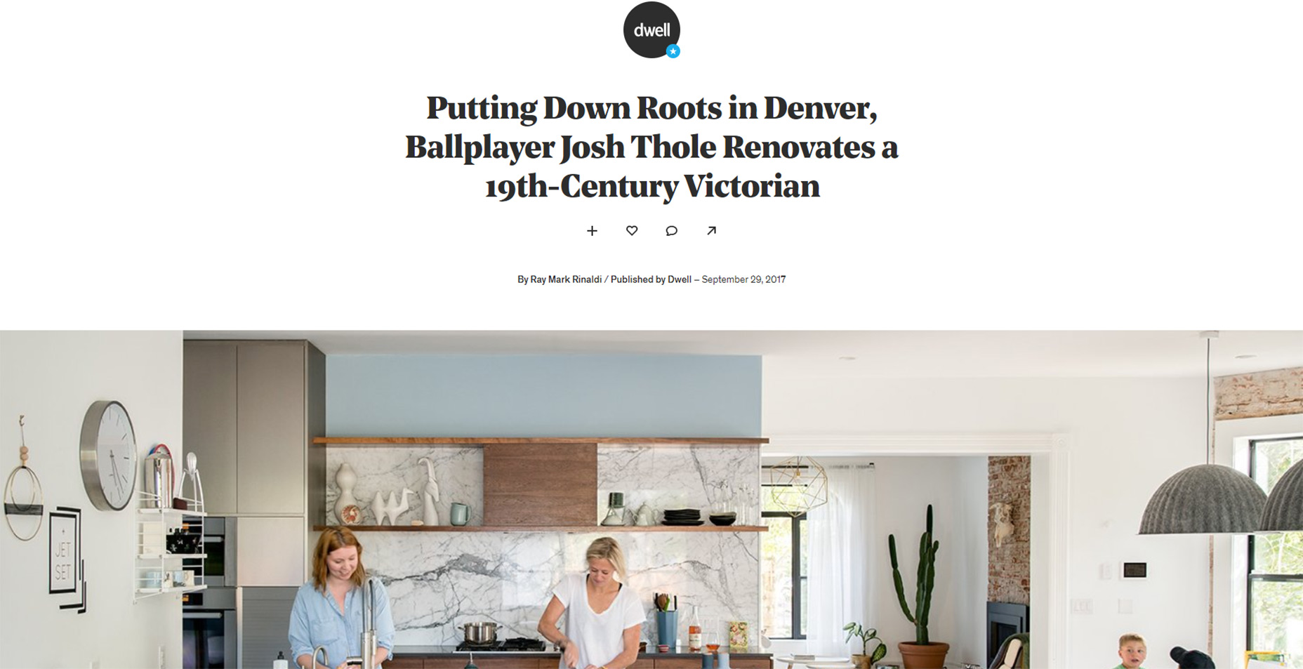
Jake Rocheleau
Jake is a writer and user experience designer on the web. He publishes articles discussing HTML5/CSS3 and jQuery coding techniques. Find out more on his website or you can follow his updates on Twitter @jakerocheleau


Read Next

15 Best New Fonts, July 2024
Welcome to our monthly roundup of the best fonts we’ve found online in the last four weeks. This month, there are fewer…
By Ben Moss

20 Best New Websites, July 2024
Welcome to July’s round up of websites to inspire you. This month’s collection ranges from the most stripped-back…

Top 7 WordPress Plugins for 2024: Enhance Your Site's Performance
WordPress is a hands-down favorite of website designers and developers. Renowned for its flexibility and ease of use,…
By WDD Staff

Exciting New Tools for Designers, July 2024
Welcome to this July’s collection of tools, gathered from around the web over the past month. We hope you’ll find…

3 Essential Design Trends, July 2024
Add some summer sizzle to your design projects with trendy website elements. Learn what's trending and how to use these…

15 Best New Fonts, June 2024
Welcome to our roundup of the best new fonts we’ve found online in the last month. This month, there are notably fewer…
By Ben Moss

20 Best New Websites, June 2024
Arranging content in an easily accessible way is the backbone of any user-friendly website. A good website will present…

Exciting New Tools for Designers, June 2024
In this month’s roundup of the best tools for web designers and developers, we’ll explore a range of new and noteworthy…

3 Essential Design Trends, June 2024
Summer is off to a fun start with some highly dramatic website design trends showing up in projects. Let's dive in!

15 Best New Fonts, May 2024
In this month’s edition, there are lots of historically-inspired typefaces, more of the growing trend for French…
By Ben Moss

How to Reduce The Carbon Footprint of Your Website
On average, a web page produces 4.61 grams of CO2 for every page view; for whole sites, that amounts to hundreds of KG…
By Simon Sterne

20 Best New Websites, May 2024
Welcome to May’s compilation of the best sites on the web. This month we’re focused on color for younger humans,…