

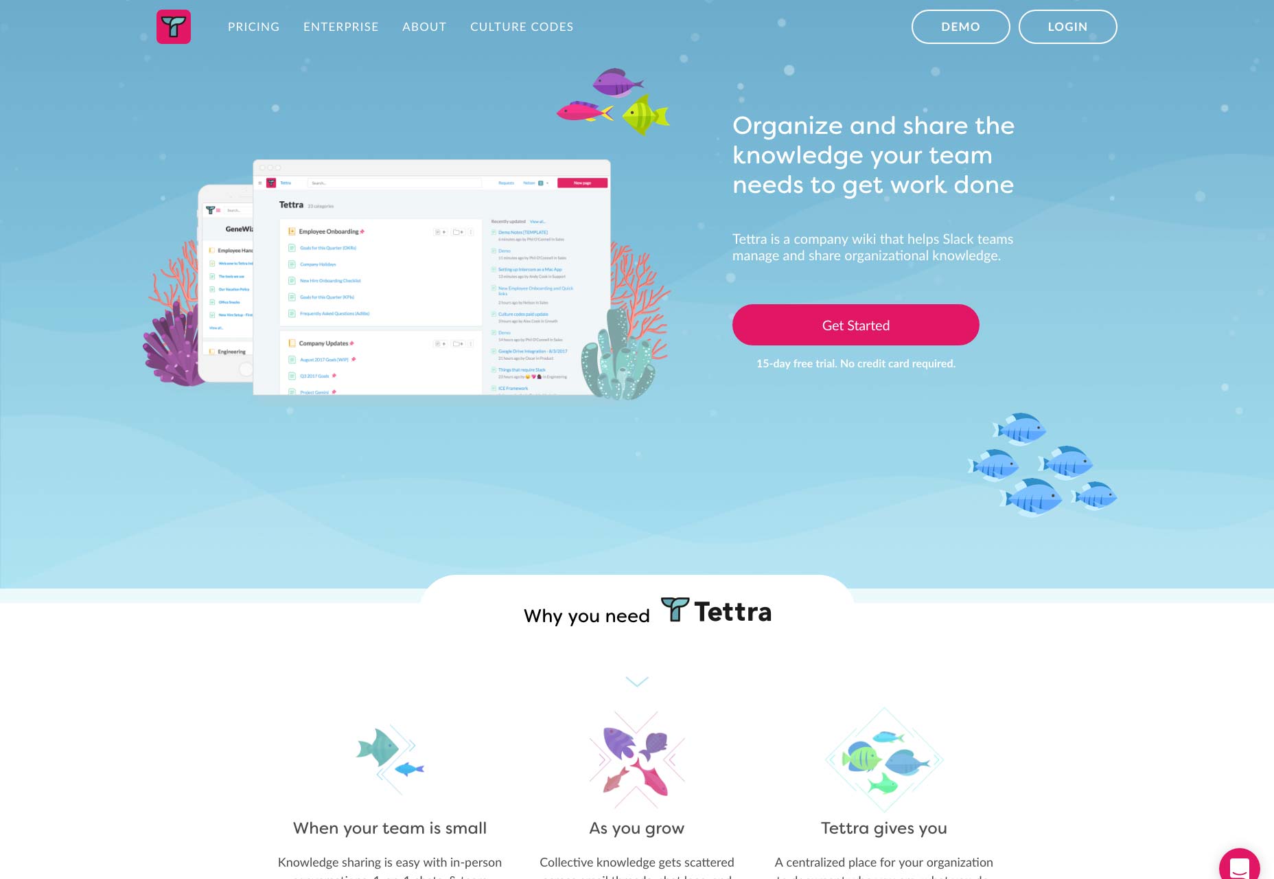
The Call-To-Action
What color? What size? Where do I put it? What does it say? Is it converting? Yes, that’s a lot of questions. And, there are CTAs everywhere, from landing pages to home pages, blog posts, e-mails etc. The copy used in the CTA is actually just as important as the size, shape, and color of the button itself. And, even a minor change may have a pretty significant impact.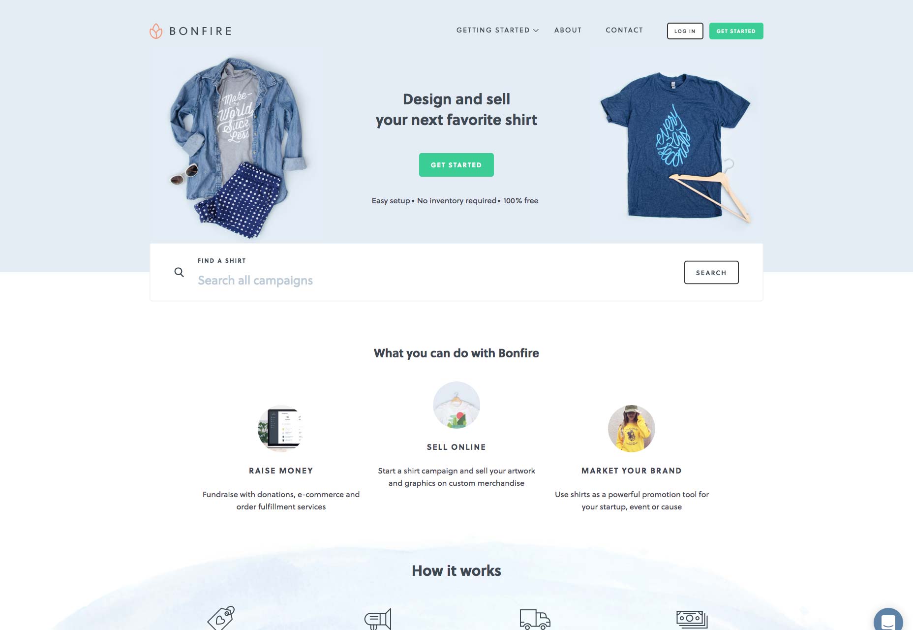
What is a CTA?
A CTA (Call to Action) is usually an image, text, button or video, that contains a link to a page with a compelling offer. Its primary job is to capture the attention of your leads and make them click through, to learn more. You will find that there are two main types of CTAs:- The one that sends the visitor to an informational, or product page, where they can either learn about your product(s) or buy them.
- The one that is part of the Inbound Marketing methodology. Your visitors are sent to a landing page with a form, which, once filled out, lets the users download or sign up for some kind of free offer, like a guide, e-book, coupon code etc.
Things to Understand Regarding CTAs
The call-to-action is the tipping point between bounce and conversion. When you need someone to do something online, the call-to-action is what they have to go through if they are to do it, regardless of whether it’s clicking through to another page, or buying something.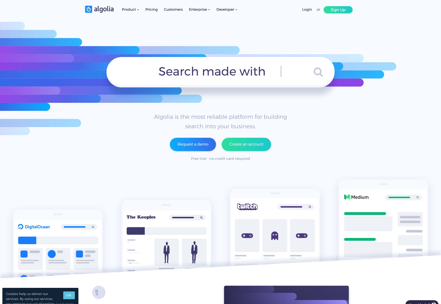 Important visual cues include, but are not limited to, shape and color. They attract the attention to the placement of the button.
However, when the prospect is at that point where they need to make up their mind, they’re interacting with the copy.
A minor change on the page can have a huge impact on conversion rates.
Making a small change on the button copy is actually a pretty minor change on the page as a whole. However, it has a much bigger impact on the decision-making process of the potential customer, and, as a consequence, the conversion rate.
It is very important to test the variables on your CTA button, regardless of what you’re selling. They are a crucial element of both the landing page, and the conversion funnel, and paying attention to detail makes sense.
Important visual cues include, but are not limited to, shape and color. They attract the attention to the placement of the button.
However, when the prospect is at that point where they need to make up their mind, they’re interacting with the copy.
A minor change on the page can have a huge impact on conversion rates.
Making a small change on the button copy is actually a pretty minor change on the page as a whole. However, it has a much bigger impact on the decision-making process of the potential customer, and, as a consequence, the conversion rate.
It is very important to test the variables on your CTA button, regardless of what you’re selling. They are a crucial element of both the landing page, and the conversion funnel, and paying attention to detail makes sense.
Designing CTAs
If you want an effective way to guide the user towards your CTA button, use directional cues. Regardless of whether it’s obvious methods such as flashy arrows, or something more discrete, like eyes on the page looking at it, just go for it.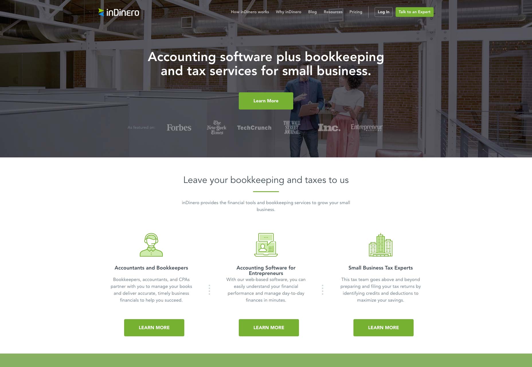 When you’re talking shape and design, the button should look like a button. This means that you can go with shading, 3D effects, and subtle gradients, to make it look like something you can click.
- Size basically tells you that the more noticeable it is, the more likely it is for someone to click it. However, you shouldn’t make a garish, green neon animated button, but it should be easily seen, instead of lost among the other elements on your page.
- Button color should be contrasting to your background colors. It should be vibrant in a way that it catches attention in the first glance, and the color shouldn’t be used anywhere on the page, if possible.
- The text will tell you that people buy with emotion, but logic follows it. If you want to encourage impulse shoppers, put a button that conveys urgency. The text should clearly tell what happens if they click the button, and this isn’t the time to be clever, or confusing.
Special Effects
Since not all buttons are made equal, you should know that the CTA button might do a better job if you put some graphical effects that make it interactive. This includes things like:- Beveled edges
- Rounded corners
- Drop shadows
- Gradients
- Arrows, or other small icons
- PayPal/Credit card logos (to build security and credibility)
- A hover effect on mouseover
CTA Placement
You’ve heard that the CTA should be above the fold, right? No, wrong. Re-think your CTAs. “The fold” is just a myth. A higher conversion rate is usually achieved by moving the CTA below the fold. For some more complicated offers, people want to understand things a bit better before they take action. In such a situation, if you put the CTA above the fold, not many people will even bother to click it. White space is best used for situations when you want to place an attention-grabbing CTA, but don’t put it too far from the main text, it should look connected.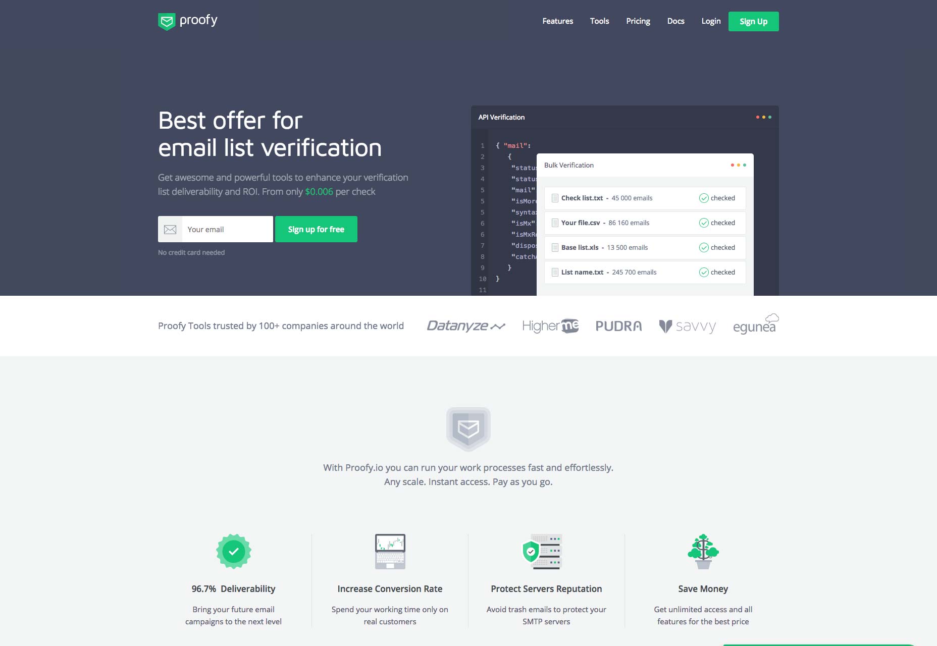
CTA Microcopy
For a moment, forget about placement. Forget about color. Focus on the CTA copy. There are a few rules for naming the CTA button, and here they are:- Don’t be clever – don’t try to re-invent the wheel.
- Nobody wants to submit. People may want to send a message, post a question or subscribe to a newsletter, but they don’t want to submit.
- Don’t be verbose, and go with terms people understand easily instead.
Put the Privacy Policy Where the User Can See It
If you want to boost the credibility of your offer, that is. And, many website owners consider it to be a good practice because it contributes to the overall credibility factor if it’s taken through Google’s manual review. However, it won’t make much of a difference to ranking. If you think that putting the privacy policy page next to a CTA button is distracting, don’t worry. People seldom click on the privacy policy pages anyways, as they consider them boring.How to Make Your CTAs More Effective
There are a few small tips that can boost the effectiveness of your CTAs below, make sure to give them a read.- CTR is not the end-all, be-all. Both CTR, as well as the conversion rate, are important when analyzing CTAs.
- Your own CTAs should be tested, and this is crucial.
- The CTAs can make an incredible difference to the performance of your campaign. A good CTA can boost effectiveness up to a hundred times when compared to a bad CTA.
De-clutter
Everything around your CTA should be clutter free. Unrelated videos, content, social media buttons, keep all of this as far as possible from the CTA. Only things that can push the offer better are allowed nearby.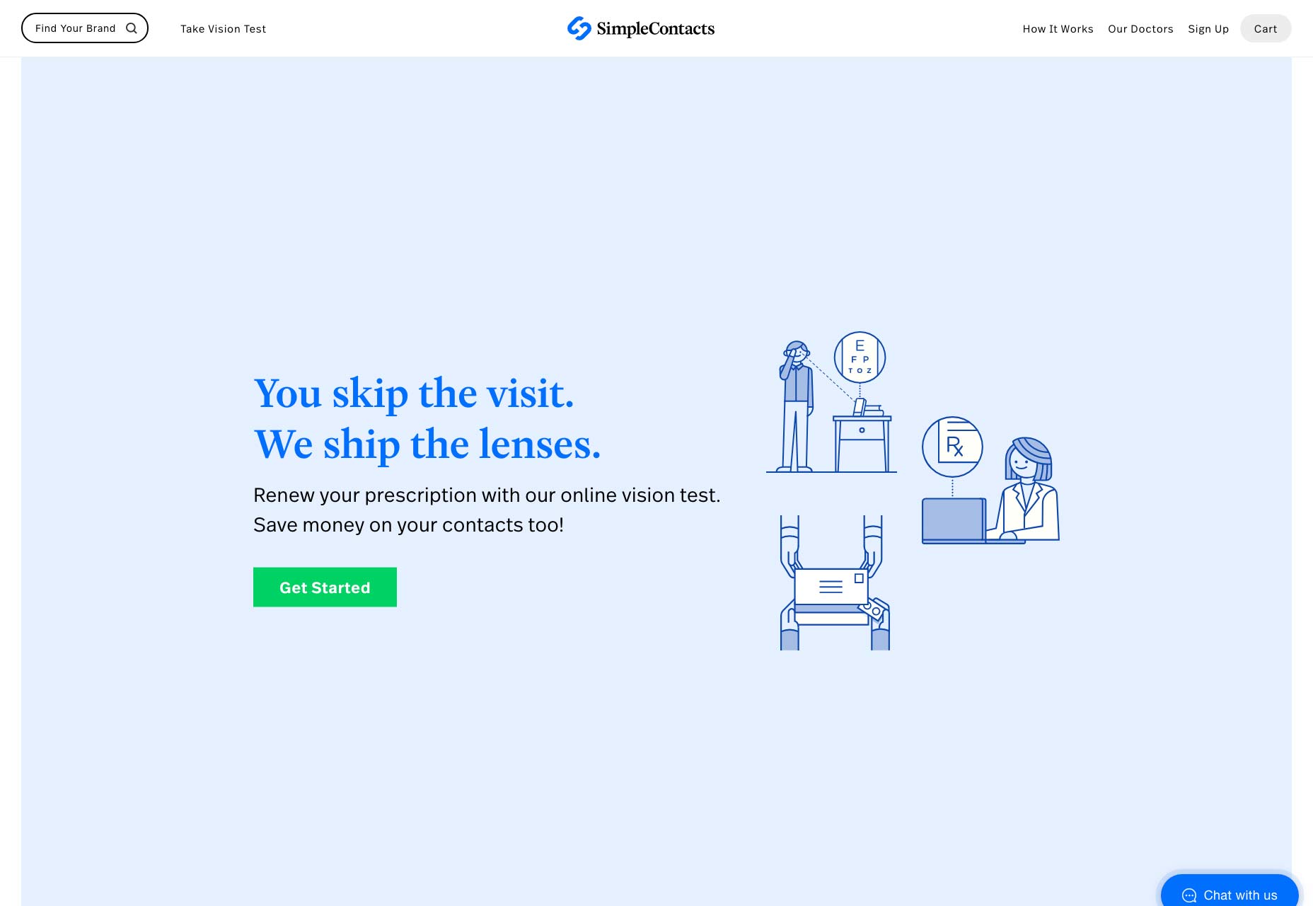
Value and Relevance are Important
Why would a small tweak have such a big influence? The answer is in the messaging, actually. “Order” will emphasize things you need to do, instead of things that you’re going to receive. However, “Get” will tell you what you’re receiving, and not what you have to do to get it. The treatment copy will convey value, but this isn’t always enough. The button copy should be relevant to the specific conversion scenario, the scenario the prospect is in when he has to click the button.
Wrapping Up
The CTA button has been around for ages. It is an essential part of digital marketing, and will often make the difference in conversion when your user turns into a lead, and a customer later on. With all the tips and tricks in the article above, you will be able to easily make a smart CTA button.Bogdan Sandu


Read Next

15 Best New Fonts, July 2024
Welcome to our monthly roundup of the best fonts we’ve found online in the last four weeks. This month, there are fewer…
By Ben Moss

20 Best New Websites, July 2024
Welcome to July’s round up of websites to inspire you. This month’s collection ranges from the most stripped-back…

Top 7 WordPress Plugins for 2024: Enhance Your Site's Performance
WordPress is a hands-down favorite of website designers and developers. Renowned for its flexibility and ease of use,…
By WDD Staff

Exciting New Tools for Designers, July 2024
Welcome to this July’s collection of tools, gathered from around the web over the past month. We hope you’ll find…

3 Essential Design Trends, July 2024
Add some summer sizzle to your design projects with trendy website elements. Learn what's trending and how to use these…

15 Best New Fonts, June 2024
Welcome to our roundup of the best new fonts we’ve found online in the last month. This month, there are notably fewer…
By Ben Moss

20 Best New Websites, June 2024
Arranging content in an easily accessible way is the backbone of any user-friendly website. A good website will present…

Exciting New Tools for Designers, June 2024
In this month’s roundup of the best tools for web designers and developers, we’ll explore a range of new and noteworthy…

3 Essential Design Trends, June 2024
Summer is off to a fun start with some highly dramatic website design trends showing up in projects. Let's dive in!

15 Best New Fonts, May 2024
In this month’s edition, there are lots of historically-inspired typefaces, more of the growing trend for French…
By Ben Moss

How to Reduce The Carbon Footprint of Your Website
On average, a web page produces 4.61 grams of CO2 for every page view; for whole sites, that amounts to hundreds of KG…
By Simon Sterne

20 Best New Websites, May 2024
Welcome to May’s compilation of the best sites on the web. This month we’re focused on color for younger humans,…