

Nathan Riley
Nathan Riley brings us a small, classically dark website with some beautiful background effects. It’s just these effects that make the stylish-yet-familiar layout pop. Unfortunately, they’ll be all but invisible on un-calibrated screens. Even so, the important stuff stands out, and looks just plain good. Oh, last complaint: the contact info could and should be way more prominent.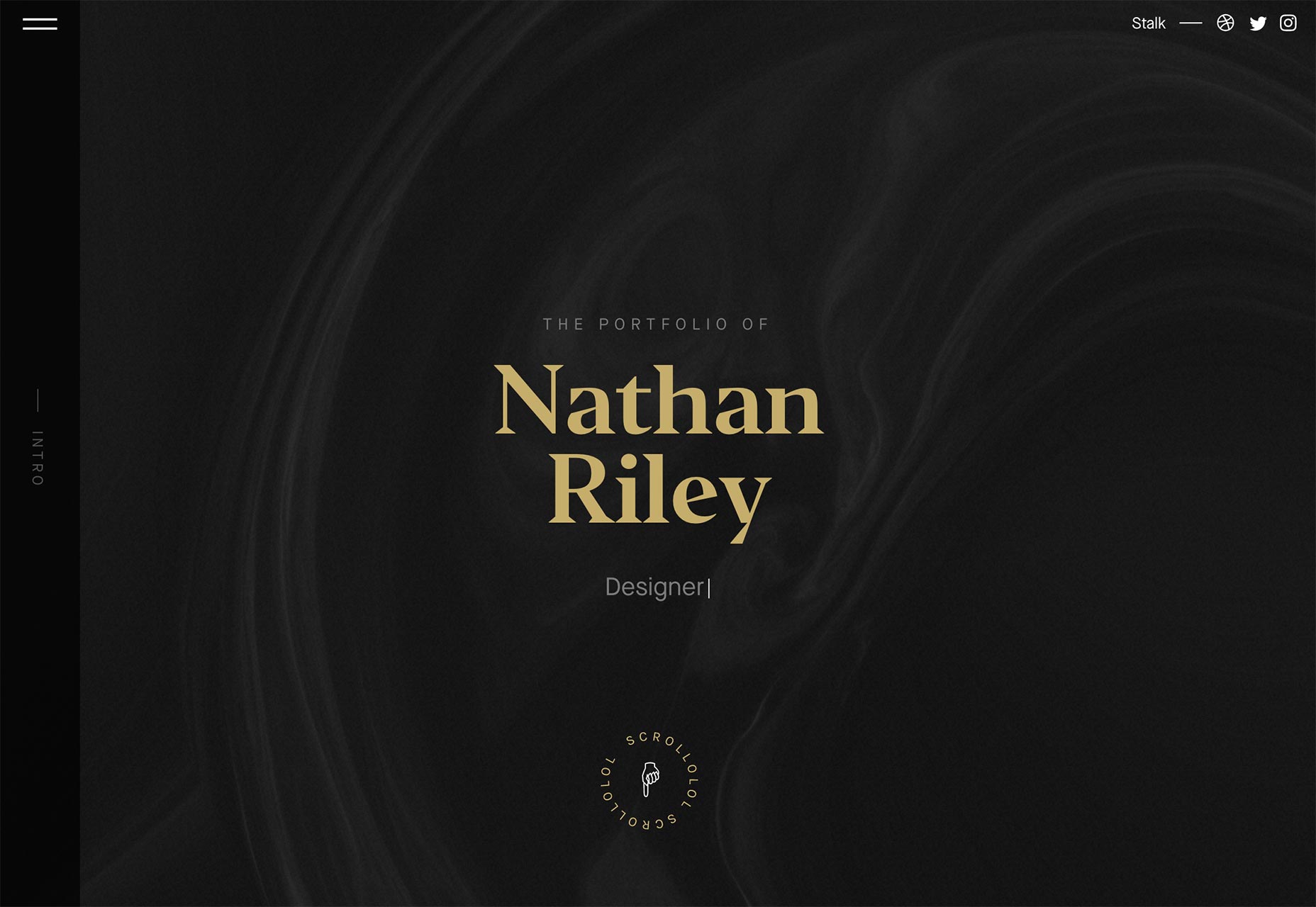
Rainfall
Rainfall has taken a fairly common modern minimalist design, and made it stand out by mastering the art of going from colorful to monochromatic again almost seamlessly. The transition from one color theme to another feels nearly seamless.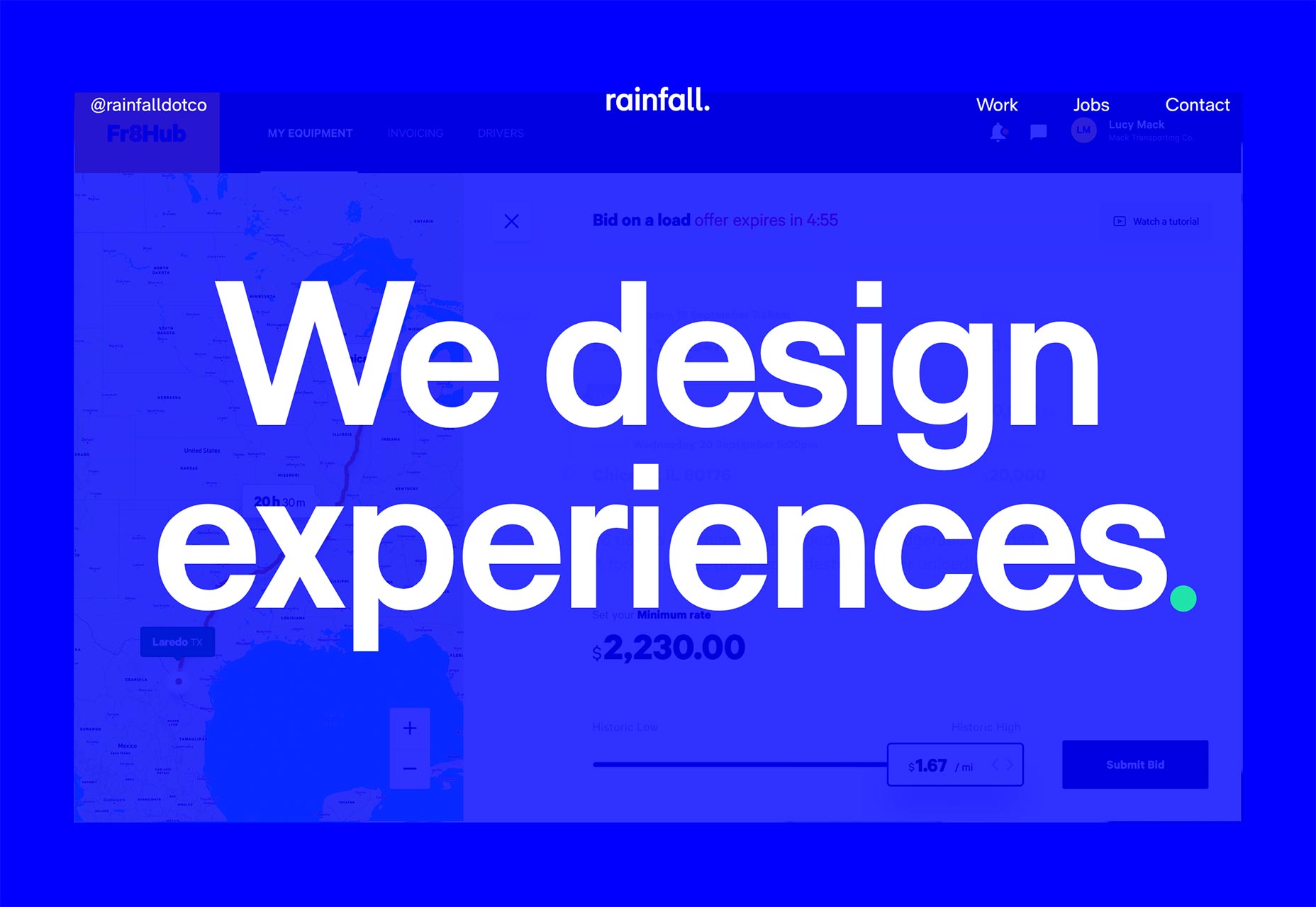
Nick Vandermolen
Nick Vandermolen’s portfolio is dark, classy, and generally gorgeous. It also can’t decide whether it wants to be a magazine or a PowerPoint presentation. Okay, I’m kidding. Mostly. You can clearly see the influence of both of those media formats in the general layout and aesthetic sensibilities. Even so, the experience is coherent and pretty. Also, the navigation is kind of what thirty percent of web designers were trying to do with frames in 2003. It’s a real trip.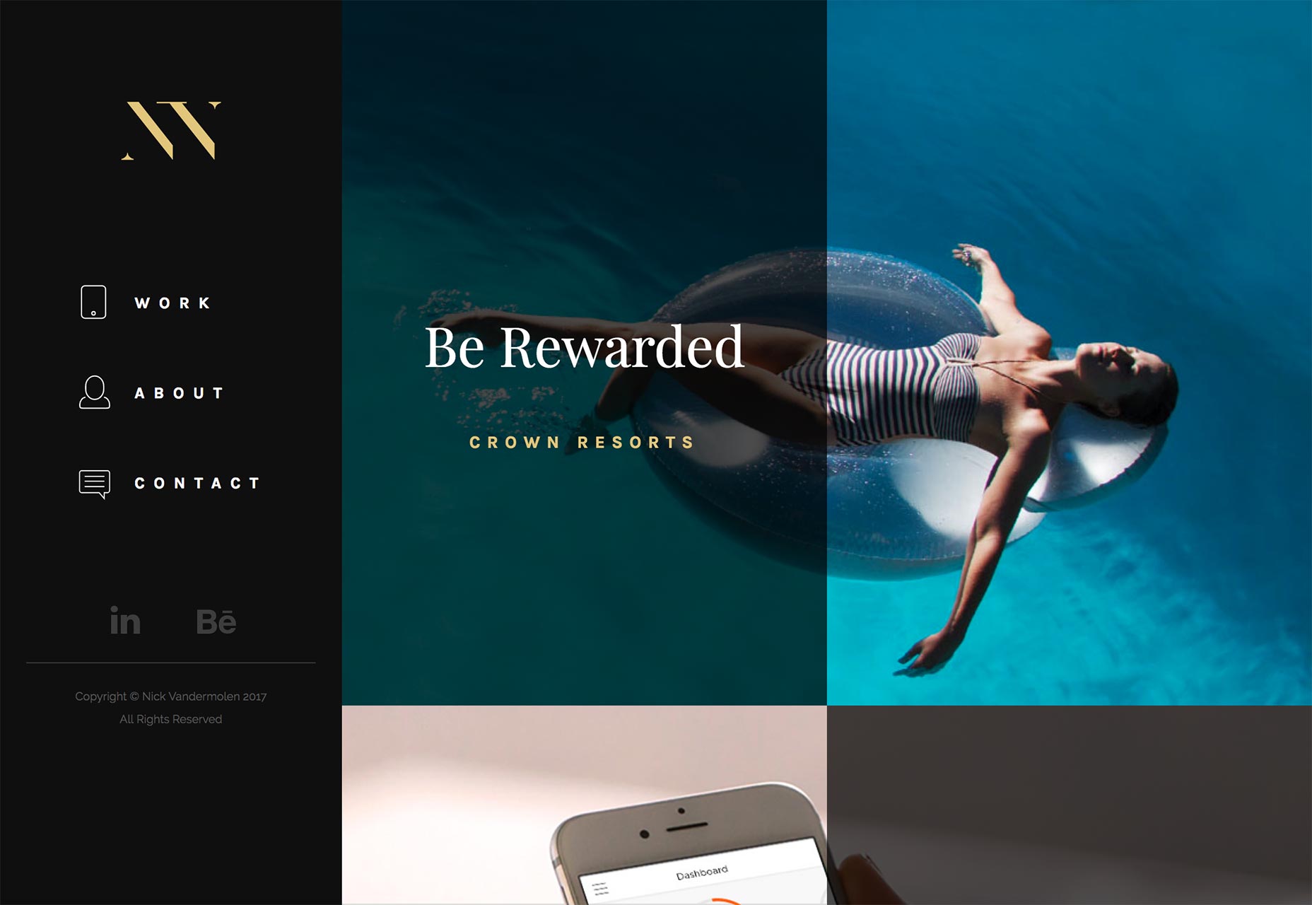
Mensch
Mensch is an oddity that just barely sits on this side of the “portfolio” category. You see, it’s a consultancy/team building company with a focus on making the world a better place. Portfolio items tend to be things like “We developed a program to help former child soldiers become small business owners.” If it weren’t for those portfolio items, however, it would just be a brochure site. And visually, it looks like one. It’s all white space and clean lines, with just a splash of background video.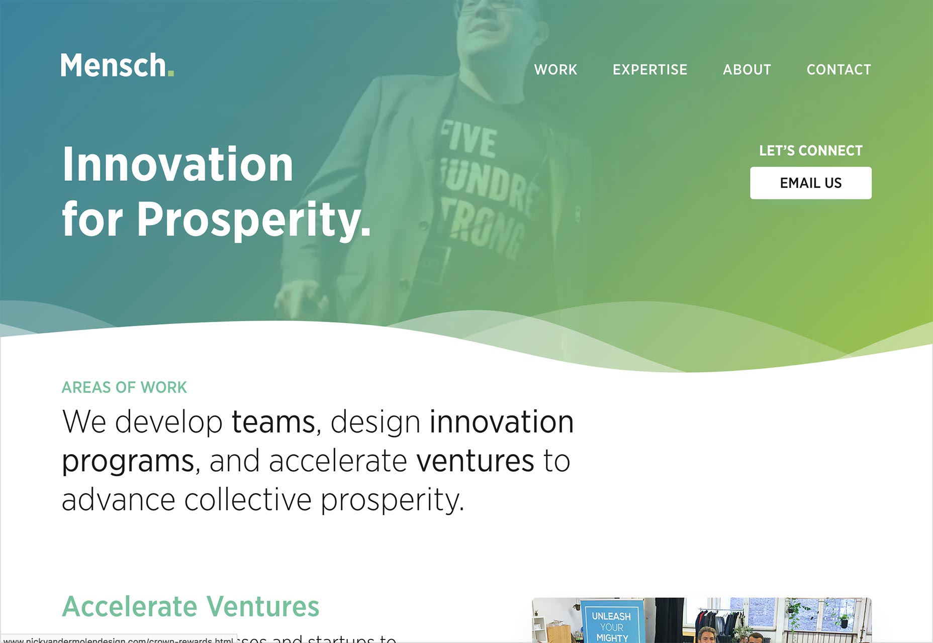
Vintage
Vintage is on the list largely for the visuals. Not only is it just plain stylish with its geometric theme, the animations have actually managed to impress me a bit. That’s rare.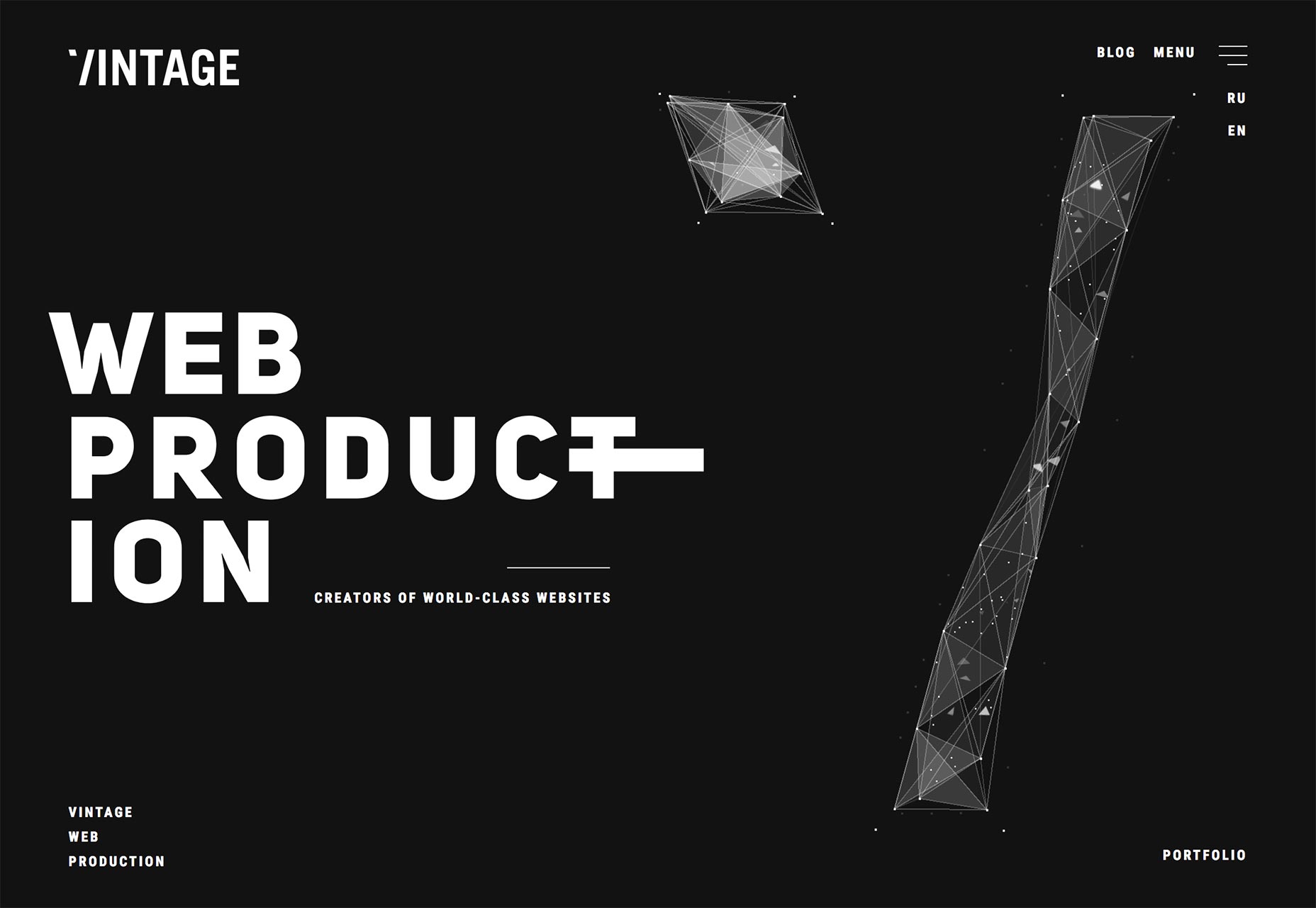
Effectlab
Effectlab might be the first Greek website I’ve reviewed. Well, Google Chrome tells me it’s Greek, anyway. It’s all Gre... I’m not going to make that joke. Anyway, the Greek type looks darned beautiful. It’s so beautiful, I’d say it takes the stylish-if-familiar layout to another level. The light graphical and animated touches are great, too.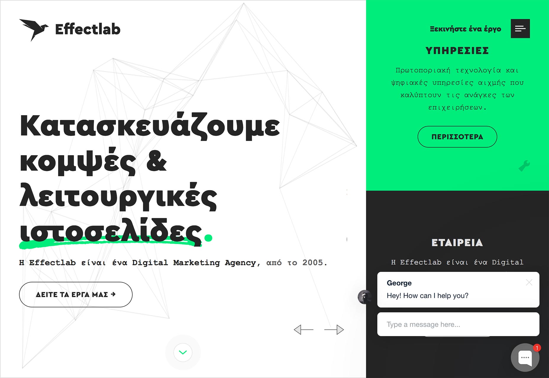
Zachary Johnson
Zachary Johnson has what is perhaps the penultimate evolution of the modern minimalist layout. It’s clean, it’s sexy, it’s smooth. I love the way he used pastels. My only criticism would be the part where his text goes over his actual work. I have to admit, with the rest of the site doing so well, that’s just puzzling. We have big screens, and the people who have small screens are used to scrolling. Let us read the text.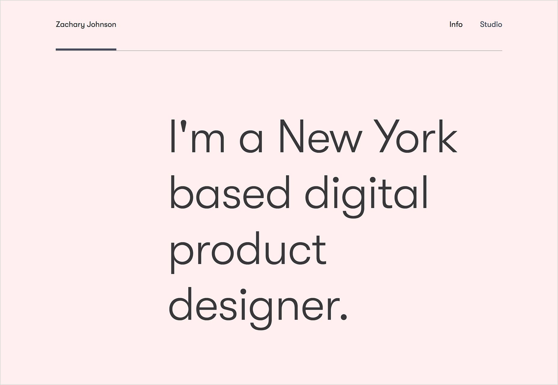
Dixon & Moe
Dixon & Moe is one more site on this list that embraces the “minimalism plus geometry” theme. In this case, the minimalism borders on brutalism, but is saved by good typography and white space. It’s also got little touches that make it look a bit like, I dunno... a technical manual? A set of diagrams? Like, all of the major elements on each page are given a letter/number designation. Go take a look. It’s cool.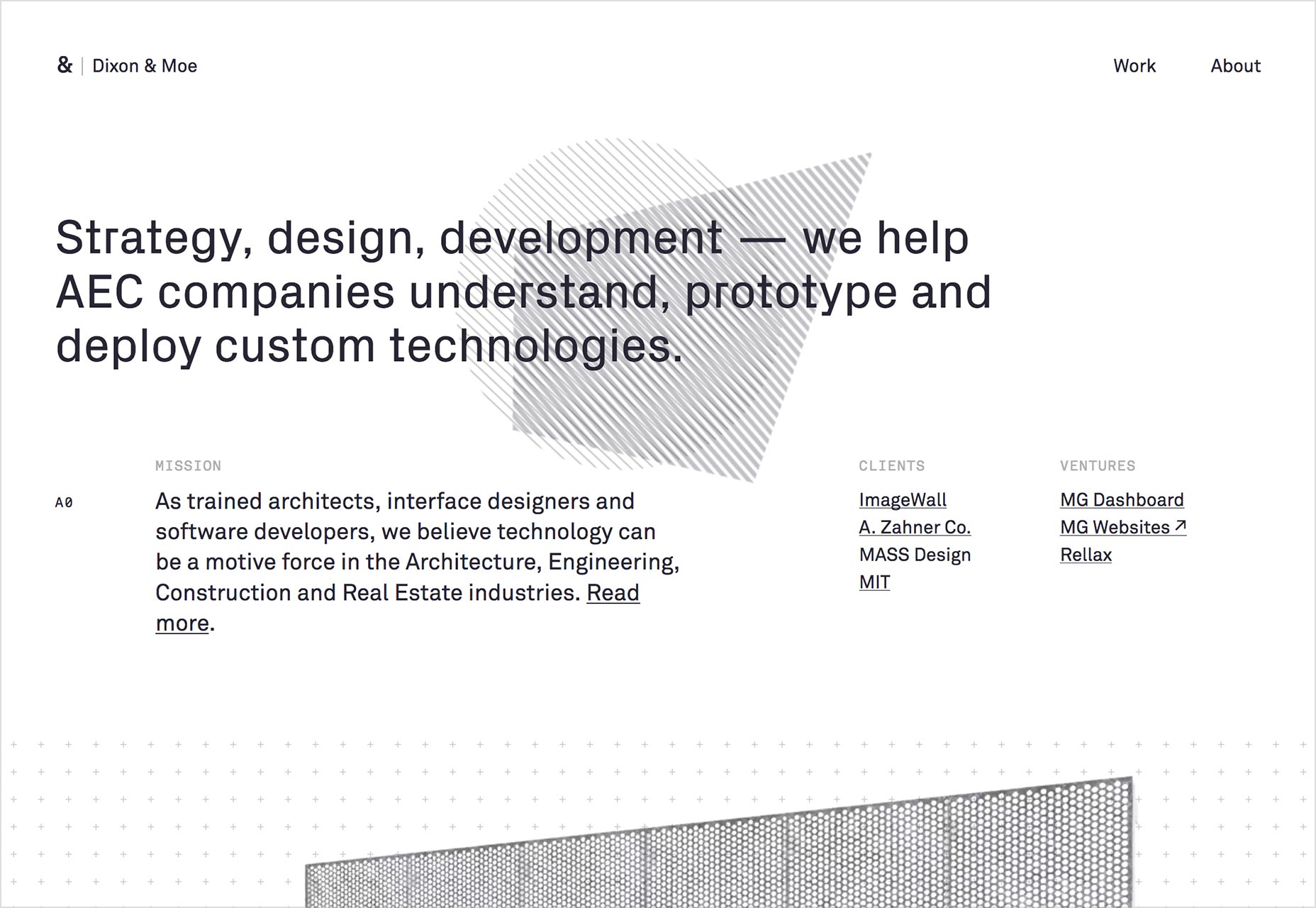
Kuudes
Kuudes is a fantastic example of the beauty of plain old organization. There’s a minimum of fancy tricks on this site, with most of the effort going in to just organizing a fair amount of information (for a portfolio site).
Léo Guenoun
Léo Guenoun’s portfolio is very, very minimalist. Everything is text until you click your way into a portfolio piece. Then it’s pretty much just images. I’m sensing a theme, here.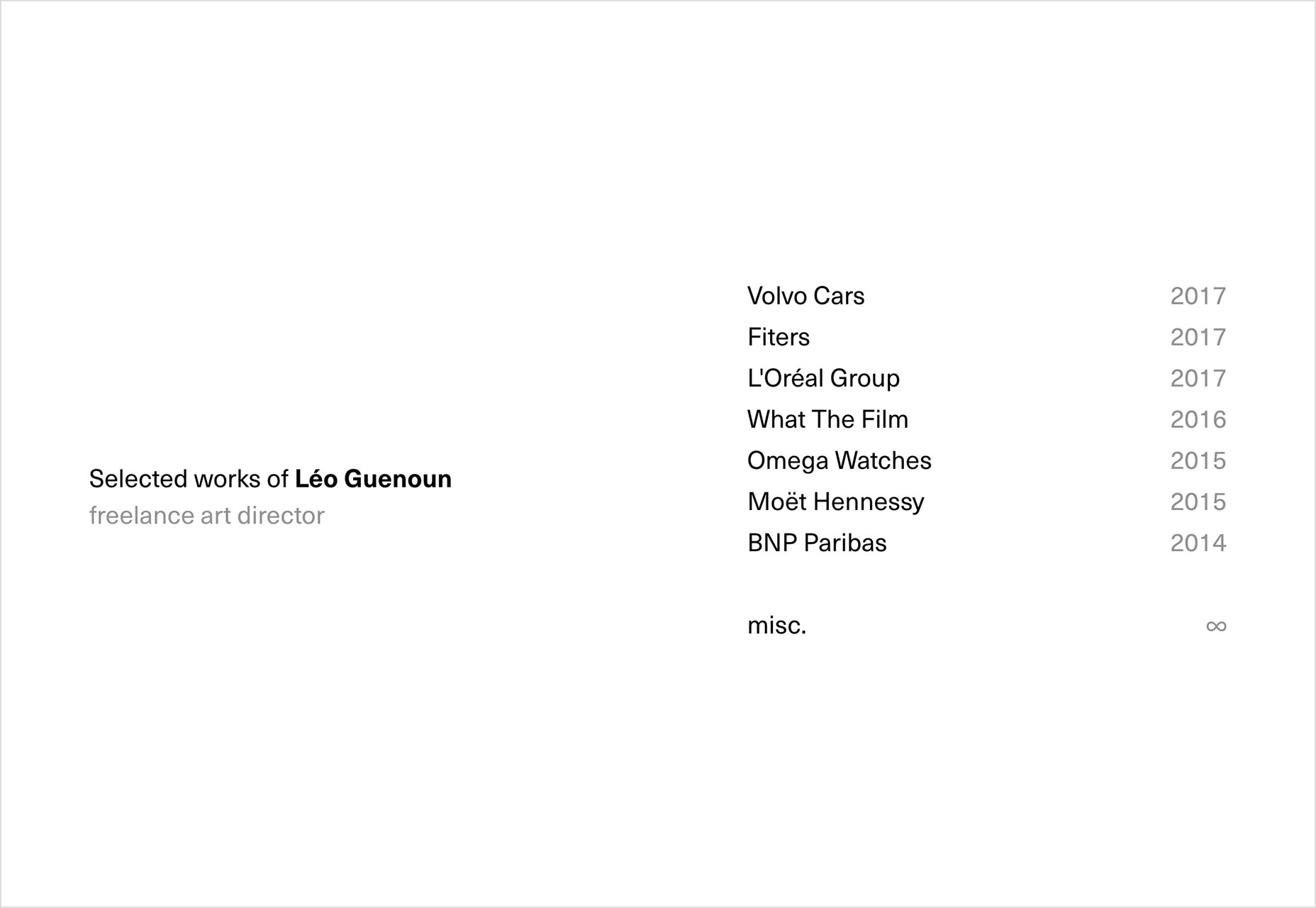
Fore Design
Fore Design embraces textbook modern design, and thus joins this month’s minimalism plus geometry club. My favorite bits of the site would have to be the case studies, and the design of the blog articles on desktop screens. They also seem to make a point of using real people’s names where they can. Whether it’s on their team page (duh), in their portfolio pieces, or on their blog, they seem to emphasize a human connection when and where they can.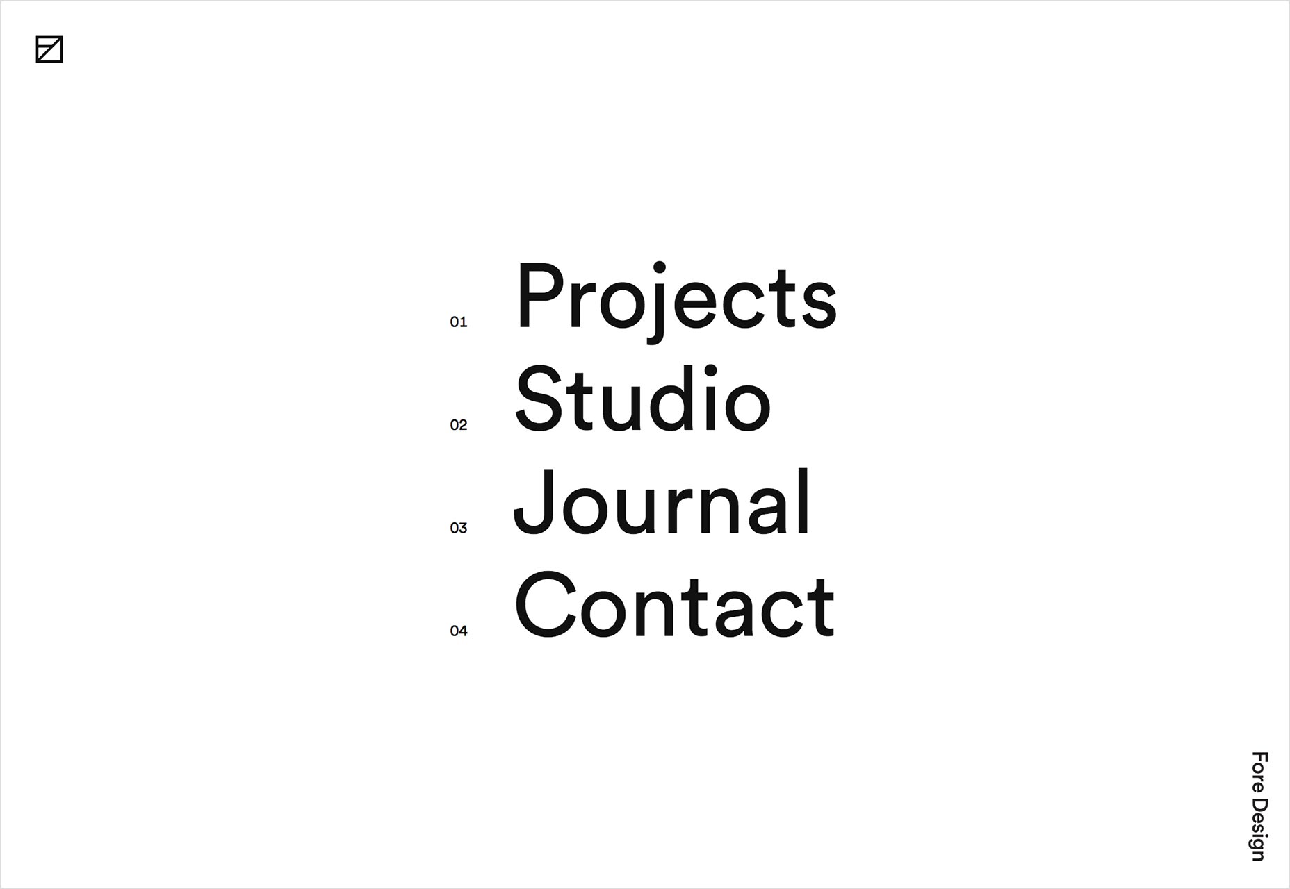
Anne Thai
Anne Thai embraces the classic white space and huge text style of site. She has to, because this is possibly the single longest one-page portfolio I’ve ever seen. Thankfully, it comes with two sets of navigation. Her work is presented artfully, and color is used to let you know you’re looking at a new project in a way that makes sense.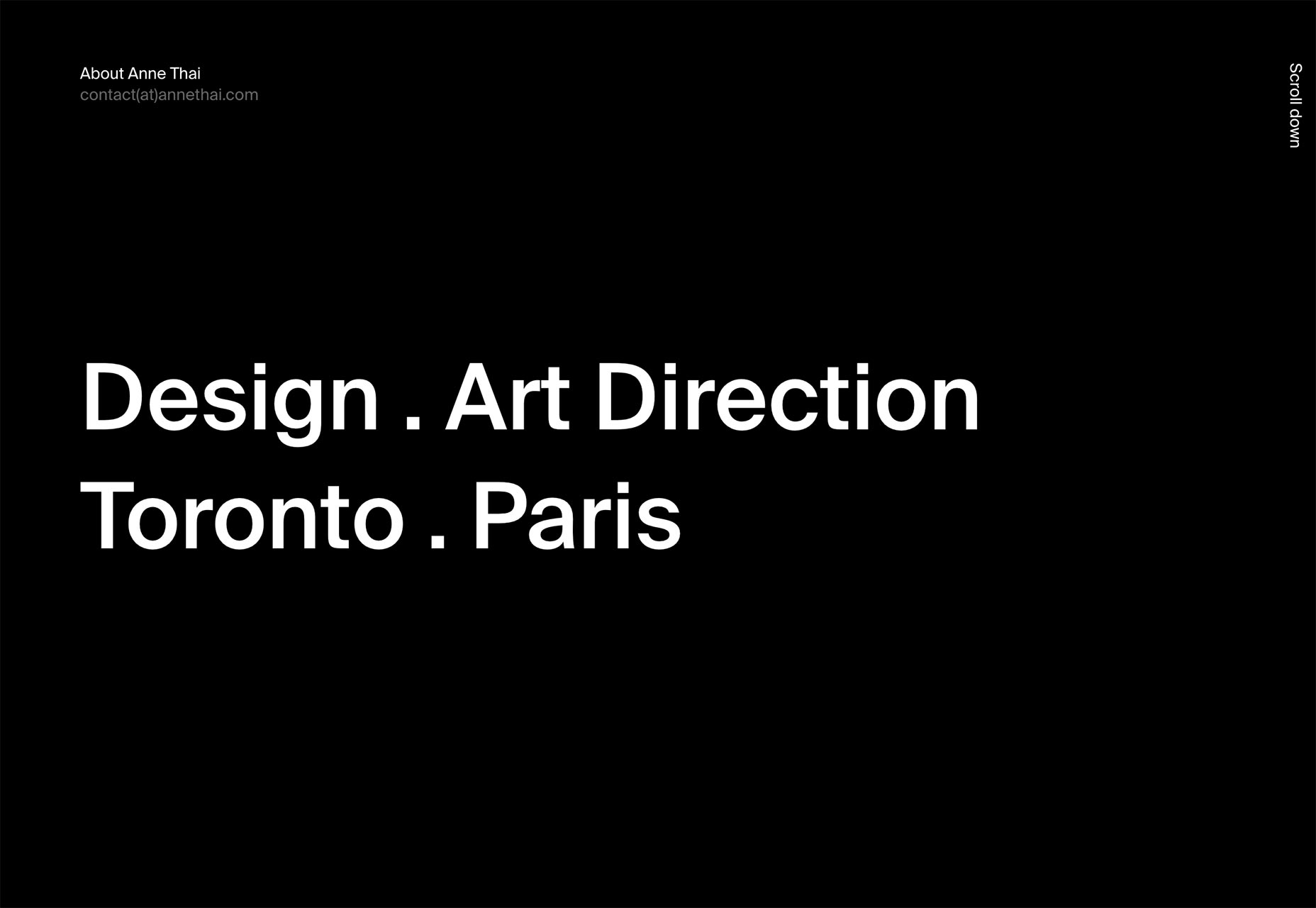
Skinn Branding Agency
Skinn brings us more classic white space and huge text. It’s not terribly original, but it is well-done. Trigger warning for people who like headings and titles to be capitalized. This site mostly doesn’t do that...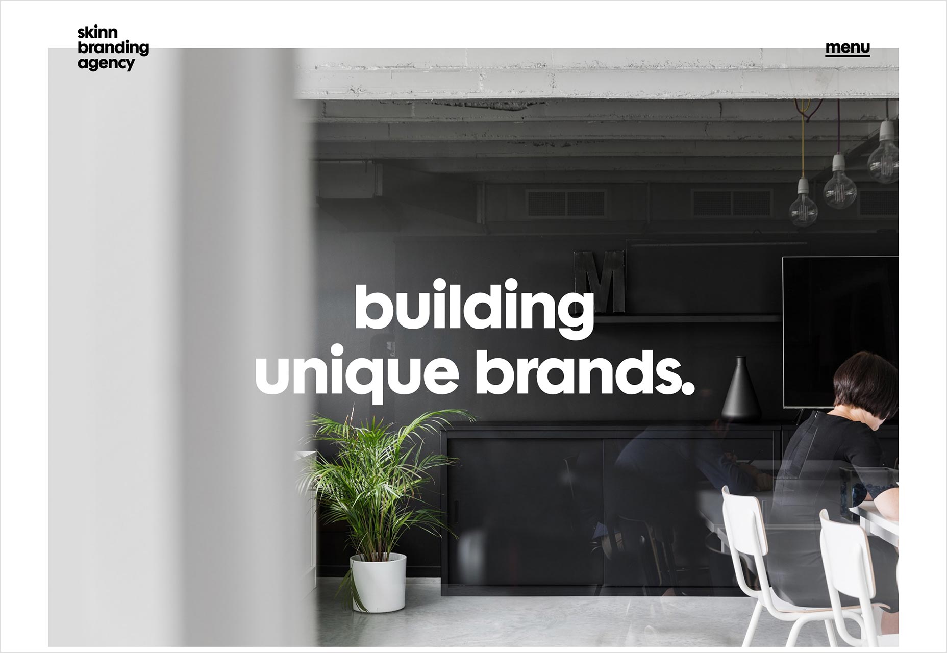
Maciej Herbert Rodzik
Maciej Herbert Rodzik brings us back a few months to the days of post minimalism, but just a little. Aside from a little asymmetry and element overlapping, this one is simplicity itself. It’s also one of the few sites that overlaps the project title with the project images that doesn’t overwhelmingly impact readability. I approve.
Zeus Jones
Zeus Jones wins the award for being the second site on this list to have the initials “ZJ”. It’s a branding agency, and the site sure as heck looks like it. Every part of the otherwise fairly standard design has clearly been made to fit a theme. Note the just plain beautiful typography.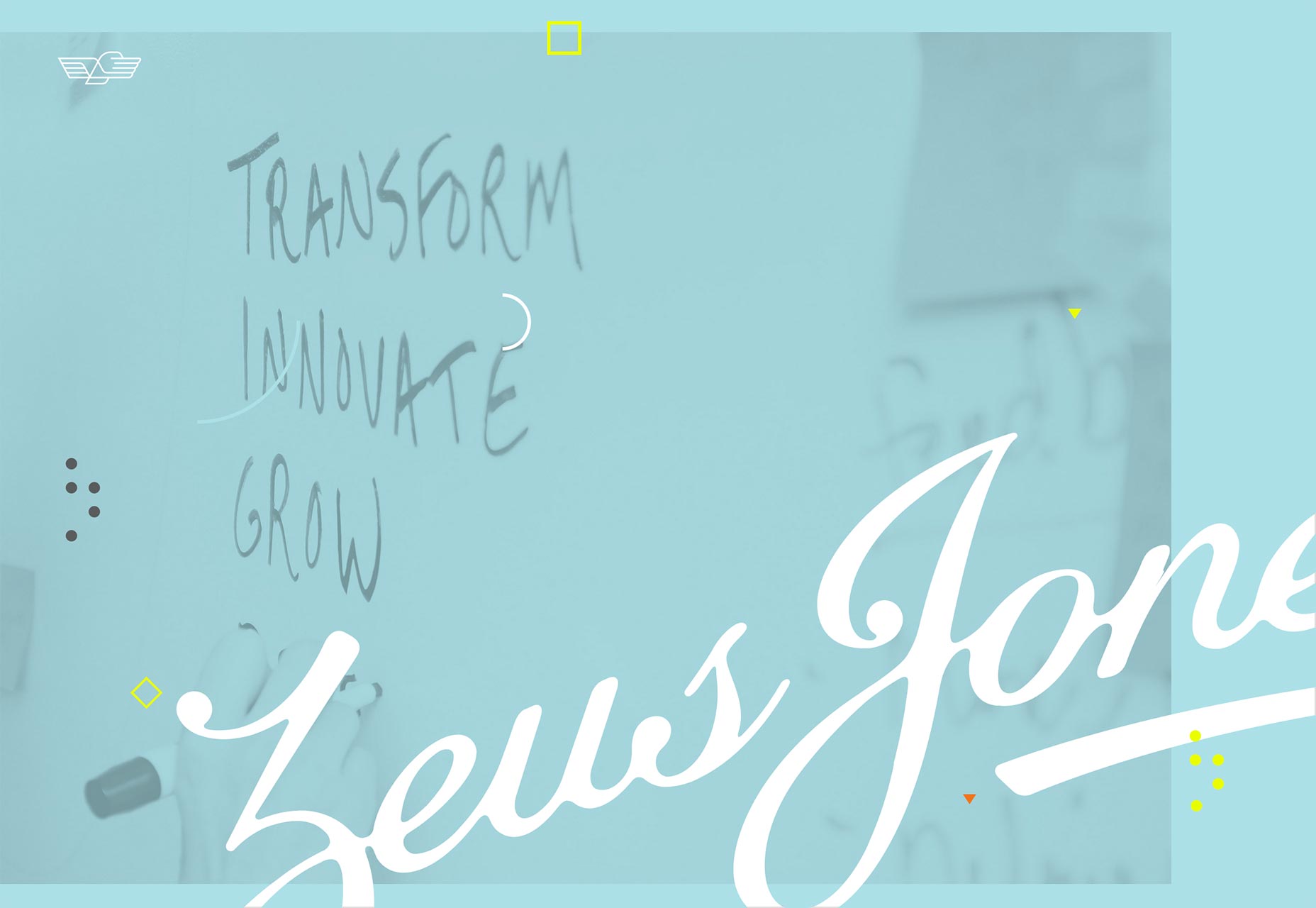
Monopo
Monopo’s site is perhaps a bit presentation-effect-heavy for my taste; but I love their use of color. Also, I must admit that anyone who can make circles work as a design theme automatically gets points from me. With the web being as “box-shaped” as it is, I can always appreciate making a theme out of any other shape.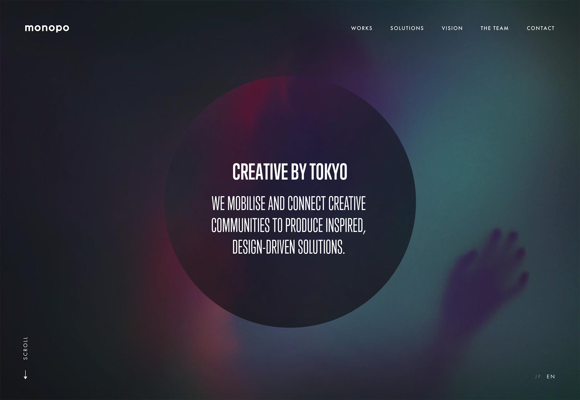
Rowan Made
Rowan Made is, without mincing words, a fairly typical example of hipster minimalism. It’s all about that artisanal feeling. Nonetheless, it is perhaps one of the finer examples of hipster minimalism that I’ve seen in a while. Plus, I’m a sucker for well-crafted typography on pretty much any site. I’d only try to make the text headings stand out a bit more, maybe. The headings are styles in a way that assumes the reader is going to be reading as opposed to skimming. Never make that assumption.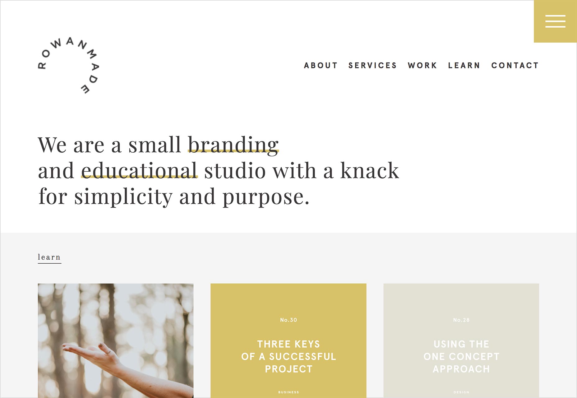
Studio Mast
Studio Mast spices up a fairly simple layout with little touches that are reminiscent of an art gallery. This idea is represented everything from the general aesthetic style, to the hover effects on images, to the controls on the home page slideshow. It’s a subtle way of calling your own work art without looking too pretentious. It’s a clever touch that doesn’t get in the way of usability. I like that kind of clever.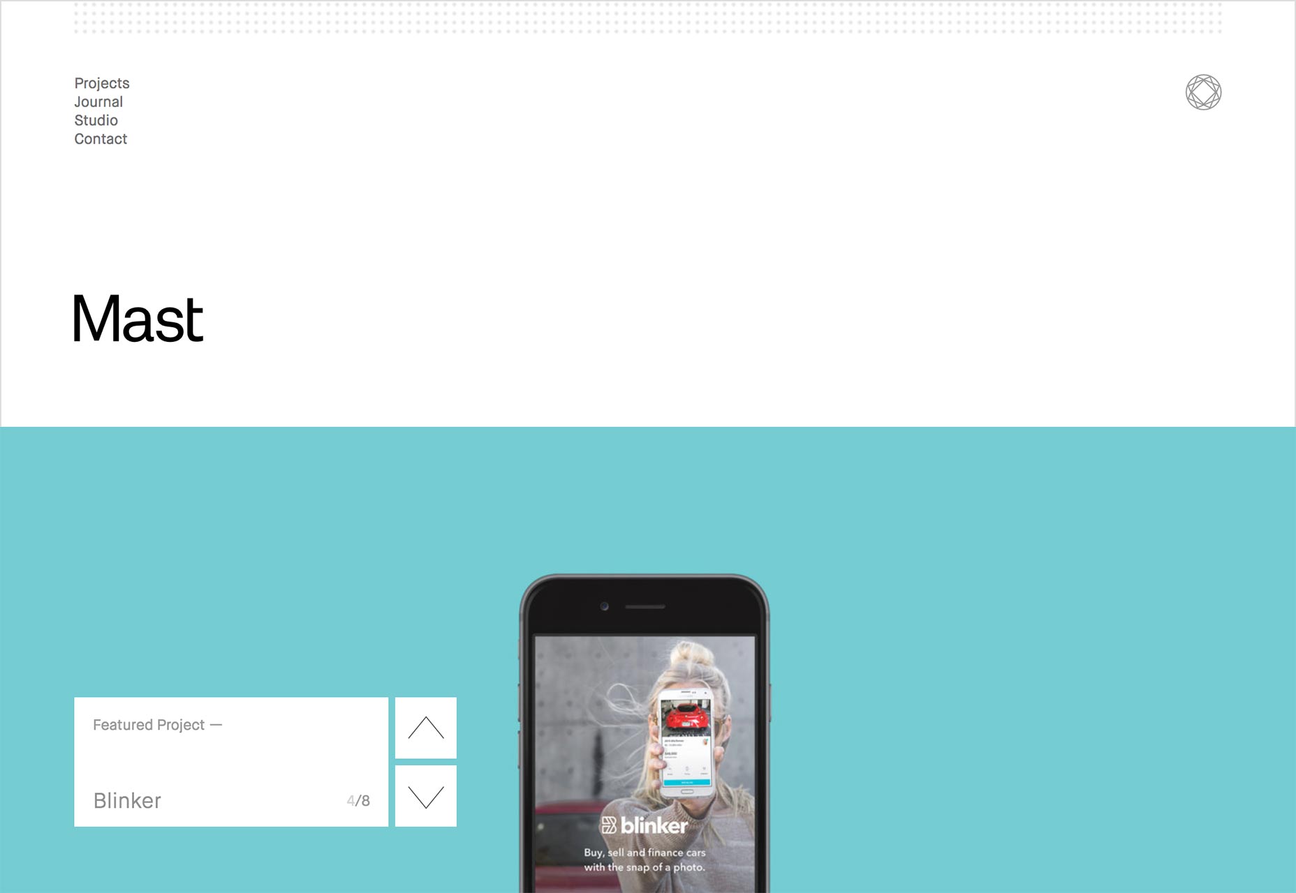
Maksim Karalevich
Maksim Karalevich’s site is all minimalist and full of... not random geometric shapes. Cool. In fact, there’s an animated signature on the home page. Even more cool. Another thing I quite like is the way some elements are styled to make the whole thing look like a gigantic chat log. It’s not something you see very often.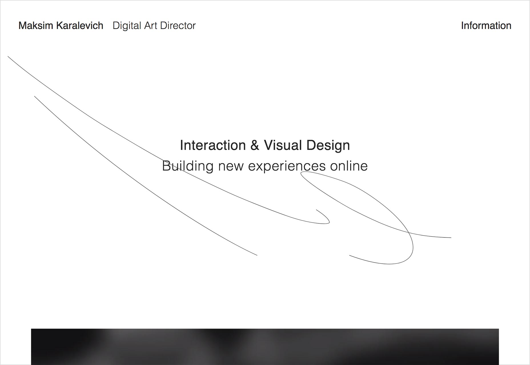
Andy H. Wei
Andy Wei brings us full circle with more of that minimalism and random geometry combo in a lovely near monochromatic site that lets his paintings have all the color. There’s a hint of post-minimalism here and there, but it’s used for emphasis, which I really like. My favorite bit has got to be the little graphical flourishes. They’re all painting-themed, so it sets exactly the right mood.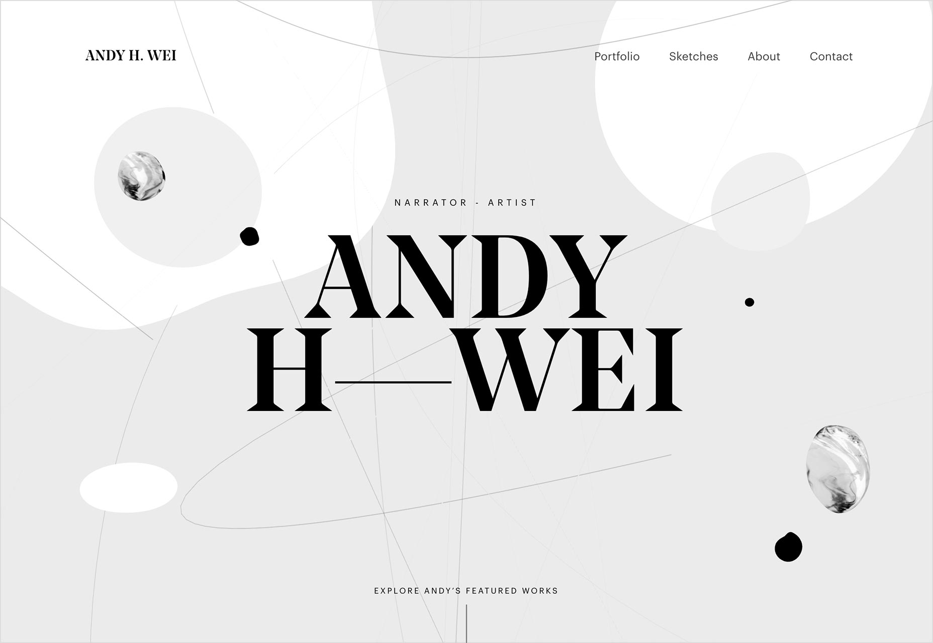
Ezequiel Bruni
Ezequiel Bruni is a web/UX designer, blogger, and aspiring photographer living in Mexico. When he’s not up to his finely-chiselled ears in wire-frames and front-end code, or ranting about the same, he indulges in beer, pizza, fantasy novels, and stand-up comedy.


Read Next

15 Best New Fonts, July 2024
Welcome to our monthly roundup of the best fonts we’ve found online in the last four weeks. This month, there are fewer…
By Ben Moss

20 Best New Websites, July 2024
Welcome to July’s round up of websites to inspire you. This month’s collection ranges from the most stripped-back…

Top 7 WordPress Plugins for 2024: Enhance Your Site's Performance
WordPress is a hands-down favorite of website designers and developers. Renowned for its flexibility and ease of use,…
By WDD Staff

Exciting New Tools for Designers, July 2024
Welcome to this July’s collection of tools, gathered from around the web over the past month. We hope you’ll find…

3 Essential Design Trends, July 2024
Add some summer sizzle to your design projects with trendy website elements. Learn what's trending and how to use these…

15 Best New Fonts, June 2024
Welcome to our roundup of the best new fonts we’ve found online in the last month. This month, there are notably fewer…
By Ben Moss

20 Best New Websites, June 2024
Arranging content in an easily accessible way is the backbone of any user-friendly website. A good website will present…

Exciting New Tools for Designers, June 2024
In this month’s roundup of the best tools for web designers and developers, we’ll explore a range of new and noteworthy…

3 Essential Design Trends, June 2024
Summer is off to a fun start with some highly dramatic website design trends showing up in projects. Let's dive in!

15 Best New Fonts, May 2024
In this month’s edition, there are lots of historically-inspired typefaces, more of the growing trend for French…
By Ben Moss

How to Reduce The Carbon Footprint of Your Website
On average, a web page produces 4.61 grams of CO2 for every page view; for whole sites, that amounts to hundreds of KG…
By Simon Sterne

20 Best New Websites, May 2024
Welcome to May’s compilation of the best sites on the web. This month we’re focused on color for younger humans,…