
1. MIA Contact Page
The biggest mistake you can make is one of the most obvious yet you’d be surprised how many sites lack a contact page. There’s a surprising trend for portfolio based sites that forgo the contact page. In lieu of a contact page, some site owners are now opting for simply throwing social icons up at the top of the page. While this is a great way to let people know you are socially available it does nothing for people who, like me, don’t have any form or social media or those of us who are trying to touch base or inquire over a matter regarding your product or service. The Fix: Get yourself a contact page. There’s no excuse to not have one especially when you have spent your time pimping out the front page with HD video and parallax scrolling. Your users can’t contact you and they are likely to think you don’t quite care about actually doing business. The site for Badass may not actually feature your traditional contact form but they still make a point to provide contact information in order for you to get in contact with them if the need should arise. Extra points for offering two separate phone numbers and email addresses to make sure you can get in touch with someone on the team. If that for some reason fails you can also try their social media accounts for a possible quicker response.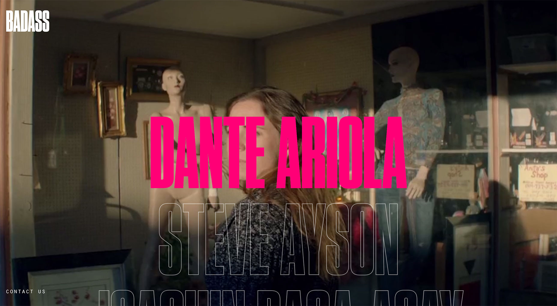
2. Hide and Seek Contact
Many of us have played the never ending (and annoying) game of “where the heck is the contact page”. This game entails—you guessed it—searching for the contact page so you can query the site owner for one reason or another. Usually if you can’t find the contact page in the navigation menu you are likely to find it in the footer navigation. While this is all well and good, it isn’t very intuitive to users. What’s worse is when instead of finding it in the footer you have to locate the contact page via Google query to find the secret page link. The Fix: Your contact page should always be in the navigation menu. Avoid putting it in the footer menu as a frustrated user is likely to turn tail end and leave your site. That means one less convertion thanks to bad UX. Kickpush makes their contact page easy to find by displaying it directly in their navigation as opposed to some sites that prefer to place their link in the footer. By placing their link in the navigation and using the simple word of “contact” they are taking the guesswork out of finding how to get in touch with them.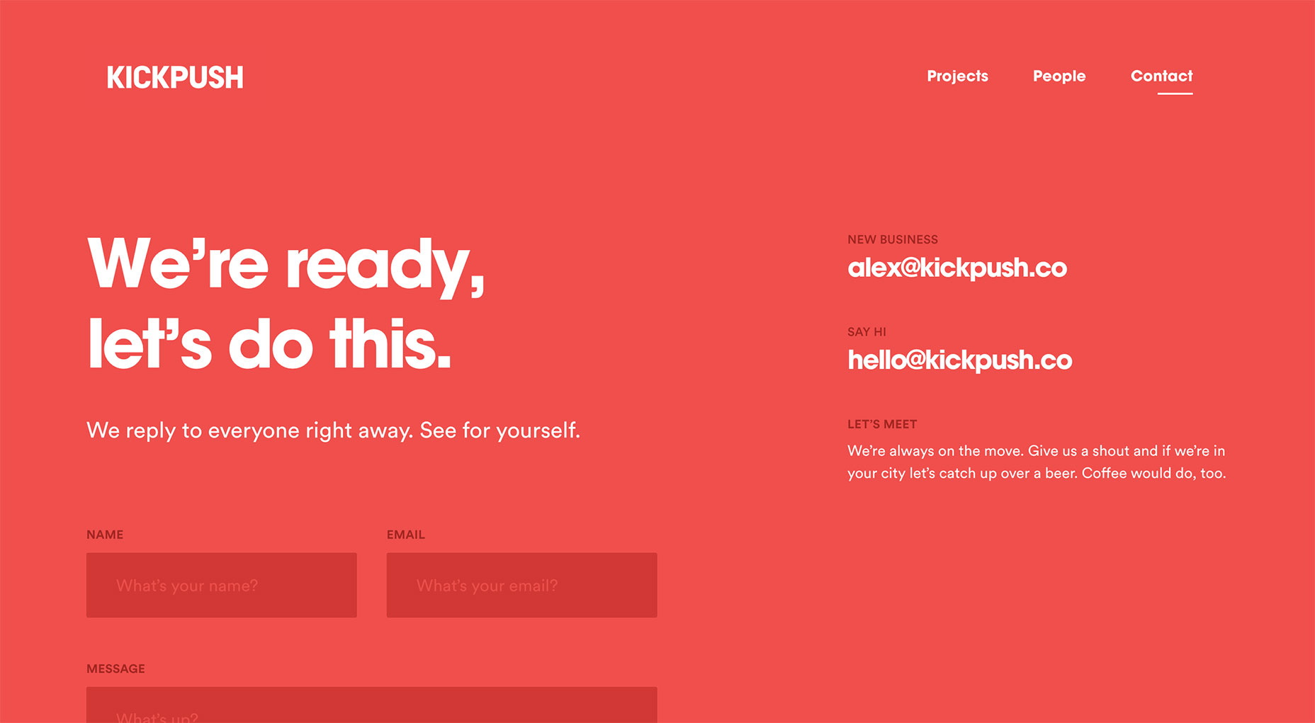
3. Inadequate or Intrusive Contact Forms
The art of the contact form is a sacred and trying practice that it takes a while to get right, but only a second to get wrong. Contact forms usually fall under two spectrums, either not enough fields or so many that it includes inputting your grandmother’s mother’s maiden name and of course the dreaded phone number request. People want to be able to tell you what they need to tell you but if you don’t give them the opportunity you can be losing out on a convertion. The same could be said that not everyone has the time or patience to fill out eighteen fields just to ask you if their discount code will work. You could also be losing a convertion by not explaining what each form is for or the correct way to input their information. The Fix: Construct your contact forms based on your site’s purpose and on the site’s target audience. If a user feels like your form doesn’t adequately allow them to address their needs then it isn’t a good form. If your form takes more than two minutes to fill out then you’re asking way too much. Forefather’s does a great job when it comes to creating a contact form based on the needs of their potential customers. Instead of going for the standard contact form that requires name, address and message they get into specifics. This ultimately allows them to craft a tailored response based on individual needs as opposed to a generic response. The form’s questions are adequate for them to gauge your wants and needs without being too intrusive.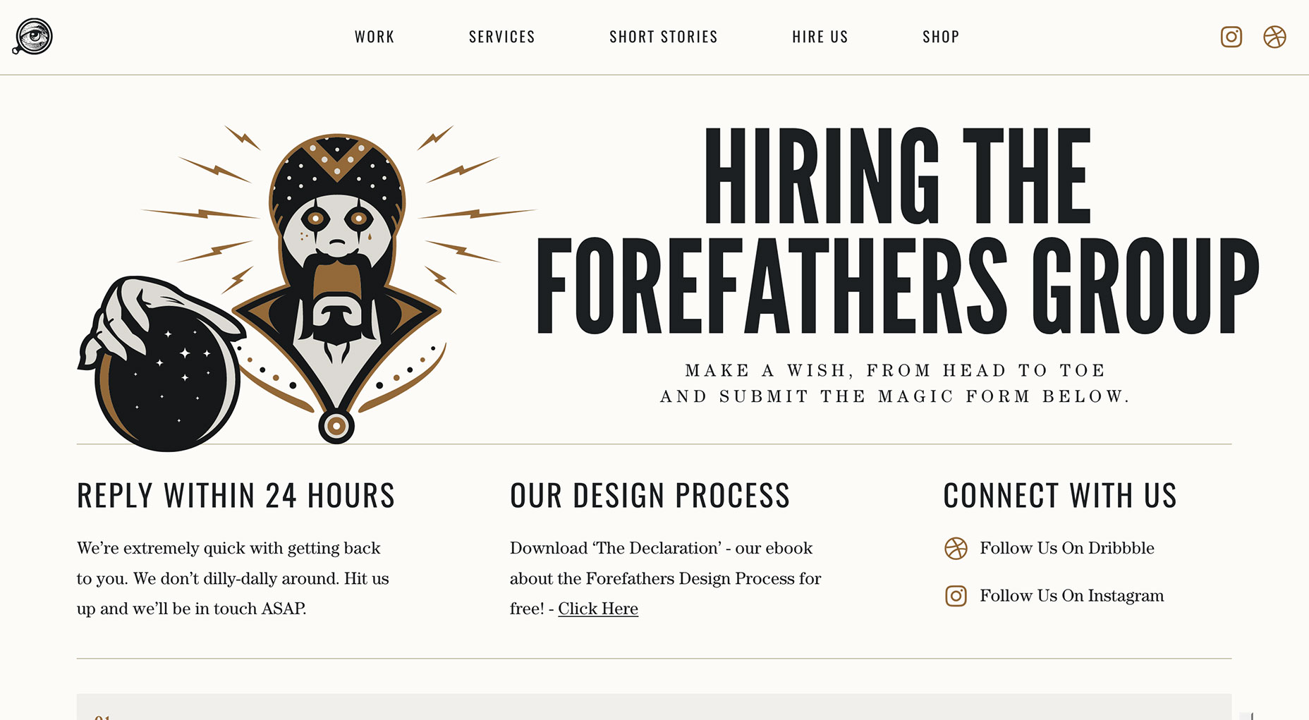
4. Not Analyzing Submissions
This may not deal with the actual contact page but failing to analyze the type of submissions you generally receive will affect your contact page design, form and detail information. Analyzing your submissions will give you a good idea of why people are contacting you and therefore you can make the needed changes to better address those issues. If the majority of your users are contacting you on three different issues constantly you might want to consider designing a subject dropbox so they can select the topic closer to their inquiry. Analyzing can also help bring awareness to any other problems your site might have depending on the number of submissions you receive and the frequency. The Fix: Don’t just respond to submissions and move on. Keep a record of them because chances are if one person is contacting you for a reason there will be four more who have the same inquiry or issue. SpicyWeb has clearly taken the time to analyze passed submissions if their “How Can We Help?” section is indication. With this it allows not only SpicyWeb but also the sender to better categorize their message. Offering topics can better the response of the site and gives senders the confidence that their inquiry will not only be received by the right person but also be answered appropriately.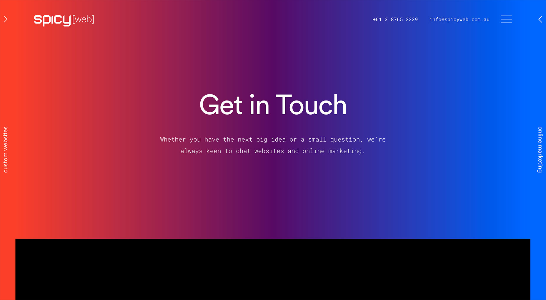
5. Form Only Options
Forms are great but sometimes they aren’t the most convenient way for a user to get in contact with you for one reason or another. Usually if a person is trying to get in contact with you it is probably for something important so you don’t want to limit them. Offering more than one venue makes you seem more accessible. Look at Moo’s Contact Us page for example. While they don’t have a standard form they have three other viable options of chat, call or email (which is in form format if you choose that option). The Fix: You don’t have to put your phone number on your page, but there should be more than one way for users to get in touch with you. If you don’t want to add a physical or electronic address you can always use your good ol’ social media icons. If you think that the simple contact page on Wonder’s website won’t be enough to cover what you need they make sure to offer multiple other options for you to get in touch. Right below the form you are given social media accounts, multiple email addresses and even an actual address to mail letters to the author if you so wish to.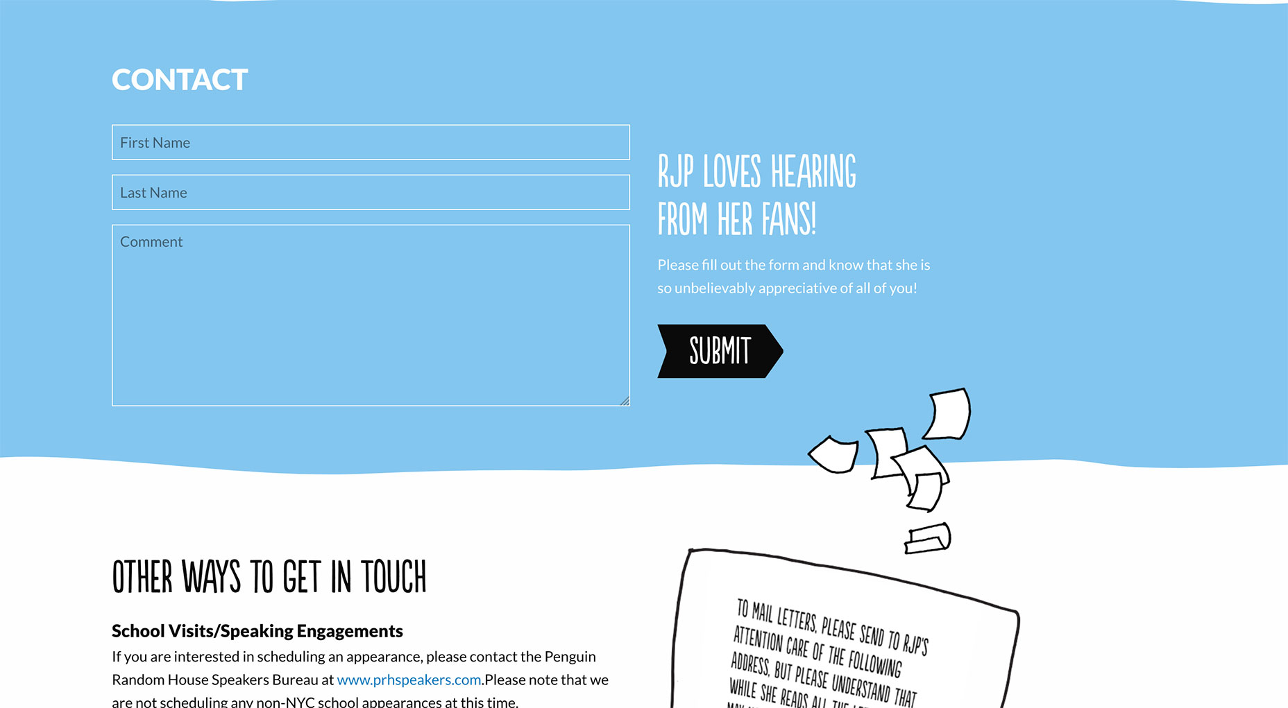
6. Mandatory CAPTCHA
CAPTCHAs are not disability friendly (visual or developmental) which should be a good enough reason to scrap them from your forms in the first place. If limited usability isn’t enough to convince you, how about the fact that only 71% of the time will three users agree on the CAPTCHA image contents. While the reason behind using a CAPTCHA at the end of your contact submission forms is a good one it isn’t worth it when users can spend minutes refreshing the code to find a visual they can actually discern. Most users, myself included, will probably end up saying “forget it” and not finish. The Fix: Thankfully there are now more viable alternatives to the annoying CAPTCHA that are less problematic to both disabled, non-English speaking people, and the “I don’t know what this says” users. When you contact a site you want to get in and get out within five minutes or less. Thankfully Sila Sveta knows this. There is no silly CAPTCHA here which allows you to send your message without the constant refresh because you deciphered the scrambled words wrong.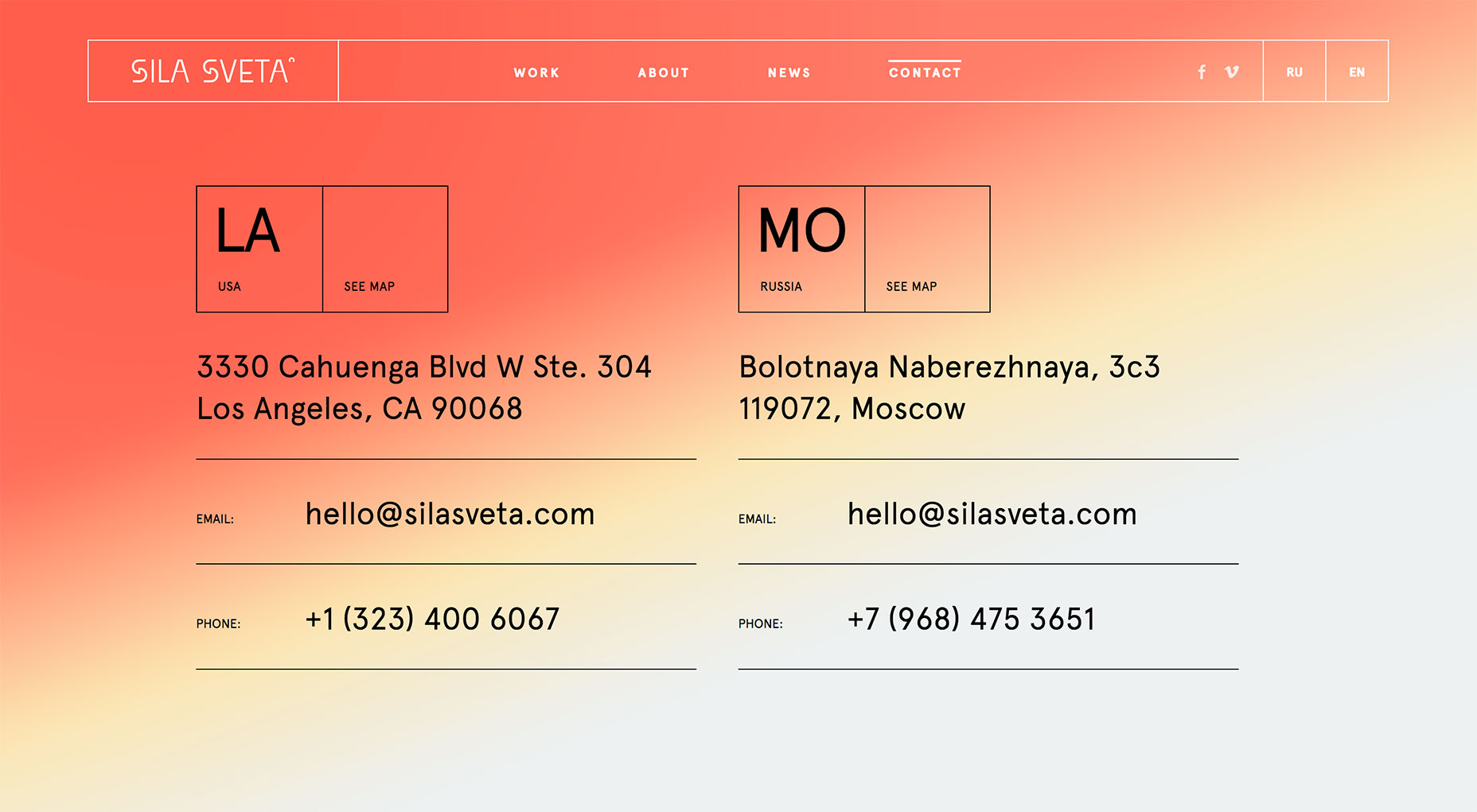
7. Unmonitored Submissions
Just because there is a form that is filled and submitted doesn’t mean that a reply is guaranteed. I have filled out numerous forms in my life and have never received a response which largely boils down to no one was is actually watching what comes in. Not watching your submissions is a great way to blow a potentially important opportunity. It also doesn’t speak very well about your site’s management and your relationship with your users. The Fix: Link your contact forms to an account that you are sure to check on a regular basis or assign the task to someone responsible. There is no point in having a contact form if you’re not going to bother to respond to the people who contact you. You need to make an effort to answer all incoming inquiries to your site. To help instill confidence that a user’s message won’t just be dismissed you should try writing positive confirmations like the all girl design trio of NJI3 does on their contact form. They let you know from the get go that if you send them a message Dina will get back to you before the day is over. This compels users to take the plunge and actually fill out the contact form.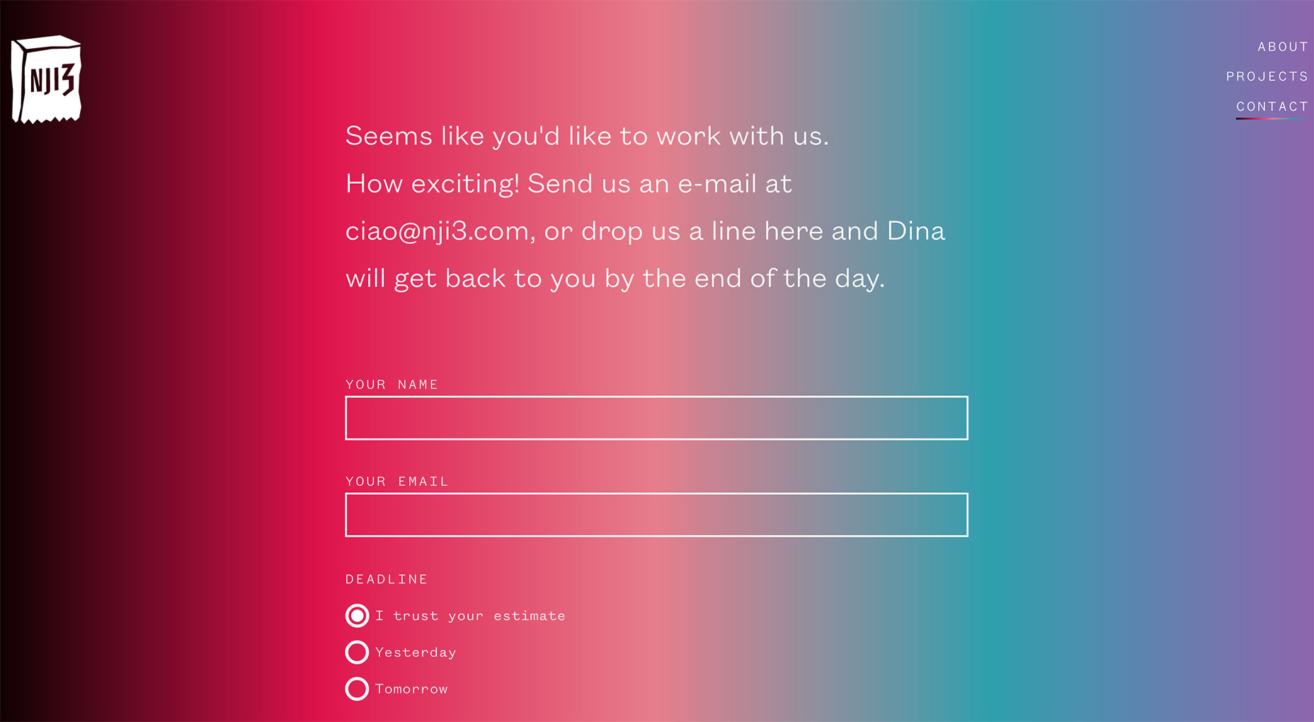
8. Broken Forms
Things break every now and again on a site, it’s just part of the territory but it doesn’t mean that it should stay broken. Forms can be broken in various ways. From submit buttons that don’t work to forms that don’t acknowledge you have all the fields completed and continues to send back an error message. Forms can break for strange reasons. While it probably isn't your fault that your form breaks, especially if you’re using a third-party application, your user is unlikely to think like that. They will see it as an excuse to flee your site and take their conversion with them. The Fix: Depending on your schedule and the influx of submissions you receive you should always test your contact form once a month especially if you haven’t received any submissions lately. This will allow you to catch any form hiccups as they develop before your users does. One way for your users to know that your form works is by having some form of confirmation message pop up after you have hit the send button. The site for designer Dani offers a simple confirmation message after you have submitted your contact form to let you know you have successfully completed the form.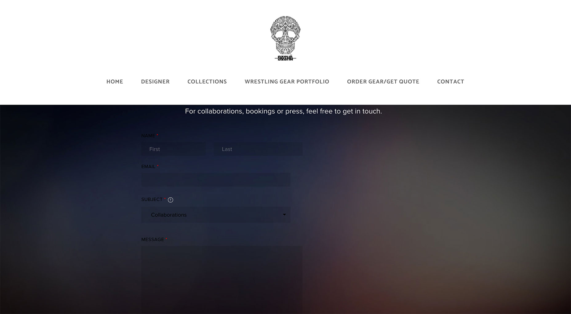
Keep the Momentum Going
Even if you have corrected the above mistakes don’t think that your contact page is finally perfect. There are other pitfalls that you are likely to get stuck in when it comes to your contact conversions. Other areas you want to pay attention to are A/B testing, your use of language with your contact buttons and reducing form friction.Gabriella Caraña
Graphic designer, photographer, animator and filmmaker. When she's not designing she can be found behind a camera.
Read Next
15 Best New Fonts, July 2024
Welcome to our monthly roundup of the best fonts we’ve found online in the last four weeks. This month, there are fewer…
By Ben Moss
20 Best New Websites, July 2024
Welcome to July’s round up of websites to inspire you. This month’s collection ranges from the most stripped-back…
Top 7 WordPress Plugins for 2024: Enhance Your Site's Performance
WordPress is a hands-down favorite of website designers and developers. Renowned for its flexibility and ease of use,…
By WDD Staff
Exciting New Tools for Designers, July 2024
Welcome to this July’s collection of tools, gathered from around the web over the past month. We hope you’ll find…
3 Essential Design Trends, July 2024
Add some summer sizzle to your design projects with trendy website elements. Learn what's trending and how to use these…
15 Best New Fonts, June 2024
Welcome to our roundup of the best new fonts we’ve found online in the last month. This month, there are notably fewer…
By Ben Moss
20 Best New Websites, June 2024
Arranging content in an easily accessible way is the backbone of any user-friendly website. A good website will present…
Exciting New Tools for Designers, June 2024
In this month’s roundup of the best tools for web designers and developers, we’ll explore a range of new and noteworthy…
3 Essential Design Trends, June 2024
Summer is off to a fun start with some highly dramatic website design trends showing up in projects. Let's dive in!
15 Best New Fonts, May 2024
In this month’s edition, there are lots of historically-inspired typefaces, more of the growing trend for French…
By Ben Moss
How to Reduce The Carbon Footprint of Your Website
On average, a web page produces 4.61 grams of CO2 for every page view; for whole sites, that amounts to hundreds of KG…
By Simon Sterne
20 Best New Websites, May 2024
Welcome to May’s compilation of the best sites on the web. This month we’re focused on color for younger humans,…


