
What is Consumer Psychology?
Understanding why and how individuals evaluate objects and events is one of the main aims of consumer psychology. Numerous studies have gotten us to an understanding that those choices and evaluations aren’t only driven by the value and quality of an object, but by internal factors, such as subjective perceptions, as well. People may abandon a website due to numerous reasons. If you’re lucky, they will come back and finish whatever they started, but this seldom happens and people just forget about it. Abandoners can actually be hot prospects, and you’ll find that companies spend a lot of money to re-engage them, in order for them to come back and finish what they started.1. Use Psychological Distance
The way we construct an object, cognitively, is impacted by our conceptual distance from that object. Low-level construal will relate to the specific, concrete features, such as price, function, color, and size, while the high-level construal will relate to the experience one has with that object, as an abstract concept. If you describe a broken link as unclickable, that is low-level construal. However, if you describe that the interaction leads to frustration, that is high-level construal.2. Understand the Primacy Effect
The primacy effect tells us that whenever we have a choice between a list of things, our brains will remember the first couple of things more than the ones later on. Things that are at the beginning of a list are regarded to be more important. One of the major reasons this works is because an individual will pay more attention at the start, and later on drift off, because their brain is either bored or tired.3. Design for Humans
One often overlooked concept when building your website is to design for humans first. More importantly, design for your specific target market first. Does your product, be it an app, or a website, or software, engage your audience? Does it push people into taking action? If something makes sense to you, that doesn’t necessarily mean that it’ll make sense for a visitor, or your business. Your visitor’s behavior on the page is directly related to how their body and mind respond to the combination of copy and design you have placed in front of them.4. Color Influences Shoppers
You will find it fascinating that certain colors can actually convey different actions and emotions.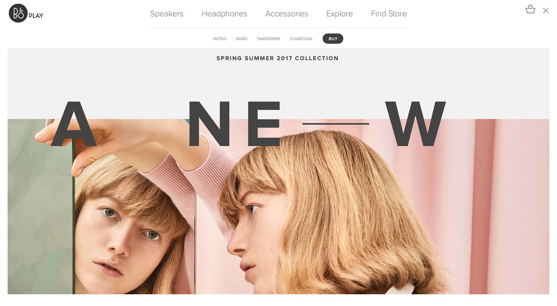 Mostly due to the fact that personal preference, history, and other things, can influence the meaning of certain colors, has led to there being a lot of theories about color.
Red might mean one thing to me, and a completely different thing to you, so understanding the color theory fundamentals is pretty important.
5. Decision Making Can be Simplified with Contrast
Two of the biggest enemies of our brain are complexity and ambiguity. If a visitor has too many options, that can stifle their process of making a decision, and lead to them abandoning your website simply because they had too overwhelming a decision to make. Some services or products are complicated by themselves, and you should go with a softer approach that will support the process of making a decision, instead of focusing on pushing the sale.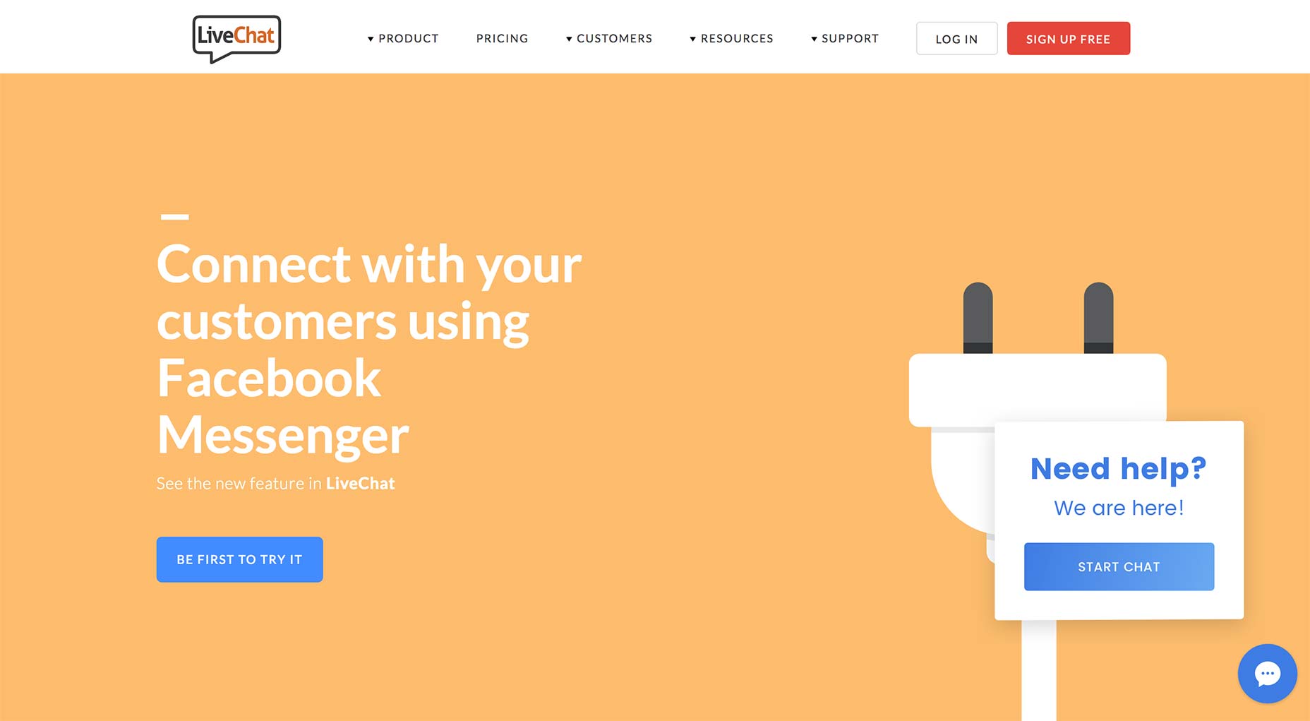 Our brains love clear contrast and simplicity, and that knowledge can be used to push your visitors towards taking an action.
Hick’s law dictates that too many options mean no decision
Have you ever found yourself at the grocery store, trying to decide which kind of chocolate to go for? That same thing happens to your visitor when he has far too many options.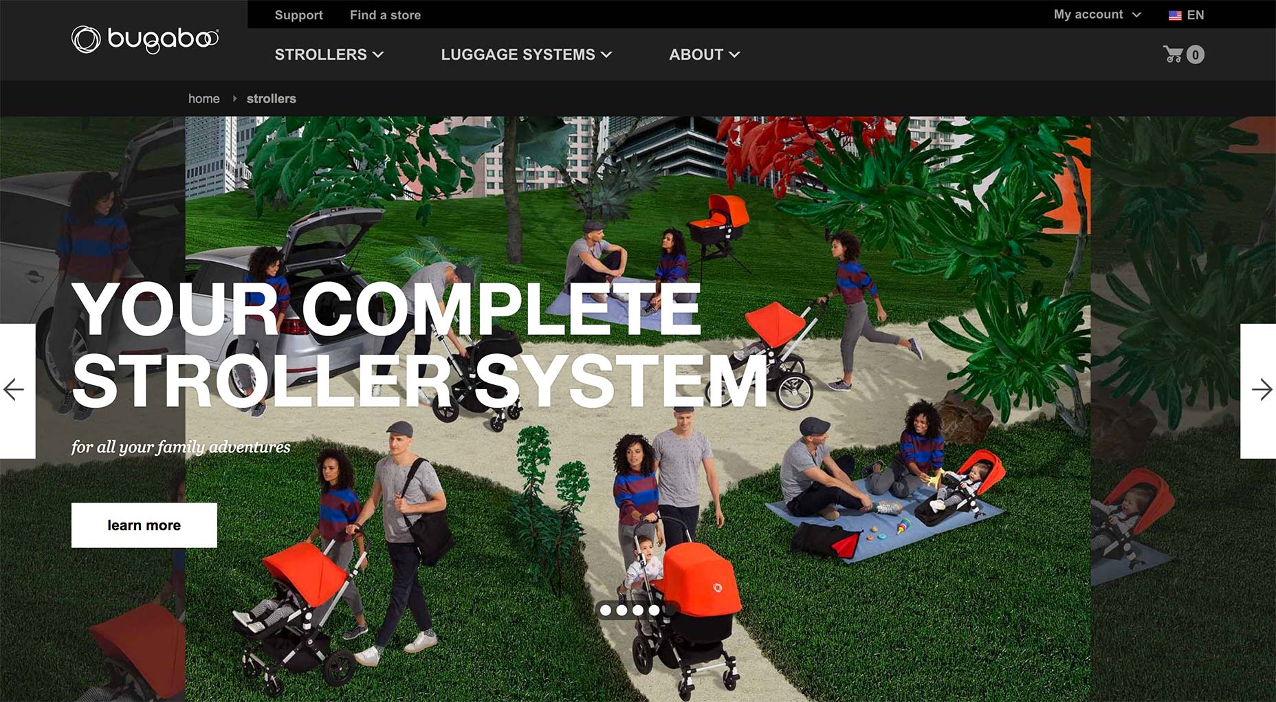 This can be too much for a visitor to handle, regardless of whether you have too many products, or too many images, or too many shipping options.
They will leave, not complete a purchase, and not take the desired action.
6. Informational Social Influence
This (aka social proof) is a phenomenon that dictates that in order to conform to their choices, people will adopt the actions of others. Social proof has a lot do to with a herd behavior. You’ll find that our brain goes where other people are going, and the decision-making center of our brain has a direct link to the area which is responsible for rewards and social learning. Seeing what choice someone else made, will activate that center and cause us to follow their lead.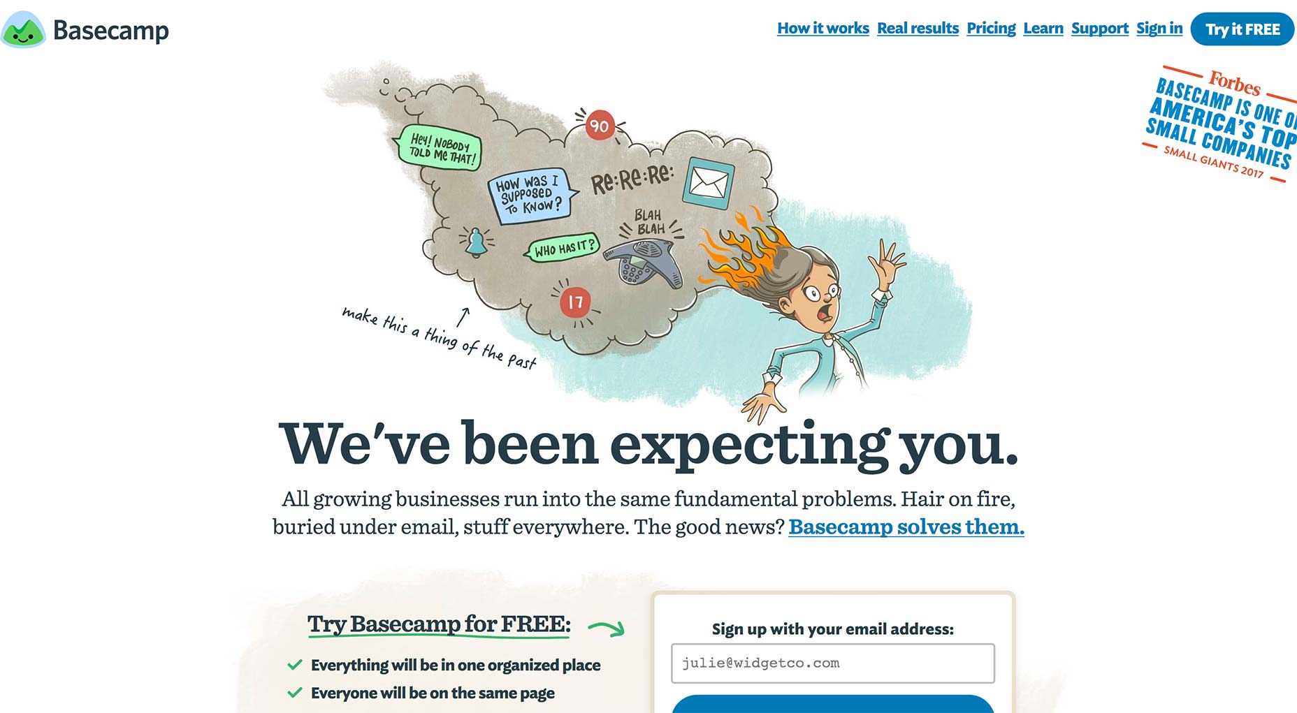
7. Nudge Visitors Toward Making Smaller Commitments
A visitor will often abandon your site because they aren’t ready to buy yet. Over half of online shoppers actually use the shopping cart to see how much the total costs are. And, the same number of shoppers actually add items over several visits before they check out. Although they may convert later, you’ll find that the Foot in the Door technique can help their decision to buy from you. This will involve you asking for small commitments first, before moving on to things that require a larger commitment.8. Faces are Sincere and Humanizing
Who doesn’t want to see a smiling face? It is most likely one of the most pleasant, familiar things in the world. It is one of the rare things that everyone understands, regardless of their background or the language they speak. Our brains actually have cells that only respond to faces, a part called the Fusiform Gyrus, and there isn’t a single other object that can get this part of the brain to spark. So, if you have a picture of someone that is looking directly at what you want your visitor to pay attention to, that may very well help you.
9. Encourage Visitors to Complete with the Illusion of Progress
You might’ve seen frequent buyer cards that have a few items pre-stamped on them, and you may be wondering what is the psychology behind that. A study has actually shown that people who get pre-stamped cards actually buy more frequently than those with empty cards. The existing stamps will give your customers a feeling of being closer to their goal. This will motivate them to complete their card, and reach the goal. This same principle can be used to get your abandoners to come back and finish their purchase.Final Thoughts
Now that you have a few design tactics to implement, you can go ahead and get started with them, putting them into play. When you’re looking at your website data and the abandonment history, you’ll find some visitor journeys a little illogical. However, psychologists have actually shown that a lot of consumer behavior tendencies aren’t only explainable, but also predictable. If you understand these tendencies, you can easily develop a strategy that works with these mental processes, instead of against them. If you know what will make your visitors tick, that is the key to developing a remarketing message that will make them click.Bogdan Sandu
Read Next
15 Best New Fonts, July 2024
Welcome to our monthly roundup of the best fonts we’ve found online in the last four weeks. This month, there are fewer…
By Ben Moss
20 Best New Websites, July 2024
Welcome to July’s round up of websites to inspire you. This month’s collection ranges from the most stripped-back…
Top 7 WordPress Plugins for 2024: Enhance Your Site's Performance
WordPress is a hands-down favorite of website designers and developers. Renowned for its flexibility and ease of use,…
By WDD Staff
Exciting New Tools for Designers, July 2024
Welcome to this July’s collection of tools, gathered from around the web over the past month. We hope you’ll find…
3 Essential Design Trends, July 2024
Add some summer sizzle to your design projects with trendy website elements. Learn what's trending and how to use these…
15 Best New Fonts, June 2024
Welcome to our roundup of the best new fonts we’ve found online in the last month. This month, there are notably fewer…
By Ben Moss
20 Best New Websites, June 2024
Arranging content in an easily accessible way is the backbone of any user-friendly website. A good website will present…
Exciting New Tools for Designers, June 2024
In this month’s roundup of the best tools for web designers and developers, we’ll explore a range of new and noteworthy…
3 Essential Design Trends, June 2024
Summer is off to a fun start with some highly dramatic website design trends showing up in projects. Let's dive in!
15 Best New Fonts, May 2024
In this month’s edition, there are lots of historically-inspired typefaces, more of the growing trend for French…
By Ben Moss
How to Reduce The Carbon Footprint of Your Website
On average, a web page produces 4.61 grams of CO2 for every page view; for whole sites, that amounts to hundreds of KG…
By Simon Sterne
20 Best New Websites, May 2024
Welcome to May’s compilation of the best sites on the web. This month we’re focused on color for younger humans,…


