

1. Circles
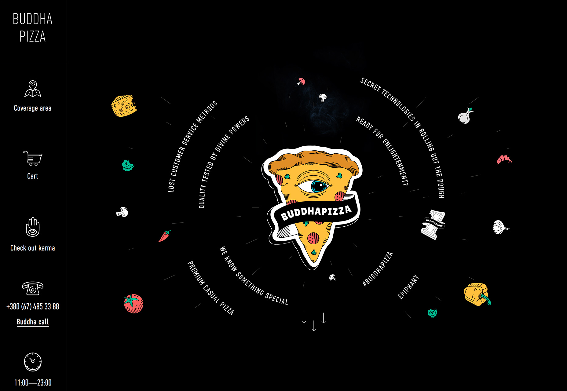
The implied meanings and associations of circles in design can have a lot to do with their usage. Circles imply a sense of completeness and harmony. They are used to represent love, energy and power. (It’s somewhat surprising that more designers don’t use circles regularly.) While the most common uses of circles recently has been in the form of buttons or calls to action thanks to Google’s Material Design, circles are taking on stronger design roles. The thing that can be difficult about circles is the canvas and shape of websites—either distinctly horizontal (desktop screens) or vertical (mobile screens). So the design has to use circles in space so that the shape doesn’t get lost in the responsive format. Each of the examples below do a good job or maintaining the circular flow without losing the shape as the canvas shifts. KymberleeJay uses a big pink circle to bring attention to the main copy on the screen. The eye moves directly from the woman’s face to the strong round shape.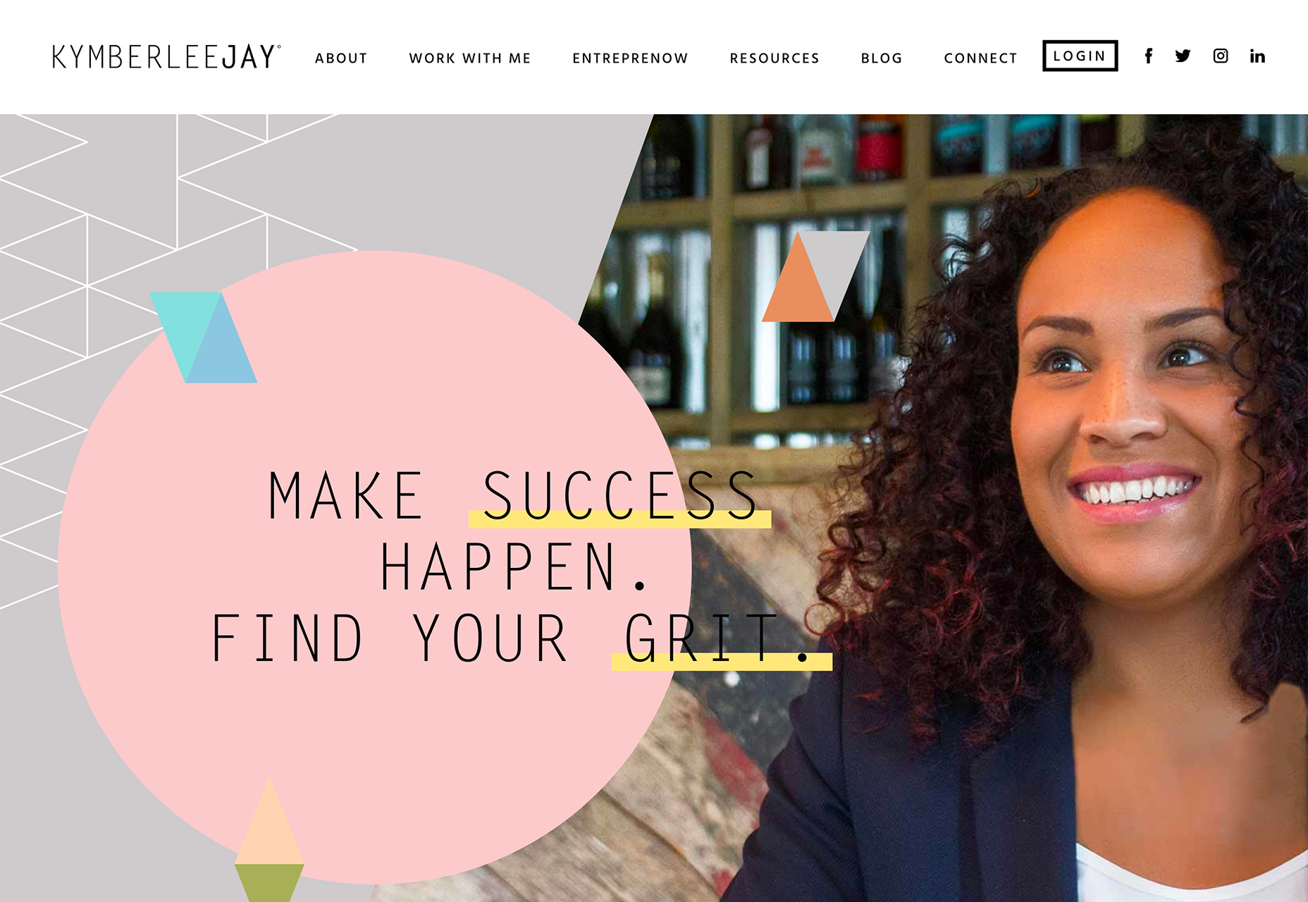 Buddha Pizza implies a circle with text and ingredients surrounding a slice. Part of what makes the circle appear is the idea that a pizza is often round. Even with the triangular image in the middle of the screen, the circle is obvious.
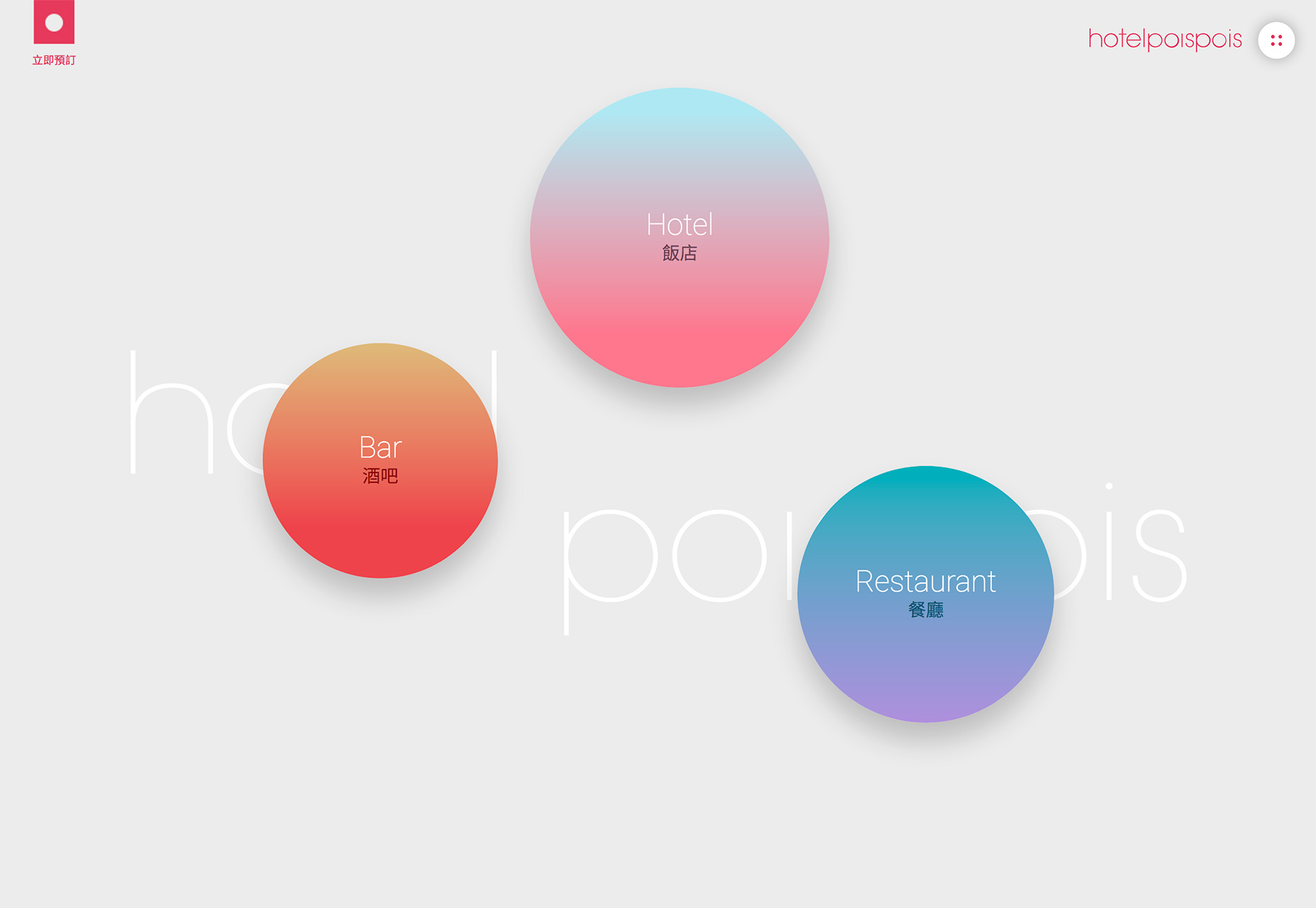
 Hotel Poispois uses floating circles to create visual interest, but they also serve as giant buttons that take users to different parts of the website.
2. Split Screens
Split screen designs are one of those trends that grows in popularity and then disappears, but it always seems to circle back. The latest iteration of the trend includes both super bold split screens and more subtle pairings. The great thing about split screen designs is that they work with the responsive format beautifully. You get double content on desktop and stacked content on mobile screens. Regardless of device, the user doesn’t feel like he or she missed out on anything by changing device type. Split screen design also provides a solution for having dual pieces of content with almost equal importance. You can showcase multiple elements and offer two distinct courses of action (and associated calls to action) on the screen at one time. This concept puts users in control of the design, allowing them to feel like there is a choice in how to interact with the content. Taco Bill’s website is a prime example of this. The design immediately poses a question to users: Do you want to order food to go or do you want a reservation to eat in. The split screen design does more than just make the design easier to use, it actually shows users that they have multiple options visually.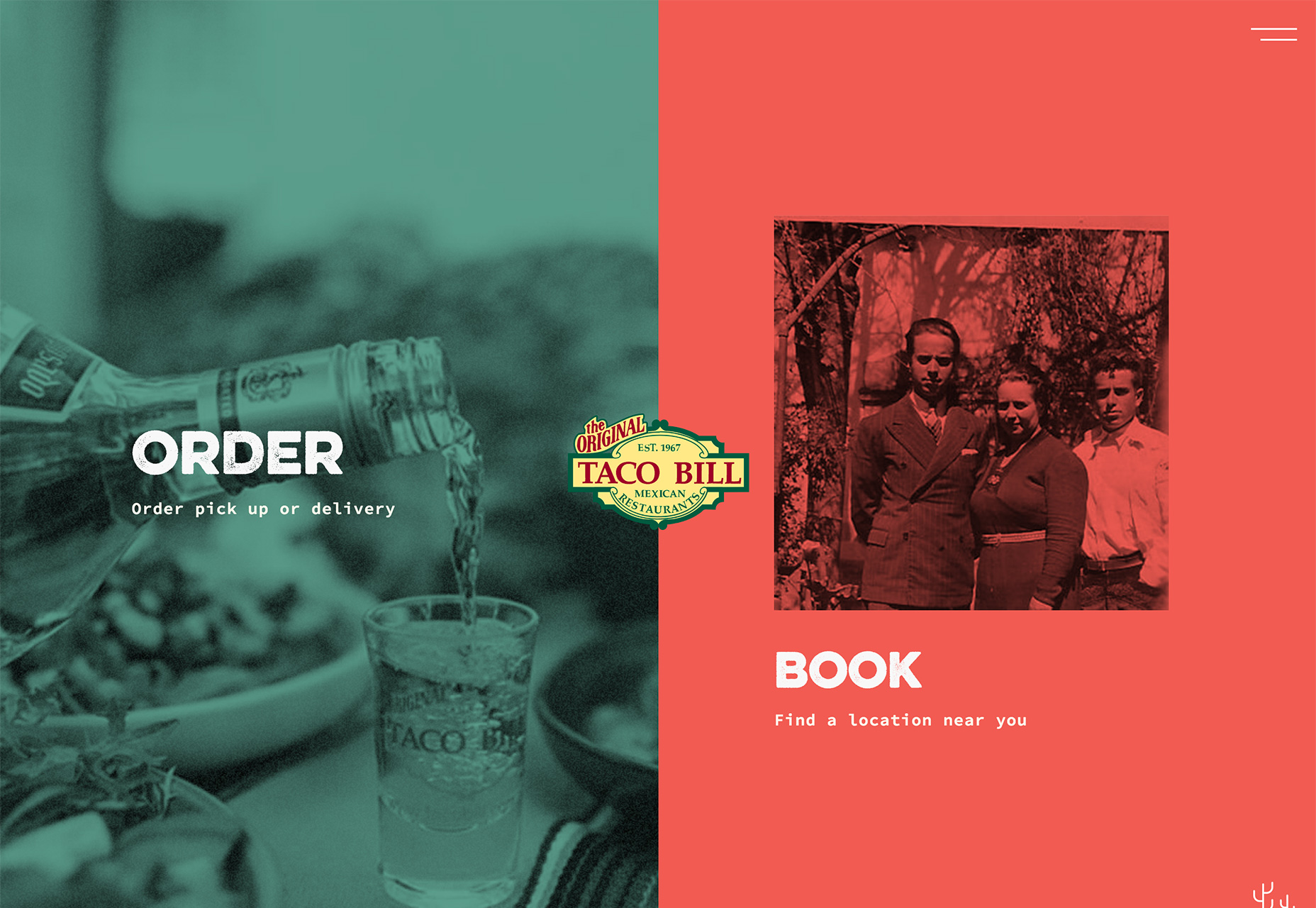 Nikos Pandazaras takes another approach with the photography portfolio website design. The site showcases two vertical photos side by side with the navigation in the middle. It’s a different approach for a portfolio style design but effective in that users get to see more images immediately. The split screen style implies that both images carry equal weight and one is no more important than the other.
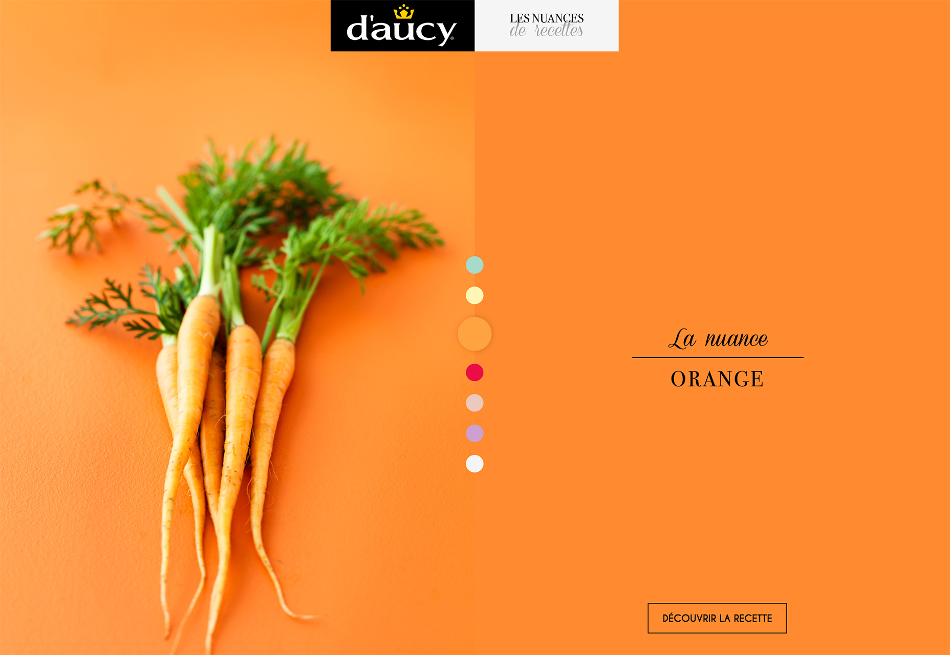
 D’Aucy uses a more subtle split screen aesthetic. One side includes an image on a textured background paired with the same color background without any texture and a headline. The design is a good way to help draw the eye across the screen so that all the content is viewed.
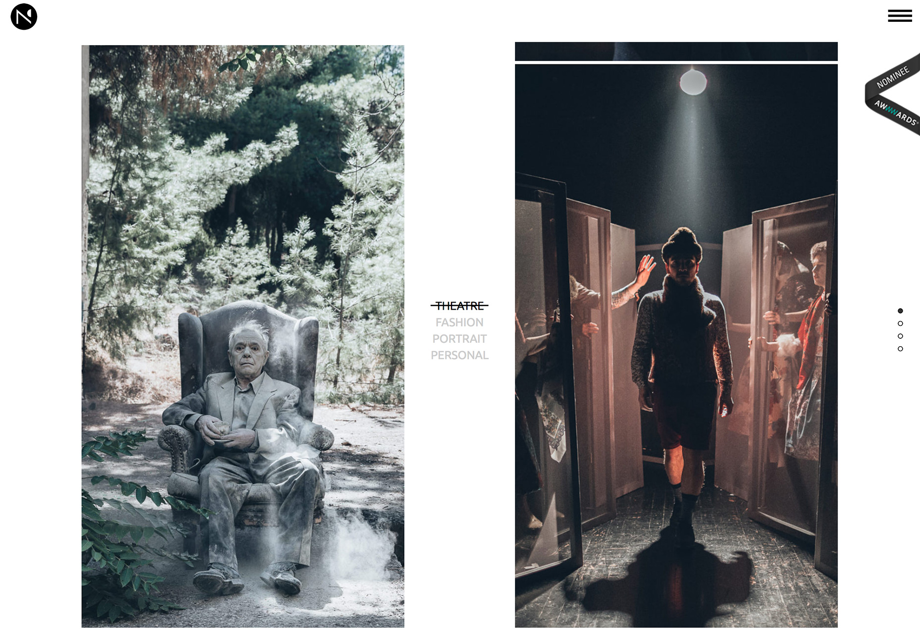
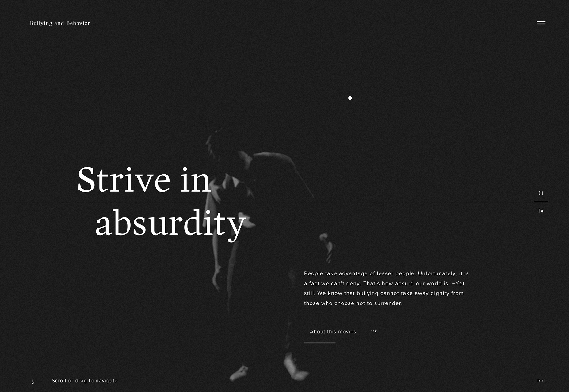
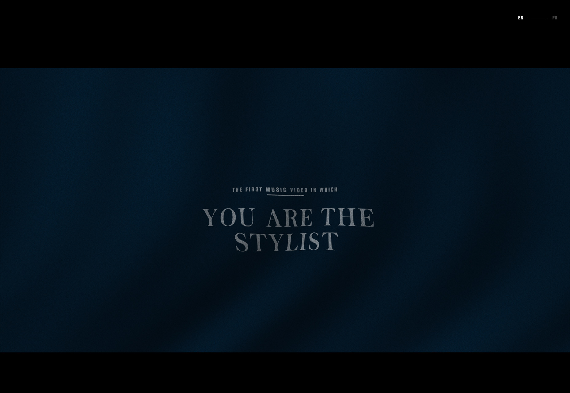
3. Dark Backgrounds, White Text
Dark backgrounds and white text are a classic combination. But this trend is emerging with a twist—there’s video or animation in the dark background. Whether the movement is subtle, such as Top Estates, or fast and furious, such as Bullying and Behavior, the action in the background is what helps draw users even. The lack of color adds an element of mystery and makes the scene a little more enticing. White type adds to the starkness of the design. While it is easy to read—that’s a good thing—the text isn’t overwhelming the design. These projects are a bit more stark by nature. The driving visual element is movement in the dark space of the background. All of the designs below feature looping animations that help create a feel for the projects. The darker the background with these designs, the more mystery they create. Darker backgrounds also increase readability because of the amount of contrast with white text. The speed of animations can create a sense of calm or frenzy. It’s pretty spectacular how much information can come from what at first glance looks like such simple designs.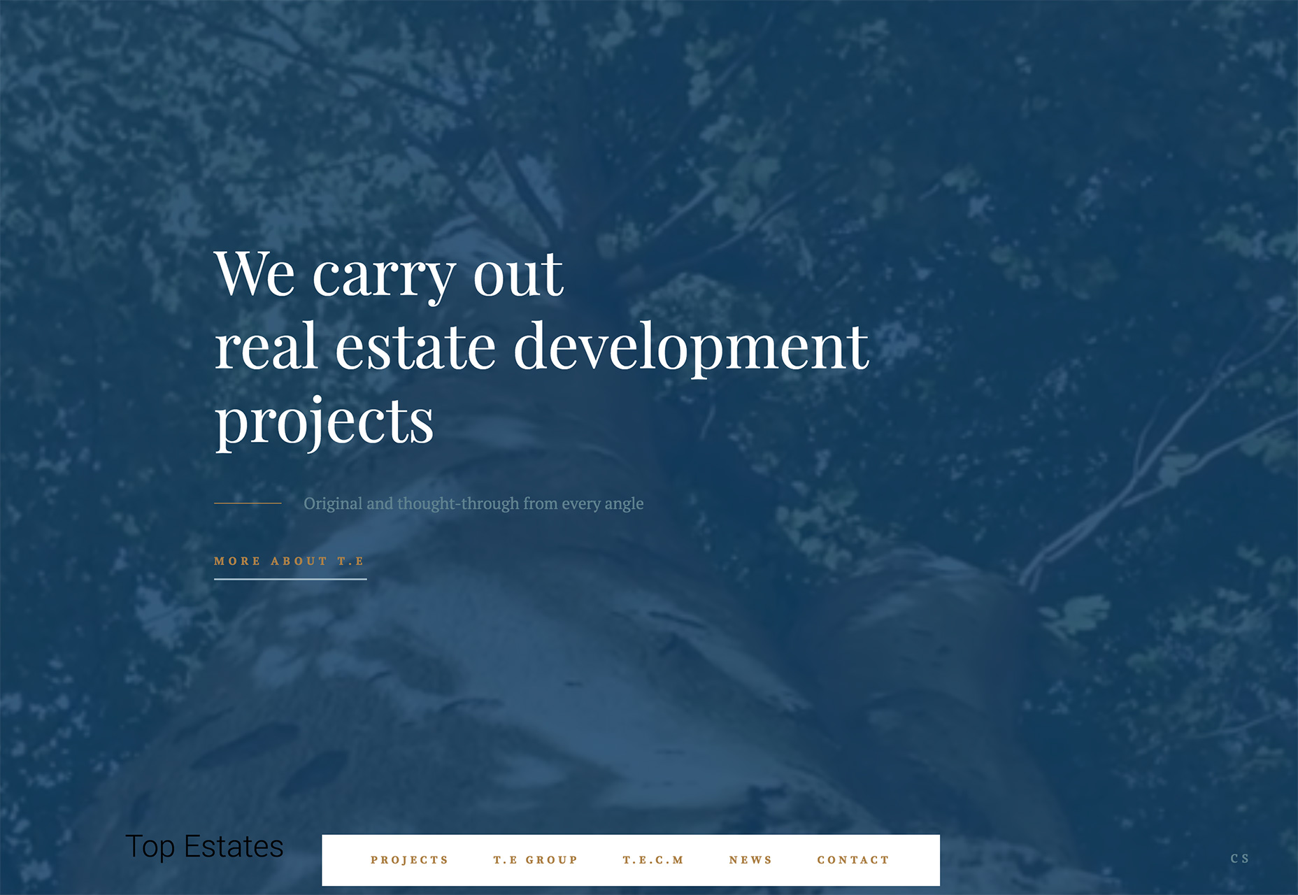
Conclusion
The nice thing about this collection of trends is that they are all things you can implement in almost any design project. Use of circles, split screens and dark backgrounds aren’t limited to a certain style of design. You can use these ideas to freshen us a site that’s feeling a little stale or incorporate them into a new project. As with any trend, think about the content and context before you get started. Does the visual plan help you achieve your overall goal with the design?Carrie Cousins
Carrie Cousins is a freelance writer with more than 10 years of experience in the communications industry, including writing for print and online publications, and design and editing. You can connect with Carrie on Twitter @carriecousins.


Read Next

15 Best New Fonts, July 2024
Welcome to our monthly roundup of the best fonts we’ve found online in the last four weeks. This month, there are fewer…
By Ben Moss

20 Best New Websites, July 2024
Welcome to July’s round up of websites to inspire you. This month’s collection ranges from the most stripped-back…

Top 7 WordPress Plugins for 2024: Enhance Your Site's Performance
WordPress is a hands-down favorite of website designers and developers. Renowned for its flexibility and ease of use,…
By WDD Staff

Exciting New Tools for Designers, July 2024
Welcome to this July’s collection of tools, gathered from around the web over the past month. We hope you’ll find…

3 Essential Design Trends, July 2024
Add some summer sizzle to your design projects with trendy website elements. Learn what's trending and how to use these…

15 Best New Fonts, June 2024
Welcome to our roundup of the best new fonts we’ve found online in the last month. This month, there are notably fewer…
By Ben Moss

20 Best New Websites, June 2024
Arranging content in an easily accessible way is the backbone of any user-friendly website. A good website will present…

Exciting New Tools for Designers, June 2024
In this month’s roundup of the best tools for web designers and developers, we’ll explore a range of new and noteworthy…

3 Essential Design Trends, June 2024
Summer is off to a fun start with some highly dramatic website design trends showing up in projects. Let's dive in!

15 Best New Fonts, May 2024
In this month’s edition, there are lots of historically-inspired typefaces, more of the growing trend for French…
By Ben Moss

How to Reduce The Carbon Footprint of Your Website
On average, a web page produces 4.61 grams of CO2 for every page view; for whole sites, that amounts to hundreds of KG…
By Simon Sterne

20 Best New Websites, May 2024
Welcome to May’s compilation of the best sites on the web. This month we’re focused on color for younger humans,…