

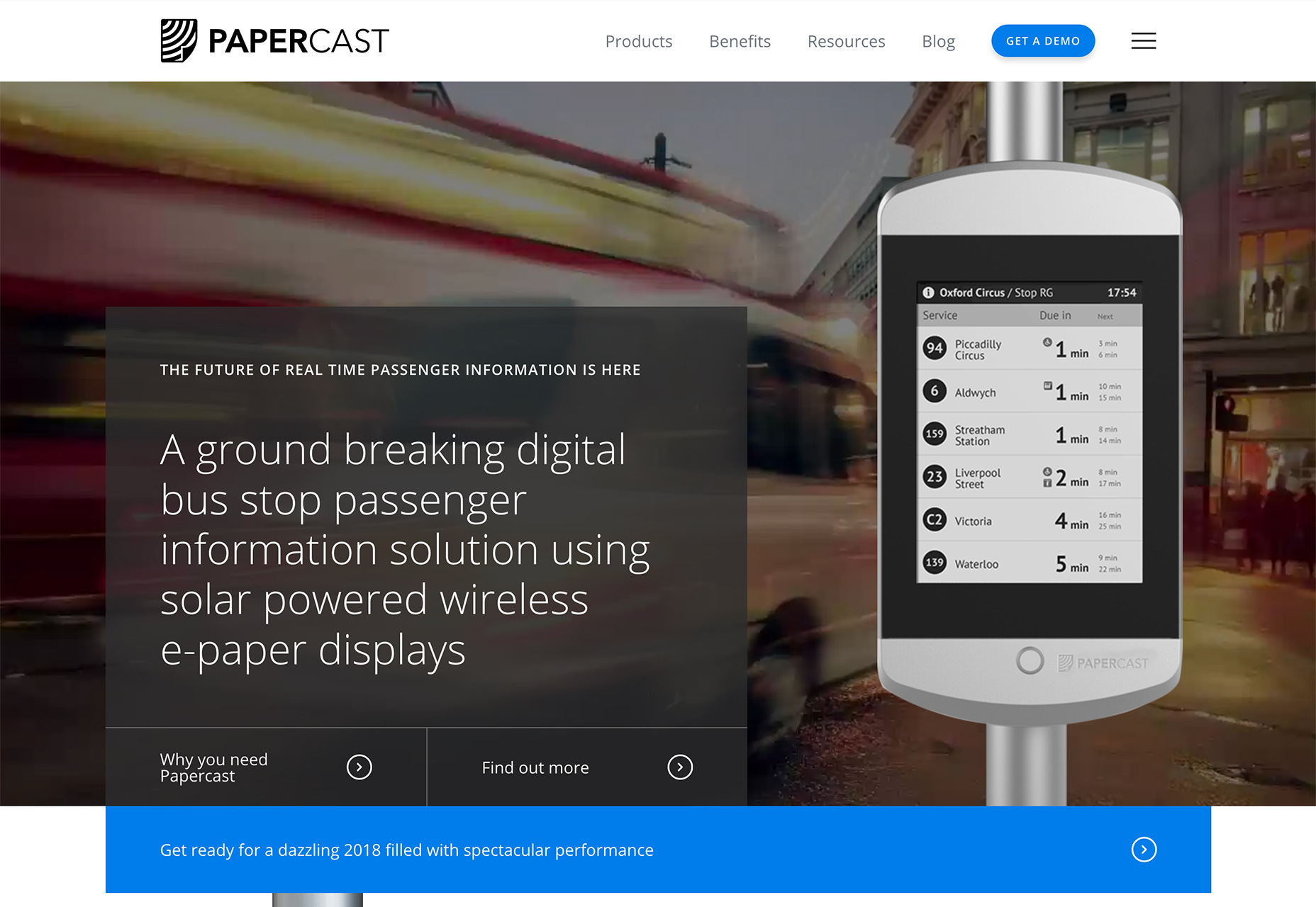
1. Simple Corner Branding
Maybe it seems way too simple, but a text branding mark in the top left corner of websites has made a comeback. While some of these simple corner branding styles include a text-based mark or text and an icon, the trend is defined by streamlined elements that fall into the background. These marks generally use simple sans serif typefaces and are white on a colored background or include a simple color element when used on light backgrounds. Black branding on a white background is equally popular. There’s an overall lack of embellishment or desire to make the logotype a focal point. This trend seems to be popular with brands that don’t have well-established names yet—think startups or small businesses—or with website designs that are fairly elaborate. For the more involved designs, such as Papercast, the messaging and description of what the website is about is actually more important than the logo or branding itself, making this branding choice a good one. This style of simplified branding takes a cue from mobile responsive website practices. Many responsive designs pare down logo treatments (as well as navigation) for smaller screens. This concept has lead more brands to create a second, simple logo for such uses, and now those logos are making their way into all screen sizes. While simple corner branding can be sleek and help users focus on other parts of the design, it doesn’t go a long way to help a small business or brand establish visual recognition of the mark, logotype or symbol. Consider this when debating whether to use this website design trend or not.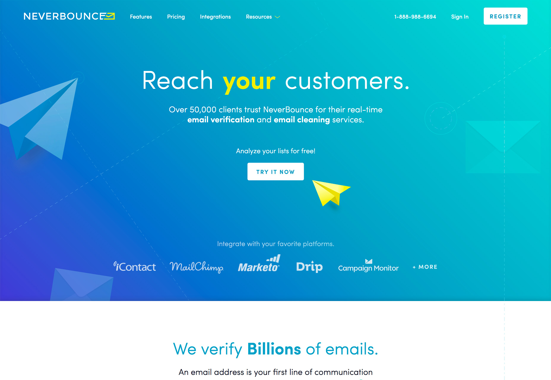
2. Skinny Vertical Homepage Sidebars
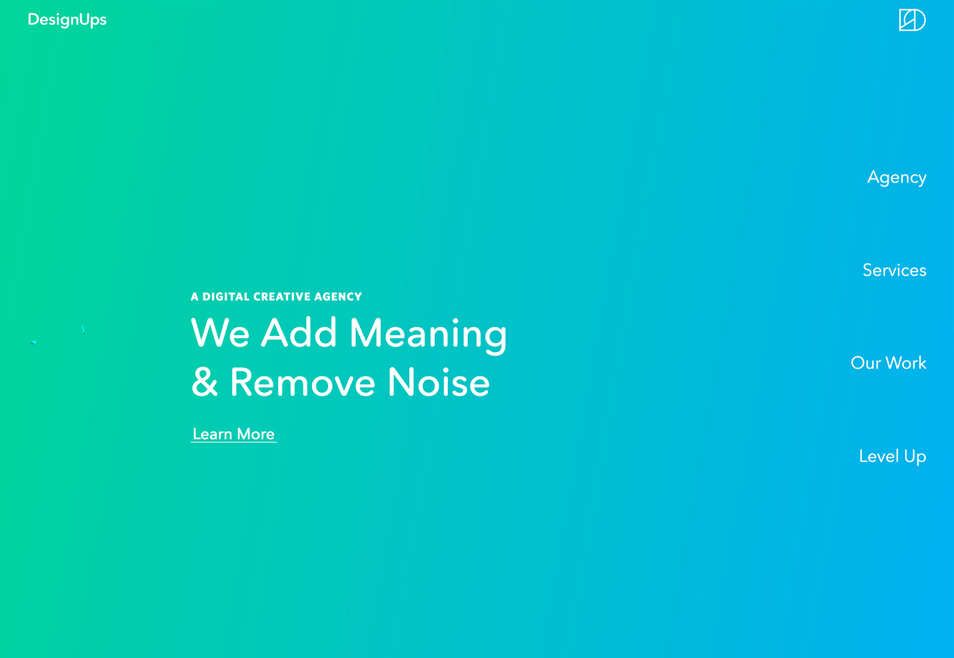
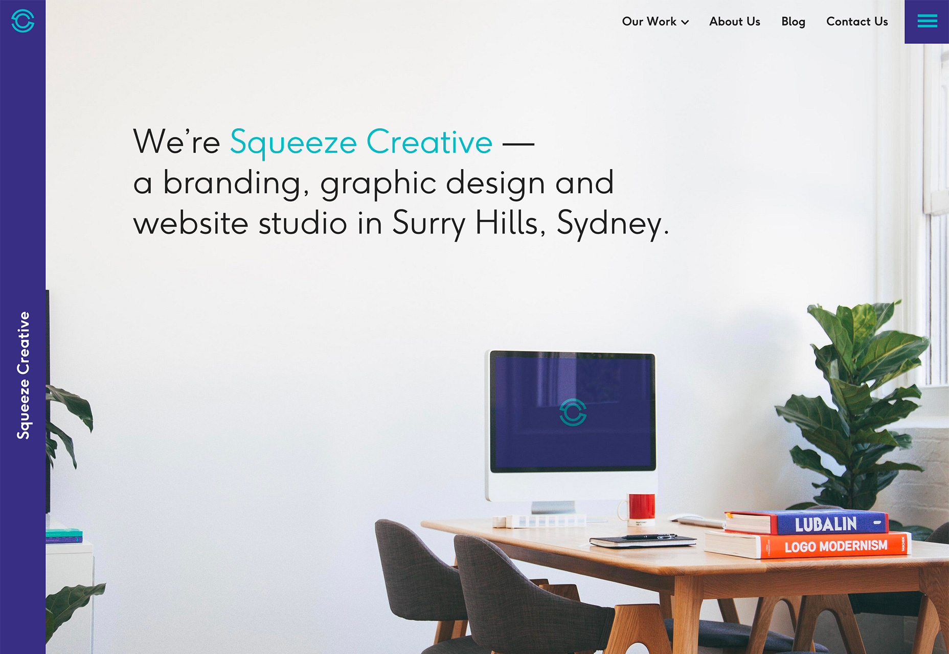
While sidebars have never really fallen out of trend on interior pages or blogs, they haven’t been a mainstay on homepages. That is beginning to change. From a place to store social media icons (such as Bubblewits) to a place for navigation or branding, super skinny vertical homepage sidebars are becoming a big deal. Part of the credit goes to mobile device usage—it’s a vertical format—and the idea that more users are OK with scrolling and screen widths that aren’t quite to wide. There’s a great deal of eye fatigue that happens for users that switch between narrow and wide reading widths (phone and desktop screens). To combat this, more designers are incorporating more vertical elements into the desktop, wide-screen versions of designs. In essence, more vertical elements decrease the overall width of larger screens, making the experience feel a little more like the mobile versions. What’s great about these vertical elements is they can work in so many different ways, including for navigation and as a branding/home button. DesignUps, uses an undefined vertical sidebar for navigation elements on the right side of the homepage. The sidebar visually blends into the background without boxing, but “shrinks” the overall width of the main messaging area. Squeeze Creative goes with a super-thin, left sidebar that includes the company’s branding. As an added bonus, the entire sidebar is a clickable “home” button that helps users find their way if they get lost in the design.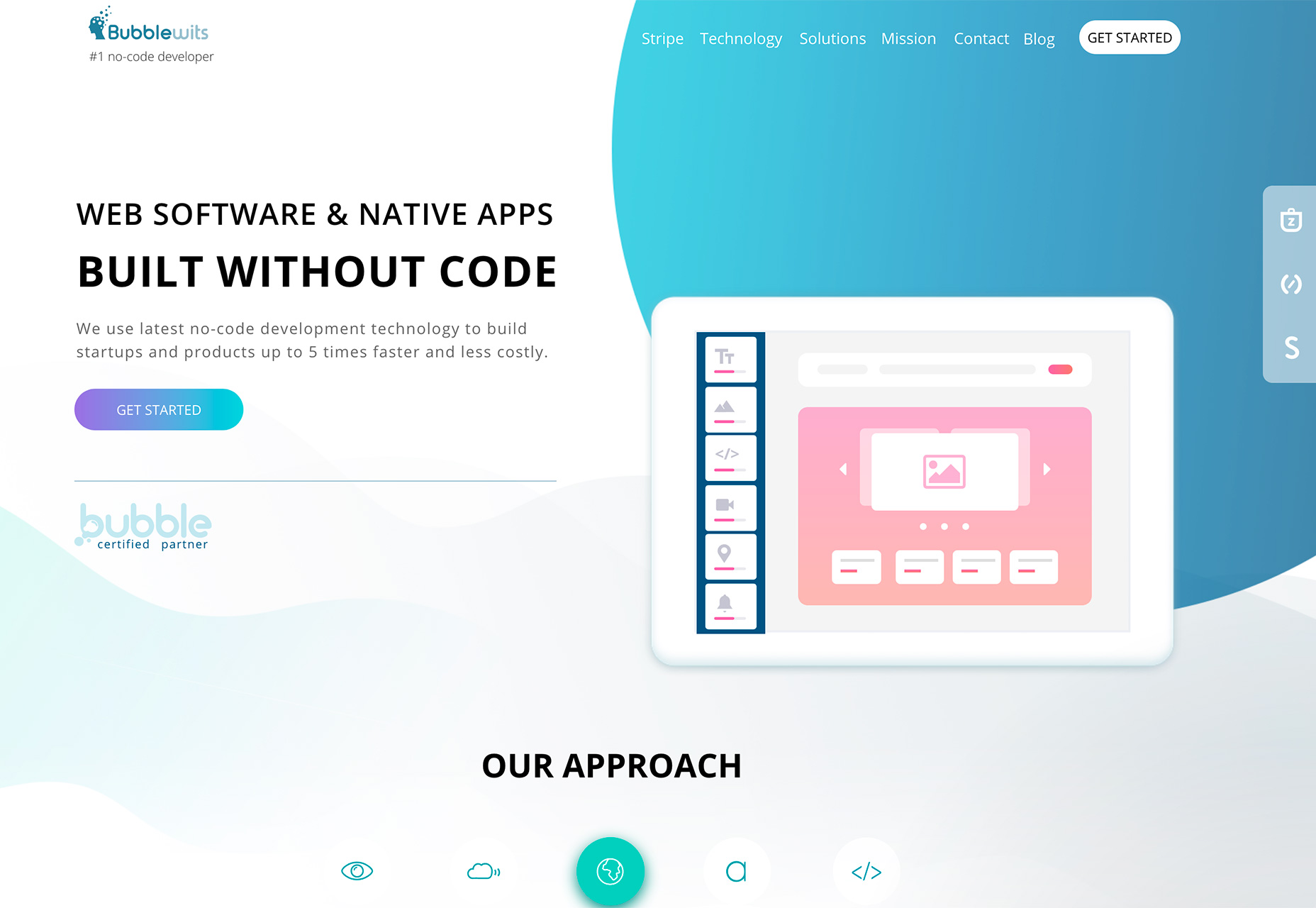
3. Peachy Color
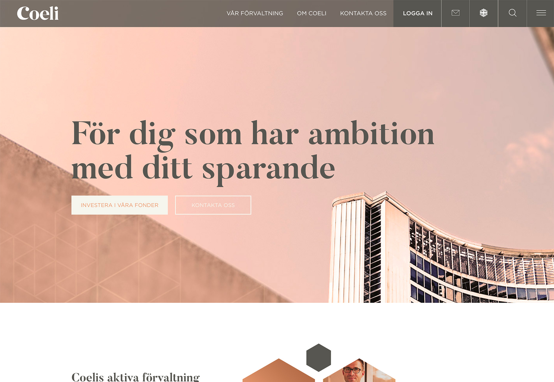
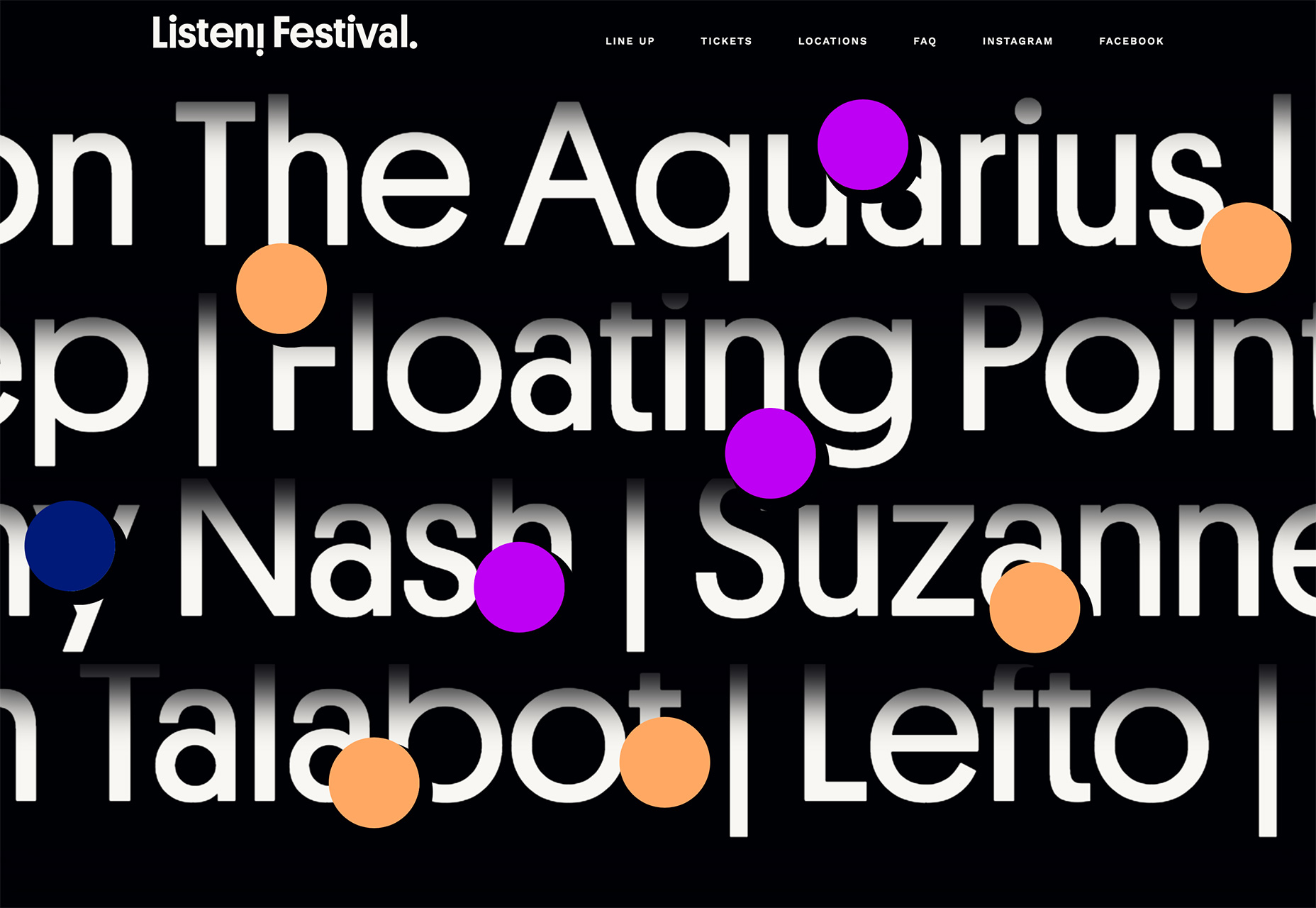
Ultra Violet may be Pantone’s Color of the Year for 2018, but recent website designs are bursting with peach color palettes and accents. (Thankfully, the paler, orange-ish option goes great with Ultra Violet if you want to use both trendy hues in projects.) Peach variations include everything from colors with a more orange look to pinkish undertones to flesh-coloring. The color is warm and inviting, although some find it a bit too feminine or pastel for general use. Meanings and emotions associated with the color include creativity, vibrancy, socialization, hunger, happiness or confidence and pride. The most well-known peach hue is that of the Crayola crayon by the same name. You can start your own peachy palette with HEX value #FFCBA4 or RGB 255, 203, 164. The trend uses peach for both the main color palette, such as Folk Strategies and Coli, and as an accent color in the manner of the website for the Listen Festival. This color trend seems to be derived from the dominant color trend of the last year, which includes colors from the material palette—take a look in the deep orange variations for inspiration. While peach is not as bold or bright as some of the blues, greens and pinks that have been popular, it still evokes the same playful idea, while allowing for more flexibility in creating color contrast between elements.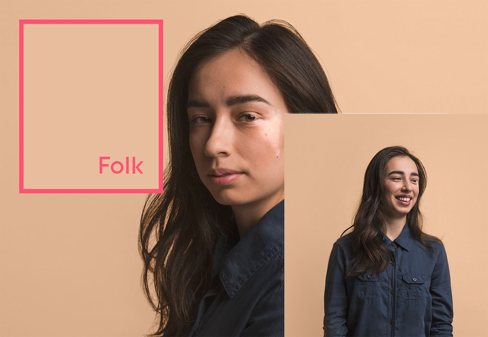
Conclusion
One of the best things about the start of the year is the idea that it is a time for new beginnings. Use this to clear your design repertoire of trends and techniques that may be starting to feel a little passé, and incorporate a new trend into the mix. Each of the trends above is rather easy to use, and the peach color palette option might be the most doable, and flexible, for the largest number of design projects. As with any trend, use it sparingly and with intention to make the most out of your new year projects.Carrie Cousins
Carrie Cousins is a freelance writer with more than 10 years of experience in the communications industry, including writing for print and online publications, and design and editing. You can connect with Carrie on Twitter @carriecousins.


Read Next

15 Best New Fonts, July 2024
Welcome to our monthly roundup of the best fonts we’ve found online in the last four weeks. This month, there are fewer…
By Ben Moss

20 Best New Websites, July 2024
Welcome to July’s round up of websites to inspire you. This month’s collection ranges from the most stripped-back…

Top 7 WordPress Plugins for 2024: Enhance Your Site's Performance
WordPress is a hands-down favorite of website designers and developers. Renowned for its flexibility and ease of use,…
By WDD Staff

Exciting New Tools for Designers, July 2024
Welcome to this July’s collection of tools, gathered from around the web over the past month. We hope you’ll find…

3 Essential Design Trends, July 2024
Add some summer sizzle to your design projects with trendy website elements. Learn what's trending and how to use these…

15 Best New Fonts, June 2024
Welcome to our roundup of the best new fonts we’ve found online in the last month. This month, there are notably fewer…
By Ben Moss

20 Best New Websites, June 2024
Arranging content in an easily accessible way is the backbone of any user-friendly website. A good website will present…

Exciting New Tools for Designers, June 2024
In this month’s roundup of the best tools for web designers and developers, we’ll explore a range of new and noteworthy…

3 Essential Design Trends, June 2024
Summer is off to a fun start with some highly dramatic website design trends showing up in projects. Let's dive in!

15 Best New Fonts, May 2024
In this month’s edition, there are lots of historically-inspired typefaces, more of the growing trend for French…
By Ben Moss

How to Reduce The Carbon Footprint of Your Website
On average, a web page produces 4.61 grams of CO2 for every page view; for whole sites, that amounts to hundreds of KG…
By Simon Sterne

20 Best New Websites, May 2024
Welcome to May’s compilation of the best sites on the web. This month we’re focused on color for younger humans,…