5 Website Metrics You Can't Ignore (and How to Design for Them)


Analytics are all the rage. But all those numbers can get overwhelming fast.
Here are five website metrics that you can't ignore—traffic sources, keywords, visitors, top 10 pages, exit pages—and design tweaks you can make so that you'll see improvement in those areas. (You can find all of these metrics and more in Google Analytics. If you aren’t tracking analytics on your website, you need to start right now.)
1. Traffic Sources
Do you know where website visitors come from? That’s what the traffic sources metric tells you.
Traffic is grouped into three buckets:
Referral: Visitors that get to your website from a link on another website
Search: Visitors that get to your website from entering keywords in a search engine and clicking those results; search traffic is further divided into organic search and paid search (if you run search engine ads and users click those rather than unpaid search listings)
Direct: Visitors that get to your website by typing in a URL
Most websites benefit from having traffic that comes from all three sources, but many websites only have organic search traffic and don’t necessarily have a budget for paid search.
Design For It
Knowing where users come from can help you create a design that will engage them more. Breaking down traffic sources might also help you understand how to design for segments that you aren’t reaching.
Design for referral traffic by creating content that other sources want to link to. This might include blog posts, UI kit or graphic element kits, or infographics that other sites can embed and link back to.
Design for search traffic by using search engine optimization best practices, such as proper keywording in content and alt and meta attributes. Designing for search might not be the sexiest part of your job, but it can be one of the most valuable.
Design for referral traffic by using URLs that are easy to remember. This website is a great example of how to use a URL: The site name, Webdesigner Depot, and URL, webdesignerdepot.com, match. It’s easy to think about any type in. URLs that are a single string of words are easiest to remember. When users have to question whether there are dots or dashes or underscores between words, they get confused.
Here’s another design trick: Incorporate search prominently in the design. Repeat users will know they can get to whatever they need from your homepage with ease. That can help increase direct traffic and time on site in one step!
2. Keywords
What is your website about? Keywords are the answer to that question.
There can be confusion between what you think a website is about, and what users think. Keyword metrics, as well as internal search, will tell you what keywords users associate with your website and content. It can give you an idea of what users are looking for when they found your website. In an ideal world, you and users have the same idea as to what the design is about.
Do the keywords match? Are you getting valuable traffic from users who really are looking for the type of information on your website?
Design For It
Most designers think the solution is to stuff the design full of keywords. While you should use keywords, stuffing the design is not the answer.
You really just need to create a solid visual plan that relates to a topic. Use quality images (and use slugs and tags to describe what’s in the image) and copy to draw users. Then focus on things that you probably already know you should be doing:
- Use a responsive design; avoid multiple websites for the same content
- Write the text in the way people speak and read, and make sure it doesn’t contain spelling or grammar errors
- Make everything on your website easy to share to help build social credibility
- Link to sources that have content – and keywords – similar to yours
- Promote content and information or products users want; don’t get stuck trying to use the same keywords over and over again because you will start to sound like a robot
3. Visitors
There are two types of website visitors: Those who are coming to your website for the first time, and those that are coming back for a repeat visit.
A mix of both types of visitors is important. If all you ever have are new visitors, then the website was not engaging enough to bring them back again. If all you ever have are returning users, you aren’t growing a potential user/customer/fan base.
Design For It
To give both types of visitors what they need, the website design has to do a couple of things.
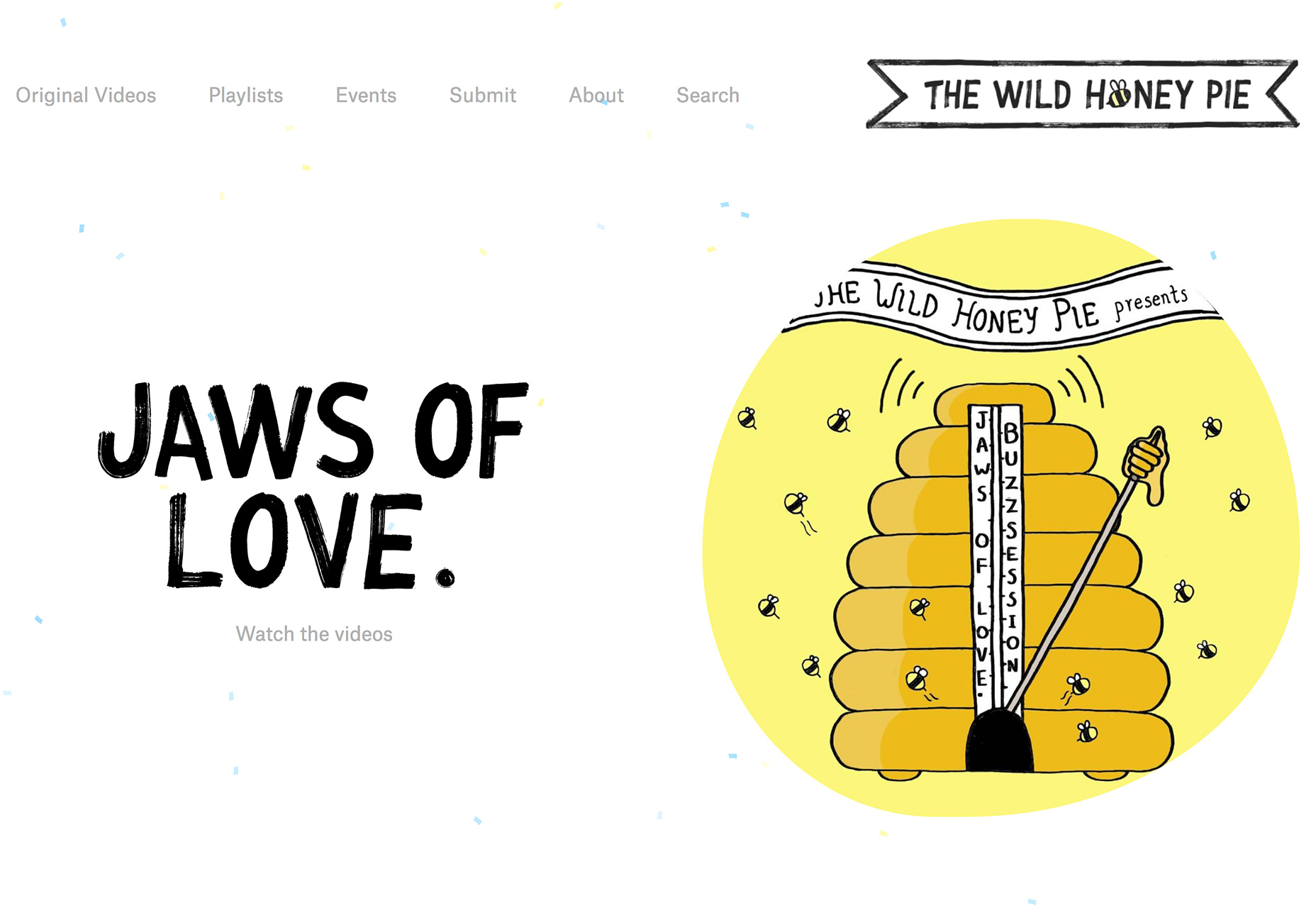
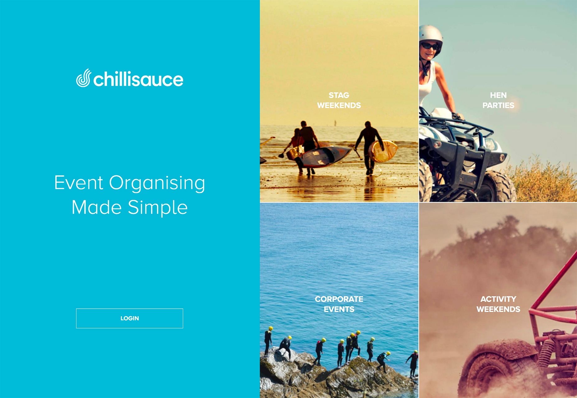
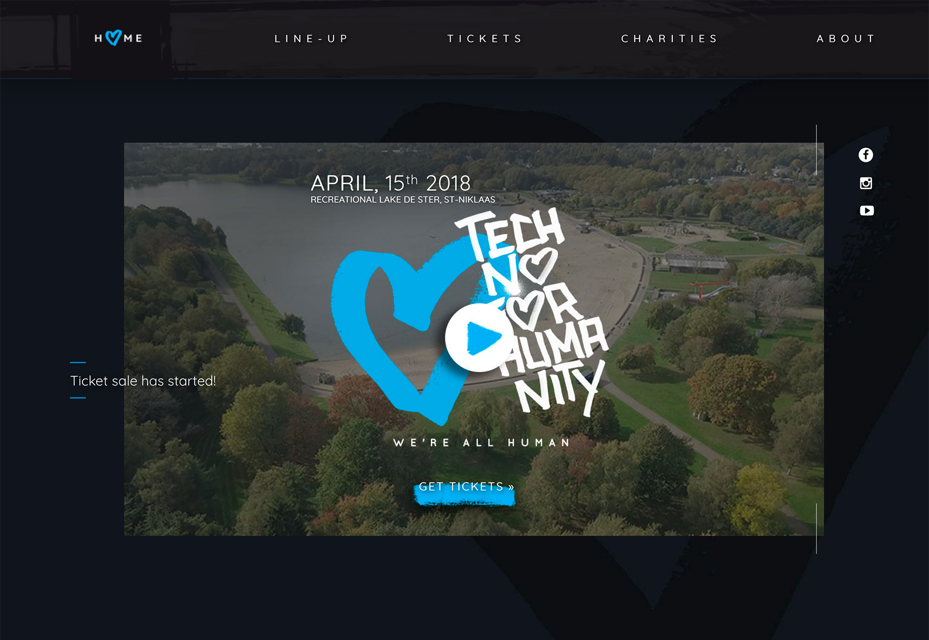
It has to have a strong visual that draws visitors in from the start, but it also needs to be dynamic so that repeat visitors will still be engaged. Interesting photos or video can be a great place to start.
It should immediately give visitors an idea what the website is about and how to find what they are looking for. Use a large headline, branding mark or logo and navigation elements to establish a sense of purpose.
There should be something for users to do so you can create a lasting connection—click a link, watch a video, play a game, register for an event or promotion. The call to action should be obvious. Don’t be afraid to tell visitors what to do and how to best interact with the design, particularly if it is a little complicated or unconventional.
4. Top 10 Pages
One of the most interesting website metrics can be a list of what pages visitors are most engaged with. Websites with robust blogs can use this information to help track what types of posts to create in the future based on popular topics, ecommerce sites can see if page traffic and interest translates to sales (and what products are most popular online) and top page rankings can help you determine traffic flow and if users are finding what they are looking for.
Many website owners are often surprised by which pages are the most popular. Top 10 pages often include About or Contact pages (users want to know who you are or get help with something), blog or news posts (maybe you’ve been lucky enough to have something go viral), data and information about your field or business and the homepage.
The pages that users are clicking may also help you determine if your goals are in-line with the goals of users. Are they viewing content that’s important to you?
Design For It
Include links and calls to action to the most-visited pages from the homepage and other pages. This is in-demand content; you should make it as easy as possible for more users to find it.
Get users to your top 10 pages even easier by including links as part of a slider or hero image. Create a visual presence for these links.
Include popular pages in the main navigation or share them on social media. Link from top pages to other top pages to encourage users to keep clicking. A sidebar element of the “Most Clicked Pages” or “Top Stories” can be an easy way to facilitate this.
5. Exit Pages
Just as important as how a user gets to your website is how they leave it.
Exit pages (rates) show the percentage of visitors that left your website from a particular page. It’s different than a bounce rate in that it tracks visitors who clicked around to multiple pages (bounce rates are a single page metric).
If a certain page has a high exit rate, it could be an indication of a problem with the user interface, such as an error or broken path. On the other hand, some pages should always have high exit rates, such as the checkout/order processed page on an ecommerce site that shows an order is completed.
If exit page rates aren’t in line with expectations, a redesign of the page is probably in order.
Design For It
The key design element on pages with high exit rates (when they shouldn’t be) is to give users something else to do. Link to interesting or related content on another page. And make sure that there aren’t broken CTAs in the design (that’s often the case with unexplained high exit rates).
If pages that should have low exit rates are high, why is that? Let’s go back to the design of the ecommerce completion page, do you have a loop link included by design that keeps users on your site, or are they failing to get to the final step in the process (look for UI errors).
Remember, exits are not good or bad. Every user will leave at some point. The key thing to think about with exit pages and the design, is unexpected exits. As long as users are leaving in the natural places, the design is in working order. If the exits are less natural—such as leaving in the middle of a process—there’s probably a lurking error or design issue.
Carrie Cousins


Read Next

3 Essential Design Trends, May 2024

How to Write World-Beating Web Content

20 Best New Websites, April 2024

Exciting New Tools for Designers, April 2024

How Web Designers Can Stay Relevant in the Age of AI

14 Top UX Tools for Designers in 2024

What Negative Effects Does a Bad Website Design Have On My Business?

10+ Best Resources & Tools for Web Designers (2024 update)

3 Essential Design Trends, April 2024

How to Plan Your First Successful Website

15 Best New Fonts, March 2024
