How Dark UX Patterns Target The Most Vulnerable

Dark UX patterns help companies maximize profits, but at the expense of the most vulnerable, and by damaging the web for everyone.

 For the most vulnerable, such as elderly, those less proficient with the language used, or users with a disability, these types of practices can provide a great deal of confusion and distress.
Even as a designer who is aware of these tricks, it’s still incredibly easy to fall victim to them. Not to mention, they are an annoyance and create a distrust between company and consumer.
[pullquote]As long as practices like this are legal and continue to convert at such high rates, companies will continue to employ them[/pullquote]
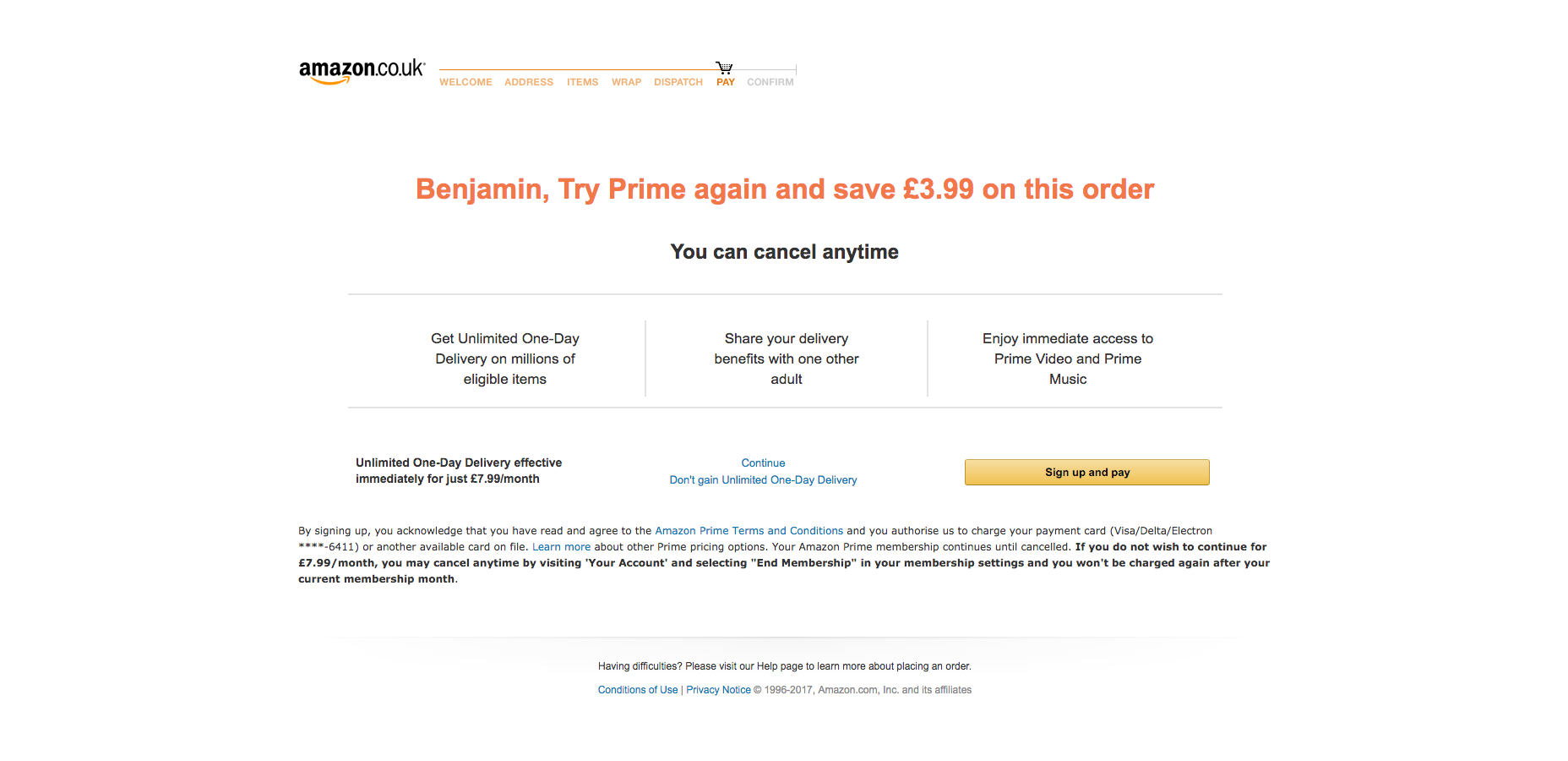
In a perfect world, Amazon would outline the benefits in a simple to read format with the primary call-to-action allowing the user to skip and continue. In reality, they hide the details in small print: print too small to read for just over 5% of the world’s population. They present the information in an oddly structured format with a confusing variety of bold text weights, different colors, and so much text it deters the user from reading through it all. As long as practices like this are legal and continue to convert at such high rates, companies will continue to employ them.
While Amazon targets the pockets of vulnerable consumers, Facebook is more interested in the user sharing as much information about themselves as possible—even if they are not intending to do so. While Facebook have made progress on privacy issues compared to earlier versions, they continue to use subtle but persuasive and confusing design techniques, and copy like below.
For the most vulnerable, such as elderly, those less proficient with the language used, or users with a disability, these types of practices can provide a great deal of confusion and distress.
Even as a designer who is aware of these tricks, it’s still incredibly easy to fall victim to them. Not to mention, they are an annoyance and create a distrust between company and consumer.
[pullquote]As long as practices like this are legal and continue to convert at such high rates, companies will continue to employ them[/pullquote]
In a perfect world, Amazon would outline the benefits in a simple to read format with the primary call-to-action allowing the user to skip and continue. In reality, they hide the details in small print: print too small to read for just over 5% of the world’s population. They present the information in an oddly structured format with a confusing variety of bold text weights, different colors, and so much text it deters the user from reading through it all. As long as practices like this are legal and continue to convert at such high rates, companies will continue to employ them.
While Amazon targets the pockets of vulnerable consumers, Facebook is more interested in the user sharing as much information about themselves as possible—even if they are not intending to do so. While Facebook have made progress on privacy issues compared to earlier versions, they continue to use subtle but persuasive and confusing design techniques, and copy like below.
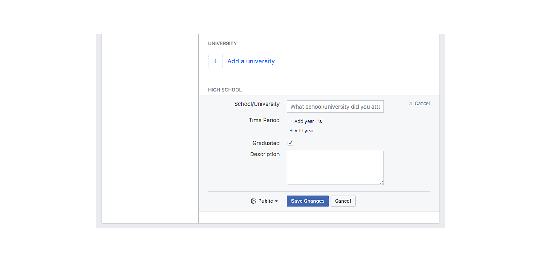 Despite going through every privacy setting and selecting ‘Only Me’, sections which contain very personal and detailed information are still defaulted to be shared publicly. Not only is this an issue with privacy, but also with security. The ease at which hackers can subsequently obtain information to answer the likes of security questions is astonishing. The dropdown is subtle and demands nowhere near as much attention as the primary call-to-action. Similar modals also use microcopy to trick users. Consider this example:
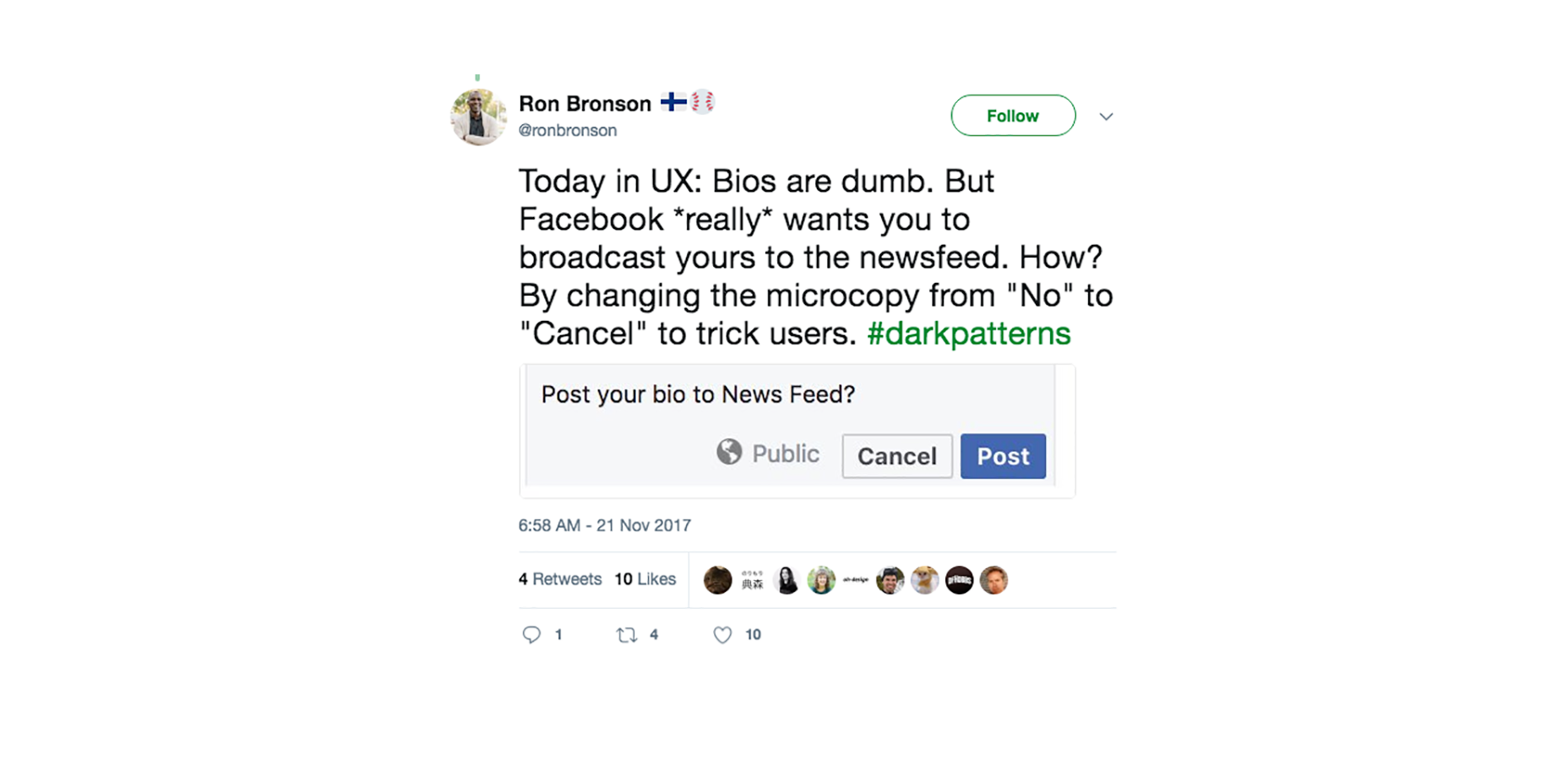 At first glance, nothing seems too untoward. At a closer look, it becomes clear that Facebook is pushing users into sharing their bio to the News Feed. It’s doing this by implying that by clicking ‘Cancel’, you are cancelling changes made to your bio. In reality, ‘Cancel’ means ‘No’. Again, it’s the type of practice that can trick even the most privacy-conscious. For the rest of users, it’s an example of just how far Facebook will push the limits if it means users will share more, interact more, and ultimately have a positive impact on their advertising revenue figures.
In the product and web design industries, aesthetics, sales techniques, and profits are all often placed above accessibility and the well-being of users. Shopify, LinkedIn, Instagram, CloudFlare, and GoDaddy are just a few names who go to such measures to impact their bottom line.
[pullquote]aesthetics, sales techniques, and profits are all often placed above accessibility and the well-being of users.[/pullquote]
It might just be making an email unsubscribe link smaller to blend in. Or making it impossible to close your account. Or something even more subtle like making you submit your name, email and full address before giving a shipping cost estimation. But it’s these dark patterns that impact the usability and accessibility of the web in really quite severe ways.
For most of us, it’s simply an annoyance. For the people who are most vulnerable, it can make things near impossible to use or understand. They may not be able to find that hidden unsubscribe link. They may not notice that something has been added to their basket during checkout. And they may become entirely disillusioned and confused with privacy settings, disguised ads and friend spam.
[pullquote]it’s the responsibility of everyone within product and marketing teams to ensure [dark patterns are] safeguarded against[/pullquote]
The web has become a place where you have to be extremely conscious and learned of areas like security, privacy, and trickery—even by the biggest reputable companies in the world. For everyone, this quite simply isn’t possible. And these patterns don’t even begin to touch upon larger issues with accessibility such as readability and color practices.
Designers and teams need to be aware of their responsibility not just to clients, employers, and shareholders, but to everyday users too. Accessibility issues and dark patterns hit the vulnerable the hardest, and it’s the responsibility of everyone within product and marketing teams to ensure this is safeguarded against.
Until better laws and regulations are introduced to protect against this, it’s the duty of teams to design responsibly and garner a balance between profit maximizing and providing the optimum usability and accessibility for all users.
At first glance, nothing seems too untoward. At a closer look, it becomes clear that Facebook is pushing users into sharing their bio to the News Feed. It’s doing this by implying that by clicking ‘Cancel’, you are cancelling changes made to your bio. In reality, ‘Cancel’ means ‘No’. Again, it’s the type of practice that can trick even the most privacy-conscious. For the rest of users, it’s an example of just how far Facebook will push the limits if it means users will share more, interact more, and ultimately have a positive impact on their advertising revenue figures.
In the product and web design industries, aesthetics, sales techniques, and profits are all often placed above accessibility and the well-being of users. Shopify, LinkedIn, Instagram, CloudFlare, and GoDaddy are just a few names who go to such measures to impact their bottom line.
[pullquote]aesthetics, sales techniques, and profits are all often placed above accessibility and the well-being of users.[/pullquote]
It might just be making an email unsubscribe link smaller to blend in. Or making it impossible to close your account. Or something even more subtle like making you submit your name, email and full address before giving a shipping cost estimation. But it’s these dark patterns that impact the usability and accessibility of the web in really quite severe ways.
For most of us, it’s simply an annoyance. For the people who are most vulnerable, it can make things near impossible to use or understand. They may not be able to find that hidden unsubscribe link. They may not notice that something has been added to their basket during checkout. And they may become entirely disillusioned and confused with privacy settings, disguised ads and friend spam.
[pullquote]it’s the responsibility of everyone within product and marketing teams to ensure [dark patterns are] safeguarded against[/pullquote]
The web has become a place where you have to be extremely conscious and learned of areas like security, privacy, and trickery—even by the biggest reputable companies in the world. For everyone, this quite simply isn’t possible. And these patterns don’t even begin to touch upon larger issues with accessibility such as readability and color practices.
Designers and teams need to be aware of their responsibility not just to clients, employers, and shareholders, but to everyday users too. Accessibility issues and dark patterns hit the vulnerable the hardest, and it’s the responsibility of everyone within product and marketing teams to ensure this is safeguarded against.
Until better laws and regulations are introduced to protect against this, it’s the duty of teams to design responsibly and garner a balance between profit maximizing and providing the optimum usability and accessibility for all users.


Read Next

3 Essential Design Trends, May 2024
Integrated navigation elements, interactive typography, and digital overprints are three website design trends making…

How to Write World-Beating Web Content
Writing for the web is different from all other formats. We typically do not read to any real depth on the web; we…
By Louise North

20 Best New Websites, April 2024
Welcome to our sites of the month for April. With some websites, the details make all the difference, while in others,…

Exciting New Tools for Designers, April 2024
Welcome to our April tools collection. There are no practical jokes here, just practical gadgets, services, and apps to…

How Web Designers Can Stay Relevant in the Age of AI
The digital landscape is evolving rapidly. With the advent of AI, every sector is witnessing a revolution, including…
By Louise North

14 Top UX Tools for Designers in 2024
User Experience (UX) is one of the most important fields of design, so it should come as no surprise that there are a…
By Simon Sterne

What Negative Effects Does a Bad Website Design Have On My Business?
Consumer expectations for a responsive, immersive, and visually appealing website experience have never been higher. In…

10+ Best Resources & Tools for Web Designers (2024 update)
Is searching for the best web design tools to suit your needs akin to having a recurring bad dream? Does each…
By WDD Staff

3 Essential Design Trends, April 2024
Ready to jump into some amazing new design ideas for Spring? Our roundup has everything from UX to color trends…

How to Plan Your First Successful Website
Planning a new website can be exciting and — if you’re anything like me — a little daunting. Whether you’re an…
By Simon Sterne

15 Best New Fonts, March 2024
Welcome to March’s edition of our roundup of the best new fonts for designers. This month’s compilation includes…
By Ben Moss

LimeWire Developer APIs Herald a New Era of AI Integration
Generative AI is a fascinating technology. Far from the design killer some people feared, it is an empowering and…
By WDD Staff