

The Beauty of Living Style Guides
Similar to a standard style guide, a living style guide provides a set of standards for the use and creation of styles for an application. In the case of a standard style guide, the purpose is to maintain brand cohesiveness and prevent the misuse of graphics and design elements. In the same way LSGs are used to maintain consistency in an application and to guide their implementation. But what makes a LSG different and more powerful is that much of its information comes right from the source code, making it easy and efficient to reflect the evolving state of an application. Even today it’s mind blowing to learn that you can use the source code of your application for building your style guide.
If you look at the examples below you will see the common denominators of a LSG are:
Even today it’s mind blowing to learn that you can use the source code of your application for building your style guide.
If you look at the examples below you will see the common denominators of a LSG are:
- A list of the elements that are documented
- Succinct documentation with code snippets and interactive UI demonstrations
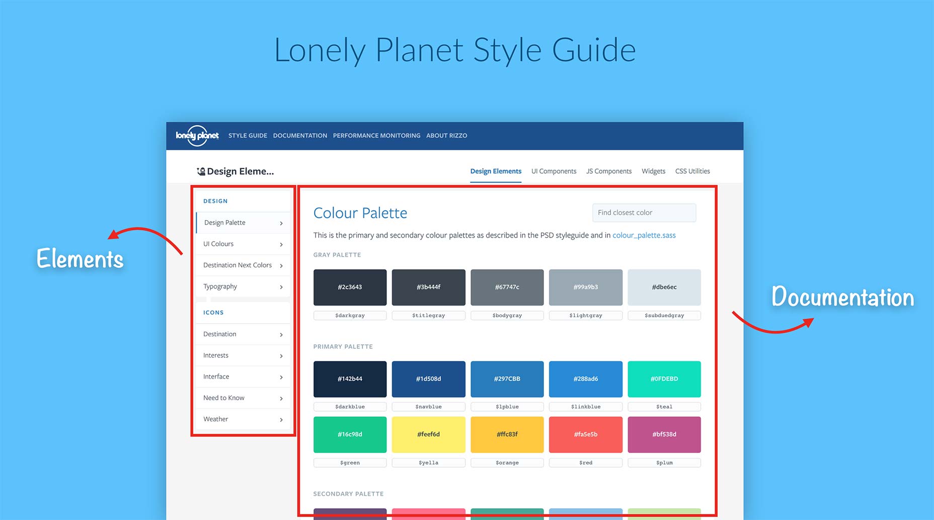 Lonely Planet Style Guide
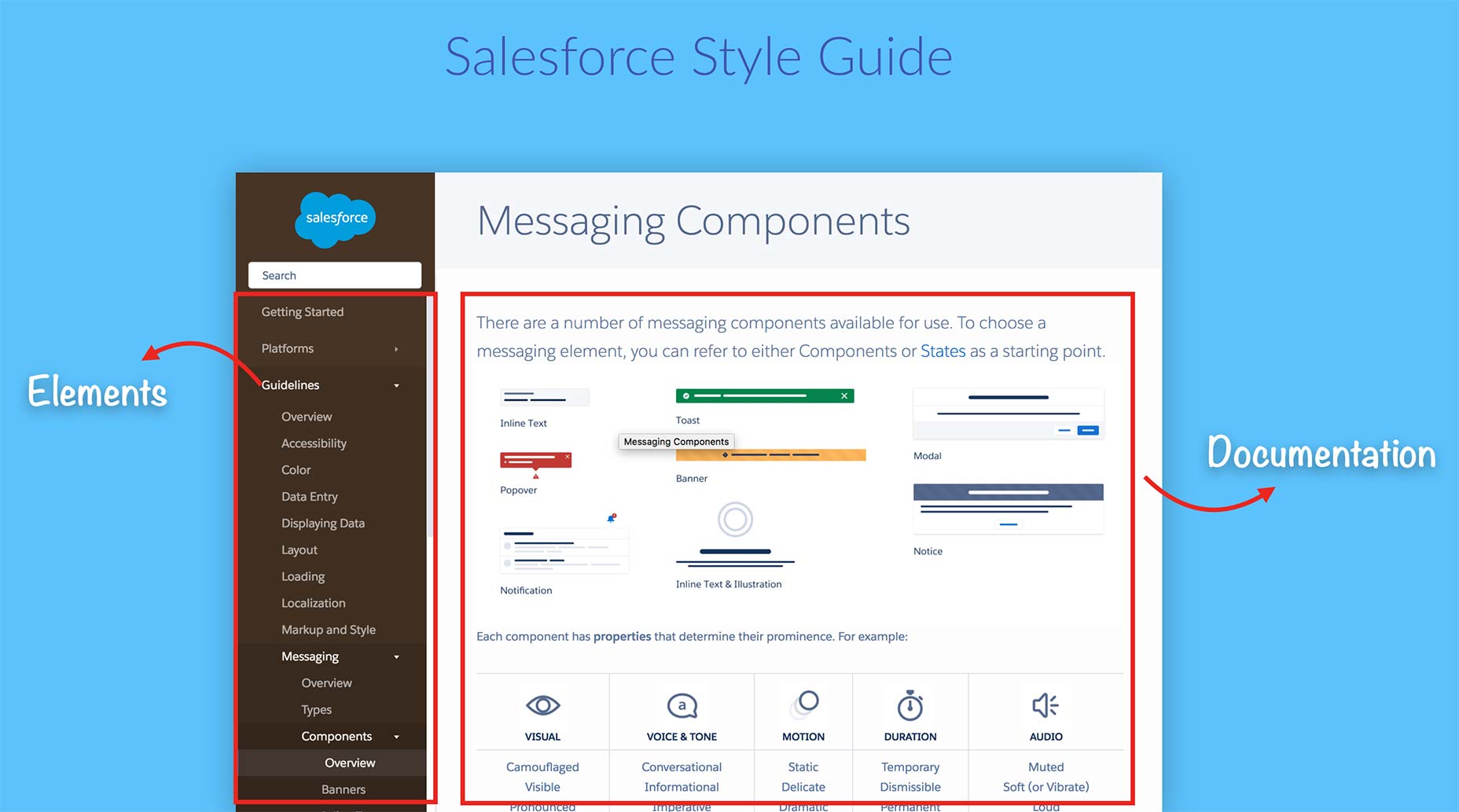 Sales Force Style Guide
Another key element of a LSG is that you can use a style guide generator to automate the process. A style guide generator will use your application source code to feed the bulk of your LSG documentation and watch for any changes made in your code, taking care of updating your style guide documentation as your application changes.
Sales Force Style Guide
Another key element of a LSG is that you can use a style guide generator to automate the process. A style guide generator will use your application source code to feed the bulk of your LSG documentation and watch for any changes made in your code, taking care of updating your style guide documentation as your application changes.
Style Guide Generators
There are many flavors to choose from, depending on the code language that you want to document or your project setup. Here are some places to look for options:- An In-Depth Overview of Living Style Guide Tools, Robert Haritonov, Smashing Magazine
- Overview of Pattern Library Generators, David Hund, GitHub
- Style Guide Generator Roundup, Susan Robertson, A List Apart
- Style Guide Tools, Website Style Guide Resources
Planning Your Style Guide
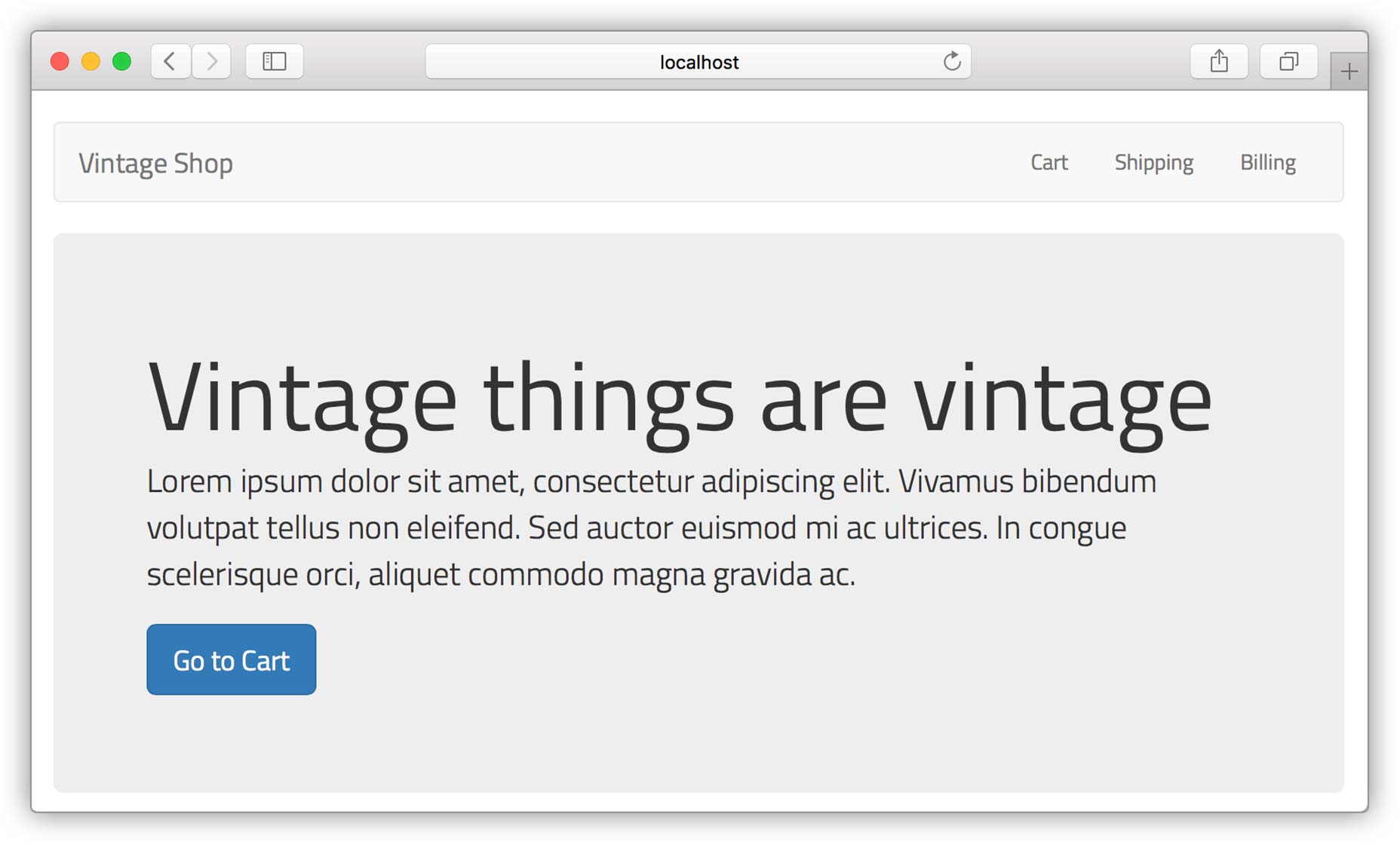
Before diving into creating your LSG the first step is planning what will be in it. Like any good website, a well structured Information Architecture (IE) is the key. So let’s get started by using the following set of designs of our sample app called “Vintage Shop” and observe the persistent elements in the UI: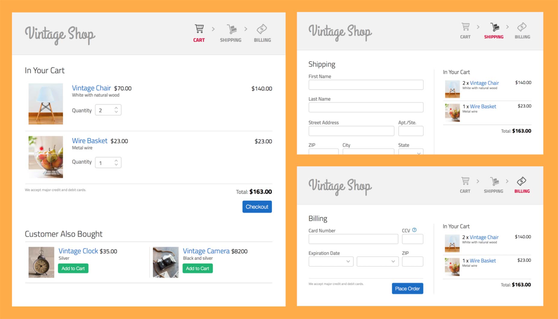 Vintage Shop Mockups
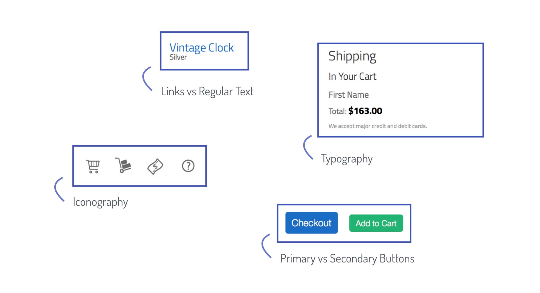
At this point I recommend starting with larger groups of elements, such as the navigation, the cart or the forms. For example, we’ll separate our design into these three groups: the steps indicator, the mini cart, and the products in the cart:
Vintage Shop Mockups
At this point I recommend starting with larger groups of elements, such as the navigation, the cart or the forms. For example, we’ll separate our design into these three groups: the steps indicator, the mini cart, and the products in the cart:
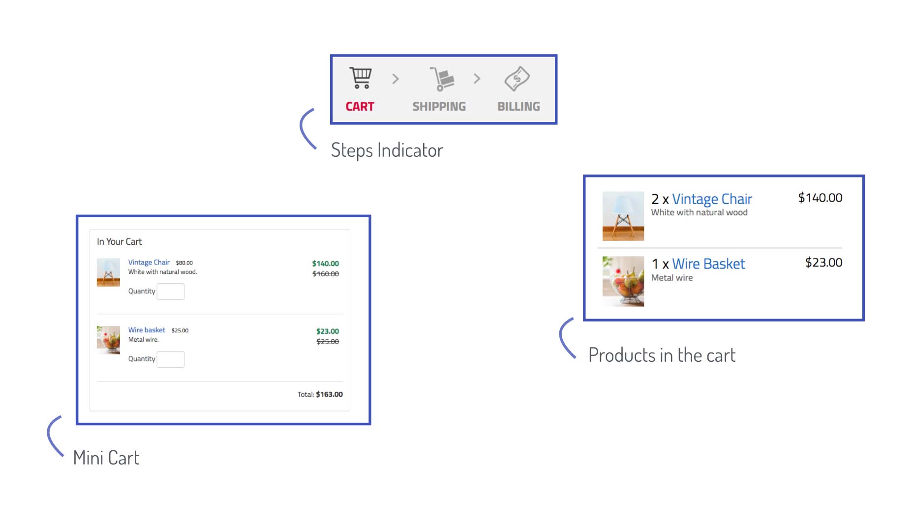 With these larger groups of elements, you can start going into more detail and identify the “styles” that persist. For example, there is a convention for the typography in general, and more specifically for the headings, the subheadings, and the links vs. regular text. The color of the buttons also persists across the pages.
 Putting it all together, let’s write down these groups using a diagram:
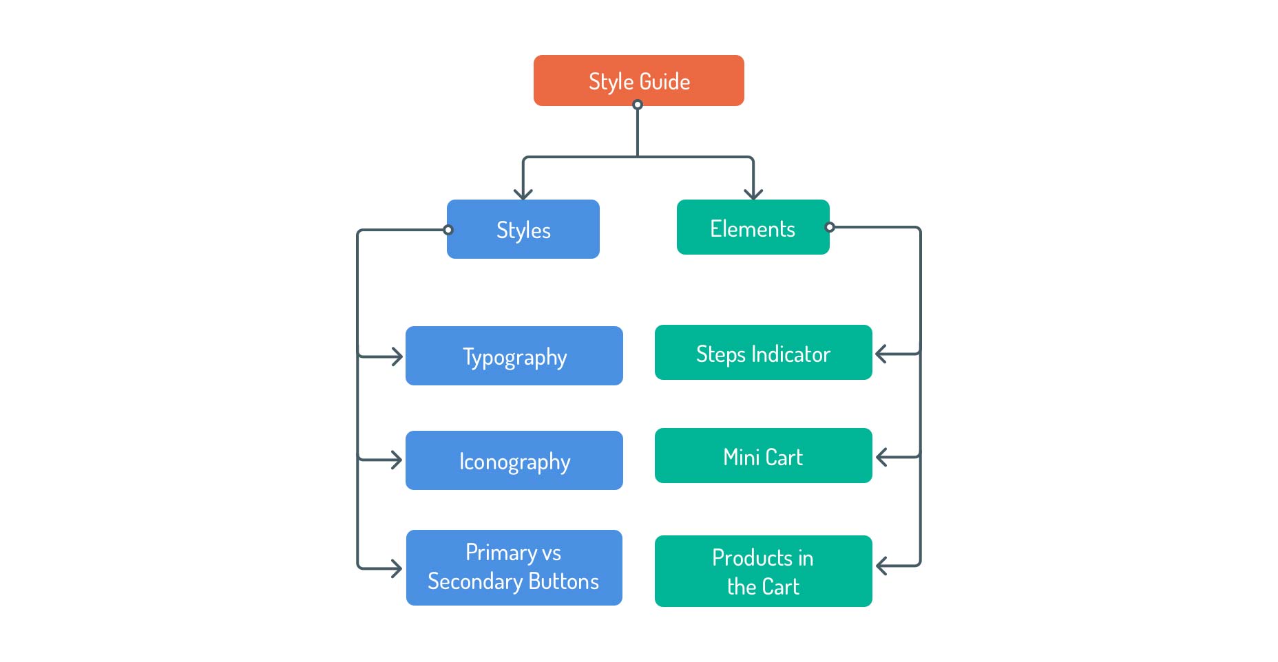 Taking a deeper look into these groups you can fine tune them and turn them into categories that you can use in your style guide as it grows. For example:
- “Elements” is a very vague term that could refer to any HTML element, so a better name for this group could be “Components” or “Modules. These are still broad terms but are more specific in the nature of the type of elements that would cover.
- “Primary vs Secondary” buttons could be part of “Base Elements”, and the color aspect of it could go inside of a “Color Palette” category.
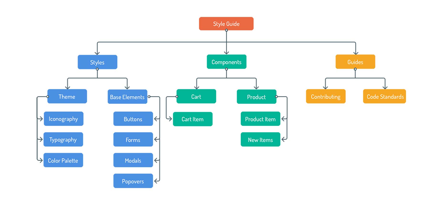 You can see how this diagram takes the shape of a site map, which is basically what you want to use as a plan when creating your living style guide.
Now, dive into the designs and sketch up your own site map, including as many categories as you think would be useful for the future. You can get ideas from other style guides (styleguides.io/examples is a great resource). Once you are done, check this more comprehensive version and compare.
You can see how this diagram takes the shape of a site map, which is basically what you want to use as a plan when creating your living style guide.
Now, dive into the designs and sketch up your own site map, including as many categories as you think would be useful for the future. You can get ideas from other style guides (styleguides.io/examples is a great resource). Once you are done, check this more comprehensive version and compare.
You could almost think of the living style guide as the “game rules” of your app. Inside of “the rules” is all the information that is needed on how to “play” the game: The building blocks and the rules for creating and making building new blocks. Including how other members of your team can contribute to it and help maintaining it as a living document.

The installation process has 3 steps:
1. Installing Node
First, make sure you have Node installed. You will need at least version 6.2. Installing the App
Then, download this zip file: sgdd-tutorial.zip to your Desktop and unzip it. This is important as another location would break the install commands. Then open the terminal and enter the following command:It will take a few seconds to install the app and its dependencies.cd ~/Desktop/vintage-shop-sgdd-tutorial && npm install
3. Running the App
Once the installation is done enter the following commands:npm run develop- In a new tab enter:
npm run document
npm run develop
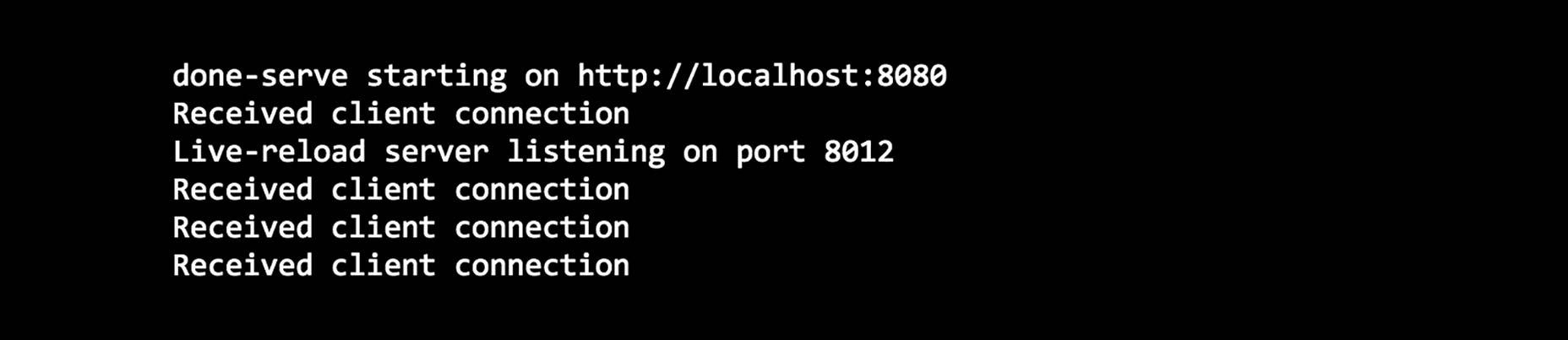
npm run document
npm run document -- -w
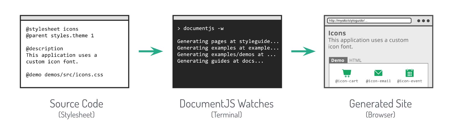
How does DocumentCSS Work?
- Reads through files specified in its configuration (for this tutorial it will be looking at
.lessand.mdfiles) - Looks for comments that uses special “tags” (like
@page,@stylesheetor@styles. - Generates html files and connects them to build the site.
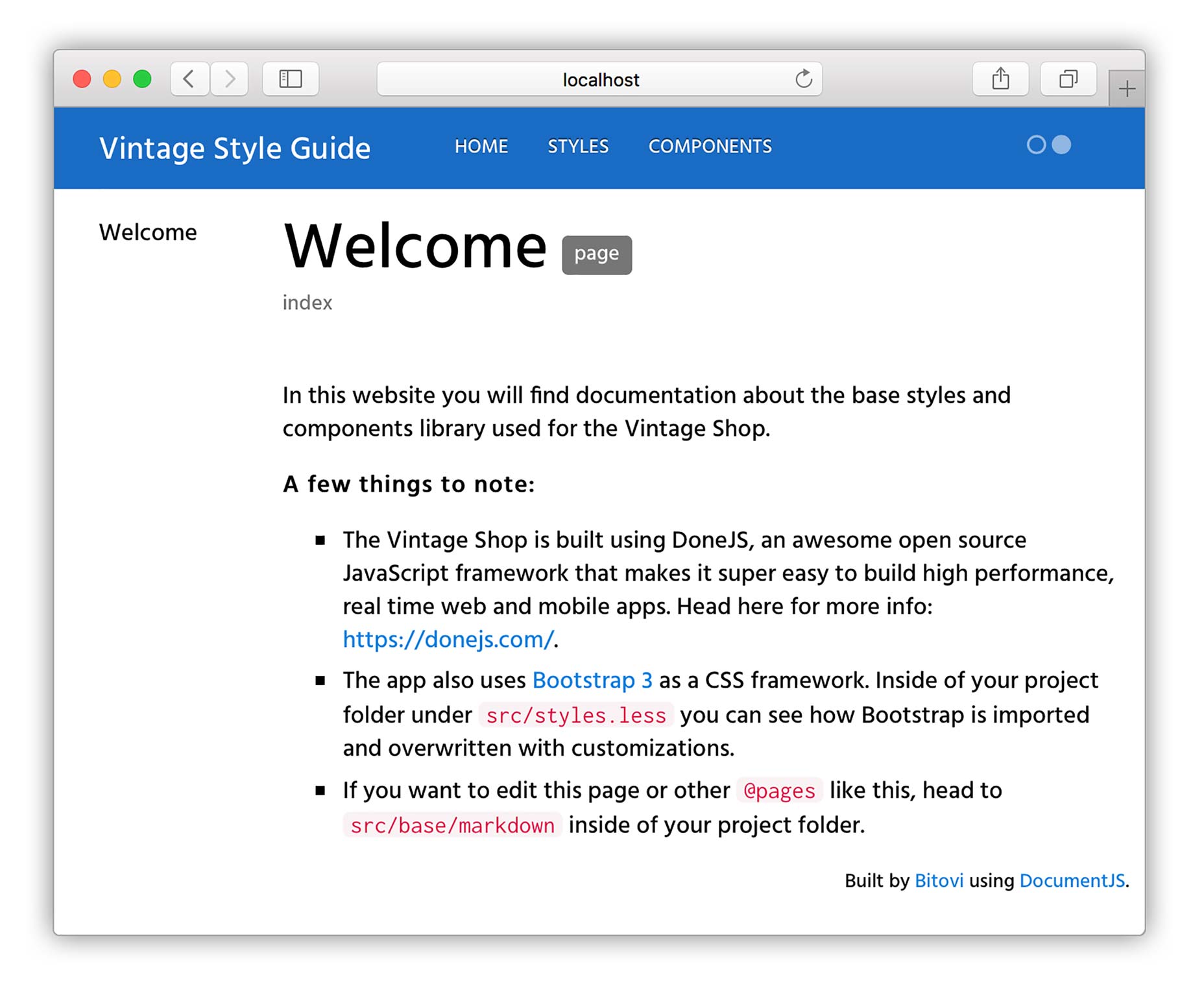
Creating a Page
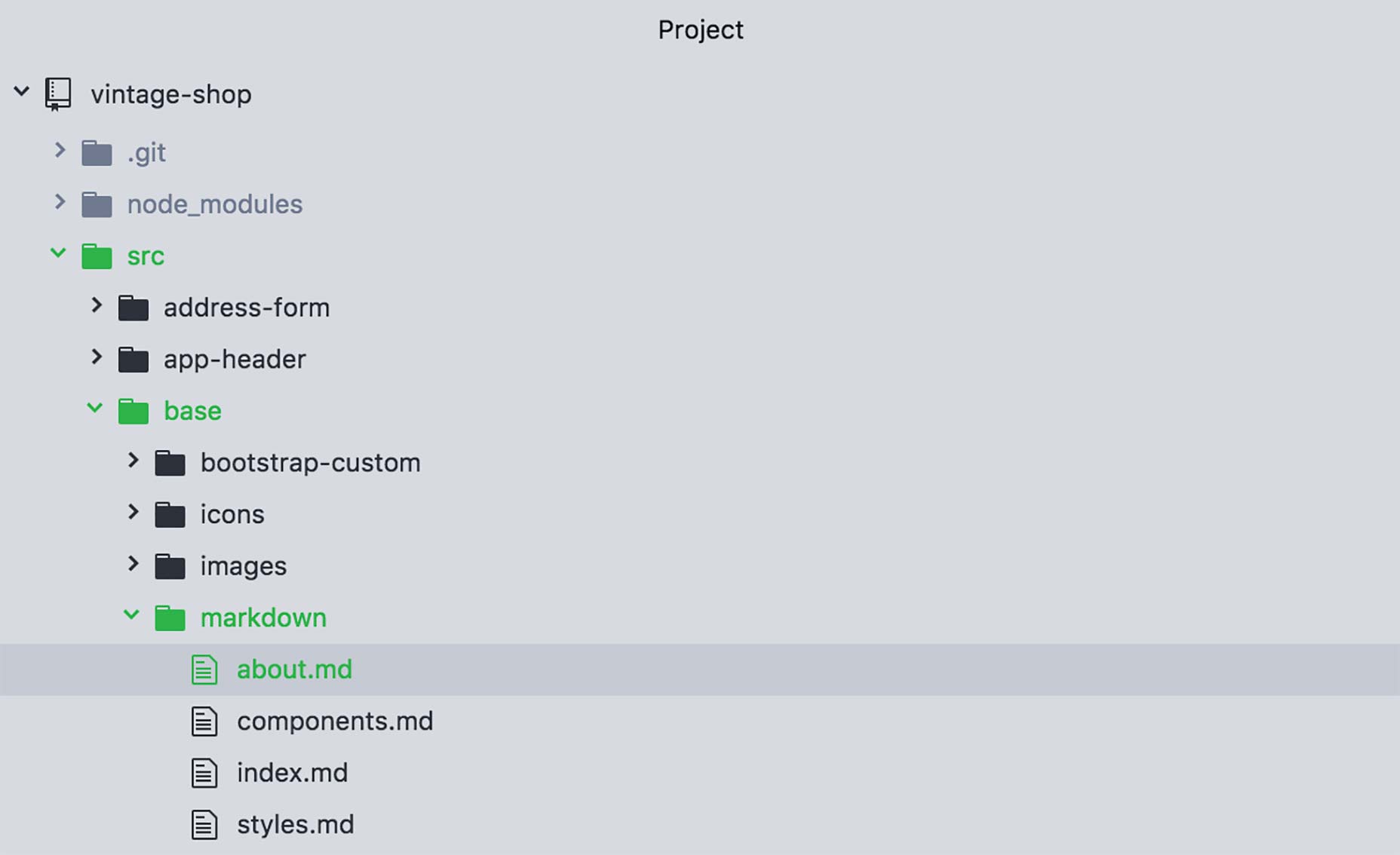
@page about about@page
about
About
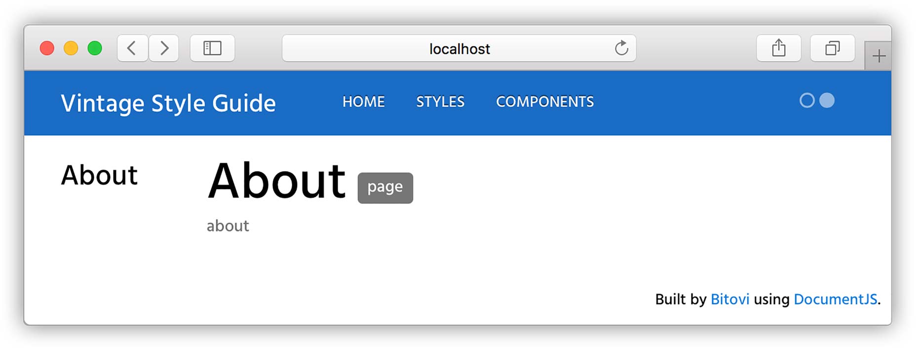
@page about About@parent index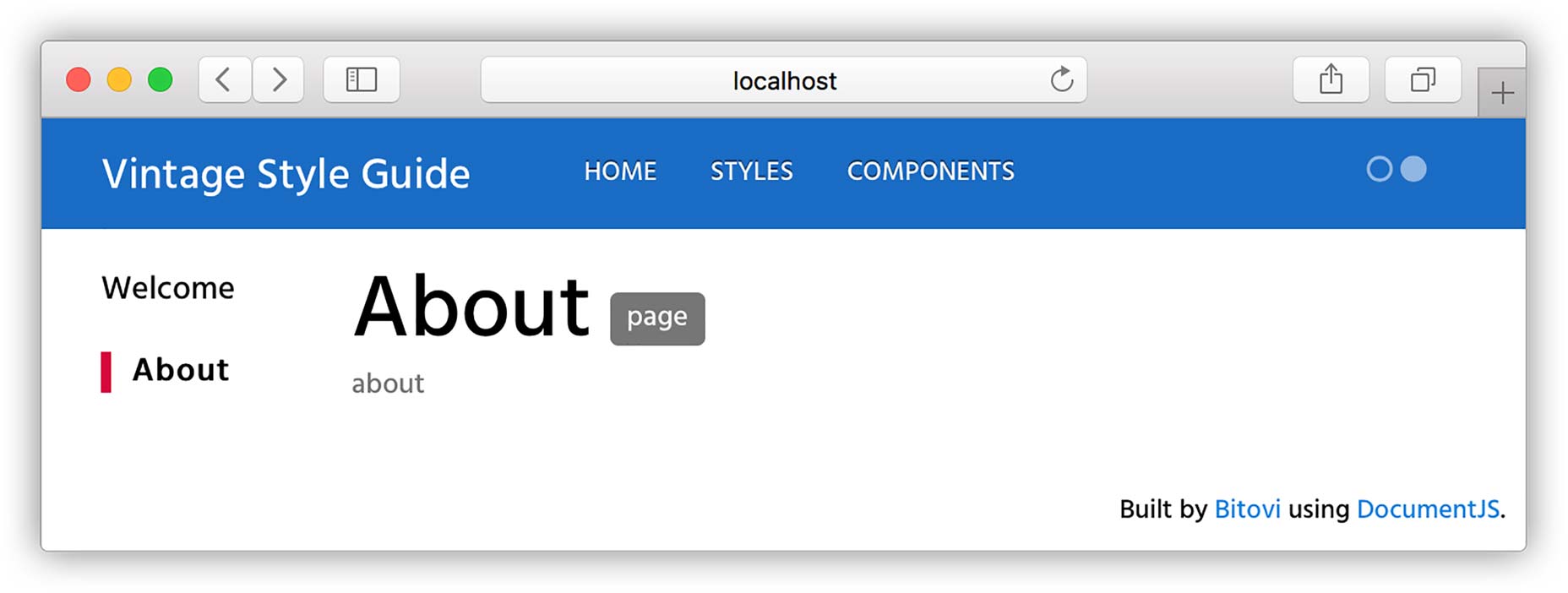
@page about About
@parent index
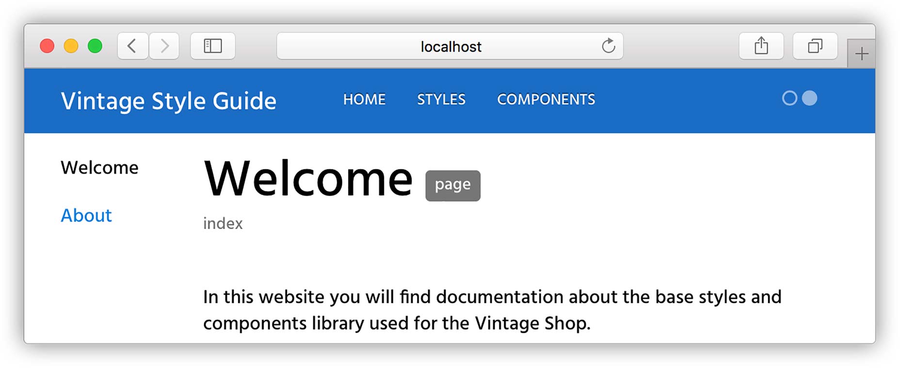
## Hello World!
This is the first page of my style guide. Here I can add any type of content that shouldn’t live with the code. Like who are the main contributors of the style guide or contact info.
For example here's an animated gif inside of an `iframe`:
<iframe class="giphy-embed" src="https://giphy.com/embed/3o7TKMt1VVNkHV2PaE" width="480" height="480" frameborder="0" allowfullscreen="allowfullscreen"></iframe> 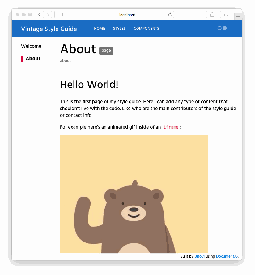

Documenting a Stylesheet
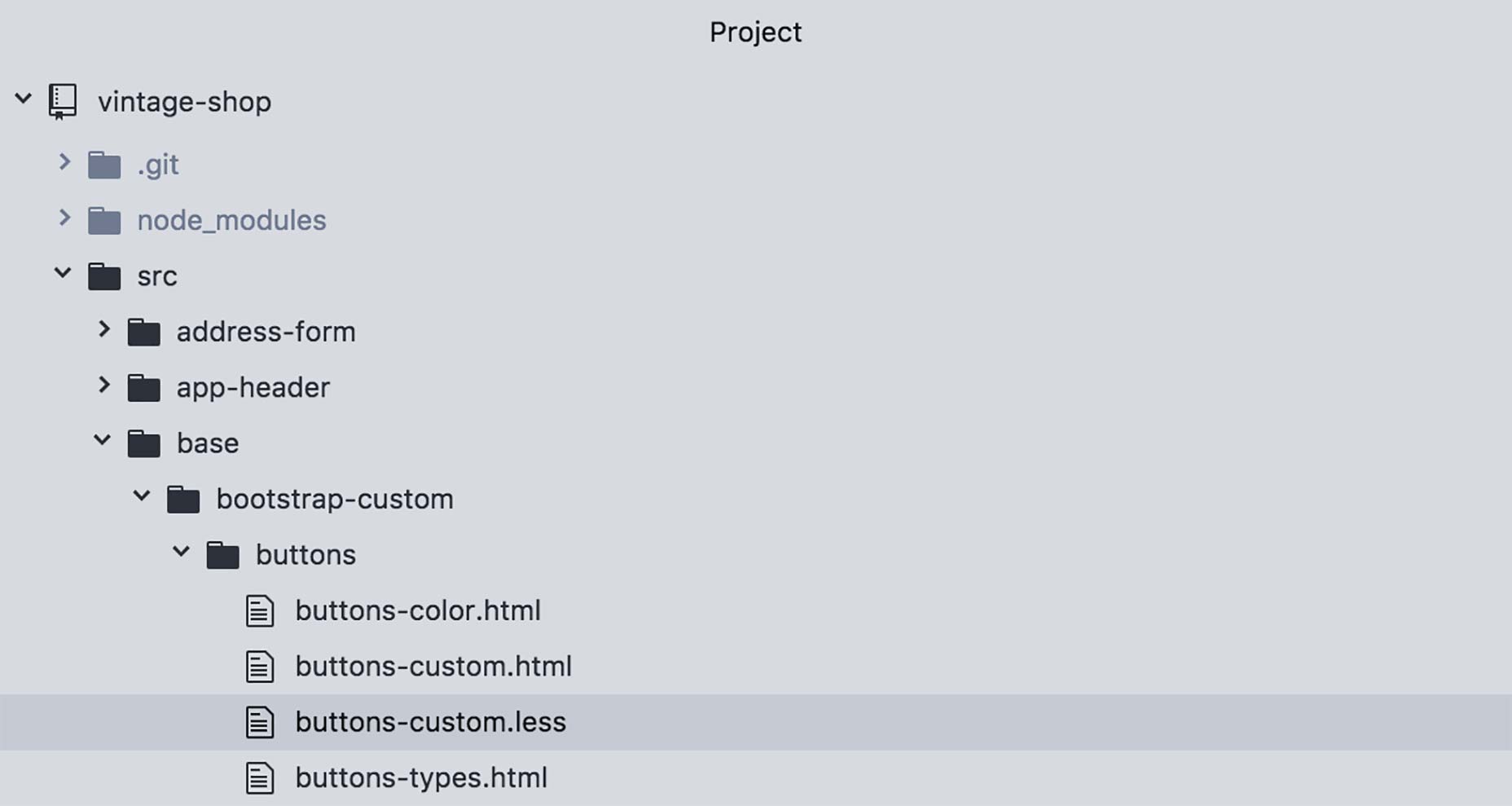 Inside of this file, and inside of a comment block, add the tag
 @stylesheet followed by two strings:
/**
@stylesheet buttons.less Buttons
*/
/** for the parser (in this case JSDoc) to recognized it.
Now let's break this down:
@stylesheetThe tag
@stylesheet declares the file as a stylesheet and tells DocumentCSS that the information in this file should be displayed a such in the style guide. This serves to differentiate it from other types of documents, like pages, components, and models, among others (read here about the full list of document types).
buttons.lessThis is the unique name for the stylesheet and is used as a reference to other tags. While you can use any type of name, I recommend using the name of the stylesheet file, as this will help finding the file when referencing the documentation. Do keep in mind that this will affect the url of your document. For this example the url will be: http://localhost:8080/styleguide/buttons.less.html
ButtonsSimilar to creating a page, this is the title of the stylesheet that will be used for display purposes in the generated site. Here you can use multiple words with spaces or other characters. To view the newly created page run the following command unless you have it watching for changes):
documentjs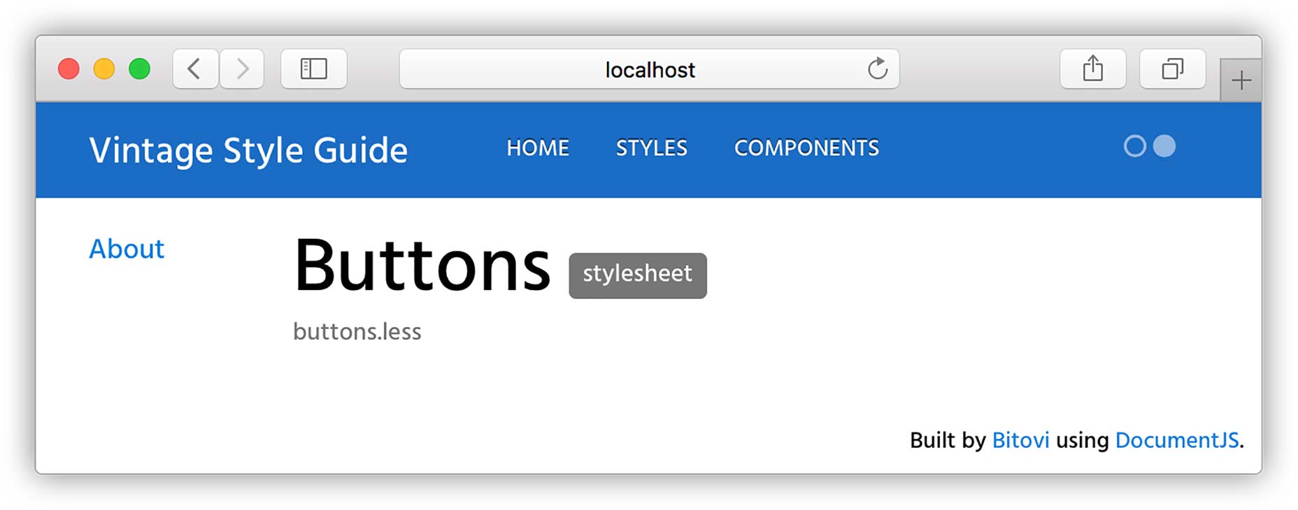
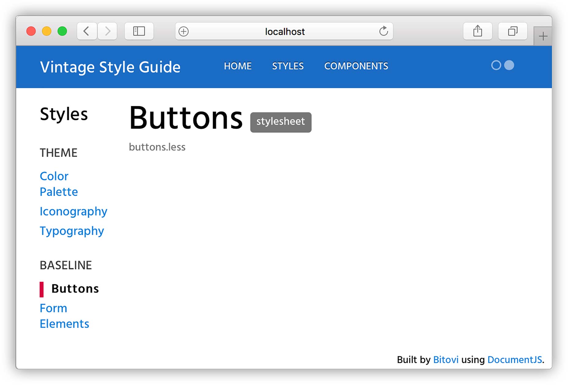
/**
 * @stylesheet buttons.less Buttons
 * @parent styles.base
*/.base to specify this page should appear under the group "Baseline" shown in the sidebar (you can also create groups in your subnav! We will dig into that in a little bit).
Re-running the docs and refreshing the page should look like this:
 Now for the meaty part! With our page in place we can do a few things:
- We can add an overall description for the doc
- We can add all sorts of content using both markdown or plain HTML
- And best of all, we can add demos for our code ?
/**
 * @stylesheet buttons.less Buttons
 * @parent styles.base
 * @description
 * Global style definitions for all button elements.
 * @iframe src/base/bootstrap-custom/buttons/buttons-custom.html
*/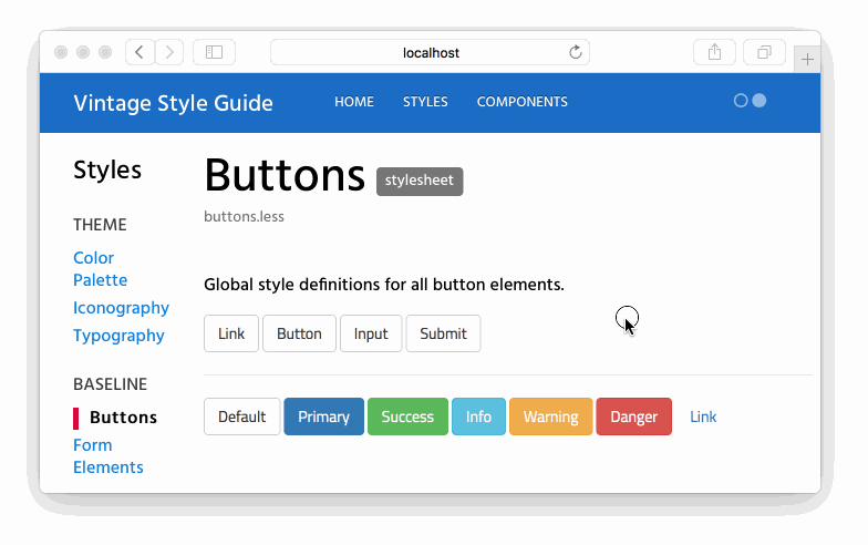 As you can see the
 @iframe tag allows to add an iframe with a demo to your doc. This demo is really just a simple html file with a script tag that imports the CSS of your app at run time.
Let’s open the demo buttons-custom.html :
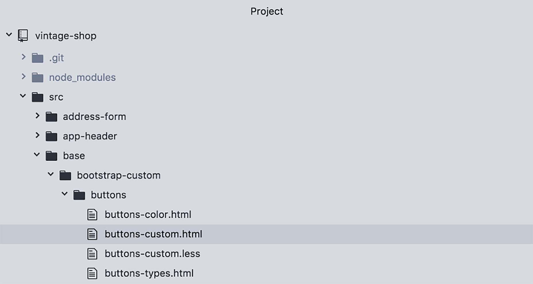
<script src="/node_modules/steal/steal.js" main="can/view/autorender/">
<import "vintage-shop/styles.less";
</script> <a class="btn btn-default" href="#" role="button">Link</a><button class="btn btn-default" type="submit">Button</button>
<input class="btn btn-default" type="button" value="Input">
<input class="btn btn-default" type="submit" value="Submit">
<hr />
<button type="button" class="btn btn-default">Default</button>
<button type="button" class="btn btn-primary btn-checkout">Primary</button>
<button type="button" class="btn btn-success">Success</button>
<button type="button" class="btn btn-info">Info</button>
<button type="button" class="btn btn-warning">Warning</button>
<button type="button" class="btn btn-danger">Danger</button>
<button type="button" class="btn btn-link">Link</button>@demo to also show the snippet of code used in it. Like this:
/**
 * @stylesheet buttons.less Buttons
 * @parent styles.base
 *
 * @description
 * Global style definitions for all button elements.
 * @demo src/base/bootstrap-custom/buttons/buttons-custom.html
*/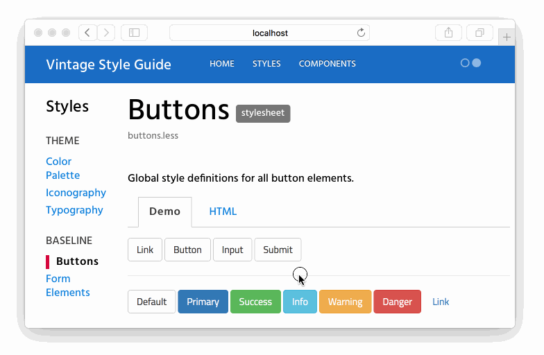 Now, before you go bananas with this, there are a couple of more goodies that you can take advantage of:
- Creating Style Sections
- Creating Stylesheet Groups
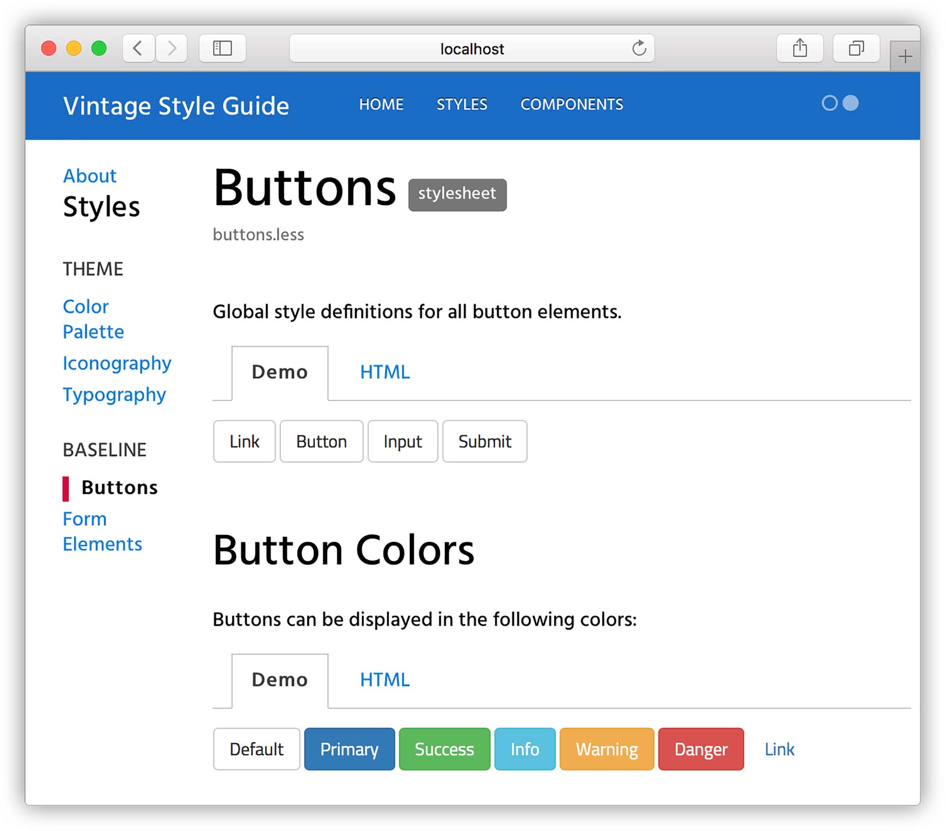
Creating Style Sections
To create a style section you can use the tag@styles. This tag is sweet because it allows you to break down your stylesheet doc into sensible chunks that you can talk about and understand better.
For instance, in our example, we have styles for defining buttons in general, regardless of the markup that is used ( either a <button/> vs <a/> tag). And then we have definitions of color. With the @styles tag we can break the color definitions into their own section, not only to talk about them separately, but to be able to hyperlink to that section directly.
This is how it works. In the same file buttons-custom.less, we are going to add the tag @styles right after the first block of styles and before the color variables. Here's how it should look like:
/**
* @stylesheet buttons.less Buttons
* @parent styles.base
*
* @description
* Global style definitions for all button elements.
* @demo src/base/bootstrap-custom/buttons/buttons-types.html
*/
.btn {
display: inline-block;
...}
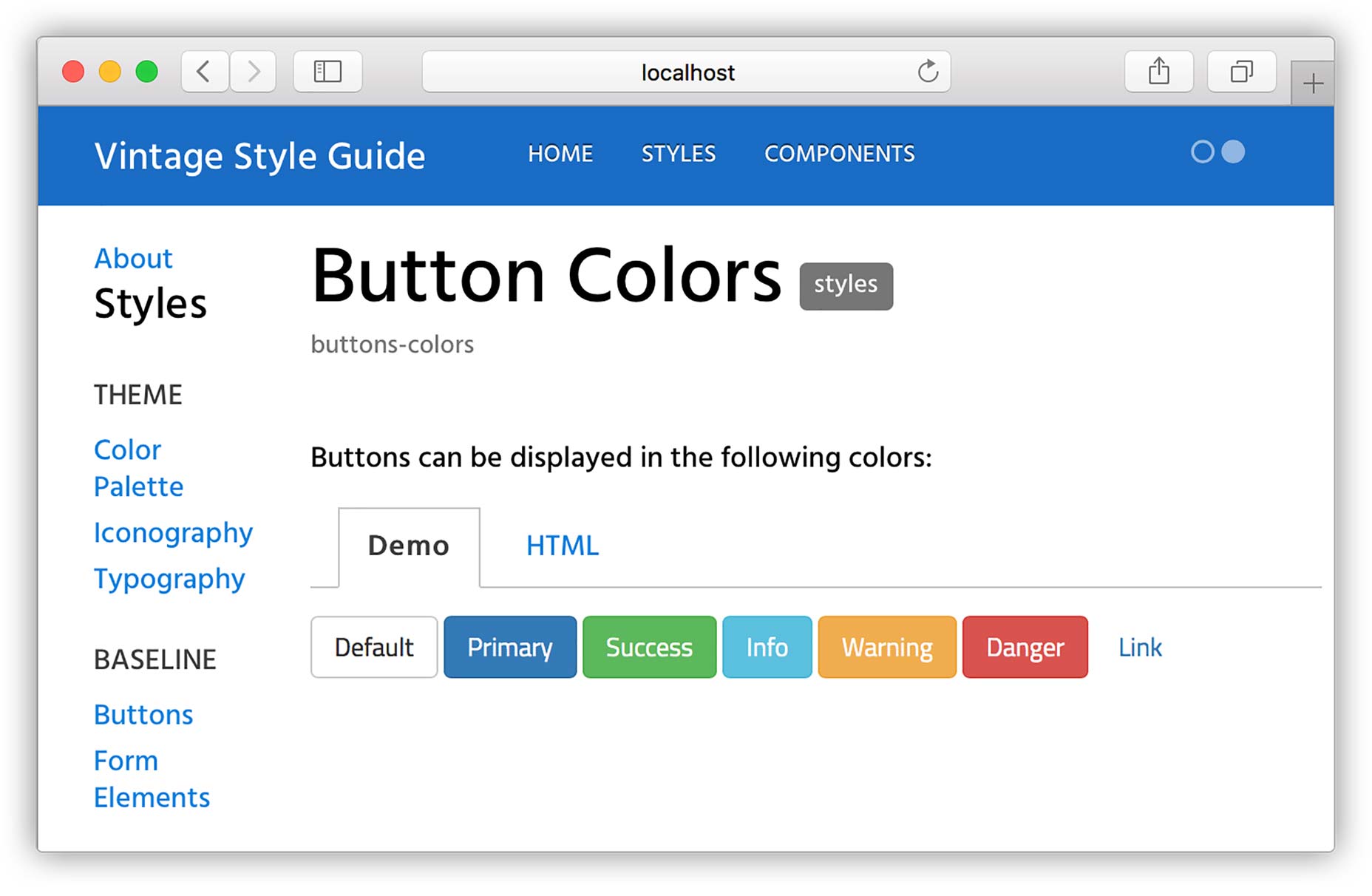
/**
* @styles buttons-colors Button Colors
*
* @description
* Buttons can be displayed in the following colors:
* @demo src/base/bootstrap-custom/buttons/buttons-color.html
*/
@btn-default-color: #333;There are a couple of things to point at here:
- I updated the first demo to show only the button types.
- I added a new comment block using the
@stylestag. Here I gave it a unique namebutton-colorsand the title ofButton Colors. I also gave it a@descriptionand added a@demofor it that only shows the button colors.
Creating Stylesheet Groups
@page styles Styles
@group styles.theme 0 Theme
@group styles.base 1 Baseline
The styles shown in this section show how elements are styles with definitions from the Bootstrap framework, in addition to any customizations made for this specific project. Therefore they will be available for use in any part of the application.@groupThe
@group tag allows you to create a section in the sidebar that appears under the parent section. For example, the groups: "Theme" and "Baseline" will appear under the parent section of "Styles".
styles.themeThis is the unique name for the group. A good practice to follow here is to use the name of the parent section, in this case "Styles" as a namespace. In this way, if you want to create another group with the same name, but under a different section, the name of the group will remain unique.
0This is the order in which the group should appear, which starts with 0. If no order is assigned, then the list of groups will be shown in alphabetical order.
ThemeThis is the actual name that will show in the sidebar, so you can use multiple words with spaces and other characters. To see groups in action, let’s add a new group as follows:
@page styles Styles
@group styles.theme 0 Theme
@group styles.base 1 Baseline
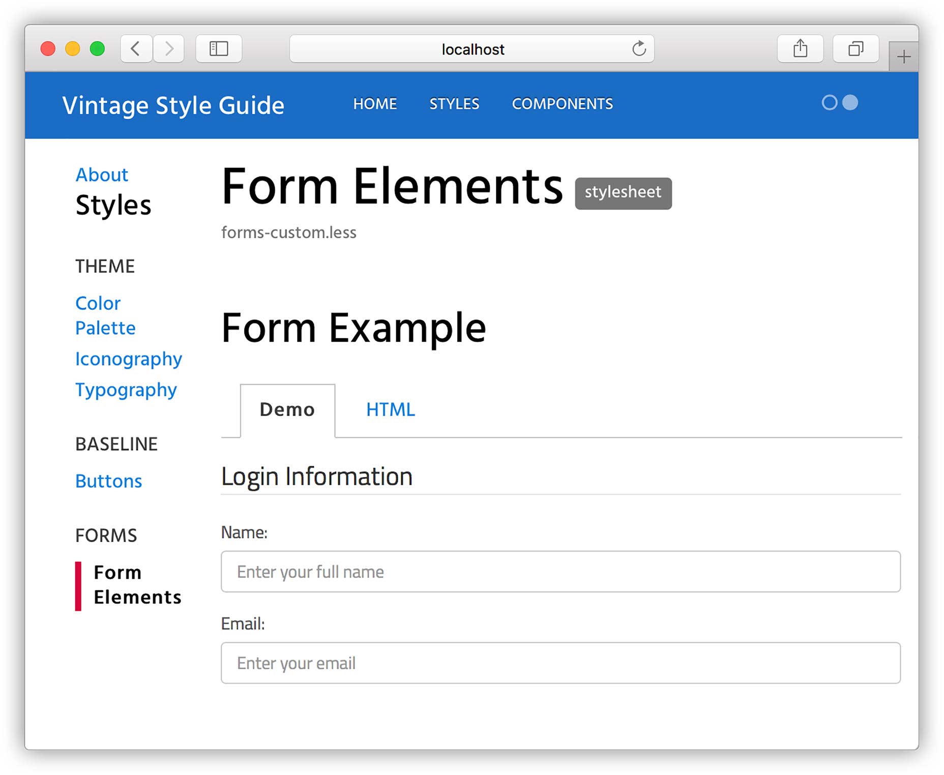
@group styles.forms 2 Forms
The styles shown in this section show how elements are styles with definitions from the Bootstrap framework, in addition to any customizations made for this specific project. Therefore they will be available for use in any part of the application.
/**
 * @stylesheet forms-custom.less Form Elements
 * @parent styles.forms
 **/
Wrap Up
 [-- Originally posted on the Bitovi blog, republished with the author’s permission. --]
Adriana De La Cuadra
This article originally appeared on Bitovi.com and is part of a free tutorial series at styleguidedrivendevelopment.com.


Read Next

15 Best New Fonts, July 2024
Welcome to our monthly roundup of the best fonts we’ve found online in the last four weeks. This month, there are fewer…
By Ben Moss

20 Best New Websites, July 2024
Welcome to July’s round up of websites to inspire you. This month’s collection ranges from the most stripped-back…

Top 7 WordPress Plugins for 2024: Enhance Your Site's Performance
WordPress is a hands-down favorite of website designers and developers. Renowned for its flexibility and ease of use,…
By WDD Staff

Exciting New Tools for Designers, July 2024
Welcome to this July’s collection of tools, gathered from around the web over the past month. We hope you’ll find…

3 Essential Design Trends, July 2024
Add some summer sizzle to your design projects with trendy website elements. Learn what's trending and how to use these…

15 Best New Fonts, June 2024
Welcome to our roundup of the best new fonts we’ve found online in the last month. This month, there are notably fewer…
By Ben Moss

20 Best New Websites, June 2024
Arranging content in an easily accessible way is the backbone of any user-friendly website. A good website will present…

Exciting New Tools for Designers, June 2024
In this month’s roundup of the best tools for web designers and developers, we’ll explore a range of new and noteworthy…

3 Essential Design Trends, June 2024
Summer is off to a fun start with some highly dramatic website design trends showing up in projects. Let's dive in!

15 Best New Fonts, May 2024
In this month’s edition, there are lots of historically-inspired typefaces, more of the growing trend for French…
By Ben Moss

How to Reduce The Carbon Footprint of Your Website
On average, a web page produces 4.61 grams of CO2 for every page view; for whole sites, that amounts to hundreds of KG…
By Simon Sterne

20 Best New Websites, May 2024
Welcome to May’s compilation of the best sites on the web. This month we’re focused on color for younger humans,…