Should the Web Have a Universal Design System?

The web is a diverse platform, but that diversity impacts usability and user experience. We explore the case for an open source design system for the entire web.

 Despite such a defined set of guidelines in both cases of iOS and Android, designers still find ways to differentiate through aspects like color, layout, and design details. In these circumstances it’s still entirely possible to achieve outstanding and unique designs which still fall within the guidelines.
Conversely, the web is an absolute blank canvas. There is the ability to take a design and user experience in any direction desired. On one hand, it’s what makes the web so attractive, diverse, and abundant. On the other hand, it can lead to a confusing experience for many people: one that is highly inaccessible, inconsistent, and uses a variety of sub-optimal and dark user experience practices.
The case of iOS and Android show just how rich and diverse a digital product or ecosystem can be, even under such regulation and moderately-strict guidelines.
This poses the question of whether a set of open source guidelines should be introduced for the entire web. Whether it comes from W3C, is a unified effort between major browsers, or is devised by a group of designers, it could improve the web for all. There would still be great scope for producing unique designs, while ensuring the web reaches much more acceptable levels of accessibility and usability as a whole. Designers and user experience professionals could contribute to this as an open source project, pushing forward the progress of the entire web.
Despite such a defined set of guidelines in both cases of iOS and Android, designers still find ways to differentiate through aspects like color, layout, and design details. In these circumstances it’s still entirely possible to achieve outstanding and unique designs which still fall within the guidelines.
Conversely, the web is an absolute blank canvas. There is the ability to take a design and user experience in any direction desired. On one hand, it’s what makes the web so attractive, diverse, and abundant. On the other hand, it can lead to a confusing experience for many people: one that is highly inaccessible, inconsistent, and uses a variety of sub-optimal and dark user experience practices.
The case of iOS and Android show just how rich and diverse a digital product or ecosystem can be, even under such regulation and moderately-strict guidelines.
This poses the question of whether a set of open source guidelines should be introduced for the entire web. Whether it comes from W3C, is a unified effort between major browsers, or is devised by a group of designers, it could improve the web for all. There would still be great scope for producing unique designs, while ensuring the web reaches much more acceptable levels of accessibility and usability as a whole. Designers and user experience professionals could contribute to this as an open source project, pushing forward the progress of the entire web.
 It’s not just web applications this system should apply to. Whether it’s a blog, portfolio, landing page, or wiki, they are all still usable products. They still require important user experience considerations such as accessibility, navigation, color practices, and typography scales. Many companies consider such aspects, while many ignore them either through choice, misjudgement, or lack of consideration. It’s an area which is so fragmented under the current system, and does not work appropriately for everyone. That includes those with a disability, visual impairment, or lack of familiarity with computers and the web. These users should be designed for first.
As it stands, the primary consideration is often the design visuals: making something impressive, unique, and eye-catching. Often this desire to differentiate can lead to oversights with user experience, and design choices like unique navigation solutions which are confusing and unfamiliar to most.
It’s not just web applications this system should apply to. Whether it’s a blog, portfolio, landing page, or wiki, they are all still usable products. They still require important user experience considerations such as accessibility, navigation, color practices, and typography scales. Many companies consider such aspects, while many ignore them either through choice, misjudgement, or lack of consideration. It’s an area which is so fragmented under the current system, and does not work appropriately for everyone. That includes those with a disability, visual impairment, or lack of familiarity with computers and the web. These users should be designed for first.
As it stands, the primary consideration is often the design visuals: making something impressive, unique, and eye-catching. Often this desire to differentiate can lead to oversights with user experience, and design choices like unique navigation solutions which are confusing and unfamiliar to most.
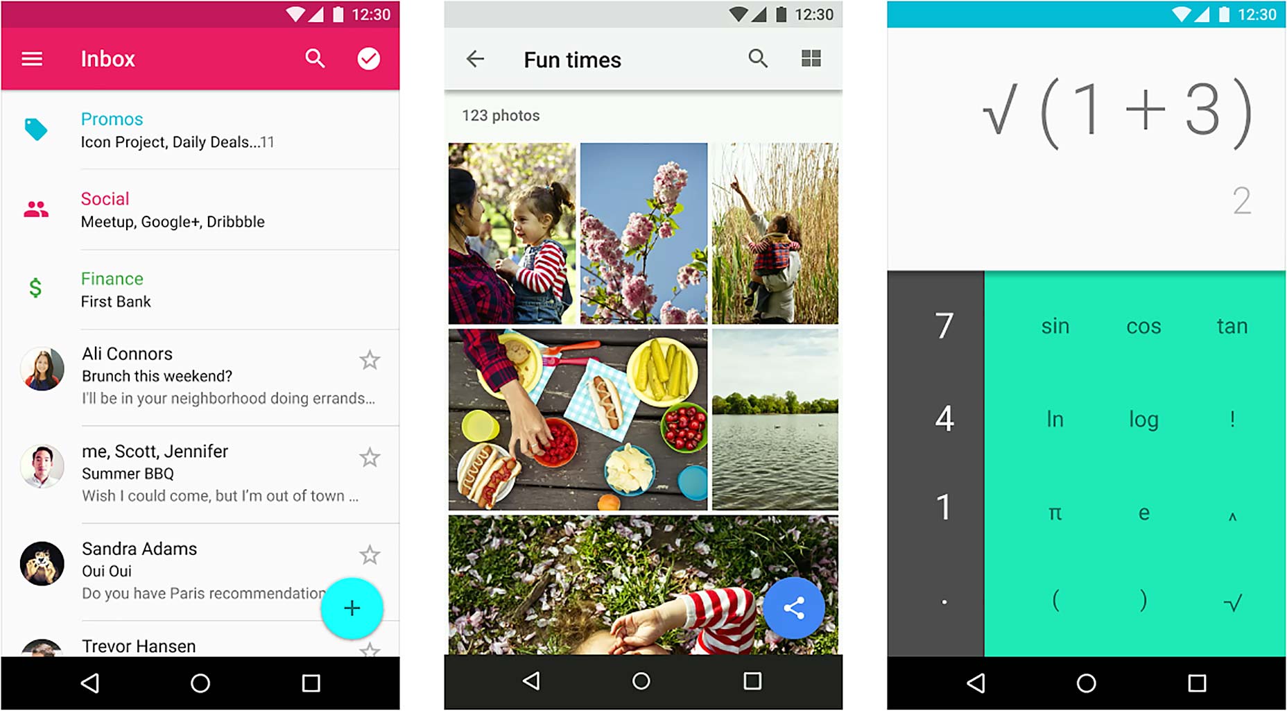
 Google is a prime example of a company who have developed a set of guidelines and applied them with absolute consistency across mobile and web. Whether you switch from Google Keep on iPhone, to Google Drive on the web, the user experience and design elements remain consistent. Then when switching between products on the web like Play Store or YouTube, it again remains consistent.
This ease of use and transition from one product or site to another should be a model to follow for others. It puts the user first, making for an entirely accessible and understandable experience. Google is beginning to take this even a step further, as they introduce Android apps and web-based equivalents that work at desktop size. With products like Chromebooks, it makes the transition between devices even more seamless.
[pullquote]The closer we can get to a cohesive design system across the web…the better it will be…for all parties involved[/pullquote]
The closer we can get to a cohesive design system across the web as a whole, the better it will be in the long run, for all parties involved. This means having systems span much further than just one company.
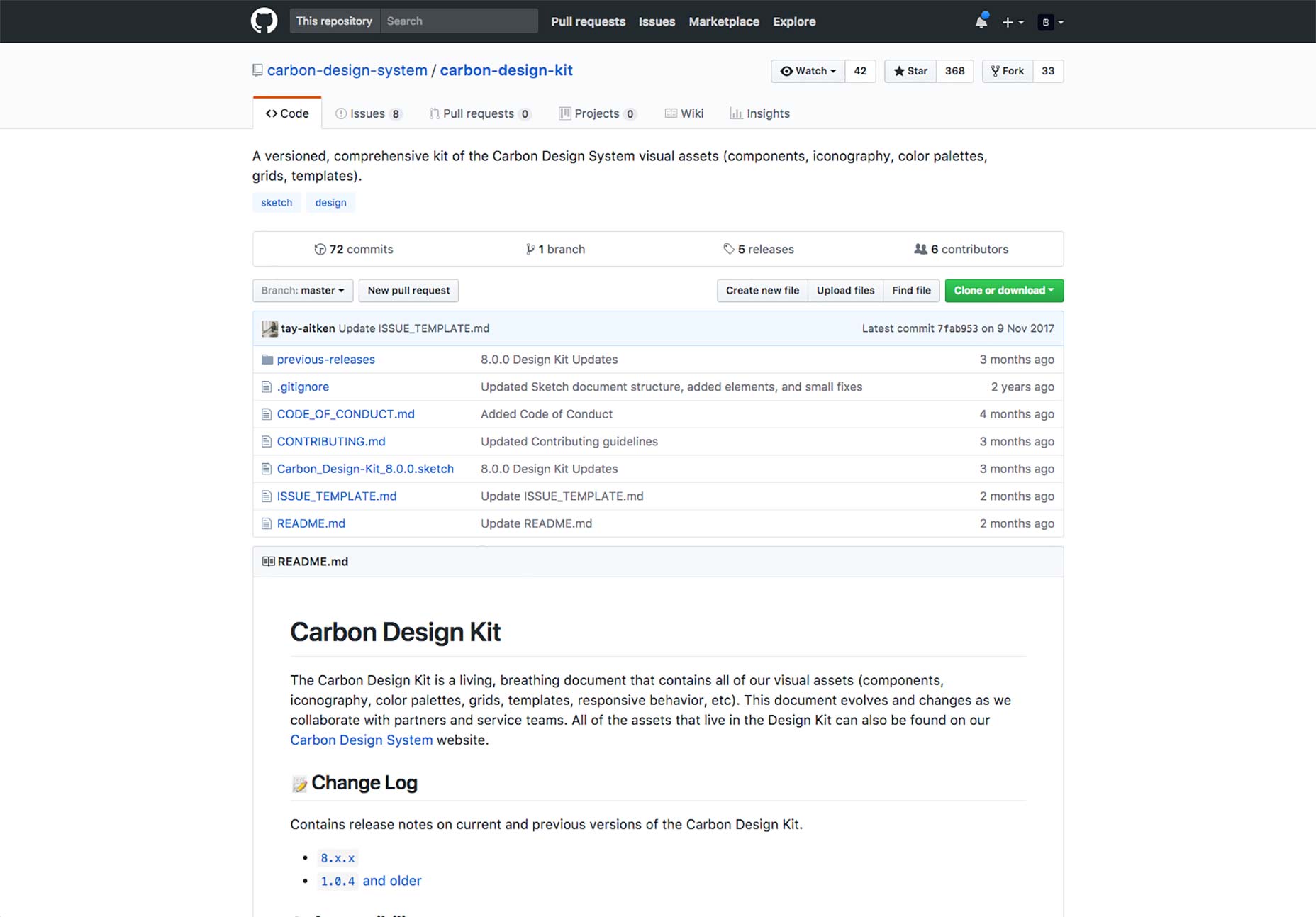
IBM or Airbnb may perfect their design systems to the nth degree and apply them with excellent consistency. However, as soon as a user switches to another product or service, their design system is likely to be wholly different, from typography and layout, to navigational practices. That’s why it needs to be looked at as an issue from further afar. And apps are the closest example we have to how successful this can be as a means to improve the everyday lives of users.
Google is a prime example of a company who have developed a set of guidelines and applied them with absolute consistency across mobile and web. Whether you switch from Google Keep on iPhone, to Google Drive on the web, the user experience and design elements remain consistent. Then when switching between products on the web like Play Store or YouTube, it again remains consistent.
This ease of use and transition from one product or site to another should be a model to follow for others. It puts the user first, making for an entirely accessible and understandable experience. Google is beginning to take this even a step further, as they introduce Android apps and web-based equivalents that work at desktop size. With products like Chromebooks, it makes the transition between devices even more seamless.
[pullquote]The closer we can get to a cohesive design system across the web…the better it will be…for all parties involved[/pullquote]
The closer we can get to a cohesive design system across the web as a whole, the better it will be in the long run, for all parties involved. This means having systems span much further than just one company.
IBM or Airbnb may perfect their design systems to the nth degree and apply them with excellent consistency. However, as soon as a user switches to another product or service, their design system is likely to be wholly different, from typography and layout, to navigational practices. That’s why it needs to be looked at as an issue from further afar. And apps are the closest example we have to how successful this can be as a means to improve the everyday lives of users.


Read Next

15 Best New Fonts, July 2024
Welcome to our monthly roundup of the best fonts we’ve found online in the last four weeks. This month, there are fewer…
By Ben Moss

20 Best New Websites, July 2024
Welcome to July’s round up of websites to inspire you. This month’s collection ranges from the most stripped-back…

Top 7 WordPress Plugins for 2024: Enhance Your Site's Performance
WordPress is a hands-down favorite of website designers and developers. Renowned for its flexibility and ease of use,…
By WDD Staff

Exciting New Tools for Designers, July 2024
Welcome to this July’s collection of tools, gathered from around the web over the past month. We hope you’ll find…

3 Essential Design Trends, July 2024
Add some summer sizzle to your design projects with trendy website elements. Learn what's trending and how to use these…

15 Best New Fonts, June 2024
Welcome to our roundup of the best new fonts we’ve found online in the last month. This month, there are notably fewer…
By Ben Moss

20 Best New Websites, June 2024
Arranging content in an easily accessible way is the backbone of any user-friendly website. A good website will present…

Exciting New Tools for Designers, June 2024
In this month’s roundup of the best tools for web designers and developers, we’ll explore a range of new and noteworthy…

3 Essential Design Trends, June 2024
Summer is off to a fun start with some highly dramatic website design trends showing up in projects. Let's dive in!

15 Best New Fonts, May 2024
In this month’s edition, there are lots of historically-inspired typefaces, more of the growing trend for French…
By Ben Moss

How to Reduce The Carbon Footprint of Your Website
On average, a web page produces 4.61 grams of CO2 for every page view; for whole sites, that amounts to hundreds of KG…
By Simon Sterne

20 Best New Websites, May 2024
Welcome to May’s compilation of the best sites on the web. This month we’re focused on color for younger humans,…