

Christopher Kirk-Nielsen
Christopher Kirk-Nielsen is a WDD reader who sent in his own site for review, and oh my God I think he’s been listening! You see, he is a front-end dev / motion designer. Typically, sites built by motion designers tend to suffer in the usability and accessibility department. In this case, however, the site looks good. It looks original. It appeals to the love of the ’80s aesthetic. And so far, I can’t get the thing to break without going back to much older browsers. Even without JavaScript, everything has a fallback.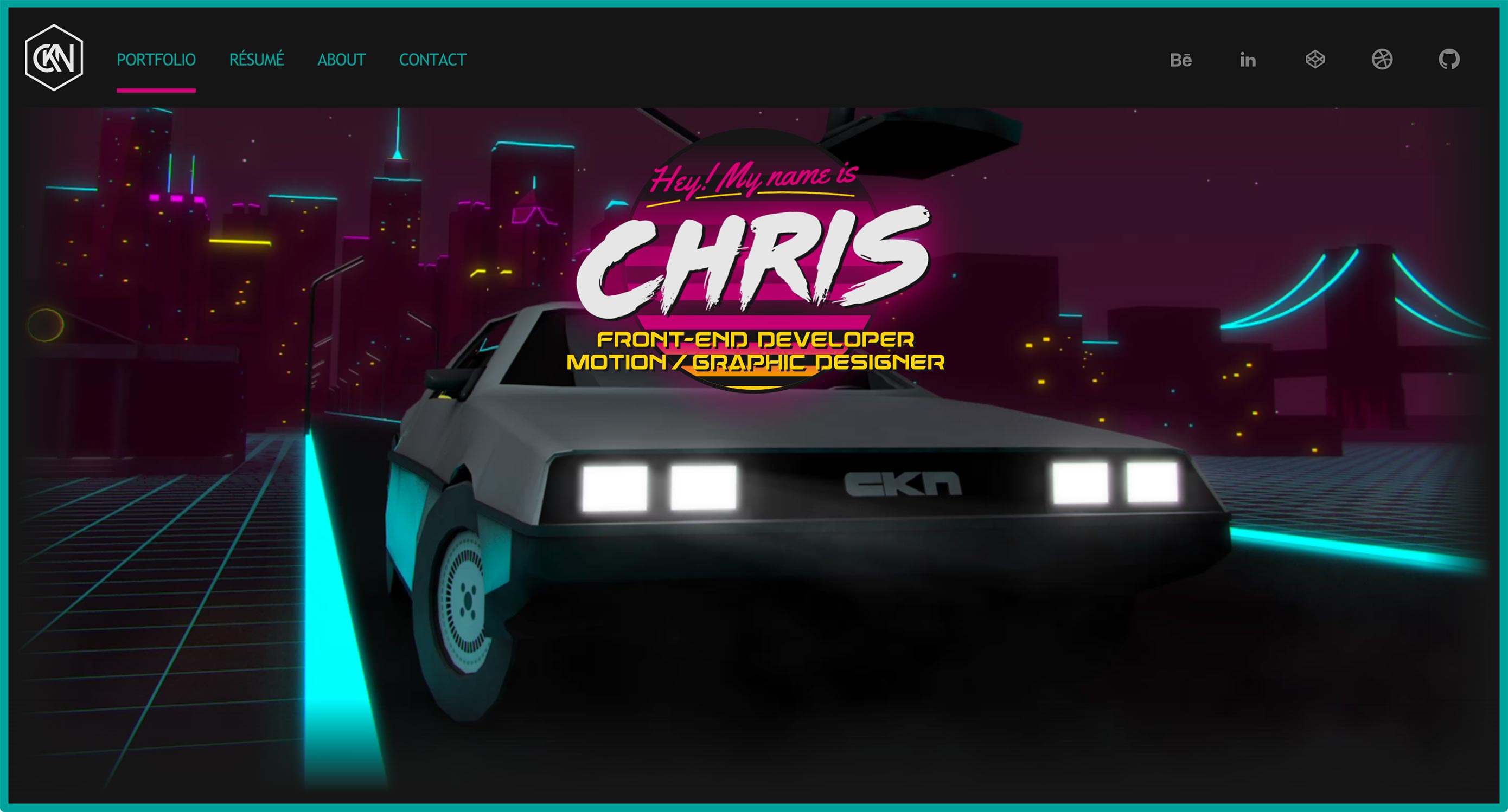
Less+More
Next up, Less+More is perhaps the very embodiment of the “white space and thick heading type” school of design. It has big type. It has big images. It has... a lightly-animated Venn diagram? Okay, I like that. No prizes for originality, but it looks good.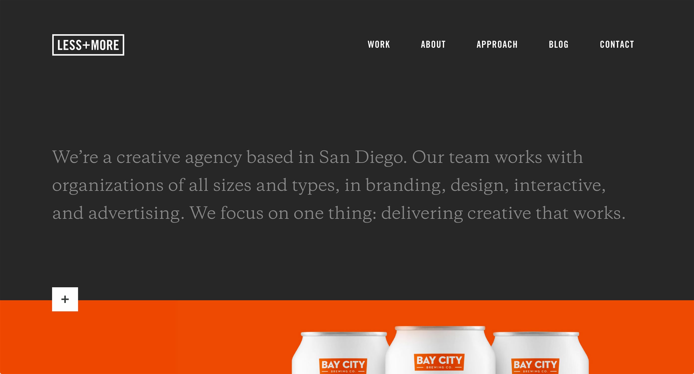
Marina Rachello
Every time I see a site so brazenly colorful as Marina Rachello’s portfolio, I always wonder if my tendency toward monochromatic palettes is wrong somehow. While some of the bolder tones don’t contrast too well with the black text, it must feel freeing to just go nuts with the colors and shapes. The only change I’d make (besides fixing the potential contrast issue) would be to make the background an SVG rather than a PNG.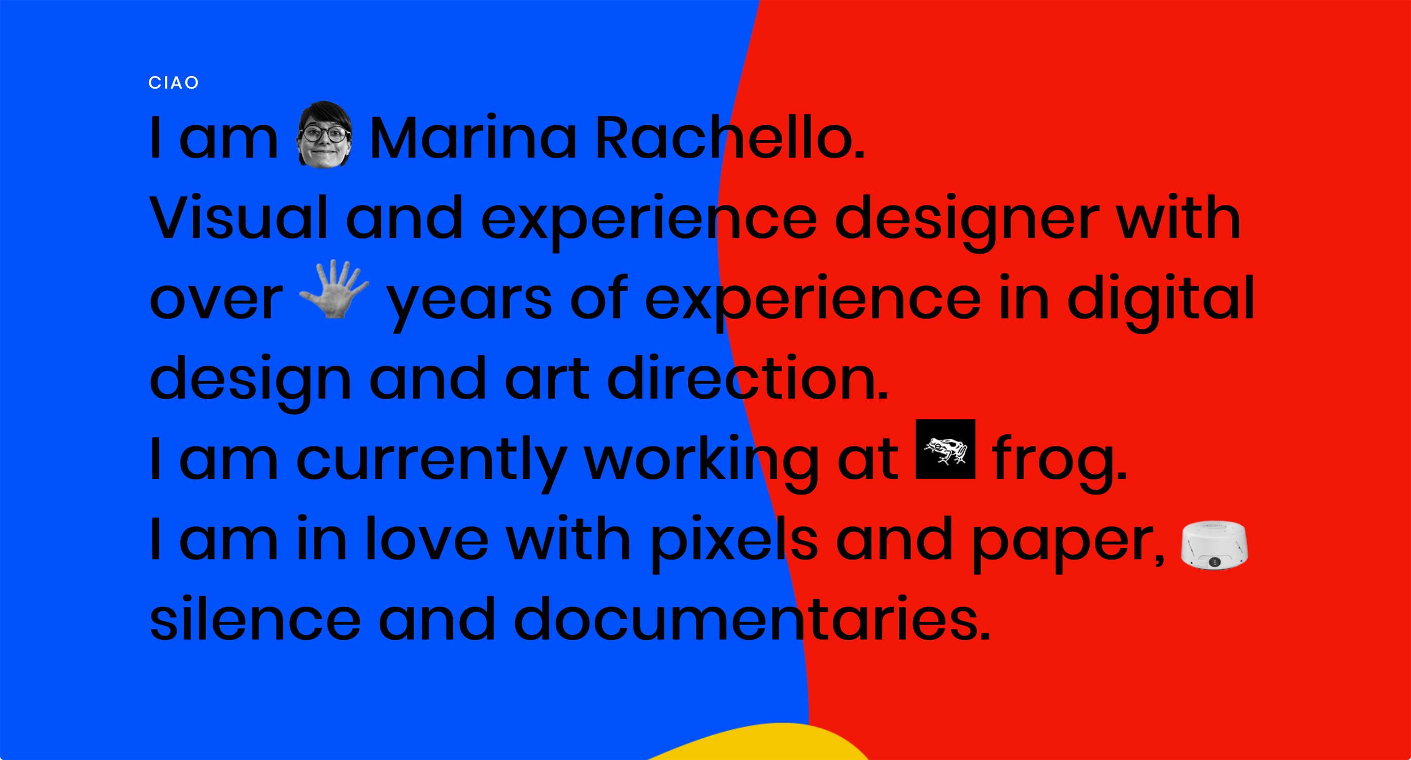
Antoni
Antoni brings us another videographer’s portfolio that goes all in on the motion design. It’s got a visually pleasing combination of background video, and simple, solid minimalism that would just scream “professional” if it weren’t so darned professional.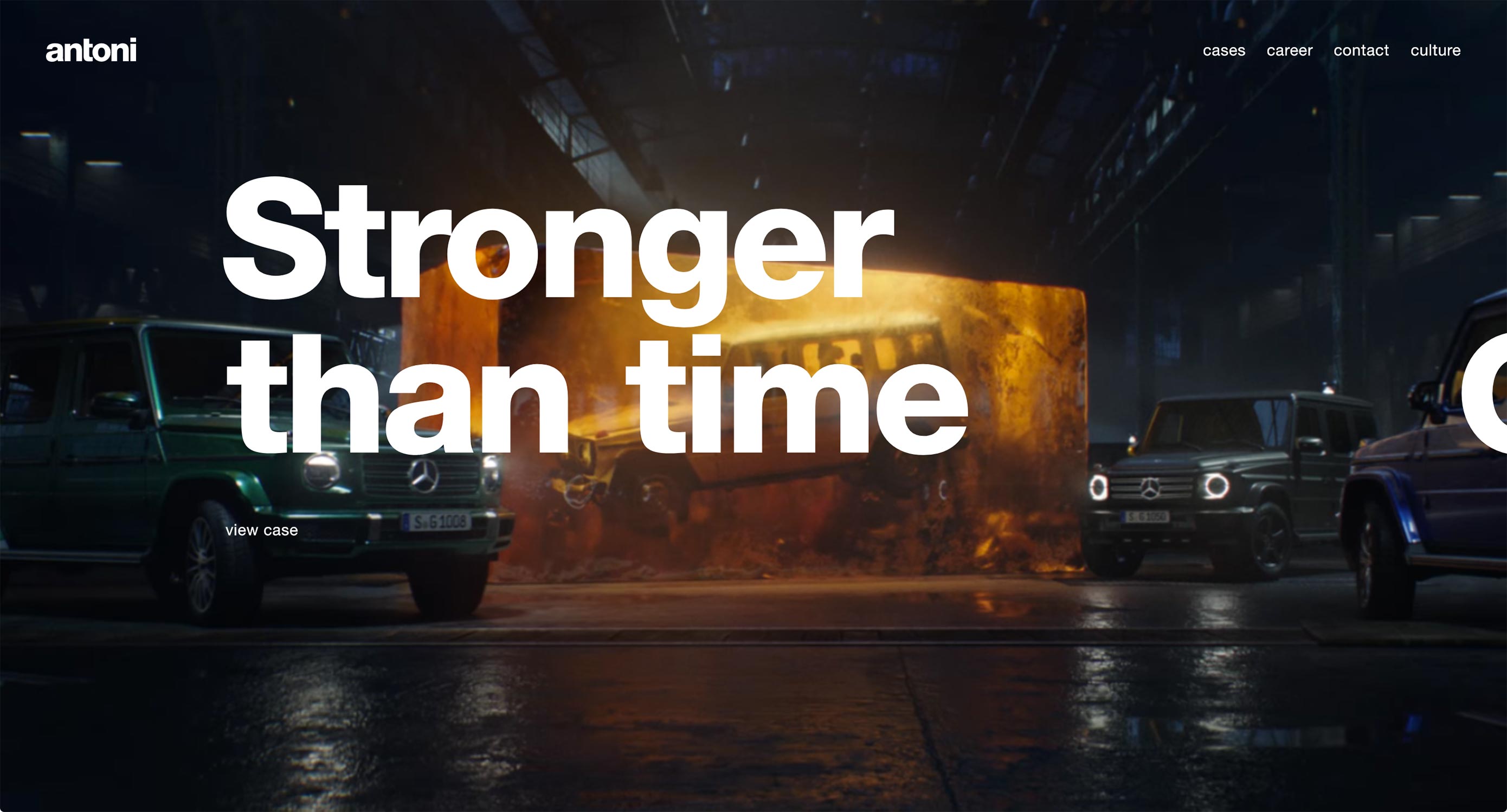
Nikos Pandazaras
Nikos Pandazaras’ portfolio is as artsy as his photography, which is par for photographers’ websites these days. You have the minimalism, the somewhat unconventional layout, and even rather artsy animation. The whole thing really fits the theme.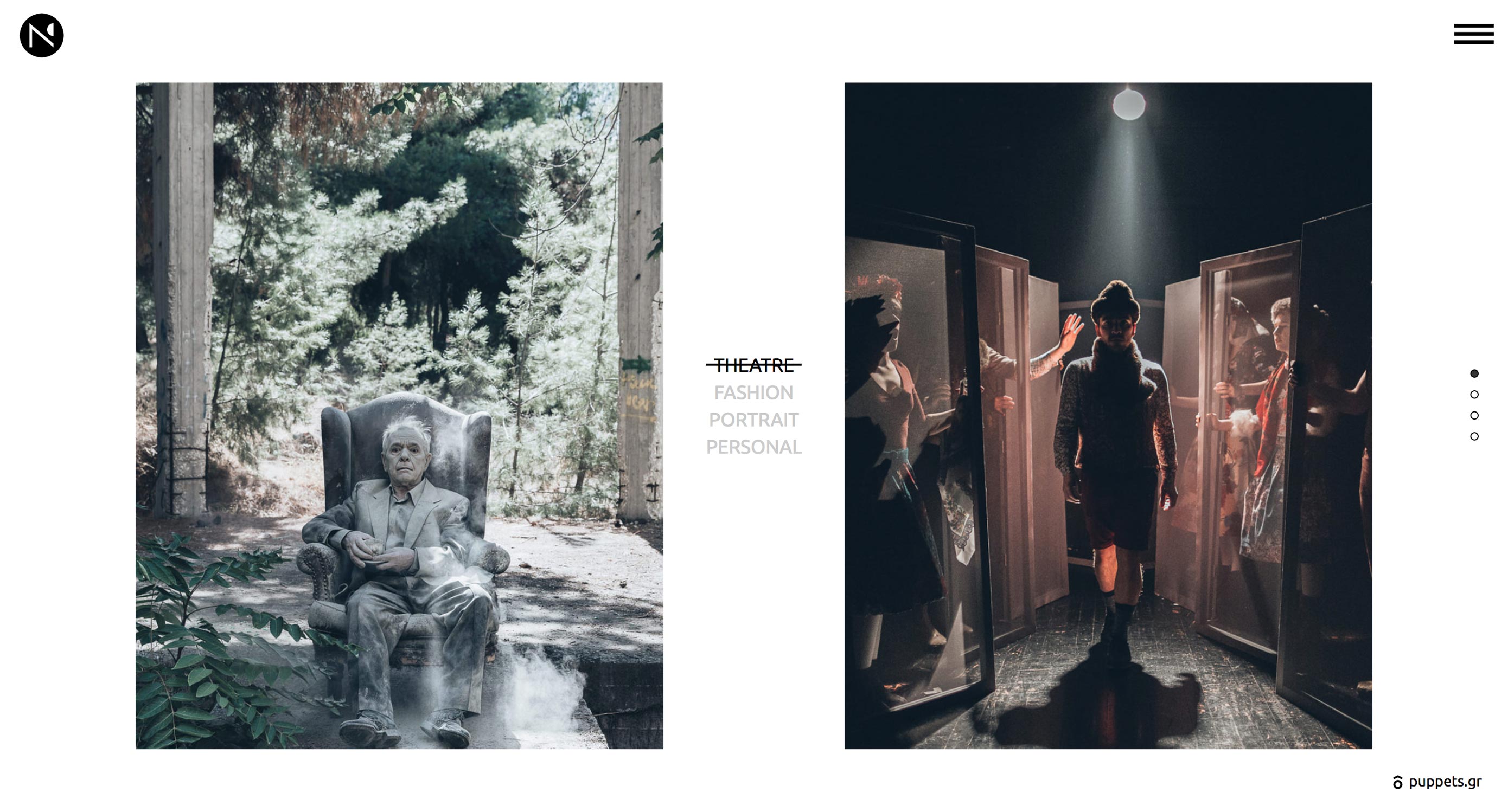
Dow Smith
Dow Smith adheres to the trend of ever-more-minimalist sites, with the big, thin text, and the love of literal white space. Tons of it. There’s also a fair bit of distracting animation, but I actually rather like the way it’s been used. Each portfolio piece is presented as a short video (embedded with HTML5) that shows how a user is expected to interact with the site. It shows how they work, not just how they look.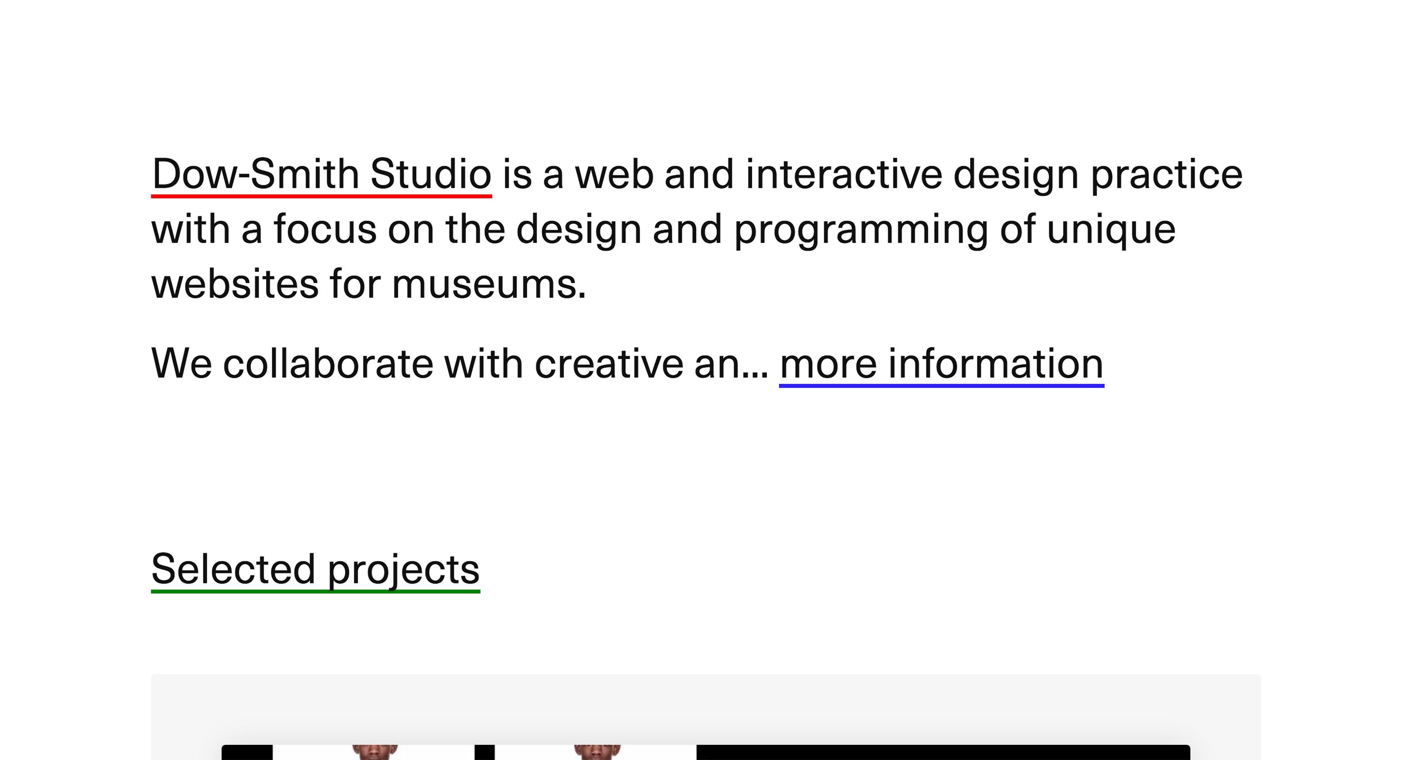
Prollective
Prollective’s website is minimalist and professional, but isn’t afraid to preen a bit. Gradients and bright colors haven’t looked this good since people kept mistaking Web 2.0 for an aesthetic trend. Despite relying far more on type than it does on imagery, this site still feels vibrant.
Blue Productions
Blue Productions properly commits to their theme by, well, using a whole lot of blue. Video is what they’re all about, so expect a fair bit of background video, and stills from their work. I particularly appreciate the cinematic presentation for all of their work.
galgo.studio
galgo.studio’s style of minimalism is bound to remind you at least a little bit of Google. They’ve worked with Google on at least one project, so that sounds about right. It’s clean, it’s smooth, it has that thin text you see on pretty much every Google site now. Some small usability issues on the home page aside, it’s a pleasure to browse.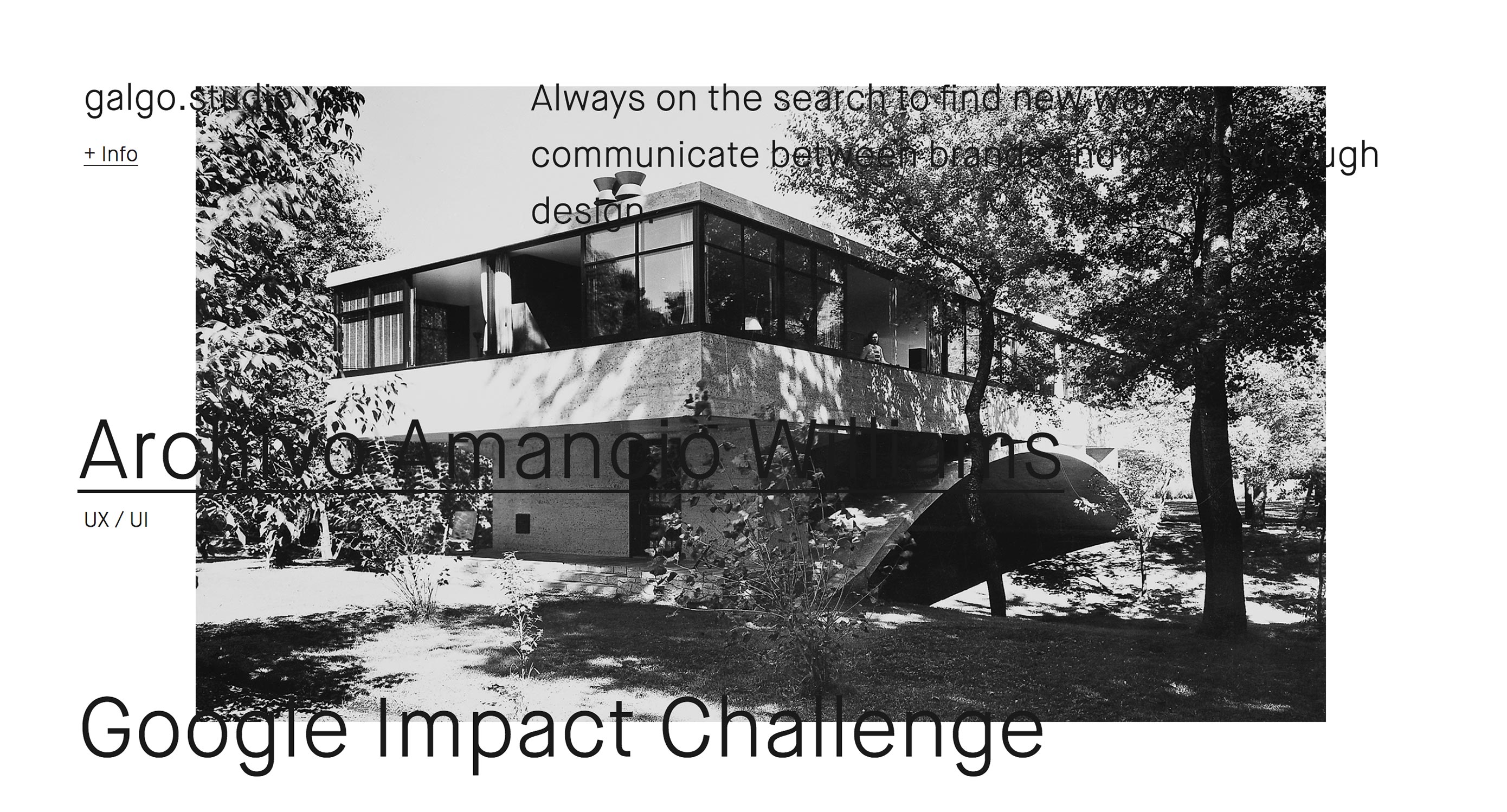
Julie Bonnemoy
Julie Bonnemoy’s portfolio hits you with some rather chaotic lava lamp effects before revealing a classy layout that revels in its asymmetry and imagery in equal measure. I feel like this is one of those sites that is perhaps a bit over-animated. Even so, when it calms down a bit, it’s just plain beautiful to look at.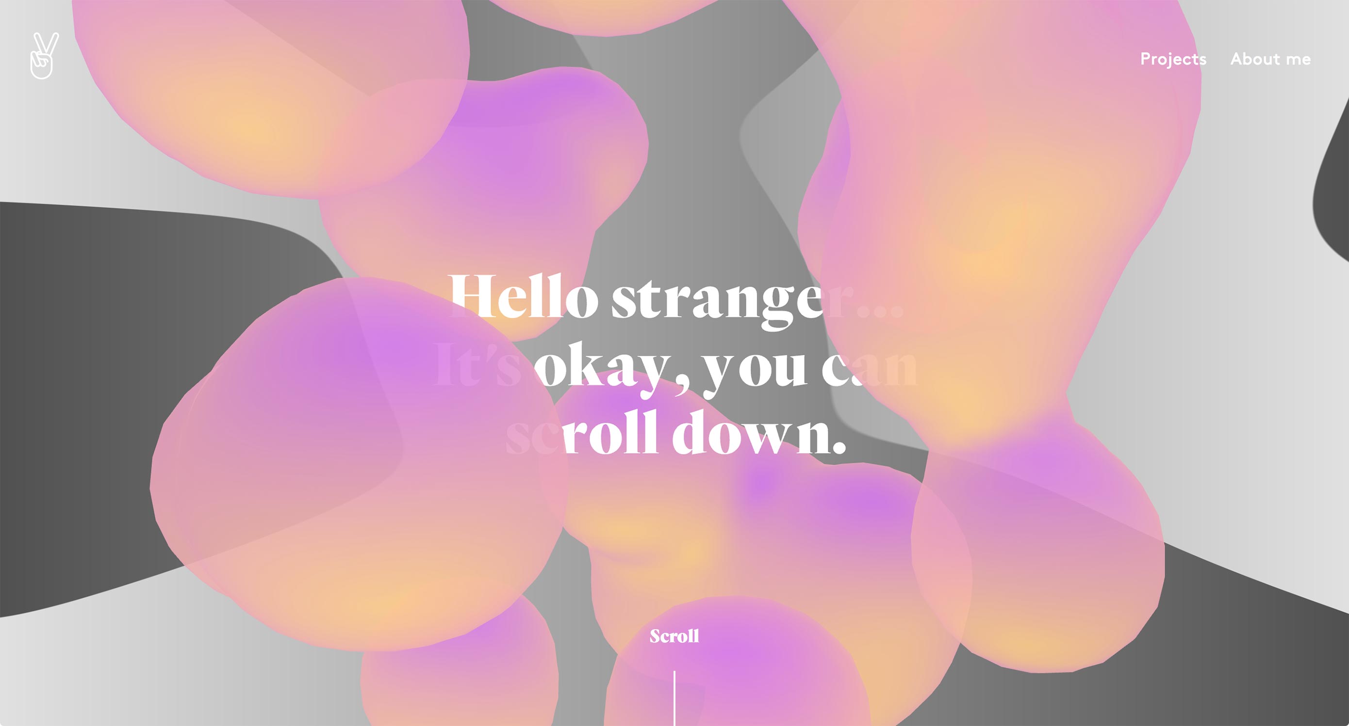
Dinner for Five
Mitsugu Takahashi’s portfolio is elegant. I don’t mean that it uses fancy type (well, it does), or that it uses imagery to project a high-class brand (it does that, too). Those are just surface level indications of a deeper understanding of the way something elegant is supposed to feel. Page loader aside, the site feels graceful, pleasant, and stylish as you could wish for. It’s almost a miracle that only one of the featured projects has anything to do with fancy weddings. It just hits all of the right notes.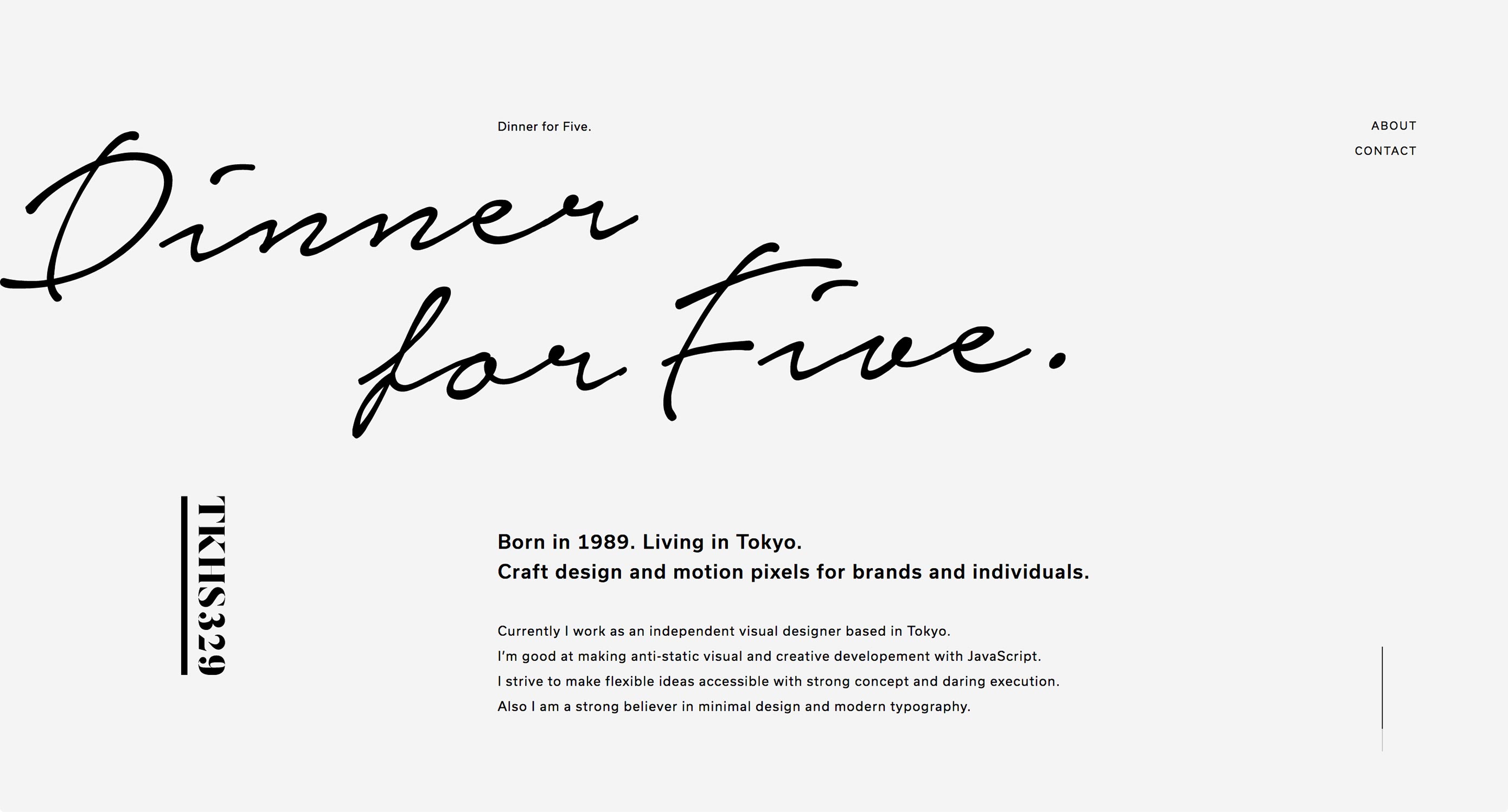
Jermaine Craig
Jermaine Craig makes a bold and risky move by hitting users right in the eye-sockets with a wall of text. The site as a whole seems to be a bit of a work in progress, but it’s already eye-catching enough for this list.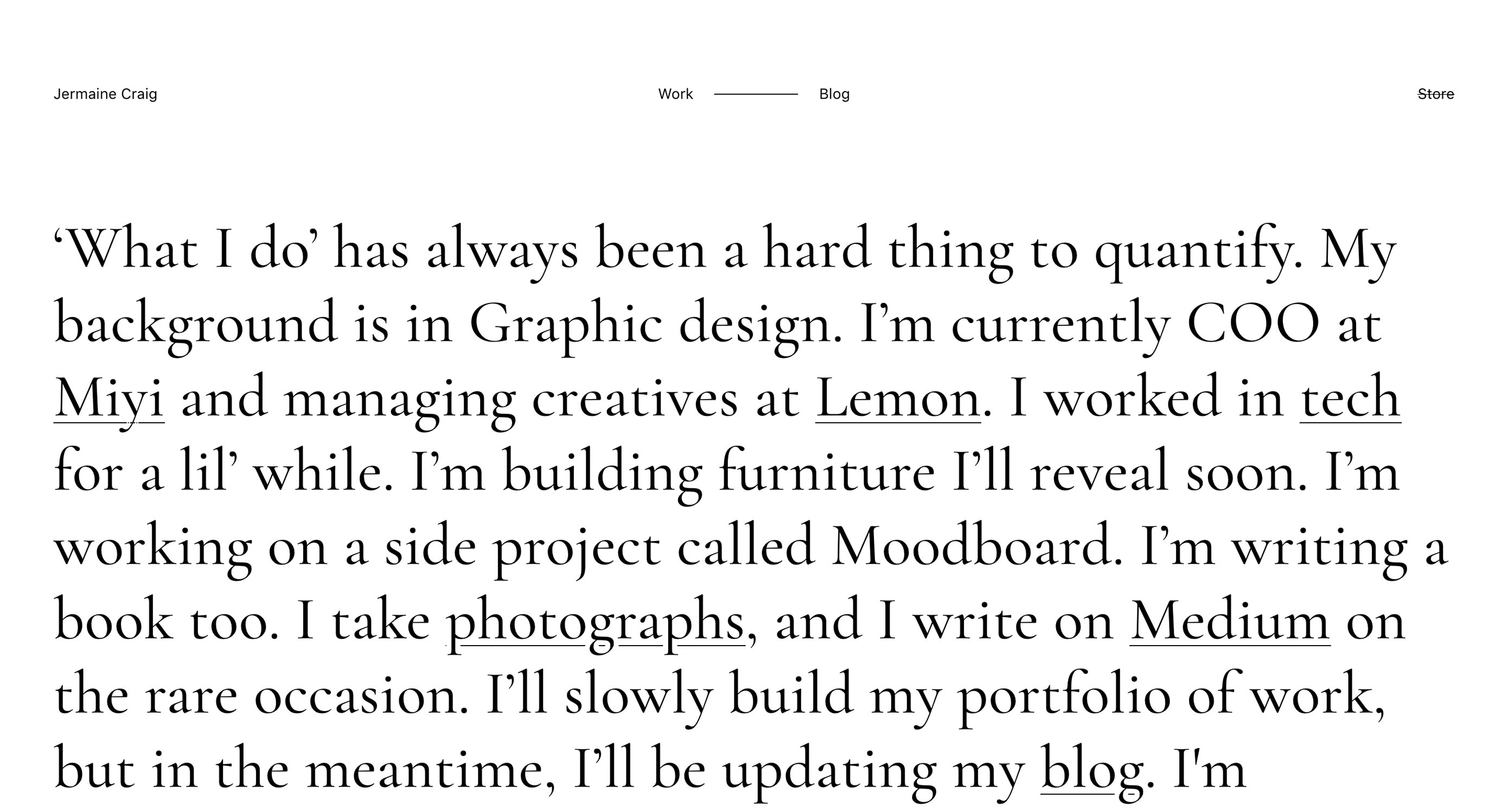
Paper Tiger
Paper Tiger is your classic minimalism that’s had few paint-filled balloons thrown at it. The people at Paper Tiger are apparently good at throwing things, though, as the use of color doesn’t overwhelm the rest of the design at all. It just takes an already-solid design and makes it stand out a bit more.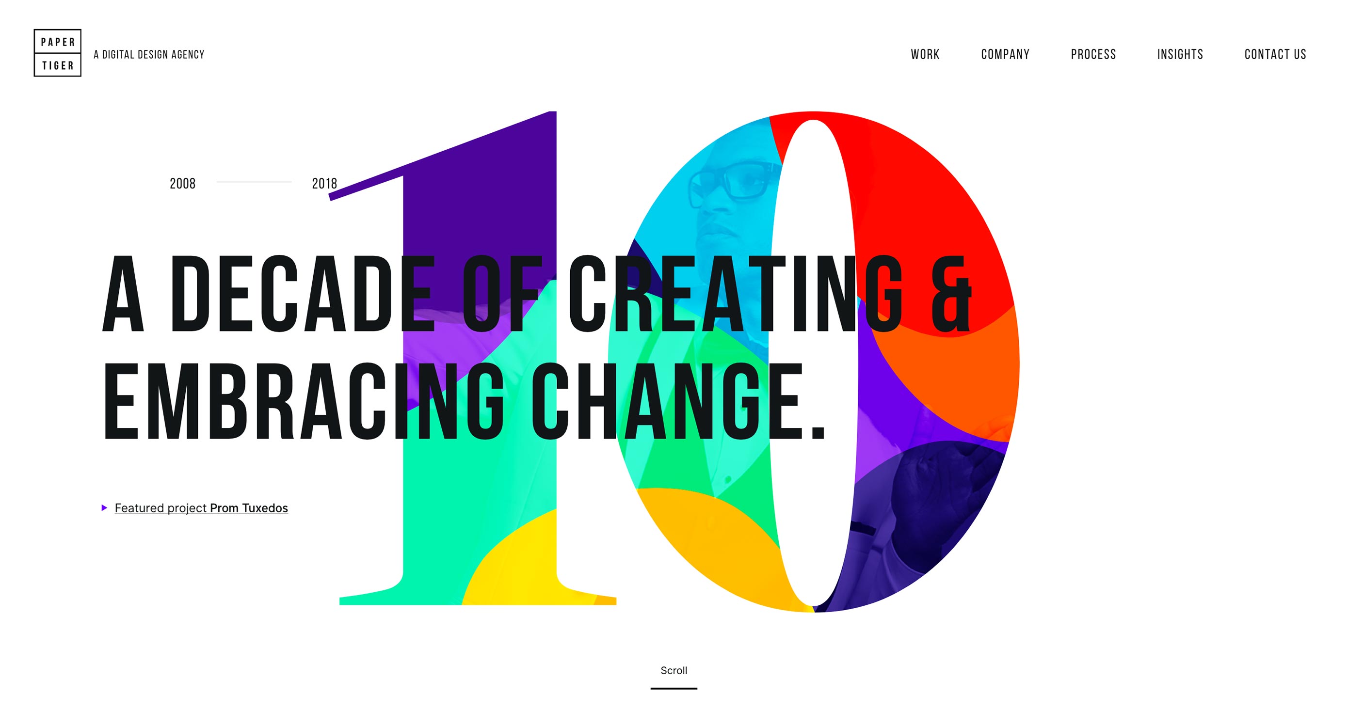
James Merrell Architects
I’m not sure why architects love the PowerPoint-style site so much, but James Merrell Architects is a fine example of the form. Even their blog is part presentation, and part print publication. The cool thing is that CSS (and JS) has come far enough to make sites like this reasonably usable, and even pretty. Even though building sites this way goes against my personal preferences — and even though there’s no point in hiding the navigation behind a hamburger menu on the desktop — I have to admit that it just looks good.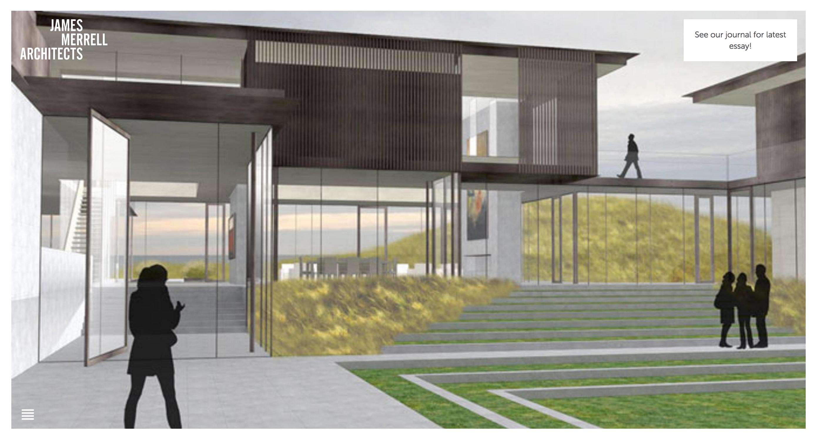
Kickpush
It’s one heck of a power move for a company that makes mobile apps (and occasionally websites) to state that they don’t even like the Internet. And yet, Kickpush has done just that. Of course, they also call London “sunny” which is exactly how you know they’re kidding. That brashness permeates the site’s entire aesthetic and experience.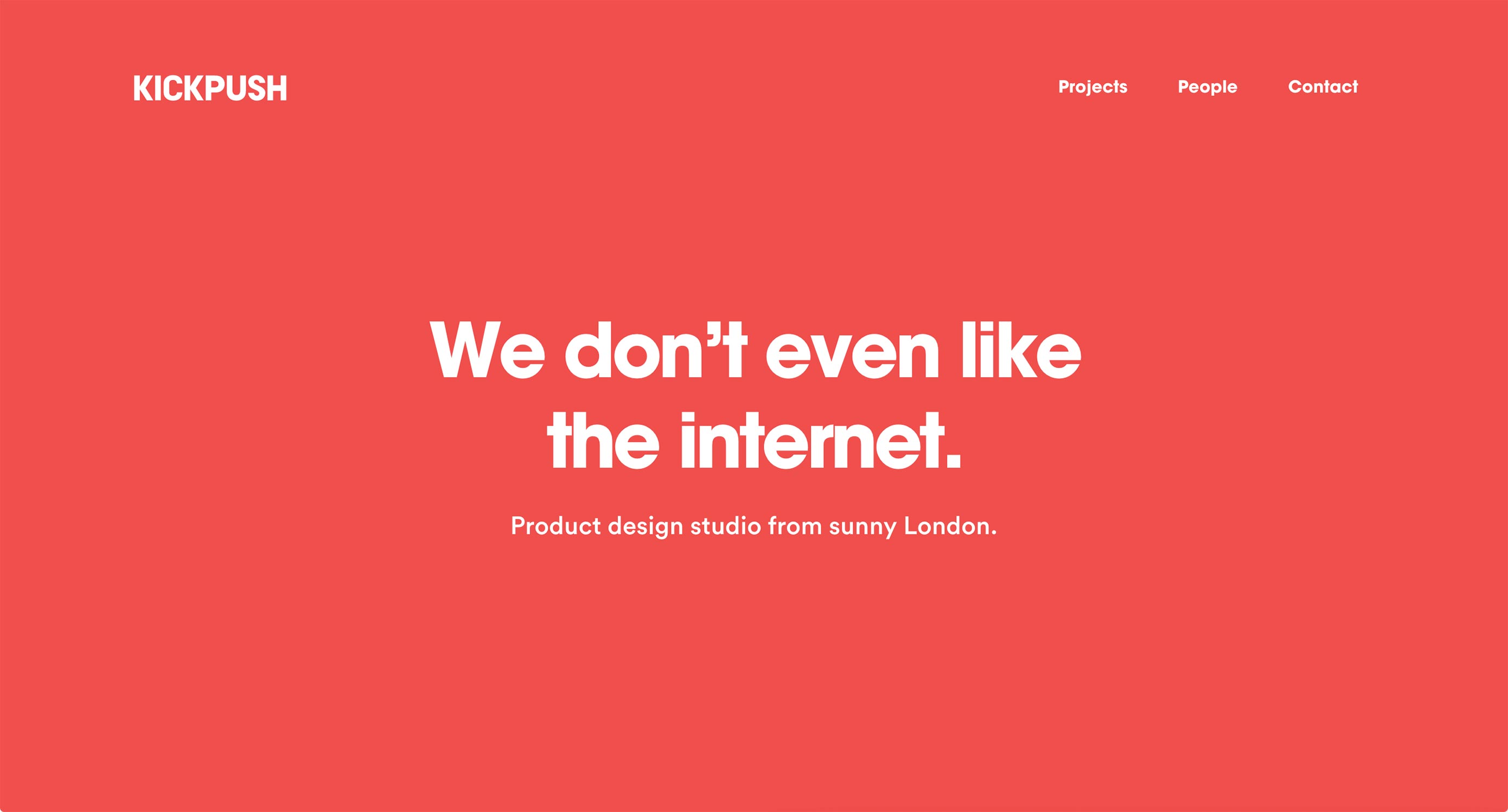
MoreSleep
MoreSleep is not just a good idea, it’s also a design studio. This one has gone for that holy grail of alternative aesthetics: the horizontal layout. Well, on their home page anyway.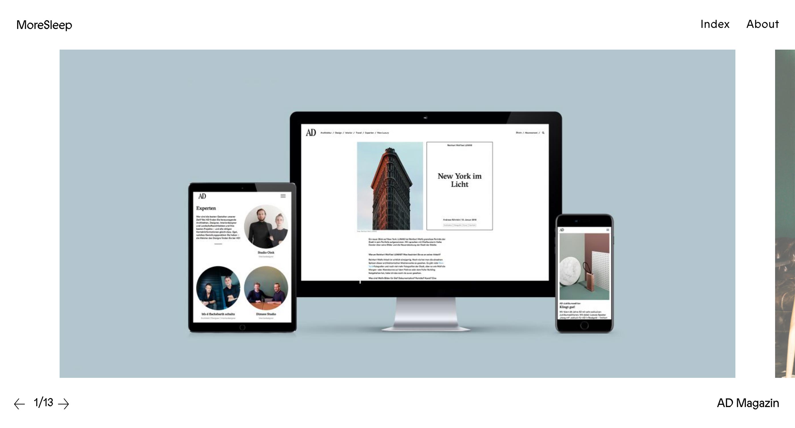
Nathan Young
Nathan Young has brought us a multiple-slideshow portfolio for our enjoyment. This sort of portfolio is actually growing on me a bit, though I’d personally try for pure CSS slideshows.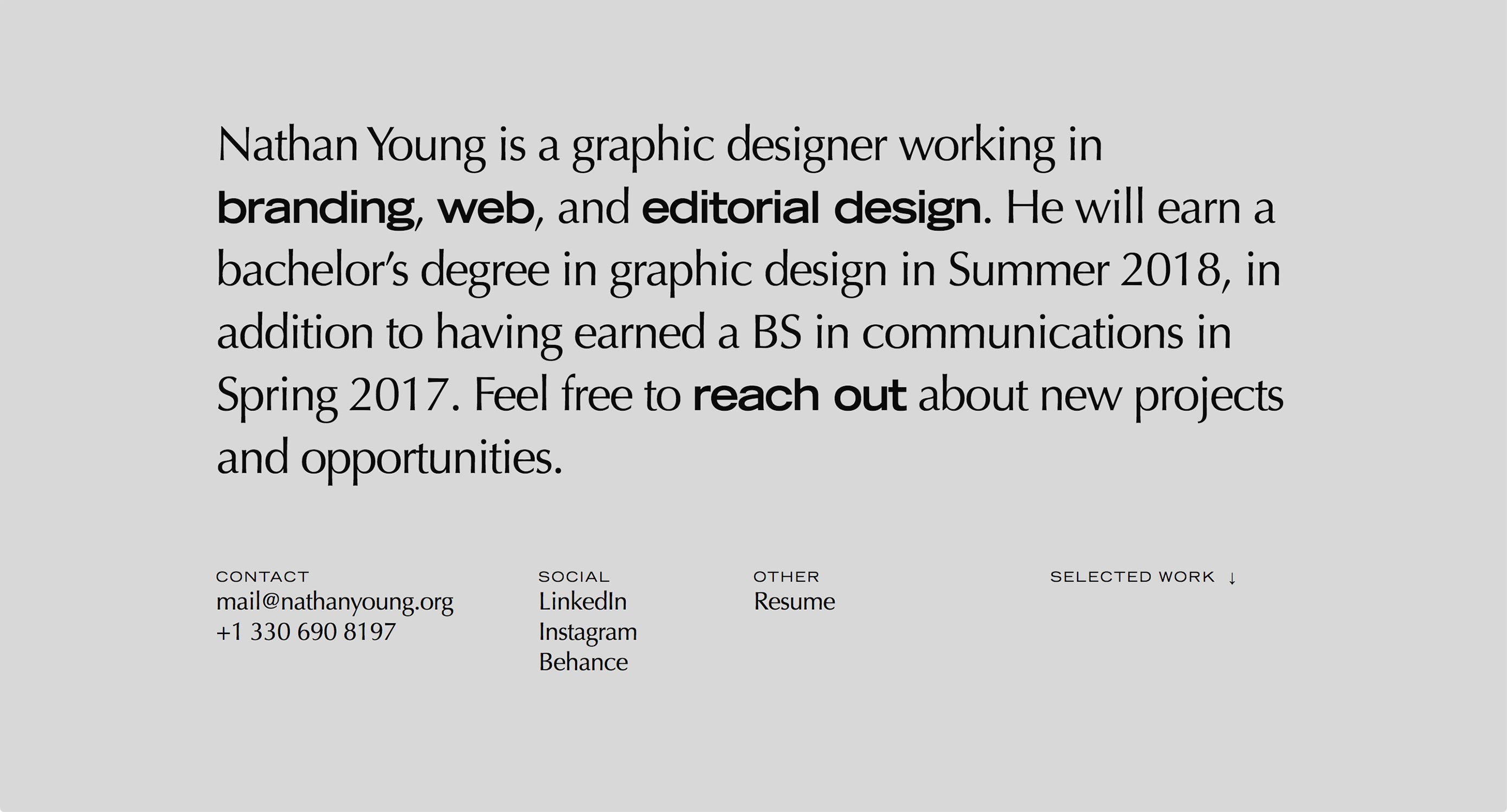
Jack Davidson
Jack Davidson’s portfolio makes absolutely sure that you will read the title of every project by replacing your cursor with said title. Don’t worry, it goes back to the regular pointer as soon as you mouse over the navigation, so it remains useful. The site is interesting, but I want to dock it a few points for using a “screen saver”. I’m getting a bit annoyed with those. At least this one is a slideshow of his work, so it’s still kind of useful.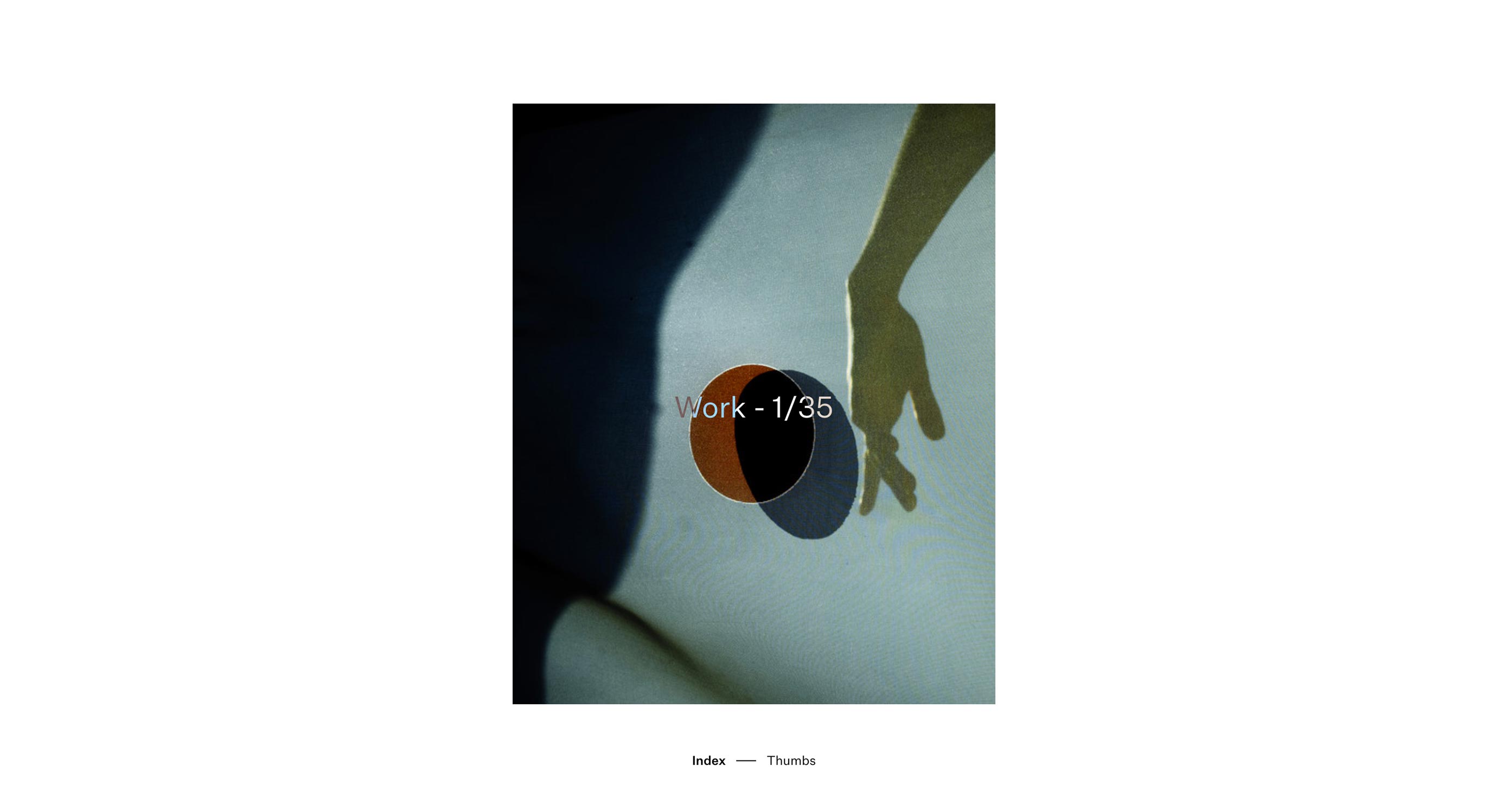
Amateur.rocks
Okay, a thousand websites have done the “it’s all text until you hover on a project name” thing. I’d just like to point at amateur.rocks to say, "They did it right." See how the images are kept from overlapping the title of the project you’re previewing? See how they don’t have to worry about text contrast like that? That’s the right way to do it.
Giovanna Silva
Giovanna Silva has taken the unconventional route of allowing people to make their own collages (sort of) with her portfolio. Click on a country/location, then start clicking away to see every picture in the project. After you’ve exhausted the stack of photos, you can see them all again in a more conventional layout. The rest of the site is a bit more conventional, too, but looks good.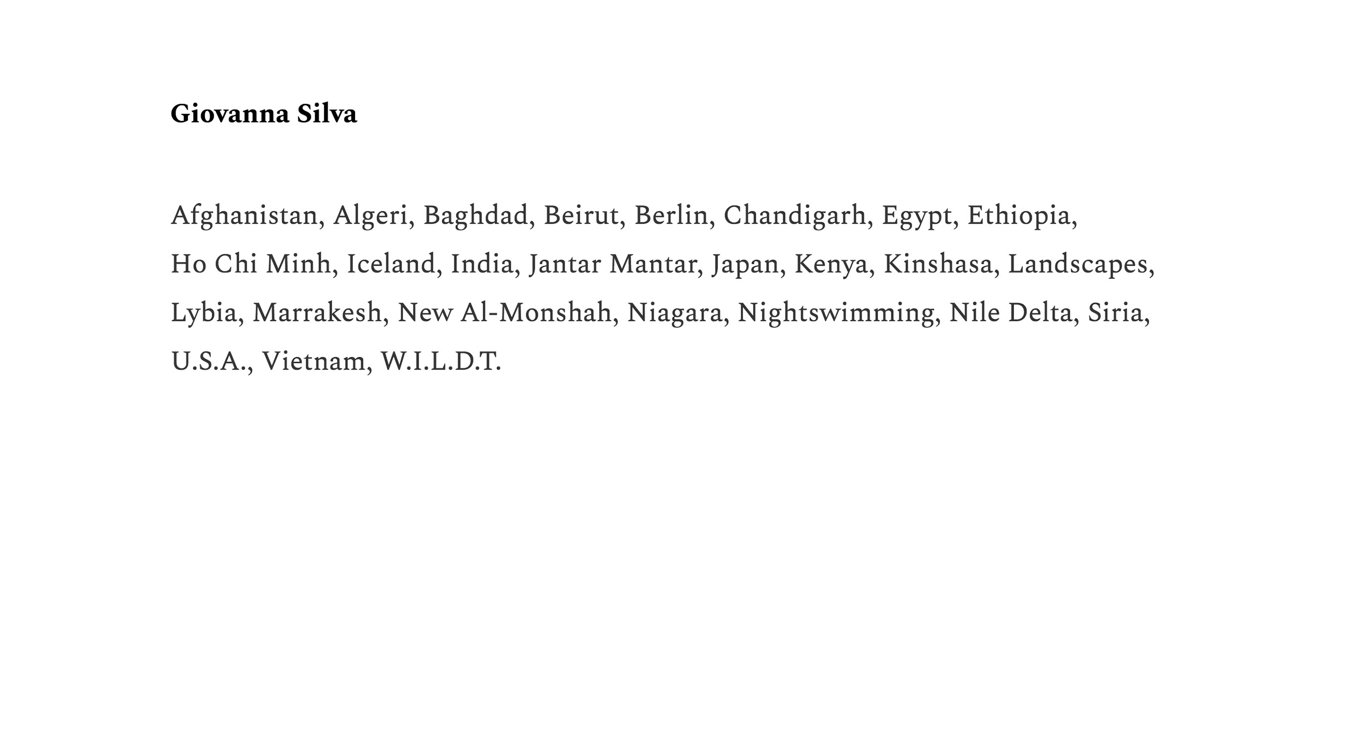
Ezequiel Bruni
Ezequiel Bruni is a web/UX designer, blogger, and aspiring photographer living in Mexico. When he’s not up to his finely-chiselled ears in wire-frames and front-end code, or ranting about the same, he indulges in beer, pizza, fantasy novels, and stand-up comedy.


Read Next

3 Essential Design Trends, May 2024
Integrated navigation elements, interactive typography, and digital overprints are three website design trends making…

How to Write World-Beating Web Content
Writing for the web is different from all other formats. We typically do not read to any real depth on the web; we…
By Louise North

20 Best New Websites, April 2024
Welcome to our sites of the month for April. With some websites, the details make all the difference, while in others,…

Exciting New Tools for Designers, April 2024
Welcome to our April tools collection. There are no practical jokes here, just practical gadgets, services, and apps to…

How Web Designers Can Stay Relevant in the Age of AI
The digital landscape is evolving rapidly. With the advent of AI, every sector is witnessing a revolution, including…
By Louise North

14 Top UX Tools for Designers in 2024
User Experience (UX) is one of the most important fields of design, so it should come as no surprise that there are a…
By Simon Sterne

What Negative Effects Does a Bad Website Design Have On My Business?
Consumer expectations for a responsive, immersive, and visually appealing website experience have never been higher. In…

10+ Best Resources & Tools for Web Designers (2024 update)
Is searching for the best web design tools to suit your needs akin to having a recurring bad dream? Does each…
By WDD Staff

3 Essential Design Trends, April 2024
Ready to jump into some amazing new design ideas for Spring? Our roundup has everything from UX to color trends…

How to Plan Your First Successful Website
Planning a new website can be exciting and — if you’re anything like me — a little daunting. Whether you’re an…
By Simon Sterne

15 Best New Fonts, March 2024
Welcome to March’s edition of our roundup of the best new fonts for designers. This month’s compilation includes…
By Ben Moss

LimeWire Developer APIs Herald a New Era of AI Integration
Generative AI is a fascinating technology. Far from the design killer some people feared, it is an empowering and…
By WDD Staff