

Kaj Jeffries
Kaj Jeffries has won my meme-loving heart by the simple expedient of using GIFs to showcase his work as a director. It’s a simple technique that works flawlessly with his particular directorial style. The layout with two columns that scroll in opposite directions is perhaps not the most practical, but certainly fits the vibe while not being unusable.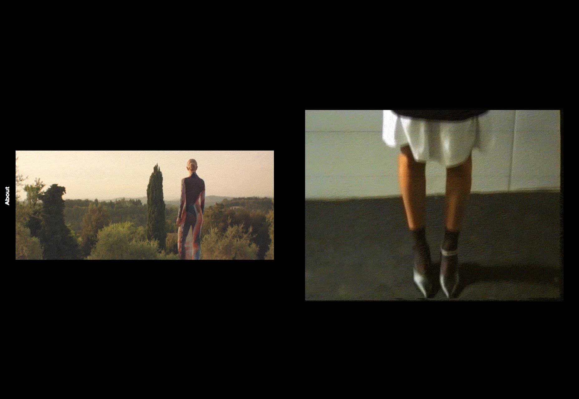
Ori Studio
Ori Studio is the first site in a long time to have “dots” as their primary theme. I don’t know, the first word I thought of was “pointillism”, but that doesn’t feel quite right. In any case, the style lends a very distinct feel to the site, and I doubt I’ll forget it soon.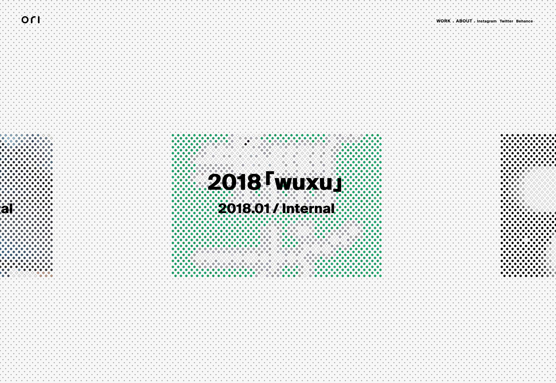
Julien Renau
When you take into account how much I dislike pre-loaders and the overuse of animation, it says something that I like Julien Renau’s portfolio. There’s just something about the little blinking mascot (which you can control via the arrow keys), and the execution of the rest of the site that I find both elegant, and a little charming.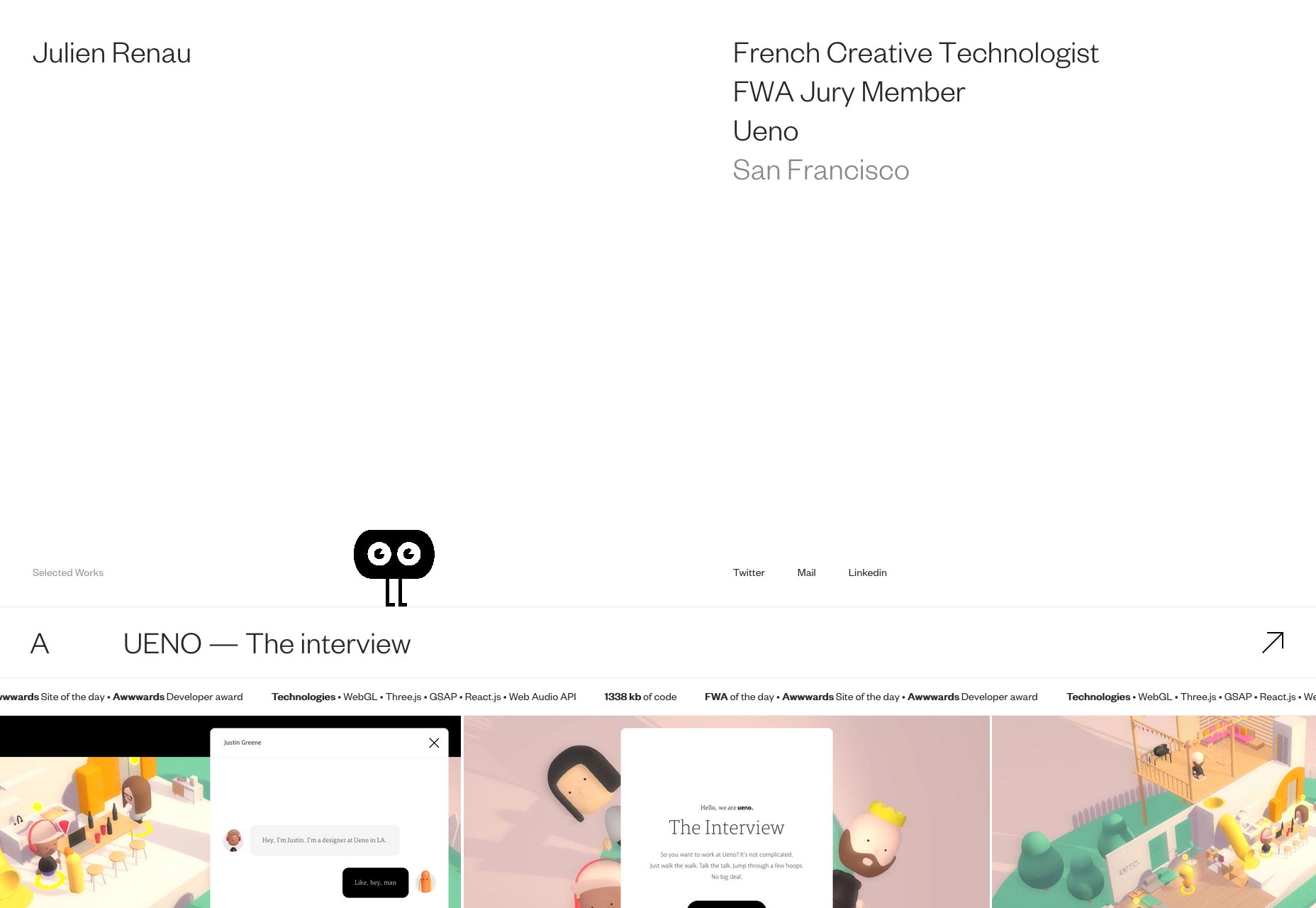
Uncanny Valley Studio
Uncanny Valley Studio changes up what would otherwise be a fairly standard minimalist layout by embracing a distorted graphical style when presenting their projects. And it works. Each of their projects also seems to feature some interactive elements, such as this basic music looper. This adds a whole new dimension to the way users experience the portfolio.
Snow Beach
Anyone who’s read a few of these articles will know that I can appreciate designers trying something bold, and even drastic, even if it’s a little flawed. That’s more or less how I’d describe Snow Beach, a portfolio for what appears to be a team of directors. The navigation isn’t exactly obvious as navigation until you look closely, and the “screensaver” kicks in way too quickly. Otherwise, this site hits you hard with that red tone, and a design that is obviously all about getting you to the videos as quickly as possible. I like it.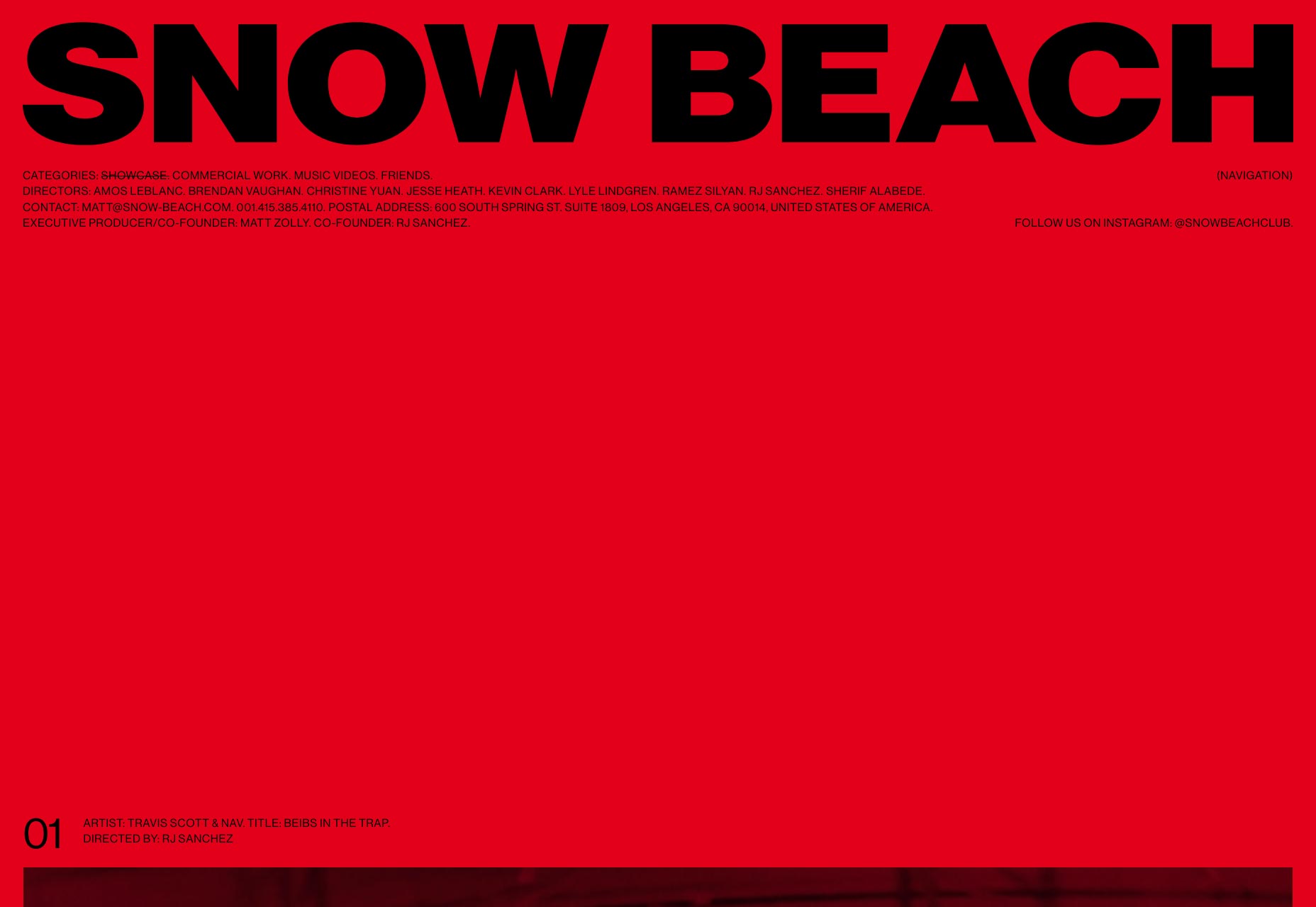
Community Films
Community Films is another portfolio for several different directors. Instead of hitting you hard with a ton of one single color, though, this one organizes its videos (and Instagram posts) into a pleasant masonry layout. I’d say they need to make it clearer which links are Instagram picture and which are videos from the get-go, without requiring the user to hover over each one. Otherwise, the site is pleasant to browse, and stays out of your way.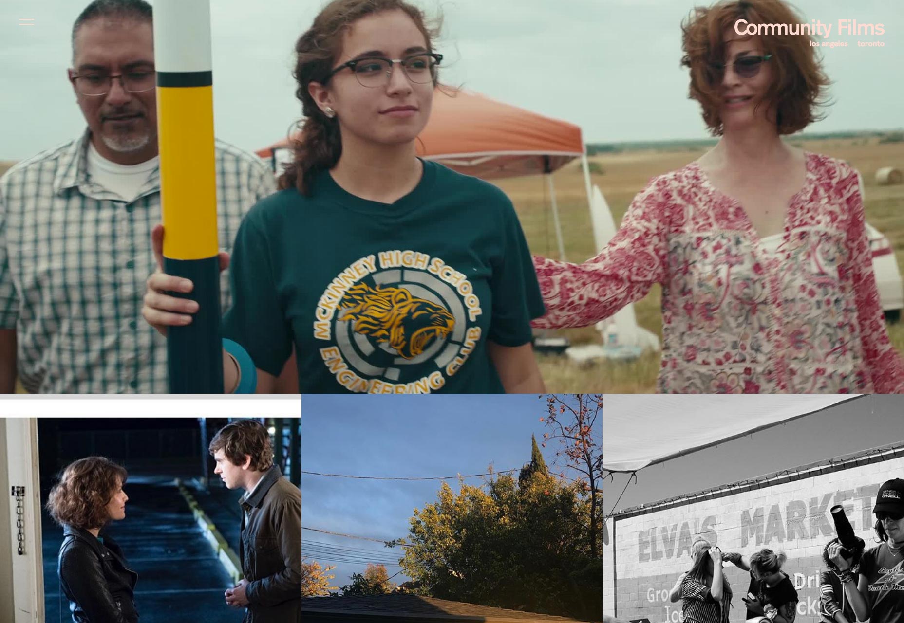
One Design Company
ODC2017 is an interesting case, as it’s not the main portfolio. It’s just a collection of things that One Design Company did in 2017. I have to say, it’s rare for me to see over a dozen color palettes put to use in one page, and even rarer still for me to think it works. But it works here.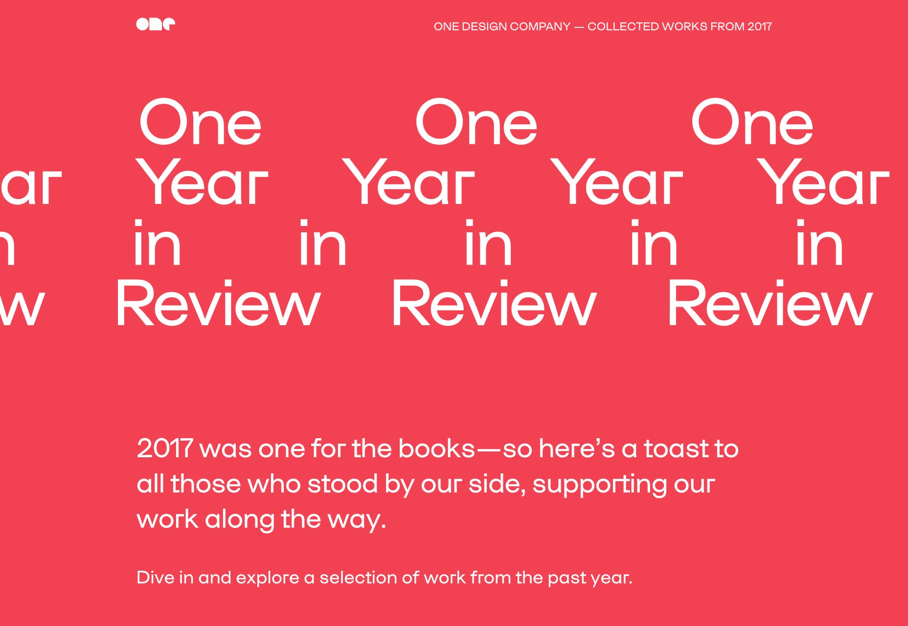
Claudia Basel
Claudia Basel’s portfolio is another one of those sites that hits the right spot ion a weird way. You know, like, it’s weird but it’s good weird. Full-screen navigation with what looks an awful lot like a family photo on the home page gives way to a minimalist portfolio that is clean and clear.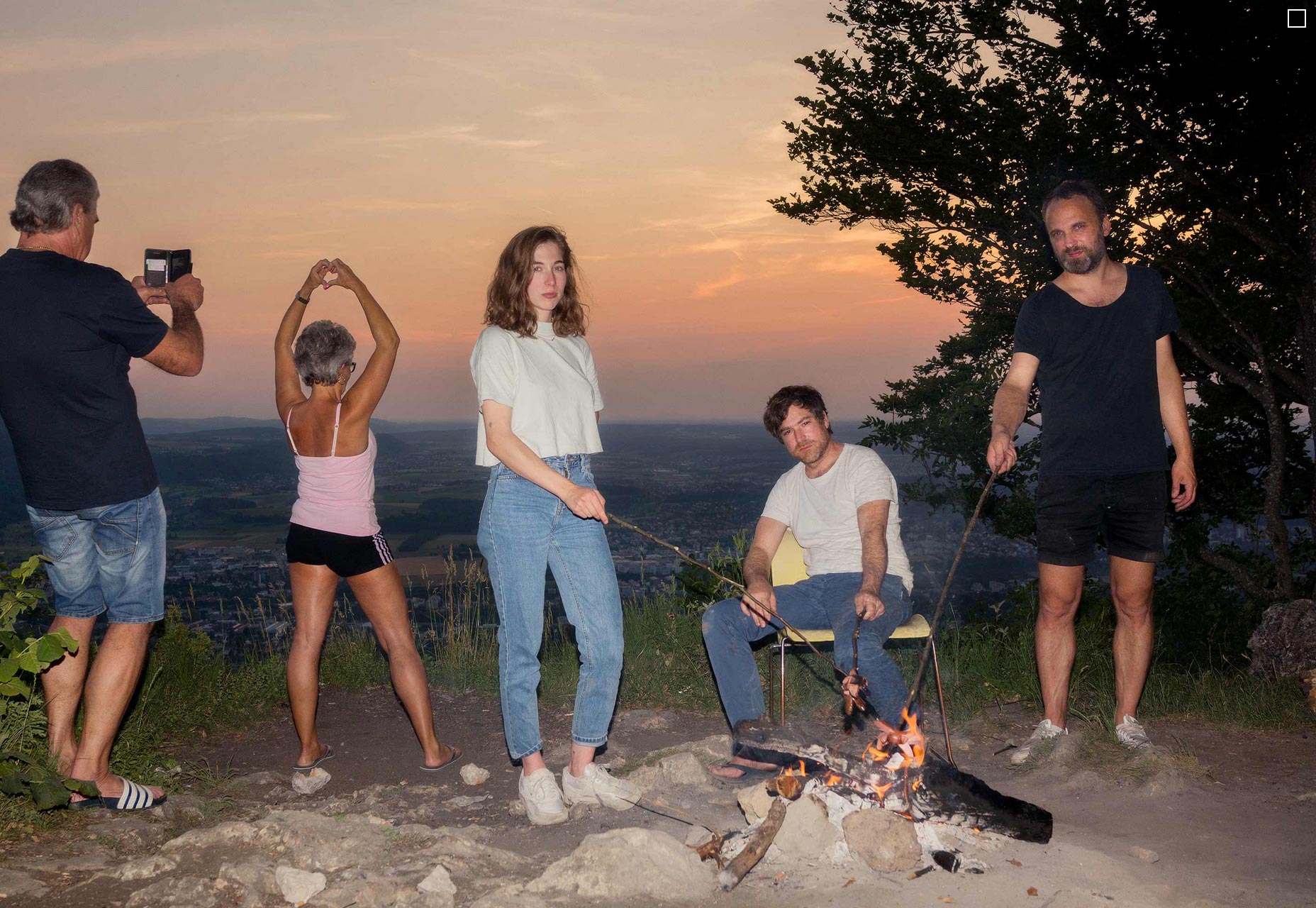
Hugo Vann
Hugo Vann took the now very-familiar asymmetrical site and gave it a dark coat of paint. It’s simple, and nothing mind-blowing, but it looks pretty, and works well. What I do particularly like is the way he presents snapshots of his work in ways that make sense for the medium. For example, he doesn’t present his mobile interfaces with skeuomorphic faux-phones, but you can still tell it’s a mobile interface first and foremost.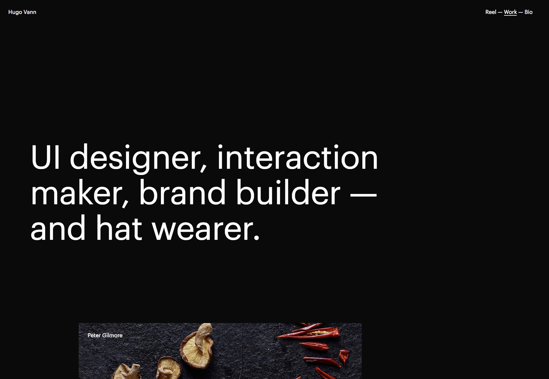
Patrick Heng
Patrick Heng used his portfolio as a way to show off all of the fancy interactive tricks he could pull. But I’ll find a way to forgive him, if only because it’s just so pleasant to look at. It’s rare that a site manages to feel colorful despite most of its elements being monochromatic. It definitely has something to do with how colorful all of his work is.
Switch
I’d just like to tell the people behind Switch that their site is lovely, find yet another way to implement project slideshows creatively, and that they should look out for lawsuits from Nintendo; they litigate hard. I typically wouldn’t recommend using slideshows for everything, but I must admit that more and more sites manage to make it work. Switch is one of them. I’d just make the contact info horizontal again. I don’t like trying to decipher text that’s “on its side”.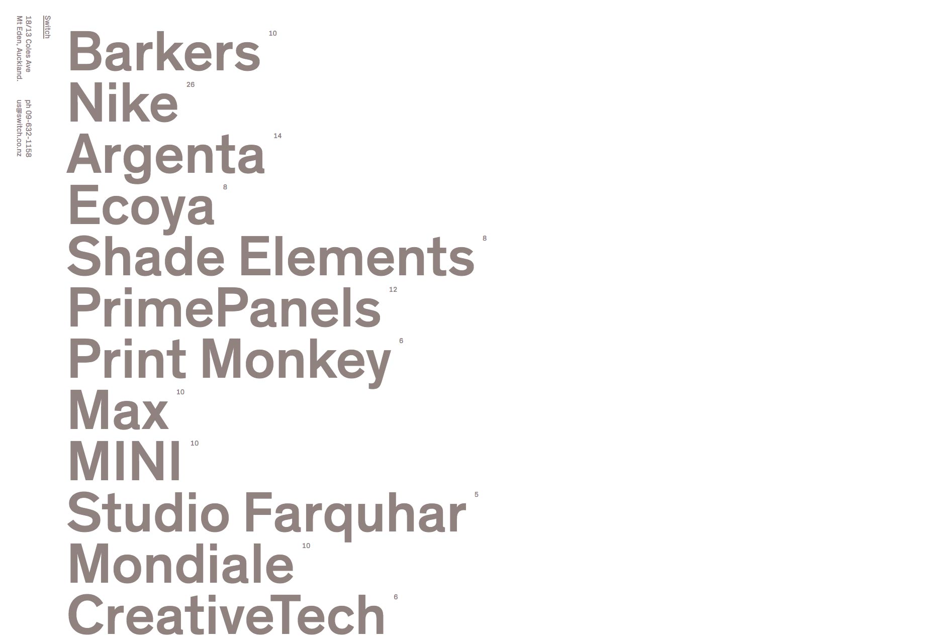
Akademi
With the dead-simple layout, the huge and bold sans-serif type, and the thick black borders on some thing, Akademi feels like a bit of a throwback. You know, a throwback to two or three years ago, at most? Darn, trends move fast. It ain’t fancy, but it’s a good website. Man, I almost miss this style, now.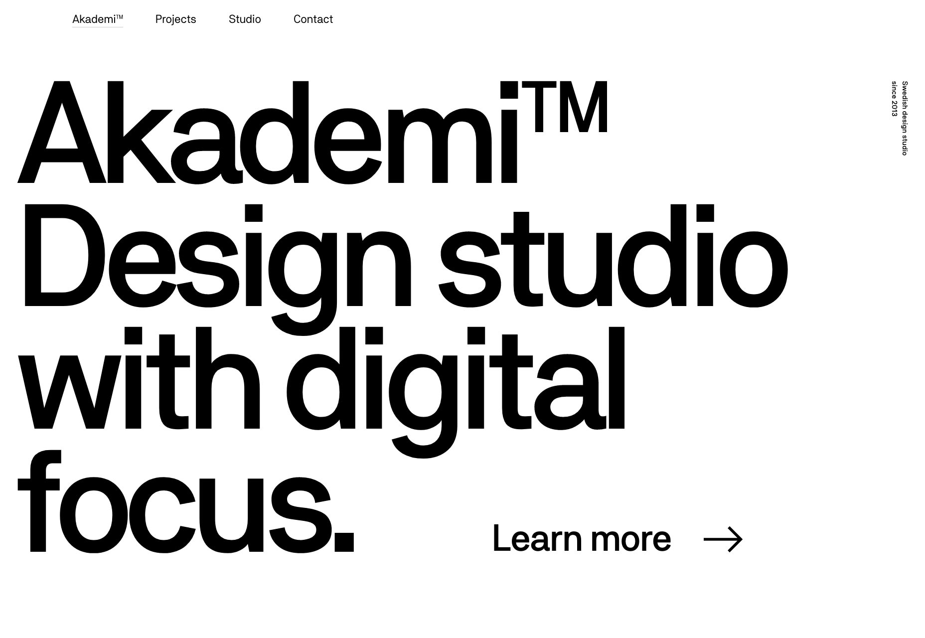
Two Twenty Two
Two Twenty Two is the next site on this list to go a little nuts with the 3D graphics on its website. We’ve got polygonal pizza, lollipops, toast, sunglasses, and those boxes from Super Mario that have question marks. The rest of the site sticks to a fairly typical layout, but that homepage really sets the tone.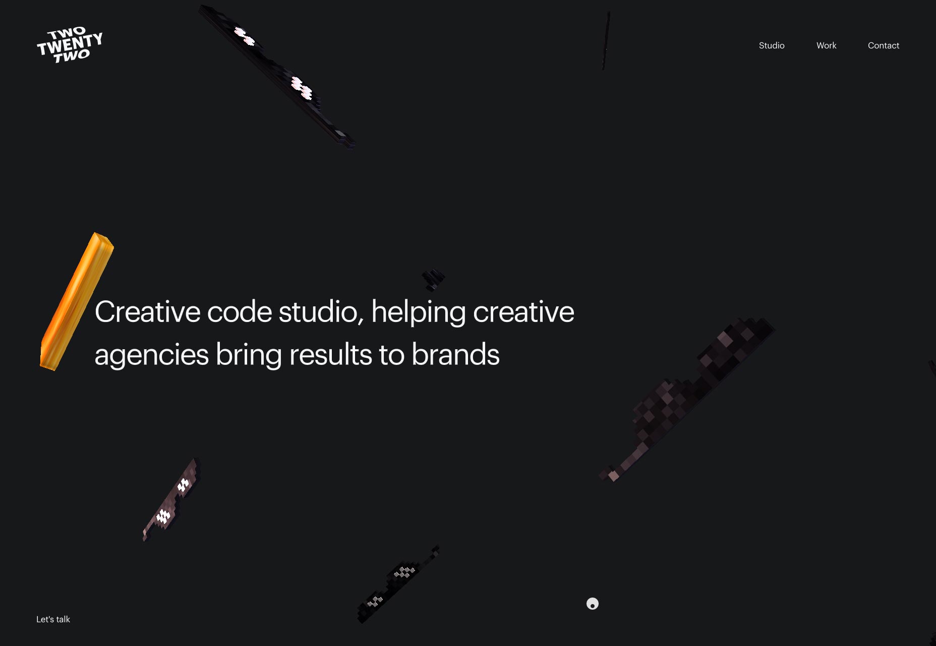
Magic People Voodoo People
Magic People Voodoo People lives up to its name by embracing a new-age kind of vibe in its presentation-style portfolio. And even if the logo does look a bit too much like clip-art for my taste, you can’t deny that they have a distinct theme going for them. P.S. Click around on their page until you see lasers shoot from the eye-logo. Then keep clicking as fast as you can.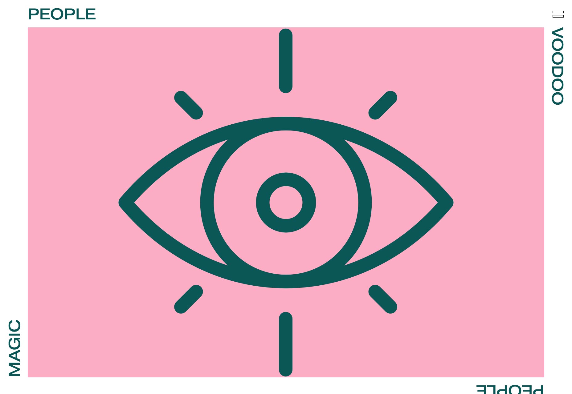
Contrast Films
Contrast Films has taken to the Internet with a presentation-style site that very lightly mimics the look of a video camera’s view-finder. It’s stylish, the type is great, and they milk that theme for all its worth. I am still skeptical of navigation links being spread to all four corners (or sides) of any given website, though. I don’t know where this trend came from, and I’d dearly like to see some numbers on how well it does or doesn’t work.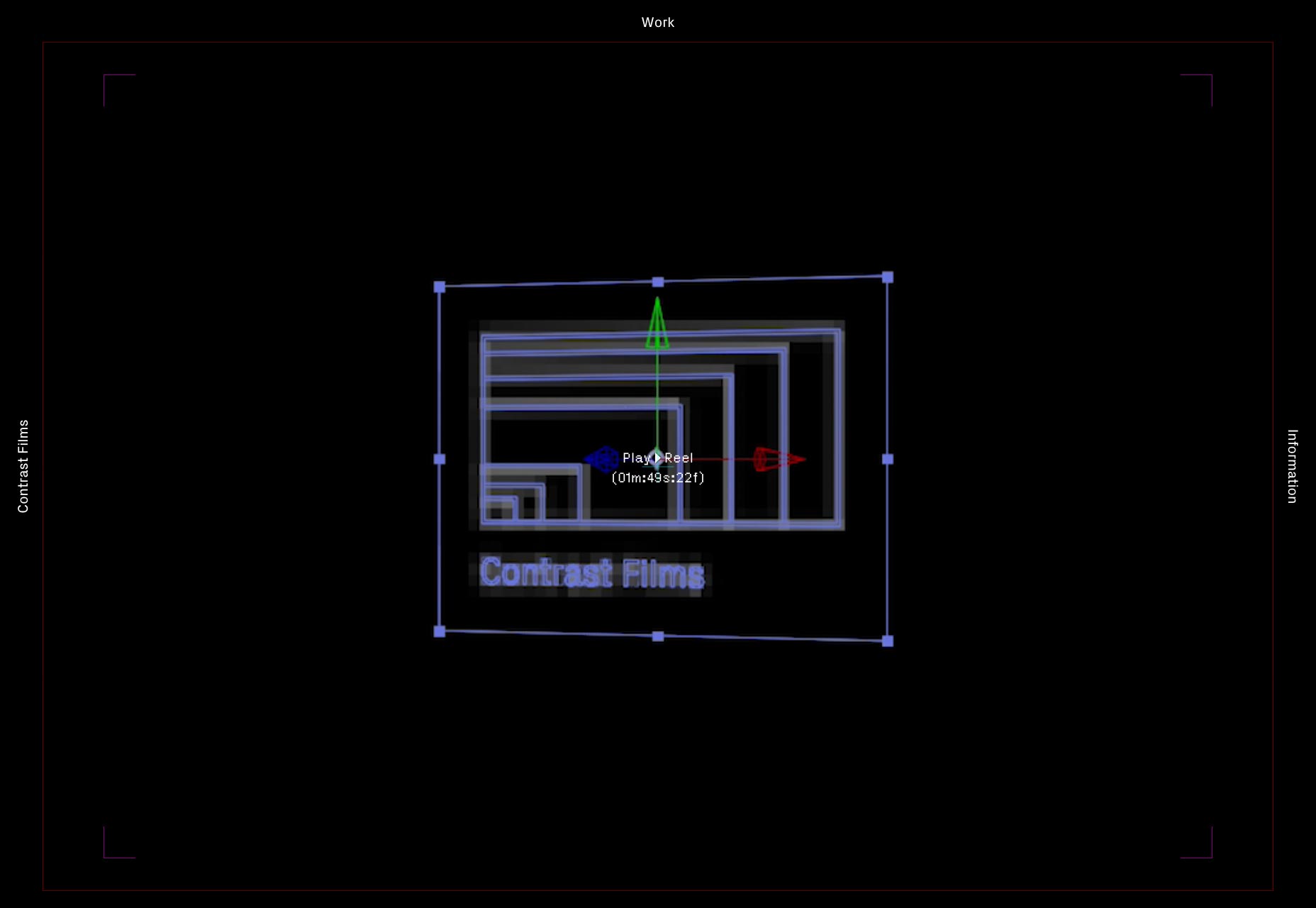
Mr. Kyle Mac
Mr. Kyle Mac brings us another website that is light, clean, and minimalist, with a few light touches of animation. Nothing mind-blowing, but solid and dependable design.
Walter Spatzek
Walter Spatzek’s portfolio goes right past “light touches” of animation, and dives right into the deep end. And yet, the rest of the design feels elegant enough that I don’t mind. The work is very clearly emphasized, and does all of the selling.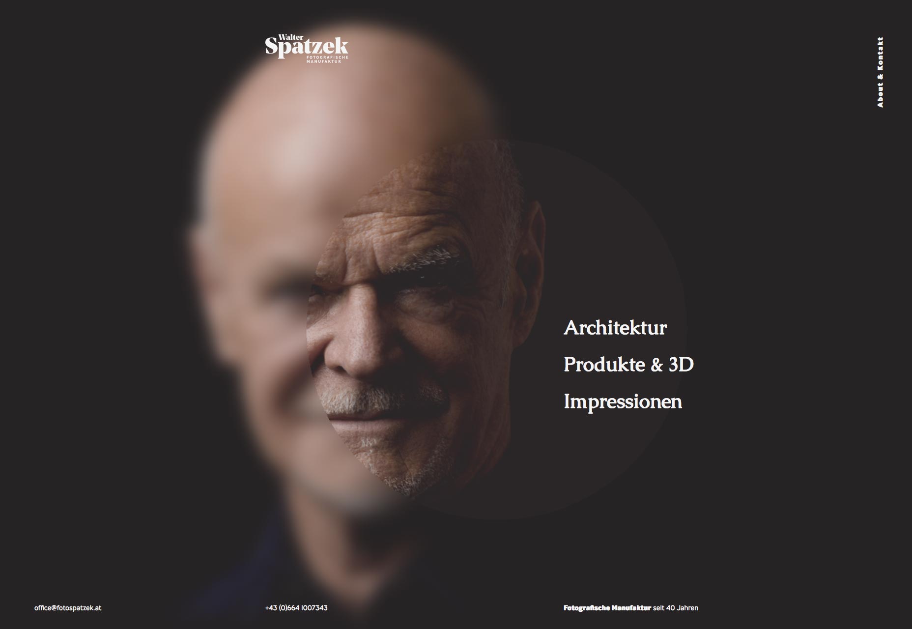
Florian Wacker
Florian Wacker has managed to do something I never thought I’d see. They’ve made (what I’m pretty sure is) German look more elegant than terrifying through typography alone. Okay, that’s a joke, but really, if that was English, I’d quite enjoy just reading everything on this site.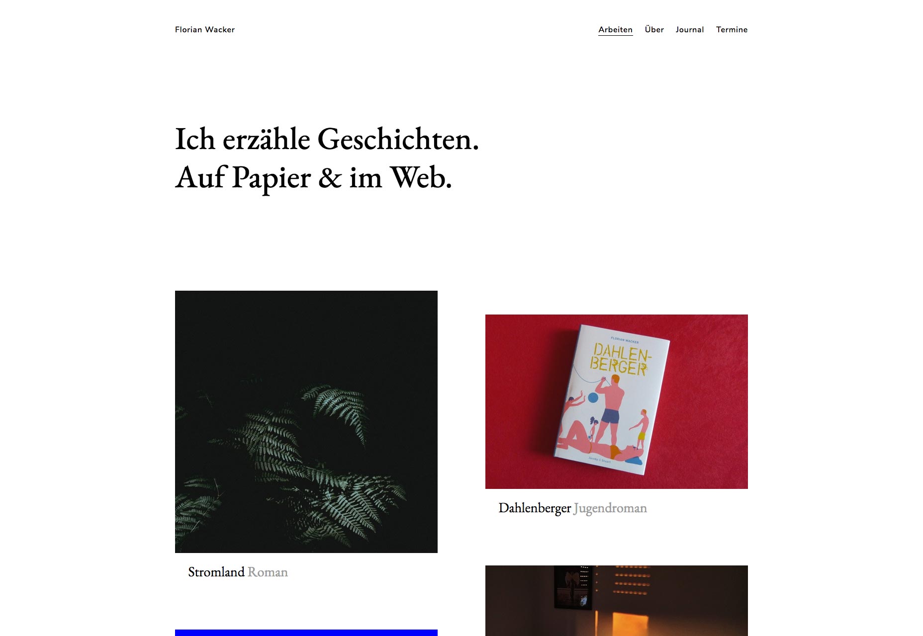
Ketan Mistry
Ketan Mistry is an old-school designer, and his website embraces an old-school theme. I half suspect his website might have looked a lot like this as far back as when we used frames and tables for layout. And why not? Good design lasts.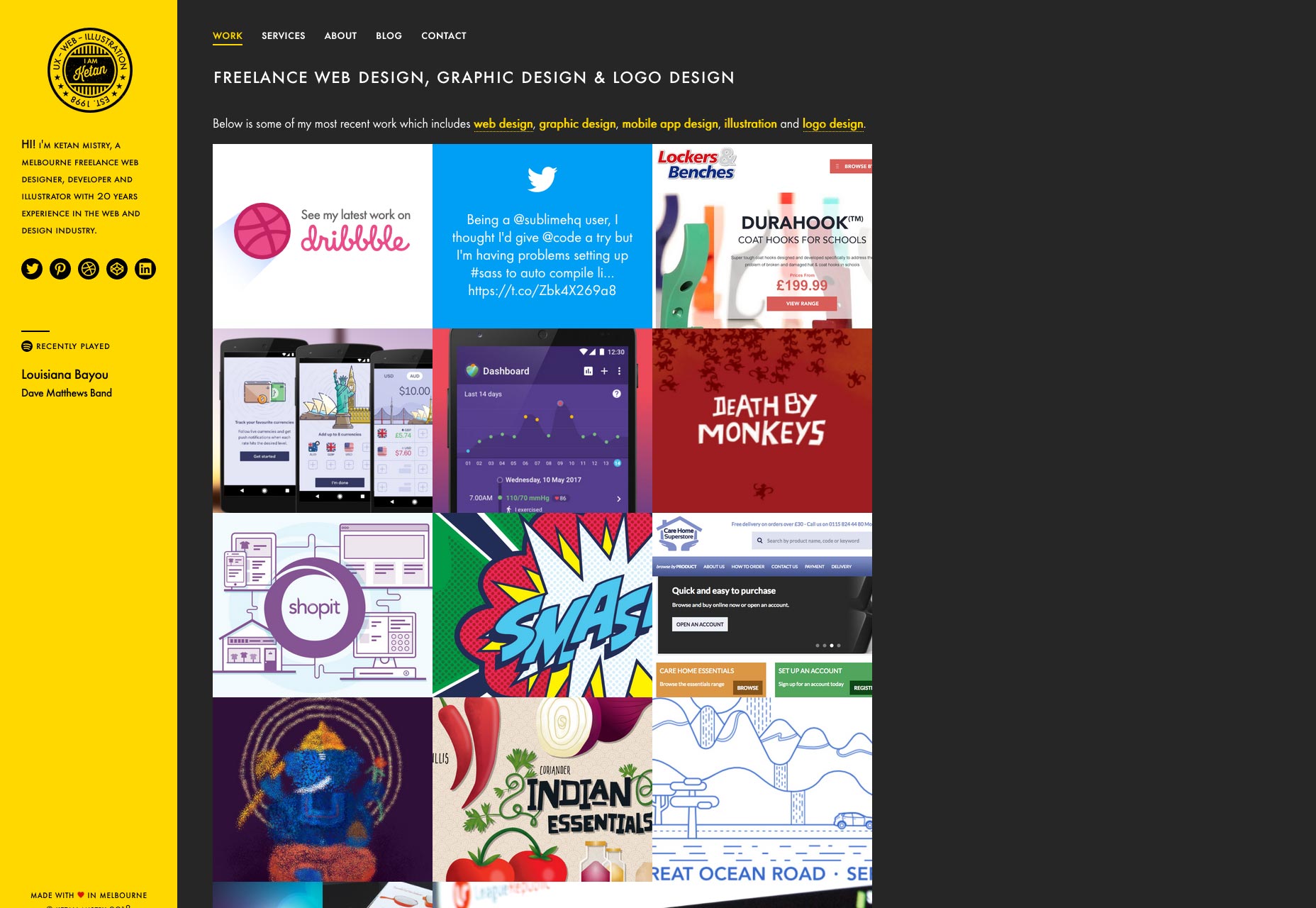
Robbie Hall Creative
If Robbie Hall’s portfolio looks a bit like a theme, don’t worry. That’s just Bootstrap showing through. However, I didn’t figure that out ’til I looked at the source. In a way, that fact alone is a testament to the skill of the designer. Plus, it looks good.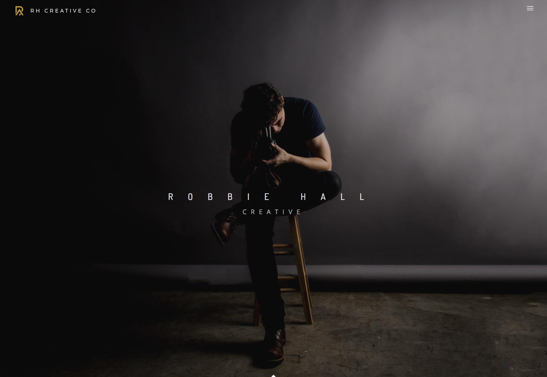
Ezequiel Bruni
Ezequiel Bruni is a web/UX designer, blogger, and aspiring photographer living in Mexico. When he’s not up to his finely-chiselled ears in wire-frames and front-end code, or ranting about the same, he indulges in beer, pizza, fantasy novels, and stand-up comedy.


Read Next

3 Essential Design Trends, May 2024
Integrated navigation elements, interactive typography, and digital overprints are three website design trends making…

How to Write World-Beating Web Content
Writing for the web is different from all other formats. We typically do not read to any real depth on the web; we…
By Louise North

20 Best New Websites, April 2024
Welcome to our sites of the month for April. With some websites, the details make all the difference, while in others,…

Exciting New Tools for Designers, April 2024
Welcome to our April tools collection. There are no practical jokes here, just practical gadgets, services, and apps to…

How Web Designers Can Stay Relevant in the Age of AI
The digital landscape is evolving rapidly. With the advent of AI, every sector is witnessing a revolution, including…
By Louise North

14 Top UX Tools for Designers in 2024
User Experience (UX) is one of the most important fields of design, so it should come as no surprise that there are a…
By Simon Sterne

What Negative Effects Does a Bad Website Design Have On My Business?
Consumer expectations for a responsive, immersive, and visually appealing website experience have never been higher. In…

10+ Best Resources & Tools for Web Designers (2024 update)
Is searching for the best web design tools to suit your needs akin to having a recurring bad dream? Does each…
By WDD Staff

3 Essential Design Trends, April 2024
Ready to jump into some amazing new design ideas for Spring? Our roundup has everything from UX to color trends…

How to Plan Your First Successful Website
Planning a new website can be exciting and — if you’re anything like me — a little daunting. Whether you’re an…
By Simon Sterne

15 Best New Fonts, March 2024
Welcome to March’s edition of our roundup of the best new fonts for designers. This month’s compilation includes…
By Ben Moss

LimeWire Developer APIs Herald a New Era of AI Integration
Generative AI is a fascinating technology. Far from the design killer some people feared, it is an empowering and…
By WDD Staff