

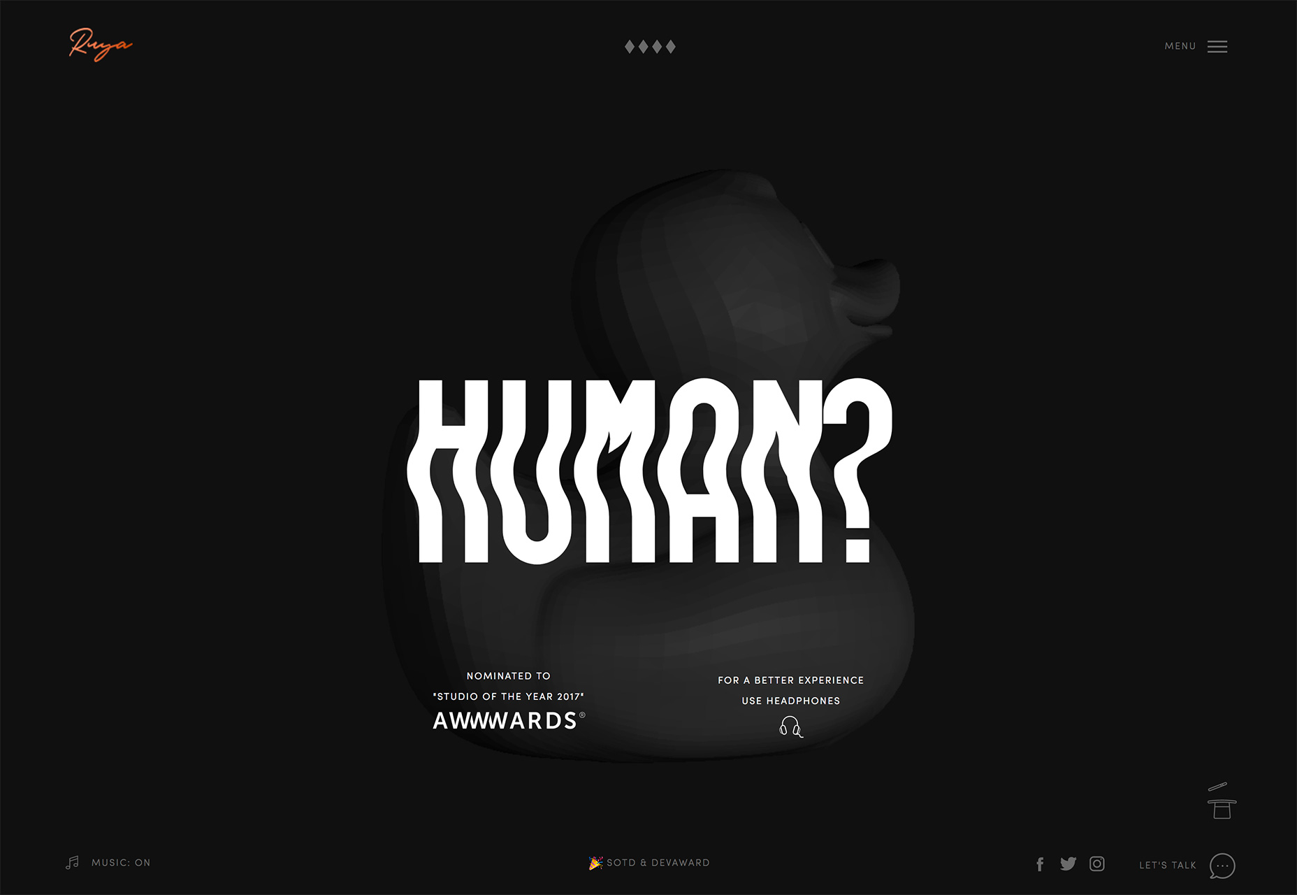
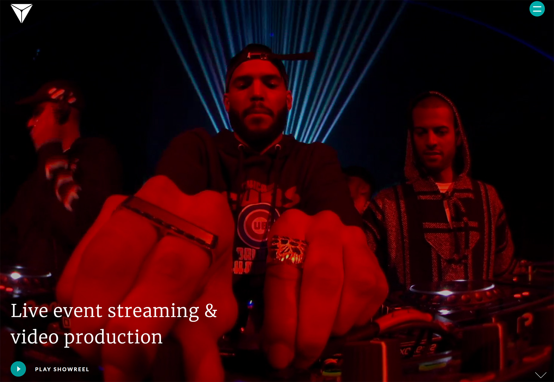
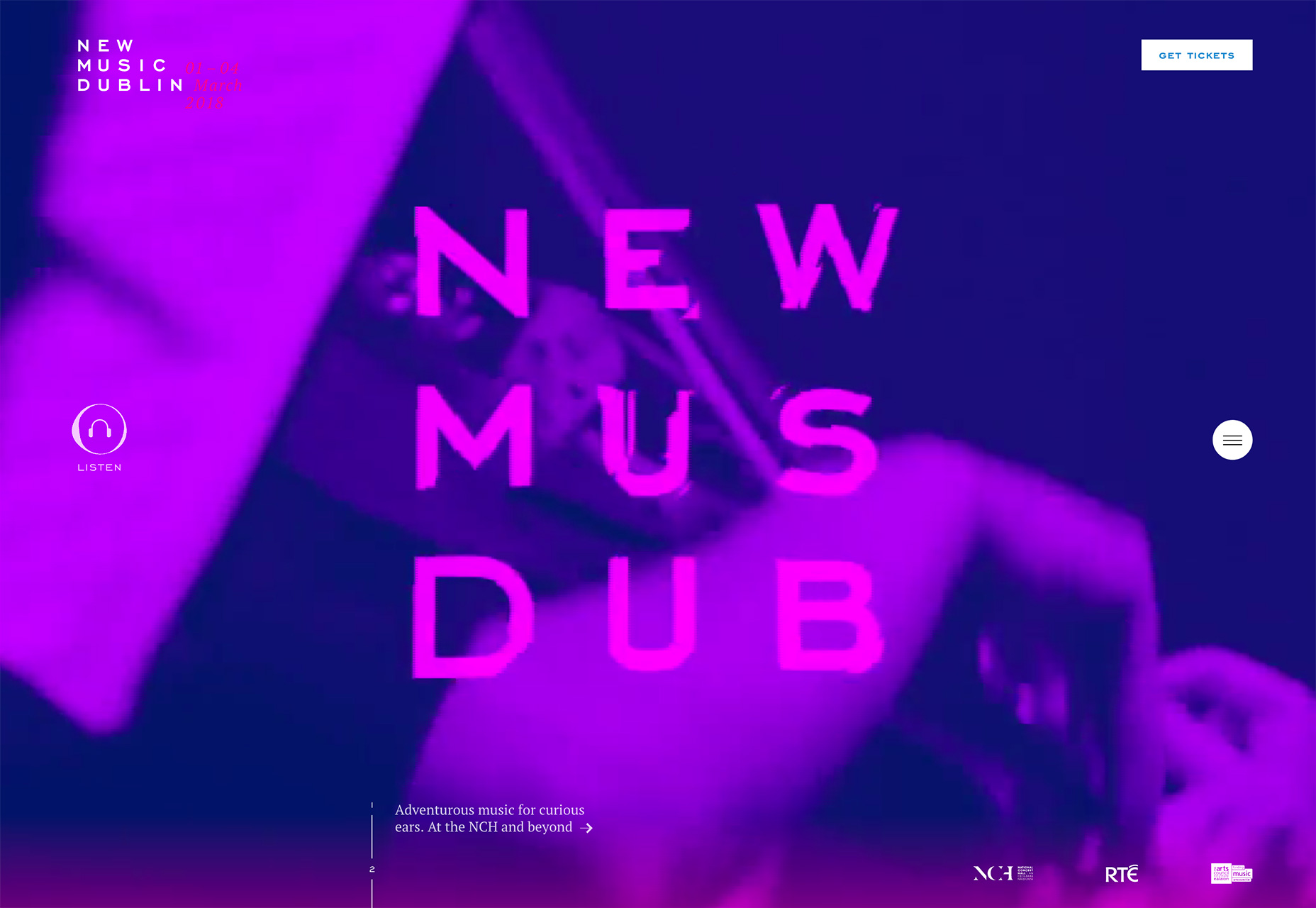
1. Poster-Style Homepages
Full-screen homepage designs featuring oversized images and video have been popular for a while, but the trend is evolving in a way that removes many of the main navigational elements and text for a more poster or movie-style feel. It’s a mash-up of minimal theory with more colorful and ornate styling. While the idea of this trend might not sound like enough to engage a user, it can actually be quite effective with the right visuals. What makes or breaks poster-style homepages is the quality of visuals and text. Without a lot of room for messaging and creating interest, these pieces must be exceptional to be effective. The biggest concern with this trend is that without many other elements—including navigation or obvious call to action buttons—users could get confused and abandon the website. It’s important to create an impressive visual experience, but not forget to give users something to do in the process. Each of the three examples below uses the poster-style concept in a different, bet equally engaging way: Tofino Resort draws users in with a great image and interesting typography. The “book now” call to action is in the top corner where users would traditionally look for navigation, but with the menu tucked inside a hamburger icon the CTA is the focal point.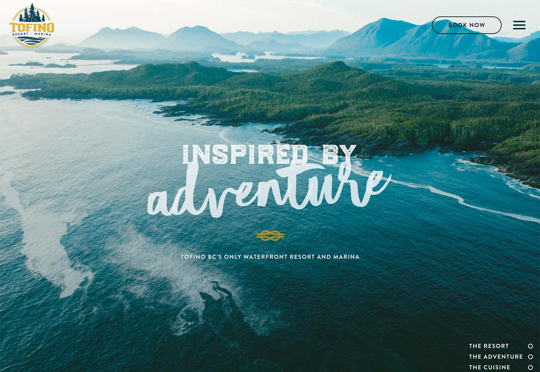 Ruya Digital opts for a more minimal style with a dark background but the simple center-screen animation and unusual text treatment create a point of visual interest. Accompany elements and text are small and tucked toward the edge of the screen to ensure users focus on the main messaging. Again, there is no main navigation present; it takes a click to access it.
 Flux Broadcast takes a video approach with a more cinematic experience. The homepage features full screen video clips with short text and only a few small elements on the screen. The user feels like they are watching a video with this design, not jumping around a website homepage. Again, navigation is tucked into a hamburger icon – the colored circle helps it stand out a little more – and a small animated arrow at the bottom right encourages users to scroll when they are finished watching the video loop.
2. Purple Color Palettes
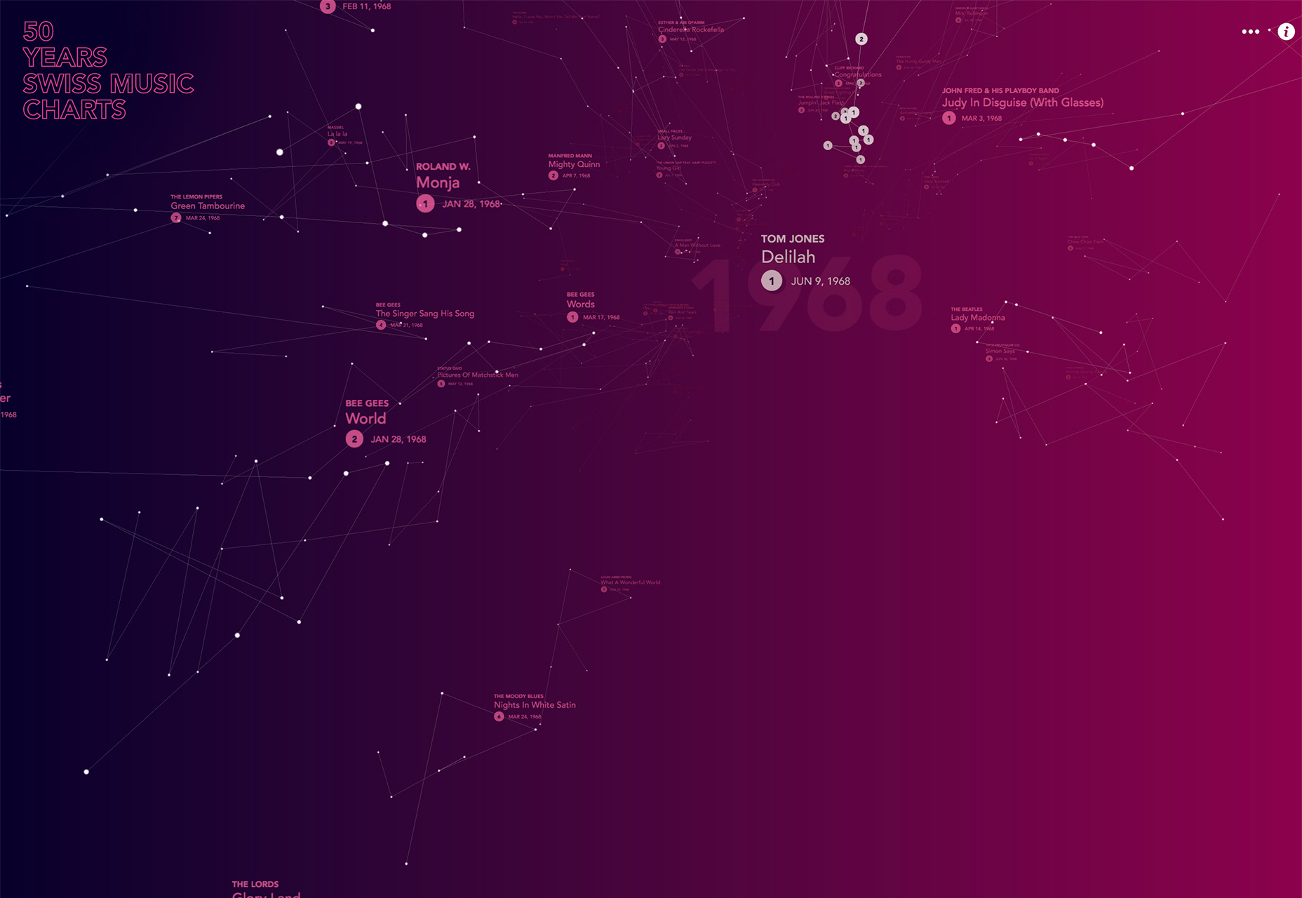
It’s no real surprise that a few months after Pantone named Ultra Violet (18-3838) as color of the year, that purple hues are showing up in a number of designs. While not all the palettes are using the same deep, dark purple as the color of the year, it has made more designers consider the red-blue mix option. What’s nice about the color is it blends nicely with other color trends—such as the brighter hues of Material Design or more minimal black and white palettes. Purple can also be a differentiator for your website design. Because it isn’t an overused color—think blue—it can provide a more memorable first impression. There are plenty of purple options to choose from. Colors can be more on the reddish or pink side, almost black for a dark moody feeling, or a little more blue. The color can be deep and saturated or pale and muted. Almost any of the variations are highly usable alone or together in a color palette with multiple purples. The examples below showcase this range of actual color usage as well as ability to adapt it in a variety of sectors. Purple, one a color that was mostly avoided, is versatile, engaging and friendly.
3. Gradients and Text
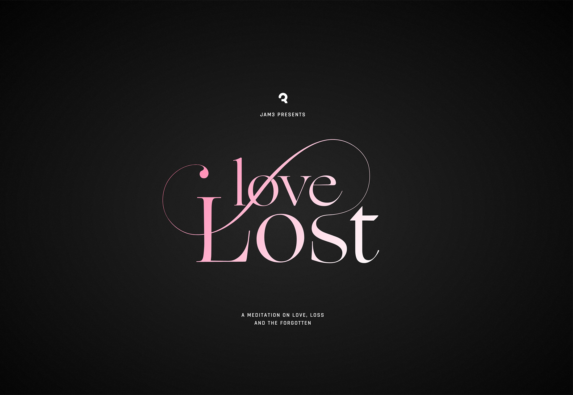
Gradients aren’t just for backgrounds and photo overlays. A solid gradient can also add emphasis to text elements, when used with purpose. The trend in typography overall has leaned toward more simple typefaces with a little “something extra.” Those extras can be anything from a photo fill to pop of color to text treatments such as capitalization or animation. And now … gradients. Admittedly, this can be a tough trend to follow if you don’t like gradients in general. (You flat design purists know who you are.) But they can be absolutely stunning. Zoocha uses a great pale yellow and blue gradient inside a modern serif on a mostly plain screen. The trick to this design is the gradient. The simplicity of the rest of the design makes it stand out.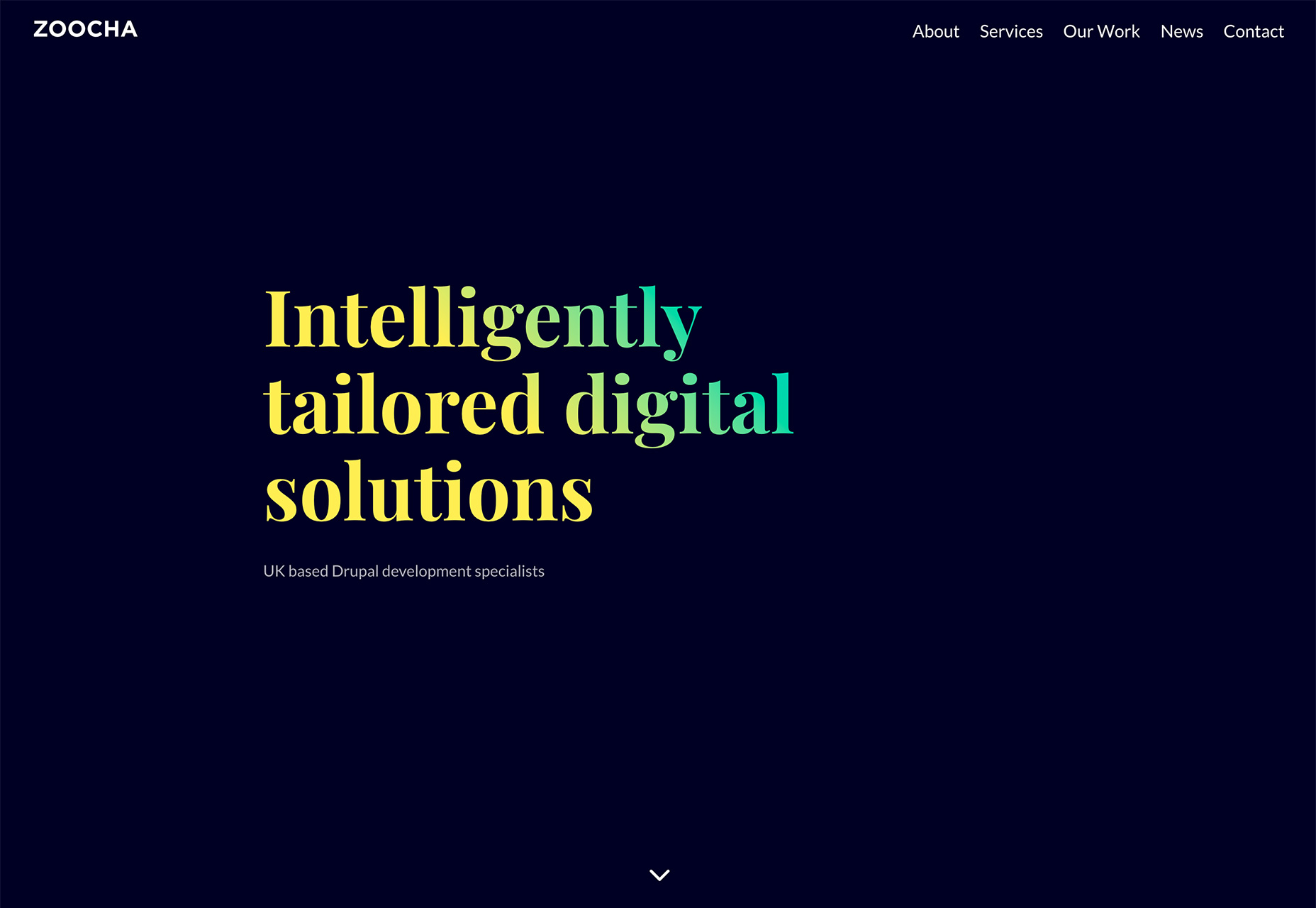 Love Lost uses a single color to white gradient in a more elaborate typeface to grab users. Much of what makes typography work in this design is the content. With a website that is reciting love poems and letters, the pink, swash-filled font is almost expected. The same is true of the pink color. It’s a great visual entry point to the rest of the design.
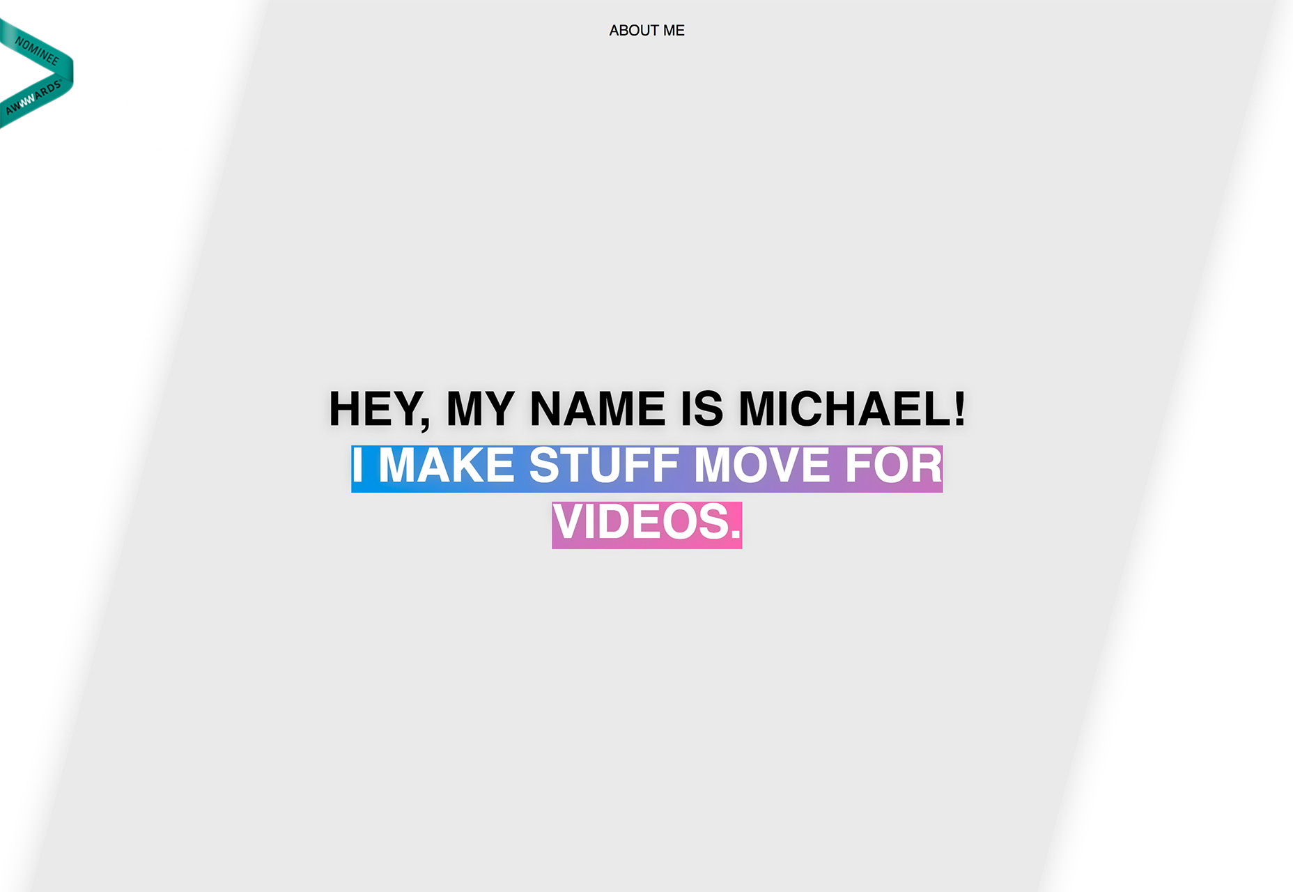
 Michael Rappaz’s portfolio site uses a text gradient with the opposite effect. Rather than a gradient fill for lettering, the design includes a gradient highlight animation to draw users in. It’s simple and visually interesting. The rest of the design is rather simple and sticks to text elements without motion or color so that there is a distinct focal point. (He also incorporates the color of the year for two trends in one.)
Conclusion
Can you see yourself using these trends in design projects? Each of these web design trends seems to have some staying power. The full screen, poster style is highly visual, although lack of obvious navigation could be an issue; purple color palettes are growing in popularity thanks to associations with other trends; and gradients are one of those trends that comes in and out of style frequently. (People seem to either love or hate them.) What trends are you loving (or hating) right now? I’d love to see some of the websites that you are fascinated with. Drop me a link on Twitter; I’d love to hear from you.Carrie Cousins
Carrie Cousins is a freelance writer with more than 10 years of experience in the communications industry, including writing for print and online publications, and design and editing. You can connect with Carrie on Twitter @carriecousins.


Read Next

15 Best New Fonts, July 2024
Welcome to our monthly roundup of the best fonts we’ve found online in the last four weeks. This month, there are fewer…
By Ben Moss

20 Best New Websites, July 2024
Welcome to July’s round up of websites to inspire you. This month’s collection ranges from the most stripped-back…

Top 7 WordPress Plugins for 2024: Enhance Your Site's Performance
WordPress is a hands-down favorite of website designers and developers. Renowned for its flexibility and ease of use,…
By WDD Staff

Exciting New Tools for Designers, July 2024
Welcome to this July’s collection of tools, gathered from around the web over the past month. We hope you’ll find…

3 Essential Design Trends, July 2024
Add some summer sizzle to your design projects with trendy website elements. Learn what's trending and how to use these…

15 Best New Fonts, June 2024
Welcome to our roundup of the best new fonts we’ve found online in the last month. This month, there are notably fewer…
By Ben Moss

20 Best New Websites, June 2024
Arranging content in an easily accessible way is the backbone of any user-friendly website. A good website will present…

Exciting New Tools for Designers, June 2024
In this month’s roundup of the best tools for web designers and developers, we’ll explore a range of new and noteworthy…

3 Essential Design Trends, June 2024
Summer is off to a fun start with some highly dramatic website design trends showing up in projects. Let's dive in!

15 Best New Fonts, May 2024
In this month’s edition, there are lots of historically-inspired typefaces, more of the growing trend for French…
By Ben Moss

How to Reduce The Carbon Footprint of Your Website
On average, a web page produces 4.61 grams of CO2 for every page view; for whole sites, that amounts to hundreds of KG…
By Simon Sterne

20 Best New Websites, May 2024
Welcome to May’s compilation of the best sites on the web. This month we’re focused on color for younger humans,…