

- Prevent edge cases from happening
- Support edge case scenarios
1. Combat Delayed Loading
As technology enables faster experiences, users’ willingness to wait has decreased. According to the latest Google survey, 2/3 of mobile web users say that the speed it takes to load a page has the most impact on their overall experience. To satisfy users’ expectations, you should do everything you can do to make your app/website load as fast as possible. But no matter how hard you try, there’ll be situations when you won’t be able to comply with speed guidelines. Slow loading time might be caused by limited internet connection. If you can improve the actual performance, at least try to create a perception of speed — how fast something feels is often more important than how fast it actually is. One technique that can help you with that is called skeleton screens. A skeleton layout is a version of your page that displays while content is being loaded. Skeleton screens give users the impression of speed (most users will believe that loading is happening more quickly than it really is).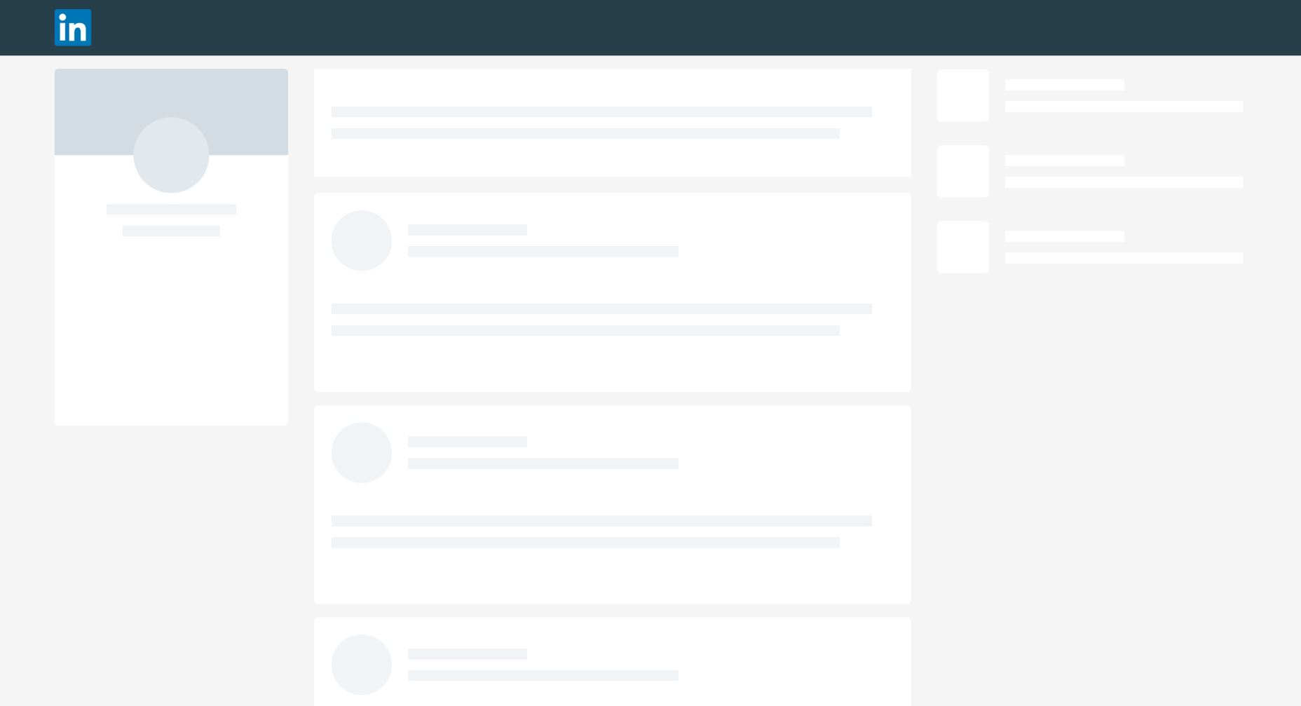 LinkedIn use skeleton screens to give the impression of speed.
Check this Codepen example of skeleton effect in pure CSS. The effect of pulsation gives a user the feeling that a website is alive and content is loading.
LinkedIn use skeleton screens to give the impression of speed.
Check this Codepen example of skeleton effect in pure CSS. The effect of pulsation gives a user the feeling that a website is alive and content is loading.
2. Design Empty States
It’s possible that individual screens in your app or website that should be populated with data will have nothing to display in some instances. For example, a screen with user challenges in a fitness app will be empty during the first-time experience (simply because users won’t have any challenges yet). As designers, we need to think about how the page looks like in this case. Showing a blank page isn’t the right thing to do. Instead, we can provide instructions on how to populate the page with data. Khaylo Workout for iOS is an excellent example of how empty space can be used to create context.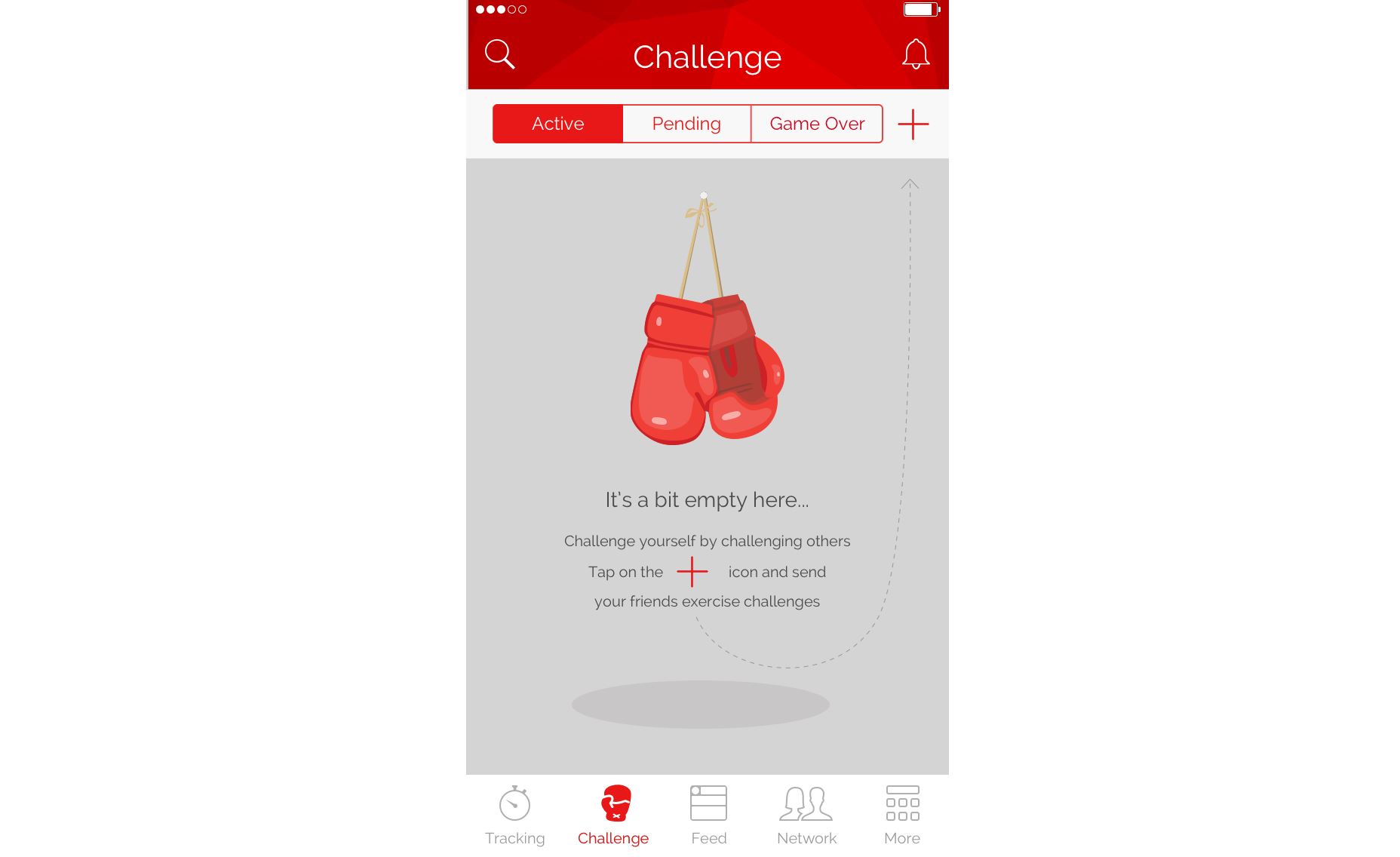 Empty space on the page can be used to give clear instructions on how to get started.
3. Address User or System Errors
Every user interaction with a system can be a potential source of error. Error states are especially common when users need to provide data input. I’ve already mentioned that it’s better to prevent errors from happening in the first place and this rule should be applied to user input. But when it comes to user input we should focus on handling the following potential problems:- The data entered by the user isn’t valid. For example, a user might mistype a credit card number during checkout. In this case, an app should provide detailed error messages that will help users to detect the source of a problem.
- A system is unable to proceed due to the technical problem. In this case, an error message should state the fact that it’s system problem, not the user’s. This will prevent users from re-submitting the data.
4. Zero Results Found
Most e-commerce websites and apps provide a search feature. And one of the most common usability issues with a search feature is when user sees a blank page with “0 results found.” Dropping someone on a page with no results can be frustrating. Especially if they have tried the search a couple of times. If you design your search feature consider using following techniques:- Spell check and suggestions. Sometimes users get no results simply because they mistyped a search query. It’s really helpful when the system detects a mistyped item and provides search results based on the most probable query. Another useful technique that will be really helpful for your users is autocomplete suggestions. This reduces user effort for typing and prevents them from entering an incorrect query in the first place.
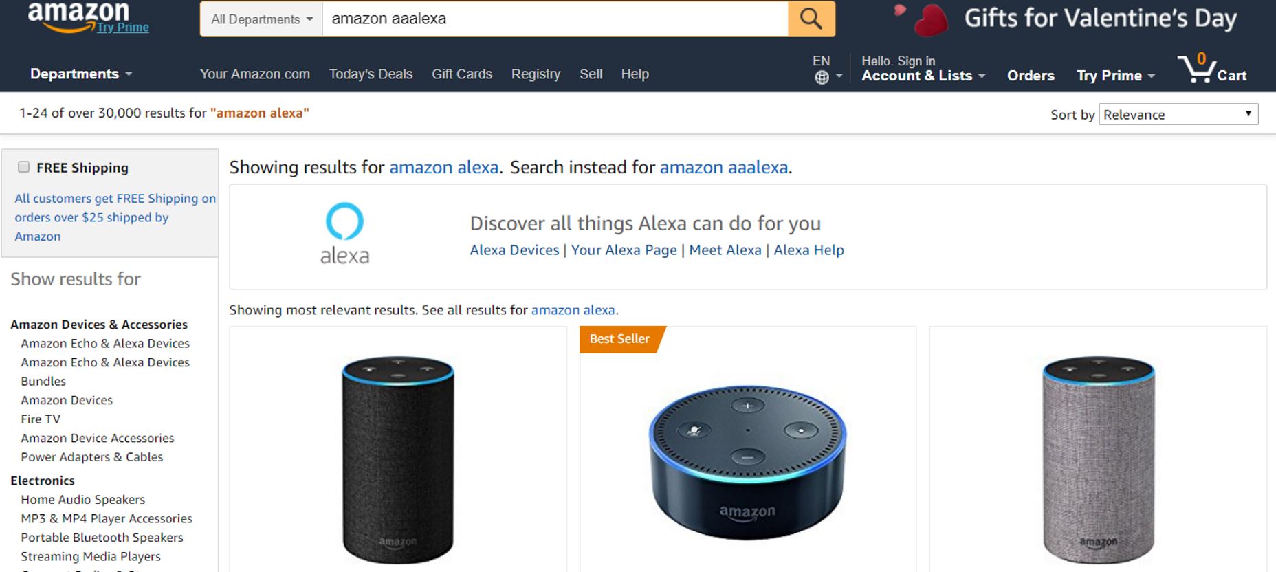 Amazon understands that the user meant “Amazon Alexa” in this query
- Provide valuable alternatives. When there are no matching search results, you can provide featured content or any other valuable alternative. For example, in the context of an e-commerce site this might be products from the similar category.
 Simply compare zero search results page from HP and Amazon. HP’s zero results page is a dead-end for the user. In contrast, Amazon provides suggestions for further searching, and promote related products.
How to Find Edge Cases
Some designers believe that designing for edge cases is similar to expecting the unexpected. But in fact, a vast majority of edge cases can be predicted before the product release. Two techniques can help you with that:- Design review: To create great design, you should pro-actively seek for edge cases. Design review is a very useful technique that can help product team find many potential edge cases. Conduct a design review early on in product design process. For better results, it’s good to invite developers and other team members to participate in such sessions.
- Testing with real users: While seeking edge cases early on with the help of other team members is an excellent approach it won’t guarantee that you’ll find all potential sources of friction. Only testing with real users will help you find out how people actually use your product and what problems they face. At the same time, it’s worth saying that strictly moderated usability testing won’t reveal a lot of edge cases simply because users are often instructed what to do and in what order. So it’s better to give users an opportunity to experiment with a system by giving them more time and more flexible tasks.
Conclusion
When we design products we often apply the Pareto principle to our design; we focus on the needs of the majority of users, apply the 80/20 rule and develop the user experience for the most probable scenario of interaction. In most cases this allows us to create a good user experience for our users. But attention to detail is what really separates excellent design from good design. Designing for edge cases is a great example of attention to details.Nick Babich
Fireart Studio is a design studio passionate about creating beautiful design for startups & leading brands. We pay special attention to nuances all the time to create professional while cool products that will not only meet all expectations, but exceed them.


Read Next

15 Best New Fonts, July 2024
Welcome to our monthly roundup of the best fonts we’ve found online in the last four weeks. This month, there are fewer…
By Ben Moss

20 Best New Websites, July 2024
Welcome to July’s round up of websites to inspire you. This month’s collection ranges from the most stripped-back…

Top 7 WordPress Plugins for 2024: Enhance Your Site's Performance
WordPress is a hands-down favorite of website designers and developers. Renowned for its flexibility and ease of use,…
By WDD Staff

Exciting New Tools for Designers, July 2024
Welcome to this July’s collection of tools, gathered from around the web over the past month. We hope you’ll find…

3 Essential Design Trends, July 2024
Add some summer sizzle to your design projects with trendy website elements. Learn what's trending and how to use these…

15 Best New Fonts, June 2024
Welcome to our roundup of the best new fonts we’ve found online in the last month. This month, there are notably fewer…
By Ben Moss

20 Best New Websites, June 2024
Arranging content in an easily accessible way is the backbone of any user-friendly website. A good website will present…

Exciting New Tools for Designers, June 2024
In this month’s roundup of the best tools for web designers and developers, we’ll explore a range of new and noteworthy…

3 Essential Design Trends, June 2024
Summer is off to a fun start with some highly dramatic website design trends showing up in projects. Let's dive in!

15 Best New Fonts, May 2024
In this month’s edition, there are lots of historically-inspired typefaces, more of the growing trend for French…
By Ben Moss

How to Reduce The Carbon Footprint of Your Website
On average, a web page produces 4.61 grams of CO2 for every page view; for whole sites, that amounts to hundreds of KG…
By Simon Sterne

20 Best New Websites, May 2024
Welcome to May’s compilation of the best sites on the web. This month we’re focused on color for younger humans,…