

Reece Parker
We begin with Reece Parker’s illustration portfolio. It’s dark, it’s minimalist, and it has an amusing little animated Q&A that I enjoyed reading through. Now you know how I feel about depending on animation, and all (I am contractually obligated to mention it at least once a month), but this was charming enough to win me over anyway. The whole site pretty much sells itself with charm. Platform: Semplice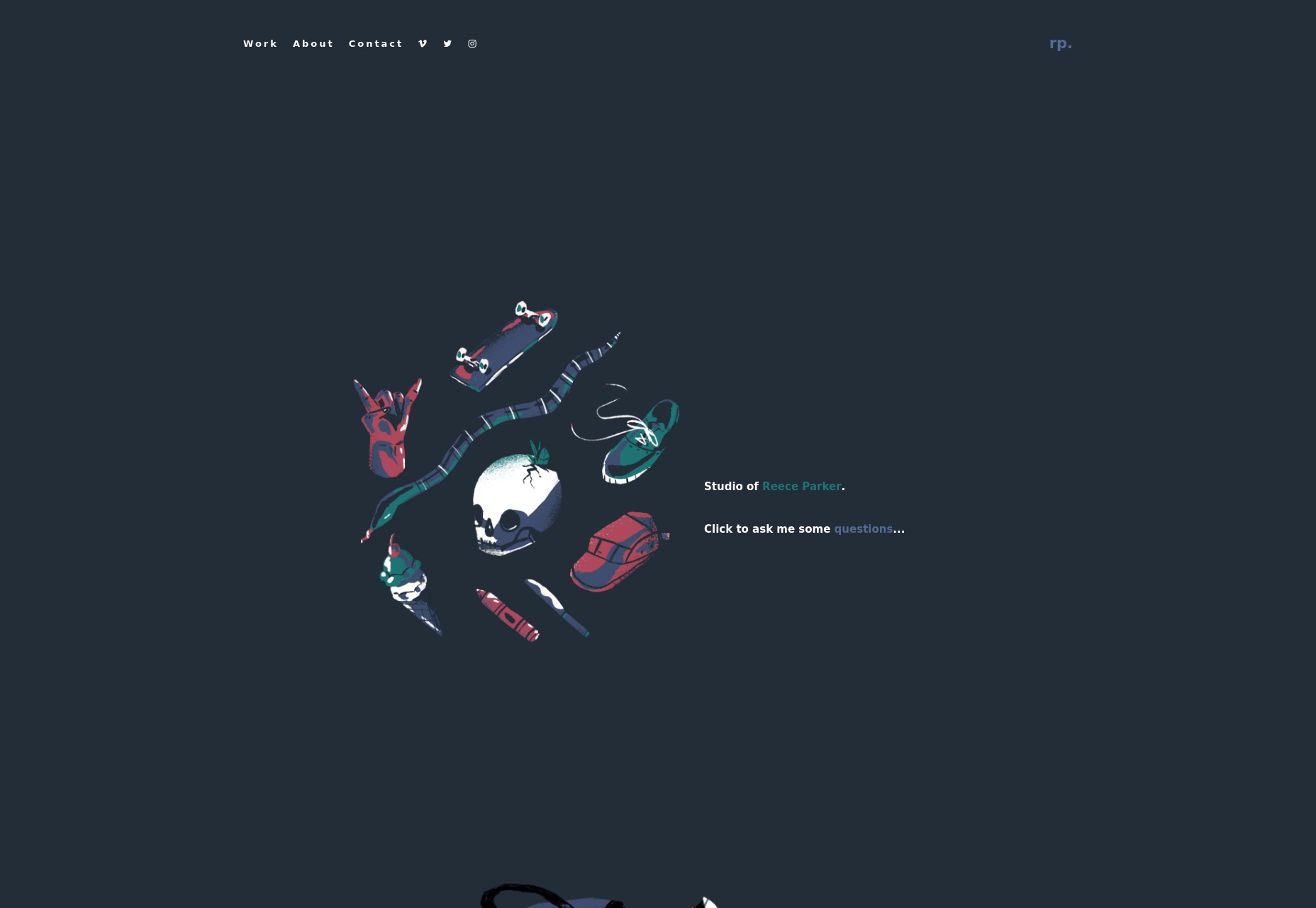
Myles Lucas
Myles Lucas’ portfolio goes straight for the “Well isn’t that something?” approach with a slideshow that is comprised of, well… his name. One letter at a time. The rest of the site isn’t much more subdued, with a background that changes color drastically as you browse through the projects. Platform: Static site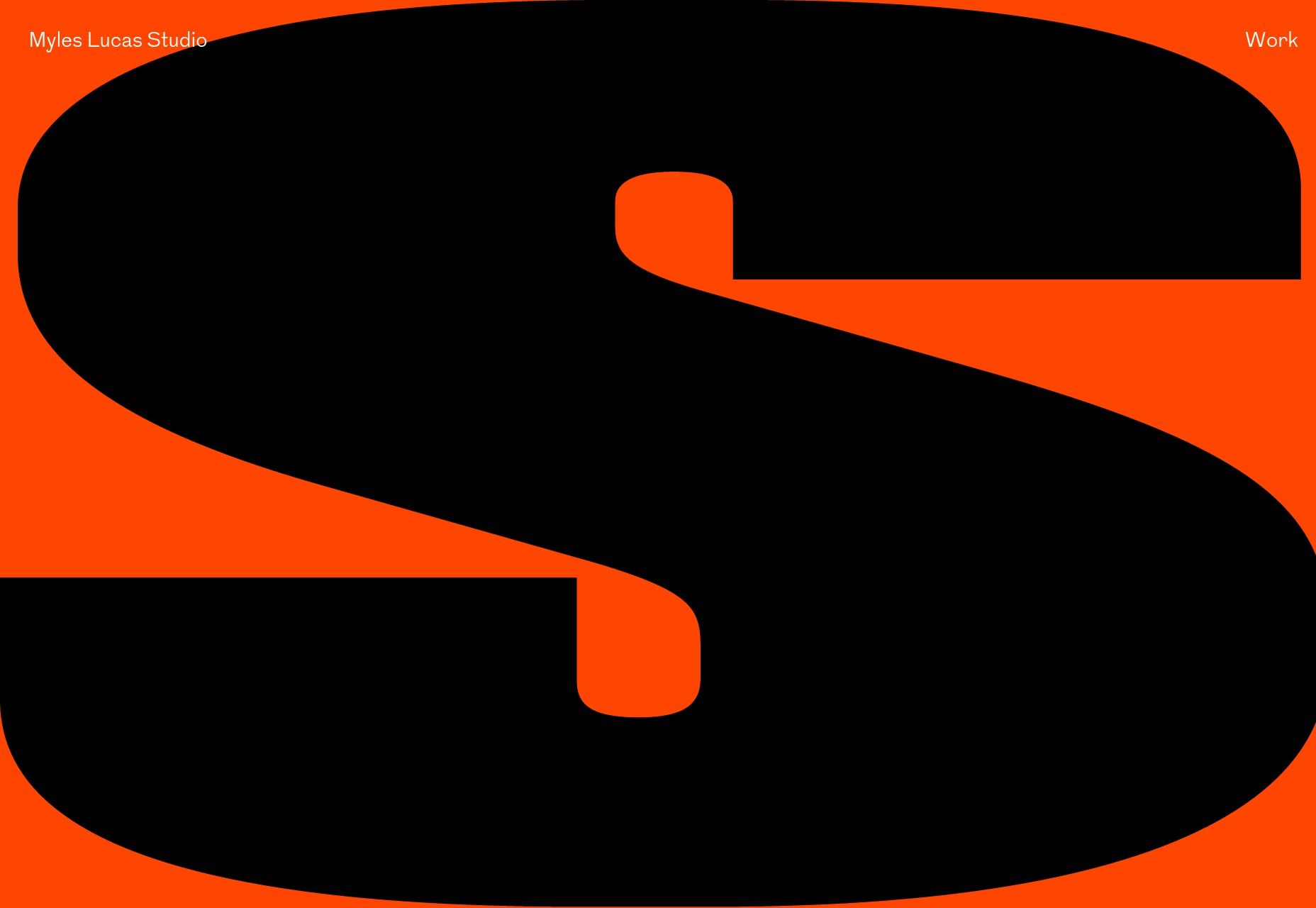
Théo Rosel
Théo Rosel brings us back yet again to that odd sort of minimalism that is packed with animation and interactive elements. Well in any case, the site’s design is elegant, clean, and pretty as you could ask for. My only note is that on the home page, you have to click and hold on the main slideshow to see the associated projects. This probably does wonders for preventing mis-taps, but it’s rather awkward for anyone who still uses a mouse. There are dozens of us. Dozens! Platform: Static site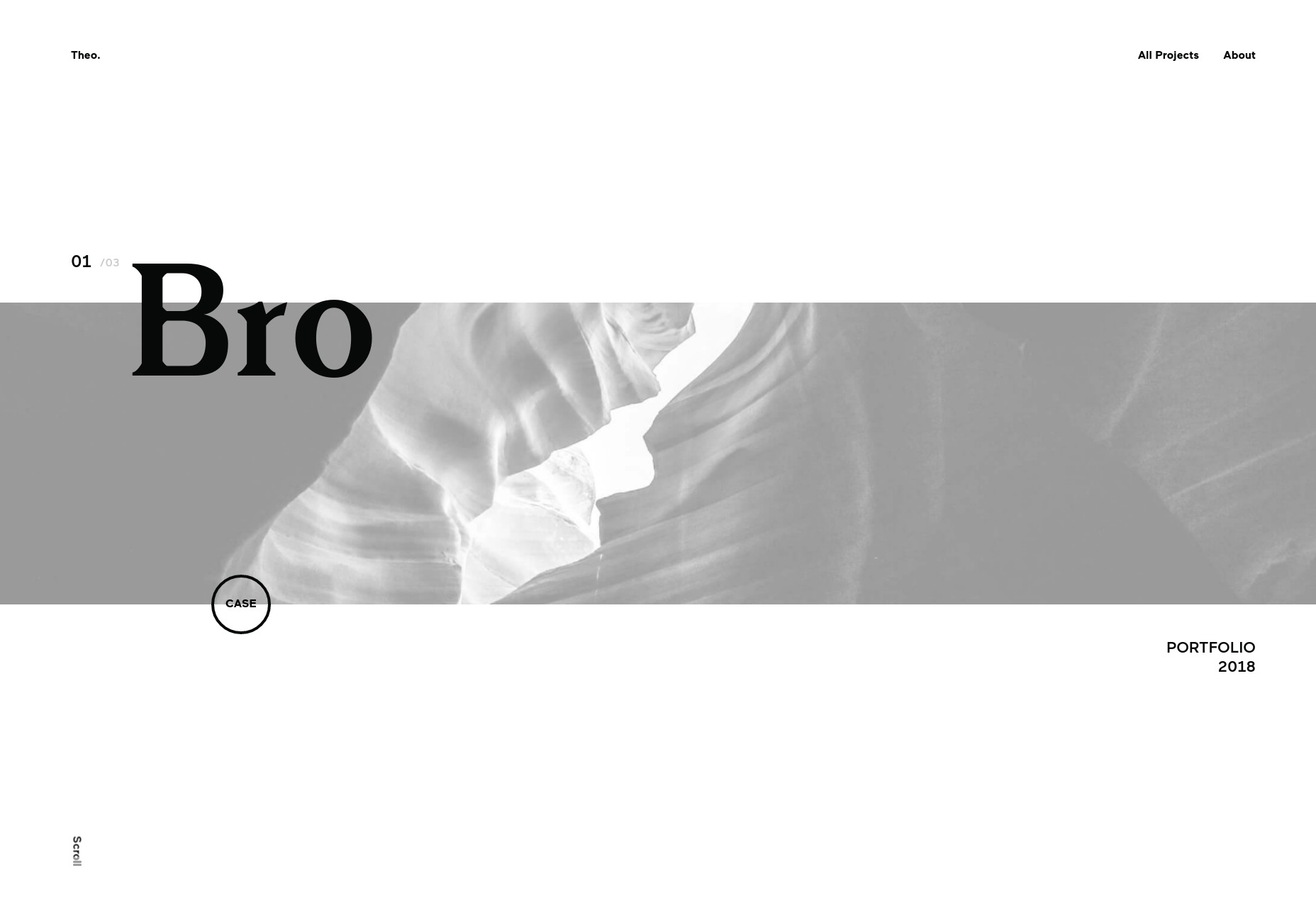
Lettuce & Co.
Lettuce & Co. is one I’m kind of excited to feature, if only because we’ve never had an event planner portfolio in this series before (that I can recall). It’s minimal, but clearly sticks to the fancy-ish, serif-loving, classic event-planner style we’ve come to associate with weddings, especially. Their past work is, of course, all about the photos, because how else would you do it? They use a lot of close-up detail shots to show how committed they are to said details, and I think it works. Platform: WordPress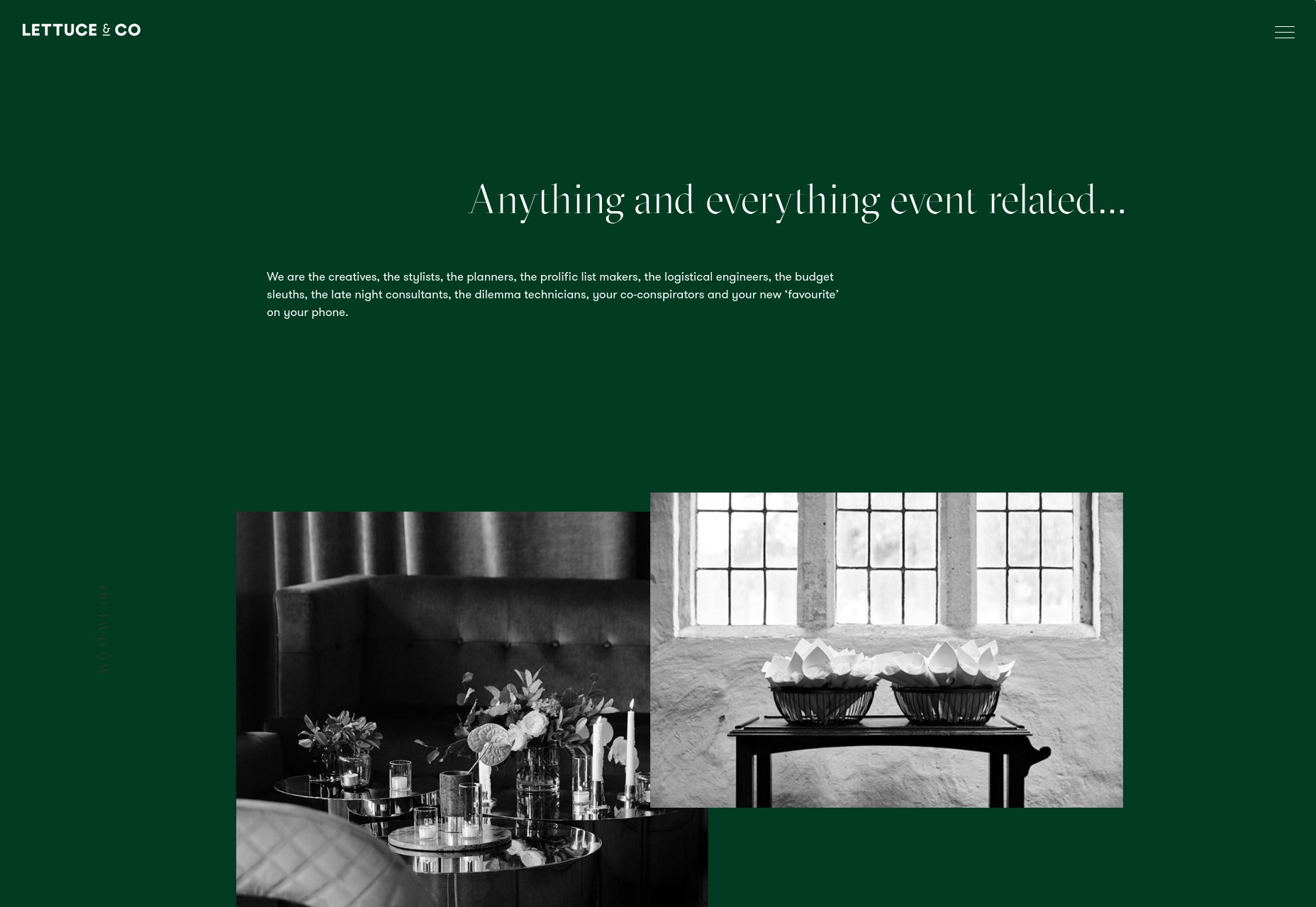
PROFI
Is brutalist web 2.0 a thing? Or is it just extreme minimalism with big text? Whatever the case, the designers at PROFI are masters of this form. I can appreciate just wanting to put your website up without worrying too much about the details normally associated with web design. But oooh, on this one you hover over images to get text, rather than the other way around. What’s old is new again. Platform: Static HTML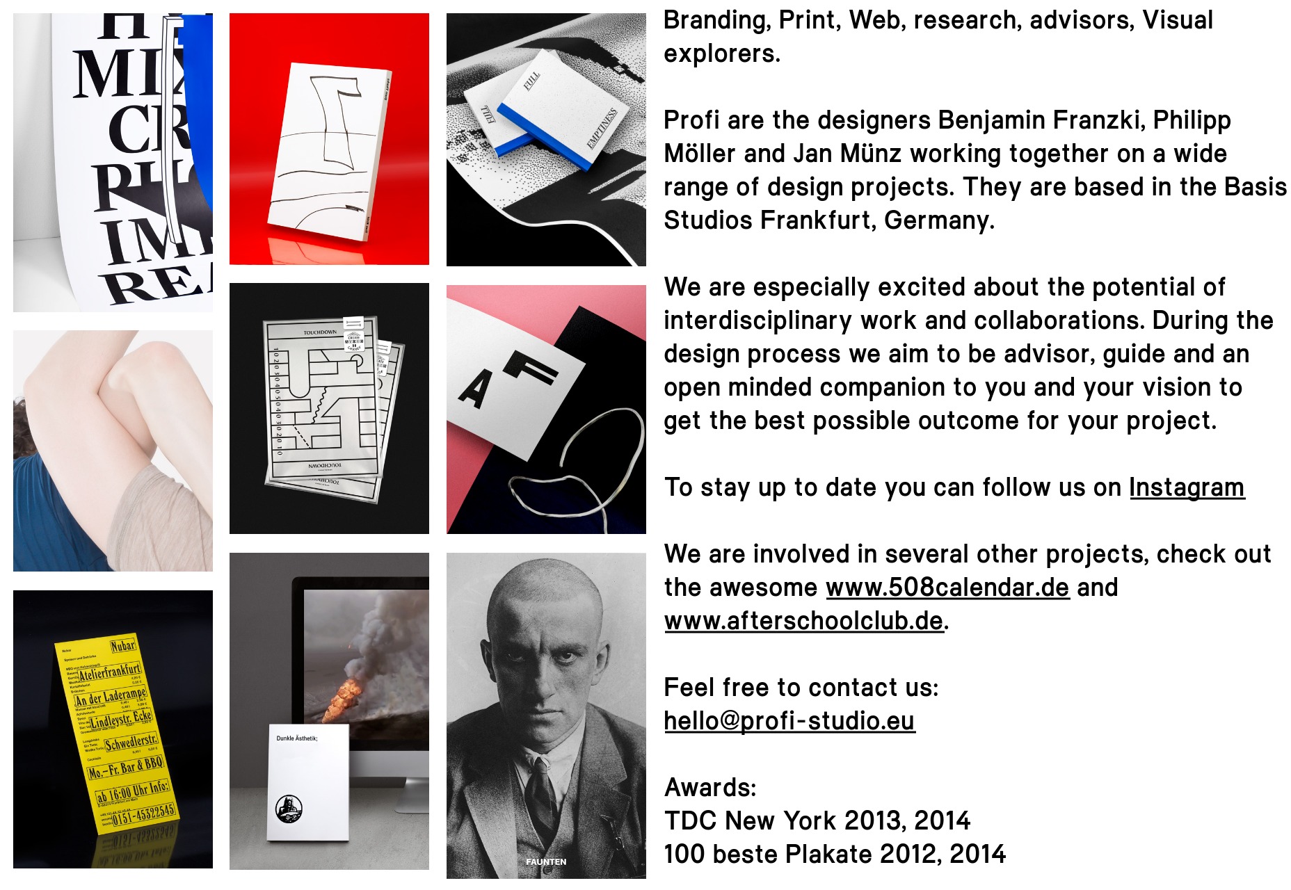
This Page
This Page is a digital studio with a pretty clear emphasis on video. Thus, the site is predictably presentation-like. Still, I absolutely love their use of color. One thing I can say for presentation-style sites: they’re usually not afraid to look as bright and cheery. Platform: JavaScript App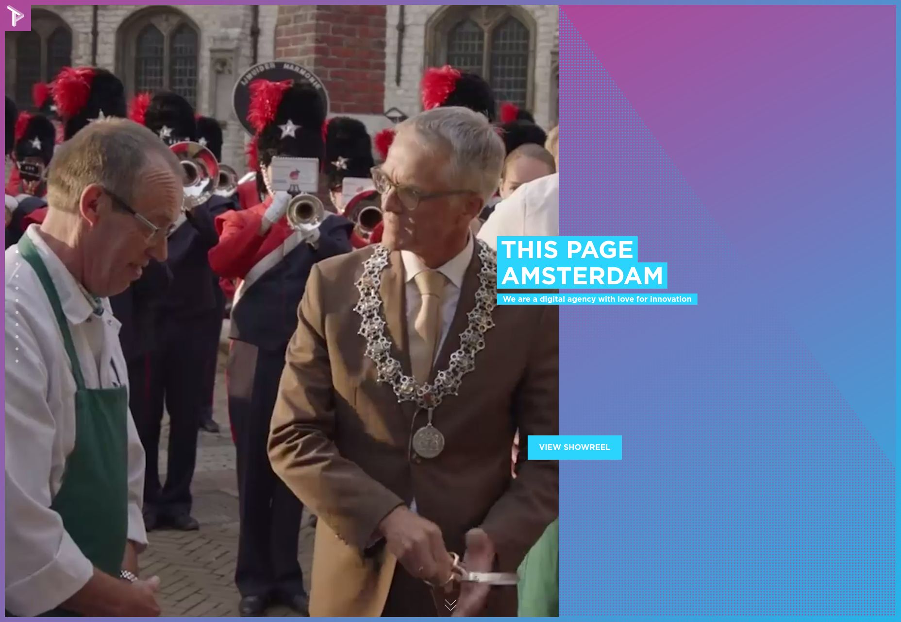
Momkai
Momkai is the second Amsterdam-based studio on this list. New conspiracy theory: they synchronize their redesigns and/or site launches for some nefarious purpose. This one takes a fairly normal layout, and embraces pastels. Also animation. Nothing mind-blowing, but it’s pretty. Platform: Static Site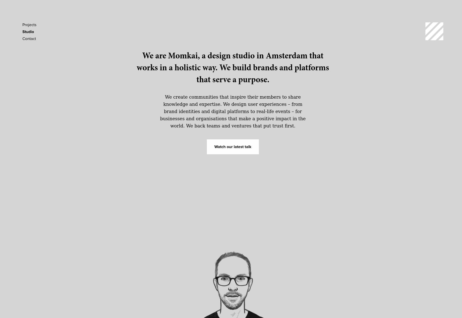
Monica Lovati
Monica Lovati is both a person and a design studio, and they both have a name that just rolls off the tongue, man. Her/their website is another one that made it onto this list because it’s pretty. Go admire it for a bit! Platform: Semplice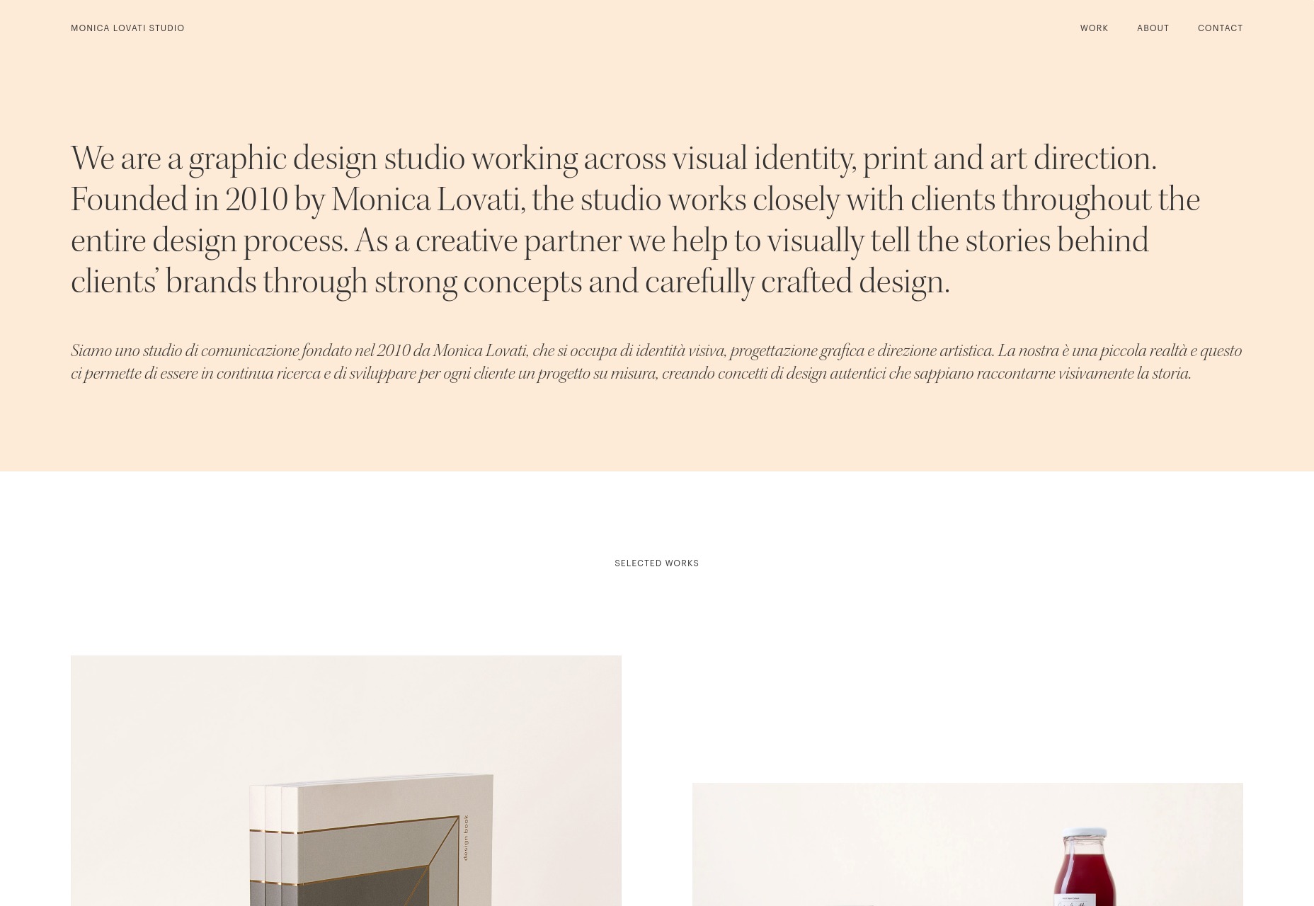
Bee Creations
I’ll be honest with you. I’d be extremely disappointed if Bee Creations wasn’t a black and yellow masterpiece. It leans more toward the black than the yellow in general, and it’s just so... aggressively modern. I do rather like the way they side-mounted header and navigation tie the site together, while case studies are allowed to be a lot more flexible with the art direction. Platform: WordPress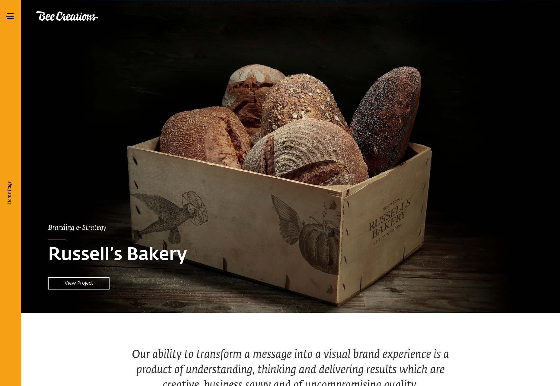
Kasra Design
Kasra Design makes excellent use of a bold color palette, but tempers it with a more classic modern aesthetic and lots of literal white space. The use of photo composites all over the place definitely sets the tone, and helps to convey the agency’s personality. Platform: WordPress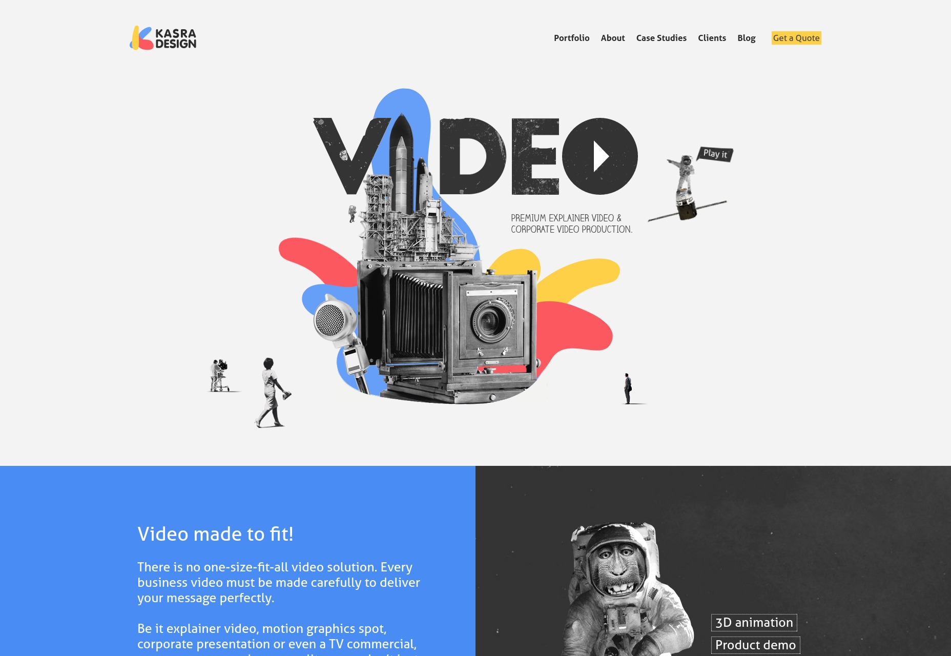
Voir(e)
Voir(e) is an atelier with a very, very distinct aesthetic style that ranges from the clothing they produce to the photos they use to showcase it to the colors of the website itself. I’d say that this site possibly wins this month’s non-existent award for most unified sense of style. Platform: Static Site (with some AJAX, not quite a full-on app)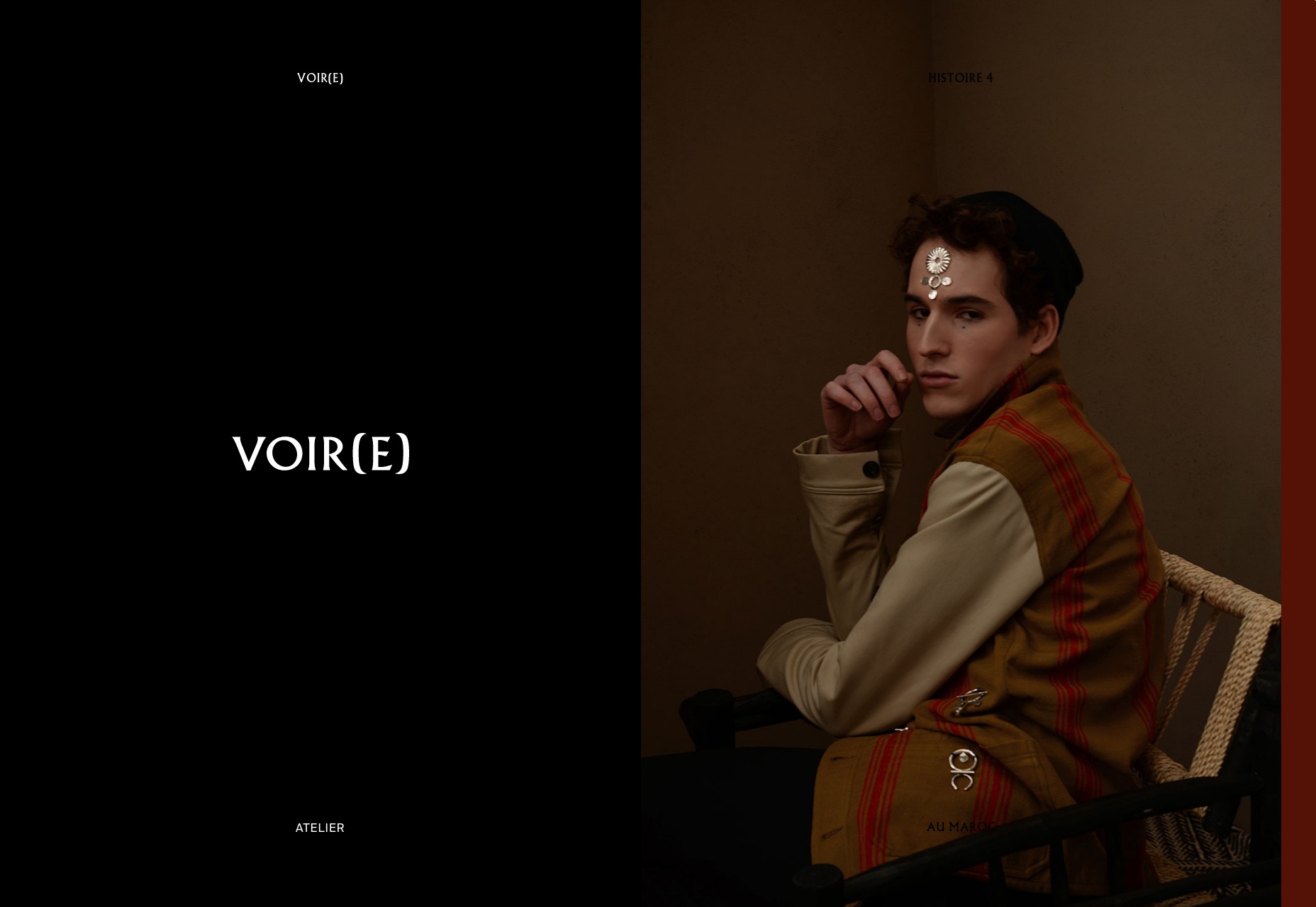
Film Truck
Film Truck is, as you might expect, a truck that goes down the street playing music and sells… wait, no. It’s a film studio. Like many sites nowadays, this one combines artsy minimalism with presentation-style UX. The color palette and small graphical flourishes do give it a distinct personality, though. Platform: JS App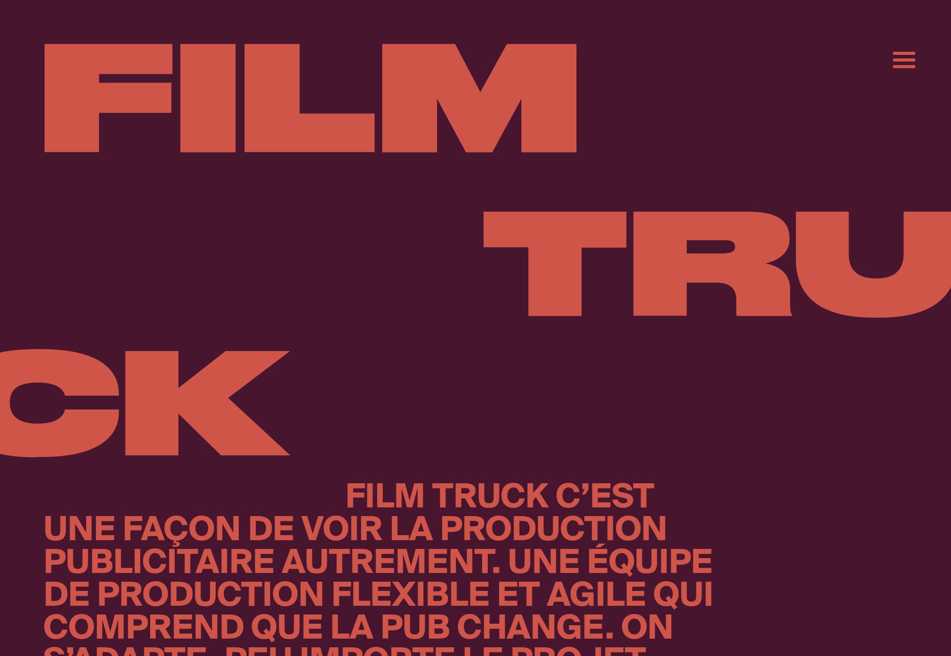
Zazu
Zazu goes for that bold, almost default-link-color blue (da-ba-dee-da-ba-die). And then they go for lots of white space with blue text. And then once in a while, they’ll throw all of those rules out the window, and engage in some honest-to-god art direction for their case studies. It’s been done before, but these people do it well. Platform: Semplice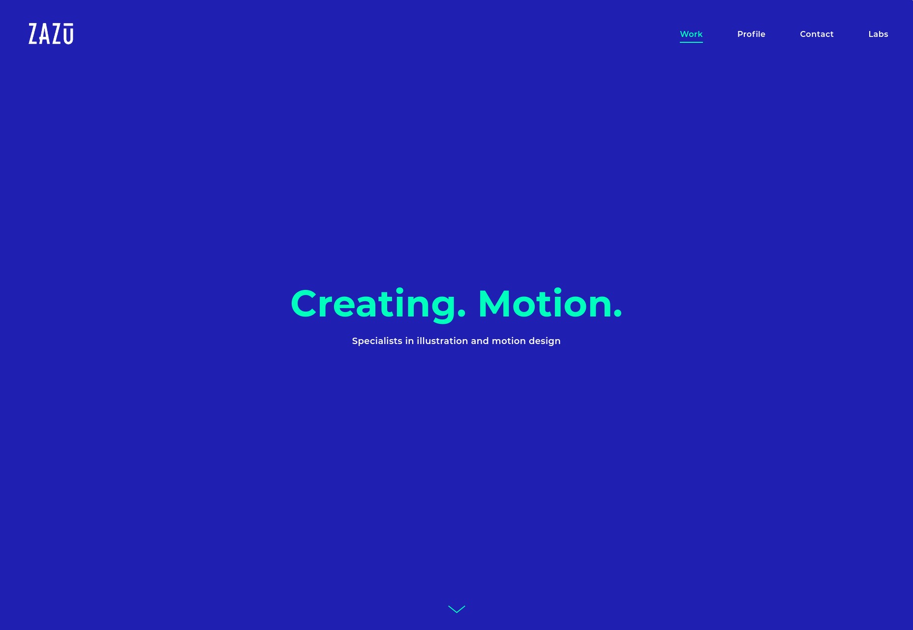
We Should Do It All
We Should Do It All is both their agency name and their mission statement. Their dedication to doing it all seems to extend to their portfolio, which is both text-heavy and image-heavy. They seem rather dedicated to telling whole story of each project, in a functional, simple, near-brutalist fashion. I actually rather like it. Platform: Static Site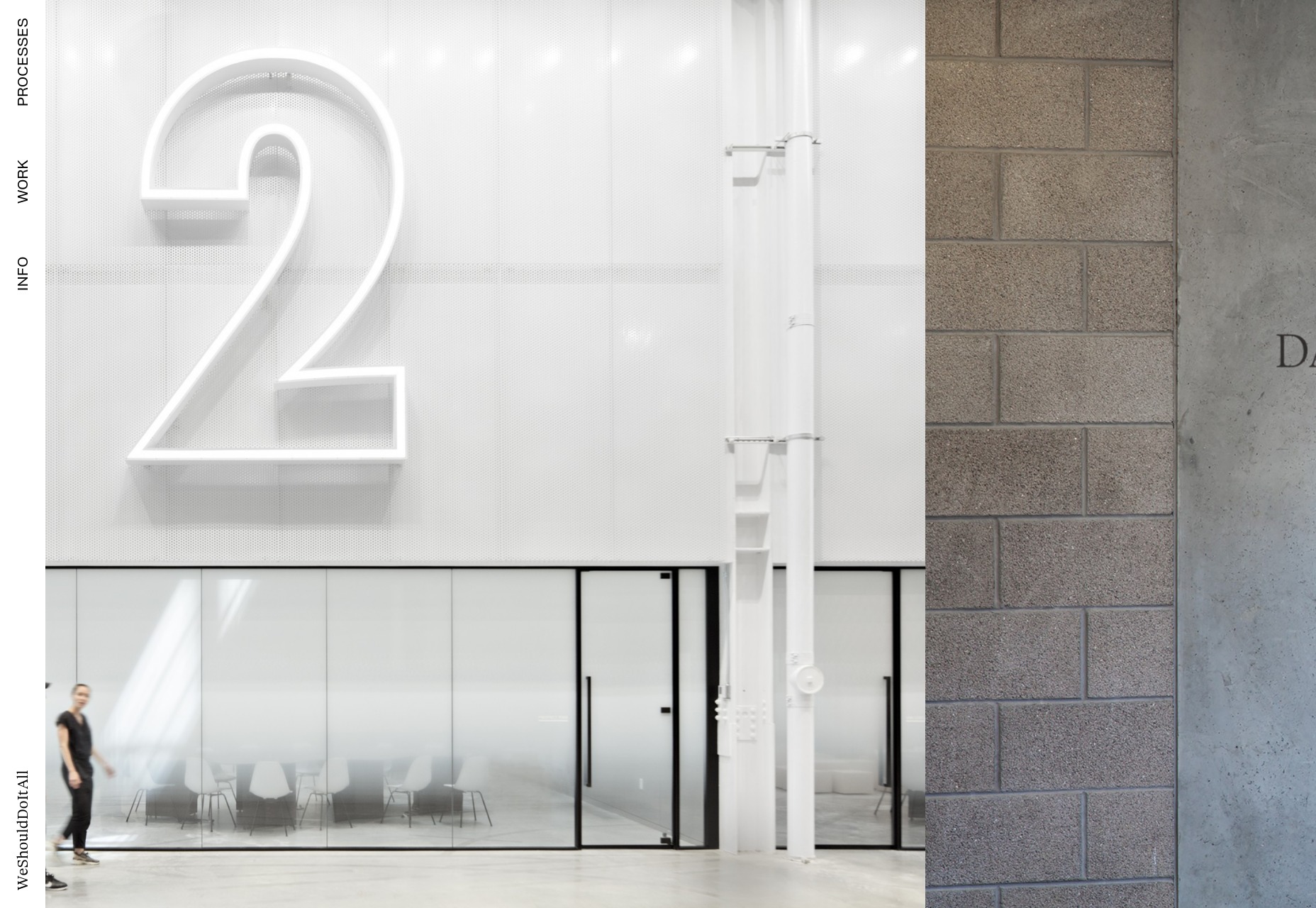
Kuon Yagi
Kuon Yagi is web designer and self-professed “markup engineer”. Now I don’t think we need another job title, but I have to admit that one sounds cool. The design is darned cool, too with a distinctly space-themed aesthetic, a .space domain name, and typography so pretty that I don’t care if a lot of the text is Japanese. Platform: Static Site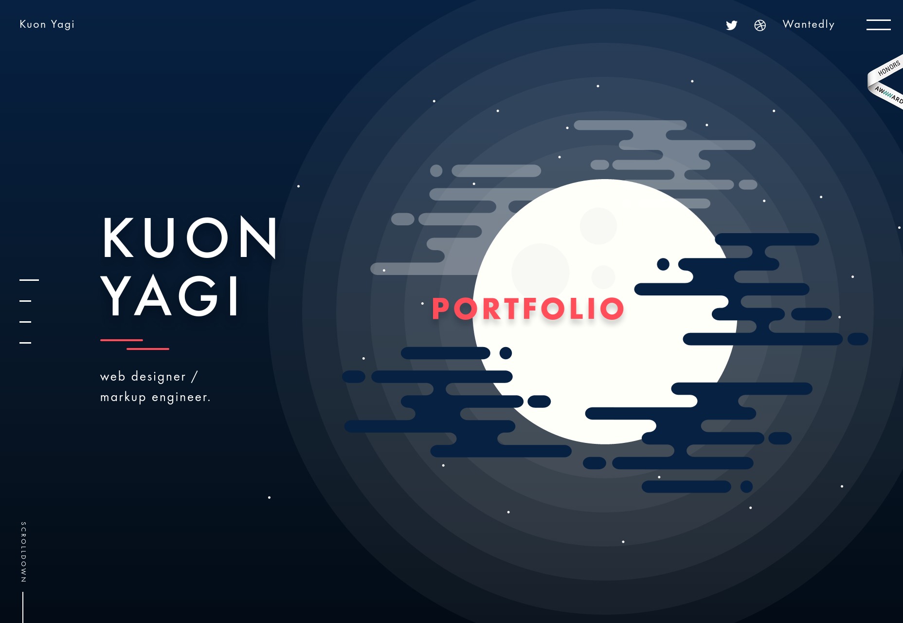
Mustafa Celik
Mustafa Celik is an art director, and has taken full advantage of animation and typography to create an experience that is rather beautiful, on the whole. It does that thing where the navigation links are all over the place, but otherwise, it’s a darned good-looking site. Platform: WordPress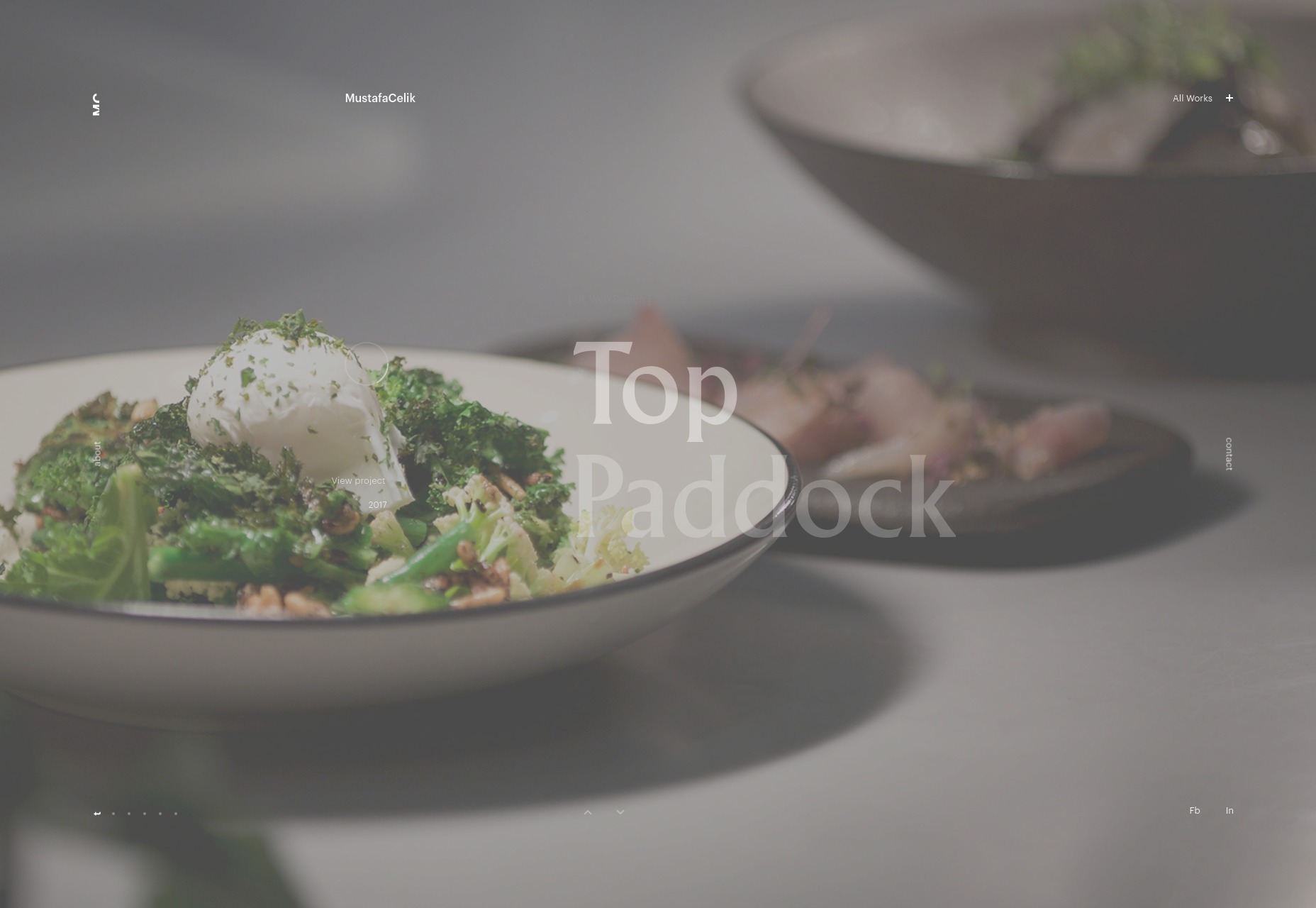
Sophie Haig
Sophie Haig’s photography portfolio combines collage-style-design, hover-over-text-to-preview UX, and the exact same font used in every hair style catalog at the local barber shop. Okay, I’m half-kidding. I’ve actually been seeing a lot of vertically "squished" type lately. I’m not a huge fan, but it has been a change of pace, and I appreciate that. In this case, it doesn’t look bad at all. Platform: Static Site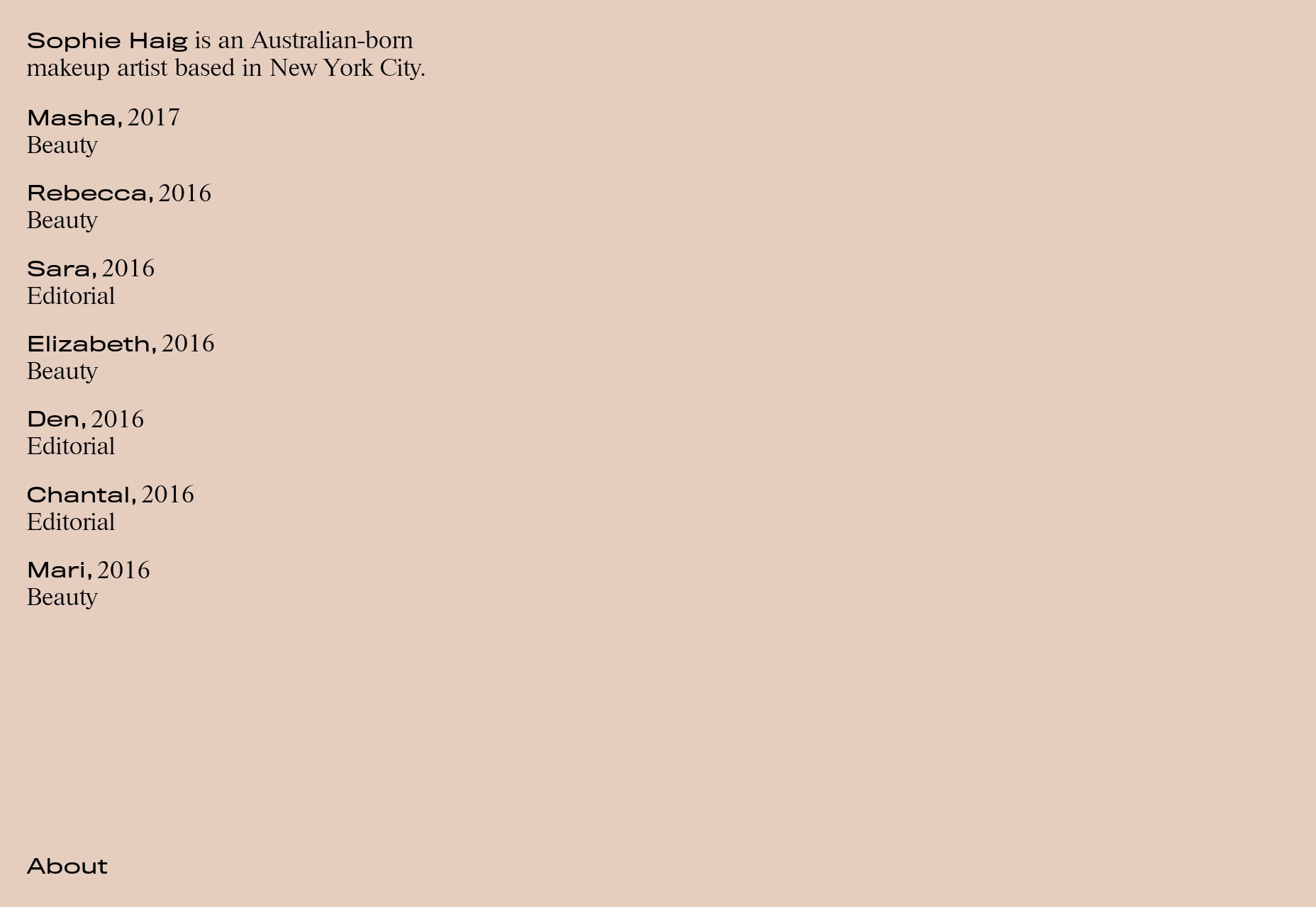
Anyonegirl
Anyonegirl is a simple yet stylish photography portfolio with a rockin’ 416 pages full of photos. Any site with that much content pretty much has to keep it simple for bandwidth reasons. Even so, there’s a distinct style present that I find appealing. Platform: WordPress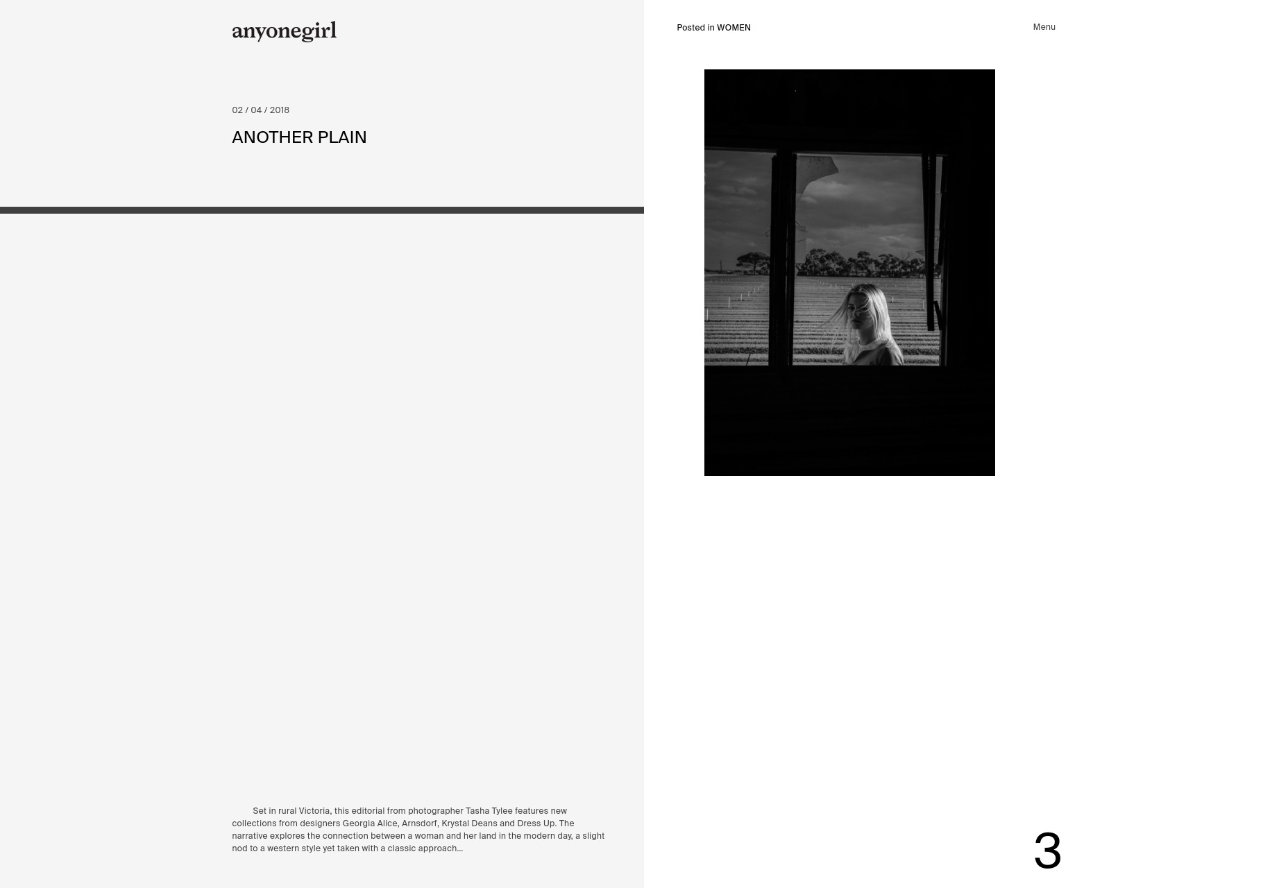
Oak & Morrow
As much as I’ve been enjoying the web’s return to color, I must admit that Oak & Morrow’s nearly monochromatic portfolio is pleasing to look at. After that, their flair for illustration adds an extra touch of style to an already great site. Platform: WordPress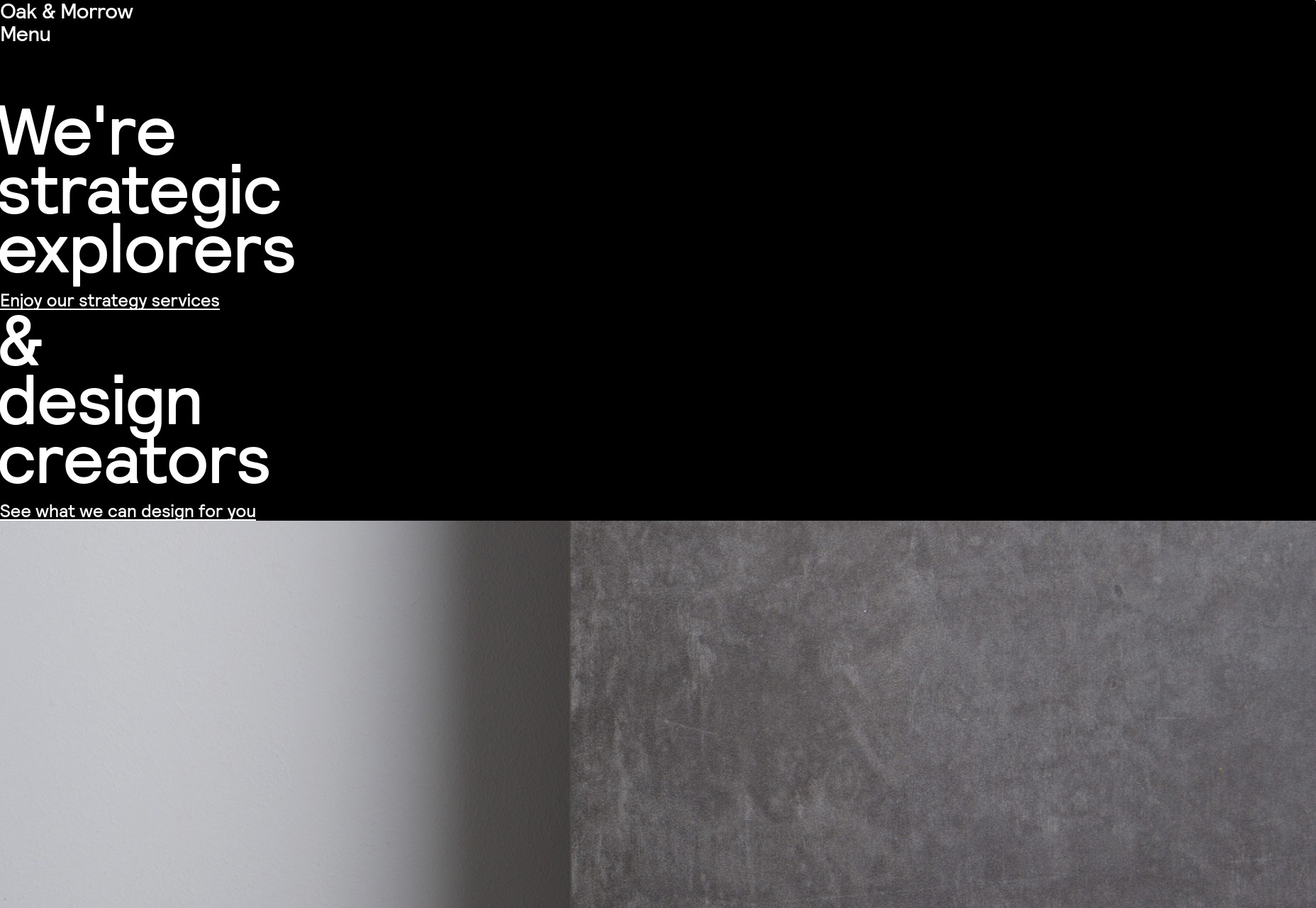
Antfood
And we finish this off with Antfood, a distinctly presentational site with tons of color, solid type, and some fairly creative animation. They also do website audio the best way I’ve ever seen it done: it’s turned off by default. If you really, really feel the need to listen to your website, you can turn it on. They’re an audio studio, so you can hardly blame them for trying. Platform: Static Site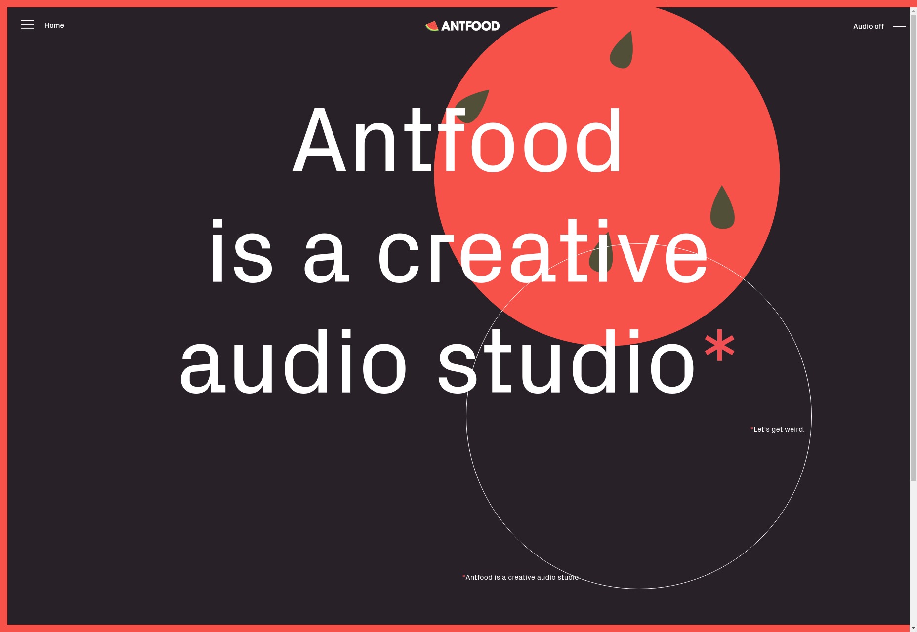
Ezequiel Bruni
Ezequiel Bruni is a web/UX designer, blogger, and aspiring photographer living in Mexico. When he’s not up to his finely-chiselled ears in wire-frames and front-end code, or ranting about the same, he indulges in beer, pizza, fantasy novels, and stand-up comedy.


Read Next

15 Best New Fonts, July 2024
Welcome to our monthly roundup of the best fonts we’ve found online in the last four weeks. This month, there are fewer…
By Ben Moss

20 Best New Websites, July 2024
Welcome to July’s round up of websites to inspire you. This month’s collection ranges from the most stripped-back…

Top 7 WordPress Plugins for 2024: Enhance Your Site's Performance
WordPress is a hands-down favorite of website designers and developers. Renowned for its flexibility and ease of use,…
By WDD Staff

Exciting New Tools for Designers, July 2024
Welcome to this July’s collection of tools, gathered from around the web over the past month. We hope you’ll find…

3 Essential Design Trends, July 2024
Add some summer sizzle to your design projects with trendy website elements. Learn what's trending and how to use these…

15 Best New Fonts, June 2024
Welcome to our roundup of the best new fonts we’ve found online in the last month. This month, there are notably fewer…
By Ben Moss

20 Best New Websites, June 2024
Arranging content in an easily accessible way is the backbone of any user-friendly website. A good website will present…

Exciting New Tools for Designers, June 2024
In this month’s roundup of the best tools for web designers and developers, we’ll explore a range of new and noteworthy…

3 Essential Design Trends, June 2024
Summer is off to a fun start with some highly dramatic website design trends showing up in projects. Let's dive in!

15 Best New Fonts, May 2024
In this month’s edition, there are lots of historically-inspired typefaces, more of the growing trend for French…
By Ben Moss

How to Reduce The Carbon Footprint of Your Website
On average, a web page produces 4.61 grams of CO2 for every page view; for whole sites, that amounts to hundreds of KG…
By Simon Sterne

20 Best New Websites, May 2024
Welcome to May’s compilation of the best sites on the web. This month we’re focused on color for younger humans,…