

1. All Photos, No Case Studies
As designers, we naturally focus on the visual aspect of our portfolios. After all, the point of our portfolio is to showcase our designs. But in most cases (with the possible exception of things like playgrounds or mood boards), your readers need, and want context for your work. Don’t just dump a bunch of photos on the page and leave it up to us to decipher what they mean. Write case studies for every project that walks us through your approach, from challenge to solution.How to Do it Right
Writing case studies feels less daunting if you break your project down into phases. You can even start by writing longer captions and a headline to go alongside each image, as shown in Mackey Saturday’s portfolio below. That’s basically all you need, since people will be scanning your page to see what’s most interesting to them. Keep it simple and and straightforward (no buzzwords or insider language), and you’ll find it’s quite easy to write case studies that elevate your portfolio significantly. Get more tips for writing portfolio case studies right here. Mackey Saturday writes his case studies in caption form for easy reading.
2. Trendy, Vague Introductions
If you’re going to lead with a personal introduction on your portfolio, write something that actually helps us understand who you are. I’ve said this before and I’ll keep saying it until I stop seeing portfolios with intros like “I move pixels.” Lines like this mean nothing to a recruiter or potential client who is browsing your website. This is your main audience, which is easy to forget when we’re just trying to make an awesome portfolio.How to Do it Right
Anyone looking to potentially hire you wants to understand at a glance what you can do for them. Something like “I’m Jessica Jones, a brand designer and art director from NYC” will do just fine. Being clear is better than being clever – being clear and clever (like Marina Rachello’s intro below) is even better.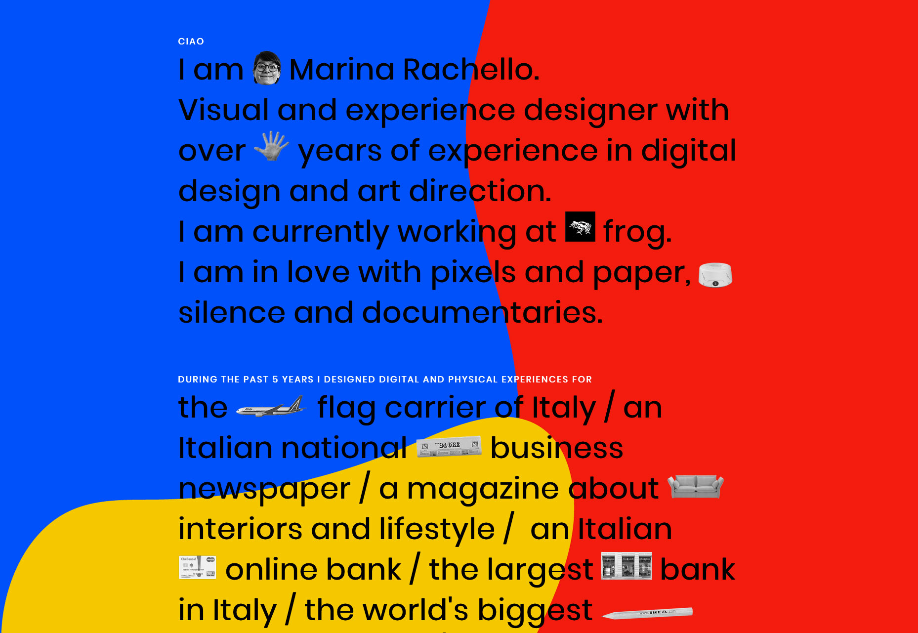 Marina Rachello’s intro is creative, yet simple and straightforward.
3. Outdated Projects and Design Style
I’m guilty of this myself: We get so busy doing the actual work, we forget our portfolio should always be current and evolve with us throughout our design career. But a dusty portfolio with outdated projects might actually be detrimental to your career. Even if you’re not sending it out to potential clients or employers, anyone can easily dig up your fossilized portfolio by simply searching your name online. That means you could be missing out on exciting work without even realizing it.How to Do it Right
The good news is, it’s easy to keep your portfolio fresh and current. This is why I recommend against using a portfolio template, as they date quickly and will lock you into layouts that might be irrelevant later. If you design your own portfolio, you can make light adjustments and updates consistently, allowing it to adapt to your career and modern design expectations without requiring a complete overhaul. Verena Michelitsch’s portfolio, custom designed with Semplice.
4. Redundant Navigation and Dead Ends
When we’re working on a project for ourselves, we get so close to the work we forget best practices we know by heart. One common mistake is redundant or dead-end user flows, either confusing your visitoror leaving them with nothing to but exit the site when they’re done reading.
How to Do it Right
Remember to guide your reader through your portfolio, always pushing them closer toward your goals. Thankfully, your portfolio has two simple goals: Showcase your work and get people to contact you. Your navigation and project pages should of course reflect that. For example, you don’t need separate Contact and About pages. Cut out the extra steps and create an Info page with your bio and contact information. Add related projects with a preview at the bottom of your case studies, as shown in Michela Picchi’s portfolio below, so it’s easy to click between your work pages and keep reading.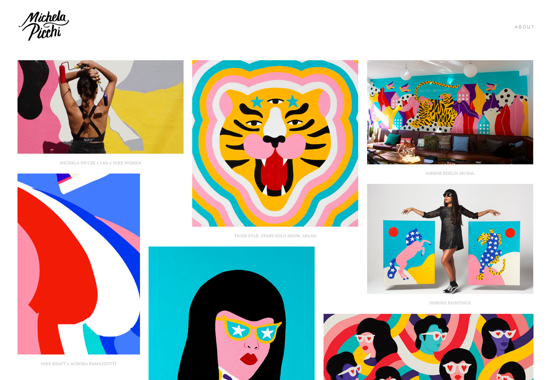 Michela Picchi’s case studies end with an engaging “More Projects” section.
5. Boring About Pages
Your About page is an opportunity to make an impression and compel people to contact you. But sadly, most About pages I see aren’t very memorable or compelling.How to Do it Right
Instead of just listing your creds and contact info, add some personality to your About page. Remember your reader has probably clicked through dozens of portfolios today. If you can make them smile, you’ll be remembered. Read more tips for making the perfect About page here.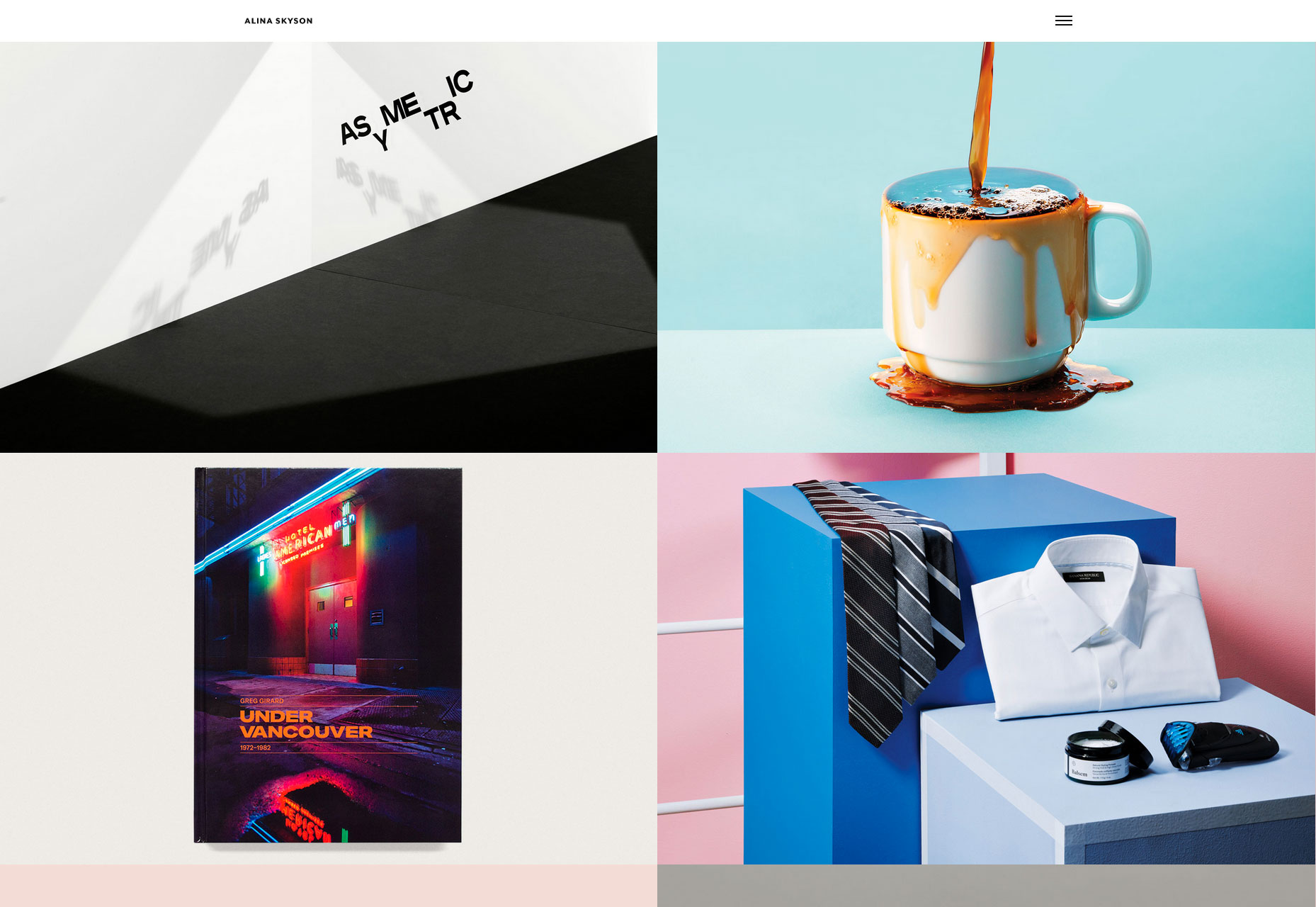 Alina Skyson’s portfolio includes a visual and memorable “10 true facts about me” section.
Conclusion
Remember that your portfolio is not meant to be a grand work of art. While the design and details are important, your portfolio is ultimately meant to showcase your work — not stand in the way of it. When you keep your work and the person viewing it in mind, you’ll have a portfolio that sets you up for success.

Read Next

15 Best New Fonts, July 2024
Welcome to our monthly roundup of the best fonts we’ve found online in the last four weeks. This month, there are fewer…
By Ben Moss

20 Best New Websites, July 2024
Welcome to July’s round up of websites to inspire you. This month’s collection ranges from the most stripped-back…

Top 7 WordPress Plugins for 2024: Enhance Your Site's Performance
WordPress is a hands-down favorite of website designers and developers. Renowned for its flexibility and ease of use,…
By WDD Staff

Exciting New Tools for Designers, July 2024
Welcome to this July’s collection of tools, gathered from around the web over the past month. We hope you’ll find…

3 Essential Design Trends, July 2024
Add some summer sizzle to your design projects with trendy website elements. Learn what's trending and how to use these…

15 Best New Fonts, June 2024
Welcome to our roundup of the best new fonts we’ve found online in the last month. This month, there are notably fewer…
By Ben Moss

20 Best New Websites, June 2024
Arranging content in an easily accessible way is the backbone of any user-friendly website. A good website will present…

Exciting New Tools for Designers, June 2024
In this month’s roundup of the best tools for web designers and developers, we’ll explore a range of new and noteworthy…

3 Essential Design Trends, June 2024
Summer is off to a fun start with some highly dramatic website design trends showing up in projects. Let's dive in!

15 Best New Fonts, May 2024
In this month’s edition, there are lots of historically-inspired typefaces, more of the growing trend for French…
By Ben Moss

How to Reduce The Carbon Footprint of Your Website
On average, a web page produces 4.61 grams of CO2 for every page view; for whole sites, that amounts to hundreds of KG…
By Simon Sterne

20 Best New Websites, May 2024
Welcome to May’s compilation of the best sites on the web. This month we’re focused on color for younger humans,…