

If you redesign Reddit…you’re inherently changing the internet.~ Diego Perez, Reddit’s Head of Design, speaking to Wired From a design perspective, it’s always difficult to critique a design without being party to the brief, without sitting in on the feedback meetings, without a detailed understanding of what the challenge is for Reddit. Like a game of Jeopardy! we have the answer, what matters is whether it matches the question. Reddit’s design challenge is more complex than most because as a site, it had been left to seed. A wild west of different communities, each with their own ideas, the new site design has to unify them all, without threatening the independent spirit that makes them what they are. Wired have published the inside story of the redesign, which is a fascinating read, but certainly glosses over the more challenging parts of the process. Reddit we’re told, employed just two UX researchers to assess the onboarding experience; their research process was to wander around outside Reddit HQ approaching different people with their laptops. With a decade of neglect, an opinionated user base, and fewer resources than many startups, it’s a minor miracle that Reddit’s design team delivered anything at all. [pullquote]it’s a minor miracle that Reddit’s design team delivered anything at all[/pullquote] As of today, 1% of users will see the new design. Over the coming months the new design will be rolled out globally. There are three design options for users to choose from: Classic view (basically old Reddit with the new features added), Card view (how most users will use the site), and Compact view (for scanning content quickly). In any other context I’d take the view that three different ‘designs’ indicate a difference of opinion in the design process that hadn’t been properly resolved. In Reddit’s case it feels like an acknowledgement of the different needs of different groups.
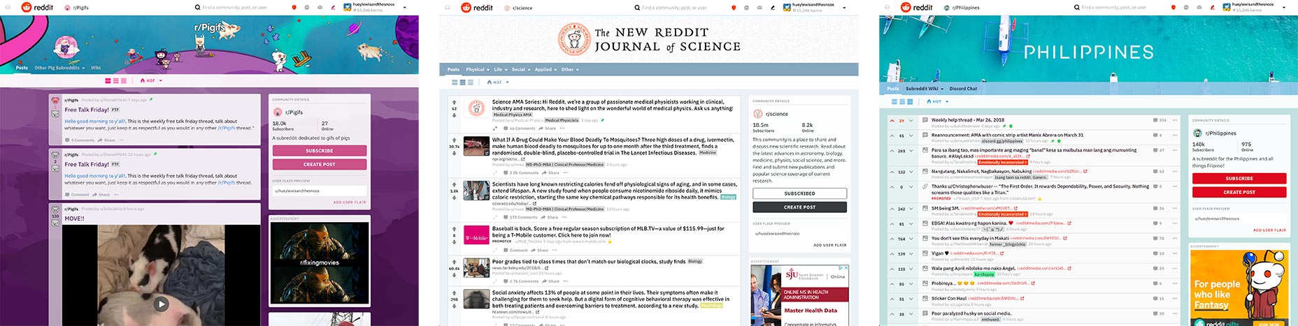 Card view (left), Classic view (center), Compact view (right)
Snoo, the site’s mascot has also received an update. Now, instead of standing around looking dopey, he’s dynamic and expressive. The reimagining of Snoo, and its integration into the brand from illustrations to Snoomojis, is excellent. While a cutesy mascot is not everyone’s cup of tea, if you’re going to do it, you may as well do it well.
The UI design is not entirely successful though. The menu bar has been replaced by a menu stuck to the top left corner of the UI. These types of menus are popular with designers—they crop up a lot on design showcases—but rarely test well with users. I’d be surprised if that decision isn’t revoked at the next iteration.
Much of the redesign is intentionally invisible, with efforts being diverted into areas that only Reddit users will notice, such as the ability to post text and images in a single post, or the introduction of WYSIWYG controls for formatting. The most significant design changes are the less obvious ones: the welcome decision to ignore Material Design, posts opening in modals instead of new windows, the stylistic distinction between internal and external links.
Reddit’s redesign is almost invisible. Like most successful redesigns it strikes a judicious balance between where the site is, and where it wants to be.
Card view (left), Classic view (center), Compact view (right)
Snoo, the site’s mascot has also received an update. Now, instead of standing around looking dopey, he’s dynamic and expressive. The reimagining of Snoo, and its integration into the brand from illustrations to Snoomojis, is excellent. While a cutesy mascot is not everyone’s cup of tea, if you’re going to do it, you may as well do it well.
The UI design is not entirely successful though. The menu bar has been replaced by a menu stuck to the top left corner of the UI. These types of menus are popular with designers—they crop up a lot on design showcases—but rarely test well with users. I’d be surprised if that decision isn’t revoked at the next iteration.
Much of the redesign is intentionally invisible, with efforts being diverted into areas that only Reddit users will notice, such as the ability to post text and images in a single post, or the introduction of WYSIWYG controls for formatting. The most significant design changes are the less obvious ones: the welcome decision to ignore Material Design, posts opening in modals instead of new windows, the stylistic distinction between internal and external links.
Reddit’s redesign is almost invisible. Like most successful redesigns it strikes a judicious balance between where the site is, and where it wants to be.
Ben Moss
Ben Moss has designed and coded work for award-winning startups, and global names including IBM, UBS, and the FBI. When he’s not in front of a screen he’s probably out trail-running.


Read Next

15 Best New Fonts, July 2024
Welcome to our monthly roundup of the best fonts we’ve found online in the last four weeks. This month, there are fewer…
By Ben Moss

20 Best New Websites, July 2024
Welcome to July’s round up of websites to inspire you. This month’s collection ranges from the most stripped-back…

Top 7 WordPress Plugins for 2024: Enhance Your Site's Performance
WordPress is a hands-down favorite of website designers and developers. Renowned for its flexibility and ease of use,…
By WDD Staff

Exciting New Tools for Designers, July 2024
Welcome to this July’s collection of tools, gathered from around the web over the past month. We hope you’ll find…

3 Essential Design Trends, July 2024
Add some summer sizzle to your design projects with trendy website elements. Learn what's trending and how to use these…

15 Best New Fonts, June 2024
Welcome to our roundup of the best new fonts we’ve found online in the last month. This month, there are notably fewer…
By Ben Moss

20 Best New Websites, June 2024
Arranging content in an easily accessible way is the backbone of any user-friendly website. A good website will present…

Exciting New Tools for Designers, June 2024
In this month’s roundup of the best tools for web designers and developers, we’ll explore a range of new and noteworthy…

3 Essential Design Trends, June 2024
Summer is off to a fun start with some highly dramatic website design trends showing up in projects. Let's dive in!

15 Best New Fonts, May 2024
In this month’s edition, there are lots of historically-inspired typefaces, more of the growing trend for French…
By Ben Moss

How to Reduce The Carbon Footprint of Your Website
On average, a web page produces 4.61 grams of CO2 for every page view; for whole sites, that amounts to hundreds of KG…
By Simon Sterne

20 Best New Websites, May 2024
Welcome to May’s compilation of the best sites on the web. This month we’re focused on color for younger humans,…