

Aesthetic Changes
Well it seems they’re ready to re-brand themselves just a bit, because their website is taking a whole new approach to the Walmart experience. The first major change is, of course, the new look and feel of their main website. For comparison, here’s the old design: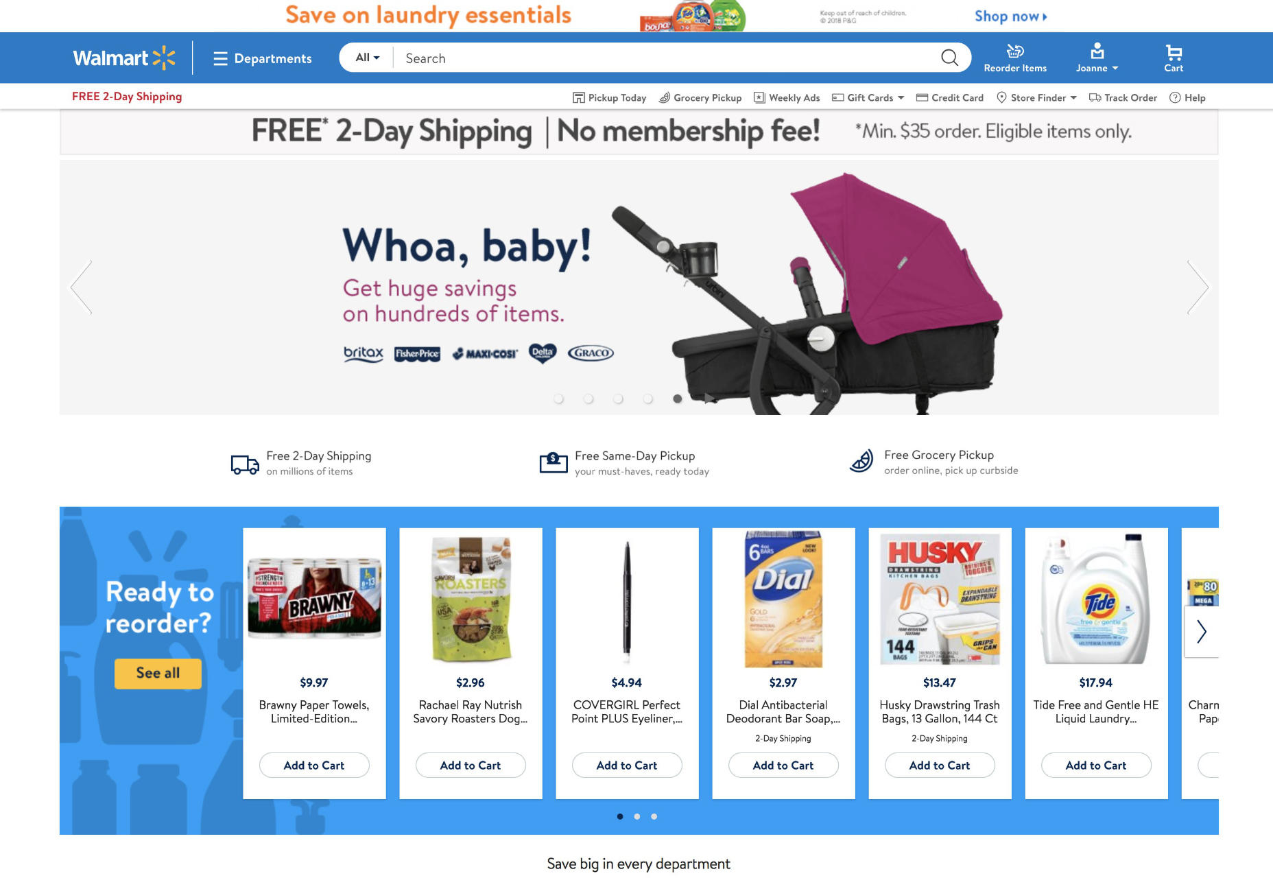 And here’s the new one:
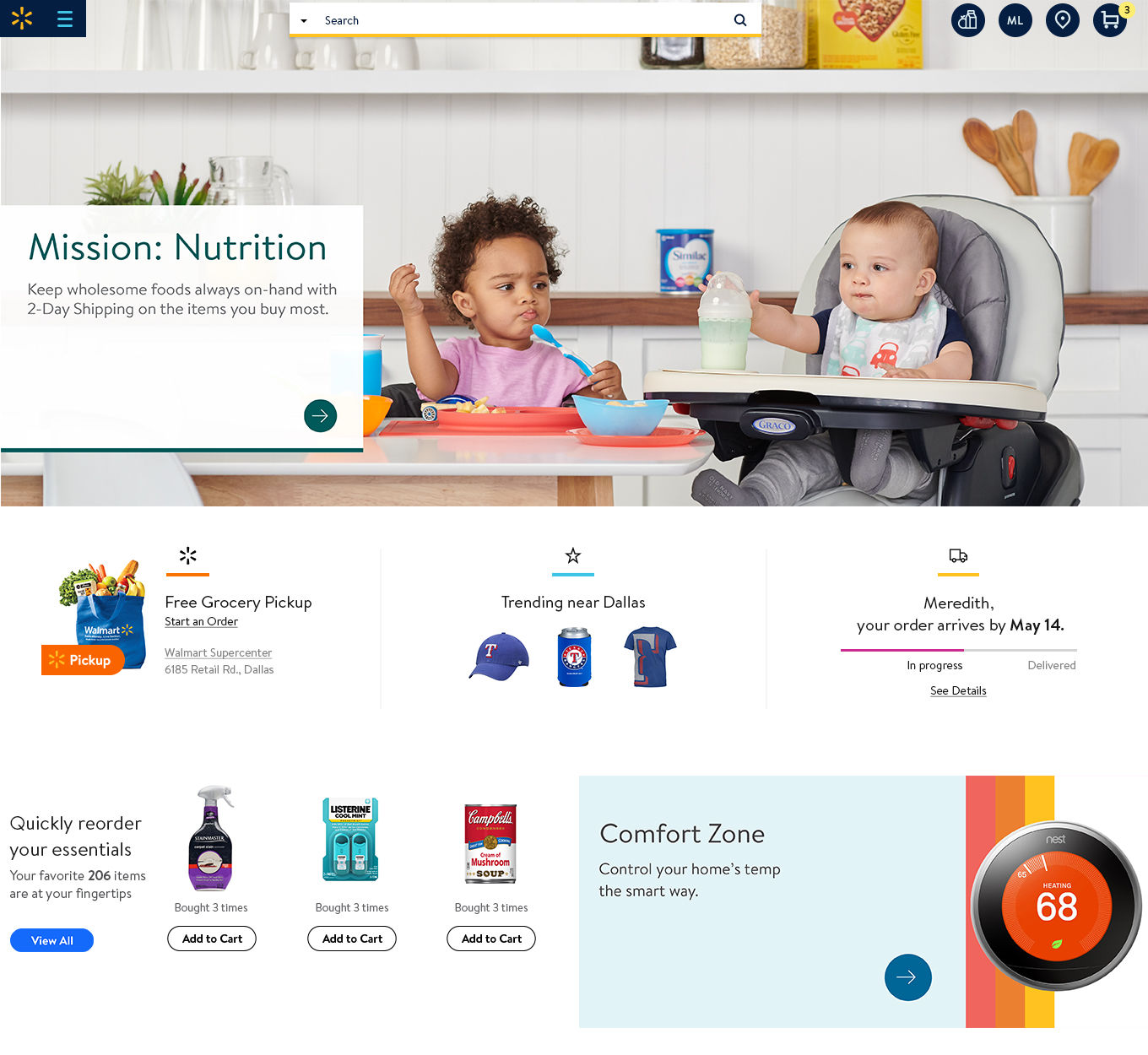
 The old UI was not overly-cluttered, especially given the size of the retailer that we’re dealing with. The new one presents an even greater emphasis on white space, though. Instead of offering you everything all at once, there’s a clear emphasis on selling more finely-targeted products. Everything is still available, but you might have to refine your search.
Speaking of which, search has always been front and center. But now, it’s even more isolated, as UI elements go. The navigation menu is even smaller, eschewing the “Departments” text. It seems they’d rather focus on the search bar as their primary means of finding the products you want. But the menu is still there, if you want to browse.
Another interesting change is that the branding has been minimized. By default, you don’t even see the name “Walmart”, just that little logo. Walmart can certainly get away with a change like this, being as large as they are.
Still, I can’t help but suspect that some users might find themselves uncomfortably wondering where the bold, classic Walmart went. Indeed, the general aesthetic reminds me more of the old Metro UI/Bing than anything else. It’s as if Material Design was made by Microsoft, and Walmart went all in. It certainly looks pretty enough, and modern, and stylish. But man it does not look like Walmart.
If that’s what they were going for, then they have succeeded admirably.
Also, Walmart apparently read the same research the rest of us did on how bigger images sell. There are a few more of them, now.
The old UI was not overly-cluttered, especially given the size of the retailer that we’re dealing with. The new one presents an even greater emphasis on white space, though. Instead of offering you everything all at once, there’s a clear emphasis on selling more finely-targeted products. Everything is still available, but you might have to refine your search.
Speaking of which, search has always been front and center. But now, it’s even more isolated, as UI elements go. The navigation menu is even smaller, eschewing the “Departments” text. It seems they’d rather focus on the search bar as their primary means of finding the products you want. But the menu is still there, if you want to browse.
Another interesting change is that the branding has been minimized. By default, you don’t even see the name “Walmart”, just that little logo. Walmart can certainly get away with a change like this, being as large as they are.
Still, I can’t help but suspect that some users might find themselves uncomfortably wondering where the bold, classic Walmart went. Indeed, the general aesthetic reminds me more of the old Metro UI/Bing than anything else. It’s as if Material Design was made by Microsoft, and Walmart went all in. It certainly looks pretty enough, and modern, and stylish. But man it does not look like Walmart.
If that’s what they were going for, then they have succeeded admirably.
Also, Walmart apparently read the same research the rest of us did on how bigger images sell. There are a few more of them, now.
Functional Changes
Of course, Walmart is also taking this opportunity to refine how they sell things to people. For example, a lot of your experience on the site will be affected by which Walmart locations are actually nearby, and what services they offer. I suspect the local inventory will also have a lot to do with it.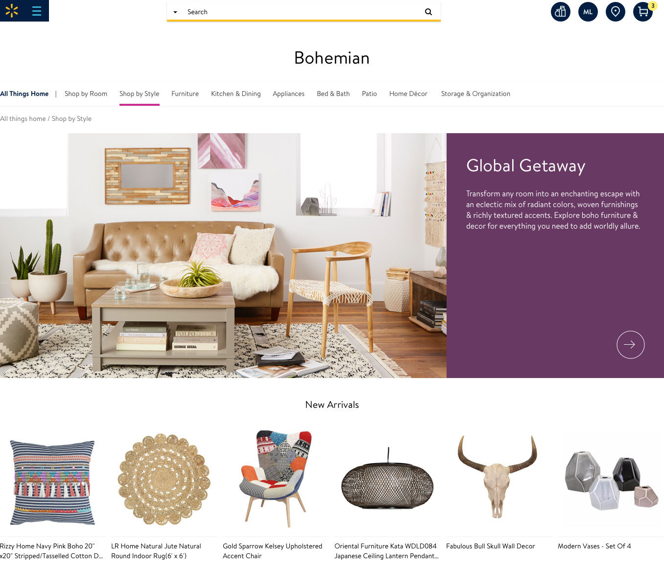 What’s more, your shopping experience will change based on the department you’re browsing through. Take groceries, for example. You probably mostly want to buy the same stuff as you did last week, so the UI will focus on making that easier. Meanwhile, if you want furniture, you’ll likely want to shop by style, and you likely won’t be buying the same thing every week.
So Does It Work?
The real question is this: why bother? Does Walmart intend to distance itself from previous public perceptions? Their blog post detailing the changes reiterates the same commitment to low prices they’ve always espoused, so it doesn’t seem like they’re going for a “luxury brand” image. If they just wanted it to look better, I’d say they’ve moved laterally. The style is certainly different, and cleaner. I have no complaints about it. But as ecommerce experiences go, I didn’t see any particular glaring issues with the last design. Functionality is a different matter. If the new design system is intended to make it easier for Walmart to offer more custom-tailored shopping experiences, then I’d say they succeeded in that. It also makes the most sense as a potential reason for the whole redesign. They’re a retailer. Selling more == good. And hey, they already know the difference between things you want to buy repeatedly, and things you don’t. That’s a step up from Amazon.Ezequiel Bruni
Ezequiel Bruni is a web/UX designer, blogger, and aspiring photographer living in Mexico. When he’s not up to his finely-chiselled ears in wire-frames and front-end code, or ranting about the same, he indulges in beer, pizza, fantasy novels, and stand-up comedy.


Read Next

15 Best New Fonts, July 2024
Welcome to our monthly roundup of the best fonts we’ve found online in the last four weeks. This month, there are fewer…
By Ben Moss

20 Best New Websites, July 2024
Welcome to July’s round up of websites to inspire you. This month’s collection ranges from the most stripped-back…

Top 7 WordPress Plugins for 2024: Enhance Your Site's Performance
WordPress is a hands-down favorite of website designers and developers. Renowned for its flexibility and ease of use,…
By WDD Staff

Exciting New Tools for Designers, July 2024
Welcome to this July’s collection of tools, gathered from around the web over the past month. We hope you’ll find…

3 Essential Design Trends, July 2024
Add some summer sizzle to your design projects with trendy website elements. Learn what's trending and how to use these…

15 Best New Fonts, June 2024
Welcome to our roundup of the best new fonts we’ve found online in the last month. This month, there are notably fewer…
By Ben Moss

20 Best New Websites, June 2024
Arranging content in an easily accessible way is the backbone of any user-friendly website. A good website will present…

Exciting New Tools for Designers, June 2024
In this month’s roundup of the best tools for web designers and developers, we’ll explore a range of new and noteworthy…

3 Essential Design Trends, June 2024
Summer is off to a fun start with some highly dramatic website design trends showing up in projects. Let's dive in!

15 Best New Fonts, May 2024
In this month’s edition, there are lots of historically-inspired typefaces, more of the growing trend for French…
By Ben Moss

How to Reduce The Carbon Footprint of Your Website
On average, a web page produces 4.61 grams of CO2 for every page view; for whole sites, that amounts to hundreds of KG…
By Simon Sterne

20 Best New Websites, May 2024
Welcome to May’s compilation of the best sites on the web. This month we’re focused on color for younger humans,…