

1. Funky, Tiny Nav
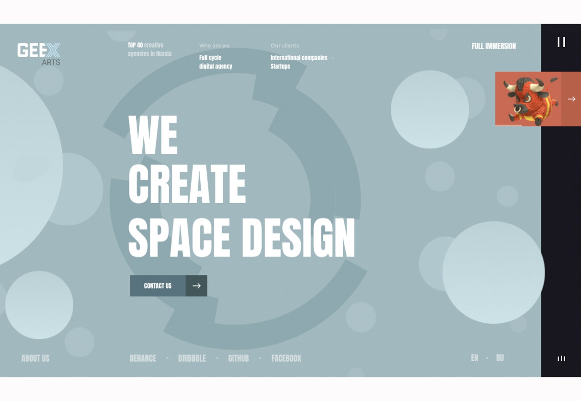
For a while designers pushed mega navigation, then hamburger-style navigation everywhere, then back to top-of-page-sticky nav. Now there’s a new navigation style popping up and it’s funkier and tinier than anything else we’ve seen in a while. These funky, tiny navigation styles are minimal at a glance, but often expand with a click or tap into a more robust set of options. What’s great about this website design trend is that it gives the design more room to focus on the main content area of the design and associated calls to action. What’s not so great is that lack of obvious navigation can be somewhat confusing for some users. That makes this a technique best for websites without a lot of pages to visit in the first place – think one-page designs or simply structured designs. Each of the examples below uses a funky, tiny nav structure in a different way:- Geex Arts draws users with a dark vertical bar on the right side with a small moving image and “pause button” style menu.
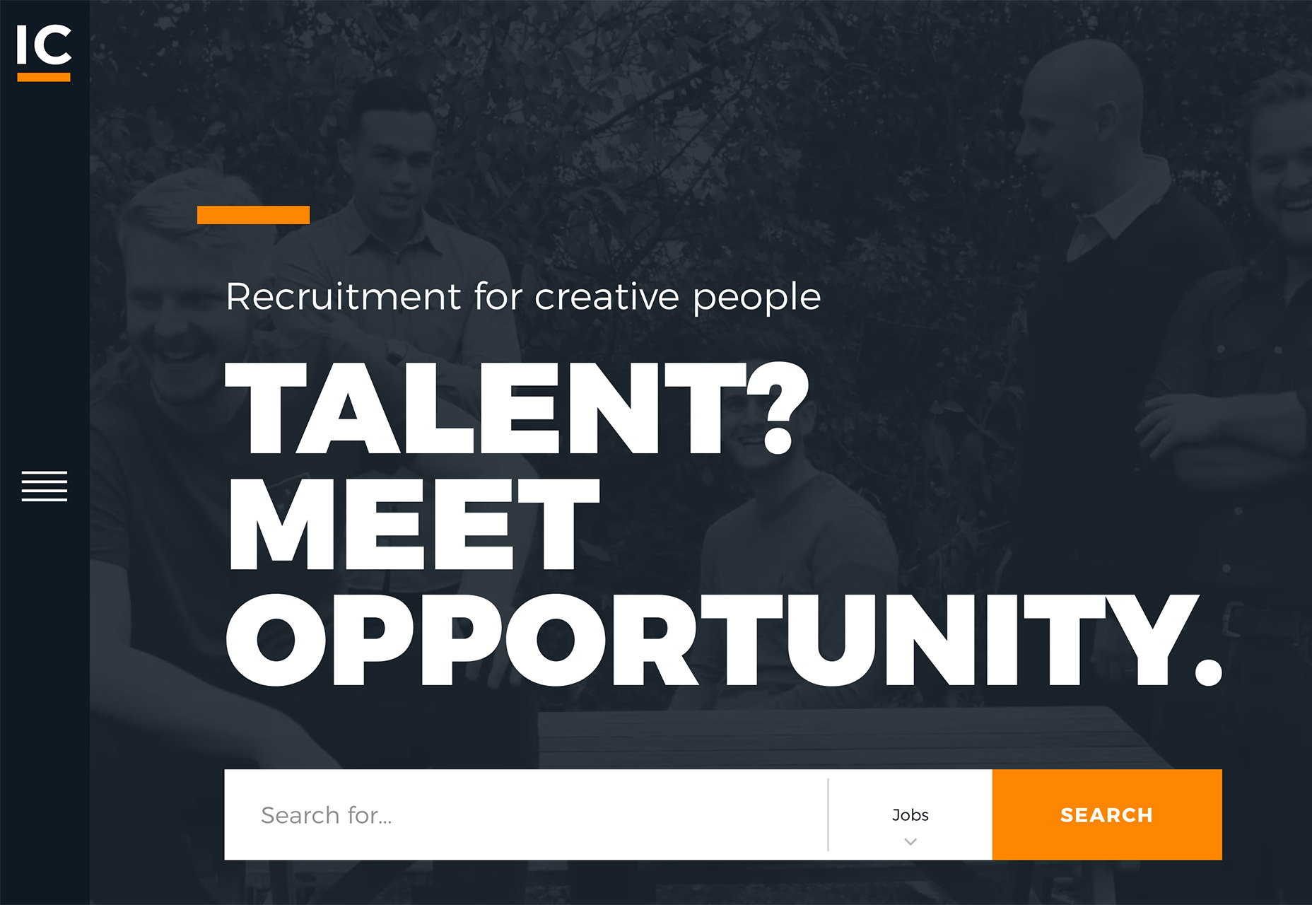
- IC Creative uses an oversized hamburger icon in the left, skinny sidebar that pops out in the same manner for desktop and mobile users. Make sure to pop it open. What’s cool about the nav is that it includes a few links – there aren’t many pages here – and links to popular blog posts. (It’s also easy to hide the menu.)
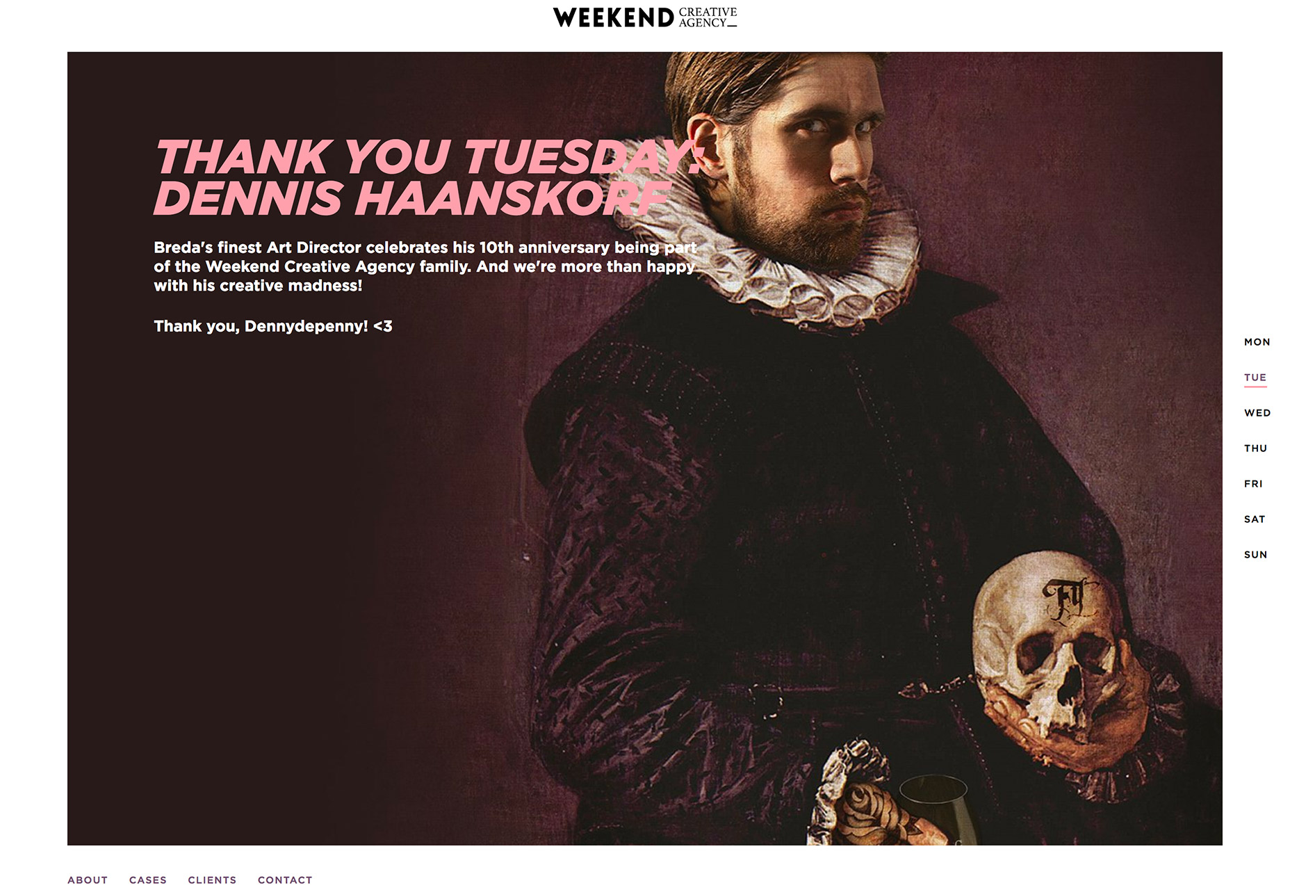
- Weekend Creative Agency also uses a thin sidebar navigation, but all the links are right there, rather than hidden in an icon. Plus, additional navigational elements are featured along the bottom of the design.
2. Interesting Cut Outs and Layers
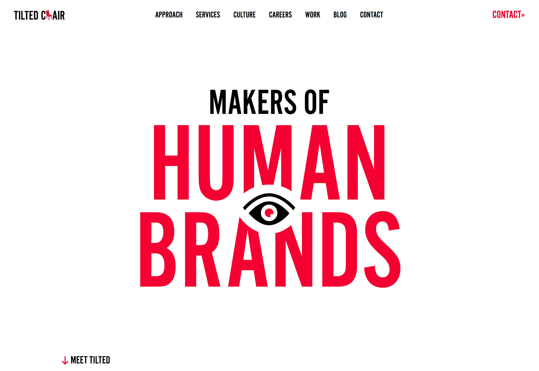
Learning to create interesting layers is one of the most valuable things you will learn about design. Layers are an easy way to create distinct visual interest and draw users through a design. Thankfully, techniques that were difficult to pull off not all that long ago have become easier to accomplish, and interesting layers are a lot easier to manage effectively. One of the most fun uses of layers recently is in the form of interesting cut outs, where parts of an element are removed to make room for another element in the foreground. Cut outs can work for almost any type of website or design. They can be any number of sizes as well. The trick is ensuring that the layers work together in an interesting way. Just putting cut out elements in a design won’t be enough to draw users in. Cut outs and layers should feel connected to the overall messaging and provide a purpose in the design, such as help navigation, direct users to look in a specific location, contribute to function or provide better understanding of the overall message of the design.- Tilted Chair does it throughout the design, but the cut out in the main headline to make room for the blinking eye is brilliant and quite attention-grabbing.
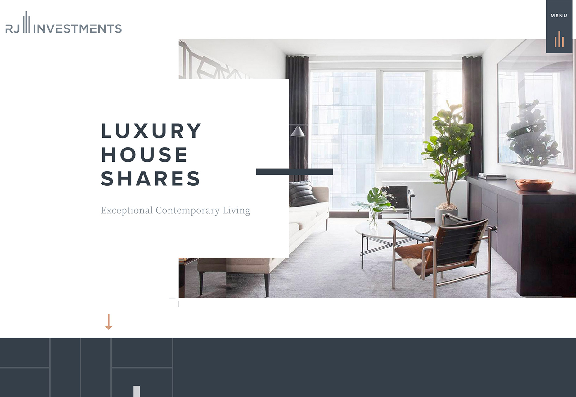
- RJ Investments uses multiple cutouts to highlight text elements, messaging and calls to action. (The nifty little menu cut out is pretty nice as well.)
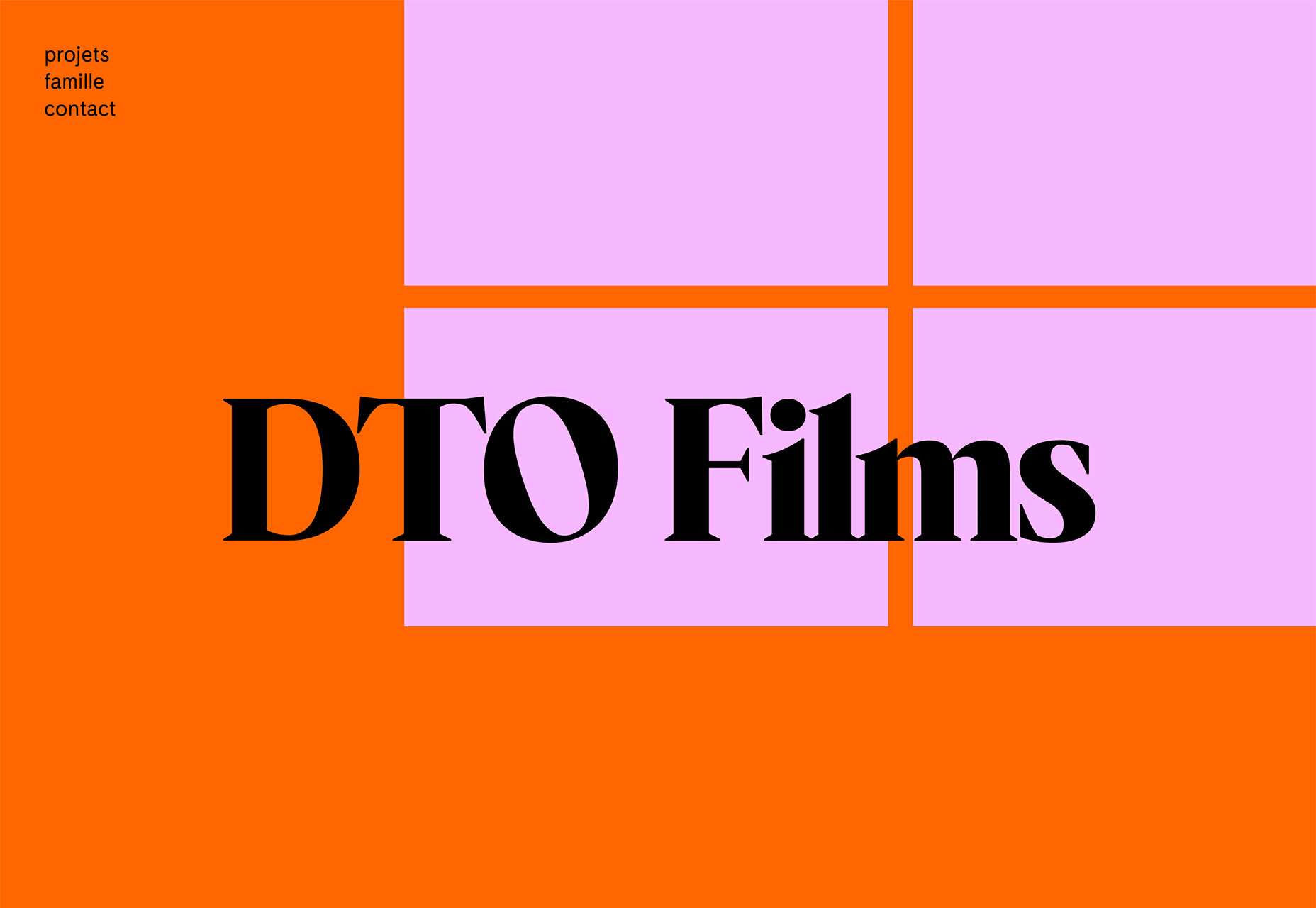
- DTO Films takes another approach altogether. The cut outs are in the background, providing a bright pop of color with orange and lavender boxes that are also animated. This cut out is most interesting because the oversized lettering on top rests in position without any real alignment, it seems. Add in the animation of the background and it feels even more random, contributing to overall visual interest.
3. Fast-Action Video
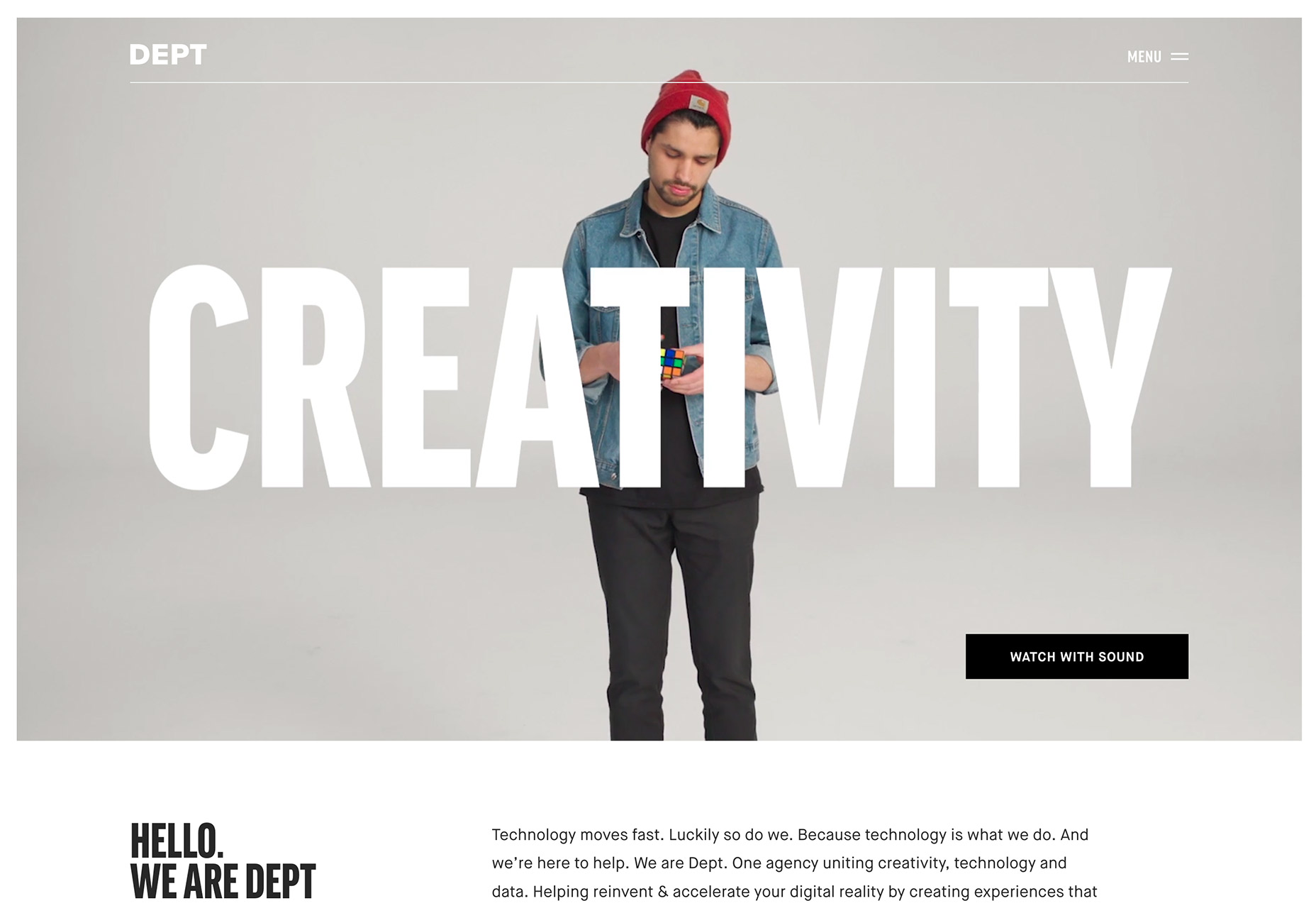
Designers have been using video for a while to tell stories through website design. A trend in the delivery of video content is fast-moving animation that draws users in quickly. There’s no doubt that a design has to have interesting content and visuals to keep a user engaged. What’s nice about fast-paced video is that the story unfolds in super-speed. The user gets the message quickly and will almost feel compelled to watch the full video loop, because the speed of action makes it feel short and quick. This can be a great boost to time on site and helping users engage with other parts of the design. Here are three different ways to use fast-action video:- Dept Agency uses a video roll that moves in a fast-forward style pace. The images and text are shown quickly – almost too quickly – and encourage users to keep looking to read the entire message on the screen, one word at a time.
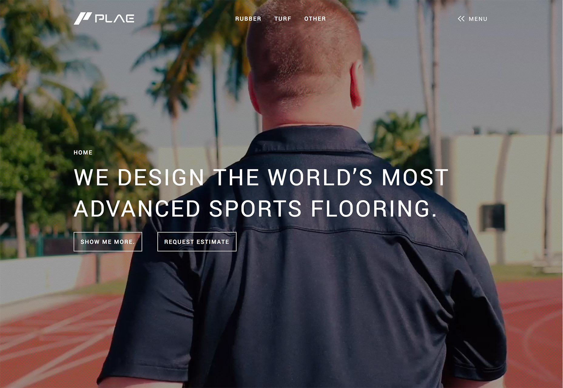
- Plae uses a series of video clips that move in a mostly normal speed and then zip to the next action clip. Just as users start to pay attention to the movement, it shifts. The video keeps changing but the message and CTA on the screen stay the same, so it’s always easy for the user to complete the web page goal.
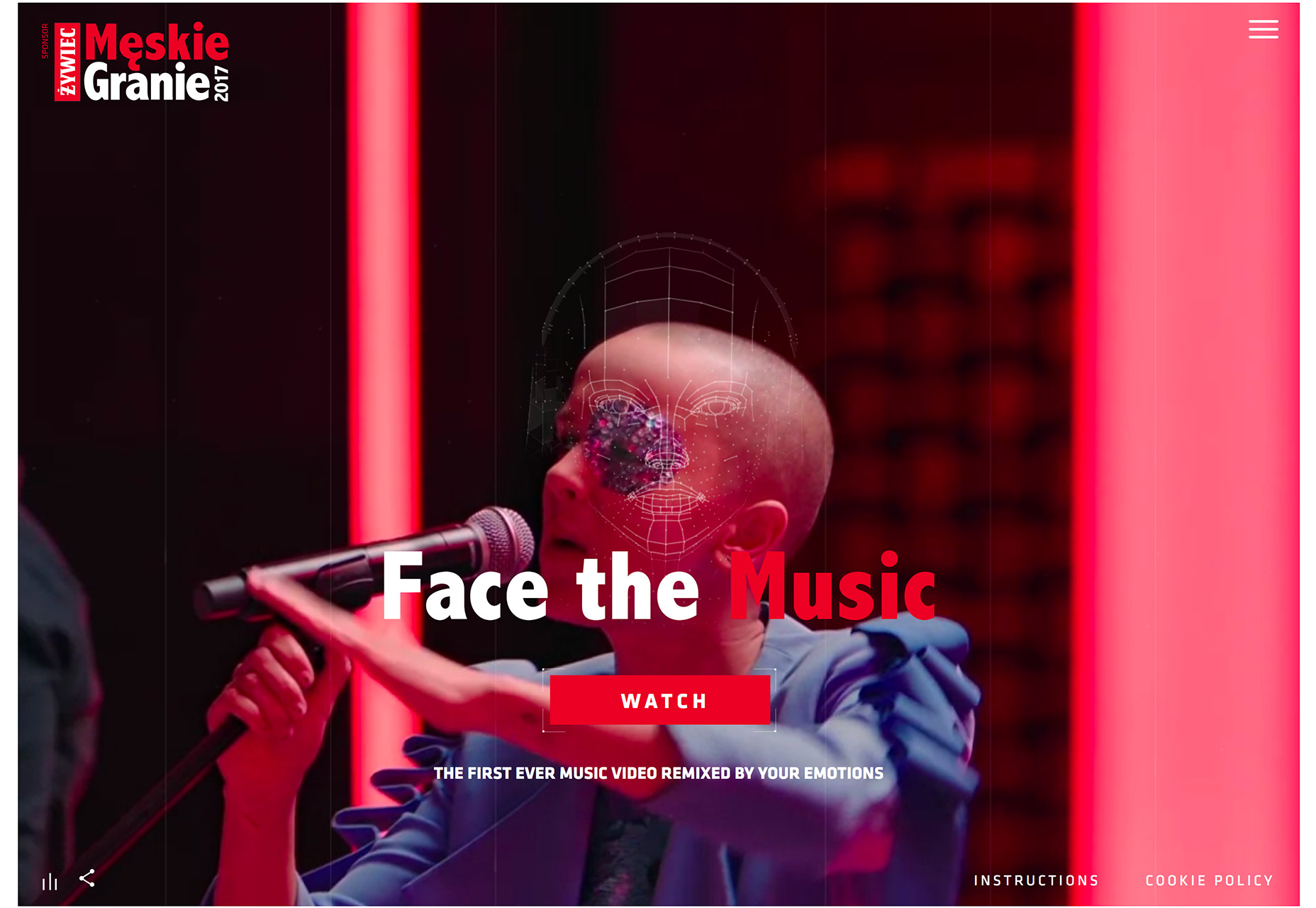
- The Meskie Granie Music Festival uses video at different paces with fast overlay transitions to create a music video-style experience for users. (It almost feels like what you would see on MTV in the 1990s.) And the interactive component – users can impact the motion based on their emotion – is pretty wild.
Conclusion
The thing that ties all of these design trends together is the must-look impact of the designs. By creating something that’s just a little bit different or behaves in a new way, users are pulled into the design. That’s exactly what each of these trends accomplishes. Which one is your favorite? What trends are you loving (or hating) right now? I’d love to see some of the websites that you are fascinated with. Drop me a link on Twitter; I’d love to hear from you.Carrie Cousins
Carrie Cousins is a freelance writer with more than 10 years of experience in the communications industry, including writing for print and online publications, and design and editing. You can connect with Carrie on Twitter @carriecousins.


Read Next

15 Best New Fonts, July 2024
Welcome to our monthly roundup of the best fonts we’ve found online in the last four weeks. This month, there are fewer…
By Ben Moss

20 Best New Websites, July 2024
Welcome to July’s round up of websites to inspire you. This month’s collection ranges from the most stripped-back…

Top 7 WordPress Plugins for 2024: Enhance Your Site's Performance
WordPress is a hands-down favorite of website designers and developers. Renowned for its flexibility and ease of use,…
By WDD Staff

Exciting New Tools for Designers, July 2024
Welcome to this July’s collection of tools, gathered from around the web over the past month. We hope you’ll find…

3 Essential Design Trends, July 2024
Add some summer sizzle to your design projects with trendy website elements. Learn what's trending and how to use these…

15 Best New Fonts, June 2024
Welcome to our roundup of the best new fonts we’ve found online in the last month. This month, there are notably fewer…
By Ben Moss

20 Best New Websites, June 2024
Arranging content in an easily accessible way is the backbone of any user-friendly website. A good website will present…

Exciting New Tools for Designers, June 2024
In this month’s roundup of the best tools for web designers and developers, we’ll explore a range of new and noteworthy…

3 Essential Design Trends, June 2024
Summer is off to a fun start with some highly dramatic website design trends showing up in projects. Let's dive in!

15 Best New Fonts, May 2024
In this month’s edition, there are lots of historically-inspired typefaces, more of the growing trend for French…
By Ben Moss

How to Reduce The Carbon Footprint of Your Website
On average, a web page produces 4.61 grams of CO2 for every page view; for whole sites, that amounts to hundreds of KG…
By Simon Sterne

20 Best New Websites, May 2024
Welcome to May’s compilation of the best sites on the web. This month we’re focused on color for younger humans,…