

Creating a Frictionless Experience
Ultimately, end-users want simplicity when interacting with a product. Frictionless designs are synonymous with simplicity because it makes things easier for the users. When we think about frictionless experience, we usually imagine a product that we can use without having to learn anything. In this product, interactions are intuitive, and every operation is smooth and natural. Crafting a frictionless experience requires designers to deeply understand how a user interacts with a user interface. To reduce UX Friction designers need to start with user journey. They must decide when friction can be helpful, where harmful, and design the product accordingly. To envision the entire journey of your product, try to understand what goals users want to achieve while interacting with your product. This knowledge will help you figure out what steps a user might take while interacting with a system or service. Based on that knowledge you’ll understand what problems they might face during each of the steps. To identify exact places where friction might occur, the team might engage in user research and testing, creating user flows, and focusing on creating an easy-to-use information architectures before the actual development starts.How to Avoid Creating Friction
While the previous section describes what you should do to identify bad friction, this section will give you some practical tips on how to deal with friction.Avoid Overwhelming Users with Content or Features
User focus is one of the most crucial characteristics of user experience. Having a strong focus helps users to achieve their goals without too much effort. But when your UI overwhelms users with content or features you help them lose focus. Here’s what you should do to minimize thinking as much as possible: Trim all the Fat Try avoiding anything unnecessary – from extra information to extra UI elements. Remember the most powerful principle of minimalism — less is more. Follow the aesthetics of minimalism and create layouts which have only essential elements. Prioritize Content and Features Don’t try to place everything you have on a single page. Prioritize your content and place it according to user expectations. For example, if you design a company website, you can offer content in separate sections rather than all in one piece on a home page. Divide and Conquer Understand natural human brain limitations and opt for chunking. Stepped forms are perhaps one of the most common examples of using chunking in modern UIs. Breaking lengthy or complicated form into a few simple forms makes the process of filling out details a lot easier.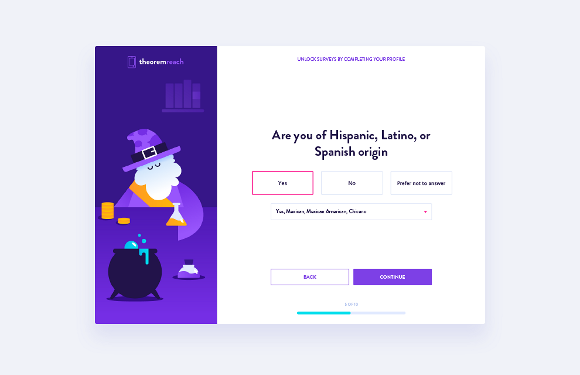 Minimalist layout with a powerful whitespace.
Don’t Make Users Guess
Lack of feedback from a system is a typical problem for many UIs. When users trigger some action and don’t receive an acknowledgment that the system got a request, they think that their request wasn’t delivered. As a result, they try again and again. This leads to the behavior known as rapid clicks. Those additional unnecessary actions often cause system errors. Here are a few things that will help you prevent rapid-clicks: Visual or Audio Feedback The app that responds to user interaction alleviates users’ fears. Fast Loading Times When users have to wait for content to load they experience friction. If loading takes too long, users start worrying whether the app is doing anything or not. As a designer/developer, do whatever you can to reduce page loading time so it complies with users expectation on how fast the operation should be. Make Loading Transparent For long-term operations, it’s essential to provide information on how much time is required to complete the operation. Visual feedback on user interactions.
Clarity Over Cleverness
Clarity has a direct impact on user expectations. Good UI is always in line with user expectations and previous knowledge. When users know what to expect, they are more happy to interact with a product. Here are few things to remember when making your UI more clear to your users: Clearly Label Elements All interactive elements, such as buttons, should be clearly identified with labels describing their function. Make Your Design Consistent Inconsistency creates confusion. When the same elements in UI look different in different parts of the app/website, this might confuse your users. Maintaining a consistent design approach allows users to use their previous knowledge when interacting with a product. Avoid Using Jargon Think about using terminology your users will understand to help them interact without any difficulties. Navigation Made Simple Poor navigation is a huge source of user frustration. Users should be able to move around to different areas of the product easily. They should also know where they are in the app’s navigation hierarchy at all times. Use Recognizable UI Patterns Every time the user has to learn how something new works, it creates friction. By using recognizable conventions, you can reduce the learning curve. Recognizable UI patterns eventually help the users to deal with complicated tasks easily. Clear labels and familiar location for menu makes wayfinding easy task for users.
Shorten the Number of Steps
Too many steps might also cause unnecessary friction. Every step in the journey, from the initial sign-up to individual operations, requires a certain amount of effort and can create friction. It’s essential to get rid of all extra steps in user flow. Keep the conventions of the KISS design principle in mind when designing user flows and remove or optimize steps that can cause friction. Here are a few more practical tips: Use Default Settings Default settings are rarely changed by most users (according to the Jared Spool and his article “Do users change their settings?” less than 5% of users change default settings). Offer Personalized Experience Use the data you have about your users to deliver a personalized experience for them. For example, both Amazon and Netflix offer tailored recommendations based on previous purchases and viewing habits. Offer Auto-Populate Details In some cases, data in your UI can be filled automatically without additional user effort. For example, if your mobile app needs to have credit card details, you can offer card scanning feature to streamline the process of adding all required information. Default settings. Autosave is enabled by default for Microsoft Word.
Prevent Errors; Handle Errors Gracefully
An ideal app actively prevents the user from making errors. But even when errors occur, good UI provides a clear help text about how to resolve the issue, as well as points out users where the error occurred. Anticipate Possible Errors When you think about potential pitfalls, you design better experiences for when those problems arise. For example, you can offer help and guidance that are necessary to the user context. Use Inline Validation By validating user input and providing feedback as soon as possible, you help users to detect and fix problems.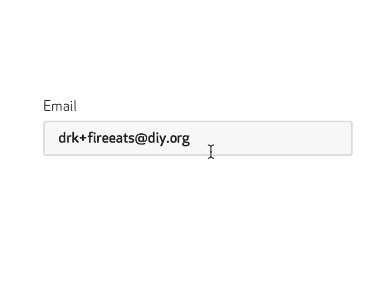 An example of inline validation.
Conclusion
If there is a sign of friction, user interaction won’t be smooth. Your goal as a designer should be in identifying bad friction and fighting it. By focusing on strategically reducing friction, you can create an outstanding user experience.Nick Babich
Fireart Studio is a design studio passionate about creating beautiful design for startups & leading brands. We pay special attention to nuances all the time to create professional while cool products that will not only meet all expectations, but exceed them.


Read Next

15 Best New Fonts, July 2024
Welcome to our monthly roundup of the best fonts we’ve found online in the last four weeks. This month, there are fewer…
By Ben Moss

20 Best New Websites, July 2024
Welcome to July’s round up of websites to inspire you. This month’s collection ranges from the most stripped-back…

Top 7 WordPress Plugins for 2024: Enhance Your Site's Performance
WordPress is a hands-down favorite of website designers and developers. Renowned for its flexibility and ease of use,…
By WDD Staff

Exciting New Tools for Designers, July 2024
Welcome to this July’s collection of tools, gathered from around the web over the past month. We hope you’ll find…

3 Essential Design Trends, July 2024
Add some summer sizzle to your design projects with trendy website elements. Learn what's trending and how to use these…

15 Best New Fonts, June 2024
Welcome to our roundup of the best new fonts we’ve found online in the last month. This month, there are notably fewer…
By Ben Moss

20 Best New Websites, June 2024
Arranging content in an easily accessible way is the backbone of any user-friendly website. A good website will present…

Exciting New Tools for Designers, June 2024
In this month’s roundup of the best tools for web designers and developers, we’ll explore a range of new and noteworthy…

3 Essential Design Trends, June 2024
Summer is off to a fun start with some highly dramatic website design trends showing up in projects. Let's dive in!

15 Best New Fonts, May 2024
In this month’s edition, there are lots of historically-inspired typefaces, more of the growing trend for French…
By Ben Moss

How to Reduce The Carbon Footprint of Your Website
On average, a web page produces 4.61 grams of CO2 for every page view; for whole sites, that amounts to hundreds of KG…
By Simon Sterne

20 Best New Websites, May 2024
Welcome to May’s compilation of the best sites on the web. This month we’re focused on color for younger humans,…