

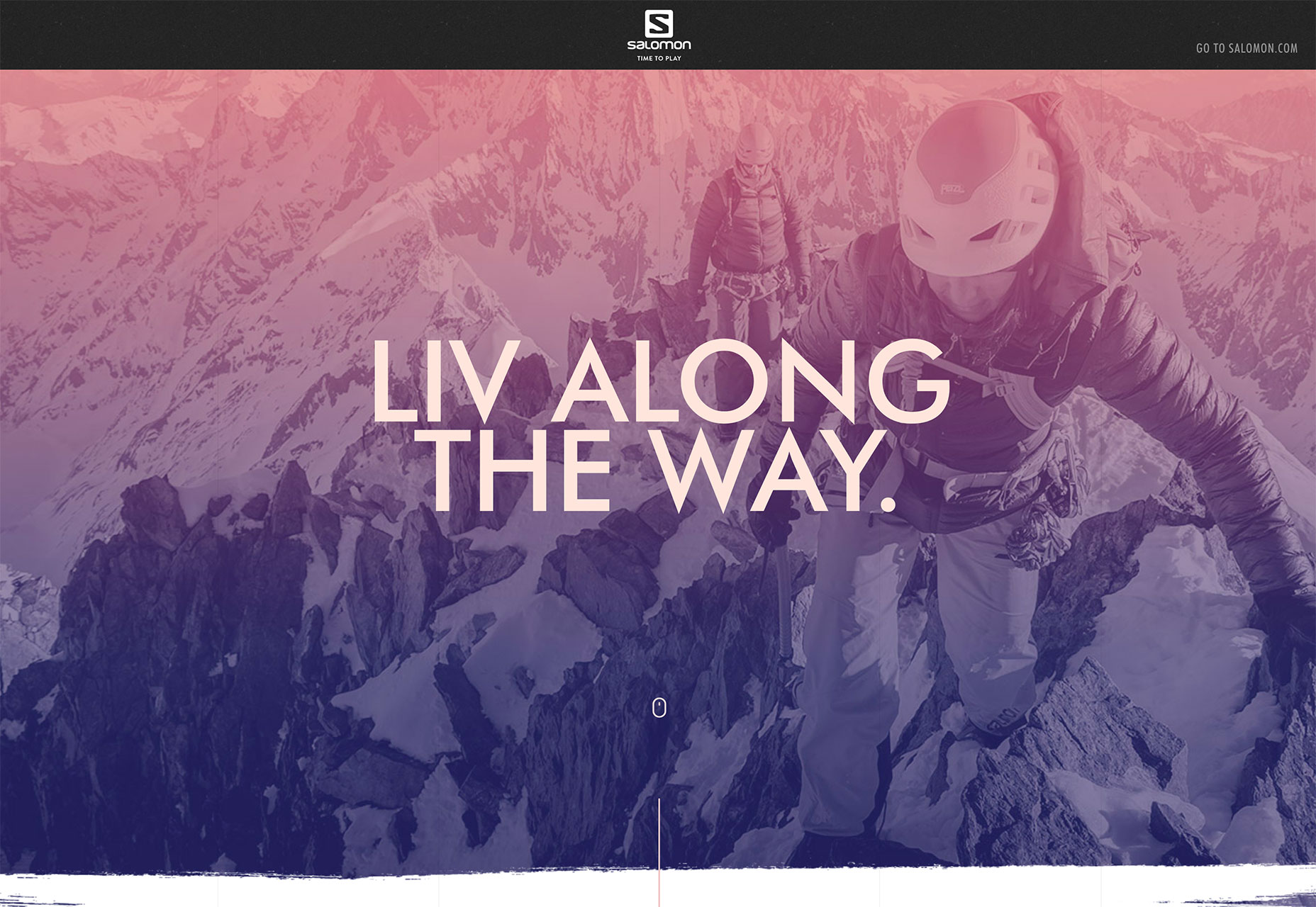
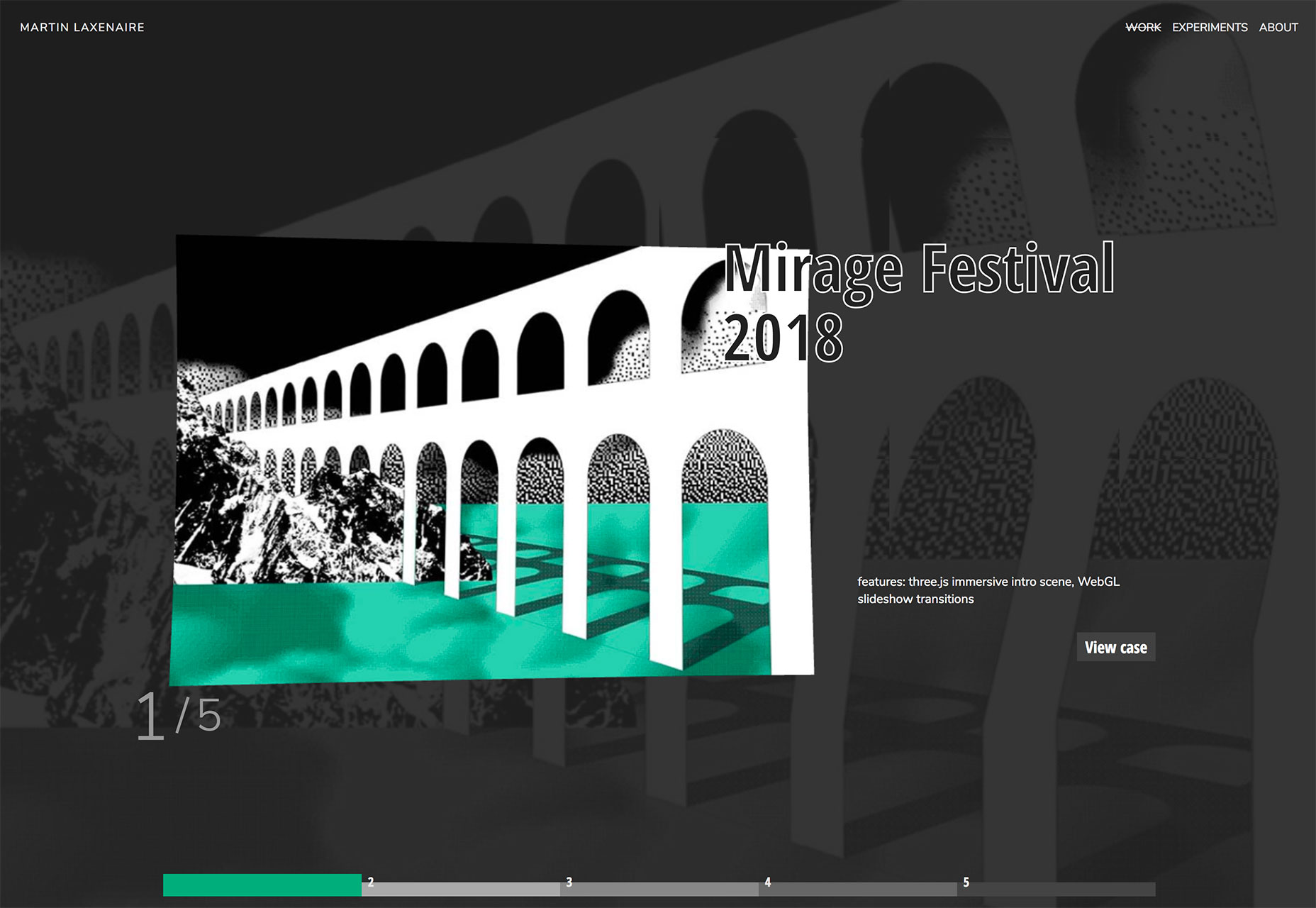
1. Interactive Layers
Designers are constantly trying to develop ways to keep users interested in the design for longer period of time. Using more interactivity is one way to do that. Pairing that interactivity with layered effects is another way to do it that has high visual interest. (It’s like putting the best of the visuals and interaction together.) Much like how parallax scrolling has worked for some time, interactive layers give users something to do with the design, generally scrolling, while elements on the screen move in different ways. The layered effect makes everything look a little more real, a little less cartoonish and can help increase engagement. It’s a mix of information and gamification. Each of the three examples below do it in a different way.- Salomon uses a scrolling story with great photos layered over a background image with depth and plenty of supporting facts. Almost haphazard placement of photos keeps the scroll action obvious so that users don’t stop moving through the content.
- ENO tells a story with video and sound in the background, while a simple foreground layer clues users into their products in the scene. It’s like watching a movie and knowing exactly what the product placements are so you can watch for them. Plus, adventure-style is instantly engaging.

- Martin Laxenaire uses fun color and animated hover states to provide content in a top layer with a similar visual in the background for depth and visual interest. And it’s a lot of fun just to see how the animations shift and shape elements on the screen.
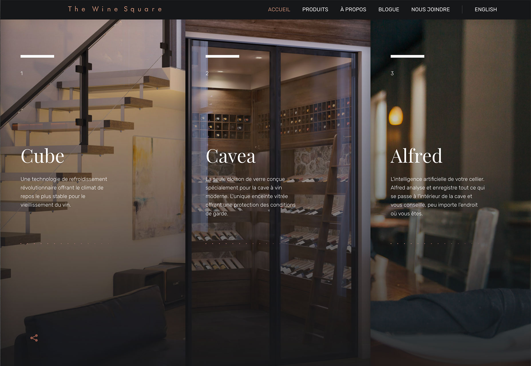
2. Three Columns of Text
One … two … three! Three columns of text! While multi-column text blocks phased out some time ago, that trend seems to be circle back. More designs are featuring three columns of text. (Maybe because users have wider desktop screens? Three columns is a little less unwieldy to read.) There’s a lot of science to back up the idea that elements in threes have a natural and harmonious feel to them. The “rule of three” has long been associated with content creation and speechwriting as a way to bring home a set of points. Think of all the stories that feature threes – Three Little Pigs, The Three Musketeers, Three Stooges – and in literature plays use three acts. It’s also a common practice to use three bullets points to support facts in slides and presentations. The rule of thirds helps you understand how and where users look at visual elements and even helps photographers and illustrators compose their work. So, it seems like a natural way to organize visual content as well. Using a three-column structure for text blocks can make it easier to break up the design. A full-width text block can be difficult to read unless the text is overly large. The ideal character count per line on a desktop is about 65 characters, so the size of the screen and size of the text do factor in. Each of the examples below use a three column format to organize information. While the first example uses three columns to break up a single block of text, this same concept is east to apply to three distinct copy blocks as well (such as in the other examples). The structure works best visually when all three text elements have similar weights and content styles.
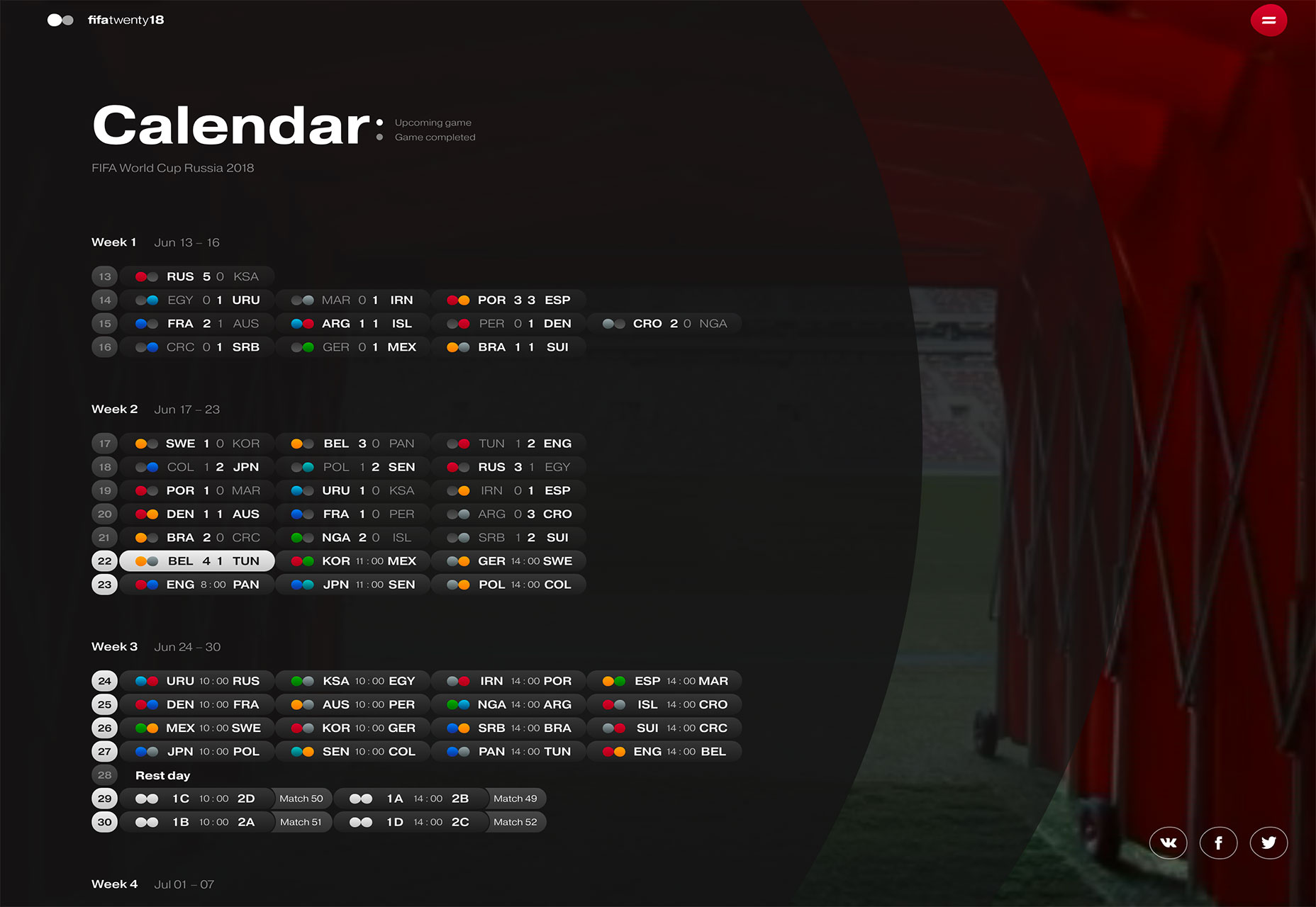
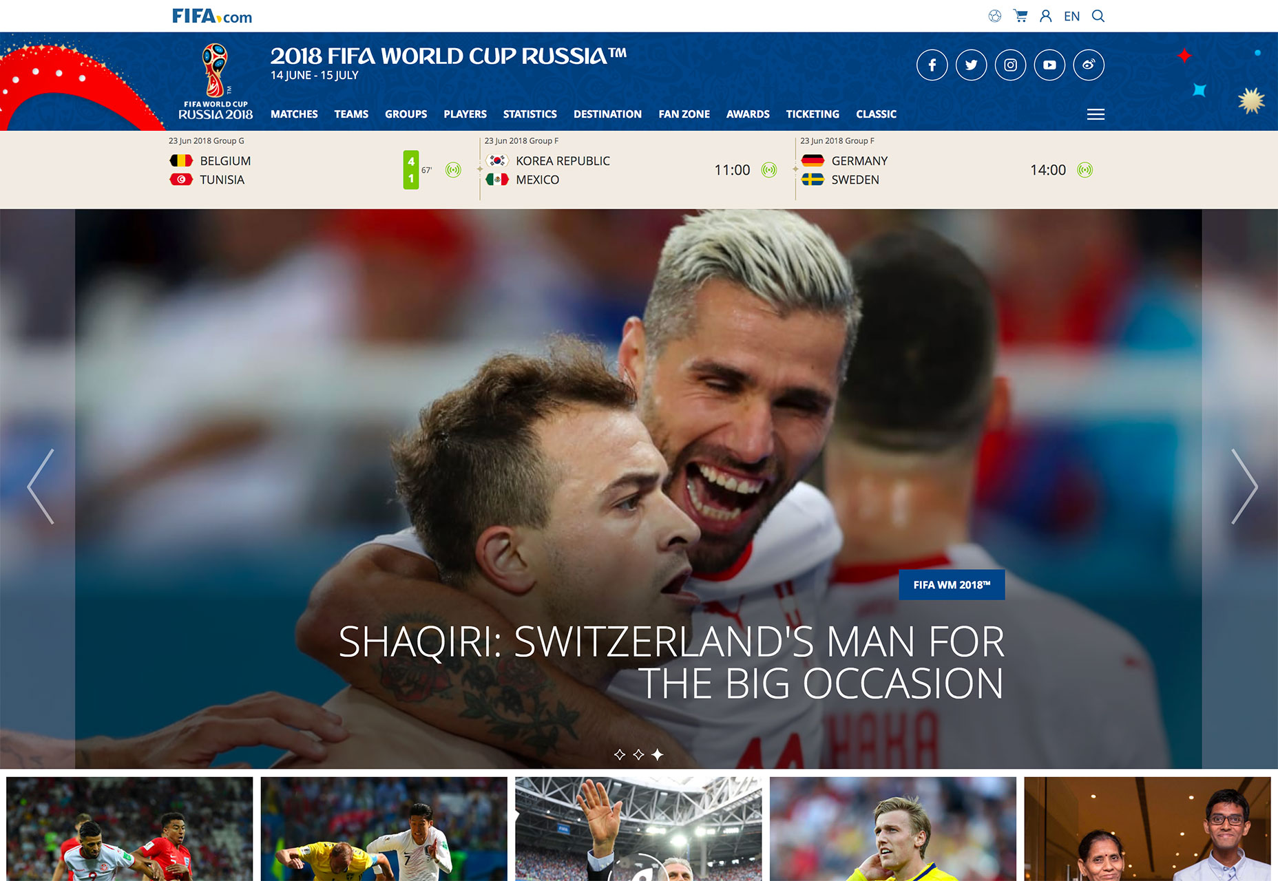
3. World Cup Fever
It seems like almost everyone has World Cup fever. With the international soccer tournament happening through mid-July, the sport is top of mind for sure. From website designs that focus on the event itself to others that are drawing inspiration from the sport, there’s a World Cup influence on design. Think about the design elements that can be pulled from World Cup designs:- Bold color choices such as the bright red and blue from the FIFA branding and design.
- Typography choices, such as the uppercase, curved lettering style uses in the main logo.
- Color combinations from all the world flags, many of which feature bright colors and reds, blues and greens.
- Soccer-field inspiration with more gridded or block-style designs.
- Hexagon shapes from the panels on a traditional soccer ball.
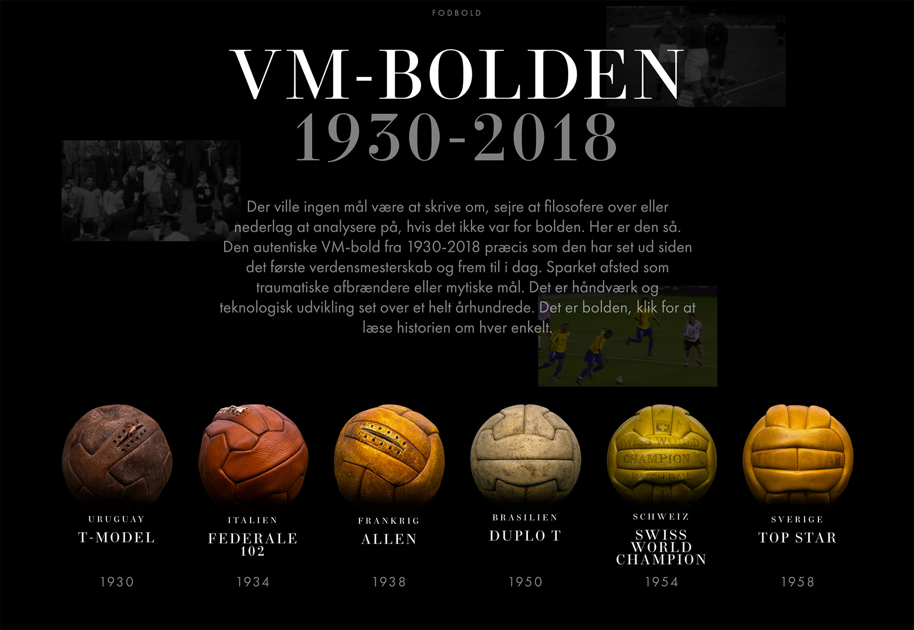
 The event is also a good reason to provide some soccer history for users, such as the visual exploration of ball types used in the website-based infographic below.
 And there’s plenty of interest in websites with these themes right now, so it shouldn’t be hard to find material to work with and plenty of sites to explore for inspiration.
Conclusion
My favorite trend this month is definitely all the soccer—dare I say “football”—projects. It’s great to see all the world influences and how something like a major event can impact the mood and visual composition of design projects. What trends are you loving (or hating) right now? I’d love to see some of the websites that you are fascinated with. Drop me a link on Twitter; I’d love to hear from you.Carrie Cousins
Carrie Cousins is a freelance writer with more than 10 years of experience in the communications industry, including writing for print and online publications, and design and editing. You can connect with Carrie on Twitter @carriecousins.


Read Next

3 Essential Design Trends, May 2024
Integrated navigation elements, interactive typography, and digital overprints are three website design trends making…

How to Write World-Beating Web Content
Writing for the web is different from all other formats. We typically do not read to any real depth on the web; we…
By Louise North

20 Best New Websites, April 2024
Welcome to our sites of the month for April. With some websites, the details make all the difference, while in others,…

Exciting New Tools for Designers, April 2024
Welcome to our April tools collection. There are no practical jokes here, just practical gadgets, services, and apps to…

How Web Designers Can Stay Relevant in the Age of AI
The digital landscape is evolving rapidly. With the advent of AI, every sector is witnessing a revolution, including…
By Louise North

14 Top UX Tools for Designers in 2024
User Experience (UX) is one of the most important fields of design, so it should come as no surprise that there are a…
By Simon Sterne

What Negative Effects Does a Bad Website Design Have On My Business?
Consumer expectations for a responsive, immersive, and visually appealing website experience have never been higher. In…

10+ Best Resources & Tools for Web Designers (2024 update)
Is searching for the best web design tools to suit your needs akin to having a recurring bad dream? Does each…
By WDD Staff

3 Essential Design Trends, April 2024
Ready to jump into some amazing new design ideas for Spring? Our roundup has everything from UX to color trends…

How to Plan Your First Successful Website
Planning a new website can be exciting and — if you’re anything like me — a little daunting. Whether you’re an…
By Simon Sterne

15 Best New Fonts, March 2024
Welcome to March’s edition of our roundup of the best new fonts for designers. This month’s compilation includes…
By Ben Moss

LimeWire Developer APIs Herald a New Era of AI Integration
Generative AI is a fascinating technology. Far from the design killer some people feared, it is an empowering and…
By WDD Staff