

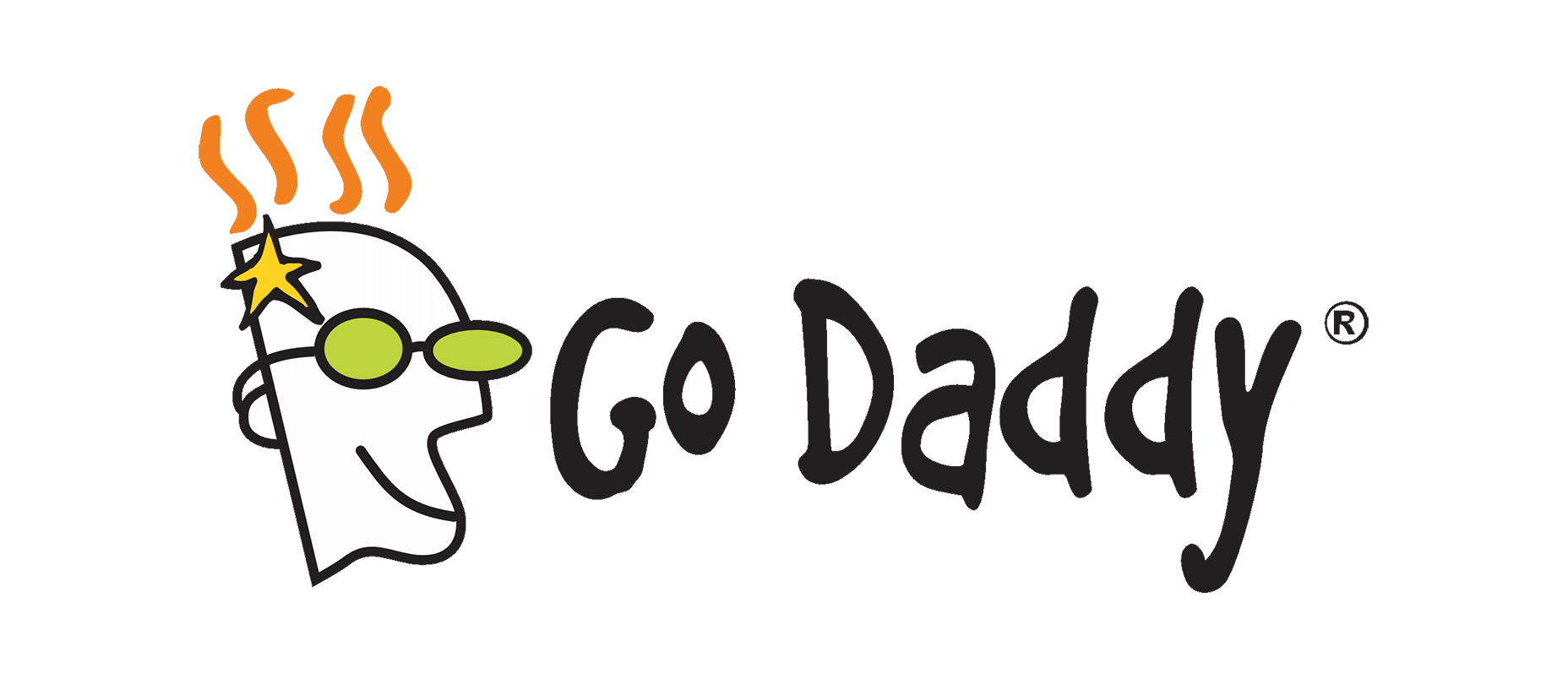
 So that’s the original logo. Nice and ‘90s.
 Here, then, is the 2016 variant where they first updated their type. As you can see, the type has a few playful touches, but the whole aesthetic is more in line with what you’d expect from a multi-million dollar corporation.
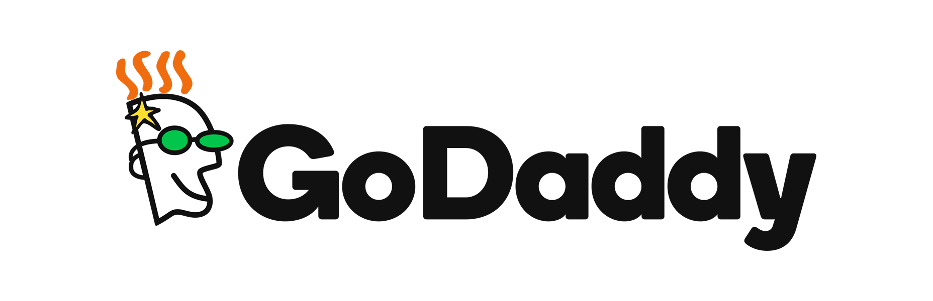
 And here’s the new logo. As you can tell, it’s just the 2016 type without the Daddy that made GoDaddy a thing.
GoDaddy is following a trend that has been happening for years, now. Hotmail, Yahoo, Google, and pretty much every major Internet company has modernized their logos and branding. The fact that they’ve all done this in almost the exact same way, with sans-serif type, has drawn criticism from those who feel like their new identities lack any sense of personality.
[pullquote]if corporate really is the new “trendy”…they nailed it, but it makes me a little sad.[/pullquote]
I can’t say that’s wrong, exactly, but I have a theory about where this trend is coming from. The companies that were once plucky startups are now entirely beholden to stockholders and boards. Investors often seem to prefer companies with a stable, mature, and even boring image. Where their value was once in their ability to challenge the status quo, they now focus on maintaining their market value, and increasing it at a more reasonable pace.
A part of that shift is a shift in branding. Is this a bad thing? If you long for the old days of the Internet, it probably seems like it. If you’ve invested in those companies, it’s probably alright with you.
An alternate theory is that the new branding actually looks more like the branding for recent startups, which have steadily moved toward corporate-looking branding. This could actually be an effort by GoDaddy to stay on-trend. And if that’s the case, if corporate really is the new “trendy”, I just don’t know what to say. They nailed it, but it makes me a little sad.
And here’s the new logo. As you can tell, it’s just the 2016 type without the Daddy that made GoDaddy a thing.
GoDaddy is following a trend that has been happening for years, now. Hotmail, Yahoo, Google, and pretty much every major Internet company has modernized their logos and branding. The fact that they’ve all done this in almost the exact same way, with sans-serif type, has drawn criticism from those who feel like their new identities lack any sense of personality.
[pullquote]if corporate really is the new “trendy”…they nailed it, but it makes me a little sad.[/pullquote]
I can’t say that’s wrong, exactly, but I have a theory about where this trend is coming from. The companies that were once plucky startups are now entirely beholden to stockholders and boards. Investors often seem to prefer companies with a stable, mature, and even boring image. Where their value was once in their ability to challenge the status quo, they now focus on maintaining their market value, and increasing it at a more reasonable pace.
A part of that shift is a shift in branding. Is this a bad thing? If you long for the old days of the Internet, it probably seems like it. If you’ve invested in those companies, it’s probably alright with you.
An alternate theory is that the new branding actually looks more like the branding for recent startups, which have steadily moved toward corporate-looking branding. This could actually be an effort by GoDaddy to stay on-trend. And if that’s the case, if corporate really is the new “trendy”, I just don’t know what to say. They nailed it, but it makes me a little sad.
Ezequiel Bruni
Ezequiel Bruni is a web/UX designer, blogger, and aspiring photographer living in Mexico. When he’s not up to his finely-chiselled ears in wire-frames and front-end code, or ranting about the same, he indulges in beer, pizza, fantasy novels, and stand-up comedy.


Read Next

15 Best New Fonts, July 2024
Welcome to our monthly roundup of the best fonts we’ve found online in the last four weeks. This month, there are fewer…
By Ben Moss

20 Best New Websites, July 2024
Welcome to July’s round up of websites to inspire you. This month’s collection ranges from the most stripped-back…

Top 7 WordPress Plugins for 2024: Enhance Your Site's Performance
WordPress is a hands-down favorite of website designers and developers. Renowned for its flexibility and ease of use,…
By WDD Staff

Exciting New Tools for Designers, July 2024
Welcome to this July’s collection of tools, gathered from around the web over the past month. We hope you’ll find…

3 Essential Design Trends, July 2024
Add some summer sizzle to your design projects with trendy website elements. Learn what's trending and how to use these…

15 Best New Fonts, June 2024
Welcome to our roundup of the best new fonts we’ve found online in the last month. This month, there are notably fewer…
By Ben Moss

20 Best New Websites, June 2024
Arranging content in an easily accessible way is the backbone of any user-friendly website. A good website will present…

Exciting New Tools for Designers, June 2024
In this month’s roundup of the best tools for web designers and developers, we’ll explore a range of new and noteworthy…

3 Essential Design Trends, June 2024
Summer is off to a fun start with some highly dramatic website design trends showing up in projects. Let's dive in!

15 Best New Fonts, May 2024
In this month’s edition, there are lots of historically-inspired typefaces, more of the growing trend for French…
By Ben Moss

How to Reduce The Carbon Footprint of Your Website
On average, a web page produces 4.61 grams of CO2 for every page view; for whole sites, that amounts to hundreds of KG…
By Simon Sterne

20 Best New Websites, May 2024
Welcome to May’s compilation of the best sites on the web. This month we’re focused on color for younger humans,…